
CHAPTER |
|
18 |
Visualizing Large Datasets |
So far, this book has covered ways to represent data with a spatial component on the map. Any type of data nowadays has a spatial component, which makes it suitable for viewing on the map. Actually, most data have an implied spatial component, and now we have tools to exploit this component. A typical business application handles customers, and customers have an address. This field is the spatial component of any data related to customers. Sales can be grouped by city, ZIP code, or state and presented on the map.
New tools to exploit the spatial characteristics of data are already in use today. SQL Server Reporting Services supports the display of data on a map, and Google has introduced a service called Fusion Tables to facilitate the binding of data of all types with geographical data. I’m not going to discuss Fusion Tables in this book because it’s not a programmable environment; instead, I discuss techniques for placing spatial data on the map.
There are types of data that are inherently tied to a location, and you have seen a few examples in previous chapters. The earthquakes occur at specific locations and any analysis of seismic data involves the earthquake’s location. Earthquakes have a temporal component too, and you will learn how to exploit both the temporal and spatial components of your data in the last two chapters of this book. Cities and airports are simpler examples of data with a prominent spatial component. This chapter doesn’t introduce a new dataset; you will use sample data from previous chapters to create interesting presentations of earthquake data, U.S. city populations, and world airports.
Beyond Markers
In Chapter 5. you learned how to place markers on the map to identify points of interest, and in Chapter 14, you learned how to handle large numbers of markers on a map. The basic idea was to display a summary at small magnification levels and wait for the user to zoom deeply into the map before showing all the markers. You can control which markers are displayed at each magnification level from within your script or use the Marker Clusterer component to cluster individual markers into groups. Even so, the task of handling too many features on a map is not a trivial one, and there are situations where it’s preferable to move away from markers and explore other techniques for visualizing large datasets.
In this chapter, you will see two new techniques for visualizing data with a spatial component. The first technique uses shapes to represent the data points instead of markers. The advantage of the shapes (circles in particular) is that their size can indicate an attribute of the data value being displayed. Figure 18-1 shows on the map the earthquakes that exceed a certain magnitude. Each circle represents an earthquake and it’s centered at the earthquake’s epicenter. The size of the circle is proportional to the magnitude of the earthquake.
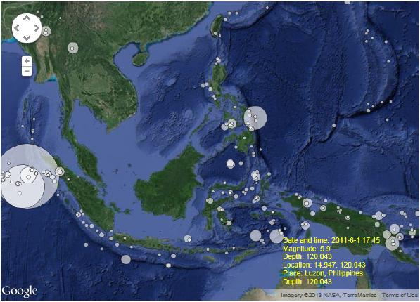
Figure 18-1 Viewing individual features on the map without markers
This type of visualization offers a whole lot of information at a glance compared to the marker approach you used to present the earthquake data in preceding chapters. Moreover, users can view data about each earthquake by clicking the circle that represents a specific earthquake. The relevant data is displayed in a section at the map’s lower-right corner. The practical aspect of this technique is that it conveys very useful information at a glance; the size of the earthquake is evident while multiple earthquakes of different magnitudes are visible on the map at once. Contrast this type of visualization with a map filled with markers. Figure 18-2 shows the same area of the globe with the same earthquakes marked with markers (left) and circles (right).
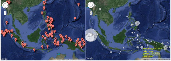
Figure 18-2 Using the appropriate visualization technique for different types of data makes a world of difference
The other approach is to place a color map, known as a heatmap, over the map. The colors of the heatmap represent the density or intensity of the data. A heatmap of the airports or U.S. cities represents the density of the data points. Figure 18-3 shows a heatmap generated by the list of world airports. The more airports in an area, the “warmer” the color over this area of the map. Incidentally, the heatmap of the airports shows the distribution of the most populated areas on the planet. Notice that sub-Saharan areas in Africa have very few airports. The same is true for the steppes in northern China. You will probably be surprised to find out that the country with the largest density of airports is New Zealand!

Figure 18-3 A heatmap with the distribution of airports all over the globe
Figure 18-3 was generated by the sample page
Density Heatmap - World Airports.html, which is included in this chapter’s support material. The heatmap’s colors may not be easily distinguishable on the printed page, but you can open the original application to view the gradient that represents the density of the airports.The heatmap of the U.S. cities in Figure 18-4 shows not only density, but also intensity. The data points have an additional attribute, which is their population. Unlike the distribution of the airports in Figure 18-3, the heatmap shown in Figure 18-4 takes into consideration not only the density of the cities, but their populations as well. Notice that the two most populated areas in the United States are the Los Angeles basin in California and New York City in the east. This happens not only because of the population of Los Angeles and New York City, but also because there are many cities with substantial populations around them. The shape in red follows the coastal line in both sides of the country! With a relatively small number of cities in the United States, I was able to generate a fairly accurate map of the population distribution. Figure 18-4 was generated by the
Density Heatmap - US Cities.html sample web page, also discussed later in this chapter.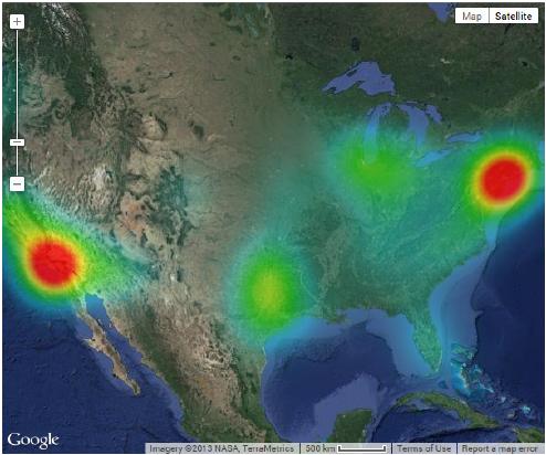
Figure 18-4 A heatmap with the density and populations of various cities across the US
Visualizing the Earthquakes
In Chapter 15, you saw how to contact a web service at the U.S. Geological Survey (http://comcat.cr.usgs.gov/fdsnws/event/1) and retrieve data about earthquakes worldwide. This service accepts several arguments, the most important of them being a range of dates, the rectangle on the earth’s surface you’re interested in, and the minimum/maximum earthquake magnitudes. USGS also provides a visual interface for building the appropriate URL, which is located at http://earthquake.usgs.gov/earthquakes/feed/v1.0/urlbuilder.php.
The URL Builder page is shown in Figure 18-5 (you see part of this page in the figure). On this page, you specify the parameters that determine the earthquakes you want to retrieve, and the application builds the appropriate URL, which you can view by clicking the Search button at the bottom of the page.

Figure 18-5 Building the URL for the USGS earthquakes web service
The following URL retrieves all earthquakes that occurred from 2010 through 2012 and exceed 7.5 points on the Richter scale:
As you can see, it’s easy to build the URL in your code by allowing users to specify, or select, the parameter values on a custom form.
Parsing the Earthquake Data
Once you have the appropriate URL, you can request the data in JSON format from within your script and get back an array of custom objects that represent the selected earthquakes. Listing 18-1 shows the structure of the document returned by the earthquakes service at USGS (just click the URL displayed at the bottom of the URL Builder page to see the GeoJSON document returned by the service):
Listing 18-1 The GeoJSON description of two earthquakes

In Chapter 15, you wrote an application to parse the array of earthquakes and place a marker on the map for each earthquake. The JavaScript code that iterates through the items of the
earthquakesArray is shown in Listing 18-2.Listing 18-2 The JavaScript code for generating a marker for each earthquake

The variables
eqFormattedDate and eqDescription are used to display the earthquake description later in the code. The actual code that places the marker on the map is quite simple. The earthquakesArray variable is an array of custom objects, one for each earthquake, and the structure of these objects is determined by the web service.Using the Circle Symbol as Marker Icon
To generate a map annotated with shapes, you must replace the marker’s default icon with the symbol of a filled circle. The circle’s radius should be proportional to the size of the earthquake to help users visualize seismic activity at a glance. Symbols don’t have specific sizes; the circle symbol, for example, doesn’t expose a radius property that you can set in your code. Instead, symbols provide the
scale property. For the example of the earthquakes, the scale property can be set to the following expression:The scale is equal to the natural logarithm base raised to the value that corresponds to the earthquake’s magnitude. The earthquake scale is a logarithmic one and you can’t use a linear function of the magnitude. An earthquake of size 7 is 10 times larger (and more than 10 times more catastrophic) than an earthquake of magnitude 6. If you set the scales of the two circles that represent two such earthquakes to 6 and 7, respectively, their difference will be hardly noticeable on the map. The proposed function yields circles that indicate the relative sizes of the earthquakes, yet they don’t allow a few very large earthquakes that occurred in the Pacific to cover an entire hemisphere. If you have an interest in seismology, you will come up with a better function to map the earthquake magnitudes into scaling factors.
The icon that represents the current earthquake in the loop that generates the markers must be declared as follows:

You should use constants for the various colors and the opacity in your script, but we can tolerate a few hard-coded values in the sample application.
Interacting with the Symbols
Your next step is to add some user interaction to the map. When users click an earthquake’s icon, additional data about the selected earthquake should appear somewhere. To display the additional data, you must add a listener to each marker’s
click event with a statement like the following:The
M variable in Listing 18-2 is the current marker and showEarthquake() is a simple function that displays the M variable’s objInfo property on a <div> element. The objInfo property is set to a lengthy description of the earthquake data (the eqDescription variable in Listing 18-2) and the task of the showEarthquake() function is implemented with a single statement:
Less trivial is the placement of the
eqData element on the page, as it overlaps the map. This element is declared in the page’s body with the following simple HTML statement:However, to place this element on the map, the following style definition is required:

The
<div> element is transparent because the background-color property isn’t set. It’s also positioned absolutely on the page and it has a large zIndex value to remain on top of the map. The downside of this approach is that the map isn’t resizable. You can either use JQuery code to make the <div> element follow the changes in the map’s size, or display the relevant data on another element of the page, outside the map. If you decide to redesign the page, you should include controls to allow users to specify the basic selection criteria for the earthquakes and build the URL in your code. The data for a specific earthquake, as returned by the USGS web service, is shown here:
Sorting the Earthquake Data
Some earthquakes occur near other ones—after all, most earthquakes occur along some well-known faults. If one of them is large, the circle that represents this earthquake may completely overlap the circles that correspond to multiple smaller earthquakes in the same area. And here we have a problem: The circles that are covered by a larger one can’t be clicked. The larger circle will receive all the clicks and users won’t be able to select one of the underlying circles.
The solution to this problem is to display the circles that correspond to smaller earthquakes on top of the larger ones. In other words, smaller circles should have larger
zIndex values. For this to happen, you must sort the array of earthquakes according to their magnitudes in descending order. Then, as each circle symbol is placed on the map, the script should assign a larger zIndex value to it. The following two statements sort the earthquakes according to their magnitude:The first statement converts the
features collection of the web service’s response into an array. The results variable represents a collection of nodes, which can’t be sorted directly. By converting it to an array, you can then apply the sort() method to sort the array. And this is what the second statement does. However, because the earthquakesArray array contains custom objects, you must supply your own function to compare two elements of the array. For more information on the syntax of the sort() method, see the discussion of arrays in Chapter 4.The
compareMagnitudes() function accepts as arguments two feature objects and compares their magnitudes. If the first one is larger, it should return 1, and if the first one is smaller, it should return –1. If both arguments have the same magnitude, the comparer should return 0. The compareMagnitudes() function, shown in Listing 18-3, reverses the two results so that the sort is ascending: You place the larger circles on the map first (using a smaller zIndex value) and the smaller ones on top.Listing 18-3 Comparing earthquakes based on their magnitudes

Representing earthquakes with circles leads to another improvement in the interface; namely, to display the data of the earthquake as the user moves the pointer over the cirlces on the map. Let’s add the necessary listeners for the
mouseover and mouseout events:
Heatmaps
When you have to display too many features on the map, like the 9,000 world airports, you may find out that none of the techniques presented so far works to your satisfaction. You can’t place so many markers on the map, not even with the MarkerClusterer component. When you deal with a very large set of data points, you visualize it better as a continuous distribution, rather than individual data points. After all, individual data lose their meaning in the crowd.
Let’s consider for a moment the requirements of a user viewing the airports on the map. If you want to look at the airports in a specific country, or a specific state/county, you can simply zoom into the area you’re interested in and view the airports as markers. Or, place a label for each airport on the map, as you have seen in Chapter 14. If you want to see the distribution of the airports on the map, however, a heatmap graph like the one shown in Figure 18-3 earlier in this chapter conveys a lot of information about the distribution and density of airports. The same is true for city populations. At large magnification levels, you may wish to see individual symbols for each city and request additional information. As you zoom out, you probably want to see the distribution of the population over the country, rather than individual cities.
The heatmap is a unique type of graph that conveys information like no other chart. It translates the density, or intensity, of the data into a color gradient and blends the individual data points into a colorful surface that covers the relevant areas of the globe. This surface is constructed with a gradient, where areas with fewer points are mapped to the gradient’s beginning color, and areas with the most points are mapped to the gradient’s ending color. Areas between the two extremes are mapped to the middle colors of the gradient.
Note that the gradient need not extend between two colors only. You can specify any color sequence and the API will generate an elaborate gradient that goes smoothly through all colors.
Constructing the Heatmap
You don’t really need to understand how the heatmap is constructed, but here’s a simple explanation. Imagine that data points are represented by pegs. Then, you throw a flexible sheet over the pegs. The sheet will take a shape dictated by the pegs it covers. Instead of rendering a three-dimensional surface over the map, you assign a different color to each point, depending on its altitude. The points that lie on the earth’s surface are transparent while the points with the highest altitude are colored with the gradient’s ending color.
If the sheet is very flexible, each peg will affect a small area around it. In areas with many pegs, the sheet will flow smoothly over the pegs and will not touch the ground. In areas with isolated pegs, the sheet will make a peak and then it will fall quickly on the ground. You can control the “stiffness” of the sheet by adjusting the
radius property of the heatmap. Using larger values for the heatmap’s radius is equivalent to covering the pegs with a stiffer sheet that can’t change its shape easily. In other words, the radius determines the area that will be affected by each peg’s height.To generate a density or intensity heatmap, you need a set of data with a spatial component (geo-coordinates) and a value. Each data item may have any number of attributes, but only the geo-coordinates are required.
The list of cities you used in a couple of chapters contains locations as well as populations. The locations are adequate for producing a distribution heatmap, as long as all data points are equal in stature. You can also include the population, in which case the script will generate an intensity heatmap. Cities with a larger population will be colored differently from cities with a smaller population.
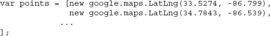
To produce a heatmap, you must first create an array of geo-locations like the following:
The
points array holds all the information required to build a density heatmap. If you add a third column to the array, this column will be used to weigh the location. A value with a weight of 2 will affect the heatmap twice as much as a point at the same location with a weight of 1. Adding a weight is like adding some points more than once. The same array with weights will look like this: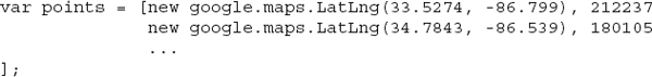
The last value in each row is the population of the corresponding city. These values are heavy weights, but it doesn’t really matter; all locations are weighted proportionally.
The Heatmap Layer
To generate the heatmap, you must create a new variable that represents the heatmap layer with the following statement:
The
HeatmapLayer object isn’t included in the script with the basic Google Maps functionality. To include this functionality in your script, you must include the visualization library. Change the <script> tag that imports the Google Maps API script by adding the libraries=visualization parameter:
Besides the array with the data points, the
HeatmapLayer object’s constructor accepts a number of optional parameters:•
map The Map object to which the heatmap will be applied.•
radius This parameter specifies the area of influence for each data point, in pixels. The area is a circle centered at any given point with radius equal to this property.•
dissipating This parameter is a true/false value that determines whether the heatmap’s colors will dissipate on zoom. When it’s false, which is the default value, the radius of influence is adjusted to the current zoom level to ensure that the color intensity is preserved. When this property is set to false, the heatmap doesn’t change as users zoom in or out.•
gradient This parameter is an array of colors that specify the progression of colors in the heatmap. You usually start the gradient with cold colors and move on to warmer colors for areas with greater density and/or intensity.•
maxIntensity The maximum intensity of the heatmap. By default, the points are colored according to their intensity with one of the colors in the gradient, and the entire range of colors is used. If your data includes points with unusually high weights, use the maxIntensity attribute to clip their values. All points whose weights exceed the maxIntensity value are colored with the last color in the gradient. These points are considered outliers, and they usually distort the heatmap by forcing all other points to be colored with colors from a relatively small range of the gradient.•
opacity The opacity of the heatmap (a numeric value between 0 and 1).You should experiment with the settings of the
dissipating and radius attributes of the heatmap to get an idea of how they affect the heatmap and how they interfere with one another. When dissipating is set to true, you will most likely need to increase the radius. Figure 18-6 shows how the same data is rendered on the heatmap using the two settings of the dissipating property. As you zoom in and out, you will realize what the dissipating property really does: It causes the heatmap to be redrawn when the magnification level is changed. When the dissipating property is set to false, the heatmap isn’t recalculated; it’s blown up along with the map.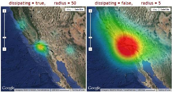
Figure 18-6 Adjusting the heatmap’s appearance through the
radius and dissipating parametersBy adjusting the radius, you can force a data point to affect a larger area and you can practically fill the map with a heatmap based on a relatively small number of data points.
The
gradient Property The value of the gradient property is defined as an array of colors. The HeatmapLayer object will generate automatically the transitions from one color to the next and the final gradient will be very smooth. The colors can be specified in many different notations, but the most common method of specifying colors is the rgb() and the rgba() functions. Both functions describe a color based on its three basic components: the red, green, and blue components. The rgba() function accepts an additional argument, the opacity of the color. Here’s the definition of a typical array of colors, which you can pass as an argument to the constructor of the HeatmapLayer object:
The rgb() and rgba() Functions
The
rgba() function generates a color value given its four components: the red, green, and blue intensities, and the opacity of the color. Thus, rgba stands for “Red Green Blue and Alpha,” alpha being the opacity. The three intensities are integers in the range from 0 to 255. The minimum value indicates the lack of the corresponding color component, and the maximum value indicates the presence of the corresponding color with full intensity. The opacity (alpha) value goes from 0 (completely transparent) to 1 (completely opaque). The color values can also be specified as percentages: The value 50% means that the intensity of the corresponding color is at 50 percent of the full intensity. The following color value corresponds to a bright red color:A dark red color can be specified as
rgba(128, 0, 0, 1) or as rgba(50%, 0, 0, 1). The following expression combines red and green in full intensities to produce a bright yellow color: rgba(255, 255, 0, 1). If you wish to work with opaque colors and you don’t care about the transparency, use the rgb() function. The rgb() function is identical to the rgba() function except that it doesn’t require the last argument. It’s possible to produce any color by combining the three basic color components and there are tools you can use to create colors interactively. This site allows users to construct colors interactively: http://www.calculatorcat.com/free_calculators/color_slider/rgb_hex_color_slider.phtml.For more information on constructing colors based on their three primary components, look up “color cube” in Wikipedia.
This specific gradient starts with a black color that is mostly transparent. The next color is cyan with a higher opacity. Then comes a green color (only the green component of the color has a non-zero value), and the gradient ends with a red color that is totally opaque.
Exploiting the Heatmap’s Opacity Figure 18-7 demonstrates an interesting effect you can achieve by manipulating the opacity values in the definition of the gradient. The map shown in the figure is an intensity heatmap of the populations of major U.S. cities. It looks as if the most populated cities are illuminated with spotlights. The printed image may not convey actual contrast, so open the sample page
Dark Heatmap.html to see the full effect.The map shown in Figure 18-7 is based on the city population data, and the heatmap layer was defined with the following statement:

Figure 18-7 Illuminating the map with spotlights through a heatmap layer
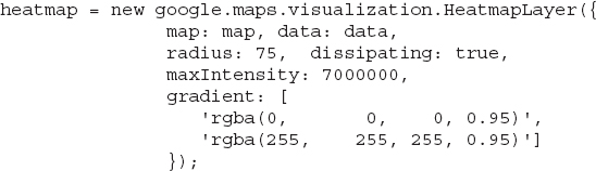
The colors that make up the gradient are practically opaque, leaving the areas of the country without major cities in the dark. The largest cities are illuminated with a spotlight whose light circle is proportional to the city population.
For a similar effect, which doesn’t blur the text on the map, use the following color definitions for the gradient:
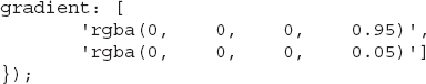
To see the alternate spotlight effect in action, open the
Dark Heatmap 2.html sample page, included in this chapter’s support material. A few cities (New York and Los Angeles) dominate the effect. You can achieve a better result by experimenting with the setting of the maxIntensity attribute, which limits the effect of the very large cities.Summary
In this chapter, you learned how to represent spatial data on the map using symbols and a unique type of chart, the heatmap. Heatmaps are colored graphs that summarize a lot of data, and they represent the density and/or intensity of the data, rather than individual data. When you’re faced with an application that calls for displaying too many markers on the map, forget the marker and related tools and use the techniques discussed in this chapter. The two techniques described in this chapter squeeze a large dataset into a picture and convey a lot of information to the user.
I have pretty much exhausted the presentation of the Google Maps API, and you have seen examples of many types of applications you can build on top of Google Maps. There’s one more interesting feature to explore in the last two chapters of this book: how to animate items on a map. The topic of animating items on a map with JavaScript is discussed in detail in the last two chapters of this book.
..................Content has been hidden....................
You can't read the all page of ebook, please click here login for view all page.