CHAPTER |
|
10 |
Geodesic Calculations: The Geometry Library |
The shapes you explored in Chapter 8 are made up of line segments that appear straight on the map. On the sphere, however, there are no straight lines; even if you could hold your hand steady and draw a “straight” line on a sphere, it would be an arc. Conversely, if you draw a straight line on a map and then wrap the paper around a sphere, the straight line will no longer be straight; it will end up as a curve on the sphere. The curved lines on the sphere are called geodesic. To make a long story very short, the shortest distance between any two points on the surface of a sphere lies on a geodesic circle. Google Maps treats the earth as a perfect sphere, and you need to understand the difference between the straight lines you draw on the map and the curved lines on the sphere.
A Quick Overview of the Mercator Projection
As you recall from Chapter 1, the Mercator projection introduces a substantial distortion to the sizes of the various features of the earth, such as islands and lakes. The distortion becomes more pronounced as you move away from the equator. There are several examples in this chapter that will help you “see” this distortion and understand why it can’t be avoided. For the benefit of readers that skip the introductory chapters, let me repeat the best explanation of the Mercator distortion I’ve read so far (a very illuminating description proposed by mathematician Edward Wright in the seventeenth century). Imagine that the earth is a balloon and the features you’re interested in are drawn on the surface of the balloon. Place this balloon into a hollow cylinder so that the balloon simply touches the inside of the cylinder. The points of the balloon that touch the cylinder form a circle that divides the balloon in two halves. This circle is the equator by convention. Because the balloon is a perfect sphere, any circle that divides it into two hemispheres is an equator and there’s an infinity of equators you can draw on a sphere.
Now imagine that the balloon expands inside the cylinder and the features drawn on the balloon’s surface are imprinted on the inside surface of the cylinder. As the balloon is inflated, more and more of its surface touches the cylinder’s surface. No matter how much the balloon is expanded, however, the two poles will never touch the cylinder. This explains why you’ll never see the two poles on a conventional map. Go to the Google Maps site, or open one of the mapping applications you have explored in receding chapters, and zoom out all the way. You will see part of the two arctic circles, all in white, but never the two poles.
When you unfold the cylinder, the imprint left on its inside surface is the map. The features near the equator touch the surface early in the process, before the balloon is substantially inflated. The further away you move from the equator, the more you have to expand the balloon in order to touch the cylinder. The balloon’s expansion, however, causes the features to expand, which explains why the Mercator projection distorts sizes. This process preserves the local shapes and angles of the various features, at the expense of features at higher latitudes being expanded by different amounts. The meridians, which all meet at the poles, will become parallel lines, and the parallels, which wrap the earth at various latitudes, remain parallel on the flat map. And this is another reason why you’ll never see the poles on a Mercator projection: The meridians run parallel to each other and they never merge (they should merge at the two poles, of course). While consecutive meridians maintain their distance around the earth, consecutive parallels are closer to one another near the equator than they are near the poles (see Figure 10-4 a little later in this chapter).
Any measurements you carry out on the map should include the distortion introduced by the projection. If you’re working in small scales, you can trust the map and the current scale. Calculations that involve global features, such as the area of an island or the distance between remote cities, must be carried out on the sphere (the balloon) and not on the map, and this is the topic of this chapter. The geometry of the shapes on the sphere is known as geodesy and the shapes on the sphere are called geodesic. This chapter will help you understand geodesic shapes and the tools for calculating lengths and areas of geodesic shapes.
Understanding the Map’s Scale
To verify the inaccuracy of measuring distances on the map, follow this experiment. View on Google Maps two locations, one way up north and the other near the equator. Two good candidates are Rovaniemi, Finland and the Lake Bosomtwe in Ghana, as shown in Figure 10-1. Make sure you view both places at the same zoom level, as was done to produce the two maps of Figure 10-1.
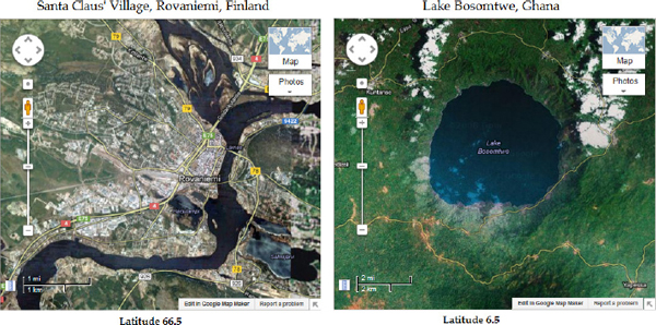
Figure 10-1 Two parts of the earth displayed at the same zoom level aren’t immediately comparable because their scales are different.
What’s wrong with Figure 10-1? The two maps have the same size at the same zoom level. Did you notice how different their scales are? A segment that corresponds to one mile near the equator corresponds to more than two miles in northern Norway. That can’t be correct, of course; it’s a distortion introduced by the Mercator projection. When you view Rovaniemi on the map, the relative distances are correct and the distances you measure on the map are also correct, as long as you use the scale at Rovaniemi’s latitude to convert inches to miles. The same is true everywhere in local scale. But as you move from Lake Bosomtwe to Rovaniemi, the scale itself changes! Even the map’s scale isn’t constant and it varies with latitude. The parts of the balloon near the equator touch the cylinder faster (with a lesser expansion) than the parts far away from the equator (which happens with further expansion of the balloon).
Geodesic Lines and Shapes
The
Polyline and Polygon objects have a property called geodesic, which is false by default. If you set it to true, the lines (and polygons) will be rendered on the map as geodesic shapes. Figure 10-2 shows two lines with common endpoints. The figure was generated by the Long Geodesic Lines.html application (the symbols of the airplanes at the start of the lines are discussed in Chapter 20). One of them has its geodesic property set to true and is rendered on the map as a curve, while the other one that appears straight has its geodesic property set to false. What’s hard to understand by looking at the figure is that the geodesic path is shorter than the other one; in fact, the shortest path between the two points is the geodesic path.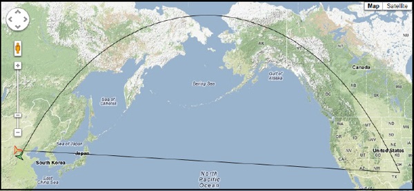
Figure 10-2 A geodesic line on the map is the shortest path between the two points on the globe.
The endpoints of the two lines are the coordinates of the Beijing and the Dallas/Fort Worth airports. Start by declaring the two endpoints as
LatLng objects:Then, create a path between the two endpoints as an array of
LatLng objects:and finally, create two
Polyline objects with the same path, but different settings for the geodesic property:
The two lines will be rendered quite differently on the map. An airplane flying from Dallas to Beijing should follow the geodesic line to make a shorter trip. (The route will be different, but only because of the air space regulations over China; what you see in the figure is indeed the shortest path between the two cities.) If the two endpoints were close together, however, you wouldn’t be able to see much difference in the two paths. Modify the Long Geodesic Lines application to draw the two lines, only this time from Dallas to Austin, or from Austin to San Antonio. Over small areas of the map, the earth is practically flat and you won’t notice much difference between geodesic and non-geodesic paths. The difference becomes obvious when the lines cover a substantial part of the globe.
Defining Geodesic Paths
As mentioned already, geodesic paths represent the shortest distance between two points on the globe, and they’re calculated automatically by the API when the
geodesic property is set to true. But how are they defined? All paths on the sphere are created as intersections of the sphere and a plane, and this intersection is always a circle. Depending on the orientation of the plane, you can create an infinite number of paths on the sphere with the same endpoints. One of these circles will split the sphere in two hemispheres, and this circle is called a greater circle. All other circles are called minor circles. Any plane that splits the earth into two hemispheres also goes through the earth’s center, and this is the basic definition of the greater circle between two points: It’s the intersection of the earth with a plane that touches the two points and goes through the center of the earth. The shorter arc of this circle is the geodesic route between the two locations.This is an accurate mathematical definition and, fortunately, you don’t need to understand how to draw geodesic paths on the globe. The API will do it for you, as long as you set the
geodesic property to true. In addition to the Polyline object, the geodesic property applies to Polygon and Circle objects.Let’s do the same with polygons. This time, you will create a
Polygon object that spans a large area on the globe, like the ones shown in Figure 10-3. Both rectangles shown in Figure 10-3 are Polygon objects with their geodesic property set to false and true, respectively. The two shapes were created by the The Global Bandaid.html web page. Edit the page and change the setting of the geodesic property to see how it affects the way the rectangle is rendered on the globe. You can also experiment with the size of the rectangle to verify that as the rectangle is reduced in size, the distortion is reduced. The distortion depends on the location of the polygon as well; drag it around with the mouse to see how its shape changes.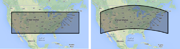
Figure 10-3 This “band-aid” shape is a rectangle wrapped around the earth.
Start by defining the rectangle that spans most of the United States with the following path:

and then create a polygon based on this path:
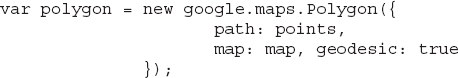
This is the default polygon defined by its path and no other options, except for the
geodesic property. The geodesic rectangle looks like a huge Band-Aid applied on the earth, doesn’t it? (It wouldn’t save the planet, but at least you know what it would look like.) That’s pretty much what the sphere geometry does to lines and rectangles: It distorts them by converting straight lines into arcs. The source of the distortion is the Mercator projection of a spherical object onto a flat surface, which is the map. The distortion, however, becomes negligible as the area you’re examining on the map becomes smaller and smaller. If the “Band-Aid” is small, the size of your neighborhood, for example, then it will remain a perfect rectangle even when applied on the globe. At small scales, the projected view of the earth is totally accurate, regardless of whether you’re near the equator or not. Of course, you must take into consideration the current scale to read the map correctly.There are other types of projections beyond the Mercator projection, yet none without some distortion. The Mercator projection is the oldest one and there are many people who consider it outdated, but for the purposes of Google Maps, it’s quite adequate. For most people, the Mercator view of the planet is totally familiar because they grew up with it and all the maps they have seen in classrooms are based on this projection. Additionally, no one really cares if Greenland appears to be larger than Australia, when in reality it’s less than one-third of Australia. Many people have criticized Google for its decision to go with the Mercator projection, but the phenomenal acceptance of Google Maps indicates that the engineers at Google made the right choice.
Changing Properties On the Fly
To add a twist to the preceding application, and also to demonstrate the use of the
setOptions() method, you can program two mouse events of the Polygon object. When the mouse is dragged into the shape (mouseover event), set the polygon’s geodesic property to true, and when the mouse is dragged out of the shape (mouseout event), set the same property to false. To implement this functionality, you only need to add the following event listeners: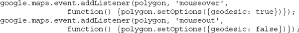
The event listeners change the setting of the
geodesic attribute when the mouse enters or leaves the polygon, respectively, and every time this happens, the polygon changes shape. To see the effects of the Mercator projection, you can make the polygon draggable and move it around with the mouse. Set the polygon object’s draggable property to true and comment out the two statements that add the event listeners.A Different View of Geodesics
Readers with an interest in math might further research the topic of geodesics. The mathematical definition of a geodesic shape is quite interesting. According to Wolfram MathWorld, a geodesic is a length minimizing curve. On the plane, it’s a straight line. On a sphere, it’s a greater circle. Geodesics describe the motion of small objects on the surface of the earth under the influence of gravity alone: objects that have no power of their own and those that at a constant speed.
The path taken by an object traveling at a constant speed under the influence of gravity alone is known as a minimum energy path. A minimum energy path is the path that a particle would follow when no forces are acting on it, just its initial speed. Any other path would require additional energy. All minimum energy paths are parts of greater circles. Inevitably, all greater paths split the earth into two hemispheres. All meridians are greater circles because they lie on planes that go through the center of the earth and they split the earth into two hemispheres. Parallels are not greater circles; the only parallel that’s also a greater circle is the equator.
How does minimum energy affect the trajectories of paths? A fundamental law in physics, one that applies to the entire universe, is the principle of minimum energy. Objects move, or assume shapes, that require the absolute minimum energy. Imagine you stretch a rubber band between any two points on the surface of a sphere. The rubber band will assume minimum length; any other shape would violate the principle of minimum energy. Just as you can’t expect to stretch a rubber band on the plane and assume a shape other than a straight line, you can’t expect to stretch a rubber band on the sphere and assume a shape that does not lie on a greater circle (which is the minimum energy path). The rubber band would further minimize its length by following a totally straight path under the crust of the earth, but this is not an option because it has to lie on the surface of the earth. Given this limitation, the minimum length path between any two points on the sphere is an arc of a greater circle.
If you have a globe at home and try to repeat this experiment, keep in mind that the friction between the rubber band and the globe is the primary force that will determine the path. A soft stretchable spring will work much better.
The Meridians and Parallels Project One of the short projects of this chapter is the
Meridians and Parallels.html project, which is shown in Figure 10-4. The meridians are drawn as gray lines and the parallels in black.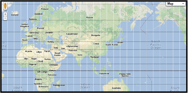
Figure 10-4 A segment of the earth covered with meridians and parallels
The page’s script draws lines every 10 degrees. The meridians extend in latitude from 90 to –90 degrees and are drawn every 10 degrees of longitude with the following loop:
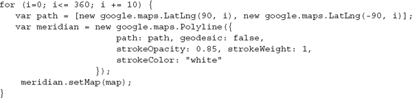
You can change the setting of the
geodesic property from false to true; the script’s output won’t be affected because meridians are great circles by definition.The parallels are drawn with another loop, and they extend from –180 degrees to 180 degrees (a full circle). Here’s the loop that draws the parallels (each parallel in the northern hemisphere is represented by the
parallelN variable and each parallel in the southern hemisphere is represented by the parallelS variable in the corresponding loop):
The parallels are defined with four pairs of coordinates, not just two. The reason for of this is that a line going from 0 degrees to 360 degrees is just a point. Here, you don’t want to draw the shortest line between two points, but the part that goes around the globe. The script does so by forcing the parallel to go through the prime meridian. The
geodesic property of the lines that represent parallels is set to false. If you change it to true, then all parallels will be drawn as meridians! It shouldn’t surprise you because parallels are not great circles, and you’re requesting that they be drawn as great circles. A great circle that connects two points at opposite sides of the globe must go through the poles!Geodesic Circles
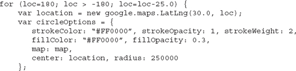
Just like polygons, circles can also be geodesic. Geodesic circles are heavily distorted near the poles and appear much larger than circles with the same radius near the equator. All the circles you see in Figure 10-5 have the same radius, but they’re drawn at different parallels. As a result, their sizes vary drastically and they demonstrate the type of distortion introduced by the Mercator projection.

Figure 10-5 Tissot’s Indicatrix is a pattern of equal radii circles repeated at varying latitude/longitude values.
The pattern generated by the circles of Figure 10-5 is known as the Tissot’s Indicatrix and it’s a mathematical contrivance that demonstrates the effects of Mercator projections. The circles on the map of the preceding figure have the same radius and are drawn at parallels of 0, +/–15, +/–30, +/–45, +/–60, and +/–75 degrees. At each parallel, the circle is repeated every 30 degrees, so you get 12 circles along the map. Listing 10-1 shows the code used to generate the circles; it’s repetitive, but it demonstrates the effects of Mercator projections very clearly. Only the code that renders the circles on the map is shown here, not the listing of the entire page. Open the
Circles on Sphere.html application to examine the code and experiment with it.Listing 10-1 Drawing the circles that form the Tissot’s Indicatrix

The script’s code creates five circles for each hemisphere:
c0n, c1n, … c4n for the Northern Hemisphere, and c0s, c1s, … c4s for the Southern Hemisphere. Instead of repeating the same statements with different numeric values, you can write a nested loop that draws a circle at the appropriate parallel.Large Geodesic Circles
The circles that make up the Tissot’s Indicatrix may be of different sizes depending on their latitude, but they’re perfectly circular. Shouldn’t they be deformed like their polygon counterparts? Circles are distorted too, but this effect is visible only if they’re large enough. Figure 10-6 shows a circle with a radius of 3,500 kilometers. As this circle moves away from the equator, it looks more and more like an ellipse.

Figure 10-6 Large circles lose their aspect ratio as they’re moved away from the equator, as demonstrated by the Draggable Circle application
The sample application
Draggable Circle.html draws a large draggable circle on the map. Open the application in your browser and move the circle around with the mouse to see the effects of the Mercator projection. An even better demonstration is a site by Google, the Mercator Puzzle site, which is shown in Figure 10-7. The Mercator Puzzle is a fun application, but a very illuminating one. It allows users to drag country shapes around with the mouse and drop them at their proper locations. Once in the correct spot, the polygon of a country is locked in place.
Figure 10-7 The Mercator Puzzle site by Google
You can find the Mercator Puzzle site at http://gmaps-samples.googlecode.com/svn/trunk/poly/puzzledrag.html.
Locate Australia’s outline (it’s the large shape shown over Greenland and parts of Europe in Figure 10-7) and move it around with the mouse. If you move it over Europe, you will see that Australia appears to be larger than Europe! Move it a little closer to the Arctic Circle and it will appear enormous. To get a feel of the distortion, Australia is 7,700,000 square kilometers, and Europe is 10,100,000 square kilometers. This shows you that any shapes near the equator are approximately equal to their actual size when “flattened” on a map. Shapes far from the equator appear much larger when projected onto the same flat map.
For an even more dramatic illustration of the Mercator distortion, move the polygon of Greenland close to Australia and you will see how much smaller it is. Yet when seen at its place on the map, Greenland appears to be almost the size of Africa.
What does it really mean to slide a country’s or a continent’s outline on the map? The Mercator projection distorts sizes, not directions. The shape of Australia remains the same, but it gets larger the closer it’s moved to the poles. Moving a continent to a different location is equivalent to “placing” a continent with the exact same size and shape somewhere else on the globe. What you see on the map is the projection of this imaginary shape. If Australia is moving gradually toward Antarctica without changing its size, it will remain as large as it is today, but on the map it will look much larger (in several million years, of course). The Mercator Puzzle is a simple tool for teaching geography, but it’s much more valuable as a visualization tool for the effects of the Mercator projection.
Another way to look at geodesic shapes is that you can’t measure distances on a Google map. Geometric calculations should yield the same results regardless of where the shapes are located on earth, and this isn’t the case for Mercator projections. Google provides the
geometry library, which exposes functions for calculating lengths and areas on the sphere given the vertices of a shape. These functions are quite accurate because they’re not affected by the Mercator distortions, yet they yield the correct result no matter where a specific feature is located. The geometry library is discussed in the second half of this chapter.Viewing the Daylight Zone on Google Maps Let’s return for a moment to the large geodesic circle. In Figure 10-8, you see a circle (the dark area on the globe) with radius equal to one quarter of the earth’s equator. The diameter of this circle is exactly one-half of the earth’s perimeter. Try to picture the imprint of a circle on the sphere. As the radius grows, the circle will eventually cover one-half of the sphere. On the map, however, the circle isn’t quite a circle, is it? When a circle becomes too large, and its center gets far away from the equator, the circle is seriously deformed.

Figure 10-8 The dark shape on the map is a circle that covers exactly one-half of the planet. The areas under this circle are in night time and the rest of the world is in day time.
Open the
Draggable Circle.html page and set the radius of the circle to this value:The radius is equal to the length of an arc that lies on the equator and covers one-quarter of the equator. A circle drawn with this radius covers exactly one-half of the globe. As the center moves away from the equator, the circle assumes an odd, but very familiar shape. The smoothly curved shape you see in Figure 10-8 is very similar to the daylight zone, isn’t it? Indeed, at any given time the sun’s light covers one-half of the planet and you can approximate the daylight zone very well by drawing a geodesic circle that covers one-half of the planet. What you actually see is the nighttime zone because you can’t cast light on Google Maps; you can only make part of the globe darker. The daylight zone is what’s left of the globe outside the shadow.
Keep in mind that the sun never gets directly over parts of the world whose latitude exceeds 23.5 degrees north (in the summer) or 23.5 degrees south (in the winter). If you wish, you can draw the parallels at 23.5 and –23.5 degrees as two lines and place a marker at the center of the circle. The center of the circle is the location on the globe directly under the sun (high noon).
The
Geometry LibraryThe
google.maps.geometry library provides a few invaluable methods for performing global geometric calculations. The functions of the geometry library take into consideration the shape of the earth and produce very accurate results. While they perform complex geodesic calculations, they expose their functionality through a few simple methods that accept locations as arguments. These methods encapsulate all the complexity of performing trigonometric calculations on the sphere.The
geometry library’s main component is called spherical and it contains the methods for calculating lengths and areas. The other two components of this library are the Poly component, which provides just two methods for computations involving polylines and polygons, and the Encoding library, which provides the utilities for encoding and decoding paths. The most useful methods are the ones in the spherical component, which are explained in the following section.To access the functionality of the
geometry library, you must include a script from Google in your page with the following directive:
You’re still loading the basic script for Google Maps, but also request that the
geometry library be included. With this directive in place, you can call the functions of the geometry library in your script by prefixing the function names with the complete name of the library. To call the computeLength() function, for example, use the following expression (and provide the appropriate arguments, of course):The
geometry.spherical MethodsThe most important component of the geometry library is the
spherical component, which provides methods for computing lengths and distances. The methods of the geometry.spherical component are discussed in the following sections.computeDistanceBetween(origin, destination)The
computeDistanceBetween() method returns the distance between the two points specified as arguments. The calculations are geodesic: They’re performed on the sphere. They take into consideration the shape of the earth and the method returns the length of the shortest possible path between the two points (the geodesic distance). To calculate the length of the shortest flight path between Dallas and Beijing airports, use the following statements:
The geodesic distance between the two cities is 11,244 kilometers. This is the length of the shortest flying route between Dallas and Kentucky. The
computeDistanceBetween() method calculates the geodesic length between the two points because this is the shortest path between them.computeLength(path)This method is similar to the
computeDistanceBetween() method, but it calculates the length of a path with multiple vertices. If you want to measure the perimeter of an island, for example, trace it with as many points as possible and then pass the array of the geo-locations that define the outline of the island to the computeLength() method to retrieve the path’s length. The outline of Iceland in the Iceland.html application is made up of 156 polygons (Iceland has a number of small islands around it) and a total of 7,590 vertices. When the computeLength() function is called for each of the polygons that make up then outline of Iceland, the total value is 6,260 kilometers. An alert box with the information is displayed every time you load or refresh the page. To better approximate complex shapes such as islands, you need to use as many points as possible to define their paths. The Iceland.html example is a simple page with a long list of polygons that correspond to the islands that make up Iceland. The polygons are drawn on the map as a draggable shape.computeArea(path)The
computeArea() method is similar to the computeLength() method, but instead of the perimeter, it calculates the area under the shape defined by the path argument. If you return to the Iceland.html example, the total area covered by the polygons that make up the island is calculated with the statements shown in Listing 10-2, which also calculate the island’s perimeter.Listing 10-2 Computing the perimeter and area of a polygon with multiple paths
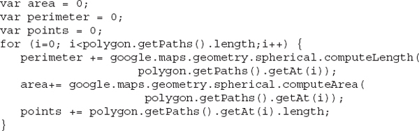
NOTE Note that both the
computeLength() and computeArea() methods accept a single array as their argument; you can’t call these methods passing an array of arrays, such as an array of paths. The calculations are performed on a single path at a time, which explains the use of a loop that iterates through the individual paths that make up the total path of the polygon. The individual paths represent the islands around Iceland, which are added to the total length and total area of the shape that represents Iceland.interpolate(origin, destination, fraction)This method returns the geo-coordinates of a point (as a
LatLng object), which lies the given fraction of the way between the specified origin and destination. The interpolate function works on geodesic paths defined by their two endpoints; you can’t interpolate a path based on a polyline (or an array of LatLng objects).The methods of the
geometry.spherical library perform geodesic calculations, because this is the only way to calculate distances and areas on the sphere. Even if you wish to know the length of a “straight” line from Los Angeles to London, the computeLength() method will return the length of the geodesic line. The “straight” line simply isn’t the shortest path connecting the two cities! The straight line is actually called the rhumb line and it’s a line of constant bearing: It crosses all meridians at the same angle. Rhumb lines were used for centuries in sailing, but are of little interest in modern cartography. I’ll come back to rhumb lines in the final chapter of this book, where you learn how to animate the flight of an airplane over a geodesic and a rhumb path. Later in this chapter, you will see a custom function that calculates the length of the rhumb line between any two points on the surface of a sphere.The
geometry.poly FunctionsThe
Poly library is much simpler as it provides just two methods: the containsLocation() and isLocationOnEdge() methods. They both return a true/false value that indicates whether a point is contained within a polygon and whether a point lies on a polyline or polygon’s edges.containsLocation(point, polygon)This method returns
true if the point argument (a LatLng object) is within the bounds of the polygon argument, which represents a Polygon object.isLocationOnEdge(point, shape, tolerance)This method computes whether the
point argument lies on or near a polyline, or the edge of a polygon, with a specified tolerance. It returns true when the distance between the point and the nearest point on the edge of the shape is less than the specified tolerance. The tolerance argument is specified in degrees, and it’s the angle between the two lines that connect the center of the earth and the two points. The default tolerance is very small: 0.000000009, or 10–9 degrees. As a reminder, an angle of 1 degree corresponds to approximately 110 kilometers on the surface of the earth, which explains the very small default value.Exercising the Geometry Library
Let’s look at a couple of examples of the methods of the
Geometry library. The first example uses the computeDistanceBetween() method to calculate distances of airports from a specific location and select the airports within a specific number of kilometers from a location. The sample application is called Nearest Airports Client Side.html and is shown in Figure 10-9. The data for this application was downloaded from www.openflights.org, which provides airport-related data free of charge (they do accept donations, however, if you find their site useful).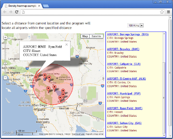
Figure 10-9 Locating airports within a given range from the map’s center location
The range specified by the user around the map’s center is marked with a semitransparent circle, and its radius is set to one of the values in the drop-down list at the top of the form. The circle isn’t draggable; instead, it’s drawn at the middle of the map and you should drag the map to center it at the desired location. As you drag the map, the script queries the data and displays the airports within the specified range from the map’s center location.
The application is based on the geo-locations of approximately 9,000 airports around the world. Every time the map is dragged, the script calculates the distance between the center of the circle and each airport. If the distance is smaller than the selected value, the airport is displayed on the map as a marker. The following statement associates a custom function with the map’s
dragend event:Listing 10-3 shows
showNearestAirports(), the function that calculates the distance of each one of 9,000 or so airports to the map’s center location and selects the ones in the specified range.Listing 10-3 The
showNearest Airports() function
The script iterates through all airports, calculates the distance of every airport from the map’s center point (represented by the
center variable), and then compares this distance to the specified range. If smaller, the script selects the current airport by adding it to the airportMarkers array. The actual script in the sample application contains many more statements that generate the contents of the right pane. The list of airports is a long <div> element constructed one item at a time as the script goes through the list of the selected airports. The code that generates the HTML content is not shown in the listing, because it’s not related to the topic discussed here. If you’re interested in generating a sidebar with additional data related to the items on the map, you can open the sample project and examine the code. Another interesting aspect of the sample application is that the name of each airport in the list is a hyperlink, and you can select an airport on the map by clicking the corresponding entry in the list. When an airport name is clicked in the list, the corresponding airport’s info window is displayed on the map.Rhumb Lines
A straight line on the map isn’t totally useless, however. For centuries sailors have used such lines to navigate and there’s a name for them: They’re called rhumb lines. There was a time when the main navigation aids were the compass and the stars. Back then, rhumb lines were used to maintain a course at sea. Rhumb lines are also known as paths of constant bearing.
What exactly is a line of “constant bearing?” As you recall from Chapter 1, and the “Meridians and Parallels Project” earlier in this chapter, the meridians are all parallel lines. If another straight line crosses a meridian at a given angle, then it will cross all other meridians at the same angle! In other words, the rhumb line is a line with a constant direction, or constant bearing. The advantage of rhumb lines is that they’re easy to navigate and were used by sailors for centuries. To some extent, they’re actually being used for sailing even today.
An interesting aspect of rhumb lines is that if you draw a rhumb line on the globe, making sure it crosses every meridian at the same angle, you’ll end up with a curve spiraling toward one of the poles, as shown in Figure 10-10 (courtesy of Wikipedia). Because of its constant inclination, rhumb lines are also known as loxodromes. Interestingly, if you were to drive on a loxodrome, you wouldn’t need to turn the driving wheel. To drive along a geodesic path, you would have to turn the wheel. You would also have to turn it more sharply as you approached the poles.
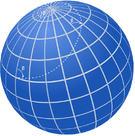
Figure 10-10 A line of constant bearing spirals toward the poles. (Image courtesy of Wikipedia.)
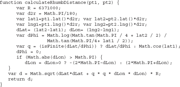
Calculating the Length of a Rhumb Line
Rhumb lines are the paths that an airplane will never take, but a sailor might (no high tech instruments are required for navigating along a rhumb line). Eventually, you may need to know the length of a rhumb line. At the very least, you may be interested in knowing the relation between a rhumb line and the equivalent geodesic line. The
calculateRhumbDistance() function, shown in Listing 10-4, accepts two geo-locations as arguments and returns the length of a straight line that connects the two points on the flat (projected) map.Listing 10-4 Calculating the length of a rhumb line
The length of the rhumb line from Dallas to Beijing is 13,134 kilometers, or 16 percent longer than the equivalent geodesic path, which was calculated by the
computeDistanceBetween() function of the geometry library of the Google API and was found to be 11,244 kilometers. Of course, this is an extreme example of a path that spans nearly one-half of the planet.Flight Paths Another demonstration of geodesic lines is shown in Figure 10-11. This map shows the flight paths from several airports in the United States (and the world) into Louisville, Kentucky. Once you have the coordinates of the airports you need, you can easily create geodesic lines between them. An interesting aspect of this application is that it displays airport data right on the map, when the mouse is hovered over an airport. In Chapter 19, you learn how to animate planes along these paths.
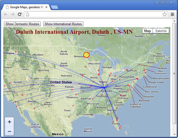
Figure 10-11 Flight paths over the United States
The page’s script contains two lists with a few dozen airports each: one for U.S. airports and another for world airports. The script draws a polyline between the international airport in Kentucky and all other U.S. airports, or all the other international airports. The
Polyline objects that represent the flight paths are geodesic lines and are rendered as curves on the map. When the mouse is hovered over an airport (the small red circle), the airport’s icon changes to a large yellow circle and its name appears near the top of the map, as shown in Figure 10-11 for the Duluth International Airport.Encoded Paths
The second component of the
geometry library is the encoding component, which provides two methods for encoding and decoding paths. As you already know, paths are specified as arrays of LatLng objects and their textual representation is quite verbose. Embedding such arrays in scripts bloats the file(s) that must be downloaded at the client. Using the geometry.encoding library, you can compress this array, transmit the compressed form of the array to the client, and decode it in your script. Encoded paths are substantially shorter than the equivalent arrays of LatLng objects that describe the shape’s path. The geometry.encoding library isn’t among the most commonly used libraries, so it’s not discussed in detail in this chapter. If you’re interested in working with encoded paths, please read the tutorial “The Encoding Library,” included as a PDF file in this chapter’s support material.Summary
This chapter should have helped you understand the difference between drawing on the flat map and drawing on the globe. All shapes drawn on the surface of the earth are called geodesic and take into consideration the curvature of the surface on which they’re drawn. A non-geodesic shape, on the other hand, is a shape on the flattened map. When geodesic shapes are projected onto the flat map, they’re distorted: Lines become curves. Measuring a large distance on a map, like the distance from Los Angeles to London, makes no sense. You need special functions to calculate the large distances on the globe and these functions are, fortunately, readily available in Google’s
geometry library. On the other hand, measuring small distances on the map, such as the perimeter of your backyard, or your jogging route, is quite accurate. The non-geodesic polygon that outlines your property, or Disneyland’s parking lot, is practically the same as the equivalent geodesic polygon. When dealing with global features, however, you must take geodesy into account and be aware of the distortions introduced by the Mercator projection...................Content has been hidden....................
You can't read the all page of ebook, please click here login for view all page.