
CHAPTER |
|
20 |
Advanced JavaScript Animation |
In the last chapter of this book, you’re going to examine a few more animation techniques and build a couple of interesting and visually appealing applications. You have read about geodesic lines in several chapters of this book and you already know that geodesics lines are the shortest paths between any two given points on the globe, even though they appear very long on the map. On the map, the shortest path is a straight one, not a curve. Yet when the shortest path between two points on the globe is subject to a Mercator projection, it becomes a lengthy curve. In this chapter, you will see why geodesic lines are shorter than rhumb lines using animation. You will actually see two airplanes flying on a geodesic and a rhumb line at constant speed, and, surprisingly, the airplane following a geodesic path will cover a seemingly longer distance, but it will arrive at its destination sooner.
You will also explore an animation technique that involves heatmaps. Heatmaps represent density or intensity of a data items over areas of the globe, as you saw in the previous chapter. The data can be anything from precipitation to population density, and from crime scenes to visitors at specific locations. The data explored in this chapter is tied to geographic locations—as opposed to moving items—and it evolves with time. You will actually see an animation of the precipitation in various parts of the eastern United States and how the precipitation changes in the course of a year.
Scalable Vector Graphics
In the examples in preceding chapters, you used the built-in symbols to represent items on the map as alternatives to the default marker symbol. For the examples in this chapter, you need more elaborate icons, which you must design on your own. The airplane symbols shown in Figure 20-1 are vector graphics generated with a few simple commands. Figure 20-1 is a detail of two airplanes flying on their paths, shown as gray lines: It’s taken from one of the examples you will develop later in this chapter.
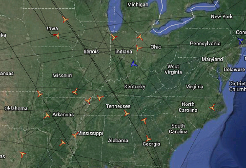
Figure 20-1 The airplane symbol is a vector graphic described with SVG commands.
The simplest technique for overlaying symbols on a map is to use small images as icons, but images have two major drawbacks. First, they don’t scale very well. Moreover, images can’t be aligned with the path. If you look carefully at the airplane icons in Figure 20-1, you will see that the airplane icon follows the orientation of its path. Your other option is to use vector graphics, which can be scaled infinitely and rotated at will. A scalable symbol is defined with geometric operators so that it’s rendered perfectly at any resolution. Every time the page is refreshed, vector graphics are recalculated and rendered at the current zoom factor. Images are just copied—and you know how easy it is to distort an image when you zoom in or out too much.
The most common type of vector graphics in web applications are the Scaled Vector Graphics (SVG), which are created with simple commands embedded in a string. There are tools for generating SVG graphics interactively, but my goal is to explain the structure of an SVG file and not to discuss the details of creating SVG symbols.
Creating SVG Icons
No special software was used to generate the symbol of the airplane. The outline of an airplane was drawn on an engineering pad (a very simple outline), and then the coordinates of each line segment were estimated and written down. The entire drawing is contained in a box with dimensions 400 by 400. The units don’t really matter; the graphic will be scaled when used on a web page. Here’s the result:
This is a declaration of a shape that (kind of) resembles an airplane. The
M command stands for moveto and it moves the pen by the specified units horizontally and vertically, without leaving any trace. The L command stands for lineto, and it moves the pen by the specified units horizontally and vertically, this time leaving a trace. The L and M are the two most basic SVG commands, and they’re followed by two numbers, which are the displacements in the horizontal and vertical directions. The z command at the end of the path closes the shape. That’s why it doesn’t accept any arguments. There are other commands for drawing smooth curves, arcs, and so on.The origin is always the upper-left corner of the drawing area, so negative X units point to the left. Positive X units point to the right and positive Y units point downward. As you can see, the SVG commands allow you to create a path, which will be rendered on the map as needed. To test your SVG description, you must place it in an XML file and open it with your browser. Start Notepad and insert the preceding SVG command in the necessary headers, as shown in Listing 20-1.
Listing 20-1 The SVG description of the airplane symbol
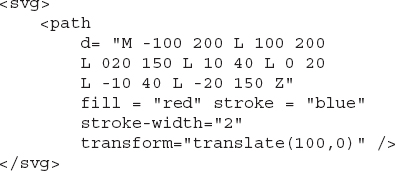
Save this text with the SVG symbol description to a file with the extension SVG and then open it in your browser (just double-click the file’s icon). Alternatively, enter the SVG commands in a new fiddle and run it to see how the shape will be rendered, as shown in Figure 20-2. Note that the SVG description of the shape must be entered in the HTML pane, not the JavaScript pane.
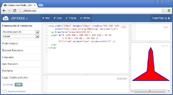
Figure 20-2 The SVG description of the airplane icon
The SVG file contains a few commands needed to scale and move the shape into position. These commands are only necessary for viewing the symbol in the browser. If you omit the command:
from the
<svg> element, the symbol’s vertical axis will be aligned with the left side of the browser: You will see only one-half of the airplane in the browser. The origin is the point (0, 0) and the first horizontal displacement is –100, so everything to the left of the origin will end up to the left of the window.Using the SVG Icon
To use the airplane shape as a symbol in your script, you only need the commands that describe the outline of the symbol. The following statement creates an icon that resembles the outline of an airplane:
All you really need from the SVG file is the command that outlines the shape’s path. If you use a third-party tool to design SVG graphics, just extract the description of the path and use it in your script. As you can see, the actual size of the symbol doesn’t matter either because the entire symbol is scaled with the
scale attribute. The value of the scale attribute used in this example was the result of some experimentation; the airplane symbol has a reasonable size regardless of the current zoom factor for a scale value of 0.090. The remaining attributes of the icon object shouldn’t be new to you.An SVG graphic is basically a path that’s defined with SVG commands. The symbol’s outline and fill colors can be specified in the constructor of the
icon object in the script. The scaling of the symbol is also specified in the script. For the time being, you can use the definition of the airplane.svg symbol to experiment with the symbol animation. For more information on the SVG format see, Appendix B. By the way, the figure of the globe with the parallels and meridians shown in Chapter 1 is an SVG graphic. You can resize it at will, and it will always be rendered without artifacts. You can also find many SVG graphics on the Web.Animated Flights
Chapter 10 discussed the topic of geodesic lines, and you designed an application to demonstrate the difference between lines on a sphere and lines on a flat map. As discussed in that chapter, the lines on the sphere are called geodesic and the straight lines on the map are referred to as rhumb lines. On the flat map, the geodesic lines that span a large portion of the globe are curved and they appear much larger than the equivalent rhumb lines, but this is just a side effect of the Mercator projection used by Google Maps. For your convenience, a figure that shows the geodesic and rhumb lines between the Dallas and Beijing airports (see Figure 20-3) is repeated here. It’s doubtful that there’s a direct flight between the two airports—and if there is one, it might even go in the opposite direction. My intention is to demonstrate the difference between the two types of paths in the most dramatic manner.

Figure 20-3 Two ways to fly from Beijing, China to Dallas, Texas
The two airplane symbols are a dead giveaway of my intentions, aren’t they? Indeed, you’re about to actually see why one of the two planes flying at the same speed over the two paths is covering the distance in a shorter time interval. The animation will actually help you understand why the path that appears to be longer is actually shorter. As mentioned in Chapter 10, a geodesic line is the shortest distance between two locations on the globe. Because the planes are cruising at the same speed, the one on the shorter path will get there sooner, no matter what its path looks like! And this is the airplane flying on the geodesic path.
You probably know that there’s no straight line in the universe either, but for a very different reason. There’s no way to travel to a distant star following a straight line path (in the sense of the Euclidean geometry) because gravity affects everything. Even light itself cannot escape gravity, so straight lines in the universe are hugely distorted. Assuming that light takes the shortest possible route, its path is as straight as it can get in the vastness of our universe.
Scaling the Flight Animation Time
Let’s now return to our earthly flight animation. The
Geodesic Flight Path.html web application, shown in Figure 20-3, uses a different technique to control the animation than the example of the Paris Metro animation. This application keeps the animation cycle constant at 20 updates per second; the animation cycle is always 50 milliseconds and this value yields a fairly smooth animation. The distance covered at each cycle varies depending on the user’s selection in the Time Scale drop-down list. The settings for the Time Scale parameter and their values are shown in the table that follows.| Setting | Value |
| Real-time flight | 1 |
| Slower | 50 |
| Slow | 100 |
| Normal | 250 |
| Fast | 500 |
| Faster | 750 |
| Very fast | 1000 |
The setting
Fast causes the animation time to run 500 times faster than actual time; it condenses 500 seconds of actual time into one second of animation time. This application uses a constant animation cycle because it’s crucial for the smooth movement of the airplane symbol, and it adjusts the animated speed of the airplane. The airplane speed is 200 meters per second, but more on this shortly. The percentage of the distance traveled so far in the animation is calculated with the following statement:where the
scaledCount variable is the number of animation seconds:The
lengths[i] variable is the length of the equivalent path, and count is an auxiliary variable that’s increased at each animation cycle by the factor of the time scale. The scaledCount variable is actual time in seconds: It’s the number of animation cycles that have occurred so far, multiplied by 50 milliseconds. The count variable is not increased by 1; it’s increased by the factor that corresponds to the item selected in the Time Scale list with the statementWhen the time scale is set to 1, the airplane flies in real time: very, very slowly. This is because the
count variable corresponds to actual seconds. Larger values for the timescale variable correspond to faster animation times. If you change the Time Scale setting during the flight, the airplane’s speed will be increased from that point on. In other words, the calculations will affect the rest of the animation without any complication.If the current setting is
Slow, the currentPercentage will be increased by 200 x 100 x 50 / 1000 = 1,000 meters every 50 milliseconds or 1000 * 20 = 20,000 meters per second. This is the animated speed of the airplane. The actual speed of the airplane is 720 kilometers per hour (or 12,000 meters per minute, or 200 meters per second) and the scaling factor is 20,000 / 200 = 100. When the time is scaled by a factor of 100, each second of animation corresponds to 1 minute and 40 seconds of flying time. A flight that lasts 15 hours, for example, will take 15 x 3,600 / 100 = 540 seconds, or 9 minutes of animation time, when using the Slow setting. Conversely, one hour of animation will be played back in 3,600 / 100 = 36 seconds with this specific setting.Using the
Faster setting, which has a factor of 750, the percentage is increased by 200 x 750 x 50 / 1000 = 7,500 meters every 50 milliseconds, or 7,500 x 20 = 150,000 meters per second. This time the scaling factor is 150,000/200 = 750 and each second of animation corresponds to 12 minutes and 30 seconds of flying time. The same 15-hour flight will take 15 x 3,600 / 750 = 72 seconds, or 1 minute and 12 seconds on your monitor. These are the exact numbers you will see at the top of the page if you execute the animation for the two settings discussed here.The actual flying time’s calculation is based on the premise that the planes fly at 200 meters per second, or 720 kilometers per hour. To be fair, commercial airplanes are a bit faster than that, averaging close to 900 kilometers per hour. The specific speed of 720 kilometers per hour was selected because it yields integers and simplifies the numeric example. Change the factor 200 in the statement that calculates the value of the
currentPercent variable to experiment with different airplane types. You can even add a second drop-down list with the speeds of various airplane types and calculate the speed in meters per second in your code (add choices like Cessna, 747, supersonic, and so on).The actual flying time is reported by the
scaledCount variable. The following statement formats the flying time as hours and minutes, as you can see in Figure 20-3, and assigns it to the txtElapsedTime element of the page: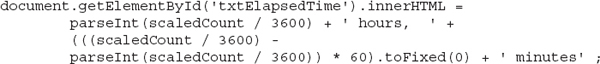
NOTE The code rounds flying times to minutes and animation times to seconds, so don’t be surprised if you run the animation twice with the exact same settings and the values of the times displayed at the top of the page differ by one minute or one second respectively.
The Animation Function
The application’s animation function,
animatePlanes(), is shown in Listing 20-2.Listing 20-2 The animate
Planes() function animates the two planes along their paths.

Other than calculating the value of the
currentPercent variable and moving the symbol on each path accordingly, the animation function is fairly straightforward. The actual animation is performed by the statement that sets the offset attribute of the polyline’s first icon. It requests the line’s icon with the statementthen it sets the offset of the first icon (there’s only one symbol anyway):
and finally assigns this icon back to its line with this statement:
The script resets the
icons attribute to force a redraw of the symbol on the line. These actions take place while the currentPercent variable is less than 1. Once the percentage of the distance traveled reaches or exceeds 100 percent, the code removes the airplane’s path from the map and displays a different symbol at the end of the path to indicate that the airplane has landed.At the end of the animation, a message showing times and distances traveled is displayed in a popup box, like the one shown in Figure 20-4.
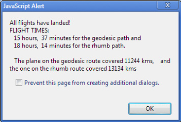
Figure 20-4 The two flight paths are indeed different and covered in very different intervals.
Are the Two Airplanes Racing One Another?
Run the animation at the fastest rate and watch the relative positions of the two airplanes. You will notice that the airplane flying on the rhumb route is getting ahead initially, but the other one catches up as it approaches the Arctic Circle, as you can see in Figure 20-5. The airplane flying on the geodesic route appears to move faster when it’s near the Arctic Circle. This is when it gets ahead of the other plane and maintains this lead to the end of the flight.
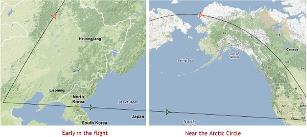
Figure 20-5 The Lower airplane seems to get ahead of the upper one early in the flight, at Least in the direction of the final destination (Left image). Near the Arctic Circle, however, the upper airplane catches up and gets ahead of the other one, and maintains this lead to the end of the trip.
But aren’t both planes flying at the same speed? This isn’t a glitch in the code. The geodesic route is distorted when projected on a flat surface, and while both airplanes fly at the same constant speed at all times, one of them appears to fly faster when it reaches higher latitudes. The reason for this is that distances near the poles are shorter than they appear. For the very same reason, Alaska appears to be comparable in size to Brazil, while in reality it’s only one fifth the size of Brazil. This is a well-known side effect of the Mercator projection. For the airplane to maintain the same speed over an area that “appears” to be larger, when in reality it is smaller, it must move faster. In other words, it’s the projection of the airplane on the flat map that appears to move faster, not the airplane flying around the globe. For more information on geodesic paths and the side effects of the Mercator projection, see Chapter 10.
Another way to look at the varying speed of the airplane on the geodesic path is that the poles are the two locations where all meridians merge together and the distance between consecutive meridians is much smaller than the distance between the same two meridians near the equator. In a sense, if you were standing on the North Pole, you could traverse the world on foot because you could walk a very small circle that intersects all meridians. If you chose to traverse the world by crossing all parallels, then there’s no shortcut; you would have to go from one pole to the other.
The
Geodesic Flight Path.html page contains a fairly lengthy script, and I’ve discussed the key points of this listing. Open the file in your favorite JavaScript editor to go through the details. The source is well documented, so you should have no problem following it through.Animating Multiple Airplanes
In this chapter’s support material, you will find the
Multiple Planes.html application (shown in Figure 20-6), which demonstrates how to animate multiple airplanes on the map. The application’s code is discussed in detail in the MultiplePlanes.pdf document.
Figure 20-6 Animating multiple airplanes in their flight paths
Animated Heatmaps
Creating a heatmap based on static data tied to specific coordinates is a straightforward process, as you recall from Chapter 19, but you can create far more compelling presentations by animating the heatmaps. In the animation examples so far, you exploited the spatial dimension of the data: The data points move in space, but their remaining attributes don’t change. If the data changes over time, you can create animated heatmaps to visualize both the spatial and temporal component of the data at once. The more data you have, the smoother the animation will be. You will find a few interesting examples of animated heatmaps on the Internet, including an animation of the growth of the WalMart stores at http://gmaps-samples-v3.googlecode.com/svn/trunk/heatmaps/walmart.html (the script is included in the page and you can easily view it). This page was published by Google to demonstrate advanced animation techniques, and it uses basic animation techniques very creatively.
To demonstrate the techniques for animating a heatmap layer, you’re going to build the
Precipitation.html and Precipitation Aggregate.html pages, which are self-contained, and you can open them in your browser by double-clicking them. The precipitation examples show rainfall data per month in a number of different states. The script contains data for the 12 months of 2012 and for 12 eastern states, one value per state per month. Each measurement is a state total (inches of rainfall per month), and the geo-location associated with each data point is the location of the state capital.The data is stored in an array of custom objects with the following structure:
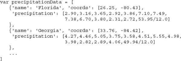
The last element in each site’s
precipitation array is the average rainfall height (the sum of the 12 month values divided by 12). Note that the geo-location is encoded as a pair of numbers that correspond to the latitude and longitude values, and not as a LatLng object.TIP The heatmap of Figure 20-7 contains very few sites, but if you can obtain data for many metropolitan areas, you can create very interesting animations, not only with precipitation data, but temperatures, humidity, and so on. The richest source of weather data is the NOAA site (National Oceanic and Atmospheric Administration). The site’s data can also be accessed with a web service to obtain relevant data in JSON/XML format, as explained in Chapter 15. Visit http://www.ncdc.noaa.gov/cdo-web/webservices/v1 for more information on using the NOAA’s web services.
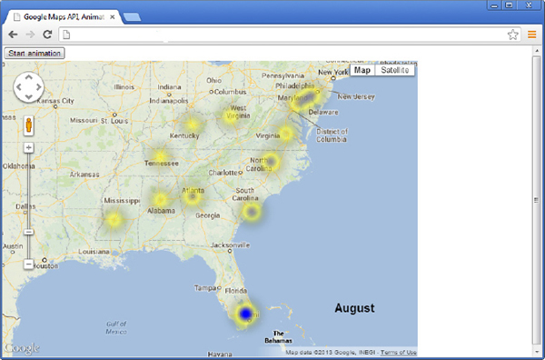
Figure 20-7 The
Precipitation.html page displays monthly rainfall data at different locations for a period of one year.The
Precipitation.html page is shown in Figure 20-7 after several frames. Load the page and then click the Animate button to start the animation. The speed of the animation is controlled from within the page’s code, and you can easily provide an interface element to let the user control the animation’s play back rate.To create the heatmap, declare a
HeatmapLayer object as usual and set its data source to the data array, which will be initially empty. Here’s the statement that creates the layer and associates it with the map: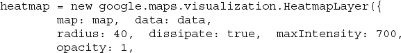
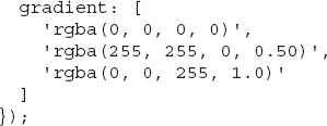
The heatmap’s gradient goes from a totally transparent black color to a semitransparent yellow tone and then to an opaque blue color. The point of the initial color is that areas with small precipitations will be colored with light grayish/yellowish color. Note also that the
rgba() function used to specify each color is embedded in quotes so that it’s evaluated as needed. The value of the radius property was the result of some experimentation, and the value of the maxIntensity property is approximately equal to the largest data value (the original values have two decimal digits and they’re multiplied by 100 before being appended to the data array so that all data values are integers).The
data array is initialized to an empty array:The idea is to fill the array with another month’s data every second or so, so that the heatmap will be updated accordingly. If you had daily data, you could animate the heatmap every one-tenth of a second. The current animation cycle gives users a chance to actually see the month name displayed on top of the map and spot the areas with the heaviest rainfall in each month.
The
data array’s elements are objects with two properties: location and weight. The location property is a geo-location and weight is the precipitation value at the location. Here’s a statement that adds an element to the data array:The Animation Function
To generate the graph, you need a function that populates the
data array and assigns it to the data property of the Heatmap object. This function will be called from within the animation function every so often to populate the same array with another month’s data. Let’s start with the basic function, the animate() function, whose task is to populate the data array with the precipitation data of the current month (one data point per location). The definition of the animate() function is shown in Listing 20-3.Listing 20-3 The
animate() function populates the data array associated with the heatmap.
The function populates the
data array with rainfall data for each of the 12 sites (states). The month variable, which represents the current month, is incremented by one at each iteration of the animation function, and it’s declared outside the function because it must maintain its value between successive calls of the function. The code starts by clearing the data array, and then it iterates through the elements of the precipitationData array; each element of this array is an object that holds the coordinates of a specific city as a LatLng object and the precipitation of this city for each month in an array of 13 elements (the 12 values and their total). The animate() function iterates the elements of the precipitationData array and extracts the city location and the current month’s rainfall value. This value is then multiplied by 100 to end up with integer values, but this is not a requirement of the Heatmap layer or the code.After populating the
data array, the code sets the heatmap object’s data to the data array by calling the setData() method and passing the array with the current values as an argument. The last statement increases the month variable by one, to point to the next month’s data. As you can guess, the application’s animation function will call this function once for each month, as explained next.Calling the Animation Function
To initiate the animation, create the
startAnimation() function to update the heatmap every second: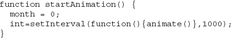
If you had daily data, you could update the heatmap every few milliseconds for a fluid animation, but with 12 frames you can’t produce real animation. The function initializes the
month variable and then calls the setInterval() method. The startAnimation() function must be called from within a button’s click event. When all frames are exhausted, you must end the effect of the setInterval() method. This must take place in the animate() function when the month variable’s value exceeds 12. Insert the following statement in the animate() function (it’s the very first statement in the function):To complete the page, you must add to your form the map and a button that will initiate the animation. Here’s the complete listing of the page’s
<body> section: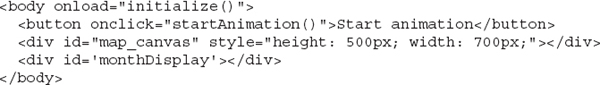
The name of the current month is displayed on a
<div> element that is placed on the map with the appropriate style. This is the monthDisplay element, and it’s updated from within the animate() function with the following statement:The
monthNames array is initialized in the JavaScript code, along with the percipitationData array—you can open the Percipitation.html page to view the complete code. In addition to the monthly data, there’s a yearly average value for each site in the precipitation data, which is displayed after the animation has gone through all 12 months. The last value is treated like another monthly value that corresponds to an extra month with the caption “Year Average.” The definition of the monthNames array is the following:Aggregating the Rainfall Values
Another similar page is the
Precipitation Aggregate.html page, which displays a heatmap of the same data, but instead of showing one month’s data at a time, it displays the total rainfall so far. The difference between the two pages is that the new one aggregates the precipitation values by adding the new precipitation to the current total in the data array. Figure 20-8 shows the final heatmap of the yearly aggregate precipitation.
Figure 20-8 The yearly total precipitation of eastern states
At the end of the animation, the heatmap displays the yearly total precipitation at each location, and not the yearly average. Both the average and the total are useful metrics and each one is better suited for specific requirements. You should open both pages to see how they differ and the type of information each one conveys. You will notice, for example, that the heatmap over Florida turns blue for certain months. This indicates heavy rainfall during the summer months in Florida, and especially during July. In the aggregate version of the page, the map over Florida never becomes blue because the total rainfall over Florida isn’t nearly as much as it is over other areas, such as Alabama. If you’re wondering why the color over Florida becomes blue for the monthly data and never for the aggregate precipitation, you should take into consideration the fact that the heatmap’s color range is determined by the minimum and maximum values of the entire data set, and not by the absolute values. As you can see, both presentations are meaningful and each has its own merits.
The two pages differ in the way they update the data array. While the first page assigns a new precipitation value to each element of the array, the
Precipitation Aggregate.html page adds the new precipitation value to the array element, and the values of the array passed to the heatmap layer are aggregates. Here’s the complete listing of the animate() function of the new page: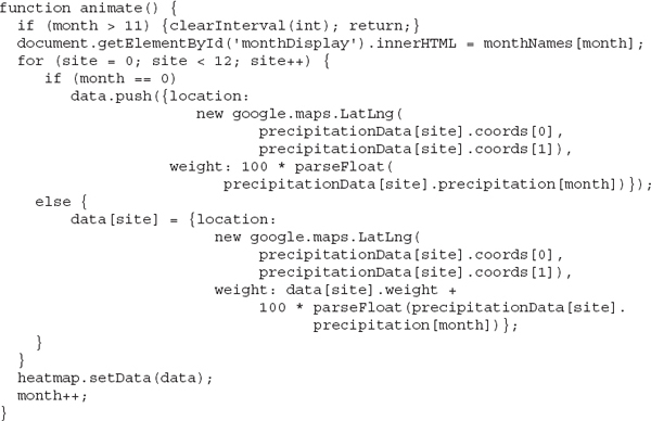
The rest of the code remains the same. It still displays the map of the United States, populates the data array, and initiates the animation when the button Start Animation is clicked. After that, the animation function takes over and updates the heatmap every second.
That’s All Folks, Thank You!
Thank you for reading this book. You have a solid understanding of the Google Maps API by now and in the course of reading this book, you have probably found some interesting or useful topics and techniques that you can apply to your projects. I hope you liked reading it, because I certainly enjoyed writing it.
If you come up with corrections and/or ideas to improve this book, or an interesting idea in the general area of mapping and GIS that you would like to share, please contact me at [email protected].
..................Content has been hidden....................
You can't read the all page of ebook, please click here login for view all page.