

CHAPTER
2
PeopleTools Mobile Design (Fluid)
In this chapter, you will use standard PeopleTools to construct touch-first PeopleSoft components that render on a variety of device form factors, including mobile and desktop devices. If you know how to create records, pages, and components, then you already know most of what is required to create this mobile PeopleSoft user experience. In this chapter, we will focus specifically on what makes fluid unique.
While working through this chapter, you will create several new fluid pages. You will learn how to combine delivered CSS classes with delivered layouts to construct intuitive user interfaces. You will learn how to compose search pages and configure search metadata. This chapter is not intended to provide a complete fluid reference but as a “Getting Started” guide. For a complete reference, see PeopleTools 8.54: Fluid User Interface Developer’s Guide.
About PeopleTools Fluid Pages
Users no longer enter transactions into information systems using just a keyboard and a mouse. Today’s users employ mobile devices, such as phones and tablets, as well as desktops, laptops, touch screens, and netbooks. Fluid is the term Oracle uses to describe PeopleSoft’s mobile-first, touch-first, but yet desktop-friendly application pages. Fluid pages are constructed in Application Designer using a drag-and-drop approach that is similar to classic PeopleTools pages. Both page types benefit from PeopleSoft’s data binding and persistence, they support the same events, and they support nested subpages. Here are a few features that are unique to fluid pages:
 Responsive design
Adaptive design
CSS3 layout
HTML5 runtime controls
Responsive and Adaptive Design
Mobile devices come in various shapes and sizes, ranging from small smartphones to large tablets. The variety in screen sizes presents a problem: How does a developer (or designer) display the right amount of information for each device size? Here are a few common solutions:
Create a separate website for each supported device classification.
Use CSS3 media queries to change the layout of information on a page (responsive).
Employ adaptive design which involves choosing what and how to display information based on device capabilities.
The “separate website” approach was common in the early days of the mobile web. CSS3 didn’t exist yet, so responsive design was not practical. Adaptive design didn’t make sense because some devices didn’t support HTML, but rather WAP/WML. Content displayed on mobile devices was different enough to warrant two separate code lines. Often this approach resulted in two or three websites: desktop, phone, and (occasionally) tablet. Developers who take this approach have to maintain multiple versions of the same application.
Responsive design uses CSS3 media query break points to apply layout rules. These rules include placement of information on a page, the size and location of graphics, and even whether to show or hide various page elements. A page constructed using responsive design will contain data, but very few layout instructions. This approach differs from the multisite approach in that all devices browse the same website. It is similar in that it still requires two code lines: separate CSS definitions for each form factor. Responsive design is very common. To see it in action, go to almost any consumer website (Amazon, Wal-Mart, and so on) and resize the browser window: At some predetermined screen width, you will see the header region change. One problem with responsive design is how to optimize content for low-bandwidth browsing. It doesn’t make sense, for example, to send a high-resolution photo to a small device where the image will be displayed as a thumbnail—too small to see any significant detail.
Adaptive design uses progressive enhancement to determine what content to display and how to display it. Developers applying adaptive design may either use client-side JavaScript or server-side programs to investigate device capabilities and render appropriate content. This approach ensures that each device receives tailor-made content. Adaptive design may employ concepts similar to responsive design, but with the key differentiator being that adaptive design won’t send content a device can’t reasonably consume.
PeopleTools fluid pages use both responsive and adaptive design. Through CSS3 media queries, preconfigured PeopleTools CSS3 stylesheets change a page’s layout at various breakpoints. Data entry and display elements contain adaptive properties, ensuring that we only send critical, important, and relevant information to various devices. For example, a grid displayed on a desktop may contain more fields than the same grid displayed on a mobile device.
CSS3 Layout
The PeopleTools classic page designer is a What You See Is What You Get (WYSIWYG) drag-and-drop designer. If you don’t like the placement of an item on a page, then you can drag it somewhere else. While it is convenient to visually see the runtime appearance of a page, the layout process is a bit tedious. I don’t know how many times I registered a classic component just so I could iteratively modify the layout while viewing that component in a web browser. Fluid pages, on the other hand, use CSS3 layouts. A developer just places fields on a page in the desired order and a fluid layout takes care of placement. Fluid chooses the position of an element through the layout, CSS, or class name.
HTML5 Runtime Controls
As long as PeopleSoft applications have been internet facing, we have had data input formats and date-specific input controls. Those classic data-entry fields require a significant amount of JavaScript and CSS. HTML5 specifies a whole set of data-entry field types, including date, time, number, numeric range, e-mail, search, and URL. The device, not PeopleSoft, determines how to display these special types of data entry fields.
Fluid Mode Setup
Before we build some cool, responsive fluid pages, let’s make sure your PeopleSoft application is configured for fluid mode. Log into your PeopleSoft server and navigate to PeopleTools | Web Profile | Web Profile. Scroll to the bottom and ensure that neither of the “Disable fluid…” checkboxes is selected. Restart your web server after changing your web profile. After making this change, mobile browsers will automatically see the fluid home page. Desktop browsers, however, will continue to default to the classic home page. On a per-user basis you can make desktop browsers default to the fluid home page by navigating to My Personalizations and then selecting the Personalize General Options category. Override the PC Homepage row by setting the Override Value to Fluid, as shown in Figure 2-1.

FIGURE 2-1. Personalize General Options page
Skillset
So, with all of this information about web technologies such as CSS3, JavaScript, and HTML5, you may be wondering if you need to become a web developer as well as a PeopleTools expert. Let me calm your fears right now and say, “No, you do not need to learn all of that fancy web stuff if you don’t want.” It is amazing what you can create if you choose to learn about web design, but the only hard knowledge requirement is core PeopleTools. With a working knowledge of Application Designer, including standard pages, components, and PeopleCode, you can create all the fluid pages you desire. I have to warn you though, if you stick with just core PeopleTools, your fluid mileage will vary. It really is in your best interest to learn CSS3 at the minimum.
My First Fluid Page
Creating an application module in PeopleTools involves describing data with record definitions and then exposing that data through pages and components. In this chapter, I want to focus specifically on fluid page development. To avoid all those other data definition tasks, we will build fluid pages against mock PeopleTools record definitions. Specifically, we will create a fluid version of the Translate Values component that uses a clone of PSXLATITEM, the translate values detail table.
The Fluid Page’s Data Model
Let’s start by cloning the delivered PeopleTools table. Log into Application Designer and open the PSXLATITEM record definition. From the Application Designer menu bar, select File | Save As. Name the new record definition BMA_XLATITEM. Select No when prompted to copy the base record’s PeopleCode. Build the record definition before continuing. Be sure to select Create Table and the appropriate execution option (I prefer execute and build script).
NOTE
Developers often ask whether or not to copy PeopleCode when copying a record. Of course, the answer depends. If the source record has PeopleCode that should exist in the target, then yes, absolutely, choose to copy the PeopleCode. But don’t click that button if you don’t really intend to copy the source record’s PeopleCode. Even worse, don’t click Yes if the source record has no PeopleCode. The copy feature doesn’t know this, so it will loop through all the events for each field attempting to copy PeopleCode events that don’t exist. These are moments lost that you will never regain.
The PSXLATITEM record definition is effective dated. The component processor has a special way of treating effective-dated rows. The Translate Values component, however, doesn’t use the component processor’s special effective-date handling. The way we work around this is to cleverly disguise the PSXLATITEM.EFFDT field by wrapping the whole PSXLATITEM record definition in a view. Rather than create our own, we can copy the existing one and just update the SQL to point to our source table. Open PSXITMMNT_VW and save it as BMA_XITMMNT_VW. Switch to the Record Type tab and verify that the Non-Standard SQL Table Name field is blank. Open the SQL Editor and change the source table from PSXLATITEM to PS_BMA_XLATITEM. Save and build this definition.
NOTE
Instead of PS_BMA_XLATITEM, you could use Meta-SQL %Table(BMA_XLATITEM) equivalent.
Constructing a Fluid Page
Within Application Designer, choose File | New from the menu bar. When the New Definition dialog appears, select Page (Fluid). Figure 2-2 is a screenshot of the New Definition dialog with Page (Fluid) selected.

FIGURE 2-2. New Definition dialog
As soon as you click the OK button on the New Definition dialog, you experience your first difference between fluid and classic pages. Fluid pages require layouts. A layout helps position page elements for responsive design. Basically, a layout is a series of group boxes placed on a page to group content within a responsive grid. Common PeopleTools fluid page layouts include PSL_APPS_CONTENT, PSL_TWOPANEL, and PSL_2COLUMN_FLOAT. The layout you choose determines the position of the page’s starting group boxes (I say “starting” because you can always add more group boxes and/or rearrange content). For example, using the PSL_2COLUMN_FLOAT layout will create a page with a series of nested group boxes. The innermost boxes of the PSL_2COLUMN_FLOAT layout contain left and right boxes for a two-column grid layout. The point of the two columns is to allow the content to change in some manner depending on device orientation and screen size. For example, a tablet may show both columns whereas a mobile phone might show one column at a time. Figure 2-3 is a screenshot of the layout selection dialog.

FIGURE 2-3. Layout selection dialog
NOTE
A layout is just a PeopleSoft page, with the page type set to Layout Page. You can create your own layouts that contain any valid page content including subpages.
Select the PSL_APPS_CONTENT layout. When prompted, name the page BMA_XLAT_FL and choose to copy the PeopleCode associated with the layout. Application Designer will present you with a new page containing a single group box that stretches the width and height of the page. Regardless of the layout chosen, the first element is a group box. All other content resides within this outer group box. Double-click the group box to inspect its properties. The first four tabs (Record, Label, Use, and General) are pretty standard. PeopleTools 8.54 adds a new tab to group boxes called Fluid. Switch to this tab and review the properties of the Fluid tab. Notice that the Default Style Name property is ps_apps_content. This is the most common style for the outermost group box on primary and secondary fluid pages. Figure 2-4 is a screenshot of the Fluid properties available to group boxes. The Form Factor Override section allows you to specify an alternate class name depending on device size, and the Suppress On Form Factor section allows a developer to hide the group box on various device sizes. These two segments differ in that the latter section will not send content to a device if it fits a category with suppression enabled. This saves valuable bandwidth on devices where the content is not relevant.

FIGURE 2-4. Fluid group box properties
Inside the group box of this new page, add the BMA_XLATDEFN.FIELDNAME field. Set the field’s Display Only and Display Control Field properties. Next, add the PSDBFLD_XLAT.LENGTH field and mark it as a related field that is related to the Field Name field. Placement of these fields within the group box doesn’t matter too much. CSS class names and layout determine placement, not location within the designer. Unlike classic, fluid design is not WYSIWYG. Application Designer does, however, maintain parental hierarchies, so make sure the fields are within the page’s one and only group box. Likewise, PeopleTools uses placement to determine field order. Figure 2-5 is a screenshot of the page thus far.

FIGURE 2-5. BMA_XLAT_FL page in development
We will develop this page further, but let’s stop here and create the metadata required to test this page. Create a new component and add our new page to the component. Application Designer requires us to specify a search record before we can save the component. The search record for the original PSXLATMAINT component, which we are sort of copying, is PSDBFLD_XLAT. Therefore, set the search record for this component to the same: PSDBFLD_XLAT. While you are at it, disable the Add action. The level 0 record represents field definitions, which we don’t add online, so the Add action is irrelevant. The point of this component is to update field metadata, not create new fields. While still viewing the component’s properties, switch to the Fluid tab and select the Fluid Mode checkbox. This checkbox is the sole differentiator between a classic component and a fluid component. Save the component and name it BMA_XLAT_FL, the same name as the page.
As with any component, we need to attach it to a menu. Create a new standard menu named BMA_FLUID. Double-click the empty space in the menu. The empty space is between the Language and Help items. When the pop-up dialog appears, set its label to Custom. Double-click on the new drop-down item that appeared under the Custom menu item and change its type to Separator. We don’t actually need a separator, but this menu can’t be empty. PeopleTools requires a menu to contain content before you can save the menu. Adding a separator is enough to satisfy Application Designer.
We are just about to register our new fluid component. The component registration wizard is going to ask us the folder that will hold this new component. All fluid components in the Portal Registry belong in a subfolder of Fluid Structure and Content | Fluid Pages. Log into your PeopleSoft application online and navigate to PeopleTools | Portal | Structure and Content. Next, navigate through the Portal Registry to Fluid Structure and Content | Fluid Pages. Create a new folder named BMA_PEOPLETOOLS and label it BMA PeopleTools.
Use the Component Registration Wizard in Application Designer to register the component. Select the options to add the component to a menu, portal registry, and permission list (all three options on the first page of the wizard). When prompted for a menu, select BMA_FLUID and bar MENUITEM1. On the third page of the wizard, where it asks you for information about the content reference, change the folder to BMA_PEOPLETOOLS and the Content Reference Label to BMA Translate Values. Before clicking Next, set the Node Name to the local portal node name. Since I am using an HRMS database, I chose the HRMS portal node. Figure 2-6 is a screenshot of this step in the registration wizard. On the next step, the permission list step, select the PTPT1200 permission list.

FIGURE 2-6. Component Registration Wizard Create Content Reference step
Finish the wizard to create the content reference. The last step of the registration wizard asks if you would like to add the permission list to your project. While this may be convenient, many organizations discourage (or don’t allow) transferring security definitions such as permission lists. Furthermore, comparing projects that contain permission lists can take a significant amount of time. As a general rule, I do not add permission lists to development projects.
Fluid Search Pages
As a developer, one of my favorite features of PeopleTools is the metadata-driven component search page. It is not a real page, but is constructed at runtime using attributes of the search record. Every other development environment requires you to create your own search page. As a functional user, on the other hand, I am not fond of the classic component search page. It is too generic.
Fluid components take a hybrid approach, allowing us to choose between a configured, metadata-driven, and generic search page or a custom search definition. Fluid forces us to rethink component search. Here are a few alternatives:
Use the default fluid search.
Create and register Pivot Grids.
Keyword search.
Construct fluid search components that collect transaction search parameters and then transfer to a target fluid page (also known as “custom search pages”).
Add a search header or sidebar to a fluid page.
NOTE
Group boxes have a special layout type called Custom Header Search that is designed for header search.
Fluid Default Search
Configuring the default search for a fluid component is as simple as checking a box and adding a page. Let’s configure our component to use this default search. Step 1 is to enable search, so open the component’s properties and switch to the Fluid tab. Find and select the Enable Search Page option. Figure 2-7 is a screenshot of the Enable Search Page option of the component attributes collection.

FIGURE 2-7. Enable Search Page option
Step 2 is to add PT_SEARCHPAGE to the component. This isn’t a page you want someone to select from a list of page tabs within a component, so mark the page as hidden. Save your component.
Pivot Grid Search
Pivot Grid search is a very powerful search feature that uses multidimensional transaction data to identify transactions. Because it is multidimensional, it requires facts and dimensions. The transaction itself is the fact and foundation tables, such as ChartFields, location, and position information, represent dimensions. Multidimensional search doesn’t work as well for foundation data because each foundation component, such as the location table, represents one dimension. Using Pivot Grid search involves creating a query and Pivot Grid. The search page for Pivot Grid search is PTS_NUI_SEARCH.
Keyword Search
Keyword search uses SES indexes to populate a search page. Keyword search configuration requires the following steps:
1. Open the component’s properties and switch to the internet tab. Select the Keyword search option.
2. On the Fluid tab of the component’s properties, select the Enable Search Page option.
3. While still viewing the Fluid tab of the component’s properties, select the Next in List and Previous in List options.
4. The final step is to log into the PeopleSoft application online and create and configure an SES index to map to the new component.
NOTE
Creating SES indexes is beyond the scope of this chapter.
Custom Search Components
A developer taking this approach would create a component that exists specifically to gather requirements to locate a transaction. The component would contain data entry fields as well as some type of selection list. This approach is not very common because the PT_SEARCHPAGE and PTS_NUI_SEARCH pages can serve as a foundation for creating your own custom search pages within a component.
Search Headers and Sidebars
The search header and sidebar approaches are very common. We will create a page with a sidebar search later in this chapter.
Fluid Page Navigation
We have a great start on a fluid page and component. Now is a good time to review our progress, but we have one problem: How do you access a fluid component? You won’t see fluid components in the standard PeopleTools menu or navigator. One way to access the component is to open its portal registry content reference and click the Test Content Reference hyperlink. Try that now by navigating to PeopleTools | Portal | Structure and Content. Within the portal registry, navigate to Fluid Structure and Content | Fluid Pages | BMA PeopleTools. Click the Edit hyperlink to the right of the BMA Translate Values item and then click the Test Content Reference hyperlink. PeopleSoft should present you with the basic search page we added to the component. Figure 2-8 is a screenshot of the component search page.

FIGURE 2-8. Fluid default search page
Figure 2-9 is a screenshot of the small-form-factor version of the Translate Values page. Notice how the fields and labels are vertically stacked and horizontally aligned around a midpoint in spite of the fact that I randomly placed these fields on a page in Application Designer. Horizontally resize your browser window and notice how the header buttons change. Take note of the fact that the component doesn’t contain the classic page bar (help link, new window link, and so on) or the footer toolbar (save, return to list, and so on). Later we will use the new PeopleTools save action to add a save button.

FIGURE 2-9. Screenshot of Translate Values page
Since fluid pages don’t appear in the menu, we need another mechanism to access them. While viewing the component, click the three-bar hamburger button in the upper right corner. A pop-up menu will appear with three navigation options:
Add to Homepage
Add to NavBar
Add to Favorites
Choosing Add to Homepage displays a list of home pages as well as a shortcut for creating an entirely new home page. Since the current URL for this transaction is a fully qualified URL that includes search key values, choosing Add to Homepage will create a home page button directly to the transaction page. This is good enough for now. A better alternative would have been to bookmark the search page. Figure 2-10 is a screenshot of the fluid home page containing the newly created grouplet that points to the BMA Translate Values component.

FIGURE 2-10. Fluid home page
A grouplet is a home page artifact that represents some type of relevant information or transaction page. A lot of people call them tiles rather than grouplets. The grouplet term comes from the fact that the content for these tiles can come from group boxes contained in a fluid PeopleSoft page. You configure individual grouplets through the Fluid Attributes tab of fluid content references. Later in this chapter you will learn how to change a grouplet’s icon and content type.
Optimizing the Component for Fluid
Our component is a single page component, so open the component properties and disable Display Folder Tabs. You can find this option in the Multi-Page Navigation section of the Internet tab. While editing the component, change the page’s Item Label to “Translate Values.” The Item Label is what PeopleSoft displays in the page’s header.
Fluid Grids
Add a grid to the fluid page. To this grid, add the following BMA_XITMMNT_VW fields:
FIELD_VALUE
DATE_FROM
EFF_STATUS
XLATLONGNAME
XLATSHORTNAME
Change the label for EFF_STATUS, XLATLONGNAME, and XLATSHORTNAME to RFT Short. Save your page, and then refresh your online view of the page. You should now see a grid positioned underneath the Length field. The grid includes lots of padding, similar to other fluid elements, but the appearance just isn’t very pretty. What we are seeing is a Classic Grid on a fluid page. We can transform this grid into a responsive grid by changing one attribute in Application Designer. Return to Application Designer and double-click the grid to reveal its property window. On the General tab, select the Unlimited Occurs Count attribute. Switch to the Use tab of the grid properties dialog and change the Grid Layout from Original Grid Layout to Original Flex Grid Layout, as shown in Figure 2-11.

FIGURE 2-11. Grid Use properties
Save the page in Application Designer and refresh the online view. You should now see a much narrower responsive grid. Figure 2-12 is a screenshot of a responsive fluid component containing data entry fields and a flex grid.

FIGURE 2-12. Fluid page with a flex grid
Even though we haven’t added a save button to this component, you can still save using the classic UI shortcut keyboard combination ALT-1 (ALT with number one key). If you enter data into the grid and press the ALT-1 combination, then the component processor will save the child record but not the parent.
HTML5 Data-Entry Fields
There was a time when web browsers could gather feedback only through input text fields and buttons (including radio buttons, checkboxes, and push buttons). Developers used to write a lot of JavaScript to create date entry fields, numeric spinners, e-mail address fields, and so on. Web browsers are a lot smarter now than they used to be. HTML5, the latest HTML specification, includes special elements for date, telephone, e-mail, number, and so on. The specification doesn’t define how to display these special elements. Rather, each device determines the best input method. A desktop computer’s web browser, for example, displays a date entry field using a combination of a calendar and numeric spinners designed for easy use with a mouse and keyboard. A smartphone, on the other hand, may display a date input field as a large selection wheel suitable for gestures.
Our Translate Values page contains a date field: DATE_FROM. PeopleTools is displaying the date field using the old method: lots of JavaScript. Let’s bring this page into the modern era by enabling HTML5 data-entry types. Return to Application Designer and open the BMA_XLAT_FL page definition. Locate and double-click the DATE_FROM field. It is the grid field with the label Effective Date. When the Edit Box Properties dialog appears, locate the Input Type property at the bottom of the fluid tab. Change the Input Type to Date. Figure 2-13 is a screenshot of the Fluid tab with the date input type selected.

FIGURE 2-13. HTML5 input types
Reload the online page and notice that it no longer displays a calendar icon inside the Effective Date field. Depending on your device and browser, however, you will see calendar-specific controls as you interact with the field. Using the Chrome web browser, for example, I receive a desktop-friendly calendar drop-down as well as a numerical spinner for manipulating the field’s date.
Adding Transaction Buttons
Those in the know can save this transaction page using the ALT-1 keyboard combination, but that isn’t very intuitive for the rest of the population. We need a better way. Fluid pages can use a special pushbutton destination called Toolbar Action. You can then specify the action to invoke when the button is selected. Add a button to the top left corner of the BMA_XLAT_FL page. Open the button’s properties and change the Destination to Toolbar Action. A few lines below the Destination field you will see the Action Type field. Set the Action Type to Save. Figure 2-14 is a screenshot of the button’s type properties.

FIGURE 2-14. Pushbutton type properties
Switch to the Label tab of the properties dialog and set the type to Text and the Text to Save. Now switch to the Fluid tab and set the Default Style Name to psc_float-right psc_primary. The first class, psc_float-right, places the button in the upper right corner of the transaction page. The psc_primary class changes the buttons color to make it evident that it is the primary button for this page. Figure 2-15 is a screenshot of the page in Application Designer and Figure 2-16 is a screenshot of the live page viewed through a web browser. Notice that the alignment of fields within Application Designer differs greatly from the online appearance. This is the nature of fluid. Fluid lets the device (with a little help from CSS3) determine where to place items.
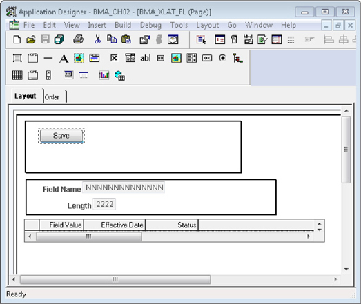
FIGURE 2-15. Page in Application Designer

FIGURE 2-16. Completed page viewed online
Figure 2-15 contains a few extra group boxes that weren’t included in the text of this chapter. Specifically, the level 0 fields are surrounded by a group box and the save button is contained within its own group box. These group boxes are not necessary, but are recommended. PeopleTools recommends that you surround related items with a group box. When in doubt, group it. When grouping items, be sure to change the group box’s type to Layout Only.
Create some test data and confirm that the save button works as expected. One of the features I miss from classic is the notification message in the upper right corner that confirms the transaction saved successfully. Fluid contains no such notifications. It does, however, contain a not-so-secret, but undocumented FUNCLIB function that will display a notification message. We can use this function to add a notification with the SavePostChange event. Open the BMA_XLAT_FL component’s PeopleCode editor and add the following PeopleCode to the SavePostChange event:

Best practice recommends using the message catalog over hard-coded text.
After adding a few new values and pressing the save button, you will see a message appear just below the header. Figure 2-17 is a screenshot of the Translate Values component showing the save confirmation message.

FIGURE 2-17. Save confirmation message
In the next section, you will learn how to use the two-column (or two-panel) layout. Before moving onto that section, use this page to add a few rows of translate values to various fields. I chose the fields PTIB_DIRECTION, PTCACHEABLE, and PTCOMPARABLE. The more test data you enter, the better your next page will look.
Those are the basics of fluid. You now have a responsive transaction page. Except for a few attribute differences, we used the same development procedures as other classic PeopleTools pages. There is a lot more to fluid, but as you experienced, you do not need to learn anything new to create fluid pages. Now let’s investigate some of its more features.
Fluid Design Patterns
Beyond the obvious visual differences between fluid and classic pages, fluid is about transaction redesign. Fluid desires to be mobile-first. It is no secret that traditional data entry is difficult on touch-oriented mobile devices. Screen resolution, input method, and network bandwidth are all constrained on a mobile device. Fluid forces us to think differently about how we enter and process data. It forces us to ask questions such as:
Can we reduce the number of user interactions (touch, type, and so on)?
What data must be visible to process a particular transaction?
How many pages does the user need to visit to complete the transaction?
The traditional PeopleSoft design pattern starts with a home page. Let’s count the number of interactions required to reach a classic business process. From the home page (1) a user interacts with a menu (2) to navigate to a transaction search page. On the search page (3), the user enters criteria (4) and searches for a specific transaction (5). The user selects a transaction (6) and then begins processing information. I count six interactions required just to reach a transaction processing page. Many of us are so comfortable with this traditional paradigm that we don’t even think about the process required to reach a transaction page. For years, PeopleSoft classic has provided usability enhancements, such as Pagelets and WorkCenters, to simplify transaction access. Fluid forces a change upon us by breaking the standard development paradigm. You already saw that Fluid navigation is different. Fluid navigates through home pages, favorites, and recent places. Likewise, transaction search is no longer free (which is good, because every transaction is different).
A New Paradigm
Let’s rethink our transaction-access strategy (navigation and search). What if the search results were always present, sort of like a part of the transaction? In our case, the search result is a list of fields. Let’s put that list in a sidebar on the left.
Search Record
The list on the left side of the component is our search page. In this case it is a summary list of fields. Create a new record definition with two fields: FIELDNAME and COUNT1. Change the record type to SQL View and save it as BMA_XLAT_FLD_VW. We are going to seriously cheat here. Our level 0 record is a delivered PeopleTools table with real data. Level 0 is read only, so this is not a problem. Level 1 however is read/write. We are relating it to a mock record so that we don’t accidentally corrupt delivered metadata. The following SQL selects from our mock level 1 record rather than the delivered PeopleTools table. Enter the following into the view’s SQL editor and then build the view.

Before continuing, be sure to build the record definition, selecting the Create Views option.
A Two-Panel Layout
Create a new fluid page that uses the PSL_TWOPANEL layout. Name the new page BMA_XLAT_2PNL_FL. Application Designer should present you with a fluid page containing a series of nested group boxes. The innermost collection should contain two group boxes, a narrow one on the left and a wider one on the right. We will be using the group boxes labeled panel action - interior and apps content. Delete the empty group box inside the apps content group box. We won’t be using that small inner group box. Figure 2-18 is a screenshot of the Application Designer’s two-panel layout.

FIGURE 2-18. PSL_TWOPANEL layout
The apps content group box is supposed to contain the same grid as the BMA_XLAT_FL page. The easiest way to recreate the grid is to copy it from the BMA_XLAT_FL page definition and paste it into the apps content group box. After pasting (or recreating) the grid, open the grid’s properties dialog and switch to the Use tab. Check the No Auto Select option. Unlike BMA_XLAT_FL, this transaction page has no level 0 to tell the component processor which rows to select. Instead we will use PeopleCode to populate the Translate Values grid.
If you review the PeopleSoft delivered fluid content, you will see lots of fluid pages that contain subpages rather than standard page content. Instead of adding content directly to layouts, some developers create subpages with content and add those subpages to layouts. This is purely a matter of preference and convenience. One added benefit to the subpage approach is that you can embed the same subpage in both classic and fluid pages.
The left side of our layout will also contain a grid, but we don’t want it to look like a grid. Rather, we want the left side of the screen to look like an iPhone or Android list view. We will use PeopleSoft’s predefined CSS3 classes to obtain the desired appearance. Drag a new grid into the panel action-interior group box. Open the grid’s properties and make the following changes to the general tab:
Set the main record and page field name to BMA_XLAT_FLD_VW.
Select Unlimited Occurs Count.
We need to disable a lot of the label options, so switch to the Label tab. For example, to turn off the row counter, click the Properties button for the navigation bar and then switch to the Row Cntr tab. Select the Invisible checkbox to turn off the row counter. Now disable the navigation bar by deselecting the Display Navigation Bar checkbox. Move down the properties dialog to the Body area and deselect Show Row Headings. Likewise, deselect Show Column Headings.
On the Use tab, select the following items:
No Row Insert
No Row Delete
Display Only
At the bottom of the Use tab, change the grid layout to List Grid Layout. Switch to the Fluid tab and set the Default Style Name to psc_list-linkmenu.
To this left-hand grid, add a pushbutton/hyperlink field. Open the button’s properties to mark it as a hyperlink and then set its Field Name property to FIELDNAME. Switch to the Label field and change the Label Type to Text. When a user invokes this hyperlink, PeopleCode will filter the grid on the right to show just translate values for the selected field. Since we want that PeopleCode to execute when a user clicks (or touches) a row, switch to the Use tab and select the Execute PC on Row/Group Click option. While still viewing the Use tab, select the Enable When Page is Display Only option.
Add the BMA_XLAT_FLD_VW.COUNT1 field to the grid. We want the translate value count to show in a little circle on the right side of the list, similar to the way approvals and exceptions appear in employee self-service fluid pages. Open the field’s properties and switch to the Fluid tab. Add the psc_list_count style class to the Default Style Name property.
A Smart Component
Unlike the first example, where we created a page with all of the necessary data-binding metadata, this page just contains a lot of structure and references. The hyperlinks on the left, for example, won’t display field names without some PeopleCode intervention. Likewise, the grid on the right won’t display data without some PeopleCode to select the correct values. Let’s create a component and write some PeopleCode.
Create a new component named BMA_XLAT_2PNL_FL. Open the component’s properties and make the following changes:
Set the search record to INSTALLATION.
Disable the Add action (Use tab to the right of the search record).
In the Internet tab, uncheck Display Folder Tabs.
Switch to the Fluid tab and mark the Fluid Mode checkbox.
Add the BMA_XLAT_2PNL_FL page and set its Item Label to Maintain Translate Values. Open the component’s PeopleCode editor by choosing View | View PeopleCode from the Application Designer menu bar. Scroll through the list of objects in the upper left to find the BMA_XLAT_FLD_VW record and then locate the RowInit event on the right. Add the following to the PeopleCode editor. Figure 2-19 is a screenshot of the component PeopleCode editor.
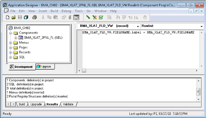
FIGURE 2-19. PeopleCode editor
Register this component using values similar to the prior component. Add it to a menu, portal registry, and permission list. Choose the BMA_FLUID menu. Set the content reference label and description to BMA Maintain Translate Values. Use the PTPT1200 permission list and complete the wizard.
After registration, test the component by visiting its Content Reference in the Portal Registry and then clicking Test Content Reference. You can find the Portal Registry online using the navigation PeopleTools | Portal | Structure and Content. The new component is registered at Fluid Structure and Content | Fluid Pages | BMA PeopleTools. Figure 2-20 is a screenshot of the new component with its sidebar exposed.

FIGURE 2-20. Responsive Translate Values page with a sidebar
If the component looks like a classic component instead of a fluid component, then verify that you selected Fluid Mode on the Fluid tab of the component properties.
Return to Application Designer and enter the following PeopleCode into the BMA_XLAT_FLD_VW.FIELDNAME FieldChange event. The component processor will invoke this PeopleCode when a user selects a row in the left panel.

Save and then reload the page in your web browser. Select an item from the list on the left and notice that the grid now contains data.
We have a minor problem with this page. No rows are selected when the page first appears. Let’s resolve this with some component PostBuild PeopleCode. Add the following to the component’s PostBuild event:

Are you tired of seeing cryptic text such as BMA_XLAT_2PNL_FL in the browser tab or page title? I am. You can change this by changing the item’s label in the menu definition.
If the device screen width is wide enough, I would like to see the sidebar on the left default to an expanded, rather than collapsed state. We can force the sidebar to default to the expanded state by adding the following PeopleCode to the Page Activate event:

Figure 2-21 is a screenshot of the final two-panel Maintain Translate Values component.
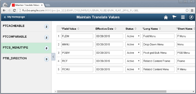
FIGURE 2-21. Two-panel Maintain Translate Values component
NOTE
In this chapter, we used several delivered CSS classes. As you build fluid components, you may need to create your CSS definitions. You can include custom CSS stylesheets into fluid components using the new AddStylesheet PeopleCode function.
Grouplets
Grouplets are group boxes displayed on home pages. Most people refer to them as tiles but we will stick with the official name of grouplet. Grouplets are normally small in stature, but can span multiple columns. You can see the grouplet attributes and grouplet types from the Fluid tab of any content reference. The HRMS Team Time grouplet is a great example. The Team Time grouplet is actually a group box within a standard fluid page. Other grouplet types include images and iScripts.
Most grouplets are image links that point to transaction pages. These are the easiest to configure because they just require an image reference in the fluid tab of a content reference. In fact, any page, including classic pages, can be added as a grouplet to a fluid home page. One thing to keep in mind when using images is caching. Once you add a grouplet to a home page, the image that was specified on the content reference before adding the grouplet is the image that will be visible until someone clears the PeopleSoft application’s cache. This is mainly significant when a person navigates to a transaction and then uses the “Add To” header item to add a transaction page to a home page. Many times, I have added a grouplet to a home page only to see the default icon appear. My greatest desire at that point is to update the icon. Even after adding an icon to the content reference, I won’t see that new icon until someone clears the cache.
Conclusion
Beauty is in the eye of the beholder. There are many people who believe fluid pages are prettier than classic pages. Although just a matter of opinion, it is an opinion shared by many (including me). At this time, however, it does not make sense to convert every page to Fluid. Fluid excels at displaying low-density information and collecting information using touch devices. Some transactions, however, require high information density and dexterity.
In this chapter, we experienced a few drops from the PeopleTools fluid reservoir. We built a couple of fluid pages, learned about fluid search, fluid layouts, and fluid design patterns. There is a lot more to fluid than what we covered in the few pages between the start and end of this chapter. For example, the PeopleTools team has added new PeopleCode functions specifically for fluid. You can read more about them, and other fluid concepts, in the PeopleTools Fluid User Interface Developer’s Guide located at http://docs.oracle.com/cd/E55243_01/pt854pbr0/eng/pt/tflu/index.html.