

CHAPTER
5
Prototyping the HTML5 “View” Layer with jQuery Mobile
In this chapter, we will use jQuery Mobile to prototype the View layer of our MVC application. In Chapters 7 and 8, we will connect the View layer to the Model layer of Chapter 4 using iScripts and REST services.
Wireframes
Figure 5-1 contains wireframes describing each of the personnel directory’s three views. The first view is a search page and will be used to gather search parameters. The second view contains a list of search results. When a user selects a result from the list of search results, the personnel directory will display the details view (View 3).
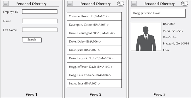
FIGURE 5-1. The three views of the mobile application
The upper right corner of View 2 and View 3 contains a search button. Touching this button will navigate to the first view (the search view) allowing the user to enter new search criteria. It probably goes without saying, but we don’t need the search button on View 1 because the purpose of the search button is to take the user to View 1.
I placed a three-lined icon in the upper left corner of each view to facilitate navigation. On a small form factor device, such as a mobile phone, touching this icon will reveal a panel with the last search results. The panel should be visible all the time on wider devices. Figure 5-2 is a wireframe describing the appearance of the panel view.
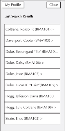
FIGURE 5-2. The panel view
Prototyping with jQuery Mobile
As we all know, each browser is unique, with varying levels of CSS and JavaScript support. Wouldn’t we be so much more productive if we could build good sites without regard for a browser’s vendor or version? Actually, we can. For example, we could build to the lowest common denominator: create sites that only use JavaScript, CSS, and HTML features that are common to all devices we plan to support. This approach would require us to research each device and build a capability matrix showing commonalities and eliminating differences. Besides being a rather difficult and tedious exercise, the resultant site would be rather boring, not something that our users would want to use (WAP and WML anyone?).
Two other cross-browser development strategies include graceful degradation and progressive enhancement. The intent of these two strategies is the same, but the approach is different. Graceful degradation starts with a rich user experience, and then provides alternatives for browsers that do not support a rich feature set. Progressive enhancement is the opposite. Progressive enhancement starts with baseline functionality and progressively enhances a page’s content according to browser capabilities.
jQuery Mobile employs progressive enhancement. Progressive enhancement allows developers to write very simple, semantic HTML, leaving the rich content portion of the user experience to the progressive framework. I am a huge fan of jQuery Mobile, because it allows me to rapidly build compelling mobile user experiences.
We used jQuery Mobile in Chapter 3 when we built mobile applications using the PeopleTools Mobile Application Platform (MAP). In that chapter, we were more focused on learning MAP and less on jQuery Mobile. In fact, to successfully use MAP, we didn’t even have to know jQuery Mobile exists. This chapter is quite a bit different. In this chapter, we will cover a significant amount of jQuery Mobile features.
A word about jQuery versus jQuery Mobile.… jQuery is cross-browser JavaScript library with no visual appearance. Familiarity with the jQuery JavaScript library is helpful, but not necessary. jQuery Mobile, on the other hand, is a mobile user interface on top of the jQuery library. In other words, jQuery Mobile uses the jQuery JavaScript library so you don’t have to.
Creating the Netbeans Source Project
Launch NetBeans (or your favorite text editor or development environment). Select File | New Project from the NetBeans menu bar. In the New Project dialog, select HTML5 from the Categories list and HTML5 Application from the Projects list. Figure 5-3 is a screenshot of the New Project dialog. Click the Next button to continue.
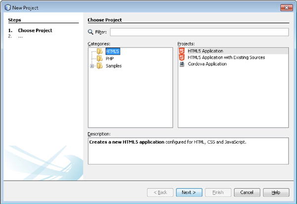
FIGURE 5-3. New Project dialog with HTML5 Application selected
In step 2 of the New Project wizard, name the new project PersonnelDirectory-jqm (jqm is an abbreviation for jQuery Mobile). Figure 5-4 is a screenshot of step 2. In step 3, choose No Site Template and click Next to move to step 4.
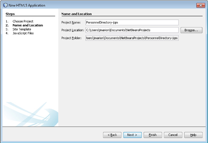
FIGURE 5-4. Step 2 of the New Project dialog
Step 4 allows us to add JavaScript libraries to the project. Before selecting JavaScript libraries, look for the blue hyperlink underneath the list of libraries. That hyperlink identifies when the list of libraries was last updated. If it has been a few weeks since you updated your list or if know there are newer versions of your favorite JavaScript libraries available, click this link to download a new list. If your list is up to date, then select jQuery and jQuery mobile. Figure 5-5 is a screenshot of step 4 of the New Project dialog. Click Finish to create the new project.
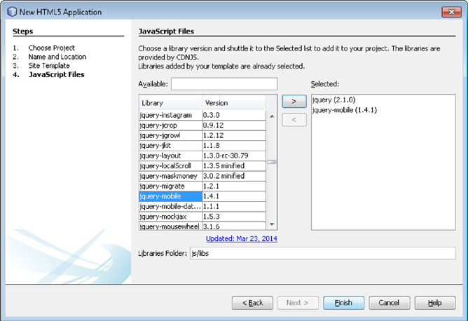
FIGURE 5-5. Step 4 of the New Project dialog
NOTE
The jQuery Mobile JavaScript library was added to PeopleTools in version 8.53 to support the 9.1 and early 9.2 iScript-based mobile applications. The PeopleTools team configured the jQuery Mobile JavaScript and stylesheet definitions to use Meta-HTML for loading external references from PeopleTools. Having these JavaScript libraries preconfigured in this manner is very helpful. Unfortunately, however, the included version is 1.0.1—a good, but old release. This chapter was built with version 1.4 and leverages features that were not available in version 1.0.1.
Manually Downloading jQuery and jQuery Mobile
The NetBeans project wizard automatically downloads the latest stable, uncompressed version of JavaScript libraries from http://cdnjs.com. Here are a few reasons why you might want to download the jQuery libraries yourself:
 You want to use a newer version of jQuery than what is available on cdnjs.
You are satisfied with the features available in an older release, such as 1.01.
You prefer the compressed version of jQuery Mobile (as I do).
You have to support legacy versions of Internet Explorer, which require one of the 1.x jQuery versions.
The compressed version of jQuery is nearly 70% smaller than the one downloaded by NetBeans, so that by itself is reason enough to manually download these files. The NetBeans downloaded version is good enough for development purposes, but I recommend downloading the minified “production” version before deploying your mobile applications in a production environment.
If you prefer to retain tighter control over your JavaScript files, point your desktop web browser at http://jquerymobile.com/ and download the appropriate version of jQuery Mobile. Note the range of jQuery versions required for your chosen version of jQuery Mobile. From the jQuery website (http://jquery.com), download the version that falls within the range required for your version of jQuery Mobile. For example, jQuery Mobile 1.4.2 requires jQuery versions 1.8–1.10 or version 2.0. If you don’t need the legacy features of the 1.x branch, choose 2.0 (because the 2.x version file size is smaller).
Creating the Search Page
Our project now contains a “boilerplate” index page and the jQuery JavaScript libraries. Ignore the index page for now and create a new search page. From the NetBeans menu bar, select File | New File. In step 1, select HTML File from the HTML5 Category. Figure 5-6 is a screenshot of the New File dialog. Click Next to move onto step 2 and name the new file search. Notice that the Created File text box at the bottom of the New HTML File wizard will show the file path, name, and extension. When naming your file, don’t include the .html extension. NetBeans adds that automatically. Click Finish to create the file.
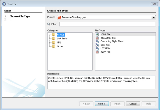
FIGURE 5-6. New File dialog
The newly created file will contain the following HTML:
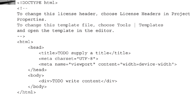
It is hard to believe this is HTML5. It looks just like regular HTML. What makes this code HTML5 is the DOCTYPE statement at the very top.
The file does not yet contain jQuery Mobile content; not even references to the jQuery JavaScript libraries. Add references by inserting the following link and script tags into the head section of the new file:

While you are updating the head section, change the contents of the title tag to Search.
CDNs
Rather than hosting popular JavaScript libraries on your servers, best practices recommend using a Content Delivery Network (CDN) whenever possible. A CDN hosts popular, static content, such as JavaScript, CSS, and images and shares that content with an unlimited number of sites. As previously mentioned NetBeans uses the cdnjs CDN. The benefits of using a CDN include caching, proximity, and connection availability. Many of the popular JavaScript libraries (jQuery, AngularJS, Ext, etc.) are available on CDNs.
The concern I have with a CDN is access: CDN hosted JavaScript files have complete access to the contents of a page. A malicious script could deface a site, install spyware on an unsuspecting visitor’s computer, or steal information from your secure pages. By using a CDN, you relinquish physical control over the JavaScript files hosted by the CDN. You have no way of confirming that those files are safe.
Another problem with CDNs is trust. Let me define trust in two ways:
You keep confidential information confidential.
You do what you say you will do (integrity).
If your site runs over SSL, your users see a visual indicator that they are communicating with the real you, not an imposter. When you include JavaScript from a CDN in that SSL conversation, the CDN also has access to the information on your pages. It is no longer just a conversation between you and the user. It is now a conversation between you, the user, and the CDN. Even worse, your site users probably don’t know the CDN is part of the conversation. This is a violation of the trust principle that you keep confidential information confidential. You can read a great hypothetical explanation of this trust issue at http://wonko.com/post/javascript-ssl-cdn.
It seems like every website has a (not so) prominently displayed privacy policy describing statistics collected about users and how the site owner intends to use that information. If you bring a CDN into the conversation, then the CDN may be using that information in a manner contrary to your privacy policy.
There are many CDN vendors available; some commercial and some free. As with any cloud service, make sure you understand the details of your hosting arrangement.
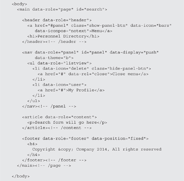
Replace the contents of the body section with the following. This will create a jQuery Mobile page definition containing header and footer regions.
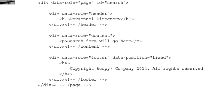
We have entered enough code to see jQuery Mobile progressive enhancement in action. To launch the page in a web browser, right-click within the NetBeans code editor and choose Run File from the context menu. The Google Chrome web browser should appear and show the search.html page. Figure 5-7 is a screenshot of the search page viewed in Google Chrome. Notice that the page has a clear header, content section, and footer.
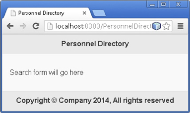
FIGURE 5-7. Search page viewed through Google Chrome
Take a moment to use Chrome developer tools to inspect the contents of the page. For example, right-click the header section and choose Inspect element from the context menu. Notice that both the header div and the corresponding h1 contain new attributes. This is progressive enhancement. jQuery Mobile identified your browser as supporting additional features and modified the HTML accordingly.
NOTE
If you don’t like the rather lifeless shades of gray employed by the jQuery mobile default themes, then create your own at http://themeroller.jquerymobile.com/.
A jQuery Mobile HTML document is composed of a series of div elements with varying data-role attributes. The data-role attribute identifies the purpose of each element. For example, the data-role for the page container is page. Why create a specific element for a page? Isn’t HTML document a synonym for page? jQuery Mobile allows you to include multiple pages or views in a single HTML document. You can then transfer between “pages” within a single document by linking to other pages by ID.
jQuery Mobile leverages the data-* HTML5 custom attribute specification for all jQuery Mobile–specific attributes. As we add more content to this page, you will see additional data-* jQuery Mobile attributes such as data-icon and data-theme.
To add a search form to this page, replace the contents of the div data-role='content' element with the following HTML:
NOTE
The form in the code listing uses the GET method because the web server running with the NetBeans debugger won’t POST to the results.html page. We will change the method to POST when we connect this to an iScript.
A form consists of a collection of label/input pairs. The default jQuery Mobile form display behavior is to stack labels on top of their corresponding input fields regardless of page width. Wrapping each pair in a div class='ui-field-contain' element causes jQuery Mobile to use a side-by-side horizontal layout when the screen width is over 448 pixels (28 em). The ui-field-contain class also adds a nice border between fields when there are two or more fields in a form. Figure 5-8 is a screenshot of the mobile search page.
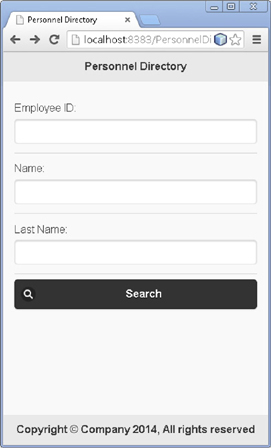
FIGURE 5-8. Personnel Directory search page
I styled the Search button using data-theme='b' to increase the contrast (and also to demonstrate how to use alternate jQuery Mobile theme swatches). Prior versions of jQuery Mobile included several theme swatches, each identified by a letter of the alphabet. Version 1.4, however, only has two themes: light and dark. You can create your own themes at http://themeroller.jquerymobile.com/. There are also several good themes available from other sources. The site http://www.gajotres.net/top-10-best-looking-free-jquery-mobile-themes/, for example, lists 10 good themes available from various sources on the internet.
The data-icon attribute attached to the search button tells jQuery Mobile to display a search icon. jQuery Mobile maintains an icon demo for each major release of jQuery Mobile. The demo page for the 1.4.2 release is at http://demos.jquerymobile.com/1.4.2/icons/. jQuery Mobile includes additional data-* attributes to specify positioning, shadow, surrounding disc, and so on.
Mocking up the Results Page
The search results page will contain a list of matching items. In NetBeans, create a new HTML5 page and name it results.html. jQuery Mobile uses Ajax to load additional pages into the original DOM. This means we don’t actually need to create a full HTML page, only a jQuery Mobile page fragment. The following code listing contains the necessary fragment to display a list of results:
Notice that the markup in this listing is very clean, minimal semantic HTML. The only interesting attributes in this code listing are the ones attached to the ul element. The data-role='listview' identifies this unordered list as a special jQuery Mobile list view. The data-inset attribute places a shadowed border around the list. The data-filter attribute instructs jQuery Mobile to add a special search box at the top of the list. Typing in this search box limits the results displayed to just list items that match the criteria. The initial display text in the search box comes from the data-filter-placeholder attribute.
Since our search results page is a page fragment and doesn’t contain references to the jQuery JavaScript and CSS libraries, we can’t launch it directly (well, we can, but it won’t have the progressive enhancements of a jQuery Mobile page). Therefore, to view the search results page, first run the search page from the NetBeans code editor. When the search page appears, don’t enter any criteria, just click the search button. We haven’t implemented any logic for handling search requests, so the criteria are irrelevant at this time. Your search results page will appear. Figure 5-9 is a screenshot of the search results page.
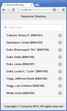
FIGURE 5-9. Search results page
NOTE
The reason we launch pages from NetBeans instead of just browsing to them within the file system is because page fragments must be loaded from a web server. jQuery Mobile uses Ajax to load pages, and Ajax requests must follow the domain of origin policy (or use CORS). This requires a web server. Browsers block Ajax requests for files within the local file system. If you are using a code editor other than NetBeans (Notepad, for example), then you will want to run your jQuery Mobile pages from a different development web server, such as the one we configured in Chapter 1.
If you compare Figure 5-9 to our wireframe in Figure 5-1, you will notice that our search results page is missing a couple of buttons in the header. Specifically, we haven’t added a button to return to the search page or a button to display the panel. Let’s go ahead and add the search page button now and save the panel button for when we actually create the panel. Implement the search button by adding the following link element to the header. The link element is in bold:

The target for the search button (or link) is #search, which is the ID for the search.html page definition. Since the search page is the application entry point, we know that it will exist in the DOM and can refer to it by ID rather than by URL. It is important to note that the page identified by #search doesn’t have to be the same page we created earlier. The only requirement is that the search page definition that loads this results page has an ID of #search. Referring to the search page by ID gives us some flexibility; the #search placeholder could point to a search form defined by an entirely different page than the one we built. Figure 5-10 shows the search results page with the new search button.
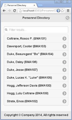
FIGURE 5-10. Search results with search button
Bookmarking is an important consideration when choosing to link by ID rather than by URL. By linking to a page that isn’t in the results page HTML structure we are assuming the page was loaded into an existing DOM. If this page was loaded by itself, for example, from a bookmark, the search button would not function because the #search page definition would not exist. The decision to assume the results page was loaded into an existing DOM, however, is consistent with our previous decision to construct the results page as a page fragment rather than a full HTML document.
Coding the Details Page
After identifying the correct search result, the user will drill into a details page to see information about a particular person within the organization. In NetBeans, create another HTML5 HTML file and name it details.html. Replace the contents of the new file with the following page fragment:
NOTE
The avatar included in the screenshots is a derivative of the one found at http://www.openclipart.org/detail/21409/buddy-icons-by-eguinaldo. It is a Scalable Vector Graphic (SVG), which means it retains its high quality appearance regardless of dimensions. SVG images are great for responsive design. I find http://www.openclipart.org to be a great resource for free graphics. I included the avatar placeholder image with the source download for this chapter. To use this image, create an “images” folder in your project and then copy the avatar.svg file into your new folder.
Again we used a page fragment rather than a full HTML page. To view this page in a web browser, you will first have to navigate to it through an existing jQuery Mobile page, such as our search page. As with the search and search results pages, launch the search page first, and then work through the navigation use case to arrive at the details page. Specifically:
Launch the search page from NetBeans (or view through another web server).
Click the search button to see the search results.
Click any one of the search results to see the details page.
We haven’t implemented any logic, so it doesn’t matter which search result you choose. They will all display the same content. Figure 5-11 is a screenshot of the details page.
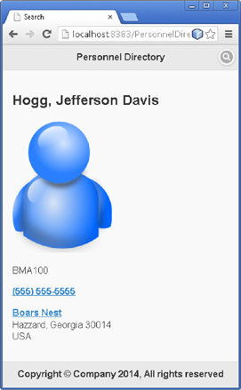
FIGURE 5-11. Details page
NOTE
The map link will take you to Google Maps, but won’t actually load Hazzard. Hazzard is a fictitious county from the Dukes of Hazzard television series. But if you are looking for Cooter’s garage, try 542 Parkway, Gatlinburg, TN 37738.
Notice that the phone number appears as a hyperlink? The phone number uses the tel: protocol so the mobile web browser will identify it as a callable number. Touching the link will launch the mobile phone dialer.
Custom Styling with jQuery Mobile
The details page is now fully functional. It has a photo of the employee, displays the phone number in a hyperlink, and links to a map. The markup is very clean and semantically correct. But visually speaking, the page needs improvement. For example, the employee name and other text are proportionally large when compared to the header. Likewise, the employee photo displays in a block above the personal information rather than beside the personal information. The way to resolve this is through CSS. We can implement CSS in one of three ways:
Using the inline style attribute of each element
Linking to external stylesheets
Embedding an internal stylesheet using the style element
There is no perfect approach to inserting style information into an Ajax-loaded jQuery Mobile page. Let’s review the good and the bad of each option.
Inline Styling Adding style attributes to each element is simple to implement and easy to prototype. We can actually open Chrome Developer Tools and mockup the CSS changes in Chrome. But here is why we won’t be using the style attribute:
The style attribute increases the HTML content in our HTML file. In later chapters, we will convert these HTML files into reusable templates with parameters for content. Polluting the HTML with style information will make these templates harder to maintain.
The web browser won’t cache style information embedded in HTML. Since our HTML is dynamic, inline style information has to be downloaded on each request.
External Stylesheets An external stylesheet linked into the head of an HTML document has all of the benefits of inline styles but without their unfavorable attributes. External stylesheets will not clutter our HTML templates, and browsers readily cache external stylesheets. There is just one problem—for valid HTML, an external stylesheet must be identified inside the HTML head element. As you may have noticed, our page fragments don’t have an HTML head element. We could add a head element, but it wouldn’t matter because jQuery Mobile wouldn’t use it anyway. Here is why:
When jQuery Mobile loads a page definition through Ajax, it searches the Ajax response for elements with the data-role attribute set to the value page (data-role='page'). We refer to this as the page definition. Anything inside the page definition is appended to the body element of the primary HTML document (the search.html page). Anything outside the page definition is ignored. Figure 5-12 is a screenshot of Chrome Developer Tools with the details page (id='details') highlighted.
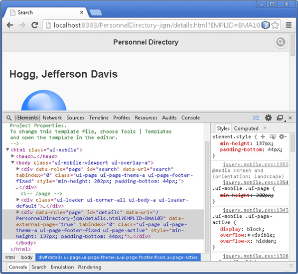
FIGURE 5-12. Details page HTML structure
Knowing how jQuery Mobile loads pages into the DOM is important when considering strategies for addressing page-specific CSS. HTML nodes that are part of the initial jQuery Mobile page (search.html) will remain throughout the duration of the application. Therefore, if we have CSS declarations that are used on multiple pages, then we can link those declarations in the head section of the main jQuery Mobile page (search.html). In fact, this is the only valid mechanism for linking to external stylesheets. You want to know something interesting? Browsers don’t necessarily follow the rules. Even though it is not valid, you can add an external stylesheet to a page definition (data-role='page') and your web browser will interpret and apply the CSS correctly. Be careful when using this approach. Browsers are not required to honor invalid content. Furthermore, as noted in the sidebar jQuery Mobile Page Caching and the DOM, this approach may have side effects.
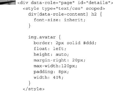
Internal Stylesheets An internal stylesheet (the style element) has all of the benefits of inline styles plus one additional benefit: It keeps style information out of the HTML details of our templates. Unfortunately, since internal stylesheets are embedded in HTML, browsers will not cache them. Like external stylesheets, traditional, internal stylesheets must be declared in the head section of an HTML document (although browsers don’t enforce this requirement).
HTML5 allows us to include scoped stylesheets anywhere in a document. Scoping only applies style information to the parent element (our page container). This eliminates the side effects common to the external stylesheet approach. Unfortunately, scoped stylesheets are not well-supported. At this time, recent builds of Chrome and Firefox support scoped stylesheets, but Safari, Opera, and Internet Explorer do not—at least not in the sense of scoping style definitions to the parent container. All browsers will interpret and apply style information even if the style element is used outside the head element, they just won’t apply the scoping rules. Browsers that don’t support scoped stylesheets will exhibit the same side effects as external stylesheets.
An internal scoped stylesheet would look something like this (page element included for context):
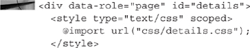
As I mentioned, an internal stylesheet is embedded in the HTML. Since our HTML is different for each employee, it isn’t possible to cache the embedded stylesheet. It will just be part of the HTML response sent to the browser with each request for the details page … unless we use a CSS import at-rule. The import at-rule allows us to define the CSS in an external file and import it into the embedded scoped stylesheet. This gives us an HTML5-valid approach to caching stylesheets without cluttering up our HTML templates. Assuming you placed the CSS contents above in a folder and file named css/details.css, the scoped CSS would look similar to the following (page element included for context):
NOTE
NetBeans 7.4 marked this @import rule with the error message “Unexpected token IMPORT_SYM found.” Don’t worry. No scoped stylesheets were harmed during the creation of this mobile website. The HTML and CSS are valid. Hopefully a future version of NetBeans will properly recognize this valid syntax.
The sample download for this chapter uses this scoped/import stylesheet approach. Figure 5-13 is a screenshot of the restyled details page. Notice that the font sizes are now consistent and the avatar floats to the left of the employee details.
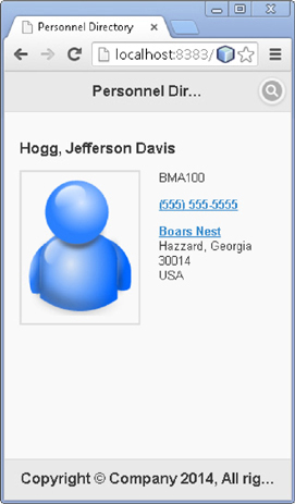
FIGURE 5-13. Restyled details page
Implementing the Responsive Panel
Our wireframes describe a panel that is hidden on small-form-factor devices, such as mobile phones, and visible on larger devices. When a user touches a certain button in the header, the panel is supposed to appear.
Panels in jQuery Mobile are elements (usually div elements) defined with the data-role='panel' attribute/value combination. If you place a panel inside a page definition as a sibling of the content element, then the jQuery Mobile framework will automatically hide the panel and style it appropriately. Placing the panel outside of a page definition is possible but requires a little bit of JavaScript to initialize the panel. Since this panel will display the same contents on every page within the personnel directory, we will add it to the application’s entry point: search.html as a sibling of the search page definition (outside of the page definition). This means we will have to add a few lines of JavaScript to initialize the panel. We will also need to add the menu display button to each page and copy the contents of the results into the panel.
Panels have many configurable features including themes, positioning, and reveal animations. There are also configurable and scripted mechanisms for opening and closing panels. We will explore some of these while constructing the panel for the personnel directory. You can learn more about panels at http://demos.jquerymobile.com/.
Let’s start by revisiting the search.html document to add a button to reveal the panel and the markup necessary to create the panel. To the header element (not the HTML head element, but the jQuery Mobile header defined as div data-role='header'), add the markup from the following code listing. I included the full header HTML for reference. Just add the markup displayed in bold:

The three-bar icon has become the standard icon used to represent a hidden menu (or panel). jQuery Mobile includes an icon with that same three bar design. To use it, we just add a data-icon='bars' attribute/value pair to our link. This markup opens the panel by specifying the panel ID in the href attribute.
Just after the search page definition, before the closing body tag, insert the following HTML. This HTML fragment defines the panel.
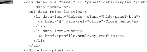
The data-role='panel' attribute/value pair identifies this HTML fragment as a panel. The data-display attribute tells jQuery Mobile the type of animation to apply when displaying the panel. Options include overlay, reveal, and push. Overlay causes the panel to appear on top of the page content. Reveal makes the panel look like it is under the page content. Push slides the panel in from the outside, pushing the page content off the screen.
The panel contains a jQuery Mobile list view styled slightly different from the one used in the search results. The first two rows of the list view display a close button and a link to edit the logged-in user’s profile. Later we will add JavaScript to copy the search results into the panel.
Since we defined this panel outside of the jQuery Mobile page definition, we need to add some JavaScript to get jQuery Mobile to treat this panel as a jQuery Mobile panel. To the HTML head section, just before the closing </head> tag, add the following:
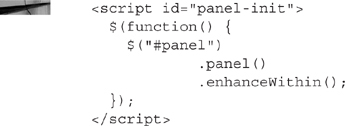
If you are familiar with jQuery, then you may recognize this code. The $(function() {…} is standard jQuery JavaScript for “run this code when the DOM is ready for manipulation.” It is shorthand for $(document).ready(function() {…}. The next line (line 3) is a jQuery CSS selector. It tells jQuery to select all elements with the ID panel. The remaining two method calls (.panel() and .enhanceWithin()) are jQuery Mobile–specific methods. The .panel() method tells jQuery Mobile to treat the selected element as a panel. The .enhanceWithin() method tells jQuery Mobile to apply the usual progressive enhancement rules to content found within the selected elements.
NOTE
If you have multiple panels that reside outside of page elements, you can initialize all of them by using the jQuery selector $('body>[data-role=’panel’]'). This tells jQuery to select all elements that are direct descendants of the body element and have the attribute data-role with a value equal to panel.
Now is a good time to test this page. From within Netbeans, right-click within the code editor of the search.html page and choose Run File from the context menu. The panel will appear similar to the screenshot in Figure 5-14.
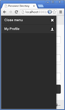
FIGURE 5-14. jQuery Mobile Panel component
With the panel defined and working properly, let’s add the panel/menu button to the other two pages. Open the results.html page and the details.html, and insert the same three-bar icon hyperlink HTML we added to the search page:

Making the Panel Responsive
Concerning panels and sidebars, the typical responsive design pattern is to automatically display panels and sidebars on larger devices (or landscape mode). The jQuery Mobile panel widget has built-in responsive support, but it works a little differently. jQuery Mobile does not automatically display panels. Instead, if the user chooses to display a panel (by touching the three-bar button) and the device width is larger than 55em (880px), then jQuery Mobile will leave the panel open and reflow the page contents so that both fit side by side. In responsive design, the point at which a display changes is known as a breakpoint. We can enable the default 55em breakpoint by adding the class='ui-responsive-panel' attribute/value pair to the body element. Oh … there is one more requirement: the panel display animation has to be set to either push or reveal. You can test this on the search page by adding the ui-responsive-panel class, touching (or clicking) the three-bar button, and then resizing your browser window (after running search.html from NetBeans, of course). As the window width grows wider you will see the contents reflow to fill the available content space. Likewise, when shrinking the window width, you will see the contents shrink to a certain point (the breakpoint), and then reflow again, pushing extra content off the screen to the right. The following code listing displays the body element change required to activate jQuery Mobile’s responsive breakpoint (additions are in bold).
With the panel’s data-display mode set to push and the page containing the class ui-responsive-panel, jQuery Mobile will hide the dismiss layer, allowing the user to work with the page contents without dismissing the panel.
Our content is small enough that we can (and should) use a narrower breakpoint. We can override jQuery Mobile’s default breakpoint by defining our own CSS media query and stylesheet. To create your own breakpoint, add the following HTML immediately following the jQuery CSS file link in the head element of the search.html document (link element included for context only):
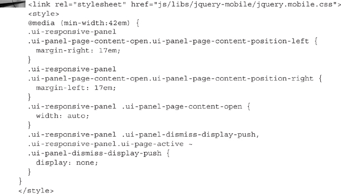
NOTE
The CSS above comes directly from the jQuery Mobile 1.4 jquery.mobile.css file. I searched the file for ui-responsive-panel, copied the contents (including the media query), and changed the min-width value.
Earlier in this chapter, we chose to import an external stylesheet into a page definition to take advantage of browser caching. In this example, however, we embedded the CSS directly into the HTML. The key difference is the other page is dynamic: our service will regenerate the contents on each request. This page is static and should reside in the web browser cache along with other CSS and JavaScript files.
Using matchMedia to Show and Hide the Panel It is a little trickier to make the panel appear when the screen reaches a certain width and then disappear when the screen becomes too narrow. What makes this difficult is that jQuery Mobile uses JavaScript to toggle classes when you open a panel. It is not possible to toggle these same classes from a CSS media query, but we can trigger the panel display state from a JavaScript MediaQueryList event.
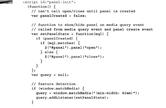
Remember the panel-init script element we created earlier that initializes the panel? We need to add a closure, a few variables, and a few other lines of JavaScript to that script block. The following code listing contains a new version of the panel-init script. It uses feature detection for mediaMatch. If the mediaMatch method is available, then the script uses a MediaQueryList to show or hide the panel depending on the screen width. Code changes are displayed in bold.
Test your code changes by reloading search.html in your web browser. If you are using NetBeans and the NetBeans Chrome connector, then the page will automatically reload. Resize the page and notice how the panel appears and disappears at the responsive breakpoint.
When your screen is wide enough to display both the panel and the search form at the same time, look at the three-bar icon and the close button (first list item). Notice that these buttons are visible all the time. Keeping them visible gives the user the option to hide (and show) the panel even after our media query automatically displays it. If you prefer to hide these buttons on wide-width devices, then add the following CSS to the inline stylesheet of the search.html page:

Figures 5-15 is a screenshot of the details page as viewed on a Droid Incredible 2 by HTC. Notice that the menu button is visible but the panel is hidden.
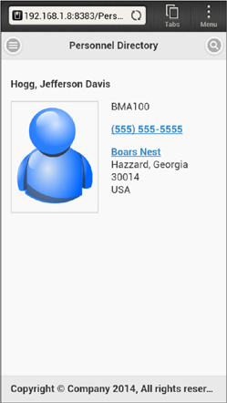
FIGURE 5-15. Details page on a Droid Incredible 2
Copying Search Results into the Panel
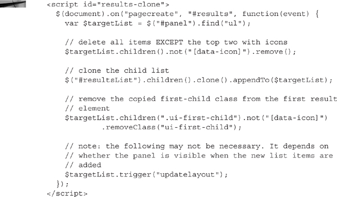
When a user clicks the search button on the search page, jQuery Mobile will use Ajax to submit the search parameters to the server and then display the results as a new page definition within the same shell as the search page. We can bind an event handler to the page create event for the results page and clone the contents into the panel. Add the following script to the end of the head element, just below the panel-init script:
Test your jQuery Mobile app again by either reloading the search page or running the search page from NetBeans. This time, when you click search, the results will be copied into the panel on the left. Figure 5-16 is a screenshot of the details page with the panel visible and showing the cloned search results.
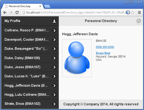
FIGURE 5-16. Details page with search results visible
Figure 5-17 is a screenshot of the same details page viewed on an iPad. Since the iPad is wider, it displays the panel but no menu or close button.
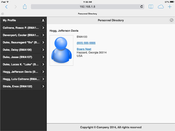
FIGURE 5-17. Details page on an iPad
The Profile Update Page
Besides viewing information about people within our organization, let’s make it possible for users to update their own contact details. Create a new HTML5 HTML File named profile.html and replace its contents with the following HTML fragment:
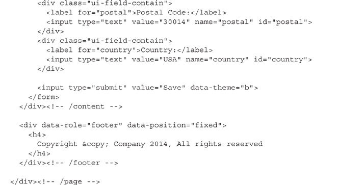
This HTML is a combination of the search page and the details page. It contains data-entry fields similar to the ones found in the search page but has a layout resembling the details page.
Wow! jQuery Mobile pages sure have a lot of div elements. Many of the structural elements in the Personnel Directory are div elements with special attributes. The meaning (semantics) of each div is determined by the data-role attribute. This is not the way we are supposed to write HTML5 applications. HTML5 is a semantic release that includes elements such as header, article, footer, nav, and aside. It seems that our jQuery Mobile div elements with attributes are trying to emulate many of those HTML5 elements.
jQuery Mobile actually places no restrictions on element types, using semantic attributes rather than element types to apply progressive enhancements. This means you are free to use the new HTML5 semantic elements as long as your target devices support HTML5. The key reason to stay with div elements is if some of your target devices won’t render the newer semantic elements.
Consider our early jQuery Mobile template along with a short panel template. Using semantic HTML5 tags, we could have written it like this:
Wait … did I say that this semantic approach only works with HTML5-capable browsers? Actually, that isn’t true. HTML5-capable browsers understand HTML5 semantic elements, which means they know how to style them appropriately (display: block, etc.), but nearly all web browsers will let you mark up HTML with elements they don’t recognize. Taking this a bit further, we could create our own jQuery Mobile elements named page, content, and panel (header and footer HTML5 elements already exist).
I added a media query to this page definition to provide more space between the avatar and data entry fields. At 28em device width, jQuery Mobile changes the way it displays fields and labels. Below 28em it stacks labels above fields. In this vertically stacked view, jQuery Mobile includes enough space between the avatar and data-entry fields. On wider displays, however, jQuery Mobile uses a horizontal layout. In this horizontal state, the avatar is too close to the first input field. The media query resolves this by adding a bottom margin to the avatar on wider displays. Figure 5-18 contains two screenshots of the profile update page as viewed on a mobile phone. The image on the left shows most of the profile page. The image on the right shows the numeric keypad that is displayed when the telephone field is active. Because the Phone field is defined as an HTML5 tel input type, the browser displays keys appropriate for entering a phone number.
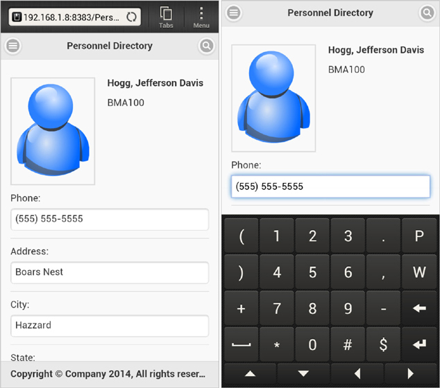
FIGURE 5-18. Two views of the profile page
A “Safe” URL
Although our jQuery Mobile application contains 4 HTML files, it is really a single page application. Only one of the files contains a full HTML document. The rest are just HTML fragments. When jQuery Mobile loads one of these fragments, it will change the browser’s URL. The problem with this behavior is that our application is dependent enough on the initial page to make those other URLs unusable. Here is a list of those dependencies:
Each page references the search page by ID.
The panel definition only exists in the search.html file.
The search.html file contains references to CSS and JavaScript used by all of the pages.
We could eliminate a couple of these dependencies by making minor changes to each file but solving the panel dependency is more complicated.
We could also ignore this URL issue and just expect people to enter our single page application through the front door: search.html. The reason we have to find a resolution, however, is because of what happens when you leave and then return to a mobile browser. For example, imagine that you are searching this new Personnel Directory when your mobile phone rings. You choose to answer the call. After saying goodbye 15 minutes later, you unlock your screen and return to the Personnel Directory. Instead of picking up exactly where you left off, the mobile browser reloads the current page. If you tested loading one of the page fragments earlier, then you know what just happened. The user is now staring at an ungracefully degraded web page with very little, if any, usable features. A simple way to solve this is to tell jQuery Mobile not to change the URL whenever it loads a page. To implement this solution, add the following JavaScript to either of the script tags in the search.html file:
Conclusion
In this chapter, you learned how to construct a responsive mobile application using jQuery Mobile. In the next chapter, we will build the same application using AngularJS, Topcoat.io, and Font Awesome, frameworks and libraries that help us build responsive applications without the heaviness of progressive enhancement.