
Design task structure for flexibility and efficiency
Support user with effective task structure and interaction control
Support user needs for flexibility within the logical task flow by providing alternative ways to do tasks. Meet user needs for efficiency with shortcuts for frequently performed tasks and provide support for task thread continuity, supporting the most likely next step.
Provide alternative ways to perform tasks
One of the most striking observations during task-based UX evaluation is the amazing variety of ways users approach task structure. Users take paths never imagined by the designers.
There are two ways designers can become attuned to this diversity of task paths. One is through careful attention to multiple ways of doing things in contextual inquiry and contextual analysis and the other is to leverage observations of such user behavior in UX evaluation. Do not just discount observations of users gone “astray” as “incorrect” task performance; try to learn about valuable alternative paths.
Provide shortcuts
No one wants to have to make too many mouse clicks or other user actions to complete a task, especially in complex task sequences (Wright, Lickorish, & Milroy, 1994). For efficiency within frequently performed tasks, experienced users especially need shortcuts, such as “hot key” (or “accelerator key”) alternatives for other more complicated action combinations, such as selecting choices from pull-down menus.
Keyboard alternatives are particularly useful in tasks that otherwise require keyboard actions such as form filling or word processing; staying within the keyboard for these “commands” avoids having the physical “switching” actions required for moving between the keyboard and mouse, for example, two physically different devices.
Grouping for task efficiency
Provide logical grouping in layout of objects
Group together objects and functions related by task or user work activity
Under the topic of layout and grouping to control content and meaning complexity, we grouped related things to make their meanings clear. Here we advocate grouping objects and other things related to the same task or user work activity as a means of conveniently having the needed components for a task at hand. This kind of grouping can be accomplished spatially with screen or other device layout or it can be manifest sequentially, as in a sequence of menu choices.
As Norman (2006) illustrates, in a taxonomic “hardware store” organization, hammers of all different kinds are all hanging together and all different kinds of nails are organized in bins somewhere else. But a carpenter organizes his or her tools so that the hammer and nails are in proximity because the two are used together in work activities.
But avoid grouping of objects and functions if they need to be dealt with separately
Grouping user interface objects such as buttons, menus, value settings, and so on creates the impression that the group comprises a single focus for user action. If more is needed for that task goal, each requiring separate actions, do not group the objects tightly together but make clear the separate objectives and the requirement for separate actions.
A dialogue box from a paper prototype of a Ticket Kiosk System is shown in Figure 22-49.
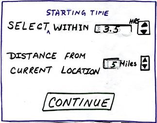
Figure 22-49 An overloaded dialogue box in a paper prototype.
It contains two objectives and two corresponding objects for value settings by the user—proximity of the starting time of a movie and the distance of the movie theater from the kiosk. Most of the participants who used this dialogue box as part of a ticket-buying task made the first setting and clicked on Continue, not noticing the second component. The solution that worked was to separate the two value-setting operations into two dialogue boxes, forcing a separation of the focus and linearizing the two actions.
Task thread continuity: Anticipating the most likely next step or task path
Support task thread continuity by anticipating the most likely next task, step, or action
Task thread continuity is a design goal relating to task flow in which the user can pursue a task thread of possibly many steps without an interruption or “discontinuity.” It is accomplished in design by anticipating most likely and other possible next steps at any point in the task flow and providing, at hand, the necessary cognitive, physical, and functional affordances to continue the thread.
The likely next steps to support can include tasks or steps the user may wish to take but which are not necessarily part of what designers envisioned as the “main” task thread. Therefore, these various task directions might not be identified by pure task analysis, but are steps that a practitioner or designer might see in contextual inquiry while watching users perform the tasks in a real work activity context. Effective observation in UX evaluation also can reveal diversions, branching, and alternative task paths that users associate with the main thread.
Attention to task thread continuity is especially important when designing the contents of context menus, right-click menus associated with objects or steps in tasks. It is also important when designing message dialogue boxes that offer branching in the task path, which is when users need at hand other possibilities associated with the current task.
Probably the most defining example of task thread continuity is seen in a message dialogue box that describes a problematic system state and suggests one or more possible courses of action as a remedy. But then the user is frustrated by a lack of any help in getting to these suggested new task paths.
Task thread continuity is easily supported by adding buttons that offer a direct way to follow each of the suggested actions. Suppose a dialogue box message tells a user that the page margins are too wide to fit on a printed page and suggests resetting page margins so that the document can be printed. It is enormously helpful if this guideline is followed by including a button that will take the user directly to the page setup screen.
Designers of information retrieval systems sometimes see the task sequence of formulating a query, submitting it, and getting the results as closure on the task structure, and it often is. So, in some designs, the query screen is replaced with the results screen. However, for many users, this is not the end of the task thread.
Once the results are displayed, the next step is to assess the success of the retrieval. If the query is complex or much has happened since the query was submitted, the user will need to review the original query to determine whether the results were what was expected. The next step may be to modify the query and try again. So this often simple linear task can have a thread with larger scope. The design should support these likely alternative task paths.
Designers of successful online shopping sites such as Amazon.com have figured out how to make it convenient for shoppers by providing for likely next steps (seeing and then buying) in their shopping tasks. They support convenience in ordering with the ubiquitous Buy it now or Add to cart buttons. They also support product research. If a potential customer shows interest in a product, the site quickly displays other products and accessories that go with it or alternative similar products that other customers have bought.
In early Microsoft Office applications the Save As dialogue box did not contain the icon for creating a new folder (the next to the right-hand icon at the top of the dialogue box in Figure 22-50). Eventually, designers realized that as part of the “Save As” task, users had to think about where to put the file and, as part of that planning for organizing their file structures, they often needed to create new folders to modify or expand the current file structure.
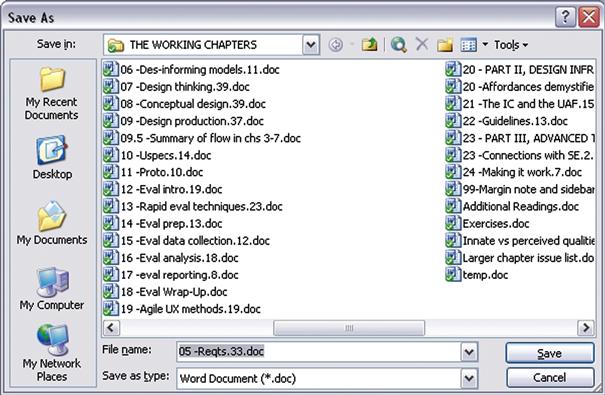
Figure 22-50 Addition of an icon to create a new file in the Save As dialogue box.
Early users had to back out of the “Save As” task and go to Windows Explorer, navigate to the proper context, create the folder, and then return to the Office application and do the “Save As” all over again. By including the ability to create a new folder within the Save As dialogue box, this likely next step was accommodated directly.
In some cases, the most likely next step is so likely that task thread continuity is supported by adding a slight amount of automation and doing the step for the user. The following example is one such case.
For frequent users of Word, the Outline view helps organize material within a document. You can use the Outline view to move quickly from where you are in the document to another specific location. In the Outline view, you get a choice of the number of levels of outline to be shown. It is common for users to want to keep this Outline view level setting at a high level, affording a view of the whole outline. So, for many users, the most likely-used setting would be that high setting. Many users rarely even choose anything else.
Regardless of any user’s level preferences, if a user goes to the Outline view it is because he or she wants to see and use the outline. But the default level setting in Word’s Outline view is the only setting that really is not an outline. The default Word Outline view, Show all levels, is a useless mash-up of outline parts and non-outline text. As a default this setting is the least useful for anyone.
Every time users launch a Word document, they face that annoying Outline view setting. Even once you have shown your preference by setting the level, the system inevitably strays away from that setting during editing, forcing you to reset it frequently. Frequent users of Word will have made this setting thousands of times over the years. Why cannot Word help users by saving the settings they use so consistently and have set so often?
Designers might argue that they cannot assume they know what level a user needs so they follow the guideline to “give the user control.” But why design a default that guarantees the user will have to change it instead of something that might be useful to at least some users some of the time? Why not detect the highest level present in the document and use that as a default? After all, the user did request to see the outline.
Earlier we described an example in which the user had to select an item from a dialogue box list of choices, even though there was only one item in the list. Our point there was that preselecting the item for the user made for a useful default.
The same idea applies here: When there is only one choice, the designer can support user efficiency through task thread continuity by assuming the most likely next action to be selecting that only choice and making the selection in advance for the user. An example of this comes from Microsoft Outlook.
When an Outlook user selects Rules and Alerts from the Tools menu and clicks on the Run Rules Now button, the Run Rules Now dialogue box appears. In cases where there is only one rule, it is highlighted in the display, making it look selected. However, be careful, that rule is not selected; the highlighting is a false affordance.
Look closely and you see that the checkbox to its left is unchecked and that is the indication of what is selected. The result is the Run Now button is grayed out, causing some users to pause in confusion about why the rule cannot now be run. Most such users figure it out eventually, but lose time and patience in the confusion. This UX glitch can be avoided by preselecting this only choice as the default.
Not undoing user work
Make the most of user’s work
Do not make the user redo any work.
Do not require users to reenter data
Do you not hate it when you fill out part of a form and go away to get more information or to attend temporarily to something else and, when you come back, you return to an empty form? This usually comes from lazy programming because it takes some buffering to retain your partial information. Do not do this disservice to your users.
Retain user state information
It helps users keep track of state information, such as user preferences, that they set in the course of usage. It is exasperating to have to reset preferences and other state settings that do not persist across different work sessions.
It would help users a lot if Windows could be a little bit more helpful in keeping track of the focus of their work, especially keeping track of where they have been working within the directory structure. Too often, you have to reestablish your work context by searching through the whole file directory in a dialogue box to, say, open a file.
Then, later, if you wish to do a Save As with the file, you may have to search that whole file directory again from the top to place the new file near the original one. We are not asking for built-in artificial intelligence, but it would seem that if you are working on a file in a certain part of the directory structure and want to do a Save As, it is very likely that the file is related to the original and, therefore, needs to be saved close to it in the file structure.
Keeping users in control
Avoid the feeling of loss of control
Sometimes, although users are still actually in control, interaction dialogue can make users feel as though the computer is taking control. Although designers may not give a second thought to language such as “You need to answer your email,” these words can project a bossy attitude to users. Something such as “You have new email” or “New email is ready for reading” conveys the same meaning but does so in a way that helps users feel that they are not being commanded to do something; they can respond whenever they find it convenient.
Avoid real loss of control
More bothersome to users and more detrimental to productivity is a real loss of user control. You, the designer, may think you know what is best for the user, but you will do best to avoid the temptation of being high handed in matters of control within interaction. Few kinds of user experience give rise to anger in users than a loss of control. It does not make them behave the way you think they should; it only forces them to take extra effort to work around your design.
One of the most maddening examples of loss of user control we have experienced comes from EndNote™, an otherwise powerful and effective bibliographic support application for word processing. When EndNote is used as a plug-in to Microsoft Word, it can be scanning your document invisibly for actions to take with regard to your bibliographic citations.
If an action is deemed necessary, for example, to format an in-line citation, EndNote often arbitrarily takes control away from a user doing editing and moves the cursor to the location where the action is needed, often many pages away from the focus of attention of the user and usually without any indication of what happened. At that point, users are probably not interested in thinking about bibliographic citations but are more concerned with their task at hand, such as editing. All of a sudden control is jerked away and the working context disappears. It takes extra cognitive energy and extra physical actions to get back to where the user was working. The worst part is that it can happen repeatedly, each time with an increasingly negative emotional user reaction.
Direct manipulation and natural interaction control
From the earliest computer usage, users have given “commands” to computers to get them to perform functions. Invoking a computer function “by command” is an indirect way to get something done by asking the computer to do it for you. In many kinds of applications there is a more direct way—essentially to do it yourself through direct manipulation (Shneiderman, 1983; Hutchins, Hollan, & Norman, 1986).
The introduction of direct manipulation, the essence of GUIs, as an interaction technique (Shneiderman, 1983) has been one of the most important in terms of designing interaction to be natural for human users. Instead of syntactic commands, operations are invoked by user actions manipulating user interface objects.
For example, instead of typing “del my_file.doc,” one might delete the file by clicking on and dragging the file icon to the “trashcan” object. Unlike the case in command-driven interaction, direct manipulation features continuous representation, usually visual, of interaction objects. As Shneiderman, who gets credit for identifying and characterizing direct manipulation as an interaction style, puts it, a key characteristic is “rapid incremental reversible operations whose impact on the object of interest is immediately visible” (Shneiderman, 1982, p. 251; 1983).
Users can perform tasks easily by pointing to visual representations of familiar objects. They can see results immediately and visually, for example, a file going into a folder. The direct manipulation interaction style is easy to learn and encourages exploration. Direct manipulation goes hand in hand with metaphors, like a stack of cards for addresses. Users apply direct manipulation actions to the objects of the metaphor, for example, moving cards within a stack. And, of course, the visual thinking and actions of direct manipulation apply beyond metaphors to manipulating objects in three dimensions as in virtual and augmented reality applications.
One way that the notion of direct manipulation enters into the design of physical products such as radios and television sets is by way of the concept of physicality. If controls for these physical devices, such as volume and tuning controls, are implemented with real knobs, users can operate them by physically grasping and turning them. This is literally a kind of direct manipulation.
Physicality
Physicality is about real physical interaction with real devices like physical knobs and levers.
Give direct manipulation support
Take adding an appointment to a computer-based calendar as an example. We illustrate the command-driven approach with the following task sequence. The user navigates to the desired day within the calendar and clicks on the time slot to select it. Then clicking the Add appointment button brings up a dialogue box in which the user types the text in one or more fields describing the appointment.
Then clicking on OK or Save appointment dismisses the dialogue box, essentially asking the computer to store the appointment. In the direct manipulation paradigm, the calendar looks and feels much like a paper calendar. The user types the appointment information directly into the time slot on the calendar, just as one might write on a paper calendar with a pencil. There is no need to ask for the appointment to be saved; anything you “write” in the calendar stays there, just as it does on a paper calendar.
Always provide a way for the user to “bail out” of an ongoing operation
Do not trap a user in an interaction. Always allow a way for users to escape if they decide not to proceed after getting part way into a task sequence. The usual way to design for this guideline is to include a Cancel, usually as a dialogue box button.
22.7 Physical actions
Physical actions guidelines support users in doing physical actions, including typing, clicking, dragging in a GUI, scrolling on a Web page, speaking with a voice interface, walking in a virtual environment, moving one’s hands in gestural interaction, and gazing with eyes. This is the one part of the user’s Interaction Cycle where there is essentially no cognitive component; the user already knows what to do and how to do it.
Issues here are limited to how well the design supports the physical actions of doing it, acting upon user interface objects to access all features and functionality within the system. The two primary areas of design considerations are how well the design supports users in sensing the object(s) to be manipulated and how well the design supports users in doing the physical manipulation. As a simple example, it is about seeing a button and clicking on it.
Physical actions are the one place in the Interaction Cycle where physical affordances are relevant, where you will find issues about Fitts’ law, manual dexterity, physical disabilities, awkwardness, and physical fatigue.
22.7.1 Sensing Objects of Physical Actions
In Figure 22-51 we highlight the “sensing user interface object” part within the breakdown of the physical actions part of the Interaction Cycle.
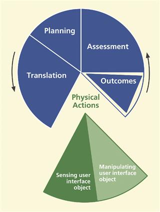
Figure 22-51 Sensing the user interface (UI) object, within physical actions.
Sensing objects to manipulate
The “sensing user interface object” portion of the physical actions part is about designing to support user sensory, for example, visual, auditory, or tactile, needs in locating the appropriate physical affordance quickly in order to manipulate it. Sensing for physical actions is about presentation of physical affordances, and the associated design issues are similar to those of the presentation of cognitive affordances in other parts of the Interaction Cycle, including visibility, noticeability, findability, distinguishability, discernability, sensory disabilities, and presentation medium.
Support users making physical actions with effective sensory affordances for sensing physical affordances
Make objects to be manipulated visible, discernable, legible, noticeable, and distinguishable. When possible, locate the focus of attention, the cursor, for example, near the objects to be manipulated.
One of us has a stereo with a CD player with controls, such as for play and stop, that are black buttons embossed with black icons. This black-on-black motif is cool looking but has a negative impact on usability. You can see the raised embossing of the icons in good light, but sometimes you like to hear your music in a low-light ambiance, a condition that makes it very difficult to see the icons.
Most people know that you should push the play button when you want to play a CD, but in low light it is difficult to tell where that button is on the plain black front of the CD player. This is definitely a case of the sensory design not supporting the ability to locate the object of an intended physical action.
Sensing objects during manipulation
Not only is it important to be able to sense objects statically to initiate physical actions but users need to be able to sense the cursor and the physical affordance object dynamically to keep track of them during manipulation. As an example, in dragging a graphical object, the user’s dynamic sensory needs are supported by showing an outline of the graphical object, aiding its placement in a drawing application.
As another very simple example, if the cursor is the same color as the background, the cursor can disappear into the background while moving it, making it difficult to judge how far to move the mouse back to get it visible again.
22.7.2 Help User in Doing Physical Actions
In Figure 22-52 we highlight the “manipulating user interface object” part within the breakdown of the physical actions part of the Interaction Cycle.
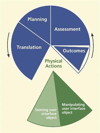
Figure 22-52 Manipulating the user interface (UI) object within physical actions.
This part of the Interaction Cycle is about supporting user physical needs at the time of making physical actions; it is about making user interface object manipulation physically easy. It is especially about designing to make physical actions efficient for expert users.
Support user with effective physical affordances for manipulating objects, help in doing actions
Issues relevant to supporting physical actions include awkwardness and physical disabilities, manual dexterity and Fitts’ law, plus haptics and physicality.
Haptics
Haptics is about the sense of touch and the physical contact between user and machine through interaction devices.
Awkwardness and physical disabilities
One of the easiest aspects of designing for physical actions is avoiding awkwardness. It is also one of the easiest areas in which to find existing problems in UX evaluation.
Avoid physical awkwardness
Issues of physical awkwardness are often about time and energy expended in physical motions. The classic example of this issue is a user having to alternate constantly among multiple input devices such as between a keyboard and a mouse or between either device and a touchscreen.
This device switching involves constant “homing” actions that require time-consuming and effortful distraction of cognitive focus and visual attention. Keyboard combinations requiring multiple fingers on multiple keys can also be awkward user actions that hinder smooth and fast interaction.
Accommodate physical disabilities
Not all human users have the same physical abilities—range of motion, fine motor control, vision, or hearing. Some users are innately limited; some have disabilities due to accidents. Although in-depth coverage of accessibility issues is beyond our scope, accommodation of user disabilities is an extremely important part of designing for the physical actions part of the Interaction Cycle and must at least be mentioned here.
Manual dexterity and Fitts’ law
Design issues related to Fitts’ law are about movement distances, mutual object proximities, and target object size. Performance is reckoned in terms of both time and errors. In a strict interpretation, an error would be clicking anywhere except on the correct object. A more practical interpretation would limit errors to clicking on incorrect objects that are nearby the correct object; this is the kind of error that can have a more negative effect on the interaction. This discussion leads to the following guidelines.
Fitts’ Law
Fitts’ Law is an empirically-based mathematical formula governing straight linear movement from an initial position to a target at a terminal location. The time to make the movement is proportional to the log2 of the distance and inversely proportional to log2 of the width of the target in the direction of the motion.
Design layout to support manual dexterity and Fitts’ law
Support targeted cursor movement by making selectable objects large enough
The bottom line about sizes cursor movement targets is simple: small objects are harder to click on than large ones. Give your interaction objects enough size, both in cross section for accuracy in the cursor movement direction and in the depth to support accurate termination of movement within the target object.
Group clickable objects related by task flow close together
Avoid fatigue, and slow movement times. Large movement distances require more time and can lead to more targeting errors. Short distances between related objects will result in shorter movement times and fewer errors.
But not too close, and do not include unrelated objects in the grouping
Avoid erroneous selection that can be caused by close proximity of target objects to non-target objects.
A software drawing application has a very large number of functions, most of which are accessible via small icons in a very crowded tool bar. Each function can also be invoked by another way (e.g., a menu choice), and our observations tell us that users mainly use the tool bar icons for familiar and frequently used functions.
As a result, they do not usually have trouble figuring out which icon to click on. If it is not a familiar function, they do not use the icons. The problem is about what happens when they do use the tool icons because there are so many icons, they are small, and they are crowded together. This, combined with the fast actions of experienced users, leads to clicking on the wrong icon more often than users would like.
Constraining physical actions to avoid physical overshoot errors
Design physical movement to avoid physical overshoot
Just as in the case of cursor movement, other kinds of physical actions can be at risk for overshoot, extending the movement beyond what was intended. This concept is best illustrated by the hair dryer switch example that follows.
Suppose you are using the hair dryer, let us say, on the low setting. To move the hair dryer switch takes a certain threshold pressure to overcome initial resistance. Once in motion, however, unless the user is adept at reducing this pressure instantly, the switch can move beyond the intended setting.
A strong detent at each switch position can help prevent the movement from going too far, but it is still easy to push the switch too far, as the photo of a hair dryer switch in Figure 22-53 illustrates. Starting in the Low position and pushing the switch toward Off, the switch configuration makes it easy to move accidentally beyond Off over to the High setting.

Figure 22-53 A hair dryer control switch inviting physical overshoot.
This is physical overshoot and is easy to prevent with a switch design that goes directly from High to Low and then to Off in a logical progression. Having the Off position at one end of the physical movement is a kind of physical constraint or boundary condition that allows you to push the switch to Off firmly and quickly without demanding a careful touch or causing worry of overshooting.
The rocker switch design in Figure 22-54 is a bit better with respect to physical overshoot because it is easier to control the position of a rocker switch as it is being moved. Still, a design with Off at one end of the movement would be a more certain design for preventing physical overshoot. It is probably easier to manufacture a switch with the neutral Off position in the middle.

Figure 22-54 A little better design.
The automatic transmission shifter of a pickup truck shown in the lower part of Figure 22-55 is an example of a design where physical overshoot is common. You can see the shift control configuration of the truck with the common linear progression of gears from low to high. Most of the time this is adequate design, but when you are coming down a long hill, you might want to downshift to maintain the speed limit without wearing out the brakes.

Figure 22-55 Typical automatic transmission shifting pattern.
However, because the shifting movement is linear, when you pull that lever down from D, it is too easy to overshoot third gear and end up in second. The result of this error becomes immediately obvious from the screaming of the engine at high RPM.
This downshifting overshoot is remedied by the gear shifting pattern of a Toyota Sienna van, shown in Figure 22-56. The gear labeled 4-D is fourth, or high, gear that includes an automatic overdrive for highway travel.
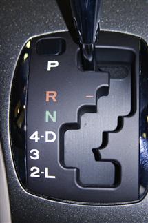
Figure 22-56 Shifting pattern in Toyota Sienna van, helping prevent physical overshoot.
When you shift down to third gear, the movement is constrained physically by a “template” overlaying the shifting lever and overshoot is prevented. It is very unlikely that a user will accidentally shift into second gear because that requires a conscious extra action of moving the lever to the right and then further down.
Finally, Figure 22-57 shows the gear-shifting pattern for a Winnebago View, which is a very small RV built on a Mercedes-Benz Sprinter chassis and drive train. It has a “tilt shift,” which means that when the transmission is in drive, you can access lower gears successively by tilting the shift lever to the left and you can shift back up to higher gears by shifting the lever to the right. This is probably the easiest to use and safest of all options in terms of the risk of downshifting overshoot.

Figure 22-57 Shifting pattern in Mercedes-Benz Sprinter, even better at helping prevent physical overshoot.
Haptics and physicality
Haptics is about the sense of touch and physical grasping, and physicality is about real physical interaction using real physical devices, such as real knobs and levels, instead of “virtual” interaction via “soft” devices.
Include physicality in your design when the alternatives are not as satisfying to the user
The BMW iDrive idea seemed so good on paper. It was simplicity in itself. No panels cluttered with knobs and buttons. How cool and forward looking. Designers realized that drivers could do anything via a set of menus. But drivers soon realized that the controls for everything were buried in a maze of hierarchical menus. No longer could you reach out and tweak the heater fan speed without looking. Fortunately, knobs are now coming back in BMWs.
Here is an email from our friend, Roger Ehrich, from back in 2002, only slightly edited:
Hey Rex, since our microwave was about 25 years old, we worried about radiation leakage, so we reluctantly got a new one. The old one had a knob that you twisted to set the time, and a START button that, unlike in Windows, actually started the thing.
The new one had a digital interface and Marion and I spent over 10 minutes trying to get it to even turn on, but we got nothing but an error message. I feel you should never get an error message from an appliance! Eventually we got it to turn on. The sequence was not complicated, but it will not tolerate any variation in user behavior. The problem is that the design is modal, some buttons being multi-functional and sequential. A casual user like me will forget and get it wrong again. Better for me to take my popcorn over to a neighbor who remembers what to do. Anyway, here’s to the good old days and the timer knob.
– Regards, Roger
Figure 22-58 shows a photo of radio controls in a car.

Figure 22-58 Car radio with digital up and down buttons instead of a tuning knob.
There is no knob for tuning; tuning is done by pushing the up and down arrows on the left-hand side. At least there is a real volume control knob but it is small with almost no depth, making it a poor physical affordance for grasping, even with slender fingertips.
As you try to get a better grip, it is easy to push it inwardly unintentionally, causing the knob and what it controls to become modal, going away from being volume control and becoming a knob to control equalizer settings. To get back to the knob being a volume control, you have to wait until the equalizer mode times out or you must toggle through all the equalizer settings back out to the volume control mode—all, of course, without taking your eyes off the road.
In contrast, Figure 22-59 is a photo of the radio and heater controls of a pickup truck.

Figure 22-59 Great physicality in the radio volume control and heater control knobs.
Still no tuning knob; too bad. But the large and easily grasped outside ring of the volume control knob is a joy to use and it is not doubled up with any other mode. Also note the heater control knobs below the radio. Again, the physicality of grabbing and adjusting these knobs gives great pleasure on a cold winter morning.
22.8 Outcomes
In Figure 22-60 we highlight the outcomes part of the Interaction Cycle.
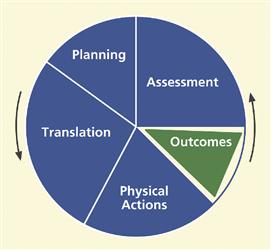
Figure 22-60 The outcomes part of the Interaction Cycle.
The outcomes part of the Interaction Cycle is about supporting users through complete and correct “backend” functionality. There are no issues about interaction design in outcomes. The relation to UX is through usefulness and functional affordances. Beyond this connection to UX, outcomes are computations and state changes that are internal to the system, invisible to users,
Because the outcomes part is technically not part of the user’s interaction, it is represented in Figure 22-59 as an isolated segment of the Interaction Cycle. Once the results of computation or the outcomes of a user request are displayed to the user, the issues all shift to the assessment part of the Interaction Cycle. Interaction designers must make the effect of outcomes visible via system feedback. So, while issues about whether the results are appropriate or correct do relate to the internal functionality and, therefore, do come under outcomes, any issues about what users see or think about the outcomes after the system computation come under the assessment part of the Interaction Cycle.
22.8.1 System Functionality
The outcomes part of the Interaction Cycle is mainly about non-user-interface system functionality, which includes all issues about software bugs on the software engineering side and issues about completeness and correctness of the backend functional software.
Check your functionality for missing features
Do not let your functionality grow into a Jack-of-all-trades, but master of none
If you try to do too many things in the functionality of your system, you may end up not doing anything well. Norman has warned us against general-purpose machines intended to do many different functions. He suggests, rather, “information appliances” (Norman, 1998), each intended for more specialized functions.
As an extreme, perhaps even ludicrous, but real-world example, consider the Wenger Giant Swiss Army Knife,4 shown in Figure 22-61.

Figure 22-61 The Wenger Giant Swiss Army Knife, the most multi-bladed knife on the planet, and for an MSRP of only $1400.
If you find yourself in need of a chuckle, see the Amazon reviews of this knife5 (where it sells for a mere $900).
Check your functionality for non-user-interface software bugs
22.8.2 System Response Time
If the system response time is slow and users have to cool their heels for several billion nanoseconds, it can impact their perceived usage experience. Computer hardware performance, networking, and communications are usually to blame, leaving nothing you can do in the interaction design to help.
In discussion with networking and communications people, you might find a way to break up transactions in a different way to distribute the computational load over time a little. If the problem is intolerable for your users, the entire systems architecture team will have to talk about it.
22.8.3 Automation Issues
Automation, in the sense we are using the term here, means moving functions and control from the user to the internal system functionality. This can result in not letting users do something the designers think they should not do or something that the designers did not think about at all. In many such cases, however, users will encounter exceptions where they really need to do it.
As an analogy, think of a word processor that will not let you save a document if it has anything marked as a spelling or grammatical error. The rationale is easy: “The user will not want to save a document that contains errors. They will want to get it right before they save it away.” You know the story, and cases almost always arise in which such a rationale proves to be wrong. Because automation and user control can be tricky, we phrase the next guideline about this kind of automation guardedly.
Avoid loss of user control from too much automation
The following examples show very small-scale cases of automation, taking control from the user. Small though they may be, they can still be frustrating to users who encounter them.
The problem in this example no longer exists in Windows Explorer, but an early version of Windows Explorer would not let you name a new folder with all uppercase letters. In particular, suppose you needed a folder for tax documents and tried to name it “IRS.” With that version of Windows, after you pressed Enter, the name would be changed to “Irs.”
So, in slight confusion, you try again but no deal. This had to be a deliberate “feature,” probably made by a software person to protect users from what appeared to be a typographic error, but that ended up being a high-handed grasping of user control.
Figure 22-62 shows part of a letter being composed in an early version of Microsoft Word and exhibiting another example of automation that takes away user control.
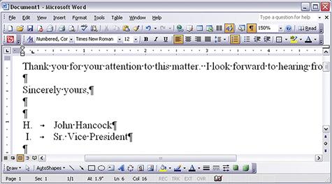
Figure 22-62 The H. John Hancock problem.
Let us just say that a user named H. John Hancock was observed typing a business letter, intending to sign it at the end as:
Instead he got:
Mr. Hancock was confused about the “I” so he backed up and typed the name again but, when he pressed Enter again, he got the same result. At first he did not know what was happening, why the “I” appeared, or how to finish the letter without getting the “I” there. At least for a few moments, the task was blocked and Mr. Hancock was frustrated.
Being a somewhat experienced user of Word, his composition of text going back to some famous early American documents, he eventually determined that the cause of the problem was that the Automatic Numbered List option was turned on as a kind of mode. At least for this occasion and this user, the Automatic numbered list option imposed too much automation and not enough user control.
That the user had difficulty understanding what was happening is due to the fact that, for this user, there was no indication of the Automatic numbered list mode. In fact, however, the system did provide quite a helpful feedback message in response to the automated action it had taken, via the “status” message of Figure 22-63, displayed at the top of the window.
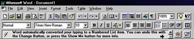
Figure 22-63 If only Mr. Hancock had seen this
(screen image courtesy of Tobias Frans-Jan Theebe).
However, Mr. Hancock did not notice this feedback message because it violated the assessment guideline to “Locate feedback within the user’s focus of attention, perhaps in a pop-up dialogue box but not in a message or status line at the top or bottom of the screen.”
Help the user by automating where there is an obvious need
This section is about automation issues, but not all about avoiding automation. In some cases, automation can be helpful. The following example is about one such case.
No matter how good your GPS system is, as a human driver you can still make mistakes and drive off course, deviating from the route planned by the system. The Garmin GPS units are very good at helping the driver recover and get back on route. It recalculates the route from the current position immediately and automatically, without missing a beat. Recovery is so smooth and easy that it hardly seems like an error.
Before this kind of GPS, in the early days of GPS map systems for travel navigation, there was another system developed by Microsoft, called Streets and Trips. It used a GPS receiver antenna plugged into a USB port in a laptop. The unit had one extremely bad trait. When the driver got off track, the screen displayed the error message, Off Route! in a large bright red font.
Somehow you just had to know that you had to press one of the F, or function, keys to request recalculation of the route in order to recover. When you are busy contending with traffic and road signs, that is the time you would gladly have the system take control and share more of the responsibility, but you did not get that help. To be fair, this option probably was available in one of the preference settings or other menu choices, but the default behavior was not very usable and this option was not discovered very easily.
Designers of the Microsoft system may have decided to follow the design guideline to “keep the locus of control with the user.” While user control is often the best thing, there are times when it is critical for the system to take charge and do what is needed. The work context of this UX problem includes:
 The user is busy with other tasks that cannot be automated.
It is dangerous to distract the user/driver with additional workload.
Getting off track can be stressful, detracting further from the focus.
Having to intervene and tell the system to recalculate the route interferes with the user’s most important task, that of driving.
Another way to interpret these twin guidelines about automation is to keep the user in control at higher task levels, where the user has done the initial planning and is driving to get somewhere. But take control from the user when the need is obvious and the user is busy.
This interpretation of the two guidelines means that, on one hand, the system does not insist on staying on this route regardless of driver actions, but quietly allows the driver to make impromptu detours. This interpretation also means that, on the other hand, the system should be expected to continue to recalculate the route to help the driver eventually reach his or her destination.
22.9 Assessment
Assessment guidelines are to support users in understanding information displays of results of outcomes and other feedback about outcomes such as error indications. Assessment, along with translation, is one of the places in the Interaction Cycle where cognitive affordances play a primary role.
22.9.1 System Response
A system response can contain:
feedback, information about course of interaction so far
As an example, consider this message: “The value you entered for your name was not accepted by the system. Please try again using only alphabetic characters.”
The first sentence, “The value you entered for your name was not accepted by the system,” is feedback about a slight problem in the course of interaction and is an input to the assessment part of the Interaction Cycle.
The second sentence, “Please try again using only alphabetic characters,” is feed-forward, a cognitive affordance as input to the translation part of the next iteration within the Interaction Cycle.
22.9.2 Assessment of System Feedback
Figure 22-64 highlights the assessment part of the Interaction Cycle.
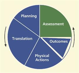
Figure 22-64 The assessment part of the Interaction Cycle.
Feedback about errors and interaction problems is essential in supporting users in understanding the course of their interactions. Feedback is the only way users will know if an error has occurred and why. There is a strong parallel between assessment issues about cognitive affordances as feedback and translation issues about cognitive affordances as feed-forward, including existence of feedback when it is needed, sensing feedback through effective presentation, and understanding feedback through effective representation of content and meaning.
22.9.3 Existence of Feedback
In Figure 22-65 we highlight the “existence of feedback” portion of the assessment part of the Interaction Cycle.
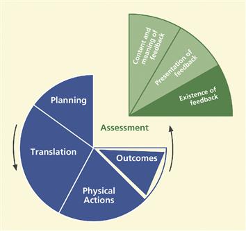
Figure 22-65 Existence of feedback, within assessment.
The “existence of feedback” portion of the assessment part of the Interaction Cycle is about providing necessary feedback to support users’ need to know whether the course of interaction is proceeding toward meeting their planning goals.
Provide feedback for all user actions
For most systems and applications, the existence of feedback is essential for users; feedback keeps users on track. One notable exception is the Unix operating system, in which no news is always good news. No feedback in Unix means no errors. For expert users, this tacit positive feedback is efficient and keeps out of the way of high-powered interaction. For most users of most other systems, however, no news is just no news.
Provide progress feedback on long operations
For a system operation requiring significant processing time, it is essential to inform the user when the system is still computing. Keep users aware of function or operation progress with some kind of feedback as a progress report, such as a percent-done indicator.
Consider the case of a user of a dbase-family database application who had been deleting lots of records in a large database. He knew that, in dbase applications, “deleted” records are really only marked for deletion and can still be undeleted until a Pack operation is performed, permanently removing all records marked for deletion.
At some point, he did the Pack operation, but it did not seem to work. After waiting what seemed like a long time (about 10 seconds), he pushed the Escape key to get back control of the computer and things just got more confusing about the state of the system.
It turns out that the Pack operation was working, but there was no indication to the user of its progress. By pushing the Escape key while the system was still performing the Pack function, the user may have left things in an indeterminate state. If the system had let him know it was, in fact, still doing the requested Pack operation, he would have waited for it to complete.
Request confirmation as a kind of intervening feedback
To prevent costly errors, it is wise to solicit user confirmation before proceeding with potentially destructive actions.
But do not overuse and annoy
When the upcoming action is reversible or not potentially destructive, the annoyance of having to deal with a confirmation may outweigh any possible protection for the user.
22.9.4 Presentation of Feedback
Figure 22-66 highlights the “presentation of feedback” portion of the assessment part of the Interaction Cycle.
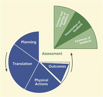
Figure 22-66 Presentation of feedback, within assessment.
This portion of the assessment part of the Interaction Cycle is about supporting user sensing, such as seeing, hearing, or feeling, of feedback with effective design of feedback presentation and appearance. Presentation of feedback is about how feedback appears to users, not how it conveys meaning. Users must be able to sense (e.g., see or hear) feedback before it can be useful to them in usage.
Support user with effective sensory affordances in presentation of feedback
Feedback visibility
Obviously feedback cannot be effective if it cannot be seen or heard when it is needed.
Make feedback visible
It is the designer’s job to be sure each instance of feedback is visible when it is needed in the interaction.
Feedback noticeability
Make feedback noticeable
When needed feedback exists and is visible, the next consideration is its noticeability or likelihood of being noticed or sensed. Just putting feedback on the screen is not enough, especially if the user does not necessarily know it exists or is not necessarily looking for it.
These design issues are largely about supporting awareness. Relevant feedback should come to users’ attention without users seeking it. The primary design factor in this regard is location, putting feedback within the users’ focus of attention. It is also about contrast, size, and layout complexity and their effect on separation of feedback from the background and from the clutter of other user interface objects.
Locate feedback within the user’s focus of attention
A pop-up dialogue box that appears directly within the user’s focus of attention in the middle of the screen is much more noticeable than a message or status line at the top or bottom of the screen.
Make feedback large enough to notice
Feedback legibility
Make text legible, readable
Text legibility is about being discernable, not about its content being understandable. Font size, font type, color, and contrast are the primary relevant design factors.
Feedback presentation complexity
Control feedback presentation complexity with effective layout, organization, and grouping
Support user needs to locate and be aware of feedback by controlling layout complexity of user interface objects. Screen clutter can obscure needed feedback and make it difficult for users to find.
Feedback timing
Support user needs to notice feedback with appropriate timing of appearance or display of feedback. Present feedback promptly and with adequate persistence, that is, avoid “flashing.”
Help users detect error situations early
A local software company asked us to inspect one of their software tools. In this tool, users are restricted to certain subsets of functionality based on privileges, which in turn are based on various key work roles. A UX problem with a large impact on users arose when users were not aware of which parts of the functionality they were allowed to use.
As the result of a designer assumption that each user would know their privilege-based limitations, users were allowed to navigate deeply into the structure of tasks that they were not supposed to be performing. They could carry out all the steps of the corresponding transactions but when they tried to “commit” the transaction at the end, they were told they did not have the privileges to do that task and were blocked and their time and effort were wasted. It would have been easy in the design to help users realize much earlier that they were on a path to an error, thereby saving user productivity.
Feedback presentation consistency
Maintain a consistent appearance across similar kinds of feedback
Maintain a consistent location of feedback presentation on the screen to help users notice it quickly
Feedback presentation medium
Consider appropriate alternatives for presenting feedback.
Use the most effective feedback presentation medium
Consider audio as alternative channel
Audio can be more effective than visual media to get users’ attention in cases of a heavy task load or heavy sensory work load. Audio is also an excellent alternative for vision-impaired users.
22.9.5 Content and Meaning of Feedback
In Figure 22-67 we highlight the “content and meaning of feedback” portion of the assessment part of the Interaction Cycle.
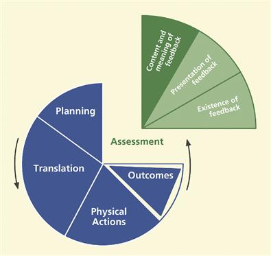
Figure 22-67 Content/meaning of feedback, within assessment.
The content and meaning of feedback represent the knowledge that must be conveyed to users to be effective in helping them understand action outcomes and interaction progress. This understanding is conveyed through effective content and meaning in feedback, which is dependent on clarity, completeness, proper tone, usage centeredness, and consistency of feedback content.
Help users understand outcomes with effective content/meaning in feedback
Support user ability to determine the outcomes of their actions through understanding and comprehension of feedback content and meaning.
Clarity of feedback
Design feedback for clarity
Use precise wording and carefully chosen vocabulary to compose correct, complete, and sufficient expressions of content and meaning of feedback.
Support clear understanding of outcome (system state change) so users can assess effect of actions
Give clear indication of error conditions
Figure 22-68 contains an error message that occurred during a Save As file operation in an early version of Microsoft Word. This is a classic example that has generated considerable discussion among our students. The UX problems and design issues extend well beyond just the content of the error message.
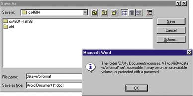
Figure 22-68 A confusing and seemingly irrelevant error message.
In this Save As operation the user was attempting to save a file of unformatted data, calling it “data w/o format” for short. The resulting error message is confusing because it is about a folder not being accessible because of things like unavailable volumes or password protection. This seems about as unclear and unrelated to the task as it could be.
In fact, the only way to understand this message is to understand something more fundamental about the Save As dialogue box. The design of the File Name: text field is overloaded. The usual input entered here is a file name, which is by default associated with the folder name in the Save in: field at the top.
But some designer must have said “That is fine for all the GUI wusses, but what about our legions of former DOS users, our heroic power users who want to enter the full command-style directory path name for the file?” So the design was overloaded to accept full path names of files as well, but no clue was added to the labeling to reveal this option. Because path names contain the slash (/) as a dedicated delimiter, a slash within a file name cannot be parsed unambiguously so it is not allowed.
In our class discussions of this example, it usually takes students a long time to realize that the design solution is to unload the overloading by the simple addition of a third text field at the bottom for Full file directory path name:. Slashes in file names still cannot be allowed because any file name can also appear in a path name, but at least now, when a slash does appear in a file name in the File Name: field, a simple message, “Slash is not allowed in file names,” can be used to give a clear indication of the real error.
The most recent version of Word, as of this writing, half-way solves the problem by adding to the original error message: “or the file name contains a or /”.
Precise wording
Support user understanding of feedback content by precise expression of meaning through precise word choices. Do not allow wording of feedback to be treated as an unimportant part of interaction design.
Completeness of feedback
Support user understanding of feedback by providing complete information through sufficient expression of meaning, to disambiguate, make more precise, and clarify. For each feedback message, the designer should ask “Is there enough information?” “Are there enough words used to distinguish cases?”
Be complete in your design of feedback; include enough information for users to fully understand outcomes and be either confident that their command worked or certain about why it did not
The expression of a cognitive affordance should be complete enough to allow users to fully understand the outcomes of their actions and the status of their course of interaction.
Prevent loss of productivity due to hesitation, pondering
Having to ponder over the meaning of feedback can lead to lost productivity. Help your users move on to the next step quickly, even if it is error recovery.
Add supplementary information, if necessary
Short feedback is not necessarily the most effective. If necessary, add additional information to make sure that your feedback information is complete and sufficient.
Give enough information for users to make confident decisions about the status of their course of interaction
Help users understand what the real error is
Give enough information about the possibilities or alternatives so users can make an informed response to a confirmation request
In Figure 22-69 is an exit message from the Microsoft Outlook email system that we used previously (Figure 22-44) as an example about completeness of cognitive affordances and giving enough information for users to make confident decisions. This message is displayed when a user tries to exit the Outlook email system before all queued messages are sent. We also use it as an example here in the assessment section, even though technically the part of the system response that is at issue here is the lack of a cognitive affordance as feed-forward.
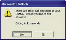
Figure 22-69 Not enough information in this feedback, or feed-forward, message.
When users first encountered this message, they were often unsure about how to respond because it did not inform them of the consequences of either choice. What are the consequences of “exiting anyway?” One would hope that the system could go ahead and send the messages, regardless, but why then did it give this message? So maybe the user will lose those messages. What made it worse was the fact that control would be snatched away in 8 seconds, and counting. How imperious!
Most users we tested with took the right one, it seems, by making what they thought to be the conservative choice, not exiting yet. Figure 22-70 is an updated version of this same message, only this time it gives a bit more information about the repercussions of exiting prematurely, but it still does not say if exiting will cause messages to be lost or just queued for later.
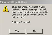
Figure 22-70 This is better, but still could be more helpful.
Tone of feedback expression
When writing the content of a feedback message, it can be tempting to castigate the user for making a “stupid” mistake. As a professional interaction designer you must separate yourself from those feelings and put yourselves in the shoes of the user. You cannot know the conditions under which your error messages are received, but the occurrence of errors could well mean that the user is already in a stressful situation so do not be guilty of adding to the user’s distress with a caustic, sarcastic, or scornful tone.
Design feedback wording, especially error messages, for positive psychological impact
Make the system take blame for errors
Be positive, to encourage
Provide helpful, informative error messages, not “cute” unhelpful messages
The almost certainly apocryphal message in Figure 22-71 is an extreme example of an unhelpful message.
Figure 22-71 Useless message shows poor designer attitude.
Usage centeredness of feedback
Employ usage-centered wording, the language of the user and the work context, in displays, messages, and other feedback
We mentioned that user centeredness is a design concept that often seems unclear to students and some practitioners. Because it is mainly about using the vocabulary and concepts of the user’s work context rather than the technical vocabulary and context of the system, we should probably call it “work-context-centered” design. This section is about how usage centeredness applies to feedback in the assessment part of the Interaction Cycle.
In Figure 22-72 we see a real email system feedback message received by one of us many years ago, clearly system centered, if anything, and not user or work context centered. Systems people will argue correctly that the technical information in this message is valuable to them in tracing the source of the problem.
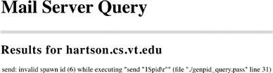
Figure 22-72 Gobbledygook email message.
That is not the issue here; rather it is a question of the message audience. This message is sent to users, not the systems people, and it is clearly an unacceptable message to users. Designers must seek ways to get the right message to the right audience. One solution is to give a non-technical explanation here and add a button that says “Click here for a technical description of the problem for your systems representative.” Then put this jargon in the next message box.
This message in the next example is similar in some ways, but is more interesting in other ways.
As an in-class exercise, we used to display the computer message in Figure 22-73 and ask the students to comment on it.
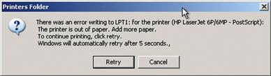
Figure 22-73 Classic system-centered “error” message.
Some students, usually ones who were not engineering majors, would react negatively from the start. After a lot of the usual comments pro and con, we would ask the class whether they thought it was usage centered. This usually caused some confusion and much disagreement. Then we ask a very specific question: Do you think this message is really about an error? In truth, the correct answer to this depends on your viewpoint, a reply we never got from a student.
The system-centered answer is yes; technically an “error condition” arose in the operating system error-handling component when it got an interrupt from the printer, flagging a situation in which there is a need for action to fix a problem. The process used inside the operating system is carried out by what the software systems people call an error-handling routine. This answer is correct but not absolute.
From a user-, usage-, or work-context-centered view, it is definitely and 100% not an error. If you use the printer enough, it will run out of paper and you will have to replace the supply. So running out of paper is part of the normal workflow, a natural occurrence that signals a point where the human has a responsibility within the overall collaborative human-system task flow. From this perspective, we told our students we had to conclude that this was not an acceptable message to send to a user; it was not usage centered.
We decided that this exercise was a definitive litmus test for determining whether students could think user centrically. Some of our undergraduate CS students never got it. They stubbornly stuck to their judgment that there was an error and that it was perfectly appropriate to send this message to a user to get attention to attending the error.
Each semester we told them that it was okay that they did not “get it”; that they could still live productive lives, just not in any UX development role. Not everyone is cut out to take on a UX role in a project.
Just to finish up the analysis of this message:
Why is the message box titled Printers Folder? Does this refer to some system aspect that should be opaque to the user?
The printer is out of paper. Add paper. Is the need to add paper when the printer is out of paper not obvious enough? If so, the Add paper imperative is redundant and even condescending.
To continue printing, click retry. Why “click retry” if the objective is to continue printing? Why not Click continue printing and label the Retry button as Continue Printing?
Windows will automatically retry after 5 seconds. First, it should be Windows will periodically try to continue printing. Beyond that, this may seem to be a useless and maybe intrusive “feature” but it could be helpful if the printer is remote—the user would not have to go back and forth to click on the button here and to see if the printer is printing. Beyond that, the 5 seconds does seem a bit arbitrary and probably too short a time to get new paper loaded, but this is not harmful.
Consistency of feedback
Be consistent with feedback
In the context of feedback, the requirement for consistency is essentially the same as it was for the expression of cognitive affordances: choose one term for each concept and use it throughout the application.
Label outcome or destination screen or object consistently with starting point and action
This guideline is a special case of consistency that applies to a situation where a button or menu selection leads the user to a new screen or dialogue box, a common occurrence in interaction flow. This guideline requires that the name of the destination given in the departure button label or menu choice be the same as its name when you arrive at the new screen or dialogue box. The next example is typical of a common violation of this guideline.
In Figure 22-74 we see an overlay of two partial windows within a personal document system. In the bottom layer is a menu listing some possible operations within this document system. When you click on Add New Entry, you go to the window in the top layer, but the title of that window is not Add New Entry, it is Document Data Entry. To a user, this could mean the same thing, but the words used at the point of departure were Add New Entry.
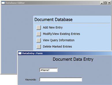
Figure 22-74 Arrival label does not match departure label
(screen image courtesy of Raphael Summers).
Finding different words, Document Data Entry, at the destination can be confusing and can raise doubts about the success of the user action. The explanation given us by the designer was that the destination window in the top layer is a destination shared by both the Add New Entry menu choice and the Modify/View Existing Entries menu choice. Because state variables are passed in the transition, the corresponding functionality is applied correctly, but the same window was used to do the processing.
Therefore, the designer had picked a name that sort of represented both menu choices. Our opinion was that the destination window name ended up representing neither choice well and it takes only a little more effort to use two separate windows.
In this example, consider the Simple Search tab, displayed at the top of most screens in this digital library application and shown in Figure 22-75.
Figure 22-75 The Simple Search tab at the top of a digital library application screen.
That tab leads to a screen that is labeled Search all bibliographic fields, as shown in Figure 22-76.
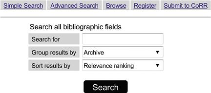
Figure 22-76 However, it leads to Search all bibliographic fields, not a match.
We had to conclude that the departure label on the Simple Search tab and the destination label, Search all bibliographic fields, do not match well enough because we observed users showing surprise upon arrival and not being sure about whether they had arrived at the right place. We suggested a slight change in the wording of the destination label for the Simple Search function to include the same name, Simple Search, used in the tab and not sacrifice the additional information in the destination label, Search all bibliographic fields, as shown in Figure 22-77.
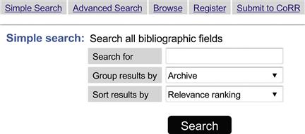
Figure 22-77 Problem fixed by adding Simple Search: to the destination label.
User control over feedback detail
Organize feedback for ease of understanding
When a significant volume of feedback detail is available, it is best not to overwhelm the user by giving all the information at once. Rather, give the most important information, establishing the nature of the situation, upfront and provide controls affording the user a way to ask for more details, as needed.
Provide user control over amount and detail of feedback
Give only most important information at first; more on demand
22.9.6 Assessment of Information Displays
Information organization for presentation
Organize information displays for ease of understanding
There are entire books available on the topics of information visualization and information display design, among which the work of Tufte (1983, 1990, 1997) is perhaps the most well known. We do not attempt to duplicate that material here, but rather reference the interested reader to pursue these topics in detail from those sources. We can, however, offer a few simple guidelines to help with the routine presentation of information in your displays of results.
Eliminate unnecessary words
Group related information
Control density of displays; use white space to set off
Columns are easier to read than wide rows
This guideline is the reason that newspapers are printed in columns.
Use abstraction per Shneiderman’s “mantra”: Overview first; zoom and filter; details on demand
Ben Shneiderman has a “mantra” for controlling complexity in information display design (Shneiderman & Plaisant, 2005, p. 583):
Train passengers in Europe will notice entering passengers competing for seats that face the direction of travel. At first, it might seem that this is simply about what people were used to in cars and busses. But some people we interviewed had stronger feelings about it, saying they really were uncomfortable traveling backward and could not enjoy the scenery nearly as much that way.
Believing people in both seats see the same things out the window, we wondered if it really mattered, so we did a little psychological experiment and compared our own user experiences from both sides. We began to think about the view in the train window as an information display.
In terms of bandwidth, though, it did not seem to matter; the total amount of viewable information was the same. All passengers see the same things and they see each thing for the same amount of time. Then we recalled Ben Shneiderman’s rules for controlling complexity in information display design (see earlier discussion).
Applying this guideline to the view from a train window, we realized that a passenger traveling forward is moving toward what is in the view. This traveler sees the overview in the distance first, selects aspects of interest, and, as the trains goes by, zooms in on those aspects for details.
In contrast, a passenger traveling backward sees the close-up details first, which then zoom out and fade into an overview in the distance. But this close-up view is not very useful because it arrives too soon without a point of focus. By the time the passenger identifies something of interest, the chance to zoom in on it has passed; it is already getting further away. The result can be an unsatisfying user experience.
Visual bandwidth for information display
One of the factors that limit the ability of users to perceive and process displayed information is visual bandwidth of the display medium. If we are talking about the usual computer display, we must use a display monitor with a very small space for all our information presentation. This is tiny in comparison to, say, a newspaper.
When folded open, a newspaper has many times the area, and many times the capacity to display information, of the average computer screen. And a reader/user can scan or browse a newspaper much more rapidly. Reading devices such as Amazon’s Kindle™ and Apple’s iPad™ are pretty good for reading and thumbing through whole book pages, but lack the visual bandwidth afforded for “fanning” through pages for perusal or scanning provided by a real paper book.
Designs that speed up scrolling and paging do help but it is difficult to beat the browsing bandwidth of paper. A reader can put a finger in one page of a newspaper, scan the major stories on another page, and flash back effortlessly to the “book-marked” page for detailed reading.
In our UX classes we used to have an in-class demonstration to illustrate this concept. We started with sheets of paper covered with printed text. Then we gave students a set of cardboard pieces the same size as the paper but each with a smaller cutout through which they must read the text.
One had a narrow vertical cutout that the reader must scan, or scroll, horizontally across the page. Another had a low horizontal cutout that the reader must scan vertically up and down the page. A third one had a small square in the middle that limited visual bandwidth in both vertical and horizontal directions and required the user to scroll in both directions.
You can achieve the same effect on a computer screen by resizing the window and adjusting the width and height accordingly. For example, in Figure 22-78, you can see limited horizontal visual bandwidth, requiring excessive horizontal scrolling to read. In Figure 22-79, you can see limited vertical visual bandwidth, requiring excessive vertical scrolling to read. And in Figure 22-80, you can see limited horizontal and vertical visual bandwidth, requiring excessive scrolling in both directions. It was easy for students to conclude that any visual bandwidth limitation, plus the necessary scrolling, was a palpable barrier to the task of reading information displays.
Figure 22-78 Limited horizontal visual bandwidth.
Figure 22-79 Limited vertical visual bandwidth.
Figure 22-80 Limited horizontal and vertical visual bandwidth.
22.10 Overall
This section concludes the litany of guidelines with a set of guidelines that apply globally and generally to an overall interaction design rather than being associated with a specific part of the Interaction Cycle.
22.10.1 Overall Simplicity
As Norman (2007a) points out, most people think of simplicity in terms of a product that has all the features but operates with a single button. His point is that people genuinely want features and only say they want simplicity. At least for consumer appliances, it is all about marketing and marketing people know that features sell. And more features imply more controls.
Norman (2007a) says that even if a product design automates some features well enough so that fewer controls are necessary, people are willing to pay more for machines with more controls. Users do not want to give up control. Also, more controls give the appearance of more power, more functionality, and more features.
But in the computer you use to get things done at work, complexity can be a barrier to productivity. The desire is for full functionality without sacrificing UX.
Do not try to achieve the appearance of simplicity by just reducing usefulness
A well-known Web-search service provider seeking improved ease of use “simplified” their search page. Unfortunately, they did it without a real understanding of what simplicity means. They just reduced their functionality but did nothing to improve the usability of the remaining functionality. The result was a less useful search function and the user is still left to figure out how to use it.
Organize complex systems to make the most frequent operations simple
Some systems cannot be entirely simple, but you can still design to keep some of the most frequently used operations or tasks as simple as possible.
Years ago our university began using a special digital phone system. It had, and still has, an enormous amount of functionality. Everyone in the university was asked to attend a one-day workshop on how to use the new phone system. Most employees rebelled and refused to attend a workshop to learn how to use a telephone—something they had been using all their lives.
They were issued a 50-page user’s guide entitled “Excerpts from the PhoneMail System User Guide.” Fifty pages and still an excerpt; who is going to read that? The answer is that almost everyone had to read at least parts of it because the designer’s approach was to make all functions equally difficult to do. The 10% of the functionality that people had to use every day was just as mysterious as the other 90% that most people would never need. Decades later, people still do not like that phone system, but they were captive users.
22.10.2 Overall Consistency
Historically, “be consistent” is one of the earliest interaction design guidelines ever and probably the most often quoted. Things that work the same way in one place as they do in another just make logical sense.
But when HCI researchers have looked closely at the concept of consistency in interaction design over the years, many have concluded that it is often difficult to pin it down in specific designs. Grudin (1989) shows that the concept is difficult to define (p. 1164) and hard to identify in a design, concluding that it is an issue without much real substance. The transfer effects that support ease of learning can conflict with ease of use (p. 1166). And blind adherence without interpretation within usage context to the rule can lead to foolish or undesirable consistency, as shown in the next example.
Be consistent by doing similar things in similar ways
Suppose that the menu choices in all pull-down menus in an application are ordered alphabetically for fast searching. But one pull-down menu is in a form in which the user enters a mailing address. One of the fields in the form is for “country” and the pull-down list contains dozens of entries. Because the majority of customers for this Website are expected to live in the United States, ease of use will be better in a design with “United States” at the top of the pull-down list instead of near the bottom of an alphabetical list, even though that is inconsistent with all the other pull-down menus in the application.
Use consistent layout/location for objects across screens
Maintain custom style guides to support consistency
Structural consistency
We think Reisner (1977) helped clarify the concept of consistency, in the context of database query languages, when she coined the term “structural consistency.” In referring to the use of query languages, structural consistency simply required similar syntax (wording or user actions) to denote similar or related semantics. So, in our context, the expression of cognitive affordances for two similar functions should also be similar.
However, in some situations, consistency can work against distinguishability. For example, if a design contains two different kinds of delete functions, one of which is used routinely to delete objects within an application, but the other is dangerous because it applies to files and folders at a higher level, the need to distinguish these delete functions for safety may override this guideline for making them similar.
Use structurally similar names and labels for objects and functions that are structurally similar
A simple example is seen in the common Next and Previous buttons that might appear, for example, for navigation among pictures in an online photo gallery. Although these two buttons are opposite in meaning, they both are a similar kind of thing; they are symmetric and structurally similar navigation controls. Therefore, they should be labeled in a similar way. For example, Go forward and Previous picture are not as symmetric and not as similar from a linguistic perspective.
Consistency is not absolute
Many design situations have more than one consistency issue and sometimes they trade-off against each other. We have a good example to illustrate.
Consider the case of multi-blade screwdrivers that are handy for dealing with different sizes and types of screws. In particular, they each have both flat-blade and Phillips-blade driver bits and each of these types comes in both small and large sizes.
Figure 22-81 illustrates two of these so-called “4-in-1” screwdrivers. As part of a discussion of consistency, we bring screwdrivers like these to class for an in-class exercise with students. We begin by showing the class the screwdrivers and explain how the bits are interchangeable to get the needed combination of blade type and size.
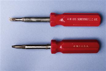
Figure 22-81 Multipurpose screwdrivers.
Next we pick a volunteer to hold and study one of these tools and then speak to the class about consistency issues in its design. They pull it apart, as shown in Figure 22-82.
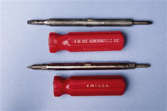
Figure 22-82 Revealing the inner parts of the two screwdrivers.
The conclusion always is that it is a consistent design. We have another volunteer study the other screwdriver, always reaching the same conclusion. Then we show the class that there are differences between the two designs, which become apparent when you compare the bits at the ends of each tool, as shown in Figure 22-83.
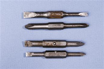
Figure 22-83 The two sets of screwdriver bits.
One tool is consistent by blade type, having both flat blades, large and small, on one insertable piece and both Phillips blades on the other piece. The other tool is consistent by size, having both large blades on one insertable piece and both small blades on the other piece.
We now ask them if they still think each design is consistent and they do. They are each consistent; they each have intra-product consistency. Neither is more consistent than the other, but each is consistent in a different way and are not consistent with each other.
Consistency in design is supposed to aid predictability but, because there is more than one way to be consistent in this example, you still lack inter-product consistency and you do not necessarily get predictability. Such is one difficulty of interpreting and applying this seemingly simple design guideline.
Consistency can work against innovation
Final caveat: While a style guide works in favor of consistency and reuse, remember that is also can be a barrier to inventiveness and innovation (Kantrovich, 2004). Being the same all the time is not necessarily cool! When the need arises to break with consistency for the sake of innovation, throw off the constraints and barriers and dive through the wormhole to the creative side.
22.10.3 Humor
Avoid poor attempts at humor
Poor attempts at humor usually do not work. It is easy to do humor badly and it can easily be misinterpreted by users. You may be sitting in your office feeling good and want to write a cute error message, but users receiving it may be tired and stressed and the last thing they need is the irritation of a bad joke.
22.10.4 Anthropomorphism
Simply put, anthropomorphism is the attribution of human characteristics to non-human objects. We do it every day; it is a form of humor. You say “my car is sick today” or “my computer does not like me” and everyone understands what you mean. In interaction design, however, the context is usually about getting work done and anthropomorphism can be less appreciated, especially if the user is already having difficulties.
Avoiding anthropomorphism
Avoid the use of anthropomorphism in interaction designs
Shneiderman and Plaisant (2005, pp. 80, 484) say that a model of computers that leads one to believe they can think, know, or understand in ways that humans do is erroneous and dishonest. When the deception is revealed, it undermines trust.
Avoid using first-person speech in system dialogue
“Sorry, but I cannot find the file you need” is less honest and no more informative than something such as “File not found” or “File does not exist.” If attribution must be given to what it is that cannot find your file, you can reduce anthropomorphism by using the third person, referring to the software, as in “Windows is unable to find the application that created this file.” This guideline urges us to especially eschew chatty and over-friendly use of first-person cuteness, as we see in the next example.
Figure 22-84 contains a message from a database system after a search request had been submitted. Ignoring other obvious UX problems with this dialogue box and message, most users find this kind of use of first person as dishonest, demeaning, and unnecessary.
Avoid condescending offers to help
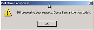
Figure 22-84 Message tries to make computer seem like a person.
Just when you think all hope is lost, then along comes Clippy or Bob, your personal office assistant or helpful agent. How intrusive and ingratiating! Most users dislike this kind of pandering and insinuating into your affairs, offering blandishments of hope when real help is preferred.
People expect other humans to be able to solve problems better than a machine. If your interaction dialogue portrays the machine as a human, users will expect more. When you cannot deliver, however, it is overpromising. The example that follows is ridiculous and cute but it also makes our point.
Clearly the pop-up “help” in Figure 22-85 is not a real example, but this kind of pop-up in general can be intrusive. In real usage situations, most users expect better.
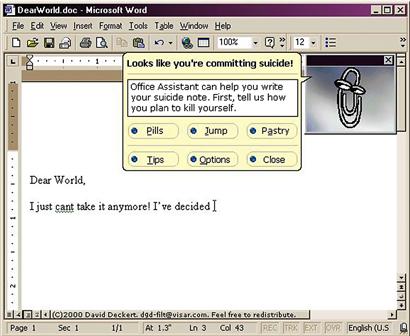
Figure 22-85 Only too glad to help.
The case in favor of anthropomorphism
On the affirmative side, Murano (2006) shows that, in some contexts, anthropomorphic feedback can be more effective than the equivalent non-anthropomorphic feedback. He also makes the case for why users sometimes prefer anthropomorphic feedback, based on subconscious social behavior of humans toward computers.
In his first study, Murano (2006) explored user reactions to language-learning software with speech input and output using speech recognition. Users were given anthropomorphic feedback in the form of dynamically loaded and software-activated video clips of a real language tutor giving feedback.
In this kind of software usage situation, where the objectives and interaction are very similar to what would be expected from a human language tutor, “the statistical results suggested the anthropomorphic feedback to be more effective. Users were able to self-correct their pronunciation errors more effectively with the anthropomorphic feedback. Furthermore it was clear that users preferred the anthropomorphic feedback.” The positive results are not surprising because this kind of application naturally uses human–computer interaction that is very close to natural human-to-human interaction.
In a second study, Murano (2006) looked at Unix for a rank beginner, again employing speech input and output with speech recognition and again employing anthropomorphic video clips of real humans as feedback. He found anthropomorphic feedback to be more effective and more desired by users than other feedback.
However, we cannot see natural language interaction with Unix as a viable long-term alternative. Unix is complex and difficult to learn, not intended for beginners. Anyone intending to use Unix for more than just an experiment will perforce not remain a beginner for long. Any expert Unix user we have ever seen would surely find speech interaction less convenient and less precise than the lightning-fast typed commands usually associated with UNIX usage. If the interaction in this study was not anthropomorphic per se, speech input and output can convey the feeling of being the “equivalent” of anthropomorphic.
In his third study, Murano (2006) determined that, for direction-finding tasks, a map plus some guiding text was more effective than anthropomorphic feedback using video clips of a human giving directions verbally, with user preferences about evenly divided. The bottom line for Murano is that some application domains are more suited for anthropomorphic interaction than others.
Well-known studies by Reeves and Nass (1996) attempted to answer the question why anthropomorphic interaction might be better for some users in some kinds of applications. They concluded that people naturally tend to interact with a computer the same social way we interact with people, especially in cases where feedback is given as natural language speech (Nass, Steuer, & Tauber, 1994). People treat computers in a social manner if the output of computers treats them in a social manner.
While a social manner of interaction did seem to be effective and desired by users of tasks that have a human-to-human counterpart, including tasks such as natural language learning and tutoring in a teacher–student kind of interaction, it is unlikely that a mutually social style and anthropomorphic interaction would have a place in the thousands of other kinds of tasks that make up a large portion of real computer usage—installing driver software, creating a text document, updating a data spreadsheet,
The bottom line for us is that users may think they would prefer anthropomorphic user-computer dialogue because it is somehow friendlier or maybe they would prefer to interact with another human rather than having to interact with a computer. But the fact remains: a computer is not human. So eventually expectations will not be met. Especially for the use of computers to get things done in business and work environments, we expect users to tire quickly of anthropomorphic feedback, particularly if it soon becomes boring by a lack of variety over time.
22.10.5 Tone and Psychological Impact
Use a tone in dialogue that support a positive psychological impact
Avoid violent, negative, demeaning terms
Avoid use of psychologically threatening terms, such as “illegal,” “invalid,” and “abort”
Avoid use of the term “hit”; instead use “press” or “click”
22.10.6 Use of Sound and Color
The use of color in displays is a topic that fills volumes of publications for research and practice. Read more about it in some of these references (Nowell, Schulman, & Hix, 2002; Rice, 1991a, 1991b). The use of color in interaction design, or any kind of design, is a complex topic, well beyond the scope of this book.
Avoid irritation with annoying sound and color in displays
Bright colors, blinking graphics, and harsh audio not only are annoying but can have a negative effect on user productivity and the user experience over the long-term.
Use color conservatively
Do not count on color to convey much information in your designs. It is good advice to render your design in black and white first so that you know it works without reliance on color. That will rule out usability problems some users may have with color perception due to different forms of color blindness, for example.
At the end of the day, color decisions are often out of the hands of interaction designers, anyway, being constrained by corporate or organizational standards and branding concerns.
Use pastels, not bright colors
Bright colors seem attractive at first, but soon lead to distraction, visual fatigue, and distaste.
Be aware of color conventions (e.g., avoid red, except for urgency)
Again, color conventions are beyond our scope. They are complicated and differ with international cultural conventions. One clear-cut convention in our Western culture is about the use of red. Beyond very limited use for emergency or urgent situations, red, especially blinking red, is alarming as well as irritating and distracting.
We heard a story at the Social Security Administration that they had an early design in which any required field in a form would blink in red if the user tried to save the form or go to the next form before filling in these fields. Later someone on the team read that blinking red can bring out latent epilepsy in some people and it got changed.
Figure 22-86 is a map of the Outer Banks in North Carolina. We have never been able to use this map easily because it violates deeply established color conventions used in maps. Blue is almost always used to denote water in maps, while gray, brown, green, or something similar is used for land. In this map, however, blue, even a deep blue, is used to represent land and because there is about as much land as sea in this map, users experience a cognitive disconnect that confuses and makes it difficult to get oriented.
Watch out for focusing problem with red and blue
Figure 22-86 Map of Outer Banks, but which is water and which is land?
Chromostereopsis is the phenomenon humans face when viewing an image containing significant amounts of pure red and pure blue. Because red and blue are at opposite ends of the visual light spectrum and occur at different frequencies, they focus at slightly different depths within the eye and can appear to be at different distances from the eye. Adjacent red and blue in an image can cause the muscles used to focus the eye to oscillate, moving back and forth between the two colors, eventually leading to blurriness and fatigue.
In Figure 22-87 we placed adjacent patches of blue and red. If the color reproduction in the book is good, some readers may experience chromostereopsis while viewing this figure.

Figure 22-87 Chromostereopsis: humans focus at different depths in the eye for red and blue.
22.10.7 Gratuitous Graphics
Jon Meads, our friend who runs Usability Architects, Inc., wants us to understand the difference between graphic design and usability (Meads, 1999):
As usability consultants, we’re often asked by potential clients to bring in a portfolio of “screens” that we’ve designed. But we don’t have any, because we don’t design “screens”; we design interaction, the intended behavior by which people will use a product or a Website.
He points out that graphic design is good for attracting attention, getting a user to stop at your Website, but it takes good UX to get them to stay at your Website. He says that Web pages that dazzle can also distract and turn off users who just want to get something done. It is a question of balance of look and feel, and behavior.
Avoid fancy or cute design without a real purpose
To impress, all you need is a trebuchet and a piano.
– Chris Stevens, Northern Exposure
A fancy appearance to a software application or Website can be an asset, but while bling-bling makes for nice jewelry, the “flash and trash” approach to interaction design can detract from usability. As Jon Meads puts it, “Usability is not graphic design.”
Aaron Marcus (2002) agrees, warning us that in the rush to provide aesthetics, fun, and pleasure in the UX, we may overdo it and move toward a commercialization of UX that will, in fact, dehumanize the user experience.
22.10.8 Text Legibility
It is obvious that text cannot convey the intended content if it is illegible.
Make presentation of text legible
Make font size large enough for all users
Use good contrast with background
Use both color and intensity to provide contrast.
Use mixed case for extensive text
Avoid too many different fonts, sizes
Use legible fonts
Try Ariel, sans serif Verdana, or Georgia for online reading.
Use color other than blue for text
It is difficult for the human retina to focus on pure blue for reading.
Accommodate sensory disabilities and limitations
22.10.9 User Preferences
Allow user settings, preference options to control presentational parameters
Afford users control of sound levels, blinking, color, and so on. Vision-impaired users, especially, need preference settings or options to adjust the text size in application displays and possibly to hear an alternative audio version of the text.
22.10.10 Accommodation of User Differences
As we have said, a treatise on accessibility is outside our scope and is treated well in the literature. Nonetheless, all interaction designers should be aware of the requirement to accommodate users with special needs.
Accommodate different levels of expertise/experience with preferences
Most of us have seen this sign in our offices or on a bumper sticker: Lead, follow, or get out of the way. In interaction design, we might modify that slightly to: Lead, follow, and get out of the way.
Lead novice users with adequate cognitive affordances
Follow intermittent or intermediate users with lots of feedback to keep them on track
Get out of the way of expert users; keep cognitive affordances from interfering with their physical actions
Constantine (1994b) has made the case to design for intermediate users, which he calls the most neglected user segment. He claims that there are more intermediate users than beginners or experts.
Don’t let affordances for new users be performance barriers to experienced users
Although cognitive affordances provide essential scaffolding for inexperienced users, expert users interested in pure productivity need effective physical affordances and few cognitive affordances.
22.10.11 Helpful Help
Be helpful with Help
Do not send your users to Help in a handbasket. For those who share our warped sense of humor, we quote from the manual for Dirk Gently’s (Adams, 1990, p. 101) electronic I Ching calculator as an example of perhaps not so helpful help. As the protagonist consults the calculator for help to a burning personal question,
The little book of instructions suggested that he should simply concentrate “soulfully” on the question which was “besieging” him, write it down, ponder on it, enjoy the silence, and then once he had achieved inner harmony and tranquility he should push the red button. There wasn’t a red button, but there was a blue button marked ‘Red’ and this Dirk took to be the one.
Entertaining, yes; helpful, no. Note that it also makes reference at the end to an amusing little problem with cognitive affordance consistency.
22.11 Conclusions
1 These recommendations are adapted from the following books, which are excellent guides for handheld designers: Weiss, S. (2002). Handheld Usability. West Sussex, England: John Wiley & Sons, Ltd.; and Bergman, E. (Ed.)(2000). Information Appliances and Beyond. San Francisco: Morgan Kaufmann Publishers.
2 Bergman, E., & Haitani, R. (2000). Designing the Palmpilot: A conversation with Rob Haitani. In E. Bergman (Ed.), Information Appliances and Beyond. San Francisco: Morgan Kaufmann, pp. 82–102.
3 http://eaganj.free.fr/code/mail-plugin/
4 http://www.wengerna.com/giant-knife-16999
5 http://www.amazon.com/Wenger-16999-Giant-Swiss-Knife/dp/B001DZTJRQ