
Chapter 22
UX Design Guidelines
To err is human; forgive by design.
– Anonymous
Objectives
After reading this chapter, you will:
1. Appreciate the difficulties in using and interpreting UX design guidelines
2. Understand the role of human memory limitations in guidelines
3. Understand and apply some of the basic UX design guidelines with respect to user actions for each stage of the Interaction Cycle
22.1 Introduction
22.1.1 Scope and Universality
There are, of course, many books and articles on design guidelines for graphical user interfaces (GUIs) and other user interfaces and their widgets—how to create and employ windows, buttons, pull-down menus, pop-up menus, cascading menus, icons, dialogue boxes, check boxes, radio buttons, options menus, forms, and so on. But we want you to think about interaction design and design guidelines much more broadly than that, even well beyond Web pages and mobile devices.
You will find that this chapter takes a broader approach, transcending design just for computer interfaces and particular platforms, media, or devices. There is a world of designs out there and, as Don Norman (1990) says, seeing the guidelines applied to the design of everyday things helps us understand the application of guidelines to interaction by humans with almost anything kind of device or system.
Design (UX) Guidelines
A UX, or interaction, design guideline is a statement suggesting recommendations and considerations to inform the design of a specific aspect or component of interaction in a certain context. Some design guidelines come from study data, but most come from principles, maxims, and experience.
User Interfaces for Handheld Devices
Brad A. Myers
Carnegie Mellon University
The term “handheld devices” includes mobile phones (in particular, “smartphones,” which have more elaborate functions and user interfaces), as well as personal digital assistants, pagers, calculators, and specialized devices such as handheld scanners and data entry devices. Portable devices that are larger than the size of a hand, such as tablets such as the Apple iPad, are generally not considered to be handheld devices.
How do interfaces designed for handheld devices differ from conventional user interfaces? The first point to emphasize is that all of the processes and techniques described in this book, from contextual inquiries through iterative prototyping through user testing, all apply to handheld user interfaces, just as for any other user interface, so the process and techniques are not different. The key difference with handheld devices is the context of use. By definition, handheld devices are used while being held in one hand, which means that generally at most one other hand is available to perform input. Furthermore, handheld devices are mostly used on the go, which means that the user is busy doing other tasks (such as walking, talking on the phone, or taking an inventory at a store) at the same time as using the handheld. Another key difference is that handhelds have much smaller screens than conventional computers or tablets. Thus, information designs and even interaction techniques designed for conventional computers may not work on handhelds. For example, multicolumn Web pages are very difficult to read on handhelds, and a pop-up menu with more than 10 items cannot be used easily. Finally, because handheld devices are often controlled with a finger, as there typically is not a mouse pointer, target areas must be sufficiently large so that users can select what they want accurately. Some handhelds require the use of a stylus (a pen-like tool for pointing to or writing on the screen) instead of (or in addition to) a finger, which means that smaller items can be selected. However, stylus-based interfaces for handhelds are becoming less common.
The implications of these differences on the design of handheld user interfaces include the following.1:
 Optimize interactions for immediate use. User interfaces on handheld devices must make the most common actions available immediately. Users expect to be able to pull the device out of their pocket and perform a task quickly with minimal interactions and minimal waiting. For example, because the most common task for a calendar while on the go is to look up the next appointment, the user interface should default to showing what is on the calendar for the current time. The user interface must allow the user to exit immediately as well, as users can be interrupted at any time, for example, by the phone ringing. Designers of the original Palm handheld made the important observation that the most important tasks should be performed with one click, even at the cost of consistency, so on the Palm, creating a new event at a particular time just requires tapping on the calendar screen, compared to deleting an event (which is relatively rare), requires multiple taps and dialog boxes.2
Minimize textual input. Even more than minimizing input in general, text entry continues to be difficult with small devices, so requiring more than a word or two to be typed is problematic, and applications should be resilient to typing errors.
Concise output. The information to be displayed must be optimized for the small displays of these devices. Designs for desktops will typically need to be redesigned to make more efficient use of the screen space. For example, avoid blank lines.
Conform to platform conventions. Because interfaces must look like other applications on that particular handheld, iPhone user interfaces must look like other iPhone applications. If a user interface must run on different handhelds, it will probably need to be redesigned substantially. For example, the Android user interface conventions are quite different from the iPhone’s. Even within a platform there might be variations. For example, an Android phone can have a variety of physical buttons and form factors, which a user interface must use correctly.
Allow disconnected and poorly connected use. Although networks continue to improve, an application should not assume it will always be well connected. Devices can go out of range, even in the middle of a transaction, and the user interface must respond appropriately. It is never acceptable for the handheld to refuse to respond to the user even if the network disappears. Users expect to be able to perform tasks even when the network is turned off, such as on an airplane.
Because handheld devices will be the dominant way that most people in the world access computation, designing effective user interfaces for these devices will likely be a significant part of a designer’s activities.
The principles and guidelines in this chapter are universal; you will see in this chapter that the same issues apply to ATMs, elevator controls, and even highway signage. We, too, have a strong flavor of The Design of Everyday Things (Norman, 1990) in our guidelines and examples. We agree with Jokela (2004) that usability and a quality user experience are also essential in everyday consumer products.
We hope you will forgive us for excluding guidelines about internationalization or accessibility (as we advised in the Preface section, What We Do Not Cover). The book, and especially this chapter, is already large and we cannot cover everything.
Usability Principles for New Frontiers in the Virtual Environment User Experience
Theresa (Teri) A. O’Connell
President, Humans & Computers, Inc.
As the Starship Enterprise pushed ever deeper into space, Star Trek’s Captain Picard encountered the challenge of making new laws for new cultures in new environments. Usability and human factors engineers face the same challenge today in defining usability principles for virtual environments (VEs). We can learn a lot from Captain Picard’s experience. Like him, we adapt the traditional to the new, sometimes even deriving novel, untried usability principles from the old.
Some VEs, for example, training environments and advanced visual analytic tools, have a single purpose. Game worlds can have serious or entertainment purposes. Other VEs are multifunctional. Second Life can be a home-away-from home, classroom-away-from-campus, office-beyond-the-workplace, or exotic-vacation-sans-travel-time. Whatever their purpose, all VEs have one thing in common. The user experience when playing, working, learning, relaxing, or collaborating in a VE differs from that of traditional computing. So, designing a VE for a good user experience requires new ways of thinking about usability principles.
It turns out that many usability principles that apply when you are playing the role of a healer, hobnobbing with virtual buddies, or slaying monsters are the same as those that apply when you are surfing the Internet or writing a paper. We just have to apply them a bit differently in VEs. The resulting principles for design and testing are not mutually exclusive—they interact to create a successful and satisfying user experience. We can see how this works by taking a quick look at some usability principles from the perspective of the VE user experience for gamers and visual analysts.
Give users a sense of control over their experiences is a great grandparent of all usability principles. This prerequisite for user satisfaction is traditionally applied by providing obvious, consistently located, and easy-to-use controls. It applies directly to VE design in strategies, such as right clicking for immediate access to avatar controls, for example, teleportation in case of griefer attacks.
But, sometimes, collaboration requires ceding control, at least temporarily. This happens to players of massive multiplayer online role-playing games (MMORPG) and analysts manipulating huge complex visual analytic data sets when their success depends on collaboration. Adapting the user control usability principle, we give users control over their own interactions, but cede control to serve VE goals, in this case, to allow collaboration. For example, online game dashboard adaptability gives gamers autonomy over what is theirs. But an inability to steal the microphone while another player talks prevents interruptions, serving the goal of courteous collaboration. During testing, we measure collaboration success by comparing game scores of teams that must take turns sending voice communications to collaborate and teams that do not.
Engage the user is the e-commerce mantra. Its sticky goal is to keep shoppers onsite and buying. In games, the usability principle is engagement trumps everything else. Engagement is a primary purpose of VE design for many reasons. Engagement increases enjoyment and enhances learning. It draws gamers into gameplay, e.g., for example, by providing an enjoyable simple quest for novices and then progressing them to higher challenge levels.
Engagement enriches the user experience. But engagement intersects with another classic usability principle, prevent visual overload, for example, by streamlining backgrounds or minimizing animations. VEs can be visually dense. We engage gamers and inform analysts with lots of interesting things to look at, but we risk distraction and visual overload.
In first-person shooter games such as Left 4 Dead, the element of surprise is integral to engagement. In adventure games, while distracting, a dense, engaging background harbors surprise. In such a case, distraction is okay. The new principle becomes control visual overload, making sure that visually rich displays engage the user but do not impede VE goals.
Instead of minimizing animation, we turn animation into a tool to attract attention and engage, for example, with surprise attacks by nonplaying characters. In visual analytic tools, we sometimes interrupt workflow with an eye-catching animation when important new information becomes available. During testing, we measure impact on satisfaction by comparing survey responses from players or analysts who experience interruption and those who do not. We survey players and analysts to learn how engaging they consider different aspects of the user experience, for example, building game scores or answering a question in an analytical VE.
Visual density also leads to a usability principle that requires the VE to assist analysis by helping analysts identify important data quickly, for example, suspicious entities. To test, we measure success by logging and counting interactions with this data, for example, the number of times analysts manipulate isolated data points into clusters or social networks to investigate entity connections. Testing against ground truth, we count the number of known connections analysts identified. We use eye tracking to create heat maps showing analysts’ gaze paths and fixations. If their eyes continuously scan the environment, but never rest on salient new data, we know it is likely that the background is too dense and impedes analysis.
When we design and test the VE for a high-quality user experience, just like Captain Picard, we are going to encounter unimagined challenges. One of our strategies will be to update traditional usability principles. This means that every design or testing team facing the challenges of producing a VE that leads to a high-quality user experience needs a person who has a strong background in fields such as the human factors behind usability principles.
22.1.2 Background
We cannot talk about interaction design guidelines without giving a profound acknowledgement to what is perhaps the mother (and father) of all guidelines publications, the book of 944 design guidelines for text-based user interfaces of bygone days that Smith and Mosier of Mitre Corporation developed for the U.S. Air Force (Mosier & Smith, 1986; Smith & Mosier, 1986).
We were already working in human–computer interaction (HCI) and read it with great interest when it came out. Almost a decade later, an electronic version became available (Iannella, 1995). Other early guidelines collections include Engel and Granda (1975), Brown (1988), and Boff and Lincoln (1988).
Interaction design guidelines appropriate to the technology of the day appeared throughout the history of HCI, including “the design of idiot-proof interactive programs” (Wasserman, 1973); ground rules for a “well-behaved” system (Kennedy, 1974); design guidelines for interactive systems (Pew & Rollins, 1975); usability maxims (Lund, 1997b); and eight golden rules of interface design (Shneiderman, 1998). Every practitioner has a favorite set of design guidelines or maxims.
Eventually, of course, the attention of design guidelines followed the transition to graphical user interfaces (Nielsen, 1990; Nielsen et al., 1992). As GUIs evolved, many of the guidelines became platform specific, such as style guides for Microsoft Windows and Apple. Each has its own set of detailed requirements for compliance with the respective product lines.
As an example from the 1990s, an interactive product from Apple called Making it Macintosh (Alben, Faris, & Saddler, 1994; Apple Computer Inc, 1993) used computer animations to highlight the Macintosh user interface design principles, primarily to preserve the Macintosh look and feel. Many of the early style guides, such as OSF Motif (Open Software Foundation, 1990) and IBM’s Common User Access (Berry, 1988), came built into software tools for enforcing that particular style.
The principles behind the guidelines came mainly from human psychology. Our friend Tom Hewitt (1999) was probably the most steadfast HCI voice for understanding psychology as a foundation for UX design principles and guidelines. These principles first evolved into design guidelines in human factors engineering.
Some UX design guidelines, especially those coming from human factors, are supported with empirical data. Most guidelines, however, have earned their authority from a strong grounding in the practice and shared experience of the UX community—experience in design and evaluation, experience in analyzing and solving UX problems.
Based on the National Cancer Institute’s Research-Based Web Design and Usability Guidelines project begun in March 2000, the U.S. Department of Health and Human Services has published a book containing an extensive set of interaction design guidelines and associated reference material (U.S. Department of Health and Human Services, 2006). Each guideline has undergone extensive internal and external review with respect to tracking down its sources, estimating its relative importance in application, and determining the “strength of evidence,” for example, strong research support vs. weak research support, supporting the guideline.
As is the case in most domains, design guidelines finally opened the way for standards (Abernethy, 1993; Billingsley, 1993; L. Brown, 1993; Quesenbery, 2005; Strijland, 1993).
22.1.3 Some of Our Examples Are Intentionally Old
We have been collecting examples of good and bad interaction and other kinds of design for decades. This means that some of these examples are old. Some of these systems no longer exist. Certainly some of the problems have been fixed over time, but they are still good examples and their age shows how as a community we have advanced and improved our designs. Many new users may think the interfaces to modern commercial software applications have always been as they are. Read on.
22.2 Using and interpreting design guidelines
Are most design guidelines not obvious? When we teach these design guidelines, we usually get nods of agreement upon our statement of each guideline. There is very little controversy about the interaction design guidelines stated absolutely, out of context. Each general guideline is obvious; it just makes sense. How else would you do it?
However, when it comes to applying those same guidelines in specific usability design and evaluation situations, there is bewilderment. People are often unsure about which guidelines apply or how to apply, tailor, or interpret them in a specific design situation (Potosnak, 1988). We do not even agree on the meaning of some guidelines. As Lynn Truss (2003) says in the context of English grammar, that even considering people who are rabidly in favor of using the rules of grammar, it is impossible to get them all to agree on the rules and their interpretation and to pull in the same direction.
Bastien and Scapin (1995, p. 106) quote a study by de Souza and Bevan (1990): de Souza and Bevan “found that designers made errors, that they had difficulties with 91% of the guidelines, and that integrating detailed design guidelines with their existing experience was difficult for them.”
There is something about UX design guidelines in almost every HCI book, often specific to user interface widgets and devices. You will not see guidelines here of the type: “Menus should not contain more than X items.” That is because such guidelines are meaningless without interpretation within a design and usage context. In the presence of sweeping statements about what is right or wrong in UX design, we can only think of our long-time friend Jim Foley who said “The only correct answer to any UX design question is: It depends.”
We believe much of the difficulty stems from the broad generality, vagueness, and even contradiction within most sets of design guidelines. One of the guidelines near the top of almost any list is “be consistent,” an all-time favorite UX platitude. But what does it mean? Consistency at what level; what kind of consistency? Consistency of layout or semantic descriptors such as labels or system support for workflow?
There are many different kinds of consistency with many different meanings in many different contexts. Although we use the same words in discussions about applying the consistency guideline, we are often arguing about different things. That guideline is just too broad and requires too much interpretation for the average practitioner to fit it easily to a particular instance.
Another such overly general maxim is “keep it simple,” certainly a shoo-in to the UX design guidelines hall of fame. But, again, what is simplicity? Minimize the things users can do? It depends on the kind of users, the complexity of their work domain, their skills and expertise.
To address this vagueness and difficulty in interpretation at high levels, we have organized the guidelines in a particular way. Rather than organize the guidelines by the obvious keywords such as consistency, simplicity, and the language of the user, we have tried to associate each guideline with a specific interaction design situation by using the structure of the Interaction Cycle and the User Action Framework (UAF) to organize the guidelines. This allows specific guidelines to be linked to user actions for planning, making physical actions, or assessing feedback and user actions for sensing objects and other interaction artifacts, understanding cognitive content, or physically manipulating those objects.
Finally, we warn you, as we have done often, to use your head and not follow guidelines blindly. While design guidelines and custom style guides are useful in supporting UX design, remember that there is no substitute for a competent and experienced practitioner. Beware of the headless chicken guy unencumbered by the thought process: “Do not worry, I have the style guide.” Then you should worry, especially if the guide turns out to be a programming guide for user interface widgets.
22.3 Human memory limitations
Because some of the guidelines and much of practical user performance depend on the concepts of human working memory, we interject a short discussion of the same here, before we get into the guidelines themselves. We treat human memory here because:
it applies to most of the Interaction Cycle parts, and
it is one of the few areas of psychology that has solid empirical data supporting knowledge that is directly usable in UX design.
Our discussion of human memory here is by no means complete or authoritative. Seek a good psychology book for that. We present a potpourri of concepts that should help your understanding in applying the design guidelines related to human memory limitations.
22.3.1 Sensory Memory
Sensory memory is of very brief duration. For example, the duration of visual memory ranges from a small fraction of a second to maybe 2 seconds and is strictly about the visual pattern observed, not anything about identifying what was seen or what it means. It is raw sensory data that allow direct comparisons with temporally nearby stimuli, such as might occur in detecting voice inflection. Sensory persistence is the phenomenon of storage of the stimulus in the sensory organ, not the brain.
For example, visual persistence allows us to integrate the fast-moving sequences of individual image frames in movies or television, making them appear as a smooth integrated motion picture. There are probably not many UX design issues involving sensory memory.
22.3.2 Short-Term or Working Memory
Short-term memory, which we usually call working memory, is the type we are primarily concerned with in HCI and has a duration of about 30 seconds, a duration that can be extended by repetition or rehearsal. Other intervening activities, sometimes called “proactive interference,” will cause the contents of working memory to fade even faster.
Working memory is a buffer storage that carries information of immediate use in performing tasks. Most of this information is called “throw-away data” because its usefulness is short term and it is undesirable to keep it longer. In his famous paper, George Miller (1956) showed experimentally that under certain conditions, the typical capacity of human short-term memory is about seven plus or minus two items; often it is less.
22.3.3 Chunking
The items in short-term memory are often encodings that Simon (1974) has labeled “chunks.” A chunk is a basic human memory unit containing one piece of data that is recognizable as a single gestalt. That means for spoken expressions, for example, a chunk is a word, not a phoneme, and in written expressions a chunk is a word or even a single sentence, not a letter.
Random strings of letters can be divided into groups, which are remembered more easily. If the group is pronounceable, it is even easier to remember, even if it has no meaning. Duration trades off with capacity; all else being equal, the more chunks involved, the less time they can be retained in short-term memory.
Not counting the area code, a phone number has seven digits, not a coincidence that this exactly meets the Miller estimate of working memory capacity. If you look up a number in the phone book, you are loading your working memory with seven chunks. You should be able to retain the number if you use it within the next 30 seconds or so.
With a little rehearsal and without any intervening interruption of your attention, you can stretch this duration out to 2 minutes or longer. A telephone number is a classic example of working memory usage in daily life. If you get distracted between memory loading and usage, you may have to look the number up again, a scenario we all have experienced. If the prefix (the first three digits) is familiar, it is treated as a single chunk, making the task easier.
Sometimes items can be grouped or recoded into patterns that reduce the number of chunks. When grouping and recoding is involved, storage can trade off with processing, just as it does in computers. For example, think about keeping this pattern in your working memory:
001010110111000
On the surface, this is a string of 15 digits, beyond the working memory capacity of most people. But a clever user might notice that this is a binary number and the digits can be grouped into threes:
001 010 110 111 000
and converted easily to octal digits: 12670. With a modicum of processing we have grouped and recoded the original 15 chunks into a more manageable 5.
The following is a trick case, but it is illustrative of the principle in an extreme setting. Ostensibly this sequence of letters contains 18 items:
NTH EDO GSA WTH ECA TRU
Because there is no obvious way to group or encode them into chunks, the 18 items, as shown, represent 18 chunks. If each three-letter group spelled a word, there would be 6 chunks. If you know the trick to this example and imagine the initial “N” being moved to the right-hand end, you get not only six words, but a sentence, which amounts to one large chunk:
THE DOG SAW THE CAT RUN
22.3.4 Stacking
One of the ways user working memory limitations are affected by task performance is when task context stacking is required. This occurs when another situation arises in the middle of task performance. Before the user can continue with the original task, its context (a memory of where the user was in the task) must be put on a “stack” in the user’s memory.
This same thing happens to the context of execution of a software program when an interrupt must be processed before proceeding: the program execution context is stacked in a last-in-first-out (LIFO) data structure. Later, when the system returns to the original program, its context is “popped” from the stack and execution continues. It is pretty much the same for a human user whose primary task is interrupted. Only the stack is implemented in human working memory.
This means that user memory stacks are small in capacity and short in duration. People have leaky stacks; after enough time and interruptions, they forget what they were doing. When people get to “pop” a task context from their stacks, they get “closure,” a feeling of cognitive relief due to the lifting of the cognitive load of having to retain information in their working memories. One way to help users in this regard is to design large, complex tasks as a series of smaller operations rather than one large hierarchically structured task involving significant stacking. This lets them come up for air periodically.
22.3.5 Cognitive Load
Cognitive load is the load on working memory at a specific point in time (G. Cooper, 1998; Sweller, 1988, 1994). Cognitive load theory (Sweller, 1988, 1994) has been aimed primarily at improvement in teaching and learning through attention to the role and limitations of working memory but, of course, also applies directly to human–computer interaction. While working with the computer, users are often in danger of having their working memory overloaded. Users can get lost easily in cascading menus with lots of choices at each level or tasks that lead through large numbers of Web pages.
If you could chart the load on working memory as a function of time through the performance of a task, you would be looking at variations in the cognitive load across the task steps. Whenever memory load reaches zero, you have “task closure.” By organizing tasks into smaller operations instead of one large hierarchical structure you will reduce the average user cognitive load over time and achieve task closure more often.
22.3.6 Long-Term Memory
Information stored in short-term memory can be transferred to long-term memory by “learning,” which may involve the hard work of rehearsal and repetition. Transfer to long-term memory relies heavily on organization and structure of information already in the brain. Items transfer more easily if associations exist with items already in long-term memory.
The capacity of long-term memory is almost unlimited—a lifetime of experiences. The duration of long-term memory is also almost unlimited but retrieval is not always guaranteed. Learning, forgetting, and remembering are all associated with long-term memory. Sometimes items can be classified in more than one way. Maybe one item of a certain type goes in one place and another item of the same type goes elsewhere. As new items and new types of items come in, you revise the classification system to accommodate. Retrieval depends on being able to reconstruct structural encoding.
When we forget, items become inaccessible, but probably not lost. Sometimes forgotten or repressed information can be recalled. Electric brain stimulation can trigger reconstructions of visual and auditory memories of past events. Hypnosis can help recall vivid experiences of years ago. Some evidence indicates that hypnosis increases willingness to recall rather than ability to recall.
22.3.7 Memory Considerations and Shortcuts in Command versus GUI Selection Interaction Styles
Recognition vs. recall
Because we know that computers are better at memory and humans are better at pattern recognition, we design interaction to play to each other’s strengths. One way to relieve human memory requirements in interaction design is by leveraging the human ability for recognition.
You hear people say, in many contexts, “I cannot remember exactly, but I will recognize it when I see it.” That is the basis for the guideline to use recognition over recall. In essence, it means letting the user choose from a list of possibilities rather than having to come up with the choice entirely from memory.
Recognition over recall does work better for initial or intermittent use where learning and remembering are the operational factors, but what happens to people who do learn? They migrate from novice to experienced userhood. In UAF terms, they begin to remember how to make translations of frequent intentions into actions. They focus less on cognitive actions to know what to do and more on the physical actions of doing it. The cognitive affordances to help new users make these translations can now begin to become barriers to performance of the physical actions.
Moving the cursor and clicking to select items from lists of possibilities become more effortful than just typing short memorized commands. When more experienced users do recall the commands they need by virtue of their frequent usage, they find command typing a (legal) performance enhancer over the less efficient and, eventually, more boring and irritating physical actions required by those once-helpful GUI affordances.
Even command users get some memory help through command completion mechanisms, the “hum a few bars of it” approach. The user has to remember only the first few characters and the system provides possibilities for the whole command.
Shortcuts
When expert users get stuck with a GUI designed for translation affordances, it is time for shortcuts to come to the rescue. In GUIs, these shortcuts are physical affordances, mainly “hot key” equivalents of menu, icon, and button command choices, such as Ctrl-S for the Save command.
The addition of an indication of the shortcut version to the pull-down menu choice, for example, Ctrl+S added to the Save choice in the File menu, is a simple and subtle but remarkably effective design feature to remind all users of the menu about the corresponding shortcuts. All users can migrate seamlessly between using the shortcuts on the menus to learn and remember the commands and bypassing the menus to use the shortcuts directly. This is true “as-needed” support of memory limitations in design.
22.3.8 Muscle Memory
Muscle memory is a little bit like sensory memory in that it is mostly stored locally, in the muscles in this case, and not the brain. Muscle memory is important for repetitive physical actions; it is about getting in a “rhythm.” Thus, muscle memory is an essential aspect of learned skills of athletes. In HCI, it is important in physical actions such as typing.
In this country at least, we use an arbitrary convention that moving an electrical switch up means “on” and down means “off.” Over a lifetime of usage, we develop muscle memory because of this convention and hit the switch in an upward direction as we enter the room without pausing.
However, if you have lights on a three-way switch, “on” and “off” cannot be assigned consistently to any given direction of the switch. It depends on the state of the whole set of switches. So, often you might find yourself hitting a light switch in an upward direction without thinking as you sweep past. If it is a three-way switch, sometimes the light fails to turn on because the switch was already up with the lights off. No amount of practice or trying to remember can overcome this conflict between muscle memory and this device.
22.4 Selected ux design guidelines and examples
The selected UX design guidelines in this section are generally organized by the UAF structure. We illustrate many of the guidelines and principles with examples that we have gathered over the years, including many design examples from everyday things, such as hair dryers, automobiles, road signage, public doorways, and so on, which demonstrate the universality of the principles and concepts. Those examples that are directly about computer interaction are mostly platform independent except, of course, screen shots that are specific to a particular system.
To review the structure of the Interaction Cycle from the previous chapter, we show the simplest view of this cycle in Figure 22-1.
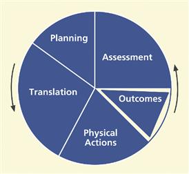
Figure 22-1 Simplest view of the Interaction Cycle.
In sum, parts of the Interaction Cycle are:
planning: how the interaction design supports users in determining what to do
translation: how the interaction design supports users in determining how to do actions on objects
physical actions: how the interaction design supports users in doing those actions
outcomes: how the non-interaction functionality of the system helps users achieve their work goals
assessment of outcomes: how the interaction design supports users in determining whether the interaction is turning out right
We will have sample UX design guidelines for each of these plus an overall category.
22.5 Planning
In Figure 22-2 we highlight the planning part of the Interaction Cycle. Support for user planning is often the missing color in the user interface rainbow.
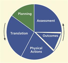
Figure 22-2 The planning part of the Interaction Cycle.
Planning guidelines are to support users as they plan how they will use the system to accomplish work in the application domain, including cognitive user actions to determine what tasks or steps to do. It is also about helping users understand what tasks they can do with the system and how well it supports learning about the system for planning. If users cannot determine how to organize several related tasks in the work domain because the system does not help them understand exactly how it can help do these kinds of tasks, the design needs improvement in planning support.
22.5.1 Clear System Task Model for User
Support the user’s ability to acquire an overall understanding of the system at a high level, including the system model, design concept, and metaphors. (NB: the special green font used in the next line denotes such a guideline.)
Help users plan goals, tasks by providing a clear model of how users should view system in terms of tasks
Support users’ high-level understanding of the whole system with a clear conceptual design, not just how to use one feature.
Help users with system model, metaphors, work context
Support users’ overall understanding of the system, design concept, and any metaphors used with a clear conceptual design. Metaphors, such as the analogy of using a typewriter in a word processor design, are ways that existing user knowledge of previous designs and phenomena can be leveraged to ease learning and using of new designs.
Design to match user’s conception of high-level task organization
Support user task decomposition by matching the design to users’ concept of task decomposition and organization.
Tabs at the top of every page of a particular digital library Website are not well organized by task. They are ordered so that information-seeking tasks are mixed with other kinds of tasks, as shown in the top of Figure 22-3. Part of the new tab bar in our suggested new design is shown in the bottom of Figure 22-3.
Help users understand what system features exist and how they can be used in their work context
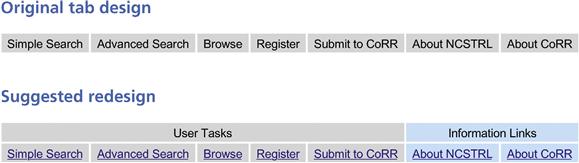
Figure 22-3 Tab reorganization to match task structure.
Support user awareness of specific system features capabilities and understanding of how they can use those features to solve work domain problems in different work situations. Support user ability to attain awareness of specific system feature or capability.
Consider the case of the Master Document feature in Microsoft Word™. For convenience and to keep file sizes manageable, users of Microsoft Word™ can maintain each part of a document in a separate file. At the end of the day they can combine those individual files to achieve the effect of a single document for global editing and printing.
However, this ability to treat several chapters in different files as a single document is almost impossible to figure out. The system does not help the user determine what can be done with it or how it might help with this task.
Help users decompose tasks logically
Support user task decomposition, logically breaking long, complex tasks into smaller, simpler pieces.
Make clear all possibilities for what users can do at every point
Help users understand how to get started and what to do next.
Keep users aware of system state for planning next task
Maintain and clearly display system state indicators when next actions are state dependent.
Keep the task context visible to minimize memory load
To help users compare outcomes with goals, maintain and clearly display user request along with results.
In the search mode within a library information system, users can find themselves deep down many levels and screens into the task where card catalog information is being displayed. By the time they dig into the information structure that deeply, there is a chance users may have forgotten their exact original search intentions. Somewhere on the screen, it would be helpful to have a reminder of the task context, such as “You are searching by author for: Stephen King.”
22.5.2 Planning for Efficient Task Paths
Help users plan the most efficient ways to complete their tasks
This is an example of good design, rather than a design problem, and it is from Borland’s 3-D Home Architect™. Using this house-design program, when a user tries to print a large house plan, it results in an informative message in a dialogue box that says: Current printer settings require 9 pages at this scale. Switching to Landscape mode allows the plan to be drawn with 6 pages. Click on Cancel if you wish to abort printing. This tip can be most helpful, saving the time and paper involved in printing it wrong the first time, making the change, and printing again.
Strictly as an aside here, this message still falls short of the mark. First, the term “abort” has unnecessary violent overtones. Plus, the design could provide a button to change to landscape mode directly, without forcing the user to find out how to make that switch.
22.5.3 Progress Indicators
Keep users aware of task progress, what has been done and what is left to do
Support user planning with task progress indicators to help users manage task sequencing and keep track of what parts of the task are done and what parts are left to do. During long tasks with multiple and possibly repetitive steps, users can lose track of where they are in the task. For these situations, task progress indicators or progress maps can be used to help users with planning based on knowing where they are in the task.
Filling out income tax forms is a good example of a lengthy multiple-step task. The designers of Turbo-Tax™ by Intuit, with a “wizard-like” step-at-a-time prompter, went to great lengths to help users understand where they are in the overall task, showing the user’s progress through the steps while summarizing the net effect of the user’s work at each point.
22.5.4 Avoiding Transaction Completion Slips
A transaction completion slip is a kind of error in which the user omits or forgets a final action, often a crucial action for consummating the task. Here we provide an associated guideline and some examples.
Provide cognitive affordances at the end of critical tasks to remind users to complete the transaction
A transaction completion slip can occur in the Ticket Kiosk System when the user gets a feeling of closure at the end of the interaction for the transaction and fails to take the tickets just purchased. In this case, special attention is needed to provide a good cognitive affordance in the interaction design to remind the user of the final step in the task plan and help prevent this kind of slip: “Please take your tickets” (or your bank card or your receipt).
As another example, we cannot count the number of times we have sent or received email for which an attachment was intended but forgotten. Recent versions of Google’s Gmail have a simple solution. If any variation of the word “attach” appears in an email but it is sent without an attachment, the system asks if the sender intended to attach something, as you can see in Figure 22-4. Similarly, if the email author says something such as “I am copying …”, and there is no address in the Copy field, the system could ask about that, too.
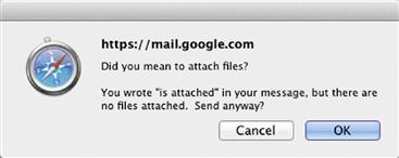
Figure 22-4 Gmail reminder to attach a file.
An example of the same thing, this time using a plugin3 for the Mac Mail program, is shown in Figure 22-5.
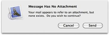
Figure 22-5 Mac reminder to attach a file.
On one banking site, when users transfer money from their savings accounts to their checking accounts, they often think the transaction is complete when it is actually not. This is because, at the bottom right-hand corner of the last page in this transaction workflow, just below the “fold” on the screen, there is a small button labeled Confirm that is often completely missed.
Users close the window and go about their business of paying bills, unaware that they are possibly heading toward an overdraft. At least they should have gotten a pop-up message reminding them to click the Confirm button before letting them logout of the Website.
Later, when one of the users called the bank to complain, they politely declined his suggestion that they should pay the overdraft fee because of their liability due to poor usability. We suspect they must have gotten other such complaints, however, because the flaw was fixed in the next version.
As a final example of avoiding transaction completion slips, we cite a microwave oven. Because it takes time to defrost or cook the food, users often start it and do something else while waiting. Then, depending on the level of hunger, it is possible to forget to take out the food when it is done.
So microwave designers usually include a reminder. At completion, the microwave usually beeps to signal the end of its part of the task. However, a user who has left the room or is otherwise occupied when it beeps may still not be mindful of the food waiting in the microwave. As a result, some oven designs have an additional aspect to the feature for avoiding this classic slip. The beep repeats periodically until the door is opened to retrieve the food.
The design for one particular microwave, however, took this too far. It did not wait long enough for the follow-up beep. Sometimes a user would be on the way to remove the food and it would beep. Some users found this so irritating that they would hurry to rescue the food before that “reminder” beep. To them, this machine seemed to be “impatient” and “bossy” to the point that it had been controlling the users by making them hurry.
22.6 Translation
Translation guidelines are to support users in sensory and cognitive actions needed to determine how to do a task step in terms of what actions to make on which objects and how. Translation, along with assessment, is one of the places in the Interaction Cycle where cognitive affordances play the major role.
Many of the principles and guidelines apply to more than one part of the Interaction Cycle and, therefore, to more than one section of this chapter. For example, “Use consistent wording” is a guideline that applies to several the parts of the Interaction Cycle—planning, translation, and assessment. Rather than repeat, we will put them in the most pertinent location and hope that our readers recognize the broader applicability.
Translation issues include:
existence (of cognitive affordance)
presentation (of cognitive affordance)
22.6.1 Existence of Cognitive Affordance
Figure 22-6 highlights the “existence of cognitive affordance” part within the breakdown of the translation part of the Interaction Cycle.
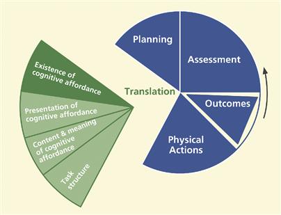
Figure 22-6 Existence of a cognitive affordance within translation.
If interaction designers do not provide needed cognitive affordances, such as labels and other cues, users will lack the support they need for learning and knowing what actions to make on what objects in order to carry out their task intentions. The existence of cognitive affordances is necessary to:
show which user interface object to manipulate
show how to manipulate an object
help users get started in a task
guide data entry in formatted fields
indicate active defaults to suggest choices and values
indicate system states, modes, and parameters
remind about steps the user might forget
Provide effective cognitive affordances that help users get access to system functionality
Support users’ cognitive needs to determine how to do something by ensuring the existence of an appropriate cognitive affordance. Not giving feed-forward cognitive affordances, cues such as labels, data field formats, and icons, is what Cooper (2004, p. 140) calls “uninformed consent”; the user must proceed without understanding the consequences.
Help users know/learn what actions are needed to carry out intentions
It is possible to build in effective cognitive affordances that help novice users and do not get in the way of experienced users.
Help users know how to do something at action/object level
Users get their operational knowledge from experience, training, and cognitive affordances in the design. It is our job to provide this latter source of user knowledge.
Help users predict outcome of actions
Users need feed-forward in cognitive affordances that explains the consequences of physical actions, such as clicking on a button.
Help users determine what to do to get started
Users need support in understanding what actions to take for the first step of a particular task, the “getting started” step, often the most difficult part of a task.
In Figure 22-7 there is a start-up screen of an early version of Microsoft PowerPoint. In applications where there is a wide variety of things a user can do, it is difficult to know what to do to get started when faced with a blank screen. The addition of one simple cognitive and physical affordance combination, Click to add first slide, provides an easy way for an uncertain user to get started in creating a presentation.
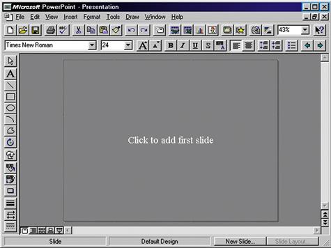
Figure 22-7 Help in getting started in PowerPoint
(screen image courtesy of Tobias Frans-Jan Theebe).
Similarly, in Figure 22-8 we show other such helpful cues to continue, once a new slide is begun.
Provide a cognitive affordance for a step the user might forget
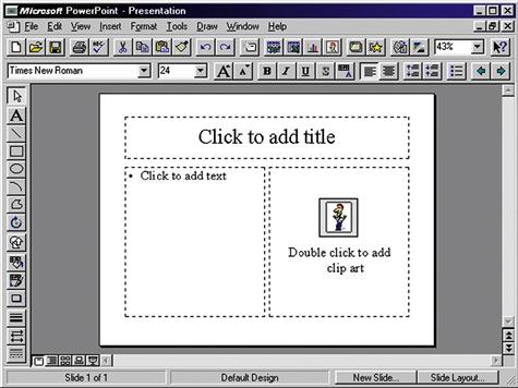
Figure 22-8 More help in getting started
(screen image courtesy of Tobias Frans-Jan Theebe).
Support user needs with cognitive affordances as prompts, reminders, cues, or warnings for a particular needed action that might get forgotten.
22.6.2 Presentation of Cognitive Affordance
In Figure 22-9, we highlight the “presentation of cognitive affordance” portion of the translation part of the Interaction Cycle.
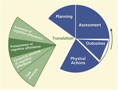
Figure 22-9 Presentation of cognitive affordances within translation.
Presentation of cognitive affordances is about how cognitive affordances appear to users, not how they convey meaning. Users must be able to sense, for example, see or hear, a cognitive affordance before it can be useful to them.
Support user with effective sensory affordances in presentation of cognitive affordances
Support user sensory needs in seeing and hearing cognitive affordances by effective presentation or appearance. This category is about issues such as legibility, noticeability, timing of presentation, layout, spatial grouping, complexity, consistency, and presentation medium, for example, audio, when needed. Sensory affordance issues also include text legibility and content contained in the appearance of a graphical feature, such as an icon, but only about whether the icon can be seen or discerned easily. For an audio medium, the volume and sound quality are presentation characteristics.
Cognitive affordance visibility
Obviously a cognitive affordance cannot be an effective cue if it cannot be seen or heard when it is needed. Our first guideline in this category is conveyed by the sign in Figure 22-10, if only we could be sure what it means.
Make cognitive affordances visible

Figure 22-10 Good advice anytime.
If a cognitive affordance is invisible, it could be because it is not (yet) displayed or because it is occluded by another object. A user aware of the existence of the cognitive affordance can often take some actions to summon an invisible cognitive affordance into view. It is the designer’s job to be sure each cognitive affordance is visible, or easily made visible, when it is needed in the interaction.
This example is about a user (shopper) whom we think would rate himself at least a little above the novice level in shopping at his local grocery store. But recently, on a trip to get some deodorant, he was forced to reconsider his rating when his quick-in-and-quick-out plan was totally foiled. First, the store had been completely remodeled so he could not rely on his memory of past organization. However, because he was looking for only one item, he was optimistic.
He made a fast pass down the center aisle, looking at the overhead signs in each side aisle for anything related to deodorant, but nothing matched his search goal. There were also some sub-aisles in a different configuration along the front of the store. He scanned those aisles unsuccessfully. Although the rubber on his shopping cart tires was burning, he felt his fast-shopping plan slipping away so he did what no guy wants to do, he asked for directions.
The clerk said, “Oh, it is right over there,” pointing to one of the upfront aisles that he had just scanned. “But I do not see any sign for deodorant,” he whined, silently blaming himself, the user, for the inability to see a sign that must have been somewhere right there in front on him. “Oh, yeah, there is a sign,” she replied (condescendingly, he thought), “you just have to get up real close and look right behind that panel on the top of the end shelf.” Figure 22-11 shows what that panel looked like to someone scanning these upfront aisles.

Figure 22-11 Aesthetic panel blocks visibility of sign as cognitive affordance.
In Figure 22-12 you can see the “deodorant” sign revealed if you “just get up real close and look right behind that panel on the top of the end shelf.”

Figure 22-12 The sign is visible if you look carefully.
The nice aesthetic end panels added much to the beauty of the shopping experience, but were put in a location that exactly blocked the “deodorant” sign and others, rendering that important cognitive affordance invisible from most perspectives in the store.
When our now-humbled shopper reminded the store clerk that this design violated the guideline for visibility for presentation of cognitive affordances, he was encouraged that he had reached her interaction design sensibilities when he overheard her hushed retort, “Whatever!”. He left thinking, “that went well.”
Cognitive affordance noticeability
Make cognitive affordances noticeable
When a needed cognitive affordance exists and is visible, the next consideration is its noticeability or likelihood of being noticed or sensed. Just putting a cognitive affordance on the screen is not enough, especially if the user does not necessarily know it exists or is not necessarily looking for it. These design issues are largely about supporting awareness. Relevant cognitive affordances should come to users’ attention without users seeking it. The primary design factor in this regard is location, putting the cognitive affordance within the users’ focus of attention. It is also about contrast, size, and layout complexity and their effect on separation of the cognitive affordance from the background and from the clutter of other user interface objects.
Message lines, status lines, and title lines at the top or bottom of the screen are notoriously unnoticeable. Each user typically has a narrow focus of attention, usually near where the cursor is located. A pop-up message next to the cursor will be far more noticeable than a message in a line at the bottom of the screen.
For some reason, many Websites have very small and inconspicuous log-in boxes, often mixed in with many objects most users do not even notice in the far top border of the page. Users have to waste time in searching visually over the whole page to find the way to log in.
Cognitive affordance legibility
Make text legible, readable
Text legibility is about being discernable, not about the words being understandable. Text presentation issues include the way the text of a button label is presented so it can be read or sensed, including such appearance or sensory characteristics as font type, font size, font and background color, bolding, or italics of the text, but it is not about the content or meaning of the words in the text. The meaning is the same regardless of the font or color.
Cognitive affordance presentation complexity
Control cognitive affordance presentation complexity with effective layout, organization, and grouping
Support user needs to locate and be aware of cognitive affordances by controlling layout complexity of user interface objects. Screen clutter can obscure needed cognitive affordances such as icons, prompt messages, state indicators, dialogue box components, or menus and make it difficult for users to find them.
Cognitive affordance presentation timing
Support user needs to notice cognitive affordance with appropriate timing of appearance or display of cognitive affordances. Do not present a cognitive affordance too early or too late or with inadequate persistence; that is, avoid “flashing.”
Present cognitive affordance in time for it to help the user before the associated action
Sometimes getting cognitive affordance presentation timing right means presenting at exactly the point in a task and under exactly the conditions when the cognitive affordance is needed.
Figures 22-13 and 22-14 are photographs of a paper towel dispenser in a public bathroom. They illustrate an example of a good design that involves just-in-time visibility of presentation of a cognitive affordance.
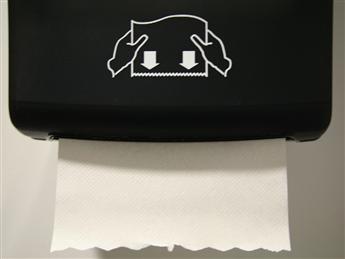
Figure 22-13 The primary cognitive affordance for taking a paper towel.
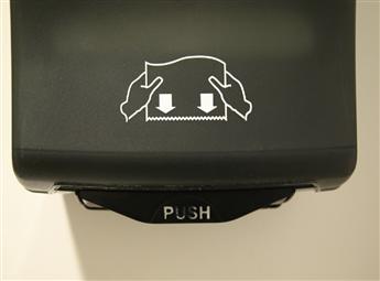
Figure 22-14 The backup cognitive affordance to help start a new paper towel.
In Figure 22-13, the next available towel is visible and the cognitive affordance in the sketch on the cover of the dispenser clearly says “Pull the towel down with both hands.”
In Figure 22-14 you can see how designers covered the case where the next towel failed to drop down so users cannot grab it. Now a different user action is needed to get a towel, so a different cognitive affordance is required.
Designers provided this new cognitive affordance, telling the user to Push the lever to get the next towel started down into position. When a towel was already in place, this second cognitive affordance was not needed and was not visible, being obscured by the towel, but it does become visible just when it is needed.
When a user wishes to paste something from one Word document to another, there can be a question about formatting. Will the item retain its formatting, such as text or paragraph style, from the original document or will it adopt the formatting from the place of insertion in the new document? And how can the choice be controlled by the user? When you want more control of a paste operation, you might choose Paste Special … from the Edit menu.
But the choices in the Paste Special dialogue box say nothing about controlling formatting. Rather, the choices can seem too technical or system centered, for example, Microsoft Office Word Document Object or Unformatted Unicode Text, without an explanation of the resulting effect in the document. While these choices might be precise about the action and its results to some users, they are cryptic even to most regular users.
In recent versions of Word, a small cognitive affordance, a tiny clipboard icon with a pop-up label Paste Options appears, but it appears after the paste operation. Many users do not notice this little object, mainly because by the time it appeared, they have experienced closure on the paste operation and have already moved on mentally to the next task. If they do not like the resulting formatting, then changing it manually becomes their next task.
Even if users do notice the little object, it is possible they might confuse it with something to do with undoing the action or something similar because Word uses that same object for in-context undo. However, if a user does notice this icon and does take the time to click on it, that user will be rewarded with a pull-down menu of useful options, such as Keep Source Formatting, Match Destination Formatting, Keep Text Only, plus a choice to see a full selection of other formatting styles.
Just what users need! But it is made available too late; the chance to see this menu comes after the user action to which it applied. If choices on this after-the-fact menu were available on the Paste Special menu, it would be perfect for users.
Cognitive affordance presentation consistency
When a cognitive affordance is located within a user interface object that is also manipulated by physical actions, such as a label within a button, maintaining a consistent location of that object on the screen helps users find it quickly and helps them use muscle memory for fast clicking. Hansen (1971) used the term “display inertia” in reference to one of his top-level principles, optimize operations, to describe this business of minimizing display changes in response to user inputs, including displaying a given user interface object in the same place each time it is shown.
Give similar cognitive affordances consistent appearance in presentation
When users of an older version of Gmail were viewing the list of messages in the Inbox, the Archive button was at the far left at the top of the message pane, set off by the blue border, as shown in Figure 22-15.
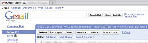
Figure 22-15 The Archive button in the Inbox view of an older version of Gmail.
But on the screen for reading a message, Gmail had the Archive button as the second object from the left at the top. In the place where the Archive button was earlier, there was now a Back to Inbox link, as seen in Figure 22-16. Using a link instead of a button in this position is a slight inconsistency, probably without much effect on users. But users feel a larger effect from the inconsistent placement of the Archive button.
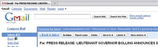
Figure 22-16 The Archive button in a different place in the message reading view.
Selected messages can be archived from either view of the email by clicking on the Archive button. Further, when archiving messages from the Inbox list view, the user sometimes goes to the message-reading view to be sure. So a user doing an archiving task could be going back and forth between the Inbox listing of Figure 22-15 and message viewing of Figure 22-16.
For this activity, the location of the Archive button is never certain. The user loses momentum and performance speed by having to look for the Archive button each time before clicking on it. Even though it moves only a short distance between the two views, it is enough to slow down users significantly because they cannot run the cursor up to the same spot every time to do multiple archive actions quickly. The lack of display inertia works against an efficient sensory action of finding the button and it works against muscle memory in making the physical action of moving the cursor up to click.
It seems that Google people have fixed this problem in subsequent versions, as attested to by the same kinds of screens in Figures 22-17 and 22-18.
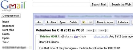
Figure 22-17 The Archive button in the Inbox view of a later version of Gmail.
Figure 22-18 The Archive button in the same place in the new message reading view.
22.6.3 Content and Meaning of Cognitive Affordance
Just what part of quantum theory do you not understand?
– Anonymous
Figure 22-19 highlights the “content and meaning of cognitive affordance” portion of the translation part of the Interaction Cycle.
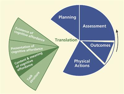
Figure 22-19 Content/meaning within translation.
The content and meaning of a cognitive affordance are the knowledge that must be conveyed to users to be effective in helping them as affordances to think, learn, and know what they need to make correct actions. The cognitive affordance design concepts that support understanding of content and meaning include clarity, distinguishability from other cognitive affordances, consistency, layout and grouping to control complexity, usage centeredness, and techniques for avoiding errors.
Help user determine actions with effective content/meaning in cognitive affordances
Support user ability to determine what action(s) to make and on what object(s) for a task step through understanding and comprehension of cognitive affordance content and meaning: what it says, verbally or graphically.
Clarity of cognitive affordances
Design cognitive affordances for clarity
Use precise wording, carefully chosen vocabulary, or meaningful graphics to create correct, complete, and sufficient expressions of content and meaning of cognitive affordances.
Precise wording
Support user understanding of cognitive affordance content by precise expression of meaning through precise word choices. Clarity is especially important for short, command-like text, such as is found in button labels, menu choices, and verbal prompts. For example, the button label to dismiss a dialogue box could say Return to …, where appropriate, instead of just OK.
Use precise wording in labels, menu titles, menu choices, icons, data fields
The imperative for clear and precise wording of button labels, menu choices, messages, and other text may seem obvious, at least in the abstract. However, experienced practitioners know that designers often do not take the time to choose their words carefully.
In our own evaluation experience, this guideline is among the most violated in real-world practice. Others have shared this experience, including Johnson (2000). Because of the overwhelming importance of precise wording in interaction designs and the apparent unmindful approach to wording by many designers in practice, we consider this to be one of the most important guidelines in the whole book.
Part of the problem in the field is that wording is often considered a relatively unimportant part of interaction design and is assigned to developers and software people not trained to construct precise wording and not even trained to think much about it.
This is one of our favorite examples of precise wording, probably overdone: “Wet Paint. This is a warning, not an instruction.”
This guideline represents a part of interaction design where a great improvement can be accrued for only a small investment of extra time and effort. Even a few minutes devoted to getting just the right wording for a button label used frequently has an enormous potential payoff. Here are some related and helpful sub-guidelines:
Use a verb and noun and even an adjective in labels where appropriate
Avoid vague, ambiguous terms
Be as specific to the interaction situation as possible; avoid one-size-fits-all messages
Clearly represent work domain concepts
As an example of matching the message to the reality of the work domain, signs such as “Keep this door closed at all times” probably should read something more like “Close this door immediately after use.”
Use dynamically changing labels when toggling
When using the same control object, such as a Play/Pause button on an mp3 music player, to control the toggling of a system state, change the object label to show that it is consistently a control to get to the next state. Otherwise the current system state can be unclear and there can be confusion over whether the label represents an action the user can make or feedback about the current system state.
In Figure 22-20 we show an early prototype of a personal document retrieval system. The underlying model for deleting a document involves two steps: marking the document for deletion and later deleting all marked documents permanently. The small check box at the lower right is labeled: Marked for Deletion.
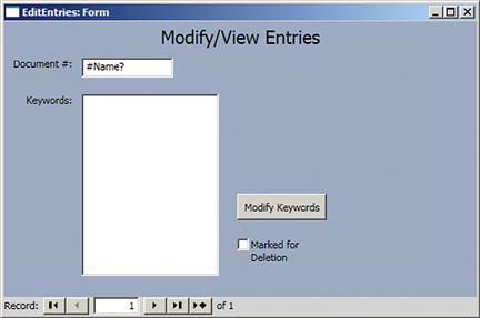
Figure 22-20 The Marked for Deletion check box in a document retrieval screen
(screen image courtesy of Raphael Summers.
The designer’s idea was that users would check that box to signify the intention to delete the record. Thereafter, until a permanent purge of marked records, seeing a check in this box signifies that this record is, indeed, marked for deletion. The problem comes before the user checks the box.
The user wants to delete the record (or at least mark it for deletion), but this label seems to be a statement of system state rather than a cognitive affordance for an action, implying that it is already marked for deletion. However, because the check box is not checked, it is not entirely clear. Our suggestion was to re-label the box in the unchecked state to read: Check to mark for deletion, making it a true cognitive affordance for action in this state. After checking, Marked for Deletion works fine.
Data value formats
Support user needs to know how to enter data, such as in a form field, with a cognitive affordance or cue to help with format and kinds of values that are acceptable.
Provide cognitive affordances to indicate formatting within data fields
Data entry is a user work activity where the formatting of data values is an issue. Entry in the “wrong” format, meaning a format the user thinks is right but the system designers did not anticipate, can lead to errors that the user must spend time to resolve or, worse yet, have undetected data errors. It is relatively easy for designers to indicate expected data formats, with cognitive affordances associated with the field labels, with sample data values, or both.
In Figure 22-21 we show a dialogue box that appears in an application that is, despite the cryptic title Task Series, for scheduling events. In the Duration section, the Effective Date field does not indicate the expected format for data values. Although many systems are capable of accepting date values in almost any format, new or intermittent users may not know if this application is that smart. It would have been easy for the designer to save users from hesitation and uncertainty by suggesting a format here.
Constrain the formats of data values to avoid data entry errors
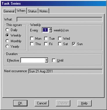
Figure 22-21 Missing cognitive affordance about Effective Date data field format
(screen image courtesy of Tobias Frans-Jan Theebe).
Sometimes rather than just show the format, it is more effective to constrain values so that they are acceptable as inputs.
An easy way to constrain the formatting of a date value, for example, is to use drop-down lists, specialized to hold values appropriate for the month, day, and year parts of the date field. Another approach that many users like is a “date picker,” a calendar that pops up when the user clicks on the date field. A date can be entered into the field only by way of selection from this calendar.
A calendar with one month of dates at a time is perhaps the most practical. Side arrows allow the user to navigate to earlier or later months or years. Clicking on a date within the month on the calendar causes that date to be picked for the value to be used. By using a date-picker, you are constraining both the data entry method and the format the user must employ, effectively eliminating errors due to either allowing inappropriate values or formatting ambiguity.
Provide clearly marked exits
Support user ability to exit dialogue sequences confidently by using clearly labeled exits. Include destination information to help user predict where the action will go upon leaving the current dialogue sequence. For example, in a dialogue box you might use Return to XYZ after saving instead of OK and Return to XYZ without saving instead of Cancel.
To qualify this example, we have to say that the terms OK and Cancel are so well accepted and so thoroughly part of our current shared conventions that, even though the example shows potentially better wordings, the conventions now carry the same meaning at least to experienced users.
Provide clear “do it” mechanism
Some kinds of choice-making objects, such as drop-down or pop-up menus, commit to the choice as soon as the user indicates the choice; others require a separate “commit to this choice” action. This inconsistency can be unsettling for some users who are unsure about whether their choices have “taken.” Becker (2004) argues for a consistent use of a “Go” action, such as a click, to commit to choices, for example, choices made in a dialogue box or drop-down menu. And we caution to make its usage clear to avoid task completion slips where users think they have completed making the menu choice, for example, and move on without committing to it with the Go button.
Be predictable; help users predict outcome of actions with feed-forward information in cognitive affordances. Predictability helps both learning and error avoidance
Distinguishability of choices in cognitive affordances
Make choices distinguishable
Support user ability to differentiate two or more possible choices or actions by distinguishable expressions of meaning in their cognitive affordances. If two similar cognitive affordances lead to different outcomes, careful design is needed so users can avoid errors by distinguishing the cases.
Often distinguishability is the key to correct user choices by the process of elimination; if you provide enough information to rule out the cases not wanted, users will be able to make the correct choice. Focus on differences of meaning in the wording of names and labels. Make larger differences graphically in similar icons.
This is an unfortunate, but true, story that evinces the reality that human lives can be lost due to simple confusion over labeling of controls. This is a very serious usability case involving the dramatic and tragic October 31, 1999 EgyptAir Flight 990 airliner crash (Acohido, 1999) possibly as a result of poor usability in design. According to the news account, the pilot may have been confused by two sets of switches that were similar in appearance, labeled very similarly, as Cut out and Cut off, and located relatively close to each other in the Boeing 767 cockpit design.
Exacerbating the situation, both switches are used infrequently, only under unusual flight conditions. This latter point is important because it means that the pilots would not have been experienced in using either one. Knowing pilots receive extensive training, designers assumed their users are experts. But because these particular controls are rarely used, most pilots are novices in their use, implying the need for more effective cognitive affordances than usual.
One conjecture is that one of the flight crew attempted to pull the plane out of an unexpected dive by setting the Cut out switches connected to the stabilizer trim but instead accidentally set the Cut off switches, shutting off fuel to both engines. The black box flight recorder did confirm that the plane did go into a sudden dive and that a pilot did flip the fuel system cutoff switches soon thereafter.
There seem to be two critical design issues, the first of which is the distinguishability of the labeling, especially under conditions of stress and infrequent use. To us, not knowledgeable in piloting large planes, the two labels seem so similar as to be virtually synonymous.
Making the labels more complete would have made their much more distinguishable. In particular, adding a noun to the verb of the labels would have made a huge difference: Cut out trim versus Cut off fuel. Putting the all-important noun first might be an even better distinguisher: Fuel off and Trim out. Just this simple UX improvement might have averted the disaster.
The second design issue is the apparent physical proximity of the two controls, inviting the physical slip of grabbing the wrong one, despite knowing the difference. Surely stabilizer trim and fuel functions are completely unrelated. Regrouping by related functions—locating the Fuel off switch with other fuel-related functions and the Trim out switch with other stabilizer-related controls—might have helped the pilots distinguish them, preventing the catastrophic error.
Finally, we have to assume that safety, absolute error avoidance in this situation, would have to be a top priority UX goal for this design. To meet this goal, the Fuel off switch could have been further protected from accidental operation by adding a mechanical feature that requires an additional conscious action by the pilot to operate this seldom-used but dangerous control. One possibility is a physical cover over the switch that has to be lifted before the switch can be flipped, a safety feature used in the design of missile launch switches, for example.
Consistency of cognitive affordances
Consistency is one of those concepts that everyone thinks they understand but almost no one can define.
Be consistent with cognitive affordances
Use consistent wording in labels for menus, buttons, icons, fields
Being consistent in wording has two sides: using the same terms for the same things and using different terms for different things. The next three guidelines and examples are about using the same terms for the same things.
Use similar names for similar kinds of things
Do not use multiple synonyms for the same thing
This example comes from the very old days of floppy disks, but could apply to external hard disks of today as well. It is a great example of using two different words for the same thing in the short space of the one little message dialogue box in Figure 22-22.
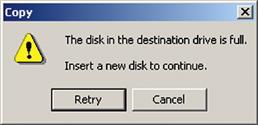
Figure 22-22 Inconsistent wording: Continue or Retry?
(screen image courtesy of Tobias Frans-Jan Theebe).
If, upon learning that the current disk is full, the user inserts a new disk and intends to continue copying files, for example, what should she click, Retry or Cancel? Hopefully she can find the right choice by the process of elimination, as Cancel will almost certainly terminate the operation. But Retry carries the connotation of starting over. Why not match the goal of continuing with a button labeled Continue?
Use the same term in a reference to an object as the name or label of the object
If a cognitive affordance suggests an action on a specific object, such as “Click on Add Record,” the name or label on that object must be the same, in this case also Add Record.
From more modern days and a Website for Virginia Tech employees, Figure 22-23 is another clear example of how easy it is for this kind of design flaw to slip by designers, a type of flaw that is usually found by expert UX inspection.
Figure 22-23 Cannot click on “View Pay Stub Summary.”
This is another example of inconsistency of wording. The cognitive affordance in the line above the Pay Stub Year selection menu says press View Pay Stub Summary, but the label on the button to be pressed says Display. Maybe this big a difference in what is supposed to be the same is due to having different people working on different parts of the design. In any case we noticed that in a subsequent version, someone had found and fixed the problem, as seen in Figure 22-24.
Figure 22-24 Problem fixed with new button label.
In passing, we note an additional UX problem with each of these screens, the cognitive affordance Select Pay Stub year in the top half of the frame is redundant with Select a year for which you wish to view your pay stubs in the bottom section. We would recommend keeping the second one, as it is more informative and is grouped with the pull-down menu for year selection.
The first Select Pay Stub year looks like some kind of title but is really kind of an orphan. The distance between this cognitive affordance and the user interface object to which it applies, plus the solid line, makes for a strong separation between two design elements that should be closely associated. Because it is unnecessary and separate from the year menu, it could be confusing. For all the years we were available as an HCI and UX resource, we were never asked to help with the design or evaluation of any software by the university. That is undoubtedly typical.
Use different terms for different things, especially when the difference is subtle
This is the flip side of the guideline that says to use the same terms for the same things. As we will see in the following example, terms such as Add can mean several different but closely related things. If you, the interaction designer, do not distinguish the differences with appropriately precise terminology, it can lead to confusion for the user.
When using Nero Express to burn CDs and DVDs for data transfer and backup, users put in a blank disc and choose the Create a Data Disc option and see the window shown in Figure 22-25.
Figure 22-25 First Nero Add button.
In the middle of this window is an empty space that looks like a file directory. Most users will figure out that this is for the list of the files and folders they want to put on the disc. At the top, where it will be seen only if the user looks around, it gives the cue: “Add data to your disc.” In the normal task path, there is really only one action that makes sense, which is clicking on the Add button at the top on the right-hand side.
This is taken by the user to be the way you add files and folders to this list. When users click on Add, they get the next window, shown in Figure 22-26, overlapping the initial window.
Figure 22-26 Another window and another Add button.
This window also shows a directory space in the middle for browsing the files and folders and selecting those to be added to the list for the disc. The way that one commits the selected files to go on the list for the disc is to click on the Add button in this window. Here the term Add really means to add the selected files to the disc list. In the first window, however, the term Add really meant proceed to file selection for the disc list, which is related but slightly different. Yes, the difference is subtle but it is our job to be precise in wording.
Be consistent in the way that similar choices or parameter settings are made
If a certain set of related parameters are all selected or set with one method, such as check boxes or radio buttons, then all parameters related to that set should be selected or set the same way.
Setting and clearing search parameters for the Find function are done with check boxes on the lower left-hand side (Figure 22-27) and with pull-down menus at the bottom of the dialogue box for font, paragraph, and other format attributes and special characteristics. We have observed many users having trouble turning off the format attributes, which is because the “command” for that is different than all the others.
Figure 22-27 Format with a menu but No Formatting with a button.
It is accomplished by clicking on the No Formatting button on the right-hand side at the bottom; see Figure 22-27. Many users simply do not see that because nothing else uses a button to set or reset a parameter so they are not looking for a button.
The following example is an instance of the same kind of inconsistency, not using the same kind of selection method for related parameters, only this example is from the world of food ordering.
In Figure 22-28 you see an order slip for a sandwich at Au Bon Pain. Under Create Your Own Sandwich it says Please circle all selections but the very next choice is between two check boxes for selecting the sandwich size. It is a minor thing that probably does not impact user performance but, to a UX stickler, it stands out as an inconsistency in the design.
Figure 22-28 “Circle all selections,” but size choice is by check boxes.
We wrap up this section on consistency of cognitive affordances with the following example about how many problems with consistency in terminology we found in an evaluation of one Web-based application.
In this example we consider only problems relating to wording consistency from a lab-based UX evaluation of an academic Web application for classroom support. We suspect this pervasiveness of inconsistency was due to having different people doing the design in different places and not having a project-wide custom style guide or not using one to document working terminology choices.
In any case, when the design contains different terms for the same thing, it can confuse the user, especially the new user who is trying to conquer the system vocabulary. Here are some examples of our UX problem descriptions, “sanitized” to protect the guilty.
The terms “revise” and “edit” were used interchangeably to denote an action to modify an information object within the application. For example, Revise is used as an action option for a selected object in the Worksite Setup page of My Workspace, whereas Edit is used inside the Site Info page of a given worksite.
The terms “worksite” and “site” are used interchangeably for the same meaning. For example, many of the options in the menu bar of My Workspace use the term “worksite,” whereas the Membership page uses “site,” as in My Current Sites.
The terms “add” and “new” are used interchangeably, referring to the same concept. Under the Manage Groups option, there is a link for adding a group, called New. Most everywhere else, such as for adding an event to a schedule, the link for creating a new information object is labeled Add.
The way that lists are used to present information is inconsistent:
In some lists, such as the list on the Worksite Setup page, check boxes are on the left-hand side, but for most other lists, such as the list on the Group List page, check boxes are on the right.
To edit some lists, the user must select a list item check box and then choose the Revise option in a menu bar (of links) at the top of the page and separated from the list. In other lists, each item has its own Revise link. For yet other lists there is a collection of links, one for each of the multiple ways the user can edit an item.
Controlling complexity of cognitive affordance content and meaning
Decompose complex instructions into simpler parts
Cognitive affordances do not afford anything if they are too complex to understand or follow. Try decomposing long and complicated instructions into smaller, more meaningful, and more easily digested parts.
The cognitive affordance of Figure 22-29 contains instructions that can bewilder even the most attentive user, especially someone in a wheelchair who needs to get out of there fast.
Use appropriate layout and grouping by function of cognitive affordances to control content and meaning complexity
Figure 22-29 Good luck in evacuating quickly.
Support user cognitive affordance content understanding through layout and spatial grouping to show relationships of task and function.
Group together objects and design elements associated with related tasks and functions
Functions, user interface objects, and controls related to a given task or function should be grouped together spatially. The indication of relationship is strengthened by a graphical demarcation, such as a box around the group. Label the group with words that reflect the common functionality of the relationship. Grouping and labeling related data fields are especially important for data entry.
Do not group together objects and design elements that are not associated with related tasks and functions
This guideline, the converse of the previous one, seems to be observed more often in the breach in real-world designs.
The Options dialogue box in Figure 22-30, from an older version of Microsoft Word, illustrates a case where some controls are grouped incorrectly with some parameter settings.
Figure 22-30 OK and Cancel controls on individual tab “card”
(screen image courtesy of Tobias Frans-Jan Theebe).
The metaphor in this design is that of a deck of tabbed index cards. The user has clicked on the General tab, which took the user to this General “card” where the user made a change in the options listed. While in the business of setting options, the user then wishes to go to another tab for more settings. The user hesitates, concerned that moving to another tab without “saving” the settings in the current tab might cause them to be lost.
So this user clicks on the OK to get closure for this tabbed card before moving on. To his surprise, the entire dialogue box disappears and he must start over by selecting Options from the Tools menu at the top of the screen.
The surprise and extra work to recover were the price of the use of layout and grouping as an incorrect indication of the scope or range covered by the OK and Cancel buttons. Designers have made the buttons actually apply to the entire Options dialogue box, but they put the buttons on the currently open tabbed card, making them appear to apply just to the card or, in this case, just to the General category of options.
The Options dialogue box from a different version of Microsoft PowerPoint in Figure 22-31 is a better design that places all the tabbed cards on a larger background and the OK and Cancel controls are on this background, showing clearly that the controls are grouped with the whole dialogue box and not with individual tabbed cards.
Figure 22-31 OK and Cancel controls on background underneath all the tab “cards”
(screen image courtesy of Tobias Frans-Jan Theebe).
Some parameters associated with a search function in a digital library are shown in Figure 22-32. In the original design, shown at the top of Figure 22-32, the Search button is located right next to the OR radio-button choice at the bottom. Perhaps it is associated with the Combine fields with feature? No, it actually was intended to be associated with the entire search box, as shown in the “Suggested redesign” at the bottom of Figure 22-32.
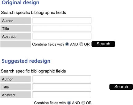
Figure 22-32 (Top) Uncertain association with Search; (bottom) problem fixed with better layout and grouping.
Here is a non-computer (sort of) example from the airlines. While waiting in Milan one day to board a flight to Eindhoven, passengers saw the display shown in Figure 22-33. As the display suggests, the Eindhoven flight followed a flight to Catalania (in Spain) from the same gate.
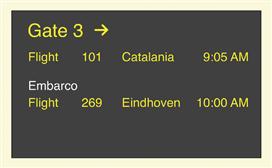
Figure 22-33 A sketch of the airline departure board in Milan.
As the flight to Catalania began boarding, confusion started brewing in the boarding area. Many people were unsure about which flight was boarding, as both flights were displayed on the board. The main source of trouble was due to the way parts of the text were grouped in the flight announcements on the overhead board. The state information Embarco (meaning departing) was closer to the Eindhoven listing than to that of Catalania, as shown in Figure 22-33. So Embarco seemed to be grouped with and applied to the Eindhoven flight.
Confusion was compounded by the fact that it was 9:30 AM; the Catalania flight was boarding late enough so that boarding could have been mistaken for the one to Eindhoven. Further conspiring against the waiting passengers was the fact that there were no oral announcements of the boardings, although there was a public address system. Many Eindhoven passengers were getting into the Catalania boarding line. You could see them turning Eindhoven passengers away but still there was no announcement to clear up the problem.
Sometime later, the flight state information Embarco changed to Chiuso (meaning closed), as seen in Figure 22-34.
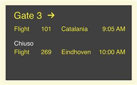
Figure 22-34 Oh, no, Chiuso.
Many of the remaining Eindhoven passengers immediately became agitated, seeing the Chiuso and thinking that the Eindhoven flight was closed before they had a chance to board. In the end, everything was fine but the poor layout of the display on the flight announcement board caused stress among passengers and extra work for the airline gate attendants. Given that this situation can occur many times a day, involving many people every day, the cost of this poor UX must have been very high, even though the airline workers seemed to be oblivious as they contemplated their cappuccino breaks.
In another simple example, in Figure 22-35 we depict a row of push-button controls once seen on a clothes washing machine.
Figure 22-35 Clothes washing machine controls with one little inconsistency.
The choices of Hot wash/cold rinse, Warm wash/cold rinse, and Cold wash/cold rinse all represent similar semantics (wash and rinse temperatures settings) and, therefore, should be grouped together. They are also expressed in similar syntax and words so it is consistent labeling. However, because all three choices include a cold rinse, why not just say that with a separate label and not include it in all the choices?
The real problem, though, is that the fourth button, labeled Start represents completely different functionality and should not be grouped with the other push buttons. Why do you think the designers made such an obvious mistake in grouping by related functionality? We think it is because one single switch assembly is less expensive to buy and install than two separate assemblies. Here, cost won over usability.
On an airplane flight once, we noticed a design flaw in the layout of the overhead controls for a pair of passengers in a two-seat configuration, a flaw that created problems for flight attendants and passengers. This control panel had push-button switches at the left and right for turning the left and right reading lights on and off.
The problem is that the flight attendant call switch was located just between the two light controls. It looked nice and symmetric, but its close proximity to the light controls made it a frequent target of unintended operation. On this flight we saw flight attendants moving through the cabin frequently, resetting call buttons for numerous passengers.
In this design, switches for two related functions were separated by an unrelated one; the grouping of controls within the layout was not by function. Another reason calling for even further physical separation of the two kinds of switches is that light switches are used frequently while the call switch is not.
Likely user choices and useful defaults
Sometimes it is possible to anticipate menu and button choices, choices of data values, and choices of task paths that users will most likely want or need to take. By providing direct access to those choices and, in some cases making them the defaults, we can help make the task more efficient for users.
Support user choices with likely and useful defaults
Many user tasks require data entry into data fields in dialogue box and screens. Data entry is often a tedious and repetitive chore, and we should do everything we can to alleviate some of the dreary labor of this task by providing the most likely or most useful data values as defaults.
Many forms call for the current date in one of the fields. Using today’s date as the default value for that field should be a no-brainer.
Here is a serious example of a case where the choice of default values resulted in dire consequences. This story was relayed by a participant in one of our UX short courses at a military installation. We cannot vouch for its verity but, even if it is apocryphal, it makes the point well.
A front-line spotter for missile strikes has a GPS on which he can calculate the exact location of an enemy facility on a map overlay. The GPS unit also serves as a radio through which he can send the enemy location back to the missile firing emplacement, which will send a missile strike with deadly accuracy.
He entered the coordinates of the enemy just before sending the message, but unfortunately the GPS battery died before he could send the message. Because time was of the essence, he replaced the battery quickly and hit Send. The missile was fired and it hit and killed the spotter instead of the enemy.
When the old battery was removed, the system did not retain the enemy coordinates and, when the new battery was installed, the system entered its own current GPS location as default values for the coordinates. It was easy to pick off the local GPS coordinates of where the spotter was standing.
In isolation of other important considerations, it was a bit like putting in today’s date as the default for a date; it is conveniently available. But in this case, the result of that convenience was death by friendly fire. With a moment’s thought, no one could imagine making the spotter’s coordinates the default for aiming a missile. The problem was fixed immediately!
Provide the most likely or most useful default selections
Among the most common violations of this guideline is the failure to select an item for a user when there is only one item from which to select, as illustrated in the next example.
Here is a special case of applying this guideline where there is only one item from which to select. In this case it was one item in a dialogue box list. When this user opened a directory in this dialogue box showing only one item, the Select button was grayed out because the user is required to select something from the list before the Select button becomes active. However, because there was only one item, the user assumed that the item would be selected by default.
When he clicked the grayed-out Select button, however, nothing happened. The user did not realize that even though there is only one item in the list, the design requires selecting it before proceeding to click on the Select button. If no item is chosen, then the Select button does not give an error message nor does it prompt the user; it just sits there waiting for the user to do the “right thing.” The difficulty could have been avoided by displaying the list of one item with that item already selected and highlighted, thus providing a useful default selection and allowing the Select button to be active from the start.
Offer most useful default cursor position
It is a small thing in a design, but it can be so nice to have the cursor just where you need it when you arrive at a dialogue box or window in which you have to work. As a designer, you can save users the work and irritation of extra physical actions, such as an extra mouse click before typing, by providing appropriate default cursor location, for example, in a data field or text box, or within the user interface object where the user is most likely to work next.
Figure 22-36 contains a dialogue box for planning events in a calendar system. Designers chose to highlight the frequency of occurrences of the event in terms of the number of weeks, in the Weekly section. This might be a little helpful to users who will type a value into the “increment box” of this data field, but users are just as likely to use the up and down arrows of the increment box to set Values, in which case the default highlighting does not help. Further evaluation will be necessary to confirm this, but it is possible that putting the default cursor in the Effective Date field at the bottom might be more useful.
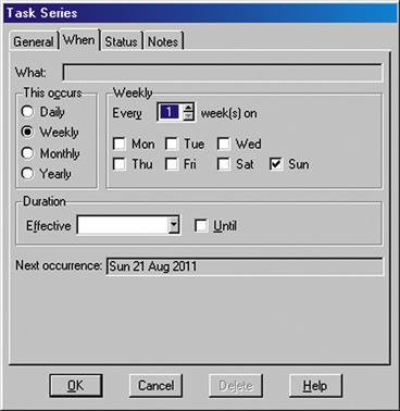
Figure 22-36 Placement of default working location could be better
(screen image courtesy of Tobias Frans-Jan Theebe).
Supporting human memory limitations in cognitive affordances
Earlier we elaborated on the concept of human memory limitations in human–computer interaction. This section is the first of several in which we get to put this knowledge to work in specific interaction design situations.
Relieve human short-term memory loads by maintaining task context visibly or audibly for the user
Provide reminders to users of what they are doing and where they are within the task flow. Post important parts of the task context, parameters the user must keep track of within the task, so that the user does not have to commit them to memory.
Support human memory limits with recognition over recall
For cases where choices, alternatives, or possible data entry values are known, designing to use recognition over recall means allowing the user to select an item from among choices rather than having to specify the choice strictly from memory. Selection among presented choices also makes for more precise communication about choices and data values, helping avoid errors from wording variations and typos.
One of the most important applications of this guideline is in the naming of files for an operation such as opening a file. This guideline says that we should allow users to select the desired file name from a directory listing rather than requiring the user to remember and type in the file name.
To begin with, the cognitive affordance shown in Figure 22-37 describing the desired user action is too vague and open-ended to get any kind of specific input from a user. What if the user does not know the exact model number and what kind of description is needed? This illustrates a case where it would be better to use a set of hierarchical menus to narrow down the category of the product in mind and then offer a list in a pull-down menu to identify the exact item.
Figure 22-37 What do you want, the part number?
In Figure 22-38 we show a very early Save As dialogue box in a Microsoft Office application. At the top is the name of the current folder and the user can navigate to any other folder in the usual way. But it does not show the names of files in the current folder.
Figure 22-38 Early Save As dialogue box with no listing of files in current folder
(screen image courtesy of Tobias Frans-Jan Theebe).
This design precedes modern versions that show a list of existing files in this current folder, as shown in Figure 22-39.
Figure 22-39 Problem solved with listing of files in current folder.
This list supports memory by showing the names of other, possibly similar, files in the folder. If the user is employing any kind of implicit file-naming convention, it will be evident, by example, in this list.
For example, if this folder is for letters to the IRS and files are named by date, such as “letter to IRS, 3-30-2010,” the list serves as an effective reminder of this naming convention. Further, if the user is saving another letter to the IRS here, dated 4-2-2010, that can be done by clicking on the 3-30-2010 letter and getting that name in the File name: text box and, with a few keystrokes, editing it to be the new name.
Avoid requirement to retype or copy from one place to another
In some applications, moving from one subtask to another requires users to remember key data or other related information and bring it to the second subtask themselves. For example, suppose a user selects an item of some kind during a task and then wishes to go to a different part of the application and apply another function to which that item is an input. We have experienced applications that required us to remember the item ourselves and re-enter it as we arrived at the new functionality.
Be suspicious of usage situations that require users to write something down in order to use it somewhere else in the application; this is a sign of an opportunity to support human memory better in the design. As an example, consider a user of a Calendar Management System who needs to reschedule an appointment. If the design forces the user to delete the old one and add the new one, the user has to remember details and re-enter them. Such a design does not follow this guideline.
Support special human memory needs in audio interaction design
Voice menus, such as telephone menus, are more difficult to remember because there is no visual reminder of the choices as there is in a screen display. Therefore, we have to organize and state menu choices in a way to reduce human memory load.
For example, we can give the most likely or most frequently used choices first because the deeper the user goes into the list, the more previous choices there are to remember. As each new choice is articulated, the user must compare it with each of the previous choices to determine the most appropriate one. If the desired item comes early, the user gets cognitive closure and does not need to remember the rest of the items.
Cognitive directness in cognitive affordances
Cognitive directness is about avoiding mental transformations for the user. It is about what Norman (1990, p. 23) calls “natural mapping.” A good example from the world of physical actions is a lever that goes up and down on a console but is used to steer something to the left or the right. Each time it is used, the user must rethink the connection, “Let us see; lever up means steer to the left.”
A classic example of cognitive directness, or the lack thereof, in product design is in the arrangement of knobs that control the burners of a cook top. If the spatial layout of the knobs is a spatial map to the burner configuration, it is easy to see which knob controls which burner. Seems easy, but many designs over the years have violated this simple idea and users have frequently had to reconstruct their own cognitive mapping.
Avoid cognitive indirectness
Support user cognitive affordance content understanding by presenting choices and information in cognitively direct expressions rather than in some kind of encoding that requires the user to make a mental translation. The objective of this guideline is to help the user avoid an extra step of translation, resulting in less cognitive effort and fewer errors.
For a user to rotate a two-dimensional graphical object, there are two directions: clockwise and counterclockwise. While “Rotate Left” and “Rotate Right” are not technically correct, they might be better understood by many than “Rotate CW” and “Rotate CCW.” A better solution might be to show small graphical icons, circles with an arc arrow over the top pointing in clockwise and counterclockwise directions.
Macromedia Dreamweaver™ is an application used to set up simple Web pages. It is easy to use in many ways, but the version we discuss here contains an interesting and definitive example of cognitive indirectness in its design. In the right-hand side pane of the site files window in Figure 22-40 are local files as they reside on the user’s PC.
Figure 22-40 Dreamweaver up and down arrows for up- and downloading.
The left-hand side pane of Figure 22-40 shows a list of essentially the same files as they reside on the remote machine, the Website server. As users interact with Dreamweaver to edit and test Web pages locally on their PCs, they upload them periodically to the server to make them part of the operational Website. Dreamweaver has a convenient built-in “ftp” function to implement this file transfer. Uploading is accomplished by clicking on the up-arrow icon just above the Local site label and downloading uses the down arrow.
The problem comes in when users, weary from editing Web pages, click on the wrong arrow. The download arrow can bring the remote copy of the just-edited file into the PC. Because the ftp function replaces files with the same name as new ones arriving without asking for confirmation, this feature is dangerous and can be costly. Click on the wrong icon and you can lose a lot of work.
“Uploading” and “downloading” are system-centered, not usage-centered, terms and have arbitrary meaning about the direction of data flow, at least to the average non-systems person. The up- and down-arrow icons do nothing to mitigate this poor mapping of meaning. Because the sets of files are on the left-hand side and right-hand side, not up and down, often users must stop and think about whether they want to transfer data left or right on the screen and then translate it into “up” or “down.” The icons for transfer of data should reflect this directly; a left arrow and a right arrow would do nicely. Furthermore, given that the “upload” action is the more frequent operation, making the corresponding arrow (left in this example) larger provides a better cognitive (and physical affordance in terms of click target size) affordance.
In Figure 22-41 you can see a photo of the heater control in a car. It looks extremely simple; just turn the knob.

Figure 22-41 How does this car heater fan control work?
However, to a new user the interaction here could be surprising. The control looks as though you grab the knob and the whole thing turns, including the numbers on its face. However, in actuality, only the outside rim turns, moving the indicator across the numbers, as seen in the sequence of Figure 22-42.
Figure 22-42 Now you can see that the outer rim is what turns
(photos courtesy of Mara Guimarães Da Silva).
So, if the user’s mental model of the device is that rotating the knob clockwise slows down the heater fan, he or she is in for a surprise. The clockwise rotation moves the indicator to higher numbers, thus speeding up the heater fan. It can take users a long time to get used to having to make that kind of a cognitive transformation.
Complete information in cognitive affordances
Support the user’s understanding of cognitive affordances by providing complete and sufficient expression of meaning, to disambiguate, make more precise, and clarify. For each label, menu choice, and so on the designer should ask “Is there enough information and are there enough words used to distinguish cases?”
Be complete in your design of cognitive affordances; include enough information for users to determine correct action
The expression of a cognitive affordance should be complete enough to allow users to predict the consequences of actions on the corresponding object.
Prevent loss of productivity due to hesitation, pondering
Completeness helps the user distinguish alternatives without having to stop and contemplate the differences. Complete expressions of cognitive affordance meaning help avoid errors and lost productivity due to error recovery.
Use enough words for unambiguous labels
Some people think button labels, menu choices, and verbal prompts should be terse; no one wants to read a paragraph on a button label. However, reasonably long labels are not necessarily bad and adding words can add precision. Often a verb plus a noun are needed to tell the whole story. For example, for the label on a button controlling a step in a task to add a record in an application, consider using Add Record instead of just Add.
As another example of completeness in labeling, for the label on a knob controlling the speed of a machine, rather than Adjust or Speed, consider using Adjust Speed or maybe even Clockwise to increase speed, which includes information about how to make the adjustment.
Add supplementary information, if necessary
If you cannot reasonably get all the necessary information in the label of a button or tab or link, for example, consider using a fly-over pop up to supplement the label with more information.
Give enough information for users to make confident decisions
In Figure 22-43 is a message from Microsoft Word that has given us pause more than once. We think we know what button we should click but we are not entirely confident and it seems as though it could have a significant effect on our file.
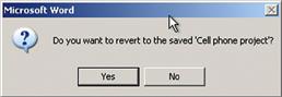
Figure 22-43 What are the consequences of “reverting?”
Figure 22-44 contains a message dialogue box from Microsoft Outlook that can strike fear into the heart of a user. It just does not give enough information about the consequences of either choice presented. If the user exits anyway, does it still send the outstanding messages or do they get lost? To make matters worse, there is undue pressure that the system will take control and exit if the user cannot decide in the next 8 seconds.
Give enough alternatives for user needs
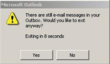
Figure 22-44 Urgent but unclear question.
Few things are as frustrating to users as a dialogue box or other user interface object presenting choices that do not include the one alternative the users really needs. No matter what the user does next, it will not turn out well.
Usage centeredness in cognitive affordances
Employ usage-centered wording, the language of the user and the work context, in cognitive affordances
We find that many of our students do not understand what it means to be user centered or usage centered in interaction design. Mainly it means to use the vocabulary and concepts of the user’s work context rather than the vocabulary and context of the system. This difference between the language of the user’s work domain and the language of the system is the essence of “translation” in the translation part of the Interaction Cycle.
As designers, we have to help users make that translation so they do not have to encode or convert their work domain vocabulary into the corresponding concepts in the system domain. The story of the toaster in Chapter 21 is a good example of a design that fails to help the user with this translation from task or work domain language to system control language. The conveyor belt speed control is labeled with system language, “Faster” and “Slower” instead of being labeled in terms of the work domain of toast making, “Lighter” and “Darker.”
Avoiding errors with cognitive affordances
The Japanese have a term, “poka-yoke,” that means error proofing. It refers to a manufacturing technique to prevent parts of products from being made, assembled, or used incorrectly. Most physical safety interlocks are examples. For instance, interlocks in most automatic transmissions enforce a bit of safety by not allowing the driver to remove the key until the transmission is in park and not allowing shifting out of park unless the brake is depressed.
Find ways to anticipate and avoid user errors in your design
Anticipating user errors in the workflow, of course, stems back to contextual inquiry and contextual analysis, and concern for avoiding errors continues throughout requirements, design, and UX evaluation.
Consider the context of a shower in which there are two bottles, one for shampoo and one for conditioner, examples of which you can see in Figure 22-45. But the problem is that one cannot see them well enough to know which is which. The important distinguishing labels, for shampoo and for conditioner, are “hidden” within a lot of other text and are in such a small font as to be illegible without focused attention, especially with soap in the eyes.

Figure 22-45 It is hard to tell which is the shampoo.
So users sometimes add their own (user-created) affordances by, in this case, adding labels on the tops of the bottles to tell them apart in the shower, as shown in Figure 22-46.
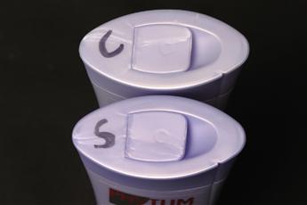
Figure 22-46 Good: some user-created cognitive affordances added.
You can see, in Figure 22-47, an example of a kind of shampoo bottle design that would have avoided the problem in the first place.

Figure 22-47 Better: a design to distinguish the bottles.
In this clever design, the shampoo, the first one you need, is right-side up and the labeling on the conditioner bottle, the next one you need, is printed so that you stand the bottle “upside down.”
Help users avoid inappropriate and erroneous choices
This guideline has three parts: one to disable the choices, the second to show the user that they are disabled, and the third to explain why they are disabled.
Disable buttons, menu choices to make inappropriate choices unavailable
Help users avoid errors within the task flow by disabling choices in buttons, menus, and icons that are inappropriate at a given point in the interaction.
Gray out to make inappropriate choices appear unavailable
As a corollary to the previous guideline, support user awareness of unavailable choices by making cognitive affordances for those choices appear unavailable, in addition to being unavailable. This is done by making some adjustment to the presentation of the corresponding cognitive affordance.
One way is to remove the presentation of that cognitive affordance, but this leads to an inconsistent overall display and leaves the user wondering where that cognitive affordance went. The conventional approach is to “gray out” the cognitive affordance in question, which is universally taken to mean the function denoted by the cognitive affordance still exists as part of the system but is currently unavailable or inappropriate.
But help users understand why a choice is unavailable
If a system operation or function is not available or not appropriate, it is usually because the conditions for its use are not met. One of the most frustrating things for users, however, is to have a button or menu choice grayed out but no indication about why the corresponding function is unavailable. What can you do to get this button un-grayed? How can you determine the requirements for making the function available?
We suggest an approach that would be a break with traditional GUI object behavior but that could help avoid that source of user frustration. Clicking on a grayed-out object could yield a pop up with this crucial explanation of why it is grayed out and what you must do to create the conditions to activate the function of that user interface object.
In a document retrieval system, one of the user tasks is adding new keywords to existing documents, documents already entered into the system. Associated with this task is a text box for typing in a new keyword and a button labeled Add Keyword. The user was not sure whether to click on the Add Keyword button first to initiate that task or to type the new keyword and then click on Add Keyword to “put it away.”
A user tried the former and nothing happened, no observable action and no feedback, so the user deduced that the proper sequence was to first type the keyword and then click the button. No harm done except a little confusion and lost time. However, the same glitch is likely to happen again with other users and with this user at a later time.
The solution is to gray out the Add Keyword button to show when it does not apply, making it obvious that it is not active until a keyword is entered. Per our suggestion earlier, we could add an informative pop-up message that appears when someone clicks on the grayed-out button to the effect that the user must first type something into the new keyword text box before this button becomes active and allows the user to commit to adding that keyword.
Cognitive affordances for error recovery
Provide a clear way to undo and reverse actions
As much as possible, provide ways for users to back out of error situations by “undo” actions. Although they are more difficult to implement, multiple levels of undo and selective undo among steps are more powerful for the user.
Offer constructive help for error recovery
Users learn about errors through error messages as feedback, which is considered in the assessment part of the Interaction Cycle. Feedback occurs as part of the system response (Chapter 21). A system response designed to support error recovery will usually supplement the feedback with feed-forward, a cognitive affordance here in the translation part of the Interaction Cycle to help users know what actions or task steps to take for error recovery.
Cognitive affordances for modes
Modes are states where actions have different meanings than the same actions in different states. The simplest example is a hypothetical email system. When in the mode of managing email files and directories, the command Ctrl-S means Save. However, when you are in the mode of composing an email message, Ctrl-S means Send. This design, which we have seen in the “old days,” is an invitation to errors. Many a message has been sent prematurely out of the habit of doing a Ctrl-S periodically out of habit to be sure everything is saved.
The problem with most modes in interaction design is the abrupt change of the meanings of user actions. It is often difficult for users to shift focus between modes and, when they forget to shift as they cross modal boundaries, the outcomes can be confusing and even damaging. It is a kind of bait and switch; you just get your users comfortable in doing something one way and then change the meaning of the actions they are using.
Modes within interaction designs can also work strongly against experienced users, who move fast and habitually without thinking much about their actions. In a kind of “UX karate,” they get leaning one way in one mode and then their own usage momentum gets used against them in the other mode.
Avoid confusing modalities
If it is possible to avoid modes altogether, the best advice is to do so.
Think about digital watches. Enough said.
Distinguish modes clearly
If modes become necessary in your interaction design, the next-best advice is to be sure that users are aware of each mode and avoid confusion across modes.
Use “good modes” where they help natural interaction without confusion
Not all modes are bad. The use of modes in design can represent a case for interpreting design guidelines, not just applying them blindly. The guideline to avoid modes is often good advice because modes tend to create confusion. But modes can also be used in designs in ways that are helpful and not at all confusing.
An example of a good mode needed in a design comes from audio equalizer controls on the stereo in a particular car. As with most radio equalizers, there are choices of fixed equalizer settings, often called “presets,” including audio styles such as voice, jazz, rock, classical, new age, and so on.
However, because there is no indication in the radio display of the current equalizer setting, you have to guess or have faith. If you push the Equalizer button to check the current setting, it actually changes the setting and then you have to toggle back through all the values to recover the original setting. This is a non-modal design because the Equalizer button means the same thing every time you push it. It is consistent; every button push yields the same result: toggling the setting.
It would be better to have a slightly moded design so that it starts in a “display mode,” which means an initial button push causes it to display the current setting without changing the setting so that you can check the equalizer setting without disturbing the setting itself. If you do wish to change the setting, you push the same Equalizer button again within a certain short time period to change it to the “setting mode” in which button pushes will toggle the setting. Most such buttons behave in this good moded way, except in this particular car.
22.6.4 Task Structure
In Figure 22-48 we highlight the “task structure” portion of the translation part of the Interaction Cycle.
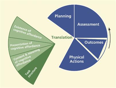
Figure 22-48 The task structure part of translation.
Support of task structure in this part of the Interaction Cycle means supporting user needs with the logical flow of tasks and task steps, including human memory support in the task structure; task design simplicity, flexibility, and efficiency; maintain the locus of control with the user within a task; and offer natural direct manipulation interaction.
Human working memory loads in task structure
Support human memory limitations in the design of task structure
The most important way to support human memory limitations within the design of task structure is to provide task closure as soon and as often as possible; avoid interruption and stacking of subtasks. This means “chunking” tasks into small sequences with closure after each part.
While it may seem tidy from the computer science point of view to use a “preorder” traversal of the hierarchical task structure, it can overload the user’s working memory, requiring stacking of context each time the user goes to a deeper level and “popping” the stack, or remembering the stacked context, each time the user emerges up a level in the structure.
Interruption and stacking occur when the user must consider other tasks before completing the current one. Having to juggle several “balls” in the air, several tasks in a partial state of completion, adds an often unnecessary load to human memory.