Chapter 7
Design Thinking, Ideation, and Sketching
A common mistake that people make when trying to design something completely foolproof is to underestimate the ingenuity of complete fools.
– Douglas Adams
Objectives
After you read this chapter, you should be able to:
1. Understand the evolution of design paradigms
2. Appreciate the design-thinking philosophy
3. Understand the ecological, interaction, and emotional design perspectives
4. Undertake ideation and sketching and appreciate their close relationship
7.1 Introduction
7.1.1 You Are Here
We begin each process chapter with a “you are here” picture of the chapter topic in the context of the overall Wheel lifecycle template; see Figure 7-1. We have noted that contextual inquiry (Chapter 3) is empirical, contextual analysis (Chapter 4) is inductive, requirements extraction (Chapter 5) is deductive, and design is integrative.
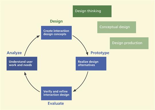
Figure 7-1 You are here; the first of three chapters on creating an interaction design in the context of the overall Wheel lifecycle template.
Chapters 3 and 4 are about existing work practice and any existing system. Chapters 5 and 6 are the bridge connecting analysis and design. This chapter and the next two are about designing the new work practice and the new system.
7.1.2 Design vs. Development
The entire field of system development uses the term “design” in a very broad sense, often connoting the entire lifecycle process. People refer to the “system design lifecycle” or “the interaction design process.” People say “you cannot do design without including evaluation.” And, of course, we agree.
The problem is that “design” is also used narrowly to refer to the creative human activity by which new ideas are synthesized and put together to make up parts of an interaction design, that is, to the box labeled “Design” in Figure 7-1, the topic of this chapter. In this usage, design is just one process activity and does not include the others; it specifically does not include analysis or evaluation.
There is really no effective term to distinguish the overall process from just synthesis activity. We would love to use the terms “develop” and “development” for the entire lifecycle process, calling it a “development lifecycle process.” However, “develop,” “development,” and “developer” are terms used almost universally to denote software engineering concepts tied strongly to programming and coding. A developer is someone who writes or develops implementation code.
Our path to happiness regarding this terminology trap is to follow the loose conventions of the field and use “design” with both narrow and broad meanings, hoping that context will provide clarity. In addition, we avoid “develop,” “developer,” or “development” as much as possible unless we are talking about software implementation. Instead, we will refer to the entire UX lifecycle process as a process for creating and refining interaction designs and will refer to activities in the lifecycle as process activities. On a rare occasion, we might lapse into using “development” to mean the creation and refinement of something, such as the development of a flow model. In those cases we are counting on context to avoid ambiguity.
7.2 Design paradigms
In a seminal paper that we think should have received more exposure, Harrison, Tatar, and Sengers (2007) paint the history of the focus of design in human–computer interaction (HCI) as a series of paradigms: engineering, human information processing (HIP), and phenomenological. They get credit for identifying the phenomenological perspective as a major design paradigm within the three major intellectual waves that have formed the field of HCI:
![]() Engineering and human factors: deconstruct work with the objective of designing the machine for optimum human performance.
Engineering and human factors: deconstruct work with the objective of designing the machine for optimum human performance.
![]() Cognitive science: the theory of what is happening in the human mind during and with respect to interaction by treating human minds as information processors.
Cognitive science: the theory of what is happening in the human mind during and with respect to interaction by treating human minds as information processors.
![]() The phenomenological paradigm (they call it the phenomenological matrix): emphasis in interaction is about making meaning (more on this later).
The phenomenological paradigm (they call it the phenomenological matrix): emphasis in interaction is about making meaning (more on this later).
Phenomenological Aspects of Interaction
Phenomenological aspects (deriving from phenomenology, the philosophical examination of the foundations of experience and action) of interaction are the cumulative effects of emotional impact considered over the long term, where usage of technology takes on a presence in our lifestyles and is used to make meaning in our lives.
The increasing importance of social and situated actions in HCI was at odds with both the usability-oriented engineering paradigm and the cognitive logic of the human information processor approach. The initial reluctance of HCI as a field to recognize and embrace the phenomenological paradigm spawned a parallel exploration in computer-supported cooperative work.
Activity theory helped explain the situated actions in work practice but did not do much to help design and evaluation. The paper by Harrison, Tatar, and Sengers (2007) is an evangelical wake-up call to include the phenomenological paradigm in mainstream HCI.
7.2.1 Engineering Paradigm
With some of its roots in software engineering, the HCI engineering paradigm prescribed starting with an inventory of the functionality envisioned for a new system and proceeding to build an interaction design of the best quality possible given available resources.
With recognition that user interaction deserved attention on its own, usability engineering emerged as a practical approach to usability with a focus on improving user performance, mainly through evaluation and iteration. The engineering approach casts design as just another lifecycle phase, a systematic approach that often works well for building systems with complex work domains.
Domain-Complex Systems
Domain-complex systems are systems with high degree of intricacy and technical content in the corresponding field of work. Often, characterized by convoluted and elaborate mechanisms for how parts of the system work and communicate, they usually have complicated work flow containing multiple dependencies and communication channels. Examples include an air traffic control system and a system for analyzing seismic data for oil exploration.
The engineering paradigm also had strong roots in human factors, where work was studied, deconstructed, and modeled. Here, the goal was user productivity and eliminating user errors. An example is the study of an assembly line where each action required to do work efficiently was described carefully. These descriptions were then more or less translated into requirements.
Designs focused on how to support these requirements and to automate where desirable. It was a purely utilitarian and requirements-driven approach. Success was measured by how much the user could accomplish, and alternative methods and designs were compared with statistical summative studies.
7.2.2 Human Information Processing (HIP) Paradigm
The human informationTatar processing approach to HCI is based on the metaphor of “mind and computer as symmetrically coupled information processors” (Tatar, Harrison, & Sengers, 2007). This paradigm, which at its base is about models of how information is sensed, accessed, and transformed in the human mind and, in turn, how those models reflect requirements for the computer side of the information processing, was defined by Card, Moran, and Newell (1983) and well explained by Williges (1982).
The HIP paradigm has its roots in psychology and human factors, from which it gets an element of cognitive theory. Especially as psychology is used in the discipline of human factors, it is about human mental states and processes; it is about modeling human sensing, cognition, memory, information understanding, decision making, and physical performance in task execution. The idea was that once these human parameters were codified, it is possible to design a product that “matches” them. Guidelines, such as not having more than seven plus or minus two items on transient lists on a user interface because of limits on human short-term memory, were a result of this type of thinking.
Human–Computer Interaction Design and the Three Paradigms
Deborah Tatar, Department of Computer Science, and, by courtesy, Psychology; Member, Center for Human-Computer Interaction; Member, Program for Women and Gender Studies; Virginia Tech
Steve Harrison, Department of Computer Science and School of Visual Arts, Virginia Tech.
Methods are like toothbrushes. Everyone uses them, but nobody wants to use somebody else’s. John Zimmerman
As you learn the methods in this book, you will adopt them for your own, and as you adopt them, you will adapt them to the situation that you are working in. Learning this well will allow you to design how you design. However, some changes are particularly difficult to understand and encompass. These are shifts across paradigms. You are unlikely to do this often, but sometimes it may be important to know when a shift is important or to recognize that someone else is working in a different paradigm.
In this sidebar, we define design as making something new that fits with reality. A design idea is a proposal for action in the world, burdened with the responsibility to solve problems or create delight. These definitions are cross-cutting. But the outcomes of design work are not as general as these definitions because any given design problem is approached within the particular way of seeing the world held by the designers. Such world views consist of a set of practices, expectations, and values sometimes called paradigms. Some world views value “thinking outside the box.” In fact, they may value this so much that one criterion for success is to break out of whatever assumptions are seen to be in place! Others may value the most refined interface that perfectly fits a heavily researched user. Paradigms suggest the kinds of questions that the designer should care about, what factors are important to consider, and what factors are outside the scope of the endeavor. The notion of paradigms differs a bit in its use in linguistics, in science, and in computation. What is really important here is that, in design, there is no absolute best for all circumstances. It depends on the paradigm. Identifying the paradigms in design helps us understand the intended value of the work more clearly.
The three paradigms we identify in human–computer interaction (HCI) are human factors, classical cognitivism/information processing, and the third/phenomenologically situated paradigm. Each of these paradigms represents a world view. Each encompasses a set of practices and expectations for the value and contribution of research. Each contributes to HCI, but in different ways. Some people might argue that there are more than three paradigms, whereas some might argue that there are fewer. But these have substantial claim to both history and utility. Human factors focus on optimizing man–machine fit. Classical cognitivism/information processing emphasizes (ideally predictive) models and theories about the relationship between what is in the computer and in the human mind. The third paradigm, with its base in phenomenology, focuses on the experiential quality of interaction, primarily the ways that users experience meaning in the artifact and its use. The third paradigm, unlike the other two, emphasizes the ways in which individuals and individual experiences in the moment may differ from one another.
To orient you, we will cartoon the nature of each of the paradigms through a simple and well-known interface example.
In the 1960s, the U.S. Air Force developed automated cockpit warning systems to alert pilots to hazardous conditions. The systems used recorded voices to tell pilots to turn, climb, or dive to avoid head-on collisions, among other things. Each of the three paradigms contributes a different kind of thinking to the formulation of the problem and the range of solutions.
1. Situations that drove the initial system design were classic examples of human factors “critical incidents” (Flanagan, 1954). That is, pilots were crashing more often than they needed to. The Air Force realized that they needed to gain the pilots’ attention quickly to avert these problems. At the time, all pilots and flight controllers were male, so someone had the bright idea of using a woman’s voice so that it would be immediately identified as the “emergency voice.” This was clever and worked well to reduce pilot errors.
2. The use of women’s voices was a particular design solution. However, it worked for reasons of interest to the classical cognitivism/information processing paradigm; women’s voices effectively differentiated signal from noise in the system interface’s interaction with the pilot. They allowed the efficient transmission of information, an important factor in any model of (i) human, (ii) computer, and (iii) interaction. Instead of simply saying “we are using women’s voices because they are different from men’s voices,” in this paradigm, we describe a model in which women’s voices vs men’s voices is an instance of the critical, generalizable parameter of signal/noise differentiation. This description suggests other design solutions. For example, a taxonomy of voice types, based on cognitive load and desired response times, could be created. Indeed, experimentation using this approach revealed that familiar women’s voices (i.e., wives, girlfriends) further improved pilot performance over nonspecific women’s voices. This approach optimized communication and pilot mental workload. This kind of characterization also continued to be useful once women became pilots and flight controllers. It predicted that their voices would no longer have the crucial properties and that another design solution needed to be sought.
3. However, starting with the first paradigm finding, there is still more to be said. A pilot’s wife’s voice might be most familiar, but might lead to unpredictable pilot response when the couple was on the verge of divorce. In the third/phenomenologically situated paradigm, we include construction of meaning in our description of the situation, including social and emotional meaning. This leads to different design implications and explorations than those that emerge in the design solutions of the other two approaches. In fact, the original female voice was reputed to have been selected for its sultry and seductive tone.1 This quality reinforced the idea of the space of the cockpit being “male,” echoed in movies such as Top Gun. However this appeared originally to pilots, it became palpably inappropriate in creating a comfortable workplace as women became pilots and flight controllers. An important aspect of the third paradigm is that it is as concerned with the variety of human behaviors as with their prevalence. That is, suppose you find that voices with certain properties work well for 98% of pilots. In the third paradigm, you might decide that you have to account for what makes the other 2% different, whereas in the first two paradigms, one is more likely to dismiss these as statistical aberrations or error.
We picked this example because the boundaries to generalizability have changed so palpably that it is relatively easy to perceive all three paradigms. Most of the time that is not the case, even retrospectively. People make arguments based on unarticulated positions, allegiances, and values, often dismissing thinking in other paradigms as uninteresting, unimportant, dull, or frivolous.
We advance the idea of the three paradigms not as an absolute truth to last for the ages, but as an important heuristic that helps explain important differences of opinion about what constitutes good design in HCI. This perspective is useful in understanding what is happening in contemporary HCI. It may also be helpful in scoping particular design problems, in understanding the concerns of a particular client, and in working across organizational and institutional team boundaries.
7.2.3 Design-Thinking Paradigm
Harrison, Tatar, and Sengers (2007) propose a third HCI design paradigm that they call the “phenomenological matrix.” We call it the design-thinking paradigm because our use of that concept goes a bit beyond their description of a “pure” phenomenological approach. This third design paradigm brings a vision of the desired user experience and product appeal and how the design of a product can induce that experience and appeal.
For Bødker and Buur (2002), the third paradigm for HCI design is motivated by a desire to “reframe usability practice.” The heavy priority for usability testing in traditional usability methods meant that usability concerns were being brought into the process too late and that emphasis was on refining a design but not on getting the right design in the first place [as Buxton (2007b) would say it]. They used participatory design techniques to experiment with and explore design through early prototypes as design sketches.
Participatory Design
Participatory design is a democratic process for design entailing user participation in design for work practice. Underlying participatory design is the arguments that users should be involved in designs they will be using, and that all stakeholders, including and especially users, have equal inputs into interaction design.
Another of their reasons for reframing usability practice is the fact that the usual usability techniques focused on snapshots of usage, user performance evaluated during single tasks. But they wanted to include emergence of use. They also wanted to overlap the four basic process activities—analysis, design, implementation, and evaluation—instead of “pipelining” them in an iterative process.
As a contrast to the other two paradigms, the third one is not about the utilitarian aspects but more about the emotional and phenomenological ones. The design-thinking paradigm is about social and cultural aspects of interaction and the design of “embodied interaction” because it is about interaction involving our whole bodies and spirit, not just our fingertips on a keyboard. It is also about “situated” design because it is about the notion of “place” with respect to our interaction with technology.
Malcolm McCullough (2004) espoused this idea in the context of pervasive, embedded, and ubiquitous computing surrounding us in our lives and in our architecture, connecting interaction design with psychology, cultural anthropology, and technology. A primary characteristic of the design-thinking paradigm is the importance of emotional impact derived from design—the pure joy of use, fun, and aesthetics felt in the user experience.
To put the paradigms in perspective, consider the concept of a new car design. In the first paradigm, the engineering view, a car is built on a frame that holds all the parts. The question of its utility is about how it all fits together and whether it makes sense as a machine for transportation. It is also about performance, horsepower, handling, and fuel mileage. The second paradigm will see the car design as an opportunity to develop ergonomic seating and maybe new steering control concepts, as well as placement of controls to react quickly to emergency driving situations.
The design-thinking view of the third paradigm will also encompass many of the things necessary to produce a car that works, but will emphasize emotional impact, “coolness” of the ride, and how to optimize the design to best appeal to the joy of driving and feelings of ownership pride. The design-thinking paradigm will also highlight the phenomenological aspects of how a car becomes more than just transportation from A to B, but how it becomes an integral part of one’s life.
The third paradigm, our design-thinking paradigm, is about designing for the user experience. Architects have long known that the physical building is not really the target of the design; they are designing for the experience of being in and using that building. Similarly, we are not designing products to sell; we are selling the experience that the product engenders, encourages, and supports.
Sometimes the design-thinking approach can be in opposition to what contextual inquiry and requirements might say a design should have. Frank Lloyd Wright was a master at envisioning a concept and an experience for his clients, often ignoring their inputs. You can see similarities in the design of the iPad. Popular criticism of the iPad cited the lack of so-called connection features, the ability to write free-form notes, and so on, making this a gadget that would not appeal to people. The argument was that this will be just another gadget without a clearly defined utility because it lacked the features to replace a laptop or a desktop computer.
However, the overwhelming success of this device goes to the fact that it is not about utility but the intimate experience of holding a beautiful device and accessing information in a special way. Before the iPad, there were email, digital newspapers such as CNN.com, book readers, and photo viewers, but this device introduced an experience in doing these same things that was unprecedented. With the design-thinking approach, often the outcome is an intangible something that evokes a deeper response in the user.
7.2.4 All Three Paradigms Have a Place
These paradigms are just frameworks within which to think about design. The paradigms are not necessarily mutually exclusive; they do overlap and can be complementary. In most real system or product development, there is room for more than one approach.
To read some of the new literature on design thinking, you might think that the old engineering approach to interaction design is on its way out (Nilsson & Ottersten, 1998), but a utilitarian engineering approach is still effective for systems with complex work domains. Just because a methodical and systematic approach to contextual inquiry, requirements, and modeling is a characteristic of the engineering paradigm does not mean that we do not pay attention to such things in the other paradigms.
Even the most innovative design thinking can benefit from being grounded in a real understanding of user work practice and user needs that comes from contextual inquiry and analysis. And even creative design thinking must still be directed and informed, and informing design can mean doing contextual inquiry and analysis, modeling, requirements extraction, prototyping, and so on. Further, there is no reason why the rich approach of design thinking, using ideation and sketching, should not be followed with iterative refinement.
Design Thinking
Design thinking is a mind-set in which the product concept and design for emotional impact and the user experience are dominant. It is an approach to creating a product to evoke a user experience that includes emotional impact, aesthetics, and social- and value-oriented interaction. As a design paradigm, design thinking is an immersive, integrative, and market-oriented eclectic blend of art, craft, science, and invention.
Ideation
Ideation is an active, creative, exploratory, highly iterative, fast-moving collaborative group process for forming ideas for design. With a focus on brainstorming, ideation is applied design thinking.
Sketching
Sketching is the rapid creation of free-hand drawings expressing preliminary design ideas, focusing on concepts rather than details. Multiple sketches of multiple design ideas are an essential part of ideation. A sketch is a conversation between the sketcher or designer and the artifact.
Similarly, there is need for creativity and innovation in all three paradigms. Just because we single out design thinking as the main place we discuss innovation and creativity does not mean there is no call for creativity in the other paradigms.
Further, even when the engineering paradigm or design-thinking paradigm is dominant in a project, designing from HIP-like inputs is still effective for leading to an interaction that is consistent with human cognitive capabilities and limitations. A consideration of ergonomics, human factors, and carefully studied workflow can still have a valid place in almost any kind of design.
7.3 Design thinking
The “design” box in the lifecycle template is usually a placeholder for an unknown or unspecified process. The usual UX lifecycle glosses over the whole subject of what is in the box labeled “design” (Buxton, 2007b). Design should be more than just a box within a larger lifecycle; it is a separate discipline on its own.
What some call design is applied only after functionality and interaction design are completed, when the product needs a shell or skin before going to market and everyone wants to know what color the device will be. This might help make an existing product attractive and perhaps more marketable, but this is cosmetic design, not essential design built into the product from the start.
Fortunately, this emerging mind-set that we call design thinking turns that around and puts a focus on design up front. The design-thinking paradigm is an approach to creating an experience that includes emotional impact, aesthetics, and social- and value-oriented interaction. The design of the product concept and design for emotional impact and the user experience comes first; it is a design-driven process.
Designers are called upon to create a new vision, taking customers and users to a profound and satisfying user experience. After the design concept emerges, then engineers can follow up by providing the functionality and interaction design to make the vision a reality.
Design thinking is immersive; everything is about design. Design thinking is integrative; you pull many different inputs, inspiration, and ideas together to focus on a design problem. Design thinking is human centered, requiring a thorough understanding of the needs, especially the emotional needs, of human users.
Design thinking is market oriented, requiring a thorough understanding of the market, trends in usage and technology, and the competition. As such, design thinking is not just the world of dreamers and geeks; it has become an essential business tool for decision making and marketing. Design thinking is broadly attentive to the product, packaging, presentation, and customer support. Design thinking is an eclectic blend of art, craft, science, and invention.
In the traditional engineering view, we use terms such as plan, analyze, build, evaluate, and optimize. In the design-thinking perspective, you are more likely to hear terms such as create, ideate, craft, envision, interpret, excite, provoke, stimulate, and empathize.
The Apple iPod Touch is an example of a product resulting from design thinking. The device has superb usability; its soft buttons have precise and predictable labels. The physical device itself has a marvelous design with great emotional impact. Much design effort went into aspects that had nothing to do with performance or functionality.
The packaging, gift-wrapping, and engraving appeal to a personal and social desirability. It is attractive; it is delightful. The user experience is everything and everything is about design. In fact, the label on the device does not say, “Made by Apple”; it says, “Designed by Apple!” “You buy it for what it can do, but you love it because it is so cool.” Apple’s senior vice president of industrial design, Jonathan Ive, says (Salter, 2009) “With technology, the function is much more abstract to users, so the product’s meaning is almost entirely defined by the designer.”
7.4 Design perspectives
We describe three design perspectives as filters through which we view design and design representations to guide thinking, scoping, discussing, and doing design. They are easy to understand and do not require much explanation.
7.4.1 Ecological Perspective
The ecological design perspective is about how the system or product works within its external environment. It is about how the system or product is used in its context and how the system or product interacts or communicates with its environment in the process. This is a work role and workflow view, which includes social interaction and long-term phenomenological aspects of usage as part of one’s lifestyle.
System infrastructure (Norman, 2009a) plays an important role in the ecological perspective because the infrastructure of a system, the other systems and devices with which it interacts in the world, is a major part of its ecology. Infrastructure leads you to think of user activities, not just isolated usage. Norman (2009b) states it in a way that designers should take to heart, “A product is actually a service.”
7.4.2 Interaction Perspective
The interaction design perspective is about how users operate the system or product. It is a task and intention view, where user and system come together. It is where users look at displays and manipulate controls, doing sensory, cognitive, and physical actions.
7.4.3 Emotional Perspective
The emotional design perspective is about emotional impact and value-sensitive aspects of design. It is about social and cultural implications, as well as the aesthetics and joy of use. System infrastructure (Norman, 2009b) can also play a role in the emotional perspective because the infrastructure of a system provides scaffolding for the phenomenological aspects of usage, which are about broader usage contexts over longer periods of time.
A product is not just a product; it is an experience (Buxton, 2007a). People do not usually use a product in isolation from other activities. People use products as part of an activity, which can include many different kinds of usage of many different things. And that starts with the out-of-the-box experience, which is not enhanced by difficult hard plastic encasing, large user manuals, complex installation procedures, and having to consent to a legal agreement that you cannot possibly read.
The Delicate Balance among Visual Appeal, Emotion, and Usability
Gitte Lindgaard, Distinguished Research Professor, Carleton University, Ottawa, Canada
Professor, Neuro affective psychology, Swinburne University of Technology, Melbourne, Australia
“Yellow sox → nice guy!” We know that many snap decisions, such as assessing the suitability of a person to a particular job, are often based on less than credible, if not entirely irrelevant, information. Still, whether we are sizing up another person or deciding to stay on a given Website, first impressions are instant, effortless, powerful, and based on affect, that is, on “what my body tells me to feel.” Even decisions that should involve serious contemplation, additional information, and evidence from different sources are made instantly. Worse, once we have made a decision, we set out to “prove” to ourselves that our decision was “right.”
Thus, when encountering an ugly, cluttered Website, we will be out of there on the next click, before gleaning the quality of the information, goods, or services it offers. However, if we have decided a priori to buy a given product from a certain vendor, we will persevere and complete our purchase, hating every step of the interaction. In our annoyed, even angry, state, we go out of our way to identify every trivial usability flaw simply to justify that initial decision.
Yet, we are much more likely to hang around and enjoy the ride on a pretty site even if its products are of a lower quality and the usability issues more serious and more numerous than on the ugly site so unceremoniously discarded. When given a choice, even the most unusable, but very pretty, site will typically be preferred over a less appealing, more usable site. In some studies, people, well aware of the site’s poor usability, have vigorously defended and justified their choice.
Numerous other studies have shown that beauty matters and that the first impression “sets the scene” for further action, at least in a Web environment where the next site is but a click away; visual appeal is simply used as a screening device. Quality of content will only be evaluated on sites that pass that initial step.
This rather uncompromising instant approach to decide on staying or leaving a Website could suggest that being pretty is all that matters. Not so! When the Canadian government wanted to attract masses of new graduates, they designed a vibrantly colorful Website with lots of animation in the belief that “this is what young people like.” They then took their beautiful Website around the country for feedback from the target audience.”Yeah, we like lots of bright color and movement” was the response, “but not when looking for a job in the Government!”
For an application to appeal to users, then, their judgmental criteria depend on the usage context. Even a neutral, relative boring gray color may occasionally be very appealing, pleasant to use, and highly usable. Figure 1 shows a telecommunications network alarm management system. In earlier versions of the software it was almost impossible to identify the problem nodes, making the operator’s job extremely stressful. If a blockage between two nodes is not detected and rectified within a few minutes, the problems spread so quickly that the entire network may break down, blocking all communication and making it almost impossible to fix.

Figure 1 Example of an alarm management system relying on a simple visual language
The gray background on the left shows a map of a recognizable part of a certain city with a network problem. The rough-looking color indicates land surrounding a small (outlined) river, shown with a smooth surface and overlaid with the network nodes currently in alarm mode. This facilitates the geographical identification of the location. The red rectangles indicate the most serious problem nodes and the seriousness of these.
In the present example, there is no communication between the two red nodes; the yellow node is affected, but is still able to communicate. Callout balloons with the letters “C” (critical, circled in green), “M”, and “m” (both medium) show where to start fixing the problem. Clicking on the red “C” takes the operator directly to the faulty equipment, shown on the right, where clicking again on the red C shows the affected equipment.
This example takes us back to Mark Weiser’s notion of “calm computing” aiming to ensure that the user feels good and “in control” at all times. There are no design gimmicks, no fun or attempt to “jazz up” the displays with smart icons or pretty colors in this user interface; it just “feels right.” This simple, very effective visual language presented on a consistent, bland background has removed most of the stress previously experienced by network operators. It has been adopted by the International Telecommunications Union as a standard for network management systems.
These examples contradict the currently sexy assumption in the human–computer interaction community that even serious tasks should be couched in a colorful gaming model. Apparently, appropriateness also features prominently when deciding how much to like a Website or an application. Judgments of appropriateness are based largely on culturally constructed expectations. The domain and the purpose of an interactive product determine our expectations and hence influence how we feel about it. This emotional effect underlies our situated judgment of appeal. Indeed, in our collective quest to create great user experiences, we must be careful not to lose sight of the traditional, often sneezed at, utilitarian brand of usability.
The example in Figure 2 is from a high-pressure petrochemical plant-management system. The plant produces many types of plastic, from purified, highly compressed gas injected under high pressure into reactor vessels operating at 200°+ C. The gas is mixed with chemical catalysts, which eventually turn the mix into tiny plastic pellets. The left side of Figure 2 shows how the pressure (red pen) and temperature (green pen) were plotted automatically on a constantly scrolling paper roll before automation. The variation in each parameter is shown in rows, and time is given in columns, with each row representing 30 minutes in elapsed time. The range of movement of those two pens enabled the team leader to easily monitor four reactor vessels simultaneously.
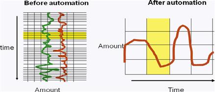
Figure 2 A before- and after-automation display shows minor changes to a mission-critical system
Three minor changes in the management system are shown on the right: (1) time is now shown in rows, (2) each column represents 10 minutes (instead of 30) of lapsed time, and (3) the two indicators are shown on different screens. These apparently minor changes paralyzed production completely. The highly experienced team with over 20 years of practice was unable to achieve the required quality of product; they continually overadjusted either the pressure or the temperature.
Consequently, the company nearly lost its main customer who bought 60% of the products, and an engineer had to be on duty with the team 24/7 for the next 6 months. The screen display was just as visually appealing as the original paper roll, but relearning the system rendered the system unusable. Thus, aesthetics alone did not ensure usability; the operators disliked the system intensely, and violation of the long-established expectations of what and how information should be displayed turned out to be a very costly oversight.
Evidently, the relationship among visual appeal, emotion, and usability is much more complex than may be assumed. To date, relatively little attention has been paid to the power of expectation, to our sense of appropriateness, and to our decisions concerning the “fitness for purpose” of interactive products. However, these do profoundly affect the appeal and hence our acceptance of such products. As user interface designers, we simply cannot afford to ignore the context in, and purpose for, which our products will be seen and used.
7.5 User personas
For the Latin sticklers, we prefer the easy-going “personas” over the pedantic but probably more correct “personae.” Personas are a powerful supplement to work roles and user class definitions. Storytelling, role-playing, and scenarios go hand in hand with personas.
We have leaned heavily on Cooper (2004) for our descriptions of personas with additional ideas on connecting to contextual data from Holtzblatt, Wendell, and Wood (2005, Chapter 9) and we gladly acknowledge their contributions here. Personas are an excellent way of supporting the design thinking and design perspectives of this chapter.
7.5.1 What Are Personas?
A persona is not an actual user, but a pretend user or a “hypothetical archetype” (Cooper, 2004). A persona represents a specific person in a specific work role and sub-role, with specific user class characteristics. Built up from contextual data, a persona is a story and description of a specific individual who has a name, a life, and a personality.
Personas are a popular and successful technique for making your users really real. Personas have an instant appeal through their concreteness and personal engagement that makes them ideal for sharing a visualization of the design target across the whole UX team.
Stories Are at the Center of User Experience
Whitney Quesenbery, WQusability, Coauthor, Storytelling in User Experience: Crafting Stories for Better Design (Rosenfeld Media)
Perhaps you think that stories and storytelling are out of place in a book about methodology and process. Once, you might have been right. As recently as 2004, a proposal for a talk about writing stories and personas as a way of understanding the people who use our systems was rejected out of hand with, “Personas? Stories!? We are engineers!”
They were wrong.
Stories have always been part of how human beings, including engineers, come up with new ideas and share those ideas with others. Stories may be even more important for innovative ideas. It is not very hard to explain an incremental change: “It is just like it is now, but with this one difference.” But when you are trying to imagine an entirely new concept or a design that will change basic processes, you need a story to fill in the gaps and make the connections between how it is now and how it might be.
To see what I mean, try this experiment. Close your eyes and try to explain to your 1995 self why you might want to use Twitter, Yelp, or Foursquare. There are just too many steps between the world then and the world now.
Sometimes it is easy because the context is familiar. Yelp’s story is like that: You are standing somewhere—the lobby of a building or a street corner—and you are hungry. Where can you go eat? Is it open right now? The idea is easy; the product is new because we could not pull off the technology, even just a few years ago.
Sometimes it is hard because the idea meets a need you did not know you even had. When Twitter first launched, people said “Why would I want to know that much about someone else’s daily life?” CommonCraft’s video, Twitter in Plain English2 takes up this challenge by showing how the system works in 2 minutes and 23 seconds. Not in technical terms, but in the human actions and human relationships it is based on.
Could you have predicted that (for a few years) a FAX would be the easiest way to order lunch from the local deli? It does not make sense until you think about the entire user experience.
One place to start an innovation story is with a frustrating situation. Tell a story that explains that point of pain. Maybe your story starts with how annoying it is to take sandwich orders from a room full of people. Include context and imagery and a realistic situation. Or it might be about the noise and craziness of lunch hour in a busy city deli, with people all yelling at once and at least three different languages in the kitchen.
Now change that story to give it a better ending. That is your innovation story.
You have people, in a situation, with a problem, and a solution, along with what will make it work.
Before you decide that your story is ready to share, ask yourself, “Did it all seem too easy? Did the story seem a little too perfect?” If so, take a 10-minute timeout and start over. Back in the deli, did you decide that the solution would be a laptop on the deli counter? Did you think about the people standing behind a counter, wiping mustard off their hands? It is easy to fall into the trap of writing stories about the users we wish we had.
Stories in user experience are not made up fairy tales; they are grounded in good user research and other data. They are like personas in this way. Personas start with data, organized into user profiles. It is the stories that turn a good user profile into a persona, that is, adding the emotions, detailed personal characteristics, and specific background or goals that make a persona come alive. You cannot tell much of a story about a stick figure. However, if you imagine Jason, who is leaving high school, is interested in computers, and loves his local sports team, you can begin to think about what kind of experiences will work well for Jason and how he might interact with the product you are designing.
Similarly, you can start with a task or goal. Use your favorite method to model the task. That gives you the analysis. Put that together into a sequence of actions, and you have a scenario. Add character into that narrative, with all their context and personal goals. Let their emotions be part of it; they are not robots. Are they frustrated, eager, happy, or sad? Now you are starting to craft a story.
Both personas and stories rely on data. They are the raw material. Scenarios and profiles are the skeleton—the basic shape and size of it. But it is when you add emotion and imagery that you have a story. If you understand the human and technical context, your stories will have believable characters and narratives.
The next time you want to help someone understand a design or how it will be used, try a story instead of a technical explanation. The really great thing about stories is that they make people want to tell more stories, which will get everyone engaged with the idea and its impact on our lives. All of a sudden, you are all talking about user experience.
7.5.2 What Are Personas Used For? Why Do We Need Them?
Common sense might dictate that a design for a broad user population should have the broadest possible range of functionality, with maximum flexibility in how users can pick the parts they like the most. But Cooper (2004, p. 124) tells us this thinking is wrong. He has shown that, because you simply cannot make a single design be the best for everyone, it is better to have a small percentage of the user population completely satisfied than the whole population half-satisfied.
Cooper extends this to say it can be even better to have an even smaller percentage be ecstatic. Ecstatic customers are loyal customers and effective marketing agents. The logical extreme, he says, is to design for one user. This is where a persona comes in, but you have to choose that one user very carefully. It is not an abstract user with needs and characteristics averaged across many other kinds of users. Each persona is a single user with very concrete characteristics.
Edge cases and breadth
Personas are a tool for controlling the instinct to cover everything in a design, including all the edge cases. This tool gives us ways to avoid all the unnecessary discussion that comes with being “edge-cased to death” in design discussions.
Personas are essential to help overcome the struggle to design for the conflicting needs and goals of too many different user classes or for user classes that are too broad or too vaguely defined. In situations where users for one work role come from different user classes, but all have to take on the same work role, a persona lets us focus on designing literally for a single person and liberates them from having to sort through all the conflicting details of multiple user classes.
As Cooper (2004) put it, personas can help end feature debates. What if the user wants to do X? Can we afford to include X? Can we afford to not include X? How about putting it in the next version? With personas, you get something more like this: “Sorry, but Noah will not need feature X.” Then someone says “But someone might.” To which you reply, “Perhaps, but we are designing for Noah, not ‘someone.’”
A specific persona makes clear what functionality or features must be included and what can be omitted. It is much easier to argue whether a person represented by a specific persona would like or use a given design feature.
Designers designing for themselves
Designing to “meet the needs of users” is a vague and ill-defined notion giving designers the slack to make it up as they go. One common way designers do stray from thinking about the user is when they design for themselves. In most project environments, it is almost impossible for designers to not think of the design in terms of how they would use it or react to it.
One of the strengths of personas is that they deflect this tendency of designers to design for themselves. Because of their very real and specific characteristics, personas hold designers’ feet to the fire and help them think about designs for people other than themselves. Personas help designers look outward instead of inward. Personas help designers ask “How would Rachel use this feature?,” forcing them to look at the design from Rachel’s perspective. The description of a persona needs to make it so well defined as a real and living being that it is impossible for a designer or programmer to substitute themselves or their own characteristics when creating the design.
7.5.3 How Do We Make Them?
As in most other things we do in analysis and design, we create a separate set of personas for each work role. For any given work role, personas are defined by user goals arising from their sub-roles and user classes. Different sub-roles and associated user classes have different goals, which will lead to different designs.
Identifying candidate personas
Although personas are hypothetical, they are built from contextual data about real users. In fact, candidate personas are identified on the fly as you interview potential users. When you encounter a user whose persona would have different characteristics than any of the existing ones, add it to the list of candidates.
This means that you will create multiple candidate personas generally corresponding to a major sub-role or user class, as shown in the top part of Figure 7-2. How many candidate personas do you need? As many as it takes to cover all the users. It could be in the dozens.
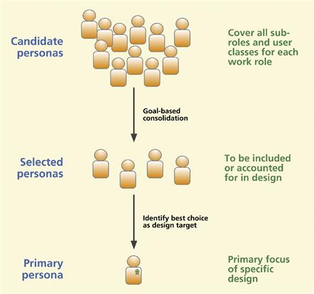
Figure 7-2 Overview of the process of creating a persona for design.
Goal-based consolidation
The next step is to merge personas that have similar goals. For example, in the Ticket Kiosk System we have a persona of an undergraduate student ticket buyer sub-role who lives on campus and is interested in MU soccer tickets. Another persona in the same work role, this time a graduate student who lives off campus, is interested in MU tennis tickets.
These two personas have different backgrounds, defining characteristics, and perhaps personal interests. But in the context of designing the kiosk system, they are similar in their goals: get tickets for medium popularity athletic events at MU.
This step reduces the number of personas that you must consider, as shown in the middle part of Figure 7-2. But you still cannot design for a whole group of personas that you may have selected, so we choose one in the next section.
Selecting a primary persona
Choose one of the personas selected in the previous step as the one primary persona, the single best design target, the persona to which the design will be made specific.
Making this choice is the key to success in using the persona in design. The idea is to find common denominators among the selected personas. Sometimes one of the selected personas represents a common denominator among the others and, with a little adjusting, that becomes the primary persona.
The way you get the primary persona right is to consider what the design might look like for each of the selected personas. The design specifically for the right primary persona will at least work for the others, but a design specifically for any of the other selected personas may not work for the primary persona.
An example of the primary persona for the student sub-role in the Ticket Kiosk System could be that of Jane, a biology major who is a second-generation MU attendee and a serious MU sports fan with season tickets to MU football. This persona is a candidate to be primary because she is representative of most MU students when it comes to MU “school spirit.”
Another persona, that of Jeff, a music major interested in the arts, is also an important one to consider in the design. But Jeff is not a good candidate as a primary persona because his lack of interest in MU athletics is not representative of a majority of MU students.
In constructing the primary persona, making it precise and specific is paramount. Specificity is important because that is what lets you exclude other cases when it comes to design. Accuracy (i.e., representing a particular real user) is not as important because personas are hypothetical.
Do not choose a mixture of users or an “average” user; that will be a poor choice and the resulting design will probably not work well for any of the personas. Averaging your users just makes your persona a Mr. Potato Head, a conglomeration that is not believable and not representative of a single user.
7.5.4 Mechanics of Creating Personas
Your persona should have a first and last name to make it personal and real. Always, of course, use fictitious names for personas to protect the anonymity of the real users upon which they may be based. Mockup a photo of this person. With permission, take one of a volunteer who is a visual match to the persona or use a photo from a noncopyrighted stock collection. Write some short textual narratives about their work role, goals, main tasks, usage stories, problems encountered in work practice, concerns, biggest barriers to their work, etc.
Whenever a persona is developed for a work role, if there is enough space in the flow and social model diagrams, you can show the association of your personas to work roles by adding the persona represented as a “head shot” photo or drawing of a real person attached with lines to the work role icon. Label each with the persona’s name.
7.5.5 Characteristics of Effective Personas
Make your personas rich, relevant, believable, specific, and precise
The detail of a persona has to be a rich part of a life story. It has to be specific and precise; this means lots of details that all fit together. Give your persona a personality and a life surrounded with detailed artifacts.
Personas are relevant and believable. Every persona must be a complete and consistent picture of a believable person. Personas excel in bringing out descriptions of user skills.
Unlike aggregate categories (e.g., user classes), a persona can be a frequent user without being an expert (because they still do not understand how it works).
Make your personas “sticky”
Some practitioners of the persona technique go far beyond the aforementioned minimal descriptions of their creations. The idea is to get everyone thinking in terms of the personas, their needs, and how they would use a given system.
Personas need to get lots of visibility, and their personalities need to be memorable or “sticky” in the minds of those who encounter them (Nieters, Ivaturi, & Ahmed, 2007). To this end, UX teams have created posters, trading cards, coffee mugs, T-shirts, screen “wallpaper,” and full-sized cardboard stand-up figures to bring their personas alive and give them exposure, visibility, and memorability to keep them on the minds of all stakeholders.
At Cisco in San Jose, designers have gone so far as to invent “action figures” (à la Spiderman), little dolls that could be dressed and posed in different ways and photographed (and sometimes further “developed” via Photoshop) in various work contexts to represent real usage roles (Nieters, Ivaturi, & Ahmed, 2007). To us, that may be going beyond what is necessary.
Where personas work best
When personas are used in designing commercial products or systems with relatively simple work domains (i.e., projects on the left-hand side of the system complexity space of Figure 2.5), they help account for the nuances and the activities in personal lives outside organizations. Social networking and other phenomenological behavior come into play.
For example, you may have the kind of person who always carries a phone but does not always carry a camera. This might help in design discussions about whether to combine a camera in a cellphone design.
As you move toward the right-hand side of the system complexity space of Figure 2.5, toward systems for more complex work domains, the work practice often becomes more firmly defined, with less variation in goals. Individual users in a given work role become more interchangeable because they have almost the same exact goals. For example, the work goals of an astronaut are established by the mission, not by the person in the astronaut role and usage is prescripted carefully.
In this kind of project environment, personas do not offer the same advantages in informing design. Roles such as astronaut or air traffic controller are defined very restrictively with respect to background, knowledge, skills, and training, already narrowing the target for design considerably. People who take on that role face stiff user class specifications to meet and must work hard and train to join the user community defined by them. All users in the population will have similar characteristics and all personas for this kind of role will look pretty much alike.
7.5.6 Goals for Design
As Cooper (2004) tells us, the idea behind designing for a persona is that the design must make the primary persona very happy, while not making any of the selected personas unhappy. Buster will love it and it still works satisfactorily for the others.
7.5.7 Using Personas in Design
Team members tell “stories” about how Rachel would handle a given usage situation. As more and more of her stories are told, Rachel becomes more real and more useful as a medium for conveying requirements.
Start by making your design as though Rachel, your primary persona, is the only user. In Figure 7-3, let us assume that we have chosen persona P3 as the primary persona out of four selected personas. Because D(P3) is a design specific to just P3, D(P3) will work perfectly for P3. Now we have to make adjustments to D(P3) to make it suffice for P1.
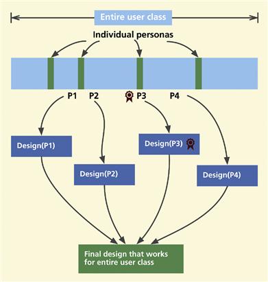
Figure 7-3 Adjusting a design for the primary persona to work for all the selected personas
Then, in turn, we adjust it to suffice for P2 and P4. The final resulting design will retain the essence of D(P3), plus it will include most of the attributes that make D(P1), D(P2), and D(P4) work for P1, P2, and P4, respectively.
As you converge on the final design, the nonprimary personas will be accounted for, but will defer to this primary persona design concerns in case of conflict. If there is a design trade-off, you will resolve the trade-off to benefit the primary persona and still make it work for the other selected personas.
7.5.8 Example: Cooper’s In-Flight Entertainment System
Cooper (2004, p. 138) describes the successful use of personas in a Sony design project for an in-flight entertainment system called P@ssport. In addition to the work roles for system maintenance and the flight attendants who set up and operate the entertainment system, the main users are passengers on flights. We call this main work role the Traveler.
The user population that takes on the role of Traveler is just about the broadest possible population you can imagine, including essentially all the people who travel by air—almost everyone. Like any general user population, users might represent dozens of different user classes with very diverse characteristics. Cooper showed how the use of personas helped mitigate the breadth, vagueness, and openness of specification of the various Traveler user classes and their characteristics.
You could come up with dozens or more personas to represent the Traveler, but in that project the team got it down to four personas, each very different from the others. Three were quite specialized to match the characteristics of a particular type of traveler, while the fourth was an older guy who was not technology savvy and was not into exploring user interface structures or features—essentially the opposite of most of the characteristics of the other personas.
They considered designs for each of the first three personas, but because none of those designs would have worked for the fourth, they came up with an initial design for the fourth persona and then adapted it to work well for all the other personas, without sacrificing its effectiveness for the target persona.
Example: User Personas—Lana and Cory
Here is an example of a persona derived from the interviews of the couple, Lana and Cory, whom we treat as a single composite persona because they share an approach to entertainment events. (NB: The interspersed comments in parentheses are not part of the personas, but possibly design-related observations related to various aspects of the personas.)
Lana is a young 20-something manager and yoga instructor in the Dirk Gently Holistic Yoga Studio and enjoys using her laptop during off-work hours. Cory works as a graphic designer at Annals of Myth-information, a small-sized company of creative people.
Lana does not own a car, a smart option in Middleburg, so she takes the bus for distances beyond walking or biking. Cory has to drive to work but bikes or takes public transportation to other places on weekends. Lana and Cory work hard, play hard, and are ready for entertainment on the weekends. (Because they both spend time occasionally at bus stops, it would be a good place for them to peruse the entertainment possibilities and buy tickets while waiting for the bus.)
In addition to pursuing Middleburg entertainment, Lana and Cory have also been known to skip over to Washington, DC, or New York City to visit friends and take in some world-class entertainment. (Therefore, they would love to see information about events in other cities included in the kiosk.)
They occasionally take time out on weekday evenings to do something different, to get away from the routine, which can include seeing a movie, visiting a museum, going out with friends, or traveling in the immediate area. As a balance to the routine of their jobs, they both crave opportunities for learning and personal growth so they often seek entertainment that is sophisticated and interesting, entertainment that challenges intellectually.
However, there are some days they want to rest their minds and they seek something more like mindless entertainment, often something that will make them laugh. They hear about a lot of events and places to visit through word of mouth, but they wonder about how many other interesting events do not come to their attention.
Cory, being influenced by his work in designing social Websites, wonders if sources of entertainment information could also provide a special kind of social networking. He would like to see mediated discussions about events and entertainment-related issues or at least a way to post and read reviews and opinions of various movies and other performances.
Similarly, Lana would like a way to share event information. “Like maybe this weekend there is going to be a jazz festival at a certain sculpture garden and I want Cory to know about it. It would be nice to have a button to touch to cause some kind of link or download to my iPhone or iPod.” It is easy to copy information from an entertainment Website and send it via email, but sharing is not as easy from a ticket office or kiosk.
To sum up the characteristics of their joint persona, they:
Exercise
See Exercise 7-1, Creating a User Persona for Your System
7.6 Ideation
Ideation is an active, fast-moving collaborative group process for forming ideas for design. It is an activity that goes with design thinking; you might say that ideation is a tool of design thinking; ideation is applied design thinking.
Ideation is where you start your conceptual design. This is a hugely creative and fun phase. Ideation is where you brainstorm to come up with ideas to solve design problems. Ideation is inseparable from sketching and evaluation aimed at exploration of design ideas.
7.6.1 Essential Concepts
Iterate to explore
Ideation involves exploration and calls for extensive iteration (Buxton, 2007b). Be ready to try, try, try, and try again. Think about Thomas Edison and his more than 10,000 experiments to create a usable and useful light bulb. Make sketches and physical mockups early and often, and expose customers and users to your designs; involve them in their creation, exploration, and iteration.
The evaluation part of this kind of exploratory iteration is never formal; there are no established “methods.” It is a fast, furious, and freewheeling comparison of many alternatives and inspiration for further alternatives. If you are starting out with only two or three alternatives, you are not doing this right.
Idea creation vs. critiquing
In the active give-and-take of design, there are two modes of thinking: idea creation and critiquing. Idea creation is about the generation of new ideas and throwing them out for discussion and inspiration. Critiquing is review and judgment.
Although you will interweave idea creation and critiquing throughout the design process, you should know which mode you are in at any given time and not mix the modes. That especially means not to mix critiquing into idea creation. Idea creation should result in a pure flow of ideas regardless of feasibility, in the classic tradition of brainstorming. Although we know that, at the end of the day, practical implementation constraints must be considered and allowed to carry weight in the final overall design, saying “Hey, wait a minute!” too early can stifle innovation.
Mason (1968) calls this separation of idea creation and critiquing “go-mode and stop-mode thinking.”3 Sodan (1998) calls it the yin and yang of computer science. In idea-creation mode you adopt a freewheeling mental attitude that will permit ideas to flourish. In critiquing you revert to a cold-blooded, critical attitude that will bring your judgment into full play.
Idea creation gives a new creative idea time to blossom before it is cut at the stem and held up to the scale. Idea creation gives you permission to be radical; you get to play outside the safe zone and no one can shoot you down. Allowing early cries of “that will never work,” “they have already tried that,” “it will cost too much,” “we do not have a widget for that,” or “it will not work on our implementation platform” will unfairly hobble and frustrate this first step of creativity.
We once experienced an interesting example of this tension between innovation and implementation constraints with a consulting client, an example that we call the implementation know-it-all. The interaction designers in a cross-disciplinary team that included software folks were being particularly innovative in scenario and prototype sketching but the software team member was not going along.
He was doubtful whether their implementation platform could support the design ideas being discussed and he got his team to stop designing, start talking about technical feasibility, and explore implementation solutions. When we threw a “premature critiquing” penalty flag, he defended his position with the rationale that there was no sense spending time on an interaction design if you are only to discover that it cannot be implemented.
This might sound like a reasonable stance, but it is actually the other way around! You do not want to spend time working on technical solutions for an interaction design feature that can change easily as you evaluate and iterate. That is the whole point of low-fidelity prototypes; they are inexpensive, fast, and easy to make without concerns about implementation platforms. Wait and see how the design turns out before worrying about how to implement it.
Beyond this, early stifling of a design idea prevents a chance to explore parts of the idea that are practical. Even when the idea does turn out to be infeasible, the idea itself is a vehicle for exploring in a particular direction that can later be used to compare and contrast with more feasible ideas.
The design teams at IDEO (ABC News Nightline, 1999) signal premature critiquing by ringing a wrist-mounted bicycle bell to signal the foul of being judgmental too early in design discussions. To help engender an idea creation attitude in early design discussions, Cooper, Reimann, and Dubberly (2003, p. 82) suggest that team members consider the user interface as all-powerfully magical, freeing it from implementation-bound concerns up front. When you do not have to consider the nuts and bolts of implementation, you might find you have much more creative freedom at the starting point.
7.6.2 Doing Ideation
If the roof doesn’t leak, the architect hasn’t been creative enough
– Frank Lloyd Wright (Donohue, 1989)
Set up work spaces
Set aside physical work spaces for ideation, individual work, and group work. Establish a place for design collaboration (Bødker & Buur, 2002). If possible, arrange for dedicated ideation studio space that can be closed off from outside distractions, where sketches and props can be posted and displayed, and that will not be disturbed by time-sharing with other meetings and work groups.
In Figure 7-4 we show the collaborative ideation studio, called the Kiva, in the Virginia Tech Department of Industrial Design. The Kiva was originally designed and developed by Maya Design in Pittsburgh, Pennsylvania, and is used at Virginia Tech with their permission.
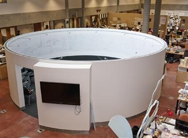
Figure 7-4 The Virginia Tech ideation studio, the “Kiva”
(photo courtesy of Akshay Sharma, Virginia Tech Department of Industrial Design).
The Kiva is a cylindrical space in which designers can brainstorm and sketch in isolation from outside distractions. The space inside is large enough for seating and work tables. The inner surface of most of the space is a metallic skin. It is painted so it serves an enveloping whiteboard that can hold magnetic “push pins.” The large-screen display on the outside can be used for announcements, including group scheduling for the work space.
In Figure 7-5 we show individual and group work spaces for designers.

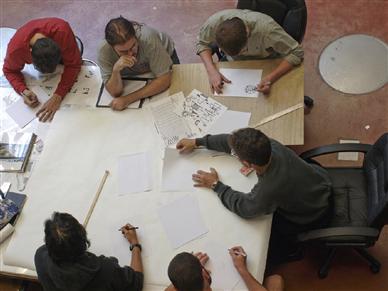
Figure 7-5 Individual and group designer work spaces
(photos courtesy of Akshay Sharma, Virginia Tech Department of Industrial Design).
Assemble a team
Why a team? The day of the lone genius inventor is long gone, as is the die-hard misconception of the disheveled genius inventor flailing about in a chaotic frenzy in a messy and cluttered laboratory (picture the professor in Back to the Future) (Brown, 2008).
Thomas Edison, famous not just for his inventions but for processes to create inventions, broke with the single genius inventor image and was one of the first to use a team-based approach to innovation. Thomas Edison “made it a profession that blended art, craft, science, business savvy, and an astute understanding of customers and markets” (Brown, 2008, p. 86). Today, design thinking is a direct descendant of Edison’s tradition, and in this design thinking, teamwork is essential for bouncing ideas around, for collaborative brainstorming and sketching, and for potentiating each other’s creativity.
So, gather a creative and open-minded team. You might think that only a talented few brilliant and inventive thinkers could make ideation work successfully. However, we all have the innate ability to think freely and creatively; we just have to allow ourselves to get into the mode—and the mood—for a free-thinking flow of ideas without inhibition and without concern that we will be criticized.
Try to include people with a breadth of knowledge and skills, cross-disciplinary people who have experience in more than one discipline or area. Include customer representatives and representative users. If you are going to be thinking visually, it helps to have a visual designer on the team to bring ideas from graphic design.
Use ideation bin ideas to get started
If you gathered ideation inputs into a “bin” of work activity notes back in contextual analysis, now is the time to use them. An ideation input bin is an unconstrained and loosely organized place to gather all the work activity notes and other ideas for sparking and inspiring design.
You should also include emotional impact factors in your ideation inputs because ideation is most likely where these factors will get considered for incorporation into the design. In your contextual data, look for work activity notes about places in the work practice that are dreaded, not fun, kill joy, or drudgery so you can invent fun ways to overcome these feelings.
Shuffle the notes around, form groups, and add labels. Use the notes as points of departure in brainstorming discussions.
Conceiving and Informing the Magitti Context Aware Leisure Guide
Dr. Victoria Bellotti, Principal Scientist, and Dr. Bo Begole, PARC, a Xerox Company
In the realm of new product and service innovation, it is rare that a business places such importance on the idea of utility that it is willing to invest heavily in user-centered research before investing in design and implementation of any kind. It is especially rare before even determining who the user should be or what the product or service should do. When this happened at PARC in 2003–2006, we were delighted to participate in an extraordinary collaboration with Dai Nippon Printing (DNP), the highest-revenue printing technologies and solutions company in the world. DNP executives wished to respond to the widespread transition from printed to electronic media. So they asked PARC, with its reputation for user-centered technology innovation, to discover a new rich media technology-based business opportunity and to develop an innovative solution for the Japanese market. They wanted the solution to be centered on leisure content, as that was most compatible with the bulk of the content in their traditional media printing business.
Initially the most important thing we needed to do was to search broadly for an ideal target user. A method we call “Opportunity Discovery” was developed to handle the situation where one wants to brainstorm and eliminate possible market opportunities in a systematic manner. Many different problem statements representing a demographic plus some activity, problem, or desire were compared side by side in terms of preagreed criteria, which represented the properties of an ideal opportunity for DNP. The most promising three were selected for further, deeper exploration. Representatives of those target markets were interviewed about their receptiveness to new technology and finally the youth market was chosen as the most likely to adopt a novel technology solution.
Using surveys, interviews, and shadowing, we determined that the 19- to 25-year-old age group had the most leisure, as they were between cram school and a demanding career. These were therefore chosen as the ideal target for our leisure technology. After engaging in some persona explorations, we brainstormed about 500 ideas for possible technology solutions and subsequently clustered them into more coherent concepts. The concepts were evaluated by a team of PARC and DNP representatives for their intuitive appeal, their match to DNP’s business competencies, and their potential to generate intellectual property, which could be used to protect any business endeavor built around the technology against competitors. The five best ideas were then sketched out in a deliberately rough scenario form to elicit criticism and improvement. They were then taken to Tokyo and exposed to representatives of the target market for feedback, refinement, and an indication as to which was the most compelling.
In the end, two scenarios were neck and neck—Magic Scope (a system for viewing virtual information) and Digital Graffiti (a system for creating virtual information). These scenarios were combined into the Magitti city leisure guide concept, which was then elaborated in a much more detailed format. We crystallized the idea of recommending venues where leisure activities could be pursued that became the heart of the final system. A mockup was built out of cardboard and plastic with switchable paper screens that matched the storyline in the scenario. This was taken back to Japan for in situ evaluation on the streets of Tokyo with target market representatives. We also held focus group evaluations using just the paper screens where more penetrating questions could be asked of large groups who outnumbered the researchers and were more confident in this context.
As Magitti was taking shape, we continued our field investigations, involving more interviews, observations, and a mobile phone diary, which led to useful insights that informed the system design. One phenomenon that we noticed was that people in the city tended to travel a long way to meet friends half-way between their widely dispersed homes. The half-way points were often unfamiliar and indeed most young people we interviewed on the street reported being moderately to extremely unfamiliar with the location they were in. A second phenomenon we noticed was that our young prospective users tended not to plan everything in advance, sometimes only the meeting place was preagreed. Both of these phenomena constituted good evidence of the receptivity toward or need for a leisure guide.
We surfaced a strong requirement for one-handed operation, as most Japanese people use public transit and carry bags with only one hand free in the context of use that Magitti was intended for. We also discovered a need for photos that convey ambiance inside a venue, as it is hard to see inside many Japanese businesses, even restaurants, because they are often above ground floor level. Finally, the fact that our target users trusted the opinions of people more than businesses and advertisers led us to believe that end user-generated content would be important.
Our extensive fieldwork and user-centered design activities allowed us to develop a well-grounded idea of what we needed to build and how it should work before we ever wrote a line of code for DNP. It is quite extraordinary that this happens so rarely, given that a lot of wasted development effort can be saved in technology innovation by good user-centered work. We can use observation to drive insights and focus our efforts on solving real problems, and we can elicit feedback from target users about simple scenarios and mockups early on to elicit crucial feedback. This approach was responsible for the fact that the Magitti system concept was very appealing to representatives of its target market. The working prototype we subsequently developed was also well received and found to be helpful in leisure outings in Tokyo. The commercial solution based off the Magitti prototype is now initially available in Japan as an iPhone application called MachiReco (meaning city recommender).
Reference
1. Bellotti V, Begole B, Chi EH, et al. Activity-based serendipitous recommendations with the Magitti mobile leisure guide. In: Proceeding of the twenty-sixth annual SIGCHI conference on Human factors in computing systems (CHI ʼ08). New York, NY, USA: ACM; 2008;1157–1166.
Brainstorm
Is it wrong to cry “Brainstorm!” in a crowded theater?
–Anonymous
Ideation is not just sketching, it is brainstorming. According to Dictionary.com, brainstorming is a “conference technique of solving specific problems, amassing information, stimulating creative thinking, developing new ideas, etc., by unrestrained and spontaneous participation in discussion.” Ideation is classic brainstorming applied to design.
Setting the stage for ideation. Part of brainstorming involves the group deciding for itself how it will operate. But for groups of any size, it is a common activity to start with an overview discussion in the group as a whole.
The initial overview discussion establishes background and parameters and agreement on goals of the design exercise. Post major issues and concepts from your ideation bin (see earlier discussion). The ideation team leader must be sure that everyone on the team is in tune with the same rules for behavior (see sub-section on rules of engagement later).
Next, divide up the team into pairs or small sub-teams and go to breakout groups to create and develop ideas. The goal of breakout groups is to have intense rapid interactions to spawn and accumulate large numbers of ideas about characteristics and features. Use marking pens on flip charts and/or write on whiteboards. Put one idea per sheet of paper so that you have maximum freedom to move each around independently.
Use sketches (imperative, not optional) annotated with short phrases to produce quick half-minute representations of ideas. You can include examples of other systems, conceptual ideas, considerations, design features, marketing ideas, and experience goals. Get all your whacky, creative, and off-the-wall ideas out there. The flow should be a mix of verbal and visual.
Reconvene when the sub-teams have listed all the ideas that they can think of or when the allotted time is up. In turn, each sub-team reports on their work to the whole group. First posting their annotated sketches around the room, the sub-teams walk the group through their ideas and explain the concepts. The sub-teams then lead a group discussion to expand and elaborate the ideas, adding new sketches and annotations, but still going for essentials, not completeness of details.
When the font of new ideas seems to have run dry for the moment, the group can switch to critiquing mode. Even in critiquing, the focus is not to shoot down ideas but to take parts that can be changed or interpreted differently and use them in even better ways.
In Figure 7-6 we show an example of ideation brainstorming in mid-process within the Virginia Tech ideation studio.
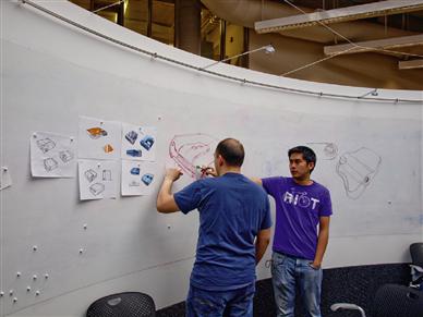
Figure 7-6 Ideation brainstorming within the Virginia Tech ideation studio, Kiva
(photo courtesy of Akshay Sharma, Department of Industrial Design).
The mechanics of ideation. Use outlining as verbal sketching. An outline is easier to scan for key ideas than bulk text. An outline is an efficient way to display ideation results on flip charts or in projected images.
Immerse your sketching and ideation within a design-support ecology, a “war room” of working artifacts as inputs and inspiration to ideation. Get it all out there in front of you to point to, discuss, and critique. Fill your walls, shelves, and work tables with artifacts, representations of ideas, images, props, toys, notes, posters, and materials.
Make the outputs of your ideation as visual and tangible as possible; intersperse the outline text with sketches, sketches, and more sketches. Post and display everything all around the room as your visual working context. Where appropriate, build physical mockups as embodied sketches.
Physical Mockup
A physical mockup is a tangible, three-dimensional, physical prototype or model of a device or product, often one that can be held in the hand, and often crafted rapidly out of materials at hand, and used during exploration and evaluation to at least simulate physical interaction.
Use teamwork and play off of each other’s ideas while “living the part of the user.” Talk in scenarios, keeping customers and users in the middle, telling stories of their experience as your team weaves a fabric of new ideas for design solutions.
In IDEO’s “deep dive” approach, a cross-disciplinary group works in total immersion without consideration of rank or job title. In their modus operandi of focused chaos (not organized chaos), “enlightened trial and error succeeds over the planning of lone genius.” Their designing process was illustrated in a well-known ABC News documentary with a new design for supermarket shopping carts, starting with a brief contextual inquiry where team members visit different stores to understand the work domain of shopping and issues with existing shopping cart designs and use.
Then, in an abbreviated contextual analysis process, they regrouped and engaged in debriefing, synthesizing different themes that emerged in their contextual inquiry. This analysis fed parallel brainstorming sessions in which they captured all ideas, however unconventional. At the end of this stage they indulged in another debriefing session, combining the best ideas from brainstorming to assemble a design prototype. This alternation of brainstorming, prototyping, and review, driven by their “failing often to succeed sooner” philosophy, is a good approach for anyone wishing to create a good user experience.
Rules of engagement. The process should be democratic; this is not a time for pulling rank or getting personal. Every idea should be valued the same. Ideation should be ego free, with no ownership of ideas; all ideas belong to the group; all are equally open to critiquing (when the time comes). It is about the ideas, not the people. There is to be no “showboating” or agendas of individuals to showcase their talent.
The leader should be especially clear about enforcing “cognitive firewalling” to prevent incursions of judgment into the idea-creation mode. If the designers are saying they need a particular feature that requires an interstellar ion-propulsion motor and someone says “wait, we cannot make that out of Tinkertoys,” you will have to throw out a penalty flag.
Example: Ideation for the Ticket Kiosk System
We brainstormed with potential ticket buyers, students, MU representatives, and civic leaders. Here we show selected results of that ideation session with our Ticket Kiosk System design team as a consolidated list with related categories in the spirit of “verbal sketching.” As in any ideation session, ideas were accompanied with sketches. We show the idea part of the session here separately to focus on the topic of this section.
Thought questions to get started:
What does “an event” mean? How do people treat events in real life?
An event is more than something that happens and maybe you attend
An event can have emotional meanings, can be thought provoking, can have meaning that causes you to go out and do something
Tickets, events, event sponsors, MU student ID, kiosk
Things people might want to do with tickets:
People might want to email tickets to friends
Possible features and breadth of coverage:
We might want to feature customized tickets for keepsake editions
Visiting speakers on current topics
Visitor’s guide to what’s happening in town and the university
View Christmas decorations on historic homes
Walk Main Street to see decorations and festive shops
Action movies, comedy (plays, stand-up), concerts, athletic events, specials
Motif for the Ticket Kiosk System could be “Adventures in Entertainment,” which would show up in the physical design (the shape, images and colors, the aesthetic appearance) of the kiosk itself and would carry through to the metaphor pervading the screen, dialogue, buttons, and so on in the interaction design
Complete theme package: Football game theme: brunch, tailgating parties, game tickets, post-game celebrations over drinks at select places in town, followed by a good football movie
Date night theme: Dinner and a movie, restaurant ads with movie/event tickets, proximity information and driving/public transportation directions, romantic evening, flowers from D’Rose, dinner at Chateau Morrisette, tour some of the setting of the filming of Dirty Dancing, stroll down Draper Road under a full moon (calendar and weather driven), watch Dirty Dancing at The Lyric Theater, tickets for late-night wine tasting at The Vintage Cellar, wedding planner consultation (optional)
Because it is a college town, if we make a good design, it can be reused in other college towns
Competition: Because we are up against ubiquitous Websites, we have to make the kiosk experience something way beyond what you can get on a Website
Emotional aspect about good times with good friends
Emphasize MU team spirit, logos, etc.
Entertainment event tickets are a gateway to fun and adventure
Combine social and civic participation
Indoor locations could have immersive themes with video and surround sound
Immersive experience: For example, indoor kiosk (where security is less of a problem) at The University Mall, offer an experience “they cannot refuse,” support with surrounding immersive visuals and audio, ATM-like installation with wrap-around display walls and surround sound, between ticket buyers, run preview of theme and its mood
Rock concerts for group euphoria
Monster trucks or racing: ambiance of power and noise, appeals to the more primal instincts and thrill-seeking
Part of university and community “family”
Ride on the emerging visibility of and talent at MU
Leverage different competencies of MU and community technologies
Patron-of-the-arts feeling: classiness, sophistication, erudition, feeling special
Create public service arrangements with local government (e.g., could help advertise and sell T-shirts for annual street art fair)
Advertise adult education opportunities, martial arts classes, kids camps, art and welding courses
7.7 Sketching
We have already mentioned sketching several times. Sketching is the rapid creation of freehand drawings expressing preliminary design ideas, focusing on concepts rather than details. To start with, we credit Bill Buxton (2007b) as the champion for sketching; much of what we say about sketching can be credited to him.
7.7.1 Essential Concepts
Sketching is essential to ideation and design
Design is a process of creation and exploration, and sketching is a visual medium for that exploration. Sketching for design goes back at least to the Middle Ages. Consider da Vinci and all his famous sketch books. Nilsson and Ottersten (1998) describe sketching as an essential visual language for brainstorming and discussion.
By adding visualization to ideation, sketching adds cognitive supercharging, boosting creativity by bringing in more human senses to the task (Buxton, 2007a). Clearly sketching supports communication within ideation and, as Nilsson and Ottsersten (1998) point out, sketches also serve as an important longer-term design documentation. This helps other team members and designers retain understanding of the design and its details as they get into prototyping and implementation. The evolution of your sketches provides a history of your thinking.
What sketching is and is not
Sketching is not about putting pen to paper in the act of drawing. A sketch is not about making a drawing or picture of a product to document a design. A sketch is not just an artifact that you look at; a sketch is a conversation between the sketcher or designer and the artifact. A sketch is a medium to support a conversation among the design team members.
In a talk at Stanford, Buxton (2007a) challenges his audience to draw his mobile phone. But he does not mean a drawing of the phone as a product. He means something much harder—a sketch that reveals the interaction, the experience of using the phone in a situated context, where the product and its physical affordances encourage one type of behavior and experience over another.
Sketches are not the same as prototypes
Sketches are not prototypes, at least not in the usual UX process sense (Buxton, 2007b). Sketches are not used to refine a design that has been chosen. Sketches are for exploring the possibilities for creating a design. Sketching is designing, whereas prototyping in the usual sense is implementation to build a concrete design representation for testing.
In Figure 7-7, based on Buxton’s Figure 52 (2007b), we show how sketches and prototypes are different in almost every way.
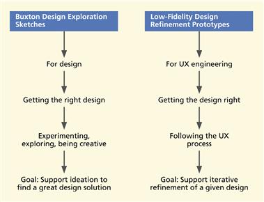
Figure 7-7 Comparison between Buxton design exploration sketches and traditional low-fidelity refinement prototypes.
Sketches evoke thinking and ideas to arrive at a design. Prototypes illustrate an instance of a design. While sketches suggest possibilities, prototypes describe designs already decided upon. Sketches are to explore and raise questions. Prototypes are to refine and provide answers.
The lifecycle iteration of sketching is a divergence of discovery, an expansion of ideas and possibilities. In contrast, the lifecycle iteration of the HCI engineering process is intended to be a convergence, a closing-up of ideas and possibilities. Sketches are deliberately tentative, noncommittal, and ambiguous. Prototypes, however detailed, are depictions of specific designs.
Sketching is embodied cognition to aid invention
Sketching is not intended to be a tool for documenting designs that are first created in one’s head and then transferred to paper. In fact, the sketch itself is far less important than the process of making it. The process of sketching is a kind of cognitive scaffolding, a rich and efficient way to off-load part of the cognition, especially the mental visualization, to physical artifacts in the world.
A sketch is not just a way to represent your thinking; the act of making the sketch is part of the thinking. Sketching is a direct part, not an after-the-fact part, of the process of invention. Designers invent while sketching. Sketching embraces one’s whole being: the hands, the mind, and all the senses.
The kinesthetics of sketching, pointing, holding, and touching bring the entire hand-eye-brain coordination feedback loop to bear on the problem solving. Your physical motor movements are coupled with visual and cognitive activity; the designer’s mind and body potentiate each other in invention.
In Figure 7-8 you can see an example of a sketch to think about design.
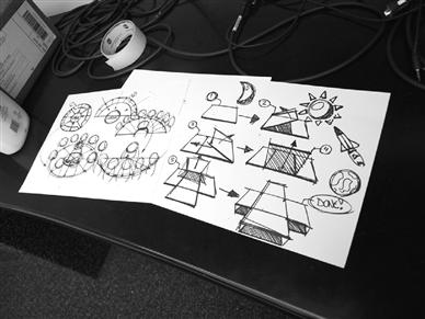
Figure 7-8 A sketch to think about design
(photo courtesy of Akshay Sharma, Virginia Tech Department of Industrial Design).
7.7.2 Doing Sketching
Stock up on sketching and mockup supplies
Stock the ideation studio with sketching supplies such as whiteboards, blackboards, corkboards, flip chart easels, Post-its™ of all sizes, tape, and marking pens. Be sure to include supplies for constructing physical mockups, including scissors, hobby knives, cardboard, foam core board, duct tape, Scotch™ tape, wooden blocks, push pins, thumb tacks, staples, string, bits of cloth, rubber, other flexible materials, crayons, and spray paint.
Physical Mockup
A physical mockup is a tangible, three-dimensional, physical prototype or model of a device or product, often one that can be held in the hand, and often crafted rapidly out of materials at hand, and used during exploration and evaluation to at least simulate physical interaction.
Use the language of sketching
To be effective at sketching for design, you must use a particular vocabulary that has not changed much over the centuries. One of the most important language features is the vocabulary of lines, which are made as freehand “open” gestures. Instead of being mechanically correct and perfectly straight, lines in sketches are roughed in and not connected precisely.
In this language, lines overlap, often extending a bit beyond the corner. Sometimes they “miss” intersecting and leave the corner open a little bit. Further, the resolution and detail of a sketch should be low enough to suggest that it is a concept in the making, not a finished design. It needs to look disposable and inexpensive to make. Sketches are deliberately ambiguous and abstract, leaving “holes” for the imagination.
They can be interpreted in different ways, fostering new relationships to be seen within them, even by the person who drew them. In other words, avoid the appearance of precision; if everything is specified and the design looks finished, then the message is that you are telling something, “this is the design,” not proposing exploration, “let us play with this and see what comes up.” You can see this unfinished look in the sketches of Figures 7-9 and 7-10.
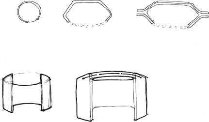
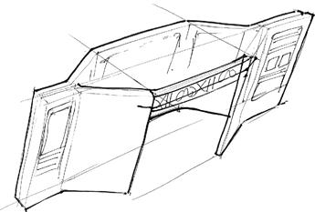
Figure 7-9 Freehand gestural sketches for the Ticket Kiosk System
(sketches courtesy of Akshay Sharma, Virginia Tech Department of Industrial Design).
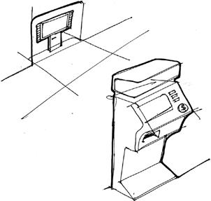
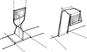
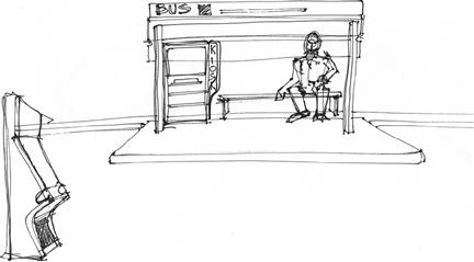
Figure 7-10 Ideation and design exploration sketches for the Ticket Kiosk System
(sketches courtesy of Akshay Sharma, Virginia Tech Department of Industrial Design).
Here are some defining characteristics of sketching (Buxton, 2007b; Tohidi et al., 2006):
![]() Everyone can sketch; you do not have to be artistic
Everyone can sketch; you do not have to be artistic
![]() Most ideas are conveyed more effectively with a sketch than with words
Most ideas are conveyed more effectively with a sketch than with words
![]() Sketches are quick and inexpensive to create; they do not inhibit early exploration
Sketches are quick and inexpensive to create; they do not inhibit early exploration
![]() Sketches are disposable; there is no real investment in the sketch itself
Sketches are disposable; there is no real investment in the sketch itself
![]() Sketches are timely; they can be made just-in-time, done in-the-moment, provided when needed
Sketches are timely; they can be made just-in-time, done in-the-moment, provided when needed
![]() Sketches should be plentiful; entertain a large number of ideas and make multiple sketches of each idea
Sketches should be plentiful; entertain a large number of ideas and make multiple sketches of each idea
![]() Textual annotations play an essential support role, explaining what is going on in each part of the sketch and how
Textual annotations play an essential support role, explaining what is going on in each part of the sketch and how
In Figure 7-11, we show examples of designers doing sketching.
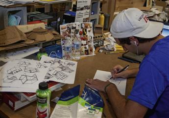
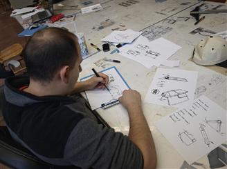
Figure 7-11 Designers doing sketching
(photos courtesy of Akshay Sharma, Virginia Tech Department of Industrial Design).
Exercise
See Exercise 7-2, Practice in Ideation and Sketching
Example: Sketching for a Laptop/Projector Project
The following figures show sample sketches for the K-YAN project (K-yan means “vehicle for knowledge”), an exploratory collaboration by the Virginia Tech Industrial Design Department and IL&FS.4 The objective is to develop a combination laptop and projector in a single portable device for use in rural India. Thanks to Akshay Sharma of the Virginia Tech Industrial Design Department for these sketches. See Figures 7-12 through 7-15 for different kinds of exploratory sketches for this project.
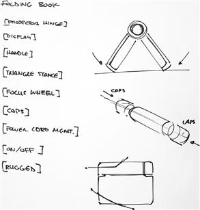
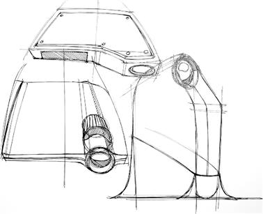
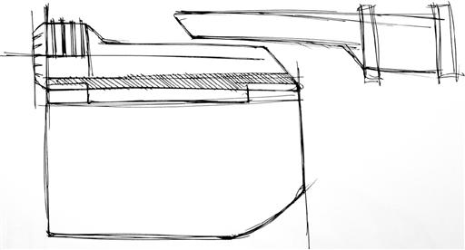
Figure 7-12 Early ideation sketches of K-YAN
(sketches courtesy of Akshay Sharma, Department of Industrial Design).
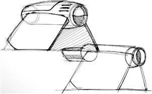
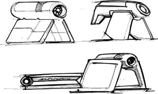
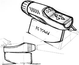
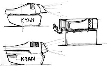
Figure 7-13 Mid-fidelity exploration sketches of K-YAN
(sketches courtesy of Akshay Sharma, Virginia Tech Department of Industrial Design).
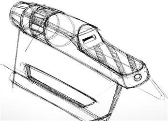
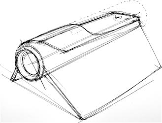
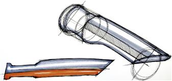
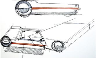
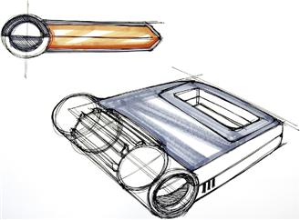
Figure 7-14 Sketches to explore flip-open mechanism of K-YAN
(sketches courtesy of Akshay Sharma, Virginia Tech Department of Industrial Design).
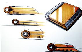
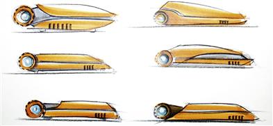
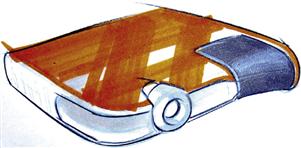
Figure 7-15 Sketches to explore emotional impact of form for K-YAN
(sketches courtesy of Akshay Sharma, Virginia Tech Department of Industrial Design).
Exercise
See Exercise 7-3, Ideation and Sketching for Your System
7.7.3 Physical Mockups as Embodied Sketches
Just as sketches are two-dimensional visual vehicles for invention, a physical mockup for ideation about a physical device or product is a three-dimensional sketch. Physical mockups as sketches, like all sketches, are made quickly, highly disposable, and made from at-hand materials to create tangible props for exploring design visions and alternatives.
A physical mockup is an embodied sketch because it is an even more physical manifestation of a design idea and it is a tangible artifact for touching, holding, and acting out usage (see Figures 7-16 and 7-17).
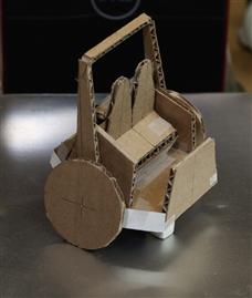
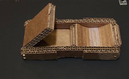
Figure 7-16 Examples of rough physical mockups
(models courtesy of Akshay Sharma, Virginia Tech Department of Industrial Design).
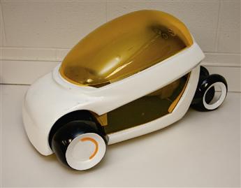
Figure 7-17 Example of a more finished looking physical mockup
(model courtesy of Akshay Sharma, Virginia Tech Department of Industrial Design).
Where appropriate in your ideation, you can do the same. Build many different mockups, each as creative and different as possible. Tell stories about the mockup during ideation and stretch it as far as you can.
For later in the process, after design exploration is done and you want a 3D design representation to show clients, customers, and implementers, there are services to produce finished-looking, high-fidelity physical mockups.
7.8 More about phenomenology
7.8.1 The Nature of Phenomenology
Joy of use is an obvious emotional counterpart to ease of use in interaction. But there is a component of emotional impact that goes much deeper. Think of the kind of personal engagement and personal attachment that leads to a product being invited to become an integral part of the user’s lifestyle. More than functionality or fun—this is a kind of companionship. This longer-term situated kind of emotional impact entails a phenomenological view of interaction (Russell, Streitz, & Winograd, 2005, p. 9).
Emerging from humanistic studies, phenomenology5 is the philosophical examination of the foundations of experience and action. It is about phenomena, things that happen and can be observed. But it is not about logical deduction or conscious reflection on observations of phenomena; it is about individual interpretation and intuitive understanding of human experience.
Phenomenology is part of the “modern school of philosophy founded by Edmund Husserl. Its influence extended throughout Europe and was particularly important to the early development of existentialism. Husserl attempted to develop a universal philosophic method, devoid of presuppositions, by focusing purely on phenomena and describing them; anything that could not be seen, and thus was not immediately given to the consciousness, was excluded.”6
“The phenomenological method is thus neither the deductive method of logic nor the empirical method of the natural sciences; instead it consists in realizing the presence of an object and elucidating its meaning through intuition. Husserl considered the object of the phenomenological method to be the immediate seizure, in an act of vision, of the ideal intelligible content of the phenomenon” (Husserl, 1962). His key and defining work from the early 20th century is now reprinted in an English translation.
However, it was Martin Heidegger who translated it into “the most thorough, penetrating, and radical analysis of everyday experience” (Winograd & Flores, 1986, p. 9). Heidegger, quoted often in human–computer interaction contexts, was actually a student of Professor Husserl and, although they had collaborated closely, they had a falling out during the 1940s over the social politics of World War II.7 “Writers like Heidegger challenge the dominant view of mind, declaring that cognition is not based on the systematic manipulation of representations” (Winograd & Flores, 1986, p. 10). This view is in opposition to the human-as-information-processor paradigm discussed earlier in this chapter.
Because phenomenology is about observables, it enjoys a relationship with hermeneutics, the theory of interpretation (Winograd & Flores, 1986, p. 27), to fill the need to explain what is observed. Historically, hermeneutics was about interpretation of artistic and literary works, especially mythical and sacred texts and about how human understanding of those texts has changed over time. However, “one of the fundamental insights of phenomenology is that this activity of interpretation is not limited to such situations, but pervades our everyday life” (Winograd & Flores, 1986, p. 27).
7.8.2 The Phenomenological View in Human–Technology Interaction
When translated to human–computer interaction, phenomenological aspects of interaction represent a form of emotional impact, an affective state arising within the user. It is about emotional phenomena within the interaction experience and the broadest interpretation of the usage context. It is about a social role for a product in long-term relationships with human users. It is about a role within human life activities. In that regard, it is related to activity theory (Winograd & Flores, 1986) because activity theory also emphasizes that the context of use is central to understanding, explaining, and designing technology (Bødker, 1991).
7.8.3 The Phenomenological Concept of Presence
The phenomenological paradigm is central to Harrison, Back, and Tatar (2007), who make it clear that HCI is no longer just about usability and user performance, but that it is about presence of technology as part of our lives: “We argue that the coming ubiquity of computational artifacts drives a shift from efficient use to meaningful presence of information technology.” This is all about moving from the desktop to ubiquitous, embedded, embodied, and situated interaction.
Presence
Presence of a product is a kind of relationship with users in which the product becomes a personally meaningful part of their lives.
Hallnäs and Redström (2002) also describe the “new usability” as a shift from use to “presence.” To them, a key characteristic of phenomenological concepts is that the product or system that is the target of design or evaluation is present in the user’s life, not just being used for something. That certainly rules out almost all desktop software, for example, but calls to mind favorite portable devices, such as the iPhone and iPod, that have become a part of our daily lives.
Use or functional descriptions are about what you do with the product. Presence is about what it means to you. A description of presence is an existential description, meaning that the user has given the product a place to exist in the user’s life; it is about being known within the user’s human experience rather than a theoretical or analytical description.
So, presence is about a relationship we have with a device or product. It is no longer just a device for doing a task, but we feel emotional ties. In Chapter 8, the Garmin handheld GPS is described as a haven of comfort, coziness, familiarity, and companionship, like a familiar old pair of boots or your favorite fleece. The device has been invited into the user’s emotional life, and that is presence.
As Hallnäs and Redström put it, “… ‘presence’ refers to existential definitions of a thing based on how we invite and accept it as part of our lifeworld.” Winograd and Flores (1986, p. 31) allude to the same relationship, as expressed by Heidegger, “He [Heidegger] argues that the separation of subject and object denies the more fundamental unity of being-in-the-world.” Here subject means the person having the user experience, and the object is everything they perceive and experience. You cannot separate the user, the context, and the experience.
Presence, or the potential for presence, cannot necessarily be detected directly in design or evaluation. Acceptance is usually accompanied by a “disappearance” (Weiser, 1991) of the object as a technological artifact. Hallnäs and Redström use, as a simple but effective example, a chair. If your description of the chair simply refers to the fact that you sit in it without reference to why or what you do while sitting in it, you have removed the user and the usage context; it is more or less just a functional description. However, if the user describes this chair as the place where she seeks comfort each evening in front of the fire after a long day’s work, then the chair has an emotional presence in that user’s life.
7.8.4 The Importance of Phenomenological Context over Time
From the discussion so far, it should be abundantly clear that the kind of emotional context found in the phenomenological paradigm is a context that must unfold over time. Usage develops over time and takes on its own life, often apart from what designers could envision. Users learn, adapt, and change during usage, creating a dynamic force that gives shape to subsequent usage (Weiser, 1991).
Short-term studies will not see this important aspect of usage and interaction. So, while users can experience snapshot episodes of good or bad usability, good or bad usefulness, and even good or bad emotional impact, the phenomenological aspects of emotional impact are about a deeper and longer-term concept. It is not just about a point in time within usage, but it speaks to a whole style and presence of the product over time. The realization of this fact is essential in both design and evaluation for emotional impact within the phenomenological context.
1 One interesting side effect was to gender popular media representations of flight control automata as female. Particularly notable is the original StarTrek computer.
3 Thanks to Mark Ebersole, long ago, for this reference.
5 Dictionary.com says phenomenology is: 1. the movement founded by Husserl that concentrates on the detailed description of conscious experience, without recourse to explanation, metaphysical assumptions, and traditional philosophical questions; 2. the science of phenomena as opposed to the science of being.
