Chapter 7. Date Diff

Date Diff, named after the T-SQL DATEDIFF function, tells you how many days or weeks apart two dates are. This app requires very little code, thanks to the Silverlight for Windows Phone Toolkit.
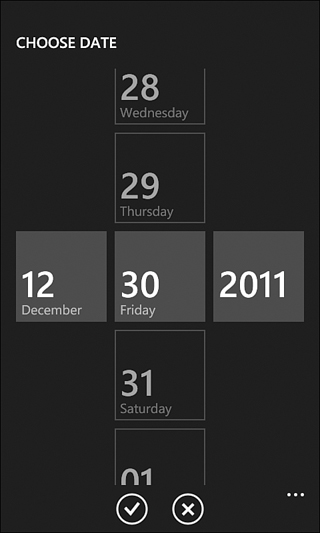
The Silverlight for Windows Phone Toolkit, available at http://silverlight.codeplex.com, contains lots of rich controls and functionality leveraged throughout this book. It’s open source, so you can even tweak it relatively easily! This app makes use of its date picker control, which matches the date picker used by the phone’s built-in apps. It starts out looking like a text box, but it presents a rich full-page interface when tapped.
Future releases of the Silverlight for Windows Phone Toolkit may not be compatible with earlier releases!
The Main Page
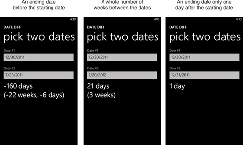
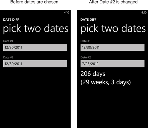
Date Diff’s only page (other than the page automatically presented by the date picker) is pictured in Figure 7.1. The user can customize the date in each date picker instance and then see the difference below.
Figure 7.1 The main page enables the selection of two dates and then shows the difference.
Listing 7.1 contains the XAML for this page.
Listing 7.1 MainPage.xaml—The User Interface for Date Diff’s Main Page
<phone:PhoneApplicationPage x:Class="WindowsPhoneApp.MainPage"
xmlns="http://schemas.microsoft.com/winfx/2006/xaml/presentation"
xmlns:x="http://schemas.microsoft.com/winfx/2006/xaml"
xmlns:phone="clr-namespace:Microsoft.Phone.Controls;assembly=Microsoft.Phone"
xmlns:shell="clr-namespace:Microsoft.Phone.Shell;assembly=Microsoft.Phone"
xmlns:toolkit="clr-namespace:Microsoft.Phone.Controls; assembly=Microsoft.Phone.Controls.Toolkit"
xmlns:local="clr-namespace:WindowsPhoneApp"
FontFamily="{StaticResource PhoneFontFamilyNormal}"
FontSize="{StaticResource PhoneFontSizeNormal}"
Foreground="{StaticResource PhoneForegroundBrush}"
SupportedOrientations="PortraitOrLandscape"
shell:SystemTray.IsVisible="True">
<Grid>
<Grid.RowDefinitions>
<RowDefinition Height="Auto"/>
<RowDefinition Height="*"/>
</Grid.RowDefinitions>
<!-- The standard header, with some tweaks -->
<StackPanel Margin="24,16,0,12">
<TextBlock Text="DATE DIFF" Margin="-1,0,0,0"
FontFamily="{StaticResource PhoneFontFamilySemiBold}"
FontSize="{StaticResource PhoneFontSizeMedium}"/>
<TextBlock Text="pick two dates" Margin="-3,-10,0,0"
FontFamily="{StaticResource PhoneFontFamilySemiLight}"
FontSize="{StaticResource PhoneFontSizeExtraExtraLarge}"/>
</StackPanel>
<StackPanel Grid.Row="1">
<!-- Date #1 -->
<TextBlock Text="Date #1" Margin="24,17,24,-5"
Foreground="{StaticResource PhoneSubtleBrush}"/>
<toolkit:DatePicker x:Name="DatePicker1" Margin="12,0"
local:Tilt.IsEnabled="True" ValueChanged="DatePicker_ValueChanged"/>
<!-- Date #2 -->
<TextBlock Text="Date #2" Margin="24,17,24,-5"
Foreground="{StaticResource PhoneSubtleBrush}"/>
<toolkit:DatePicker x:Name="DatePicker2" Margin="12,0"
local:Tilt.IsEnabled="True" ValueChanged="DatePicker_ValueChanged"/>
<!-- The result -->
<TextBlock x:Name="ResultTextBlock" Margin="24,0"
FontSize="{StaticResource PhoneFontSizeExtraLarge}"/>
</StackPanel>
</Grid>
</phone:PhoneApplicationPage>
Notes:
→ Although DatePicker is in the same Microsoft.Phone.Controls namespace as other controls, it resides in the Microsoft.Phone.Controls.Toolkit assembly, so this XAML file requires a separate XML namespace declaration. By convention, apps in this book use the toolkit prefix for this namespace/assembly.
→ The two date pickers automatically show today’s date by default, and when tapped they invoke the full-screen picker interface shown at the beginning of this chapter. The tilt effect applied to each date picker only affects the inline display; not the full-screen picker.
The date picker requires two specific images to be included in your project!
Listing 7.2 contains the code-behind for the main page.
Listing 7.2 MainPage.xaml.cs—The Code-Behind for Date Diff’s Main Page
using System;
using Microsoft.Phone.Controls;
namespace WindowsPhoneApp
{
public partial class MainPage : PhoneApplicationPage
{
public MainPage()
{
InitializeComponent();
}
void DatePicker_ValueChanged(object sender, DateTimeValueChangedEventArgs e)
{
// Do the calculation
TimeSpan span = this.DatePicker2.Value.Value - this.DatePicker1.Value.Value;
// Format the result
int days = span.Days;
int wholeWeeks = days / 7;
int remainder = days % 7;
string result = days + (Math.Abs(days) == 1 ? " day" : " days");
if (Math.Abs(days) > 14)
{
result += "
(" + wholeWeeks + " weeks";
if (remainder != 0)
result += ", " + remainder
+ (Math.Abs(remainder) == 1 ? " day" : " days");
result += ")";
}
// Display the result
this.ResultTextBlock.Text = result;
}
}
}
Notes:
→ Each date picker’s date can be retrieved via its Value property, which is a nullable DateTime that has its own Value property. The nullability is handy because it enables each picker to express the concept of no date being selected. However, it also results in awkward-looking Value.Value property accesses. Because Value can only become null programmatically, this code can safely access each Value subproperty without checking for null.
→ Most of the code is concerned with formatting the string, which takes a few different forms depending on how far apart the two dates are.
The Finished Product