
Hour 19. Implementing CSS3 Transformations, Transitions, and Animations
What You’ll Learn in This Hour:
 How to move, rotate, scale, and skew 2D elements
How to apply perspective and move and rotate 3D elements
How to animate objects created in HTML and CSS
Combining HTML5 and CSS3 makes for an incredibly powerful design medium, and this book barely scratches the surface—after all, HTML5 and CSS3 form the basis of many mobile applications and are beginning to gain traction in video game development as well. (All of that is well beyond the scope of this little book.) But I firmly believe that beginners should be exposed to the foundations of these advanced topics, and this hour is a prime example. Advanced interactivity using CSS3 is (at the time of writing) still experimental, but designers have been fiddling with it for a few years—and so can you!
Accounting for Browser Differences
Before we begin our foray into the experimental world of CSS3 transformations, transitions, and animations, it’s important to understand what “experimental” means in this situation and how to account for it. These particular elements of CSS3 have been in use for several years, but are still considered experimental because the CSS3 specifications for transformations, transitions, and animations have not yet stabilized. The developers of the various web browsers approach the implementation of the specification through vendor-specific prefixes.
Vendor prefixes, such as -webkit (for WebKit-based browsers such as Chrome and Safari), -moz (for Mozilla Firefox), -ms (for Microsoft Internet Explorer), and -o (for Opera), are used by browser developers to add support for experimental features, but in a sort of temporary (and sometimes browser-specific) way. After a specification has settled down and stabilized, and when rules have been created around the implementation of specific features, browser vendors implement those rules in a standardized way and without the necessary vendor prefix.
Note
You first encountered vendor-specific prefixes in Hour 9, “Using Tables and Columns,” when learning about CSS3 columns.
In the examples that follow in this hour, vendor prefixes are used along with the standard property so that the examples will be usable both now and in the future. Writing out the vendor-prefixed properties is a bit tiresome, writing this:
-webkit-transform: translate(100px) rotate(20deg);
-webkit-transform-origin: 60% 100%;
-moz-transform: translate(100px) rotate(20deg);
-moz-transform-origin: 60% 100%;
-ms-transform: translate(100px) rotate(20deg);
-ms-transform-origin: 60% 100%;
-o-transform:translate(100px) rotate(20deg);
-o-transform-origin:60% 100%;
instead of just the standard properties:
transform: translate(100px) rotate(20deg);
transform-origin: 60% 100%;
At least you can be sure of as much coverage as possible. In time, the specifications will stabilize and the vendor prefixes can be dropped; you can check the handy website at http://caniuse.com to see how support changes over time.
Using 2D Transformations
When we look at content on web pages, we’re looking at two-dimensional (2D) objects that exist on the same plane and have a length and a width. Showing off a photo of your kitten? That image has a height and a width; it’s a 2D image. The same is true for HTML container elements—a <div> and <p> and <section> all have lengths and widths that can be specified and also manipulated.
Performing 2D transformations using CSS3 allows you to change the position, length, and width of these elements by translating, rotating, and scaling the elements using the CSS3 transform property. We take a look at each of these use cases in the following sections.
Note
For all the figures in this hour, start with static placements of elements that then do something. When used, the figures show the initial placement of elements, but you should open the sample HTML files in your browser to see the full effect of the code and the movement of the elements.
Translating Elements
Translating an element in a 2D space sounds much more intriguing than it actually is; translating just means “moving.” Using the translate() function of the transform CSS3 property enables you to place your elements along the x-axis (horizontally) or y-axis (vertically). This method seemed the easiest to understand, so let’s get started and build on it.
Figure 19.1 shows one 2D box, the result of the code in Listing 19.1.

LISTING 19.1 Transforming a 2D Element
<!DOCTYPE html>
<html lang="en">
<head>
<title>Translating a 2D Element</title>
<style type="text/css">
#theBox {
height: 250px;
width: 250px;
background-color: #ddd;
border: 1px solid #000;
text-align: center;
display:table-cell;
vertical-align:middle;
font-size: 150%;
font-weight: bold;
}
#theBox:hover {
-moz-transform: translate(75px,100px);
-ms-transform: translate(75px,100px);
-o-transform: translate(75px,100px);
-webkit-transform: translate(75px,100px);
transform: translate(75px,100px);
}
</style>
</head>
<body>
<div id="theBox">
I am a box!<br/>Watch me move!
</div>
</body>
</html>
The code in Listing 19.1 uses some stylesheet entries to style a <div> with an ID of theBox that is 250 pixels wide and 250 pixels high, has a black border and a gray background, and contains some aligned text. But the second stylesheet entry, for the hover state of the <div> with an ID of theBox, contains the functions used to translate (move) the box by using the CSS3 transform property. Specifically, these functions (one for each vendor prefix, plus the “standard”) tell the browser to translate (move) the element 75 pixels along the x-axis and 100 pixels along the y-axis when hovering over the element. Go ahead and try it.
You might notice that the movement is quick and not terribly smooth. If you imagined a smooth, easily flowing transition from one position to another, don’t despair—we cover how to achieve that using CSS3 transitions later in this hour. For now, let’s just get a solid foundation with 2D and 3D transformation basics.
Rotating Elements
Rotating an element in a 2D space means that it turns from an origin point and continues clockwise from 0° to 360° (you can also indicate counterclockwise movement using negative degrees). To achieve rotation, use the rotate() function of the transform CSS3 property and specify the degrees as an argument. For example, the following rotates an element 45° clockwise:
transform: rotate(45deg);
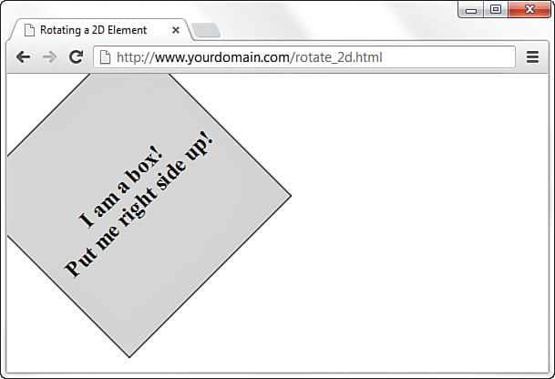
Figure 19.2 shows one 2D box that begins already rotated 45° counterclockwise. The code in Listing 19.2 goes on to set it right side up.
LISTING 19.2 Rotating a 2D Element
<!DOCTYPE html>
<html lang="en">
<head>
<title>Rotating a 2D Element</title>
<style type="text/css">
#theBox {
height: 250px;
width: 250px;
background-color: #ddd;
border: 1px solid #000;
text-align: center;
display:table-cell;
vertical-align:middle;
font-size: 150%;
font-weight: bold;
-moz-transform: rotate(-45deg);
-ms-transform: rotate(-45deg);
-o-transform: rotate(-45deg);
-webkit-transform: rotate(-45deg);
transform: rotate(-45deg);
}
#theBox:hover {
-moz-transform: rotate(0deg);
-ms-transform: rotate(0deg);
-o-transform: rotate(0deg);
-webkit-transform: rotate(0deg);
transform: rotate(0deg);
}
</style>
</head>
<body>
<div id="theBox">
I am a box!<br/>Put me right side up!
</div>
</body>
</html>
Note
All rotations (and skewing and other transformations) begin at a point of origin, which you can set using the transform-origin property. If you do not specify a value for transform-origin, the default is used; the default is as if you specified the following in your stylesheet:
transform-origin: 50% 50%;
This default value means that the origin of the transformation should be 50 percent along the x-axis and 50 percent along the y-axis, or smack in the middle of the element.
As with Listing 19.1, the code in Listing 19.2 uses some stylesheet entries to style a <div> with an ID of theBox that is 250 pixels wide and 250 pixels high, has a black border and a gray background, and contains some aligned text. Also note that we use the rotate() function of the transform property to set the initial display of the <div> at –45° (45° counterclockwise).
The second stylesheet entry is used for the hover state of the <div> with an ID of theBox, and it contains the functions used to rotate the box back to an upright position (0°). If you hover over the box with your mouse, the box rotates 45° clockwise from its position at –45° (or 315°, if you prefer to think of it that way) to a position of 0°.
Scaling Elements
Scaling an element in a 2D space means that it appears to change in size along both the x-axis and the y-axis. To achieve rotation, use the scale() function of the transform CSS3 property and specify a value less than or greater than 1, depending on how you would like it to scale—use a value from .01 to .99 to scale the element smaller than the original, and use a value greater than 1 to scale the element larger than the original. For example, the following scales an element to half the original size:
transform: scale(.5);
You can scale an element along the x-axis or y-axis, using the following syntax:
transform: scale(value_for_x_axis, value_for_y_axis);
If you do not specify separate values, then it will be assumed that you mean to scale the element similarly along both the x-axis and the y-axis, which is typical. So scale(.5) in the previous example scales an element equally along both the x-axis and the y-axis.
The code in Listing 19.3 scales the basic box we’ve used in examples so far to half its size. Give it a try!
LISTING 19.3 Scaling a 2D Element
<!DOCTYPE html>
<html lang="en">
<head>
<title>Scaling a 2D Element</title>
<style type="text/css">
#theBox {
height: 250px;
width: 250px;
background-color: #ddd;
border: 1px solid #000;
text-align: center;
display:table-cell;
vertical-align:middle;
font-size: 150%;
font-weight: bold;
}
#theBox:hover {
-moz-transform: scale(.5);
-ms-transform: scale(.5);
-o-transform: scale(.5);
-webkit-transform: scale(.5);
transform: scale(.5);
}
</style>
</head>
<body>
<div id="theBox">
I am a box!<br/>Watch me shrink!
</div>
</body>
</html>
As with the previous listings in this hour, the code in Listing 19.3 uses some stylesheet entries to style a <div> with an ID of theBox that is 250 pixels wide and 250 pixels high, has a black border and a gray background, and contains some aligned text. The second stylesheet entry is used for the hover state of the <div> with an ID of theBox; it contains the functions used to scale the box to half its size. If you wanted to scale the box to three times its original size, you would use this line:
transform: scale(3);
If you wanted to scale just the height of the box to three times its original size, you would use the following, and you would see something like Figure 19.3:
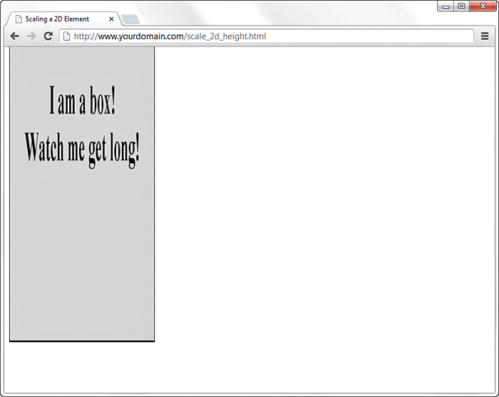
Note that not just the box is scaled—everything inside the container element is scaled as well, as with the text in this example.
Skewing Elements
To skew an element in a 2D space is to distort it along the x-axis or y-axis by a certain number of degrees. To skew an element, use either the skewX() or skewY() function of the transform CSS3 property (depending on how you’d like to skew it) and specify the value of an angle in degrees, from –90° to 90°. For example, the following skews an element 45° along the x-axis:
transform: skewX(45deg);
Note
Although you can specify the value of an angle from –90° to 90°, values of -90, 90, or 0 result in an imperceptible element. The angle will be there, and skewed appropriately, but your browser won’t be able to render it. If you use an angle value of 1 or 89, you’ll begin to see why.
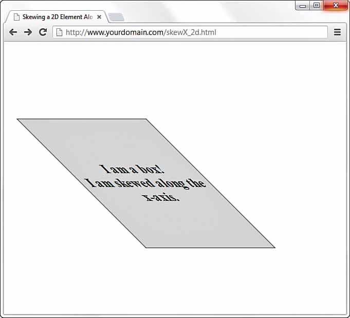
Figures 19.4 and 19.5 show the basic gray box we’ve been using in this hour, skewed to a 45° angle along the x-axis and then the y-axis (for example, using skewX(45deg) and skewY(45deg), as appropriate).

Using 3D Transformations
As mentioned previously, when we view content on web pages, we do so in 2D. So how do we make the leap from 2D to 3D spaces in what is essentially still a 2D interface? Using CSS, we can create a space that appears to display objects in three dimensions by adding depth to the height and width that makes up two-dimensional space. In the sections that follow, you’ll see how to perform some of the same types of transformations that you did earlier in this lesson in the 2D space, but in a 3D space.
Applying Perspective
In general, perspective is the process of drawing 2D objects in a particular fashion, to give the proper representation of their height, width, and depth all in relation to one another when viewed from a specific point (the vanishing point).
While working with 2D objects, you used the x-axis and y-axis; now the z-axis comes into play. The syntax of the perspective CSS property is simply this:
perspective: length;
Note
By default, the vanishing point of an element is placed at the center of the element, but it can be modified using the perspective-origin CSS property in the same way that transform-origin has a default but can also be set manually.
Length can be in pixels or ems and must be greater than 0.
You can also use functional notation to add the perspective() function to a list of functions of the transform property, like so:
transform: perspective(length) property(value);
Applying perspective to an element does not itself make a difference in the display; it has to happen in conjunction with using one of the 3D transformations, as you’ll see in a moment. But to better understand perspective before moving on, glance back at Figure 19.2, which is a 2D element that has been rotated –45°. Compare that image with Figure 19.6.

You should be able to see the depth that has been added to the object. In this case, the perspective value is 300 pixels, which provides for a visible effect. However, in Figure 19.7, the perspective value is 3000px, which results in a barely perceptible 3D effect because the greater the value, the greater the distance there is between the viewer and the object, resulting in a much more subtle appearance of perspective.

Finally, contrast this object with the one in Figure 19.8, which has a perspective value of 100 pixels—the effect is dramatic!

Moving and Rotating in 3D Space
Moving (or translating) and rotating objects in a 3D space is quite similar to performing the same operations in a 2D space. In 2D space, as you’ve seen previously, you can use the translate() and rotate() functions of the transform property to perform these actions; in a 3D space, the functions are as follows:
rotateX(angle), rotateY(angle), and rotateY(angle) rotateX(angle)—Rotates an object around the appropriate axis, in contrast to the 2D rotate(angle) transformation function, which just shifts an object along the x- or y-axis. This difference is seen when comparing Figure 19.2 and Figure 19.6.
translateZ(value)—Positions an object closer to or farther from the viewer.
Creating and Manipulating a Cube
The best way to get a handle on 3D objects is to make one that can be easily visualized as a 3D object—a six-sided cube, perhaps. Creating a 3D cube out of HTML and CSS might seem daunting, but I have faith that you’ll be able to understand it and put together all the pieces. (There are, in fact, six pieces, for the six sides of the cube, to put together.)
I’ve gone ahead and created a 3D cube; see Listing 19.4. The result of this listing appears in Figure 19.9. After the listing, I explain each step of the creation of the cube.

LISTING 19.4 Creating a 3D Cube
<!DOCTYPE html>
<html lang="en">
<head>
<title>Creating a 3D Cube</title>
<style type="text/css">
body {
margin: 75px 0px 0px 75px;
}
#wrapper {
-moz-perspective: 500px;
-webkit-perspective: 500px;
perspective: 500px;
}
#the_cube {
-moz-transform-style: preserve-3d
-webkit-transform-style: preserve-3d
transform-style: preserve-3d
}
#the_cube div {
width: 150px;
height: 150px;
position: absolute;
border: 1px solid black;
background: rgba(200,200,200,0.5);
font-size: 125%;
font-weight: bold;
line-height: 125px;
text-align: center;
}
.front {
-moz-transform: translateZ(75px);
-ms-transform: translateZ(75px);
-o-transform: translateZ(75px);
-webkit-transform: translateZ(75px);
transform: translateZ(75px);
}
.back {
-moz-transform: rotateY(180deg) translateZ(75px);
-ms-transform: rotateY(180deg) translateZ(75px);
-o-transform: rotateY(180deg) translateZ(75px);
-webkit-transform: rotateY(180deg) translateZ(75px);
transform: rotateY(180deg) translateZ(75px);
}
.right {
-moz-transform: rotateY(90deg) translateZ(75px);
-ms-transform: rotateY(90deg) translateZ(75px);
-o-transform: rotateY(90deg) translateZ(75px);
-webkit-transform: rotateY(90deg) translateZ(75px);
transform: rotateY(90deg) translateZ(75px);
}
.left {
-moz-transform: rotateY(-90deg) translateZ(75px);
-ms-transform: rotateY(-90deg) translateZ(75px);
-o-transform: rotateY(-90deg) translateZ(75px);
-webkit-transform: rotateY(-90deg) translateZ(75px);
transform: rotateY(-90deg) translateZ(75px);
}
.top {
-moz-transform: rotateX(90deg) translateZ(75px);
-ms-transform: rotateX(90deg) translateZ(75px);
-o-transform: rotateX(90deg) translateZ(75px);
-webkit-transform: rotateX(90deg) translateZ(75px);
transform: rotateX(90deg) translateZ(75px);
}
.bottom {
-moz-transform: rotateX(-90deg) translateZ(75px);
-ms-transform: rotateX(-90deg) translateZ(75px);
-o-transform: rotateX(-90deg) translateZ(75px);
-webkit-transform: rotateX(-90deg) translateZ(75px);
transform: rotateX(-90deg) translateZ(75px);
}
</style>
</head>
<body>
<div id="wrapper">
<div id="the_cube">
<div class="front">FRONT</div>
<div class="back">BACK</div>
<div class="left">LEFT</div>
<div class="right">RIGHT</div>
<div class="top">TOP</div>
<div class="bottom">BOTTOM</div>
</div>
</div>
</body>
</html>
The bulk of this code is all the stylesheet entries, which themselves are lengthy because of the need to use vendor-specific prefixes for several CSS properties. For a moment, skip over all that and look closely at the set of <div>s:
<div id="wrapper"> wraps itself around all the others and acts as the 3D space, with a perspective set for it (500px, in this case).
<div id="the_cube"> sets the stage for something we intend to remain three-dimensional, through the use of the transform-style property with a value of preserve-3d.
<div class="front"> (and all the other <div>s with class names corresponding to sides of the cube) acts as a side of the cube.
Note
Even with the vendor prefixes in use, working with transforms is a tricky business and can change as different versions of browsers are released. Don’t be alarmed if your results look slightly different than mine, especially if you are using a browser other than Chrome. Consider it a good opportunity to make small changes to your code to try to make it work—fiddling around with code just to see what happens is what professionals do, too, and don’t let anyone tell you otherwise!
Now go back and take a closer look at the stylesheet, beginning with the entry for all <div>s that are children of the <div> with an ID of #the_cube—in other words, each face of the cube:
#the_cube div {
width: 150px;
height: 150px;
position: absolute;
border: 1px solid black;
background: rgba(200,200,200,0.5);
font-size: 125%;
font-weight: bold;
line-height: 125px;
text-align: center;
}
This entry ensures that each face of the cube has the same height, width, border, background color, and font attributes. You can see in Figure 19.9 that all the sides do indeed look the same (except for the specific text printed on each one).
Now comes the tricky part: walking through the transformations for each of the faces. To avoid clutter, in the following reference to the stylesheet entries, I’m using only the basic property (for example, transform), not all the vendor-specific versions, which you can see in Listing 19.3. Let’s get started, with the front face:
.front {
transform: translateZ(75px);
}
The front face is the face of the cube we want to see first; as such, we do not rotate it or apply any transformations whatsoever except to move it forward on the z-axis by half its length, or 75 pixels. Seems simple enough. If you want to see what happens if you change the value of translateZ() to something else, go for it—you’ll note a gap between the faces of your cube.
Next we begin to rotate the remaining faces of the cube so that their edges line up with all the other faces. Take a look at the entry for the left face:
.left {
transform: rotateY(-90deg) translateZ(75px);
}
Here, the 150×150 square face maintains the 500-pixel perspective that is set for the 3D field and is rotated on its y-axis by –90°. Moving the face forward on the z-axis by 75 pixels makes the edges line up, as you can see in Figure 19.10.

The remaining faces are defined similarly: First they are rotated into position along either the x- or y-axis, and then they are moved along the z-axis:
.back {
transform: rotateY(180deg) translateZ(75px);
}
.right {
transform: rotateY(90deg) translateZ(75px);
}
.top {
transform: rotateX(90deg) translateZ(75px);
}
.bottom {
transform: rotateX(-90deg) translateZ(75px);
}
The result is the 3D cube that you see in Figure 19.9. To get a better feel for how rotating the faces of the cube along the x- or y-axis works, I urge you to change the values of rotateX() and rotateY() to see how the faces do or do not line up. Later in this lesson, we build on the 3D cube example and learn to spin it around with CSS3 animation.
Implementing CSS3 Transitions
Early in this lesson, you saw some examples of moving, rotating, and scaling 2D elements when the user hovered over it with the mouse. At that time, you probably noticed that the movement was quick and not all that smooth, and I promised a fix for that in a later part of the lesson. It’s now time for that fix, which happens by using CSS3 transitions.
Transitions occur when moving between CSS properties, such as moving from the initial state of an object to one that is scaled down in size. If you do not control the transition (the initial examples in this lesson did not), the user will see the first state and then immediately see the other, thus making the “transition” barely perceptible.
To control the transition, use the transition CSS property (don’t forget the appropriate vendor prefixes for WebKit, Mozilla, and Opera; Internet Explorer does not require a vendor prefix), which uses the following syntax:
transition: property duration timing-function delay;
Although property refers to the name of the property you will be transitioning—for example, using transform to scale an object—the duration, timing-function, and delay values are new to you. The duration value is the time in seconds between the two states, timing-function is one of several functions that help you define the acceleration of the transition (for example, is it fast at the beginning or the end of the transition?), and delay is the time in seconds before the transition begins.
Note
You can also specify the properties individually, instead of putting them all in the transition property, by using the transition-property, transition-duration, transition-timing-function, and transition-delay properties on separate lines in your stylesheet.
Refer to Listing 19.3, which scales a 2D element to half its original size. To control the transition between the element and the shrunken version, you add these lines to the stylesheet entry for #theBox:
-moz-transition: -moz-transform 5s ease-in 1s;
-o-transition: -o-transform 5s ease-in 1s;
-webkit-transition: -webkit-transform 5s ease-in 1s;
transition: transform 5s ease-in 1s;
These entries tell the browser to transition to the new value of the transform property (in this case, it is scale(.5)) by waiting 1 second and then easing into the new value over 5 seconds. If you loaded the modified code in your browser, you would see that, indeed, when you hover over the 2D box, it pauses for a moment and then slowly begins to shrink, finishing 5 seconds later. It’s impossible to show you that process in a static image, so you’ll have to try it yourself.
For more information on CSS3 transitions, especially the options for transition-timing-function, see https://developer.mozilla.org/en-US/docs/Web/Guide/CSS/Using_CSS_transitions.
Getting Started with CSS3 Animation
You can think of CSS3 animation as a souped-up set of transition controls. The process happening onscreen is indeed a transition (or several) between properties, but there are more considerations—and, therefore, subproperties—in the animation CSS property than in the transition CSS property.
In Hour 10, “Creating Images for Use on the Web,” you might recall a brief discussion about creating animated web graphics. Specifically, the first step in creating an animated web graphic is to create a series of images that then are displayed one after the other, just as movies and cartoons put individual frames together to create the moving picture. In CSS3 animation, the animation is built by defining keyframes, which themselves define how the browser should display a particular element during an animation sequence.
Keyframes are defined in a stylesheet using the following syntax (don’t forget the appropriate vendor prefixes for all four vendors):
@keyframes name_of_keyframe {
from {
property: value;
}
to {
property: value;
}
}
To use a practical example, let’s return to the 3D cube created in Listing 19.3. Suppose you wanted to spin that cube so that it appeared to be tumbling through space—that would require rotating it around both the x- and the y-axis, from 0° to 360°:
@keyframes spin {
from { transform: rotateY(0deg) rotateX(0deg); }
to { transform: rotateY(360deg) rotateX(360deg);}
}
Having thus created a keyframe called spin, we need to refer to it in the animation property; in this example, the animation property is applied to the definition of #the_cube. Take a look at the full example:
#the_cube {
-moz-transform-style: preserve-3d;
-webkit-transform-style: preserve-3d;
transform-style: preserve-3d;
-webkit-animation: spin 5s infinite linear;
-moz-animation: spin 5s infinite linear;
-ms-animation: spin 5s infinite linear;
-o-animation: spin 5s infinite linear;
animation: spin 5s infinite linear;
}
The syntax for the animation property in this example is:
animation: keyframe_name time iteration_count timing_function
In this example, I defined the animation to spin infinitely but complete its linear rotation in 5 seconds. If I changed linear to ease, you would notice a slight pause before each iteration. As with the previous example in the section on transitions, it’s impossible to show you this process in a static image—you’ll have to try it yourself.
To learn more about the numerous subproperties of the animation property, I recommend visiting https://developer.mozilla.org/en-US/docs/Web/CSS/animation.
Summary
This hour introduced you to the basics of moving, rotating, scaling, and skewing 2D and 3D elements (as well as the content within them). You learned that creating 3D elements from 2D elements begins with the application of perspective, and you saw how to control that perspective to achieve the look you want. Finally, you took the first steps toward controlling the transitions between CSS properties, using two different sets of transition and animation controls.
Q&A
Q. If all this CSS is experimental, is it really safe to use?
A. Much of the HTML5 and CSS3 specifications are still labeled as experimental (in fact, HTML5 is still just a recommendation and does not yet have an official specification), yet designers have been using such elements for years because browsers include rendering support for the experimental elements. If you use vendor-specific prefixes when implementing experimental features and provide fallback options for even older browsers, there’s no need to wait until specifications are final to dream up designs and interactivity that take advantage of experimental functionality if you determine that they provide better experiences for your users. As always, continue to review and test your site in the browsers that are most popular with the users of your site, to ensure they are having the viewing experience you intend.
Workshop
The Workshop contains quiz questions and exercises to help you solidify your understanding of the material covered. Try to answer all questions before looking at the “Answers” section that follows.
Quiz
1. How do you rotate a 2D element 90° counter-clockwise? Be sure to use vendor prefixes in your answer.
2. What is the difference between scale(3) and scale(1,3)?
3. What does the z-axis represent?
Answers
1. You use this:
-moz-transform: rotate(-90deg);
-ms-transform: rotate(-90deg);
-o-transform: rotate(-90deg);
-webkit-transform: rotate(-90deg);
transform: rotate(-90deg);
2. The first example scales an element equally in width and height to three times the original size of each. The second example keeps the width the same as the original but scales the height to three times the original size.
3. The z-axis represents depth.
Exercises
Spend some time with the 3D cube example and modify the size, color, and placement of the six sides, to get a better feel for how the parts of the whole come together.
Look into the numerous options available for the transition and animation properties (see https://developer.mozilla.org/en-US/docs/Web/CSS/transition and https://developer.mozilla.org/en-US/docs/Web/CSS/animation, respectively), and modify the 2D scale and rotation and 3D spinning cube examples to take advantage of different aspects of these properties.