
Hour 16. Using CSS to Do More with Lists
What You’ll Learn in This Hour:
 How the CSS box model affects lists
How to customize the list item indicator
How to use list items and CSS to create an image map
Hour 5, “Working with Text Blocks and Lists,” introduced you to three types of HTML lists. Hour 13, “Working with Margins, Padding, Alignment, and Floating,” covered margins, padding, and alignment of elements. In this hour, you learn how to apply margins, padding, and alignment styles to different types of HTML lists, helping you produce some powerful design elements purely in HTML and CSS.
Specifically, you learn how to modify the appearance of list elements—beyond the use of the list-style-type property that you learned in Hour 5. You will put into practice many of the CSS styles you’ve learned thus far, and the knowledge you gain in this hour enable you to use lists for more than just simply presenting a bulleted or numbered set of items.
HTML List Refresher
As you learned in Hour 5, HTML lists come in three basic types. Each presents content in a slightly different way, based on its type and the context:
The ordered list is an indented list that displays numbers or letters before each list item. The ordered list is surrounded by <ol> and </ol> tags, and list items are enclosed in the <li></li> tag pair. This list type is often used to display numbered steps or levels of content.
The unordered list is an indented list that displays a bullet or other symbol before each list item. The unordered list is surrounded by <ul> and </ul> tags, and list items are enclosed in the <li></li> tag pair. This list type is often used to provide a visual cue that brief yet specific bits of information will follow.
A definition list is often used to display terms and their meanings, thereby providing information hierarchy within the context of the list itself—much like the ordered list, but without the numbering. The definition list is surrounded by <dl> and </dl> tags, with <dt> and </dt> tags enclosing the term and <dd> and </dd> tags enclosing the definitions.
When the content warrants it, you can nest your ordered and unordered lists—or place lists within other lists. Nested lists produce a content hierarchy, so reserve their use for when your content actually has a hierarchy you want to display (such as content outlines or tables of content). Or as you will learn later on, you can use nested lists when your site navigation contains subnavigational elements.
How the CSS Box Model Affects Lists
Specific list-related styles include list-style-image (for placement of an image as a list item marker), list-style-position (indicating where to place the list item marker), and list-style-type (the type of list item marker itself). But although these styles control the structure of the list and list items, you can use margin, padding, color, and background-color styles to achieve even more specific displays with your lists.
Note
Some older browsers handle margins and padding differently, especially around lists and list items. However, at the time of writing, the HTML and CSS in this hour and other lessons in this book are displayed identically in current versions of the major web browsers (Apple Safari, Google Chrome, Microsoft Internet Explorer, Mozilla Firefox, and Opera). Of course, you should still review your web content in all browsers before you publish it online, but the need for “hacking” style sheets to accommodate the rendering idiosyncrasies of browsers is fading.
In Hour 13, you learned that every element has some padding between the content and the border of the element; you also learned that there is a margin between the border of the element and any other content. This is true for lists, and when you are styling lists, you must remember that a “list” is actually made up of two elements: the parent list element type (<ul> or <ol>) and the individual list items themselves. Each of these elements has margins and padding that can be affected by a style sheet.
The examples in this hour show you how different CSS styles affect the visual display of HTML lists and list items. Keep these basic differences in mind as you practice working with lists in this hour, and you will be able to use lists to achieve advanced visual effects within site navigation.
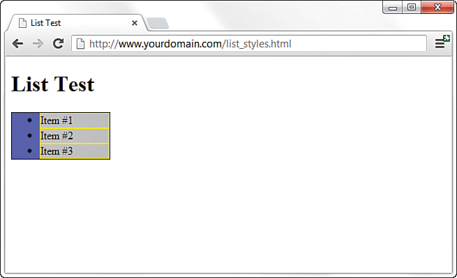
Listing 16.1 creates a basic list containing three items. In this listing, the unordered list itself (the <ul>) is given a blue background, a black border, and a specific width of 100 pixels, as Figure 16.1 shows. The list items (the individual <li>) have a gray background and a yellow border. The list item text and indicators (the bullet) are black.
LISTING 16.1 Creating a Basic List with Color and Border Styles
<!DOCTYPE html>
<html lang="en">
<head>
<title>List Test</title>
<style type="text/css">
ul {
background-color: #6666ff;
border: 1px solid #000000;
width:100px;
}
li {
background-color: #cccccc;
border: 1px solid #ffff00;
}
</style>
</head>
<body>
<h1>List Test</h1>
<ul>
<li>Item #1</li>
<li>Item #2</li>
<li>Item #3</li>
</ul>
</body>
</html>
As Figure 16.1 shows, the <ul> creates a box in which the individual list items are placed. In this example, the entirety of the box has a blue background. But also note that the individual list items—in this example, they use a gray background and a yellow border—do not extend to the left edge of the box created by the <ul>.
Note
You can test the default padding-left value as displayed by different browsers by creating a simple test file, such as the one in Listing 16.1, and then adding padding-left: 40px; to the declaration for the ul selector in the style sheet. If you reload the page and the display does not change, you know that your test browser uses 40 pixels as a default value for padding-left.
This is because browsers automatically add a certain amount of padding to the left side of the <ul>. Browsers don’t add padding to the margin because that would appear around the outside of the box; they add padding inside the box and only on the left side. That padding value is approximately 40 pixels.
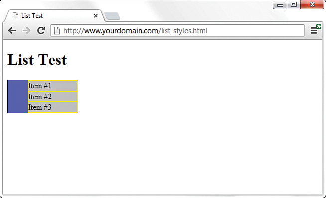
The default left-side padding value remains the same, regardless of the type of list. If you add the following line to the style sheet, creating a list with no item indicators, you will see that the padding remains the same (see Figure 16.2):
list-style-type: none;
When you are creating a page layout that includes lists of any type, play around with padding to place the items “just so” on the page. Similarly, just because no default margin is associated with lists doesn’t mean you can’t assign some to the display; adding margin values to the declaration for the ul selector provides additional layout control.
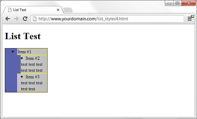
But remember, so far we’ve worked with only the list definition itself; we haven’t worked with the application of styles to the individual list items. In Figures 16.1 and 16.2, the gray background and yellow border of the list item show no default padding or margin. Figure 16.3 shows the different effects created by applying padding or margin values to list items instead of the overall list “box” itself.
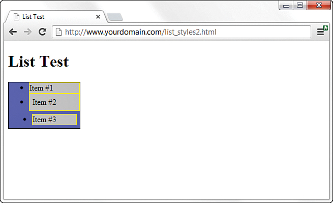
The first list item is the base item, with no padding or margin applied to it. However, the second list item uses a class called padded, defined in the stylesheet as padding: 6px; you can see the 6 pixels of padding on all sides (between the content and the yellow border surrounding the element). Note that the placement of the bullet remains the same as the placement of the first list item. The third list item uses a class called margined, defined in the stylesheet as margin: 6px, to apply 6 pixels of margin around the list item; this margin allows the blue background of the <ul> to show through.
Placing List Item Indicators
All this talk of margins and padding raises another issue: the control of list item indicators (when used) and how text should wrap around them (or not). The default value of the list-style-position property is outside—this placement means that the bullets, numbers, and other indicators are kept to the left of the text, outside the box created by the <li></li> tag pair. When text wraps within the list item, it wraps within that box and remains flush left with the left border of element.
But when the value of list-style-position is inside, the indicators are inside the box created by the <li></li> tag pair. Not only are the list item indicators then indented further (they essentially become part of the text), but the text wraps beneath each item indicator.
Figure 16.4 shows an example of both outside and inside list style positions. The only changes between Listing 16.1 and the code used to produce the example in Figure 16.4 (not including the filler text added to Item #2 and Item #3) is that the second list item uses a class called outside, defined in the stylesheet as list-style-position: outside, and the third list item uses a class called inside, defined in the stylesheet as list-style-position: inside.
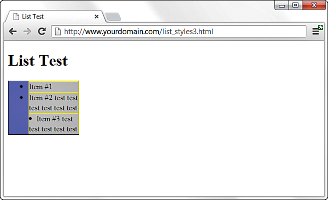
The additional filler text used for the second list item shows how the text wraps when the width of the list is defined as a value that is too narrow to display all on one line. You could have achieved the same result without using list-style-position: outside because that is the default value of list-style-position without any explicit statement in the code.
However, you can clearly see the difference when the inside position is used. In the third list item, the bullet and the text are both within the gray area bordered by yellow—the list item itself. Margins and padding affect list items differently when the value of list-style-position is inside (see Figure 16.5).
In Figure 16.5, both the second and third list items have a list-style-position value of inside. However, the second list item has a margin-left value of 12 pixels, and the third list item has a padding-left value of 12 pixels. Although both content blocks (list indicator plus the text) show text wrapped around the bullet, and the placement of these blocks within the gray area defining the list item is the same, the affected area is the list item within the list itself.
As you would expect, the list item with the margin-left value of 12 pixels displays 12 pixels of red showing through the transparent margin surrounding the list item. Similarly, the list item with the padding-left value of 12 pixels displays 12 pixels of gray background (of the list item) before the content begins. Padding is within the element; margin is outside the element.
By understanding the way margins and padding affect both list items and the list in which they appear, you can create navigation elements in your website that are pure CSS and do not rely on external images. Later in this hour, you learn how to create both vertical and horizontal navigation menus, as well as menu drop-downs.
Creating Image Maps with List Items and CSS
In Hour 11, “Using Images in Your Website,” you learned how to create client-side image maps using the <map> tag in HTML. Image maps enable you to define an area of an image and assign a link to that area (instead of having to slice an image into pieces, apply links to individual pieces, and stitch the image back together in HTML). However, you can also create an image map purely out of valid HTML and CSS.
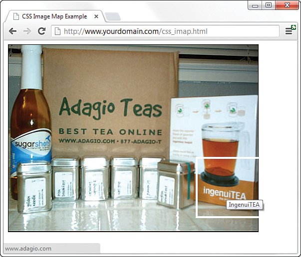
The code in Listing 16.2 produces the image map that Figure 16.6 shows. When the code is rendered in a web browser, it simply looks like a web page with an image placed in it. The actions happen when your mouse hovers over a “hot” area, as you can see in Figure 16.6: The thicker white border and image alt text shows the area the mouse hovered over, and in the lower left of the browser window, you can see the URL assigned to that hot spot.
LISTING 16.2 Creating an Image Map Using CSS
<!DOCTYPE html>
<html lang="en">
<head>
<title>CSS Image Map Example</title>
<style type="text/css">
#theImg {
width:500px;
height:375px;
background:url(tea_shipment.jpg) no-repeat;
position:relative;
border: 1px solid #000000;
}
#theImg ul {
margin:0px;
padding:0px;
list-style:none;
}
#theImg a {
position:absolute;
text-indent: -1000em;
}
#theImg a:hover {
border: 4px solid #ffffff;
}
#ss a {
top:0px;
left:5px;
width:80px;
height:225px;
}
#gn a {
top:226px;
left:15px;
width:70px;
height:110px;
}
#ib a {
top:225px;
left:85px;
width:60px;
height:90px;
}
#iTEA1 a {
top:100px;
left:320px;
width:178px;
height:125px;
}
#iTEA2 a {
top:225px;
left:375px;
width:123px;
height:115px;
}
</style>
</head>
<body>
<div id="theImg">
<ul>
<li id="ss"><a href="[some URL]"
title="Sugarshots">Sugarshots</a></li>
<li id="gn"><a href="[some URL]"
title="Golden Needle">Golden Needle</a></li>
<li id="ib"><a href="[some URL]"
title="Irish Breakfast">Irish Breakfast</a></li>
<li id="iTEA1"><a href="[some URL]"
title="IngenuiTEA">IngenuiTEA</a></li>
<li id="iTEA2"><a href="[some URL]"
title="IngenuiTEA">IngenuiTEA</a></li>
</ul>
</div>
</body>
</html>
As Listing 16.2 shows, the style sheet has quite a few entries, but the actual HTML is quite short. List items are used to create five distinct clickable areas; those “areas” are list items that are assigned a specific height and width and then placed over an image that sits in the background. If the image is removed from the background of the <div> that surrounds the list, the list items still exist and are still clickable.
Let’s walk through the style sheet so that you understand the pieces that make up this HTML and CSS image map, which is—at its most basic level—just a list of links.
The list of links is enclosed in a <div> named theImg. In the style sheet, this <div> is defined as block element that is 500 pixels wide and 375 pixels high, with a 1-pixel solid black border. The background of this element is an image named tea_shipment.jpg that is placed in one position and does not repeat. The next bit of HTML that you see is the beginning of the unordered list (<ul>). In the style sheet, this unordered list is given margin and padding values of 0 pixels all around and a list-style of none—list items will not be preceded by any icon.
The list item text itself never appears to the user because of this trick in the style sheet entry for all <a> tags within the <div>:
text-indent: -1000em;
By indenting the text negative 1,000 ems, you can be assured that the text will never appear. It does exist, but it exists in a nonviewable area 1,000 ems to the left of the browser window. In other words, if you raise your left hand and place it to the side of your computer monitor, text-indent:-1000em places the text somewhere to the left of your pinky finger. But that’s what we want because we don’t need to see the text link. We just need an area to be defined as a link so that the user’s cursor changes as it does when rolling over any link in a website.
When the user’s cursor hovers over a list item containing a link, that list item shows a 4-pixel border that is solid white, thanks to this entry in the style sheet:
#theImg a:hover {
border: 4px solid #ffffff;
}
The list items themselves are then defined and placed in specific positions based on the areas of the image that are supposed to be the clickable areas. For example, the list item with the ss ID, for Sugarshots—the name of the item shown in the figure—has its top-left corner placed 0 pixels from the top of the <div> and 5 pixels in from the left edge of the <div>. This list item is 80 pixels wide and 225 pixels high. Similar style declarations are made for the #gn, #ib, #iTEA1, and #iTEA2 list items so that the linked areas associated with those IDs appear in certain positions relative to the image.
Summary
This hour began with examples of how lists and list elements are affected by padding and margin styles. You learned about the default padding associated with lists and how to control that padding. Next, you learned how to modify padding and margin values, and how to place the list item indicator either inside the list item or outside it—you began to think about how styles and lists can affect your overall site design. Finally, you learned how to leverage lists and list elements to create a pure HTML and CSS image map, thus reducing the need for slicing up linked images or using the <map> tag.
After learning to “think outside the (list) box,” if you will, you learned how to use unordered lists to produce horizontal or vertical navigation within your website. By using CSS instead of graphics, you have more flexibility in both the display and maintenance of your site. Throughout this hour, you learned that, with a few entries in your style sheet, you can turn plain underlined text links into areas with borders and background colors and other text styles. Additionally, you learned how to present nested lists within menus.
Q&A
Q. An awful lot of web pages talk about the “box model hack” regarding margins and padding, especially for lists and list elements. Are you sure I don’t have to use a hack?
A. At the beginning of this hour, you learned that the HTML and CSS in this hour (and others) all look the same in the current versions of the major web browsers. This is the product of several years of web developers having to do code hacks and other tricks before modern browsers began handling things according to CSS specifications, not their own idiosyncrasies. Additionally, there is a growing movement to rid Internet users of the very old web browsers that necessitated most of these hacks in the first place. So although I wouldn’t necessarily advise you to design only for the current versions of the major web browsers, I also wouldn’t recommend that you spend a ton of time implementing hacks for the older versions of browsers—which less than 5% of the Internet population uses, by the way. You should continue to write solid code that validates and adheres to design principles, test your pages in a suite of browsers that best reflects your audience, and release your site to the world.
Q. The CSS image map seems like a lot of work. Is the <map> tag so bad?
A. The <map> tag isn’t at all bad and is indeed valid HTML5. Determining coordinates used in client-side image maps can be difficult, however, especially without graphics software or software intended for the creation of client-side image maps. The CSS version gives you more options for defining and displaying clickable areas, only one of which you’ve seen here.
Workshop
The Workshop contains quiz questions and activities to help you solidify your understanding of the material covered. Try to answer all questions before looking at the “Answers” section that follows.
Quiz
1. What is the difference between the inside and outside list-style-position values? Which is the default value?
2. Does a list-style with a value of none still produce a structured list, either ordered or unordered?
3. When using an unordered list to create image hot spots, how do you draw the hot spot area?
Answers
1. The list-style-position value of inside places the list item indicator inside the block created by the list item. A value of outside places the list item indicator outside the block. When inside, content wraps beneath the list item indicator. The default value is outside.
2. Yes. The only difference is that no list item indicator is present before the content within the list item.
3. The hot spot area is drawn by giving the list item a specific height and width, along with a starting point indicated by a value for right and left.
Exercises
Be sure you really understand the different effects of padding and margins, and inside and outside list item placement, by creating lists and list items and then adjusting these values much as we did in the beginning of this hour.
Find an image, and try your hand at mapping areas using the technique shown in this hour. Select an image that has areas where you can use hot spots or clickable areas leading either to other web pages on your site or to someone else’s site. Then create the HTML and CSS to define the clickable areas and the URLs where they should lead.