
Hour 23. Organizing and Managing a Website
What You’ll Learn in This Hour:
 How to determine whether one page is enough to handle all your content
How to organize a simple site
How to organize a larger site
How to write maintainable code
How to get started with version control
The bulk of this book has led you through the design and creation of your own web content, from text to graphics and multimedia. Along the way, I’ve noted some of the ways you can think about the lifecycle of that content—but in this hour, you learn how to look at your work as a whole.
This hour shows you how to think about organizing and presenting multiple web pages so that visitors will be able to navigate among them without confusion. You’ll also learn ways to make your website memorable enough to visit again and again. Web developers use the term sticky to describe pages that people don’t want to leave. Hopefully this chapter helps you make your websites downright gooey!
Because websites can be (and usually should be) updated frequently, it’s essential to create pages that can be easily maintained. This hour shows you how to add comments and other documentation to your pages so that you—or anyone else on your staff—can understand and modify your pages. It also introduces you to version control so that you can innovate individually or as part of a team without overwriting work that you might want to have saved.
When One Page Is Enough
Building and organizing an attractive and effective website doesn’t always need to be a complex task. If you are creating a web presence for a single entity (such as a local event) that requires only a brief amount of very specific information, you can effectively present that information on a single page without a lot of flashy graphics. In fact, there are several positive features to a single-page web presence:
All the information on the site downloads quicker than on more extensive sites.
The whole site can be printed on paper with a single print command, even if it is several paper pages long.
Visitors can easily save the site on their hard drives for future reference, especially if it uses a minimum of graphics.
Links between different parts of the same page usually respond more quickly than links to other pages.
Figure 23.1 shows the first part of a web page that serves its intended audience better as a single lengthy page than it would as a multipage site. The page begins, as most introductory pages should, with a succinct explanation of what the page is about and who would want to read it. A detailed table of contents allows visitors to skip directly to the section containing the material they find most interesting. If this “page” were printed, it would contain about six paper pages’ worth of text about driving traffic to websites—something a visitor might think about printing and reading later, perhaps while also taking notes.
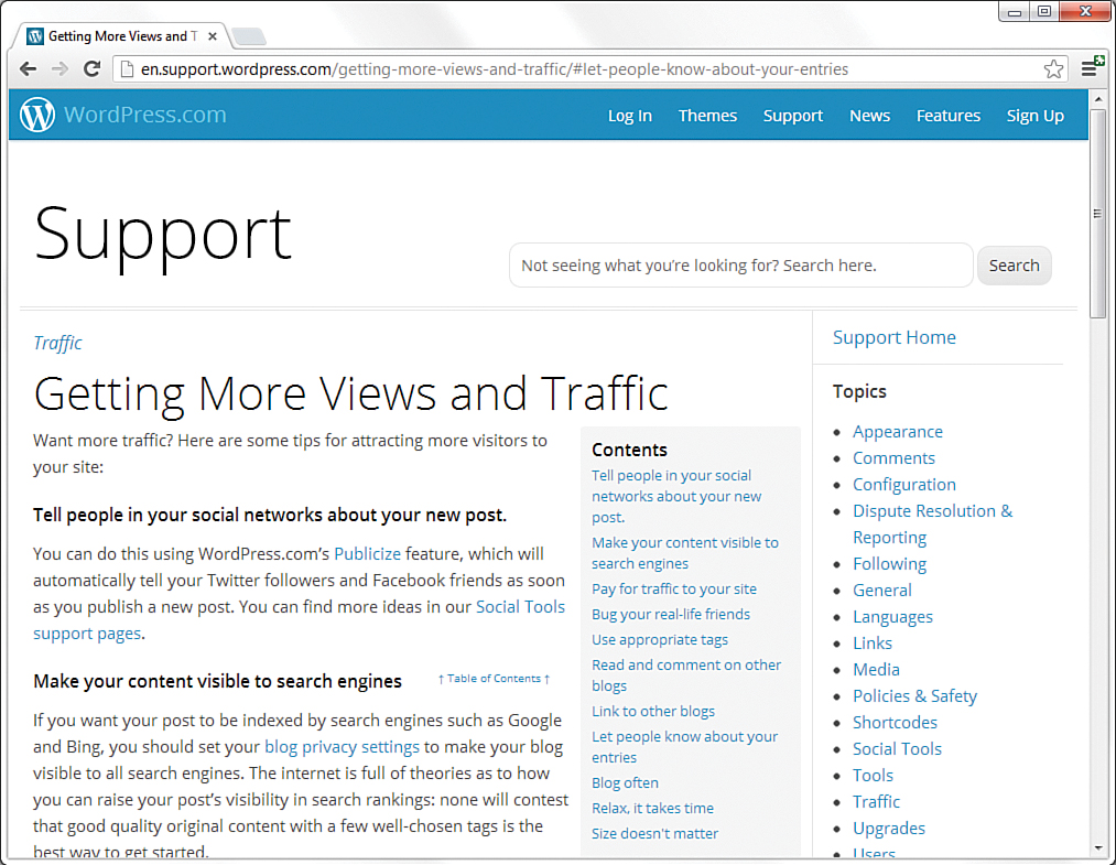
When pages contain a table of contents to separate sections of information, it is also common for each short section to contain a link back up to the table of contents so that navigating around the page feels much the same as navigating around a multipage site. Because the contents of these types of longer pages are intended as a handy reference, visitors will definitely prefer the convenience of bookmarking or saving a single page instead of having to save 8 or 10 separate pages. The most common examples of single-page information websites are encompassed within Wikipedia, at www.wikipedia.org. If you consider each entry full of rich content to be its own “site,” the single-page sites within Wikipedia—with their own tables of contents—represent millions of printed pages.
Having experienced many beautiful and effective graphical layouts online, you might be tempted to forget that a good, old-fashioned outline is often the clearest and most efficient way to organize long web pages full of text-based content within a site. This is especially true with the influx of single-page interfaces (also called single-page applications) that attempt to bring all the interactivity of desktop applications into a web browsing experience. These applications are often built using HTML and JavaScript frameworks and include significant visual design elements; in fact, these sites are often used to publish design portfolios rather than the type of text-based content that I’m using here.
Organizing a Simple Site
With the exception of the aforementioned special cases of single-page applications and portfolio sites, single-page websites tend to serve as merely “coming soon” or placeholder purposes. If you spend any time at all on the web, you’ll quickly learn that most companies and individuals serve their readers better by dividing their site into short, quick-read pages surrounded by graphical navigation that allows them to gather almost all the information they could want within a few clicks. Furthermore, using multiple pages instead of a series of very long pages minimizes scrolling on the page, which can be especially bothersome for visitors who are using mobile devices to view the full site or who have relatively low-resolution monitors (less than 800×600).
Tip
Regardless of how large your site is, it’s a good idea to carefully organize your resources. For example, placing the images for your web pages in a separate folder named images is one step toward organization. Similarly, if you have files that are available for download, place them in a folder called downloads. This makes it much easier to keep track of web page resources based on their particular types (HTML pages, PNG images, and so on). Additionally, if you organize your site into sections, such as Company, Products, Press, and so on, put the individual pages into similarly named directories (company, products, press, and so on), for the same organizational reasons.
The fundamental goal of a website is to make the individual or organization visible on the Internet, but also—and more important—to act as a portal to the information within the site itself. The main page of a site should give the user enough information to provide a clear picture of the organization, as well as traditional contact information and an email address to submit questions or feedback. It should also provide clear pathways into the highly structured information within other pages in the site. The main page shown in Figure 23.2 provides examples of all these good features: basic information, contact information, and paths to information for multiple audiences.
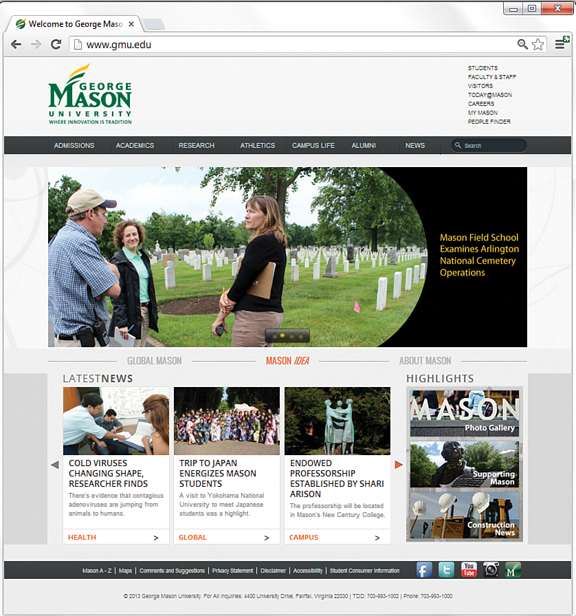
FIGURE 23.2 This university main page uses a basic design, minimal but useful graphics, and a clear structure to entice users to explore for more information.
One of the most common mistakes beginning website developers make is creating pages that look fundamentally different than other pages on the site. An equally serious mistake is using the same publicly available clip art that thousands of other web authors are also using. Remember that, on the Internet, one click can take you around the world. The only way to make your pages memorable and recognizable as a cohesive site is to make all your pages adhere to a unique, unmistakable visual theme. In other words, strive for uniqueness when compared to other websites, yet uniformity within the site itself.
As an example of how uniformity can help make a site more cohesive, think about large, popular sites you might have visited, such as ESPN.com. If you visit the MLB section at ESPN.com (see Figure 23.3) and then visit the NFL section (see Figure 23.4), you’ll notice a very similar structure.
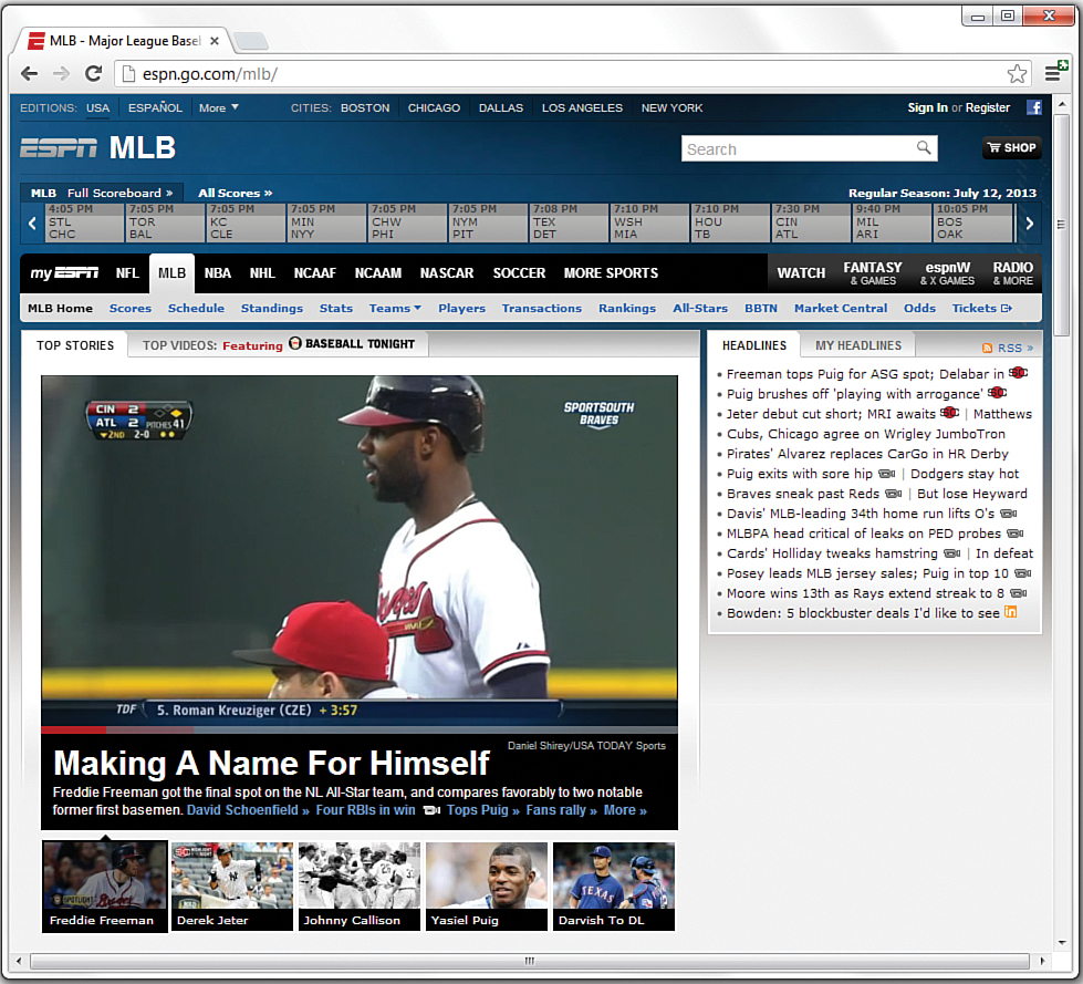
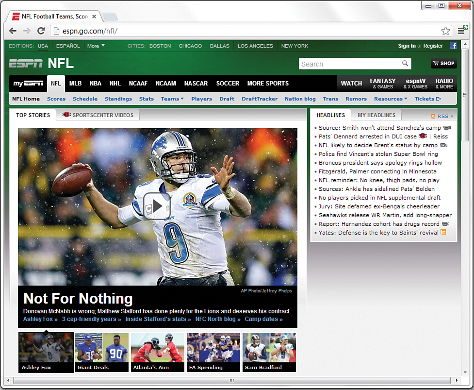
In both examples, you see navigation elements at the top of the page (including some subnavigation elements), a large area in the middle of the page for the featured item graphic, a rectangle on the right side containing links to top stories, and a set of secondary rectangles under the primary image leading readers to additional stories. The only difference between the MLB section and the NFL section is the color scheme: The MLB section is part of a predominantly blue color scheme, whereas the NFL section is predominantly green. However, in both sections, you know that if you want to read the popular news stories, you look to the right of the page. If you want to navigate to another section in the site or to the site’s main page, you look to a navigational element at the top left of the page.
The presence of consistent design and organizational elements helps ensure that your users will be able to navigate throughout your content with confidence. From a maintenance perspective, the consistent structural template enables you to reuse pieces of the underlying code. This type of code reuse typically happens through dynamic server-side programming outside the scope of this book, but in general, it means that instead of copying and pasting the same HTML, CSS, and JavaScript over and over, that client-side code exists in only one place and is applied dynamically to the content. Therefore, instead of making changes to thousands of files to make a background change from blue to green, for example, you would need to make a change only once.
Organizing a Larger Site
For complex sites, sophisticated layout and graphics can help organize and improve the looks of your site when used consistently throughout all your pages. To see how you can make aesthetics and organization work hand in hand, let’s look at examples of navigation (and, thus, underlying organization) for a few sites that present a large volume of information to several different audiences.
Figure 23.5 shows the main page of Amazon.com, specifically with the side navigation selected. Amazon is in the business of selling products, plain and simple. Therefore, it makes sense for Amazon to show product categories as the main navigational elements.
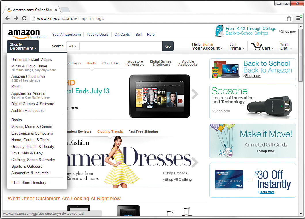
Although Amazon is in the business of selling products, it still has to provide information regarding who it is, how to contact it, and other ancillary yet important information to enhance the business-to-consumer relationship. Links to this sort of information appear in the footer, or bottom portion, of the Amazon.com website—outside the viewing area of this screenshot. When creating your site template, you must determine the most important content areas and how to organize that content; also remember to provide users with basic information—especially if that information will enhance your image and make users feel as if you value what they have to say.
The next example is of a secondary page within the Peet’s Coffee & Tea website (www.peets.com). All the pages in the Peet’s website follow one of the common types of presenting navigation and subnavigation: a horizontal strip for main navigation, with secondary elements for that section placed in a vertical column on the left. As Figure 23.6 shows, the section the user is currently browsing (Community) is highlighted in the main navigation (through a subtle font color change), as is the specific page in the secondary navigation (using a background color change for the element). These types of visual indicators help users orient themselves within the site. Using a visual indicator is a useful tactic because your users might arrive at a page via a search engine or by a link from another website. After your users arrive, you want them to feel at home—or at least feel as if they know where they are in relation to your site.
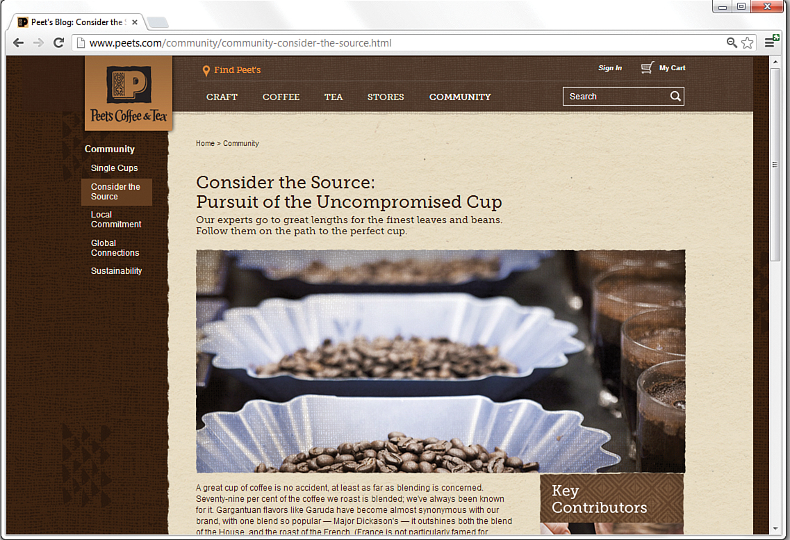
FIGURE 23.6 This Peet’s Coffee & Tea secondary page shows a main navigation element selected with secondary navigation on the left side of the page.
As you can see by the different main navigation elements—Craft, Coffee, Tea, Stores, and Community—the Peet’s website has to serve the needs of many different types of people who come to the website for many different reasons. As you organize your own site content, determine the information that is most important to you, as well as the information that is most important to your users, and create a navigation scheme that finds a happy medium between the two.
Figure 23.7 shows another example of a navigation style, this time with a twist on the standard top navigation/left side navigation scheme. In this example, the left side navigation (the secondary navigation, in this case) also appears in a drop-down menu under the main navigation (refer to Hour 17 for information on how to do something like this). Hovering the mouse over any of the other main navigation elements shows similar menus. This scheme gives users an entire site map at their fingertips because they can reach any place in the site within one click of any other page.
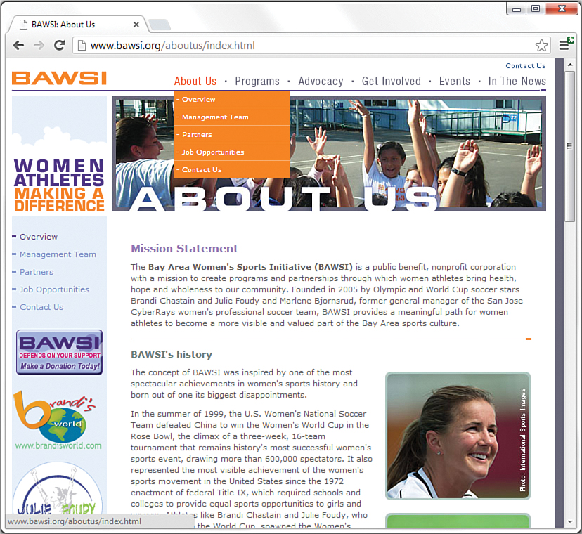
Also notice that the Overview link in the side navigation window is styled a bit differently—with heavier purple text—than the other links in the window, indicating to visitors what page they are on. This visual detail, similar to what you saw on the Peet’s site, is an unobtrusive way to give users a sense of where they are within the current navigational scheme.
You can choose among many different types of navigation styles and ways of indicating to users where they are and where they might want to go next. Keep in mind the following fact: Studies have repeatedly shown that people become confused and annoyed when presented with more than seven choices at a time, and people feel most comfortable with five or fewer choices. Therefore, you should avoid presenting more than five links (either in a list or as graphical icons) next to one another, if at all possible—and definitely avoid presenting more than seven at once. Amazon.com gets a pass here because it is an Internet superstore, and users expect a lot of “departments” in which to shop when they get there. But when you need to present more than seven links in a navigation list, break them into multiple lists with a separate heading for each of the five to seven items.
It will also help your readers navigate your site without confusion if you avoid putting any page more than two (or, at most, three) links away from the main page. You should also always send readers back to a main category page (or the home page) after they’ve read a subsidiary page. In other words, try to design somewhat of a flat link structure in which most pages are no more than one or two links deep. You don’t want visitors to have to rely heavily, if at all, on their browsers’ Back buttons to navigate your site.
Writing Maintainable Code
If you’ve done any coding before reading this book, you already know how important it is to write code that can be maintained—that is, you or someone else should be able look at your code later and not be utterly confused by it. The challenge is to make your code as immediately understandable as possible. A time will come when you’ll look back on a page that you wrote, and you won’t have a clue what you were thinking or why you wrote the code the way you did. Fortunately, there is a way to combat this problem of apparent memory loss.
Documenting Code with Comments
Whenever you develop an HTML page or CSS snippet, keep in mind that you or someone else will almost certainly need to make changes to it someday. Simple text web pages are usually easy to read and revise, but complex pages with graphics, tables, and other layout tricks can be quite difficult to decipher.
Note
To include comments in a stylesheet, begin comments with /* and end them with */ (your commented code should be between these characters).
The HTML <!-- and --> comment syntax does not work properly in stylesheets.
To see what I’m talking about, visit just about any page in a web browser and view its source code. Using Internet Explorer, right-click any page and select View Source. Using Chrome or Firefox, right-click any page and select View Page Source. You might see a jumbled bunch of code that is tough to decipher as pure HTML. This might be because content management software systems have generated the markup dynamically, or it might be because its human maintainer has not paid attention to structure, ease of reading, code commenting, and other methods for making the code readable by humans. For the sake of maintaining your own pages, I encourage you to impose a little more order on your HTML markup and stylesheet entries. The same goes for any JavaScript you might write in the future: Proper indentation is your (and your future development partner’s) friend.
Tip
One handy use of comments is to hide parts of a web page that are currently under construction. Instead of making the text and graphics visible and explaining that they’re under construction, you can hide them from view entirely with some carefully placed opening and closing comment indicators around the HTML that you do not want to appear. This is a great way to work on portions of a page gradually and show only the end result to the world when you’re finished.
As you have seen in several different lessons throughout this book, you can enclose comments to yourself or your coauthors using the HTML beginning and ending comment syntax: <!-- and -->. These comments will not appear on the web page when viewed with a browser but can be read by anyone who examines the HTML code in a text editor or via the web browser’s View Source (or View Page Source) function. The following example provides a little refresher just to show you how a comment is coded:
<!-- This image needs to be updated daily. -->
<img src="headline.jpg" alt="Today's Headline" />
As this code reveals, the comment just before the <img /> tag provides a clue to how the image is used. Anyone who reads this code knows immediately that this is an image that must be updated every day. Web browsers completely ignore the text in the comment.
Indenting Code for Clarity
I have a confession. Throughout the book, I’ve been carefully indoctrinating you into an HTML code development style without really letting on. It’s time to spill the beans. You’ve no doubt noticed a consistent pattern with respect to the indentation of all the HTML code in the book. More specifically, each child tag is indented to the right two spaces from its parent tag. Furthermore, content within a tag that spans more than one line is indented within the tag.
The best way to learn the value of indentation is to see some HTML code without it. You know how the song goes—“You don’t know what you’ve got ‘til it’s gone.” Anyway, here’s a very simple table coded without any indentation:
<table><tr><td>Cell One</td><td>Cell Two</td></tr>
<tr><td>Cell Three</td><td>Cell Four</td></tr></table>
Not only is there no indentation, but there also is no delineation between rows and columns within the table. Now compare this code with the following code, which describes the same table:
<table>
<tr>
<td>Cell One</td>
<td>Cell Two</td>
</tr>
<tr>
<td>Cell Three</td>
<td>Cell Four</td>
</tr>
</table>
This heavily indented code makes it plainly obvious how the rows and columns are divided up via <tr> and <td> tags.
Consistent indentation might even be more important than comments when it comes to making your HTML code understandable and maintainable. And you don’t have to buy into this specific indentation strategy. If you’d rather use three or four spaces instead of two, that’s fine. And if you want to tighten things up a bit and not indent content within a tag, that also works. The main point to take from this section is that it’s important to develop a coding style of your own and then ruthlessly stick to it.
Tip
If you work with other people (or plan to) in developing web pages, consider getting together as a group to formulate a consistent coding style. That way, everyone is on the same page—pun intended.
Thinking About Version Control
If you’ve ever used Google Docs, you have encountered a form of version control; in Google Docs, Google automatically saves revisions of your work as you are typing. This is different than simply automatically saving your work (although it does that, too) because you can revert to any revision along the way. You might have encountered this concept when using popular blog-authoring software such as Blogger or WordPress, or even when editing wikis—both of these also enable users to revise their work without overwriting, and thus deleting for all time, their previous work.
You might be wondering, “Well, what does that have to do with HTML or CSS? You’re talking about documents.” The answer is simple: Just as you might want to revert to a previous edition of an article or letter, you might want to revert to a previous edition of your HTML or CSS. This could be because you followed a good idea to the end, but your markup just proved untenable and you don’t want to start over entirely—you just want to back up to a certain point along your revision path.
Version control involves more than just revision history. When you start using version control systems to maintain your code, you will hear terms like these:
Commit/check in and check out—When you put an object into the code repository, you are committing that file; when you check out a file, you are grabbing it from the repository (where all the current and historical versions are stored) and working on it until you are ready to commit or check in the file again.
Branch—The files you have under version control can branch or fork at any point, thus creating two or more development paths. Suppose you want to try some new display layouts or form interactivity, but you don’t want an existing site to appear modified in any way. You might have started with one master set of files but then forked this set of files for the new site, continuing to develop them independently. If you continued developing the original set of files, that would be working with the trunk.
Change/diff—This is just the term (you can say change or diff) for a modification made under version control. You might also hear diff used as a verb, as in “I diffed the files,” to refer to the action of comparing two versions of an object (there is an underlying UNIX command called diff).
Fork—When you find an open source GitHub repository that you want to use as the basis for your own work (or that you want to contribute to), you fork the repository to then create a copy of it that you can work on at your own pace. From the forked repository, you can push commits to your own version, fetch changes from the original repository, and issue pull requests to the owner of the original if you would like to contribute your changes to the original repository that you forked.
You will hear many more terms than just these few listed here, but if you can conceptualize the repository, the (local) working copy, and the process of checking in and checking out files, you are well on your way to implementing version control for your digital objects.
Using a Version Control System
Several different version control systems are available for use, some free and open source, and some proprietary. The two most popular systems are Subversion (subversion.apache.org) and Git (git-scm.com). If you have a web hosting service that enables you to install Subversion, you can create your own repository and use a Subversion client to connect to it.
An increasingly popular tool is Git, which is a decentralized approach to version control and also offers numerous tools and hosting options for users who want to get started with a repository but don’t necessarily want, need, or understand all the extra installation and maintenance overhead that goes with it. One such hosting option for Git repositories is GitHub (github.com). It allows users to create accounts and then store and maintain as many code repositories for free as they would like (as long as they are open source), while also providing paid solutions for users who want to maintain private code repositories.
For anyone wanting to get started with version control, I recommend Git and GitHub for relative ease of use and free, cross-platform tools. The GitHub Help site is a great place to start: See http://help.github.com/. An added benefit of the already-free GitHub account is the capability to use Gist (gist.github.com) to share code snippets (or whole pages) with others (those snippets themselves are Git repositories and, thus, are versioned and forkable in their own right). GitHub repositories, including Gists, are also excellent ways to get started with version control of your work.
Using HTML and CSS Frameworks
If you use a content management system (CMS) such as Wordpress (www.wordpress.org) or Drupal (www.drupal.org) to power your website, you will end up using a presentation template designed for one of those systems—but what about the people who do not want to use a CMS but would like a starting point for an advanced HTML and CSS presentation? Over the last few years, the web development world has seen the rise of HTML and CSS (or “front-end”) frameworks, which can help solve this problem. Many of these frameworks are open source and available for download or forking from GitHub repositories. These frameworks often also include advanced JavaScript functionality, but don’t let that scare you—numerous examples and documentation help guide you through the initial stages of your work.
I recommend three popular front-end frameworks:
Bootstrap—Developed internally by engineers at Twitter, this framework is open source software for anyone who wants to use it to get started with modern design elements. Learn more at http://getbootstrap.com/, which includes a simple “Get Started” section that explains what is included and how to use it.
Foundation—Another open source framework, Foundation emphasizes responsive design so that people with all different kinds of devices, from desktops to phones, can enjoy and use your website. Learn more at http://foundation.zurb.com/, which includes an extensive “Getting Started” section that details the components of the display templates you can use.
HTML5 Boilerplate—One of the leanest frameworks out there, this might be the most useful for beginners because it provides the basics of what you need without overwhelming you with the possibilities. Learn more at http://html5boilerplate.com/, and see the documentation maintained within the GitHub repository.
Although front-end frameworks can be incredibly useful for speeding up some of the foundational work of web development, you run the risk of falling into the “cookie cutter” trap, in which your site looks like all the others out there (at least, the ones using the same framework). However, with a little creativity, you can avoid that trap.
Summary
This hour gave you examples and explanations to help you organize your web pages into a coherent site that is informative, attractive, and easy to navigate. Web users have become quite savvy and expect well-designed websites, and they will quickly abandon your site if they experience a poor design that is difficult to navigate.
This hour also discussed the importance of making your code easy to maintain by adding comments and indentation. Comments are important not only as a reminder for you when you revisit code later, but also as instructions if someone else inherits your code. Indentation might seem like an aesthetic issue, but it can help you quickly analyze and understand the structure of a web page at a glance.
Because you likely will soon need code-management tools either for yourself or for yourself and other developers in your group, this lesson introduced you to a few concepts of version control. Version control enables you to innovate without losing your solid, production-quality work and also provides more opportunities for other developers to work within your code base.
Finally, you learned a little bit about HTML and CSS frameworks, of which there are many. These frameworks can help you speed up your web development project by giving you templates that already contain modern and validated markup.
Q&A
Q. Won’t adding a lot of comments and spaces make my pages load slower when someone views them?
A. The size of a little extra text in your pages is negligible when compared to other, chunkier web page resources (such as images and multimedia). Besides, slower dial-up modem connections typically do a decent job of compressing text when transmitting it, so adding spaces to format your HTML doesn’t usually change the transfer time. You’d have to type hundreds of comment words to cause even 1 extra second of delay in loading a page. Also keep in mind that, with the broadband connections (cable, DSL, and so on) that many people use, text travels extremely fast. The graphics are the components that slow pages down, so although you need to optimize your images as best you can, you can use text comments freely. You can also learn more about the concept of “minifying” your HTML and CSS (and JavaScript, too) at https://developers.google.com/speed/docs/best-practices/payload?hl=fr#MinifyHTML.
Q. Using version control seems like overkill for my tiny personal website. Do I have to use it?
A. Of course not—websites of any type, personal or otherwise, are not required to be under version control or other backup systems. However, most people have experienced some data loss or website crash, so if you don’t use version control, I highly recommend at least performing some sort of automated backup of your files to an external system. By “external system,” I mean any external drive, whether a physical drive attached to your computer or a cloud-based backup service such as Dropbox (www.dropbox.com).
Workshop
The Workshop contains quiz questions and activities to help you solidify your understanding of the material covered. Try to answer all questions before looking at the “Answers” section that follows.
Quiz
1. What are three ways to ensure that all your pages form a single cohesive website?
2. What two types of information should you always include in your home page?
3. You want to say to future editors of a web page, “Don’t change this image of me. It’s my only chance at immortality.” But you don’t want users who view the page to see that message. How can you do this?
Answers
1. Use consistent background, colors, fonts, and styles. Repeat the same link words or graphics on the top of the page that the link leads to. Repeat the same small header, buttons, or other elements on every page of the site.
2. Use enough identifying information that users can immediately see the name of the site and understand what it is about. Also, whatever the most important message is that you want to convey to your intended audience, state it directly and concisely. Whether it’s your mission statement or a trademarked marketing slogan, make sure that it is in plain view here.
3. Put the following comment immediately before the <img /> tag:
<!-- Don't change this image of me.
It's my only chance at immortality. -->
Exercises
Grab a pencil (the oldfangled kind) and sketch out your website as a bunch of little rectangles with arrows between them. Sketch a rough overview of what each page will look like by putting squiggles where the text goes and doodles where the images go. Each arrow should start at a doodle icon that corresponds to the navigation button for the page the arrow leads to. Even if you have the latest whiz-bang website-management tools (which are often more work to use than just creating the site itself), sketching your site by hand gives you a much more intuitive grasp of which pages on your site will be easy to get to and how the layout of adjacent pages will work together—all before you invest time in writing the actual HTML to connect the pages. Believe it or not, I still sketch out websites like this when I’m first designing them. Sometimes you can’t beat a pencil and paper!
Open the HTML files that make up your current website, and check them all for comments and code indentation. Are there areas in which the code needs to be explained to anyone who might look at it in the future? If so, add explanatory comments. Is it difficult for you to tell the hierarchy of your code—is it difficult to see headings and sections? If so, indent your HTML so that the structure matches the hierarchy and thus enables you to jump quickly to the section you need to edit.
Create an account at GitHub, and create a repository for your personal website or other code-based project. From this point forward, keep your repository in sync with your work on your personal computer by committing your changes to the GitHub repository.