
13. WordPress and Mobile Users
In This Chapter
• Making your site “mobile ready” for smartphones and tablets
• Managing your site from your smartphone or tablet
• Posting content to your site from your smartphone or tablet
Mobile Internet users, people using smartphones or tablets to browse the web, are one of the fastest growing segments online. In the next couple of years, mobile users and mobile devices will be the single dominant category online. So, how does your website look on an iPhone or tablet? Don’t know? You should. Using WordPress? Well at least you’re a good way there, if not all set. Curious? Journey on with me.
Making Your WordPress Site Mobile Ready
When people talk about making a website “mobile ready,” the first thing to understand is that people aren’t talking about whether the website will load on a smartphone or tablet—they are talking about how it looks and if mobile users can navigate the site. For the most part (there are some exceptions), any website will load on a smartphone or tablet. There aren’t special mobile-activating HTML codes people need to use. The issue is that a non-mobile-friendly website can be hard to read and even harder to navigate on the smaller screens where you use touch controls to do things. If you have a smartphone or tablet, you’ve probably visited lots of sites like this—sites where the text was really small and you had to zoom in (a lot) to read what was on the page, and it had navigation menus that you couldn’t use with fingers and touch. It’s not a great experience. Let’s not do that to our site visitors, shall we? Good.
There are two ways to fix this problem in WordPress: One is using plugins; the other is picking the right theme. Both have their pros and cons. In the end, both can work very well. You just have to decide which is right for you.
Themes
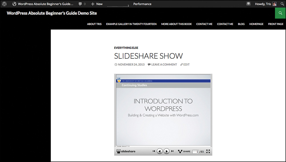
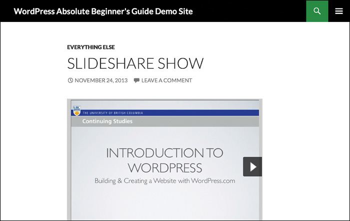
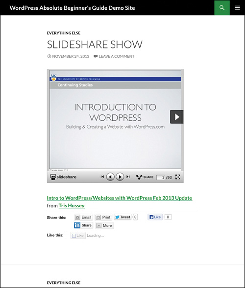
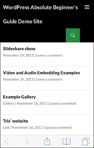
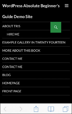
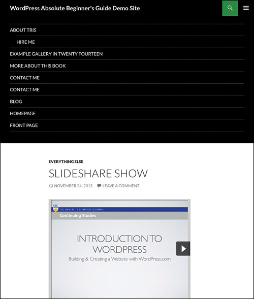
Starting with the right theme is probably the easiest way to go. Pick a theme that works on all devices and you can stop right there. If you’re using any of the newer WordPress.org themes (2010 through 2014), all of these are “mobile ready” or “responsive” themes. A responsive theme has additional stylesheets and code that allows it to adjust and change the layout of the theme, depending on the width of the window. So, in reality, a responsive theme isn’t changing for a mobile device; it’s just assuming that if the screen is a certain size or smaller, it is a mobile device. It’s clever and it works pretty much all the time. So if you look at the demo site on my desktop browser (Figure 13.1), an iPad (Figure 13.2), an iPad mini (Figure 13.3), and an iPhone (Figure 13.4), you see how the site has adjusted so the content looks its best. Menus? The three bars in the corner of the iPad mini and iPhone screens are the menu. Tapping those bars reveals the menu that you see on the desktop and iPad (Figures 13.5 and 13.6). A responsive theme “knows” the space it has to work with and adjusts accordingly.
Are responsive themes perfect? No. Even with responsive themes, your content might not look exactly as you intend. Some gallery and slideshow plugins don’t work on mobile browsers. The Jetpack, Genesis, and WooThemes ones do, but not all do. Sometimes text is still small or the images don’t scale properly. Responsive themes also can’t account for how plugins will—or won’t—behave on mobile devices. Responsive themes just change the layout; they don’t prevent things from loading that don’t work on mobile devices. To pull off that kind of magic, you need a plugin.
Plugins
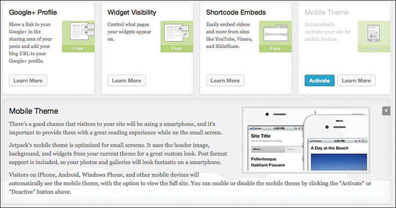
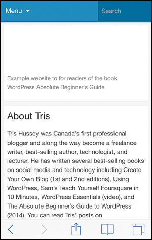
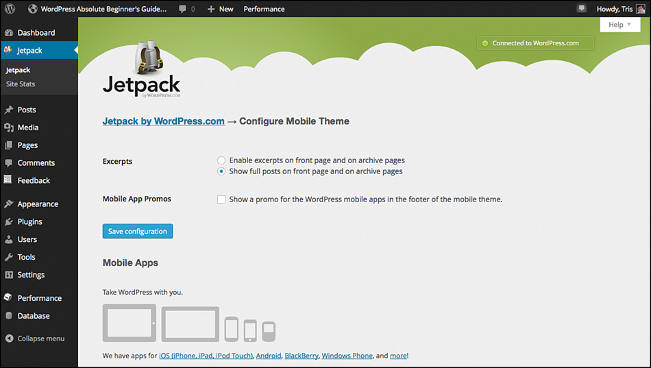
Using a plugin to handle mobile visitors takes a step beyond a theme adapting to a different screen size. Plugins work by determining whether the user is on a mobile device and serving up a completely different theme to mobile users, a theme that is specifically designed only for mobile devices and overrides all the other parts of your theme. Although a responsive theme will look like your “regular” theme, but smaller, a plugin-driven solution will look very different. In my opinion, there are only two options worth talking about: Jetpack and WPTouch Mobile (http://wordpress.org/plugins/wptouch/). For Jetpack, you just need to turn on the mobile theme (Figure 13.7), and when you reload the page on your iPhone (or similar-sized device), you’ll get a layout like Figure 13.8. (This example shows the About Tris page.)
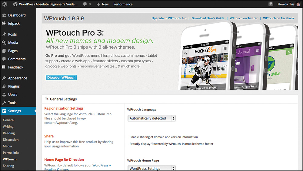
There aren’t too many settings for the Jetpack mobile theme (accessed from the Configure button in the mobile theme section) (Figure 13.9), and the theme works very well out of the box. It’s pretty basic. It works, it’s simple, but it’s also not very customizable. WPTouch Mobile on the other hand, has a raft of possibilities—not to mention that the mobile theme for Jetpack and WordPress.com uses code contributed by the WPTouch Mobile team. When you download and install WPTouch Mobile, their settings screen immediately lets you know they mean business (Figure 13.10).
The figure doesn’t even show half the options you have with this awesomely powerful plugin, but that’s okay. Because even just turning it on gives mobile users a great experience (Figure 13.11).
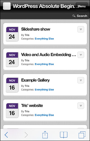
Notice the completely different look and feel, and there is a lot you can change about it. I recommend making sure the menus are all set correctly, but beyond that, chances are you’re good to go. The Pro version of the plugin (paid) offers more customization and features, but the free version is powerful enough for most people. As you can see, though, there is a downside to using a plugin like either of these. For smartphones, you lose the branding and such that you might have added to your theme. For tablet owners, if you have a responsive theme, that version will show. If you don’t have a responsive theme, these plugins cover you only for smartphones, not tablets.
 NOTE
NOTE
It nearly goes without saying—since Adobe has abandoned the project—but any site that uses Flash won’t work on Apple mobile devices (iPads and iPhones). Because Apple devices still dominate the mobile browsing world, seeing Flash on a website is pretty rare. However, if you’re working on fixing up an older website, make sure all the Flash you might have been using is replaced with a mobile-friendly alternative.
How to Decide What’s Right for You
You might be pretty confused at this point. Plugin or responsive theme, what’s the right choice? What will cover my bases the best? First, it doesn’t hurt to have a theme that is responsive. Consider it your safety net. I’ve opted for only responsive themes, and recently, I’m using plugin-based solutions less and less because I like having a consistent branding and look across all devices. That might not be the right choice for you and your visitors, though. You might need the features, especially if you have a large smartphone audience, that a plugin brings that a simple responsive theme can’t. My advice is to start with a responsive theme and then add a plugin to the mix if you need to.
Writing, Posting, and Managing Your Site from a Mobile Device
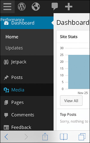
Not that long ago, although you could work with your WordPress site through the browser on your smartphone or tablet, it wasn’t something I would have suggested for most people. If I did, it was only if you needed to do something in a pinch. Today, between the mobile apps and improvements to the Dashboard in WordPress 3.8, you can do a lot from your mobile device. Maybe not everything, but all the really important things, such as posting, approving comments, and even updates to WordPress. Don’t believe me? Here is how the demo site looks on my iPad (Figure 13.12) and iPhone (Figure 13.13).
As you can see, this is certainly workable. A few taps will get you to most tasks. Now, for writing, that’s a task best left for the WordPress Mobile app (iOS, Android, Blackberry, Windows Phone, and more: http://wordpress.org/mobile/). The mobile app focuses the posting process down to key steps and uses an interface much better designed for mobile use than the website probably ever could be. How do I know? I spent the better part of two years doing the majority of my writing (articles, blog posts, even some book chapters) on my iPad and gave a presentation to WordCamp Vancouver 2013 (http://www.slideshare.net/trishussey/wordpress-your-ipad-doing-it-right) on the topic of this chapter. I’m a huge and enthusiastic supporter of light, mobile workflows. For this chapter, I’ll be using the WordPress app for iOS—specifically on the iPad—for screenshots and examples.
WordPress Mobile App
The WordPress mobile app hasn’t been, honestly, my favorite way to publish to my blogs from my iPad. It is, however, the app that is most consistent and is most likely to work well now and in the future with your WordPress blog. Do I recommend you download it? Absolutely. Are there better apps out there? Maybe. However, because the WordPress Mobile app is free, you can’t argue with the price. You can find the WordPress mobile app on the app store for your device or start at http://wordpress.org/mobile/ and follow the direct links to download the app version you need. After you have the app downloaded and installed, it’s time to add your site.
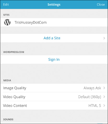
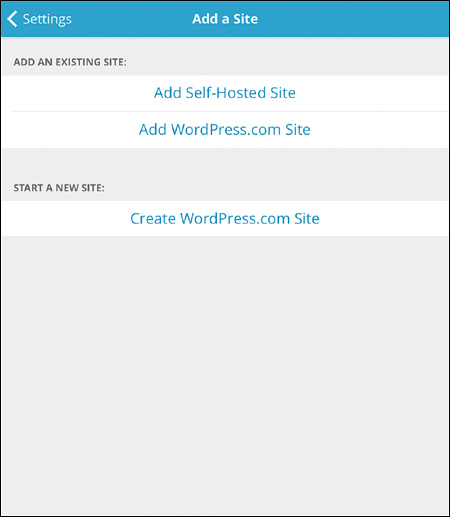
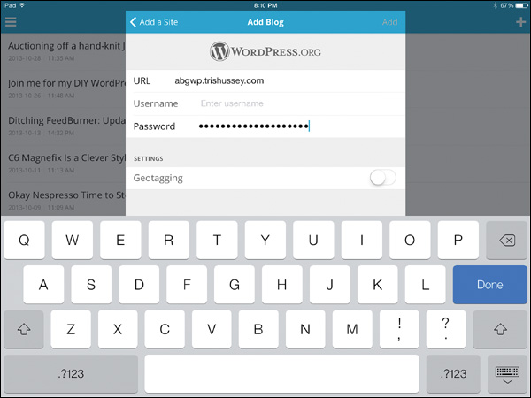
Adding Your Sites
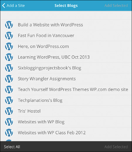
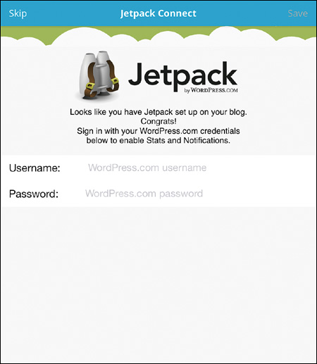
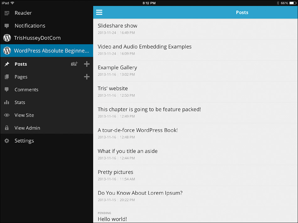
Tap the Settings icon in the app and then tap to Add a Site. You can sign in to WordPress.com now if you want, but you can hold off and do that later (Figure 13.14). Choose whether you’re adding a self-hosted site or a WordPress.com site (Figure 13.15) and log in to the site (Figure 13.16). If you log in to WordPress.com, you’ll be offered a list of your blogs to choose from (Figure 13.17). Because I have Jetpack turned on for the demo site, I was prompted to log in to WordPress.com so I could check my Jetpack stats (Figure 13.18) from within the app (which is a great feature, by the way). That’s it! When the app works through the process of logging you in and getting your Post and Page list, you’ll see something like Figure 13.19 with your posts and other parts of your site.
Posting Through the Mobile App
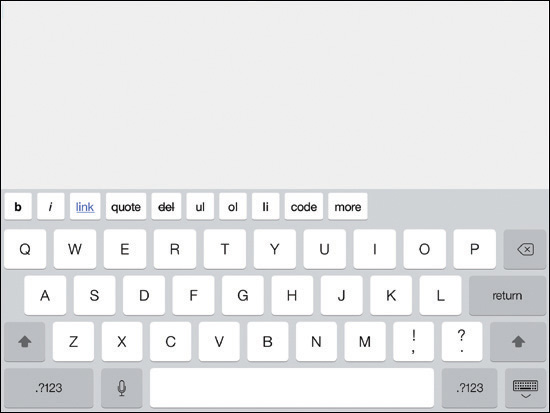
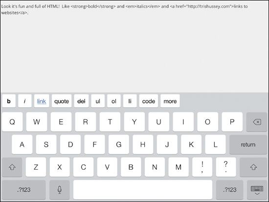
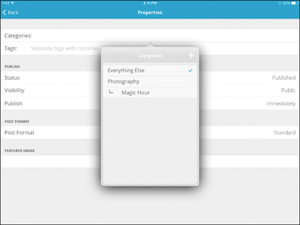
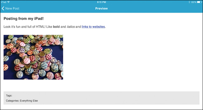
When you tap to create a post or page, you’ll see a screen like Figure 13.20. The title goes at the top and the text goes below. Here’s the thing about the text—for formatting, it’s all in HTML. If you want to type a long post and format it later in your browser on your laptop or desktop, that’s great. Figure 13.21 shows a little example of the text for the post with bold, italic, and a link inserted. You can use the quick buttons at the bottom of the screen to do this basic formatting. It might not look pretty, but it works. If you hide the keyboard, you can tap the Settings icon to get to the Post/Page properties, like setting a category or tags (Figure 13.22). If you want to write and save this as a draft to finish later, tap on Status to change from Published to Draft. This setting determines what the post’s status will be when you send the post up to your site, not what the post’s status is at this moment (a touch confusing for me as well). When you’re all done, tap Publish in the corner of the screen (you might have to hide the keyboard first). Adding images you say? Let me tell you all about that.
Handling Images
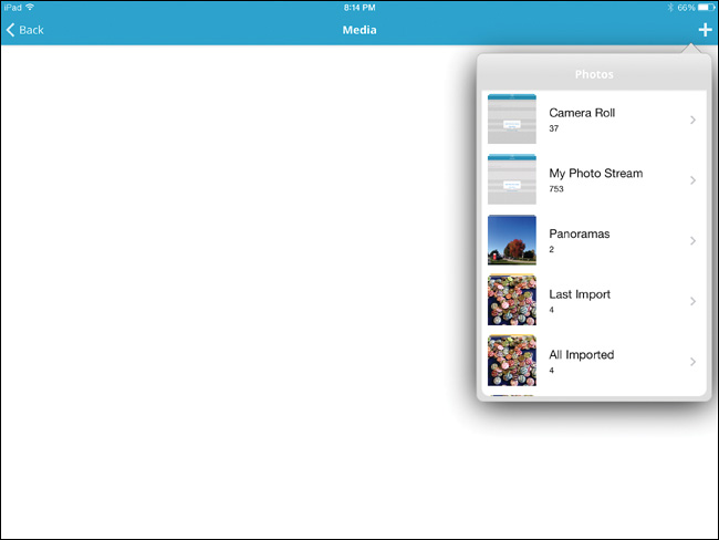
Working with images on mobile devices can be challenging. On iPads and iPhones, it’s especially limiting. You can work only with images that are on your device, not any of the images already uploaded to the Media Library on your site. Adding an image to your post starts with tapping the image icon and allowing the app access to your photos. Then you pick the photo you want and the size you want and it’s inserted. Unfortunately it’s inserted at the bottom of the post, and you can’t edit the information about the image (Figures 13.23, 13.24, and 13.25). You can add in a Feature Image through the Post/Page properties, but again—limitations.
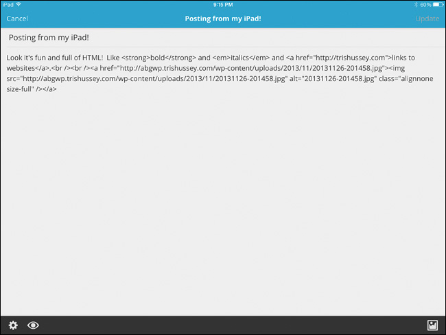
My advice, and experience, is that the mobile apps are pretty good at getting text up to your site, but they still have a long way to go before working with images is easy. Generally, I would write my posts, send them up as drafts, and then add the images I needed (unless the post didn’t need an image).
Managing Comments
Of all the site management tasks that the WordPress mobile app can do, I think it’s managing comments where it shines. Really. You can check through the mobile app when you have a comment waiting (with Jetpack installed, these notifications can be pushed automatically to you from the mobile app), check the comment, approve (or mark as spam), and even reply. Sometimes I think the whole process is faster and easier on my mobile devices—even my iPhone—than on the desktop. Tap, tap, tap. Reply. Done. If you use the mobile app for nothing else, that alone will be worth it.
Administering Your Site
Administering your site through your browser or the mobile app is not worth it for more than the occasional task. Yes, it works just like the desktop version, but it’s a lot trickier to tap and read everything. Check boxes and menus might not always work the way you’d like them to, and little pop-up screens—sometimes they just don’t work at all. I’ve installed and updated plugins in a pinch, but I don’t do much more than that—certainly not any serious troubleshooting. Go ahead and log in to your site on your mobile device. Try it. You’ll find it workable, but not something to use all the time.
Conclusion
When the World Wide Web as we know it now was born in 1991, we couldn’t have imagined the devices we have today. I have more computing power in my iPhone than I did in the Mac I used back then. (If nothing else, it didn’t even have a color screen!) The mobile world has dramatically changed how we approach publishing online content. Lucky for us, the WordPress world is keeping up. We have great themes, plugins, and apps to make sure our content is accessible and available to all. And while you’re at it, you can even do a little writing on your tablet if you want. It’s a great focused experience, I can tell you that for sure (and it’s one of my favorite ways to write).