
Chapter 1
Understanding Human-Centered Design
To practice design, it is crucial that we maintain our perspective. When thinking about a user’s experience with a product, we need to keep that user front and center in our minds. Our solution should benefit the user—it should consider their wants, their needs, their goals, and their frustrations.
The single biggest reason that products fail is misalignment with the people who use them. All too often designers meticulously craft a round peg only to be baffled when users with square holes are uninterested. But how could this happen? How can we, as designers, avoid making products that frustrate users? Most importantly, how can we create products that delight users and speak to their needs?
The answer is perspective. Not our individual perspective; rather, we must consider the many perspectives of the people who will use our product. We need to understand their wants, needs, goals, and frustrations. These tenets should be our North Star, our guiding light when we aren’t sure how to proceed.
It’s too easy to think of ourselves as the user, to think about what we want to see in a product, to incorporate our wants and needs into a solution, to use our tastes and aesthetics over the preferences of the people who will be using our product. These patterns lead us to incorporate our biases into our designs, and we end up creating a product we want rather than a product others need.
This is exactly what human-centered design tries to avoid. The goal is to design for others, not ourselves. We need to remove our wants and needs from the creative process and instead focus on the end users—the people we are designing for. By using a strong, well-thought-out process, we can maintain this perspective.
In this chapter, we’ll cover the basics of human-centered design—what it is, where it comes from, and how to adopt a design practice that will keep us centered on the people we design for. We’ll dive into the definitions of user experience (UX) and user interface (UI) and the differences between these commonly confused terms. We’ll talk about how to build products, following processes used by large organizations to get work done. Finally, we’ll dip into some cognitive theory and show that an understanding of how people process information can help us build human-centered products.
What Is Human-Centered Design?
Have you ever come across a door that you couldn’t figure out how to open? Sometimes you’ll push a door and realize it won’t move. Is it locked? Are you not allowed to use this door? Is it broken somehow? Usually, no—you missed that you must pull, rather than push, to open it. But for whatever reason, you didn’t understand that, and you may feel silly or foolish for not noticing.
Realistically, it’s probably not your fault.
Author’s Note
A signifier is something in a design that indicates how to use the design. The term comes from Don Norman’s book The Design of Everyday Things.
It’s most likely that the door was missing a clue, or a signifier1, to let you know how it works. Doors sometimes have handles that indicate how they operate. It’s common for a door with a big metal rod along the side of it to operate as a “pull.” That rod is a signifier telling you to pull it to open the door. Other doors have nameplates (FIGURE 1.1) that tell you to push or to pull.
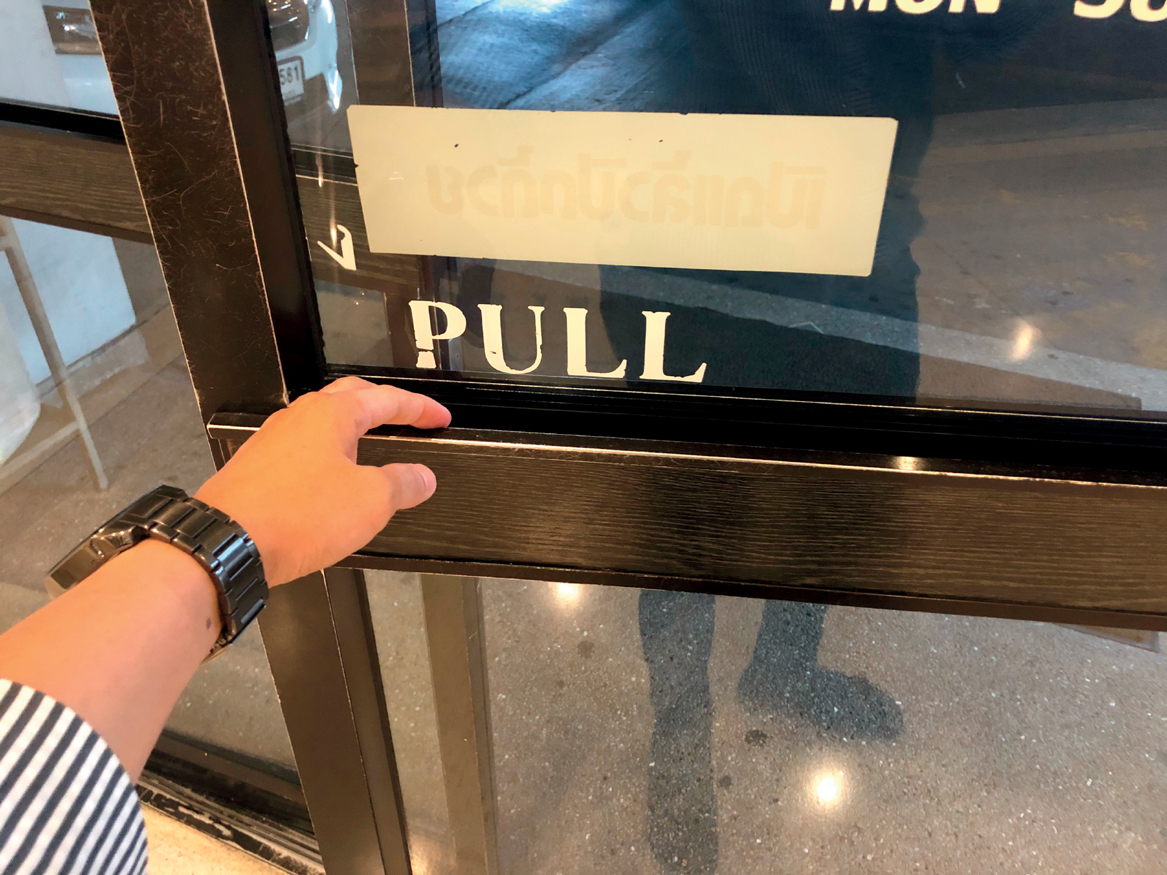
FIGURE 1.1 A door with multiple signifiers that indicate how it operates. Large lettering indicates you should pull toward yourself to open the door. Additionally, there is a large metal handle you can fit your hands inside to pull the door toward you. (Chalit Silpsakulsuk/Shutterstock)
1 https://en.wikipedia.org/wiki/The_Design_of_Everyday_Things
But sometimes, doors aren’t intuitive to use. You’ll see something that makes you think it’s a push, but in fact it’s a pull.
Nonintuitive doors are common. It’s the classic example cited by Don Norman, the “grandfather of UX,” as he discusses the concept of signifiers and affordances in his book The Design of Everyday Things. His name is even used to label nonintuitive doors, called Norman doors. Check out this video: https://tinyurl.com/asuxd1-1.
Essentially, every interaction a human has with an object (whether that be a door, a chair, a digital product, or anything else) can be broken down into what the object communicates that you can do and what you are actually allowed to do. A signifier sends a signal informing you what you can do—such as a handle on a door implying you can pull, or a plate on a door implying you can push. An affordance is the action you can take—in the case of a door, push or pull.
When a signifier and an affordance are aligned, an experience is easy, or intuitive—we’ve designed a situation where the signal sets an expectation, and the affordance is that expectation. When there is no signifier, or the signifier is ambiguous, then we’ve designed a situation where nothing sets that expectation—or worse, sets the opposite expectation. This is referred to as mapping—good mapping is when there’s a clear relationship between controls (signifiers) and the effect they have on the environment (affordances).
If you have a door with a handle, that’s a signifier to pull. However, if it opens only with a push (its affordance), then that’s a bad user experience.
This is the practice of user experience design. It’s the concept of thinking through how something works, then communicating that functionality to someone who has no idea how that thing was made or operates. When making an experience for someone else, including something as simple as how a door opens, think about who will use that experience. This consideration that we apply to our designs is called human-centered design.
Author’s Note
In this book, I switch between the term user experience design and product design. There’s a difference between them, but the nuance is so small that the terms are used interchangeably. The industry uses both terms; in fact, I have had multiple jobs where it was called both, depending on who I was speaking with.
Human-centered design is the practice of designing a product for the people who will actually use it and is grounded in empathy for those who will use it. It is performed by defining a problem to solve, ideating possible solutions to that problem, and prototyping and testing those solutions with the people who will use it. Eventually, the results of that testing will be implemented so that the people who encounter the problem will have a solution that works, works well, and works for them.
The need for human-centered design can be something complicated, like how doctors operate sophisticated surgical equipment or how an electrician fixes a power issue. Or it could be something quite simple, such as turning on a faucet or using a stove.
The concept of human-centered design has many definitions and takes many forms. Many people have written about it, and each has their own take on how to define it.
Human-centered design is an approach to creating a program, policy, service, or product that is tailored to the needs of the person who will use it or be impacted by it.2
2 https://bloombergcities.medium.com/explainer-what-is-human-centered-design-4d7883d406ce
—Bloomberg Cities
It is based on a philosophy that empowers an individual or team to design products, services, systems, and experiences that address the core needs of those who experience a problem.3
3 https://medium.com/dc-design/what-is-human-centered-design-6711c09e2779
—DC Design
Human-centered design is an approach to problem-solving commonly used in design, management, and engineering frameworks that develops solutions to problems by involving the human perspective in all steps of the problem-solving process.4
4 https://en.wikipedia.org/wiki/Human-centered_design
—Wikipedia
A common theme among these definitions is that they have the same structure:
It is a process.
It solves problems.
It is based on the needs of others.
So when you follow the principles of human-centered design, you are using a process that enables you to solve the problems of other people.
This definition helps us understand what we should be doing. But how do we follow a process? How do we understand the needs of others? And how do we solve their problems?
Author’s Note
The terms human-centered design and design thinking are often interchangeably used in the industry. There is a slight difference between the two—the former is used more often when wanting to put a human perspective in every step of the product creation process, while the latter is used more often when focusing on problem-solving. In this book, I don’t draw a distinction and go back and forth between them.
Luckily, we can rely on design thinking to help. At its core, design thinking is a series of processes that allow us to better understand the problems of others so that we can design impactful solutions. Design thinking encourages us to research, empathize with others, think of possible solutions to their problems, and then test simulations of those ideas so that we can see if our solutions could actually work if we build them.
But where can we start? Before we decide on a specific model or framework to do our work, we should be aware of several design thinking models.
Design Thinking Models
A design thinking model is a framework for us to apply design thinking to the problems we want to solve. A model serves as a roadmap, a guide, or a series of steps or phases that we can follow or reference as we work. Sometimes a model can be used like a map—we travel to an endpoint and use a model along that journey. Other times, a model can be something we reference, comparing the experience we design to a series of principles that exemplify a good user experience.
Let’s look at a few models that exist and then dive into the model we’ll be using for the rest of this book.
Don Norman’s Design of Everyday Things
Don Norman is famous in the design industry. In his book The Design of Everyday Things, he proposes a four-step process for creating a good user experience:
Observe
Ideate
Prototype
Test
First, we must observe. We have to understand the people we want to design for. We need to see how they act, what their problems are, and how they move around their environment. Throughout this process of observation, we take notes and record our findings to allow us to form an opinion on what the problems to solve are so that we can move on to the next step in the process.
Next, we ideate. From our observations, we think of ways to solve the users’ problems. We brainstorm, sketch, and create ideas that could work. We spend time thinking of wild and crazy ideas, and eventually pare down to a couple that we think will work best.
After we ideate, we prototype. From our best ideas, we start to develop a functional representation of those ideas to show to users. We create digital mockups or even use pieces of paper to represent our ideas in a fast, iterative way with the purpose of getting feedback early, often, and quickly.
After we prototype, we test. Testing is a valuable way to gain feedback to see how others actually use our ideas. We use the prototypes and share them with people to see how they would use the designs. We test to see how intuitive our product is, how desirable it would be, and above all, if our ideas actually would solve the problem users experience.
Don Norman’s original design thinking process is the core of modern design thinking. We observe, we ideate, we prototype, and then we test. This model has gone through several revisions and interpretations to create various design thinking frameworks that help improve the human-centered design practice.
Aarron Walter’s Hierarchy of User Needs
Aarron Walter is an award-winning writer known best for his book Designing for Emotion.5 In it, he defines a framework called the hierarchy of user needs (FIGURE 1.2).
5 https://abookapart.com/products/designing-for-emotion
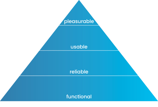
FIGURE 1.2 A user’s needs are filled from the bottom of the pyramid to the top. A higher point on the pyramid can’t be reached until the points below it are met.
Aarron Walter takes the psychologist Abraham Maslow’s hierarchy of human needs6 and adapts it to design. Essentially, when interacting with an experience, that experience needs to have the following elements, in order of importance:
6 https://en.wikipedia.org/wiki/Maslow%27s_hierarchy_of_needs
Functional
Reliable
Usable
Pleasurable
Think of these as a pyramid. Each aspect builds on itself, satisfying the user more and more deeply. Beginning with functional, each element lays a foundation for the element that follows.
Start by imagining an experience with none of these things. Perhaps something is beautiful. If it’s not functional, it won’t satisfy the basic needs of the user and its aesthetic will become unappreciated. Perhaps you’ve experienced this yourself, when interacting with a design that looks good but doesn’t make sense or can’t be used.
The lowest level of a user’s needs is for an experience to be functional. It needs to perform the basic task it promises to do by existing. If it doesn’t function, it will not meet the core needs of its users. By definition, it will be nonfunctional, or unusable.
Next, a product needs to be reliable. If it is functional, but only some of the time, then it can technically be used, but not on a consistent basis. For example, think of an unreliable internet connection. It functions, sure, but you can’t count on it to function all the time, and as a result, you won’t be able to use it as well as you could a functional and reliable connection.
After being functional and reliable, it must be usable. Usable may sound like functional, but there are core differences that make this category higher on the hierarchy of user needs. Usable means that a product is easy to learn, discover, and utilize. A user shouldn’t have to search for functionality; it should not require much effort to operate. A usable product is one that not only works but works well.
Lastly, a product must be pleasurable. It is not enough for products to work well to reach this level of satisfaction in the hierarchy of user needs. They must be delightful to use and produce joy. Perhaps they solve a user’s problem well, or they are aesthetically enjoyable to use. They have such a deeply satisfying user experience that users are not only able to use the product well, but they also have a good time doing so.
Let’s work with an example. Imagine a mug. If that mug is not functional, then you won’t be able to use the mug to solve your problem, like drinking out of it. The mug fails to satisfy the most basic tenet of the hierarchy of user needs.
Now, imagine the mug is functional—it holds liquid, it can be picked up, it can be drunk out of, and it operates like a normal mug. However, if it is not reliable—say, it leaks half the time—then we wouldn’t want to keep using that mug. It works, but it doesn’t work well enough and consistently enough that we’d want to keep coming back to it.
So let’s say our mug is functional and reliable—it works, and it always works. Now let’s imagine the mug’s handle can fit only one finger—like your pinky. The mug wouldn’t be usable—at least, not as usable as it could be. If there were a lot of liquid in the mug, it’d be hard to lift from the handle, so we’d have to grab it by the sides. If the mug were full of a hot liquid, like coffee, then we would need to use the handle, which would be too challenging.
Let’s replace the handle to fit the size of your hand and make the mug more usable. Now, our mug is functional, reliable, and usable. It solves the problem of drinking liquid. But is it pleasurable? Is it “fun” to use the mug? Does it produce joy? Are there things that we can design into the mug to achieve this need? We could give the mug an aesthetic design that evokes joy, such as a pleasing graphic design or curvature to it that looks nice. Or perhaps there are additional functionalities that make it more pleasing, as with self-heating mugs that warm liquid that’s gone cold. Or perhaps warm liquid changes the visual design of the mug, revealing a new pattern based on the temperature inside.
Using this model in our design thinking practice would enable us to ensure the experiences we create work, work often, work easily, and work in a way that people want to return more often.
IDEO’s Human-Centered Design Process
IDEO, a world-renowned design agency, offers a variation on Don Norman’s design thinking model. They think of human-centered design as comprising three steps (FIGURE 1.3).7
7 ideo.org
Inspiration
Ideation
Implementation
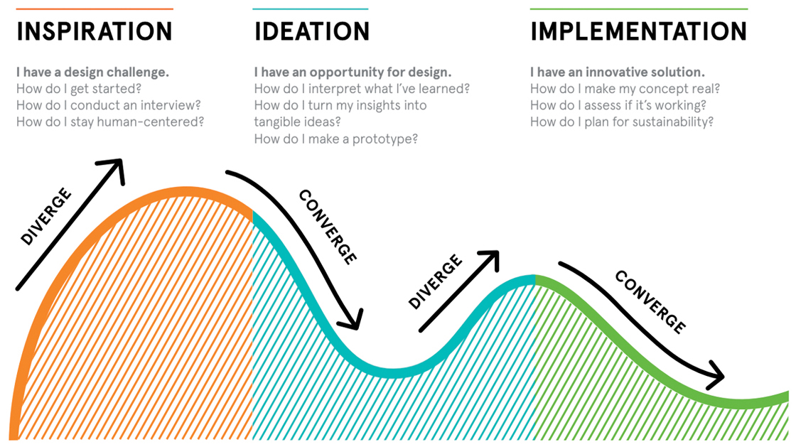
FIGURE 1.3 IDEO’s three steps of human-centered design.
Similar to Don Norman’s method, this method involves observation, ideation, prototyping, and testing. However, it builds on his model by showing how we can diverge and converge during that process.
We start with inspiration. We know we have a problem to solve for our users, but we might not know the details. How can we become inspired? Here, we diverge and explore the problem space—we look at various resources and obtain different sources of information to gain the most inspiration. Think of yourself as an explorer—you are seeking the most information possible to know as much as you can about the problem.
Then, we move on to ideation. We have an opportunity to design. How do we make sense of it all? How do we interpret what we have learned and turn it into an idea? This is where we converge—we need to take our information from the inspiration step and make it make sense. We need to form opinions and create hypotheses as we think of ideas to solve our users’ problems. During this step, we diverge again—once we form opinions and make sense of our observations, we diverge to think of solutions. We brainstorm, we sketch, and we create various ideas that eventually become prototypes for testing.
Lastly, we move on to implementation. Now that we have a solution, we need to see if that solution works. We find users, test with them, and observe how our solution functions in the hands of others. We converge again—as we test, we narrow down our ideas and see what works and what doesn’t. We begin to build our solution, implementing our ideas into functional products.
The Double Diamond
The process of diverging and converging repeatedly is common in design thinking models. The British Design Council8 has created a method that relies on diverging and converging as we conduct the design process called the Double Diamond (FIGURE 1.4).
8 www.designcouncil.org.uk/our-resources/framework-for-innovation
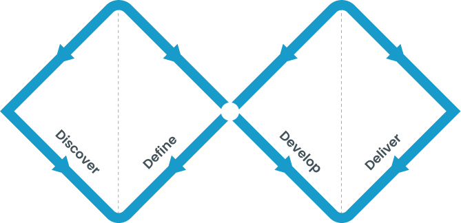
FIGURE 1.4 The Double Diamond design process.
The Double Diamond is a great way to think about the design process, as it relates to a specific problem in search of a singular solution. It lends itself well to design engagements that have a single, clear-cut set of deliverables and timeline. It is broken up into four steps:
Discover
Define
Develop
Deliver
The Double Diamond process begins with a problem that will flow through the entire project. Everything in this model hinges on the problem, and each design step incorporates it.
First, we discover more about the problem. What is the problem? How does it relate to users? How do users move around the problem? Are there others who have solved the problem before? What do they do, and how do they do it? This step is all about research—researching users, competitors, and technological solutions that have the problem. In this step, we are explorers, diverging from the problem and researching everything we can think of related to it.
Next, we define. This is where we start to converge—after learning everything we can about the problem, we synthesize that research and come to understand our findings more clearly. We work toward defining what the real problem is, or the “problem to solve.” This definition is crucial to the success of the project—it is what we will ideate against, and what we will try to deliver a solution for. All the research during this step converges on a single point: the problem definition, which is our problem to solve.
The problem to solve is the turning point in the project. Once we understand it, we are prepared to diverge again, except this time with a better understanding of what we are trying to accomplish.
Next, we develop. We diverge again—now that we understand the problem, we must develop solutions to it. We ideate, brainstorming solutions and sketching ideas until we hit a critical mass of different options. Then, we begin to evaluate those options and prepare prototypes that allow us to test them.
Finally, we deliver. We take our ideas from the develop step and test them. We show users our ideas, gain their feedback, and make revisions as we converge toward our solution to the problem to solve.
The Nielsen Norman Group’s Design Thinking Process
The Nielsen Norman Group (NN/g) offers a comprehensive model for the design thinking process.9 It’s broken into six steps of design, across three phases (FIGURE 1.5).
Empathize
Define
Ideate
Prototype
Test
Implement
9 www.nngroup.com/articles/design-thinking/
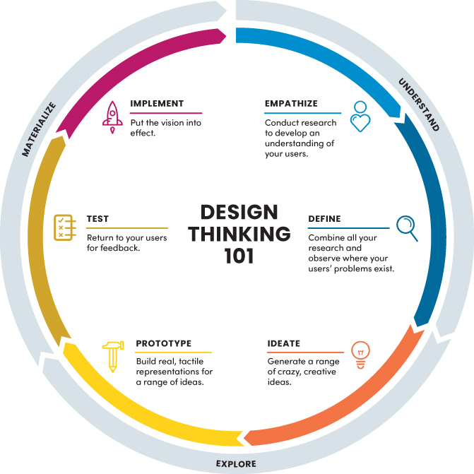
FIGURE 1.5 The NN/g model of design thinking. Each circle represents a step in the design process; the arrows represent the phases. Each circle has a line that leads back to an earlier step in the process, emphasizing that at any point a designer can reevaluate a step given what they’ve learned during the process. Each step is a loop, allowing for and promoting the idea that a step can be repeated as needed.
Under the NN/g design thinking model, we empathize to understand our users, the problem, and the context. We must imagine what it is like to encounter the problem and learn how people interact with it.
Then, we define. After we learn of the problems our users face, we define those problems and determine the problem to solve. What will we try to solve on behalf of our users?
Afterward, we ideate. Once we have a clear understanding of the problem to solve, we think of solutions that could work for them. We brainstorm, sketch, and create ideas.
After we ideate, we prototype. This is when we create representations of our ideas, with the intent to test them. Our representations should allow others to see our ideas and interact with them so that we can learn more about how they would be received.
Next, we test. Once we have our prototypes, we find users and share our ideas with them. We test the ideas, not the users, and see how well our ideas hold up. We challenge our hypotheses and see if our ideas are usable and can solve users’ problems.
Finally, we implement. Once we know how our ideas work, we build and deliver them to users. We turn our prototypes into functional products and release them to the world.
Our Design Thinking Process
All the design thinking models discussed are appropriate ways to practice human-centered design. In your practice, you may prefer one model to another, and that’s totally acceptable. Design practitioners around the world use other models not covered here.
For our purposes, we are going to adopt NN/g’s process for several reasons:
It is iterative.
The NN/g design thinking model allows for iteration during each step of the process. In practice, design is rarely a linear process. Commonly, you learn things in each step that incentivizes you to return to an earlier stage. You may learn during testing that you didn’t think of a possible use case and want to return to the ideation step. Or you might implement your solution and see that you solved part of the problem but not all of it. So you want to restart the empathize step. This model leaves us the room to do so.
It is detailed.
This design thinking model is broken into six steps that focus on a lot of detail and clarity. For example, the implement step explicitly focuses on delivering a solution, such as working with developers to create your idea. This level of specificity allows us to deeply explore the full extent of the design thinking process.
It has phases that oversee its steps.
In addition to the six comprehensive steps, it also has three phases that oversee those steps: understand, explore, and materialize. Each phase helps us understand how the steps play into the overall design thinking process. First, we must understand our users and the problem to solve, and we do so by empathizing and defining. Then, we must explore what we can do for our users by ideating and prototyping. Then, we must materialize our solution by testing and implementing. In this way, we have a clear process with actionable steps that offer a concrete approach to human-centered design.
Let’s explore each of those steps in greater detail.
Step 1: Empathize
In the first step of the design thinking process, it is our goal to get a better understanding of the problem we want to solve. We have several ways to do this.
Observe Others
To better empathize, we can start by observing others as they experience the problem. We watch them complete tasks, try to use a product, or go through a day in their lives to see how they encounter the problem and how they currently try to solve it. We can leverage user interviews, diary studies, contextual inquiries, or other methods that allow us to be observers and see the problem in action.
Experience the Problem
Alternatively, we can experience the problem ourselves. We can directly gain experience with the pain points of what we are trying to solve by completing tasks related to the problem. If it’s a product, we can try using it to see the problems with it. If it’s a process, we can go through the process to see how we experience it and how we feel during it.
Talk with Experts
Another technique is to find experts related to the problem and speak with them about it. Experts could be industry leaders who have studied the problem or who have solved similar problems. Or experts could be users who frequently encounter the problem and have a lot of experience with it. We can interview these experts to learn more about the problem and how they deal with it.
Search for Solutions
Finally, we can search for solutions that already exist. If it’s a common or well-known problem, it’s possible others have already solved it (or tried to solve it). Perhaps a solution exists that we can interact with and take inspiration from so that we can better solve the problem ourselves. We could perform a competitive analysis and look at other offerings in the problem space. We could analyze these companies from a strengths and weaknesses perspective, looking for ways to innovate around the problem.
However we decide to empathize, we do so with the intent to better understand the current state of things so that we can form opinions and better define what we want to accomplish for our target audience.
Step 2: Define
In the second step of the design thinking process, we begin to form opinions. We take the research from the first empathize step, synthesize it, then analyze the results. Here, we must answer several questions.
What Commonalities Exist?
In our observations, we must categorize and sort our research. What trends or common points are present? Does everyone experience the problem in the same way? Does everyone have the same solution to the problem? Are there common issues that most people experience? We must draw parallels and, from those parallels, be better informed to think of ideas later in the process.
How are People Served?
From our observations, did we notice any solutions? Did we notice a lack of solutions in a certain aspect of the problem? Are people underserved in any capacity? By identifying where people are satisfied and dissatisfied, we can better focus on a solution.
What is the Problem to Solve?
In this step, we attempt to clearly define the problem to solve. We take our research and observations and form opinions on how people are struggling. We don’t think of a solution just yet; rather, we try to well define what problems people have and what problem we specifically want to focus on for the remainder of the design thinking process. We may observe multiple problems, and that’s OK—it is in this step that we want to focus our attention so we can think of solutions that are specific to what we want to solve.
With a clear understanding of the problem to solve, we will be well set up to ideate possible solutions.
Step 3: Ideate
In the third step of the design thinking process, we want to create solutions. Here, we take our research and our problem to solve and both diverge and converge around possible solutions.
Diverge Around Possibilities
First, we diverge. We go wide, thinking of all sorts of possible solutions that could solve the core problem users face. We brainstorm without restriction—no idea is “too crazy” during this step. We want to think of as many ideas as possible and then, from those ideas, converge. We do this with brainstorming, mind mapping, and other techniques that allow us to generate ideas for us to converge around.
Converge Around Probabilities
After truly exploring possible ideas through brainstorming, sketching, and other ideation techniques, we converge. We compare ideas against each other, evaluating through the lenses of the ones we think could best solve our users’ problems, or the ones that are most feasible. We prioritize ideas so we can test them with users.
Once we have a few possible solutions, we prototype those solutions with the intent of testing our ideas with our audience.
Step 4: Prototype
In the fourth step of the design thinking process, we create representations of our ideas to see how they perform. We take our ideas and give them shape so we can see how they function in the hands of others.
Lean and Imperfect
In this step, it’s not about perfection—it’s about gaining information. We need to validate our ideas, not create a fully functional product. It’s a waste of time to create a perfect, fully coded, or fully functional idea to test. We want something quick, yet accurate enough to give people an idea of how our solution could work—so we can spend the least amount of time validating our design direction and getting feedback. Create the smallest viable idea that will let you test your solution.
Tactile
Our ideas need to be tested with others. Whatever you prototype, it has to be able to be used by others. This could be something as complex as a high-fidelity, pixel-perfect mockup of every screen in your product or as simple as a few pieces of paper you could show someone to give them a rough sense of your idea. As long as it conveys your idea, it can work.
With a functioning MVPr (minimum viable prototype, not to be confused with MVP for minimum viable product), we can move on and test our ideas with our target audience so we can learn whether our design solutions make sense in the context of their lives.
Step 5: Test
In this step of the design thinking process, we test our ideas. After creating representations of those ideas, we can see how users interact with them so we can test our assumptions and learn if our solution actually solves users’ problems.
Is it Usable?
When people interact with your prototype, is the solution usable? Do people know how to navigate it? Have you clearly communicated the design in a way that satisfies their hierarchy of needs? Do your signifiers accurately communicate your affordances? Is it functional, reliable, usable, and delightful? It’s OK if all these aspects aren’t there for your prototype, as long as your testing suggests that they will be.
Does it Actually Solve the Problem?
Most importantly, does your idea satisfy the problem to solve? Have you created something that actually could solve your users’ problems? This is the time to learn whether or not that’s true, and if it’s not, how you can adjust the design so it’s more likely to solve the problems.
Assuming the prototype yields great testing results and we are convinced the design solution will work, we can move on to building the solution.
Step 6: Implement
In the last step, you implement your solution. In this step, you are certain your ideas work—now, you get them into the hands of your users in real life.
What Needs to be Built?
How will someone create your solution? Will it need to be coded? Will you need a back-end architecture to keep it running? As you design your solution, you have to think of all the supporting structures needed for your solution to exist in the real world.
How will Users use it?
How will users interact with your solution? For a functioning product, you will need to think of all the use cases of your design. What if there is an error? What if a user starts using your product and then comes back to it at a later point? You have to consider more than just the “happy path” of your designs—you must deliver a fully thought-out product experience that covers all edge cases a user could run into.
Design Thinking Is the First Step
There are many ways to approach human-centered design. We have many models available to us, tons of frameworks that help us keep the most important things in perspective: the problem we are trying to solve, and the people we are trying to solve it for. In this book, we will be applying the design thinking process so that we can approach our problem to solve in a human-centered way.
Human-centered design is just one piece of the puzzle. Design needs to operate with other job functions in order to implement the design solution in the real world. To do this, we need to be aware of how products are built so that we can integrate our processes with everyone else who is working on the problem to solve.
How Are Products Built?
Our goal as designers is to make something that solves the problems of the people we design for. We follow design thinking to accomplish this goal; however, our design thinking process doesn’t live on its own. Rather, we have to balance the demands of design thinking with the needs of the businesses that produce the products we work on. Design thinking is one element of creating a solution to the problem to solve. In order for that solution to actually reach the hands of customers, we need the business to be able to produce, distribute, and maintain that solution.
Author’s Note
Like the terms user experience design and product design, the terms user and customer are also interchangeable. It comes down to the company culture. At Nickelodeon, I felt “user” was too cold to refer to our customers and tried to shift the culture to “child” over “user.” However, this failed to catch on. Similarly, at Amazon, our end users are always referred to as “customers.”
To take the benefits of design thinking and bring them into the world, we need to build the solutions we come up with. To do so, we rely on product development processes to make sure we’re on track, within budget, and able to deliver our ideas to the people that will benefit from them.
How Do We Implement Our Products?
We’ve talked about how having a good design thinking process helps us create usable, delightful user experiences. Another element of successful product design is having a good development process that helps us implement those user experiences.
In the UX industry, several different product development processes allow us to build products. While some are more common than others, it all depends on where you work, the problems you are tasked to solve, and the philosophies of the organizations that you belong to that influence which methods you may use in your day-to-day work.
Some organizations work in a linear fashion, where work is handed off from one group to the next as a project moves through phases. Different disciplines become involved at different stages in the project as their skill sets become more or less important depending on the phase of the work. If a project is at the beginning of the design thinking process, then it needs a lot of research and user researchers would be very involved helping to uncover the needs of the people the team is designing for. Alternatively, if we are at the end of a project and need to implement a solution, then developers would primarily be responsible for writing the code that ensures the product functions correctly.
Other organizations prefer to work in an iterative fashion, constantly evolving and improving the products they work on. Projects in these organizations also move in phases, though the time between these phases is a lot shorter—in some cases days or even weeks long. In these projects, we are constantly working on each part of the design thinking process to continually solve problems for the users of our solutions.
What’s better—a linear, longform series of steps that lead to a final solution, or an iterative, shortform constant set of work that builds on a “never complete” solution over time? Is it better to have a relay race, where different disciplines pass a baton from one department to the next? Or is it preferable to capture the flag, where multiple disciplines simultaneously operate toward a common goal?
In reality, both approaches can work. It all depends on the problem to solve.
Waterfall: A Linear, Phased Work Stream
The Waterfall methodology, or more commonly, Waterfall, is a project management process in which each phase of the project flows like water going down a waterfall (FIGURE 1.6).

FIGURE 1.6 Waterfall project management. (Gail Johnson/Shutterstock)
In Waterfall, each phase of the project must be completed before the next one can begin. You start at the top of the waterfall and work your way down the project until you get to the next step in the waterfall, constantly flowing downward until your project is complete.
In FIGURE 1.7, you can see how each step of the project flows into the next one, with a clear roadmap for what work will be completed and what work comes next. The schedule does not include room for going to a previous step in the process—the project marches on, just as water falls from a cliff to its next destination.
FIGURE 1.7 Waterfall development steps. Each step of the waterfall design process occurs one at a time, with no time or ability to go back a step with new learnings or information.
Under this methodology, it is common to have a really good sense of the problem you want to solve and all the requirements for a project up front before doing any work. For the model to function, it requires a deep planning process where people scope the project and perform the research required for the rest of the project to be successful. This can include the design of the problem to solve, the timelines for each phase of the project, and the eventual deliverable that’s expected.
This method is common in industries with a lot of dependencies during each phase of a project. It’s common in construction industries, for example, where a project needs to be scoped out and planned before the work begins. It’s costly and challenging to change a building plan as you are creating the building, and having a really clear scope of your project prior to building it helps avoid the need to change requirements during the project.
This aspect of Waterfall is also one of its major criticisms. As you move through a project, you will learn new pieces of information that could directly influence what you want to build. As a result, this method is less flexible than other methods because each step must be completed before moving to the next step, and it’s difficult to go to a previous step once it is complete.
Waterfall is a common method for building products, but most often those products have clear deliverables or require all the information to be known prior to starting the work.
For software development, this process may be preferred to others. Software engineers have a really good sense of what needs to be built and how long it will take because requirement-gathering and design work are done upfront. In an agency setting, for example, a client may come to the business with a clear problem and a clear task, and you may use a Waterfall methodology to deliver that product.
Here are some of the major benefits of Waterfall:
Predetermined scope
Because each step is dependent on the next, it’s a lot more common to have a clear, predetermined set of deliverables for a project.
Linear progression
When one phase begins, it is informed by the previous phase, which leads to a good sense of what needs to be done and who’s working on what. Development, for example, will be well informed by the design specs, and as a result the project will run more smoothly because of that clarity.
Strong documentation
Since each phase has dependency on the prior phase, projects end up well documented. Design preparing a handoff to development, for example, ends up creating a well-thought-out series of specification documents that inform how the design should function. As a result, the organization gains clear documentation for future works.
Waterfall, however, is not without its criticisms:
The initial problem to solve might not be the right one.
Usually, people don’t exactly know what they need up front; nor do they know what’s possible with technology. As a result, the initial task isn’t usually what’s best for the user, or there’s an idea that ends up being better. This leads to tension between the nature of Waterfall as a process and the possibility of a better product.
We learn things during the process.
In reality, the problem is not very easy to define. Usually, a lot of exploration and understanding is required to fully define the problem to solve (let alone solve it), and as a result, things are missed. In a Waterfall process, time and resources aren’t allocated to pivoting, which can hurt the eventual shipped product.
Changing requirements affects everything.
Waterfall isn’t an adaptable process. If something changes (like business goals, user needs, or market conditions), it is harder to adapt and shift the project (and stakeholder expectations).
I’ll give you an example of a time I worked in a waterfall environment. Media companies usually have tight content timelines. As a result, we had to lock in the product schedule so that we could release each piece of content when the business needed it. If we shipped a piece of holiday content late, then that content wouldn’t be as relevant (a Christmas episode should release before Christmas, not after). Since we were working back from a fixed date, we didn’t have the opportunity to launch the product iteratively—it was more of a one-time launch strategy. These project parameters are why we operated in a waterfall fashion—create the script, collect the assets, produce the content, test it, allow for minor revisions, then release and work on the next piece of content. We didn’t go back to earlier steps to revise, and we never addressed content after it was released—we were already moving on to the next project.
Overall, Waterfall provides the most structure and expectations for a project, at the expense of flexibility as the project goes on.
Agile: An Iterative, Continual Process
Agile product development, or Agile, is the opposite of Waterfall. Instead of a rigid structure of predefined phases with scoped-out deliverables and timelines, Agile emphasizes lean, iterative product development. Under the Agile methodology, we focus on incremental product gains rather than making large, substantive changes or product releases (FIGURE 1.8).
FIGURE 1.8 Agile creates small incremental changes instead of major product releases.
Agile is focused on incremental product gains via product iterations. Perhaps your first product launch is an MVP (minimum viable product). Then your next launch enhances the work of that release, adding a new feature or fixing problems you’ve encountered now that your product is out in the wild with real, daily users.
In FIGURE 1.9, we focus on a smaller release during the first sprint, or deliverable, then move on to the next sprint and focus on the next release. In this way, we solve smaller problems and iterate more frequently on the product, taking the learnings from each sprint and applying them to the next one. This allows us to incorporate feedback into the product because the room for iteration is built into the process.
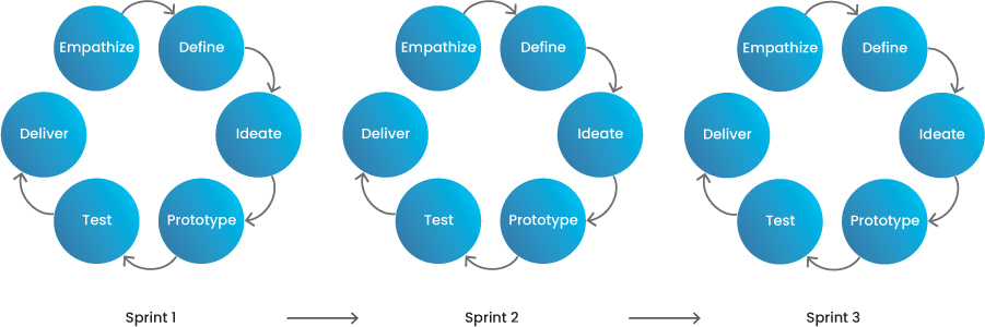
FIGURE 1.9 Sprints deliver small incremental changes.
Using Agile, the work isn’t as planned out in advance. We have a general sense of what we want to accomplish, but the roadmap might be shorter because we don’t have a great sense of what we’re going to work on—we’re going to release a version of our product, then measure as we go. This can lead to less certainty and predictability for stakeholders, which may give them concern.
Some of the major benefits of Agile include:
Frequent software releases
The focus is on shipping minimum viable features and iterating on an existing product, so the product receives constant updates and enhancements. Instead of shipping a singular product and being done with it, the product continues to receive support and improvements.
Product change at any moment
The product development life cycle is so short and lean that a change in requirements, market conditions, or business priorities can be much more easily accommodated.
Better cross-functional collaboration
Teams are handing off smaller increments of work more frequently, so those teams have better communication because they talk constantly. Designers, developers, and product managers usually speak with each other daily, discussing product enhancements, requirements, and feedback.
Some criticisms of Agile include:
Potential lack of human-centered design
In Agile, it’s more difficult to be humancentric because there isn’t a lot of time to go deep into the problem and its definition. We’re so focused on the current release/sprint that we fail to look into future sprints and releases because we evaluate as we go. In Waterfall, there’s time built into the schedule to research and understand a problem adequately.
Harder to estimate deliverables
You’re measuring as you go, so it’s harder to estimate how long the work will take because you aren’t completely sure what you’re building.
Less documentation
You’re focused on shipping the work today, so you’re not focused on good notekeeping or handing off deliverables. As a result, documenting processes usually falls short.
I’ve operated in an Agile fashion while working at tech companies. With an already released product, we focused on adding features and functionalities in order to remain competitive and continually deliver enhancements for our customers. Sometimes these would be new features, while other times it would be updates to improve quality of life. We would gather feedback from our users, analyze which feedback was most impactful and actionable, and then prioritize product improvements that we felt would deliver the most value to the highest percentage of users. The roadmap would change constantly as we gathered information from the market, our customers, and the business. As a result, we would continually make improvements and iterate on the product in month long increments, constantly pushing the product forward.
Hybrid: A Combination of the Two
Hybrid product development combines aspects of Waterfall and Agile to form a blend of both methods (FIGURE 1.10).
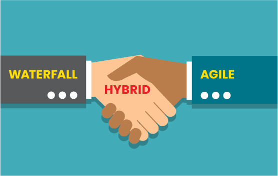
FIGURE 1.10 Waterfall and Agile methods working together. (RomanticSunday/Shutterstock)
Under a hybrid model, a project would start as Waterfall, gathering requirements and defining the problem to solve. The user need would be well defined at the beginning of the process, and we would have a clear understanding of what we were trying to accomplish. However, once we begin to ideate, we would shift to an Agile approach, using sprints for the ideate, prototype, and test steps of the design thinking process to better understand if the solution solves users’ needs well. We could even use the implement step of the design thinking process in this model, shipping small parts of the product incrementally as we continue to iterate via sprints (FIGURE 1.11).
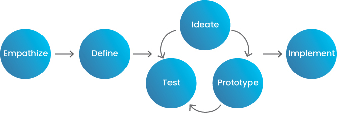
FIGURE 1.11 A hybrid method blends Waterfall and Agile to use the best of both.
Author’s Note
A “fast follow” is a release that comes quickly after a product or feature is launched. It’s something you know you need but, for whatever reason, didn’t have time to fit in before you launched your product. It’s common for some smaller-priority items or bug fixes to be incorporated into a second, smaller release shortly after something launches.
I have worked in a hybrid environment in several companies, usually when first releasing a product. We would conduct a lot of upfront research to empathize with customers and define the problem to solve, being really clear about what people wanted and what we were trying to accomplish for them and the business. Then, we would do several design sprints to ideate, prototype, and test possible solutions to those problems. After finding a solution we felt confident in, we would move forward and release a minimum viable product that solved our customers’ problems. After release, we would do several “fast follows” to enhance the product further, iterating even more. If we felt the product was doing well, we’d ideate, prototype, and test more features, adding to the product over time. Sometimes the product would stay alive for years, while other times we’d see that the cost of operating the product didn’t justify the benefits it provided, and we’d “sunset” or otherwise stop working on it.
Which Process Is Good for Your Projects?
The process that’s best for your projects depends on where your project is in its lifecycle.
If you are early in your product development, you need a lot of research to define the problem you want to solve in addition to phasing out the work. In that case, Waterfall would be your best place to start.
If you have already released a product and are trying to enhance or improve it, you would do so on an incremental, steady, iterative basis. In this case, Agile would be a better methodology.
If you are working on a new feature for a product that already exists, then you may prefer a blend of the two, a hybrid approach. Perhaps you want to spend a lot of time doing research, and then a smaller amount of time ideating and iterating on what you’ve already created in order to incorporate that feature into an existing product.
The process you choose will also depend on the type of company you work for.
If you work at an agency, you may end up in a Waterfall environment. A client will come to you and ask you to solve a problem of theirs, and over the course of many months, you’ll meet timelines and deliverables in a linear fashion until you deliver a singular product or a design for the client to use in the way they see fit.
If you work in-house, you may be in an Agile environment. Embedded software teams will be in constant communication to enhance and improve the product they work on, making small changes over time as the business evolves and market changes.
The process you choose will also depend on the industry you work in.
In the entertainment industry, for example, it’s common for businesses to move slowly and plan out content releases over a calendar year. In some cases, a product is released, the hype around that product fades, and the product doesn’t get iterated on. The business moves on to the next product, or the next release, and doesn’t go back to enhance or modify last year’s releases. As a result, entertainment companies like large TV networks will work on a Waterfall basis.
If you work at a technology company, your industry will move at a faster pace, constantly iterating on your product and releasing new features. Perhaps your product is seen as a service, one that needs to evolve with the ever-shifting needs of its customers and the competition. As a result, you will probably work in an Agile environment, taking on smaller initiatives that, over time, significantly enhance your product.
For our purposes, design thinking can fit into any of these processes. I recommend adopting the process that best fits the type of work you wish to do in the industry. If you wish to work at an agency or create brand new products, Waterfall will be more common. If you wish to work in-house on existing products, Agile will be more common. Target the process that best fits the type of work you wish to do in your career.
What Is User Experience, or “UX”?
Have you ever walked in a park and seen a path like the one in FIGURE 1.12?

FIGURE 1.12 Users sometimes make their own path. (Miguel Dominguez Muñoz/Pearson Education Ltd)
Someone spent the time and money to make these beautiful, aesthetic-looking paths for people to use. They are paved, neat and clean, and well laid out. But not everyone uses them, because they don’t fit their needs. If someone wants to head to a location not along the existing paths, they make their own. The shortest distance to their destination is diagonal—through the grass rather than on the brick path laid out for them.
The path in FIGURE 1.13 avoids the well-designed, laid out path; people use the new path to reach their location as fast as possible.
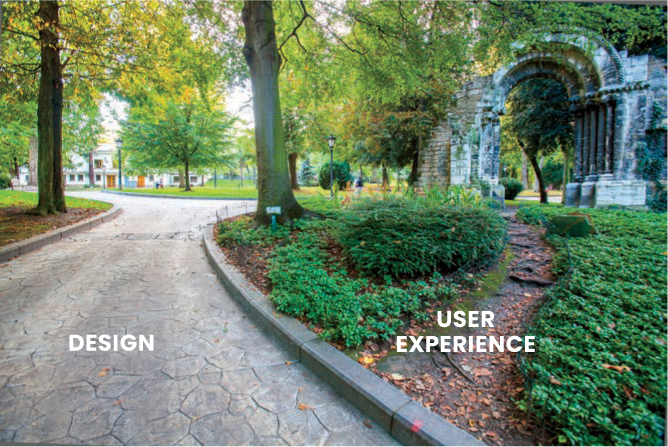
FIGURE 1.13 Sometimes what we design doesn’t match the experience users want. (Miguel Dominguez Muñoz/Pearson Education Ltd)
These types of paths created in parks are called desire paths. Pedestrians desire to walk along certain pathways in parks—ones that are natural to them. It’s natural to take a diagonal path through an open space to get to a location faster. While the artificially designed path is easier to walk along, it goes against the desires of getting to a location with less effort—in this case, by spending less time and energy walking an indirect route. The artificial path is more aesthetic, is more pleasurable to walk, gets less dirt on one’s shoes, is paved so it’s easier to walk, and may even be designed to accommodate foot traffic. Despite all these advantages, enough pedestrians have found it easier to make their own path—and as a result, have walked through the grass so much—that a natural path has emerged through the park.
Even though someone designed a way for people to navigate this experience, it doesn’t match these users’ wants and needs, and people made their own way through the “product.” We can design an experience, but we have to consider our users and the user experience of our product. How will people use it? What do they want from it? How frictionless is it?
The UX, or the user experience, here is the experience of a person walking down the paths—they want to use the product in a manner that meets their needs, not necessarily the paths laid out by the designers.
Let’s take a closer look at a few examples that can give us a better idea of what UX truly is.
UX Is Usercentric
UX Design is a commitment to building products with the customer in mind.
—Marieke McCloskey, UX researcher and product strategist
When considering the user experience of a product, the goal is to remain usercentric throughout the design of that product. We have to consider all users—not just the primary users we would expect, but the secondary, tertiary, and additional users of the experiences we design. Are we considering all the demographics? All possible use cases? How does the experience we’re designing fit into the lives of the people we are making them for?
When we think of making an experience, we may have a customer in mind. When making a camera, for example, we may think of a photographer who is very familiar with composition, lighting, and aligning the perfect shot. We may design a camera with features and functionalities for this savvy photographer, implementing features that allow for multiple conditions and subjects.
However, during this process, we may forget other users of the products. We may ignore the non-savant, the user who uses their camera only for special occasions like birthdays or family gatherings. We may forget the first-time user, who wants a high-end camera but doesn’t know how to operate it (FIGURE 1.14). We need to build our camera with all customers in mind and what they hope to accomplish with the experience we design. We may design multiple experiences, one for the entry-level or newer user and one for the expert. Keeping the customer in mind is crucial, as they’re the one using the end experience.

FIGURE 1.14 Cameras have a lot of options available to adjust for lighting, distance, and subject, among other variables. Creating an “optimal lighting” function for less experienced users can help educate them on how to use the camera and can develop their confidence for future uses. (Witthaya Prasongsin/123RF)
UX Is More Than a Screen
UX Design is so much more than just designing for a screen.
—Paul Boag, author of User Experience Revolution
So often people think of UX as digital design. They equate UX design to a set of wireframes, screens, or mockups that a user moves through. But UX is so much more than a set of images on a digital screen. It’s the experience that exists around those images.
How does someone use the product that the images sit in? Is it used by touch gestures, a keyboard, a screen reader, or something else? Is it even digital? UX exists outside of the platforms and features we design for—it’s the full experience someone has when using your product (FIGURE 1.15).

FIGURE 1.15 Notice the large font, green success screen, and giant check mark, all designed bigger than normal so the customer can quickly verify the purchase was successful and continue moving through the physical space they are in. (asiandelight/Shutterstock)
Even for digital-only experiences, the act of designing an experience extends far beyond the visual representation of that experience. To communicate a vision, it requires more than just the screens that represent that vision. We must research how people will use an experience so that we are well informed around the problem we want to solve. We must design the information architecture, structuring how the experience is organized. We must execute that experience by forming product tenets that let us deliver the best experience we can for users.
To accomplish these things, we prepare research results. We create user journeys and flows throughout the product experience. We organize our information into site maps and taxonomies that allow users better navigation. We create common design patterns so users can better understand our signifiers and affordances. While an experience may predominately occur on a screen, designing for that experience happens just as much off the screen as it does on it.
UX Is All Around Us
UX doesn’t live inside our phones or our websites.
—Matt Hryhorsky, UX manager at Shopify
UX, at its core, is about a user’s experience with a product. That product doesn’t have to be digital. It could be a physical product (FIGURE 1.16), like a pair of scissors or a tea kettle. It could be a set of instructions, like those for building a new set of IKEA furniture. It could even be a door. When we diminish UX down to a series of screens, we end up losing sight of the entire customer journey.

FIGURE 1.16 IKEA continually innovates in the flat-pack furniture space by spending a lot of its resources on instruction manuals. Engineers team with designers to create the user experience behind the step-by-step instructions that allow customers to put together complicated pieces of furniture in their own homes, without the assistance of screens. (Vadim Guzhva/123RF)
We can think of UX as a system—a user has experiences across the entire system, from when they shop for furniture in a store to buying that furniture, bringing it home, assembling it, and incorporating it into their lives.
The Basic Elements of UX
UX Design is all about the process of creating experiences for the users of those experiences. At its core, UX Design covers several key elements that make up an experience.
Usability
Author’s Note
The exact definition of usability is often debated. For example, Don Norman defines it as a combination of learnability, efficiency, memorability, errors, and satisfaction. Others define it based on user perceptions and measurements of a product’s performance. For our purposes, I stick to ease of use.
Usability is the ease with which people use products. It is also referred to as ease of use. Usability is a measure of the difficulty someone has when trying to use a product, often used in the context of completing a task. We measure a product’s usability and try to create the most intuitive, frictionless products possible by using the design thinking process. This is commonly thought of as how we communicate things to our users, or how easy or difficult it is to find information.
For example, we can apply the concept of usability to all mobile products by considering how people hold the devices and use their thumbs to navigate on the screen. Because we hold a phone at the bottom to support it against the pull of gravity and maintain balance, our thumbs can reach different parts of the screen with different degrees of ease. Closer to the bottom, as shown in the green zones in FIGURE 1.17, is easier, while it is difficult to reach the upper corners of the screen. This is why we have navigation controls at the bottom of the screen on our mobile apps, for example, instead of at the top.
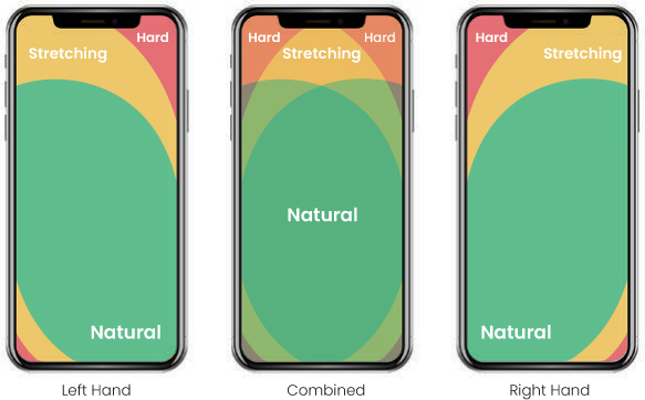
FIGURE 1.17 Users commonly cradle the bottom of their phones in one hand and use their thumb to navigate around the device. This image ranks tap zones based on level of comfort. (octdesign/Shutterstock)
Let’s take a closer look at two of the most popular browsers on phones: Chrome and Safari. The placement of the UI controls for typing in a website—which are, arguably, the most important controls when opening a new tab—exist in different places in these browsers. For Chrome, the focus is on consistency with web patterns. On a desktop, the input for a domain name is at the top of the page, which is where Chrome keeps it for its phone app. For Safari, however, they put the domain name input on the bottom of the screen so that users have an easier time tapping that field to open it. Safari prioritizes mobile usability, since the user’s thumb is at the bottom of the phone. These differing design philosophies—consistency versus usability—are apparent across similar experiences (FIGURE 1.18).
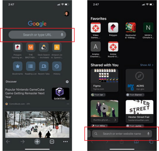
FIGURE 1.18 Chrome (left) has the search bar near the top of the screen, which is harder to reach when a user holds the phone at the bottom; Safari (right) has it at the bottom of the screen.
We can measure usability by observing our users interact with a product and hearing their feedback. Additionally, we can measure usability through objective metrics like the time it takes to complete a task or how often a task is completed successfully.
Usefulness
For something to be useful, it has to allow users to get closer to, or meet, their goals. If something is useful, then it can be used to achieve a goal. This is different than usable—if something is usable, then it can be used, but it is not necessarily useful.
Consider a product designed for no purpose. This product could be usable, in that it could function, could be reliable, and could be used by someone. But if that product has no purpose and has no usefulness, then that product won’t have a meaningful user experience for its users.
Consider a product that is a feather, intended to be a paperweight for loose pieces of paper (FIGURE 1.19). This product is usable—to use it, you place it on top of a stack of papers and it keeps the papers in place. But it’s not very useful—in fact, the feather will blow away and not keep the papers in place. Thus, the user experience is not useful and is, as a result, poor.

FIGURE 1.19 A feather is too light to act as a paperweight. It’s usable (you can put it on a stack of papers), but it isn’t useful (it won’t hold that stack in place). (Cheuk-king Lo/Pearson Education Asia Ltd)
Desirability
Desirability is the measure of how much a product is wanted by a user. It’s more subjective than other elements of UX, as it relates to tastes and aesthetics. It also lives higher in the hierarchy of user needs in that it becomes more important after usability and usefulness are established.
Imagine a mature marketplace—all the products in that marketplace are probably usable and useful. What ends up differentiating those products, then? Why buy an Apple computer when plenty of PC counterparts exist, at cheaper prices? Are AirPods really better than all other wireless headphones on the market?
To some, they are. Apple products provide a better user experience than other products in the eyes of these users, because they desire them. They may have similar usability and usefulness, but the desirability factor that Apple puts in its products, as well as its brand perception, allows it to surge ahead of its competitors.
Brand Perception
The desirability of a single product from an organization leads to a good user experience. Over time, if that organization continues to deliver good user experiences across different products, they become known for their excellent UX. People see brand names and automatically associate their past user experiences with that company’s products to future user experiences with new products. The brand name adds legitimacy and expectation to new product releases, and users assume that those releases have or will have a good UX, even if those new products fail to provide that.
This can go both ways—if a company continues to deliver bad UX, it will be known for doing so. The perception of that brand filters down to the perception of the experience. Apple has created a perception that their brand is synonymous with high quality. Other companies, however, have had mixed reception of their product releases—some have been very good, and others have not. As a result, their brand perception is mixed, and the perception of the user experience of their products is mixed as well.
UX Touches Many Disciplines
Author’s Note
Like other terms in the design industry, the term content design has shifted over the years, from communication design to UX writing to content design. Sometimes, we change the names of terms to convey alternative meaning, to be more specific, or to capture more use cases as our understanding improves and technology evolves.
In reality, user experience is made up of many different disciplines (FIGURE 1.20).10
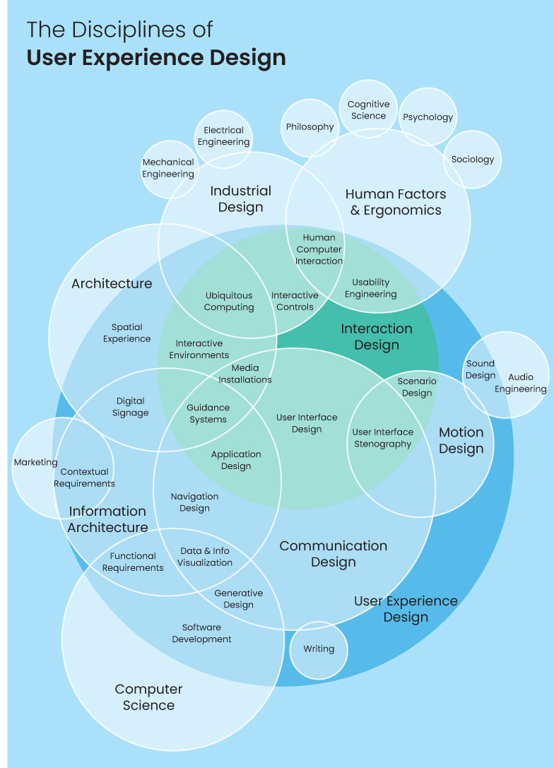
FIGURE 1.20 The disciplines of user experience, by Dan Saffer.
10 https://visual.ly/community/Infographics/computers/disciplines-user-experience-design
As designers, when we consider someone’s experience with our product, we must think of all sorts of elements related to that experience. We must consider how it looks (visual design), its structure (information architecture), how it operates (interaction design), how it’s built (computer science), and how it communicates with our users (content design), among other factors. When considering these elements, the idea of creating a “good” user experience can feel daunting. Thankfully, we start at a much simpler place when considering our design process.
The UX Triad
For our purposes, broadly speaking, when pursuing product design, we can think of user experience as the intersection between a user’s needs, a business’s goals, and the technology that connects them (FIGURE 1.21).11
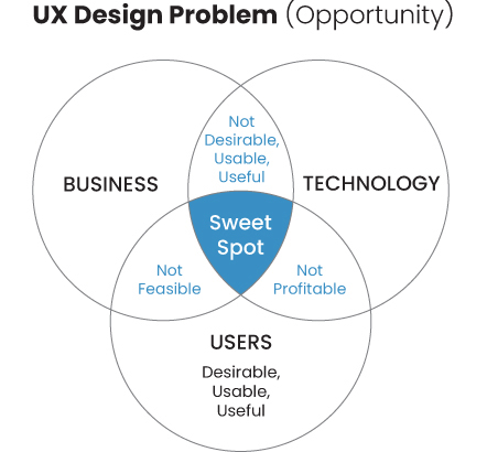
FIGURE 1.21 UX combines the needs of the user that uses it, the goals of the business that pays for it, and the constraints of the technology that powers it.
11 https://voices.berkeley.edu/art-and-design/user-experience-design
As designers, we can create great user experiences as long as we balance the following three elements of UX.
User Needs
You can’t have user experience without “user,” so this element is straightforward. We need to think about all the needs of our users—it’s why they will come to us for help solving their problems. As a result, we need to understand everything we can about them. What is their problem to solve, and how does our experience help them? What are their goals? Their wants? Their needs? Their frustrations? Understanding these and delivering a solution that incorporates them creates a strong user experience that satisfies the basic components of UX.
Business Goals
In reality, it is not enough to think about users—we must think about businesses as well. Businesses will be the entities creating these experiences at scale. To allow the maximum number of users the opportunity to access the experience we design, we must convince and rely on the business to deliver the experience. Why would a business invest in a strong user experience? What goals does the business have by releasing this product? How will they measure success and know what it looks like? How do they make money? You can create the best experience considering your users’ needs, but if you ignore the business’s concerns and goals, then that experience won’t be able to sustain itself or scale.
Technology Constraints
If we understand what the business and the users gain from a potential experience, that puts us in a great spot to create something amazing. However, we have to be mindful of what’s even technologically possible to create. If users want a robot that cleans the floor every day, is that possible? Can we create a delivery service that drops off our medication to our front door? Is what we want to create possible from a feasible perspective? From a logistical one? We are bound by the technology that can power our experiences, and when we design, we have to know what is and isn’t possible in order to craft the best experience.
If we aren’t aware that our phones can use their cameras to scan information, we’ll miss a potential opportunity to create a digital menu at restaurants. If we don’t know that computers can recognize the text in sentences, we’ll miss the opportunity to design a product that helps with our grammar as we write. We need to be mindful of what’s possible today, and what could be possible tomorrow, as we design.
The UX triad needs to incorporate all three of these elements—the users, the business, and the technology. Not only must these elements be considered, they must be balanced—there may be a technology that exists that would satisfy the problem to solve, for example, but if it’s too expensive for the business to buy, or too complicated for users to understand, then we cannot create a good user experience.
UX Incorporates All Elements of an Experience for All People
UX is the holistic, complete experience all users have with a product. It extends beyond a singular individual and must incorporate all users. It extends beyond the solution itself, incorporating all the research, architecture, and implementation of that solution. It even extends beyond screens, making its way into the physical surfaces and locations where the experience takes place.
By balancing the UX triad—the users who interact with the experience, the business that produces and maintains it, and the technology that empowers it, we can create a balanced, well-designed user experience for our audience.
What Is UI?
A UI, or user interface, is the surfaces that allow a user to interact with a product. A user interface can be a series of digital text fields, a set of physical buttons, or any other collection of signifiers and affordances that allow a user to operate a product. It is the means that allow users to use the things we create for them.
Our industry suffers from an identity crisis. Internally, as designers, we have a good sense of the difference between UX and UI. Externally, however, things become a little bit blurry. The perception is that design is a deliverable. Design involves visuals, and it involves artifacts that are given to other teams to build. Design is something that we can see, that can be given to others, so that they can use it. It’s a series of wireframes or mockups that a developer can build, and whatever interface a designer creates is the full extent of the UX that goes into it.
Outside the industry, a lot of confusion exists around the difference between UX and UI for those trying to understand it, work with it, or enter it. But this confusion also exists within the industry, among organizations that deliver products for users to experience, and even on the teams that make these experiences. Many think UX = UI = the design.
Compare the definition of UI with the definition of UX. A user interface allows users to operate a product, whereas a user experience is the entire holistic experience with a product.
Ken Norton has a very good definition for the difference between UX and UI:
UX is focused on the user’s journey to solve a problem; UI is focused on how a product’s surfaces look and function.
—Ken Norton, partner at Google Ventures
UX is involved with solving problems for users. We must identify the problem to solve, and then by following good UX practices we solve that problem.
UI is involved with how the solution works. How does it look? How does it operate? How does the solution communicate with users?
More simply, UX is the entire experience a user has with a product, while the UI is how that experience is represented. It is a part of the UX (FIGURE 1.22):
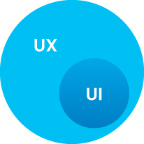
FIGURE 1.22 UI exists within UX—it is an inseparable part of the user’s experience with a product.
At the same time, the UI defines the UX. The UI is a part of the UX, so slight variations in UI for similar products can result in drastically different user experiences. The two are interconnected, which is why the industry at large sometimes struggles with defining the two.
Different UI, Same Problem to Solve
Let’s take a look at this problem a little more deeply and try to understand how UI is related to UX by seeing the UIs of products that solve similar problems.
Food Delivery Apps
Uber Eats, DoorDash, and Grubhub allow people to order food from restaurants. All three solve the same problem: “I’m hungry, and I don’t want to spend time or money on preparing my food.” But each has its own way of showing the solution to that problem (FIGURE 1.23).
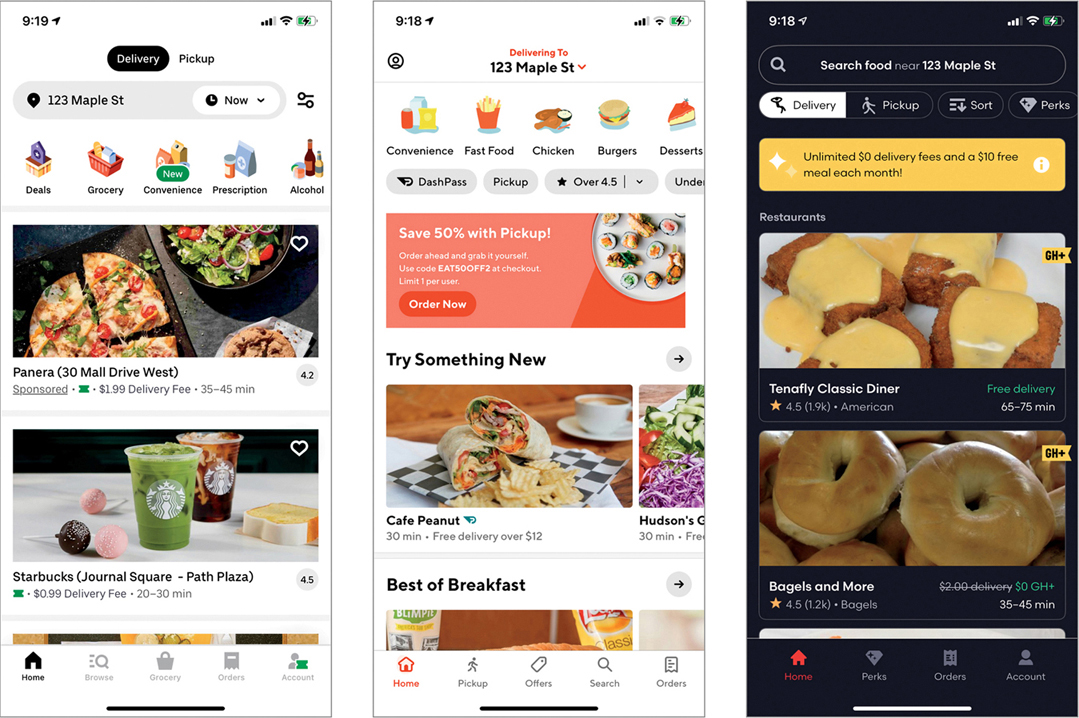
FIGURE 1.23 The home screens for three food delivery apps.
All three products have a filter at the top that lets users choose either delivery or pickup, but each has a different way of showing that filter. Uber Eats and Grubhub have a text input, while DoorDash uses a drop-down arrow to change your location. DoorDash is assuming users won’t need to change their location often, thus deprioritizing that option visually and saving space for the main aspect of this experience—connecting users to their food.
Continuing down the page, we see filters at the top for Uber Eats and DoorDash that let users search by cuisine. Grubhub chooses not to include this option, instead focusing on the content—places for people to eat. As for content, Uber Eats and Grubhub offer single vertical scrolls, while DoorDash offers sections based on topics. This allows users to preselect an area of interest, such as “something new” or “best of breakfast.”
Each app attempts to solve the same problem but approaches it in slightly different ways—this is obvious in their UIs, but a little more subtle in their UXs. The changes in the UI affect the user experience. This is because the UI is a part of the UX.
Search Apps
Let’s take a look at another problem and how different companies approach it. Let’s imagine that you are browsing the internet and want to search for something. As a user, you have something you are trying to find and want to use a search engine to help you look for it. Several different businesses try to solve this core user problem, but because they value different things as a business, their UX varies.
Microsoft Bing presents the user with the UX and UI in FIGURE 1.24.
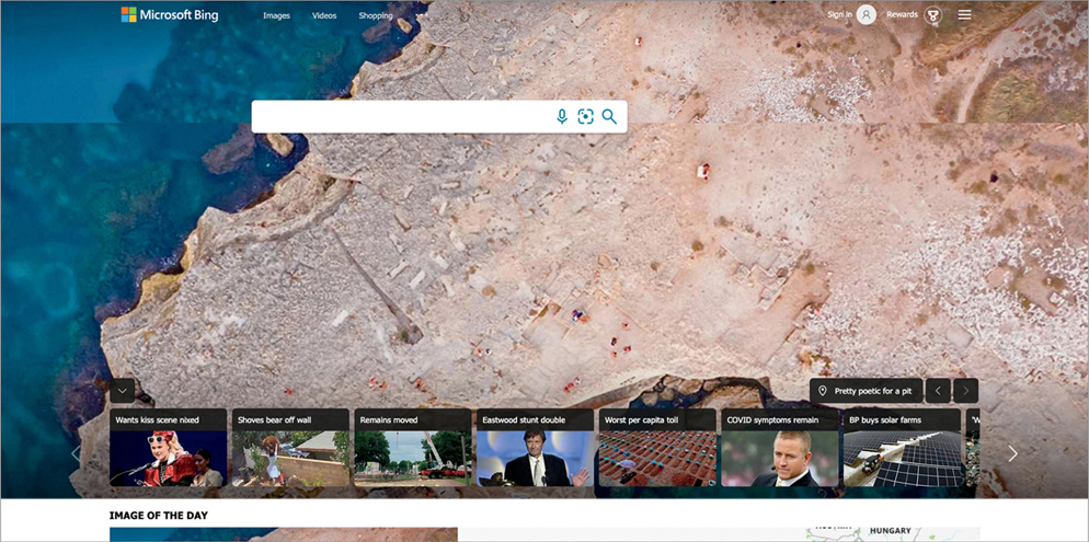
FIGURE 1.24 Microsoft Bing’s homepage for search. Besides the ability to search, it includes a background image, trending articles, and various account settings.
This page’s primary function is to search the internet for information using Bing’s search engine. However, the search bar is not the primary element on the page. It’s the user’s primary goal, but it’s not the primary goal of the business. The business distracts from the search functionality by showing beautiful imagery and even pushing content for the user to engage with on the bottom bar. If the user scrolls the page, they can find more information that Microsoft wants them to engage with.
This is an example of a user experience that combines user and business goals. Users want to search, while Microsoft wants users to click on specific information. As a result, we end up with a mixed experience.
Let’s take a look at another example, Yahoo (FIGURE 1.25).
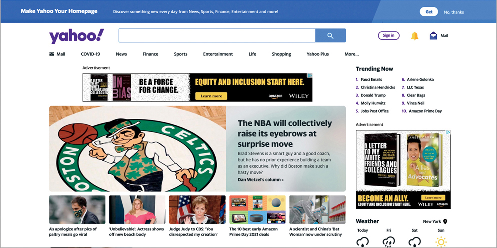
FIGURE 1.25 Yahoo’s homepage for search. Like Bing, it includes multiple features beyond search, including advertisements, trending searches, trending articles, weather information, and account settings.
Yahoo provides a different way for users to search. Like Microsoft, they want users to be able to search, but also want to nudge users into engaging with content that benefits them. Advertisements, trending content, featured content, sponsored content, and more are displayed. This is a search page for a search engine, but Yahoo wants to create a home that users go to—you may come to this page to search for something specific, but you might also come to check the weather or read up on the news without having a specific goal in mind. Yahoo prioritizes creating a home for users and uses its search engine as one ingress point for people to come to this page.
Let’s look at a third example, Google (FIGURE 1.26).
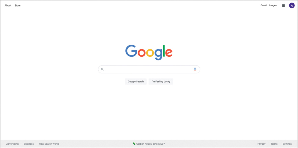
FIGURE 1.26 Google’s homepage for search. It has fewer features than Bing or Yahoo, focusing on the ability to search or adjust the user’s account settings.
Google’s approach is completely usercentric. As a business, Google cares about its search engine logic (and the massive amount of revenue generated by advertisements and sponsored content after searching). As a business, they want a critical mass of users using their platforms and infrastructures to improve their data analytics and push their products. Google cares about an ecosystem of products that users adopt, in addition to their brand perception.
This UI is an easy-to-use, usercentric direct solution to the user’s need of “I want to search the internet.” It’s not a surprise that Google is one of the most widely adopted search engines in the world, and one of the most beloved user experiences related to search. It’s fast, it’s easy, and it gets out of the way of the user. It speeds up their workflow and makes search easy.
The problem to solve hasn’t changed among these examples—users want to search the internet. The business goals, however, vary greatly, which impacts the UI and the UX.
The Basic Elements of UI
With a better understanding of the philosophy behind UI, we can start to understand the components that define a UI. There are several high-level elements that make up a user interface.
Color
In UI design, color can be used as either an aesthetic or a signifier (FIGURE 1.27). Color creates moods in an interface. A bright UI can create a vibrant atmosphere of constant activity or movement; a dark UI can create a nighttime atmosphere that suggests secrecy or sleep. A UI can be monochromatic and stick to a single color scheme, or multichromatic and pull from a wide set of hues. Color is used to establish a setting for users.

FIGURE 1.27 Color is a foundational UI element that sets mood, communicates interactivity, and expresses brand values. (Lotus_studio/Shutterstock)
Color can also tell us what’s actionable in an interface, for example, by creating a visual language that communicates certain colors meaning interactivity. A paragraph of black text with a few blue words in it can communicate a hyperlink to a different part of the product. A rectangle with text in it that’s a different color than the rest of the UI can indicate a button to be pressed. Through the visual design principle of contrast, we can use color to teach our users how to use our product (FIGURE 1.28).
FIGURE 1.28 Apple’s light and dark mode options. The light mode feels brighter and more active, as if it’s day and time to move around, while the dark mode feels less bright and active, as if it’s night and time to sleep.
Typography
In UI design, typography is the arrangement of text in a way that makes the copy legible, clear, and visually appealing to the user (FIGURE 1.29).12 Typography communicates crucial information to the user, such as how to navigate the interface, the status of the user, and how to solve the problem they came to the product for.
FIGURE 1.29 An arrangement of typography on a magazine cover to draw interest from the reader, grab their attention, and communicate what’s inside the magazine. (Artisticco LLC/123RF)
12 https://unsplash.com/photos/2X6bkiL0GDo
Typography also does a very important job of communicating the brand values to the user. Depending on the font style and typeface you choose, you can end up setting completely different moods (FIGURE 1.30).13
FIGURE 1.30 Despite having the same words, different fonts can lead to different messages. (Kaspri/Shutterstock)
13 https://www.reddit.com/r/funny/comments/977s8h/font_matters/
In UI design, typography must be more than legible—it must be readable as well. A typeface may be legible—that is, its letters are easy to distinguish from one another—but how we apply that typeface in our designs is how we impact and improve how readable it is.
In FIGURE 1.31, both sentences are legible. Each letter in the sentence can be identified. However, the first sentence is much harder to read than the second. This is because each letter is spaced very far away from the next, thus adding extra effort for the reader to identify what is being said. Our typography decisions should be made so that our designs are a lot more usable—in this case, more readable than legible.
FIGURE 1.31 Typography decisions make some designs more readable than others. Choosing the right font, letter spacing, line spacing, and other typography attributes affect how easily users can use a product.
Images
In UI design, images are used to communicate brand ideals or content to users.
If we are a luxury brand that values a clean, minimalistic look, then the images we select for our UI would try to create that aesthetic. Perhaps we’re a photography studio and we choose single-subject, high-focus objects to portray in our imagery. Or maybe we’re a children’s brand and we choose imagery filled with lots of colors, shapes, and movement to suggest fun and energy for our users. The style of the images we use in our UI help impart our brand values.
If we are a streaming service, we will use our images to convey the content available for users to engage with. Our UI will use scenes from the streaming content we provide to partition content and suggest different things to watch. We may use specific scenes from those movies to imply the type of content it is, like a ghost walking down a hall to suggest horror, or a woman laughing to suggest comedy. If we are a food company, we may use pictures of recipes to incentivize people to interact with our content, implying the types of meals they could cook.
The images we choose provide context and establish setting and, through our UI, play into the user’s experience.
Icons
Like images, icons are visual representations that provide context and establish setting. However, they are a specific type of image in that they have symbolic value that is used to communicate to the user.
Icons symbolize actions a user can take in a UI (FIGURE 1.32). A magnifying glass represents the ability to search. A house represents the ability to go to the home of the product. A speaker represents the ability to change the volume. Icons allow us to use fewer words and rely on common images to represent concepts in our UI.
FIGURE 1.32 A set of icons that includes common actions like search, play, pause, email, and volume. Icons pull from real-world representations to communicate common actions to users. (Vector Fave/Shutterstock)
Icons are also influenced by other UIs outside of themselves. Since icons are a representation of a concept, users find UI to be more intuitive if similar concepts are represented in similar ways across different experiences. The icons for “play” and “pause” are fairly universal—a triangle can represent the ability to play content, and two vertical lines next to each other can represent the ability to pause content. This is such a common pattern in UI design that it would be strange to create a UI with the same functionality but different icons.
Author’s Note
The meaning of icons changes over time. For example, a Rolodex icon used to represent the contacts in your phone. Now, they’re represented by an avatar. As the real world evolves into new meanings, the digital representations of those meanings evolve as well. Since few people use a Rolodex anymore, the design industry has evolved the concept of a Rolodex icon into something that more closely represents the real-world representation of that concept.
What about the icon for “favorite,” though? Is there a common icon to represent that action? Perhaps a star? Or a heart? Or a bookmark? These icons have fewer universal patterns across products and tend to represent the content that can be favorited. As a result, these icons vary visually across different interfaces.
Layout
When we take all our UI elements into consideration, we need a system for putting them into our product and having the user move between the various available affordances. To do this, we must establish the layout of our UI. A layout is a set of rules for how you measure, size, and space your UI elements.
Layouts help us establish rhythm and balance for a design. We can use layouts to assign common groupings to related elements, such as creating a card component in the UI that has an image, some text, and an icon of various colors to communicate a singular element. Perhaps this is an episode of a show, and by laying out the elements in a way that makes them look connected (FIGURE 1.33),14 we can communicate the title, an image from the show, a description of it, and an icon that indicates we can play it.
FIGURE 1.33 Food Network’s homepage. There is a main piece of content (the large image in the middle), three additional pieces of content below it, and a TV schedule. The layout of images and text, combined with the rectangles they are bounded by, helps you understand which elements are related and which are separate.
Layouts have a history in print design, but the principles of that history greatly influence digital design to this day.
UI Is a Part of UX
UI exists within UX (FIGURE 1.34).15 It is a part of the user’s experience and helps to define how strong that user experience is.
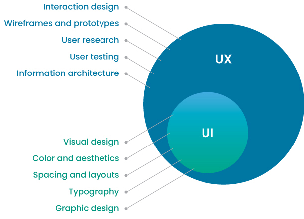
FIGURE 1.34 Kustard’s description of the relationship between UX and UI. Although UI is responsible for the visual elements of an experience, visual elements do not compose the entire “design” of that experience—there are additional design elements that make up the user’s experience with a product.
15 https://medium.com/kustard-design/ui-and-ux-a-simple-explanation-622c4009add3
At the same time, it is not the complete user experience. The visual elements of a user experience do not fully represent that experience. Although it’s an integral part of how a user interacts with a product, the UI of that product makes up but one part of its UX.
Similarly, UX does not exist without UI. A user cannot experience a product without the surfaces that allow that user to operate that product. The UI is a deeply important part of the experience a user has with a product.
Cognitive Overload
It is a designer’s job to craft and curate experiences. We design products so that users can enjoy them as easily and effortlessly as possible and so that they may accomplish their goals. The design of a product should get out of the way so users can use that product for their own wants and needs.
Author’s Note
The next section shows several products that suffer from cognitive overload. While the design of these products does create more for its users to process, the truth is that all these businesses are successful and have been in business for quite some time. The observations made here are not to disparage these companies; rather, they are to illustrate that even successful products have room for improvement.
This is easier to do than it sounds. With the pressures of the business to add more features and functionalities, the constraints of the technologies that power those experiences, and the difficulty to know how to best set up users to succeed at their goals, we can end up creating experiences that overwhelm users and prevent them from getting the job done that they came to us for in the first place.
But there’s hope. We can rely on some general heuristics to reduce how much information our users need to absorb. By removing steps in the process, remaining consistent in our visual language, and making information easy to find, we can avoid a situation where users struggle using our products and avoid cognitive overload.
What Is Cognitive Overload?
Imagine you’re browsing the web, looking for a new car to purchase. You search using Google for auto dealerships, hoping to find a website where you can browse for different models of cars to compare. While searching, you come across the website shown in FIGURE 1.35.16
FIGURE 1.35 LingsCars.com has a lot of competing visual elements, from color to motion to typography to sound. Combined, they may lead to overstimulation—a component of cognitive overload.
This company is most likely intentionally making the choice, as a brand, to include all these elements in an over-the-top, cheesy, personality-driven way. As a user, however, you might feel overwhelmed. Scanning the website, we see tons of colors, shapes, sections, videos, GIFs, and other visual elements. Where are you supposed to look on the page? Why are there so many moving elements? What does any of this have to do with cars?
You may feel overstimulated when looking at this site. This is a side effect of various design elements of the page affecting your cognitive load. You are trying to understand color, typography, shape, layout, and motion, not to mention the content itself.
In essence, as you try to understand each of these elements and make sense of them all, you are experiencing cognitive overload. Your brain literally cannot process all the information it has absorbed until you discard some of it and make sense of the rest. As designers, we don’t want our users to experience this. It is our goal, using the design thinking process, to create solutions to our users’ problems—not to make their lives more difficult.
To understand cognitive overload and how to avoid it as designers, we must understand what cognitive load is, followed by what affects it.
Cognitive Load Theory
People perceive information, understand it, and hold onto it to use later. We draw from our experiences and make sense of not only the current experience but past experiences as well. Our ability to perceive, understand, and retain information can be broken into three stages: sensory memory, working memory, and long-term memory.
Sensory Memory
First, we must receive information. To do so, we have our senses—our eyes, ears, nose, and everything else that receives sensory information. When experiencing a product, we can use our eyes to read words on a page, to look at shapes and images, or to scan a product for the element we want to interact with.
If we are looking at a page to buy a car, we can use our eyes to scan for something that represents that car, like an image of a car or the word car.
Working Memory
Once we perceive information via sensory memory, we move on to working memory. We take the information we received from our senses and start to analyze it. In this stage, we review, or “rehearse,” the information. As we do this, we either add this information to our long-term memory or forget it.
When experiencing a product, we might look at a webpage for cars and start to translate information into our working memory. We see images on the page that aren’t the image we are looking for, and we forget them. Some of those images might be memorable, however, and we put them into long-term memory for a later date.
Long-Term Memory
Our long-term memory allows us to pull and use information we’ve perceived and retained. We’ve experienced information in the past that left an impression, that we took the time to sense, work on, and eventually encode into our long-term memory.
When experiencing a product, we may pull from long-term memory to find what we are looking for. Perhaps we’re on that webpage for cars looking for car information—we can pull from our long-term memory to remember what a car looks like and look for a similar image. Or we can remember the previous webpages we’ve experienced and try to look for that car information in a similar place.
How They Work Together
These three memory banks—sensory, working, and long-term—allow us to navigate an experience, as they all influence our cognitive load.
Cognitive load is the total amount of information your working memory can handle. If your working memory is empty, you can process information. If it’s full, then you can’t.
Your working memory is influenced by both your sensory memory and your long-term memory. If you have too many pieces of information overloading your sensory memory, then you can’t process them all in your working memory. Similarly, if you can’t access your long-term memory for information, or spend too much brain power trying to access your long-term memory, you can’t process the information in your working memory (FIGURE 1.36).17
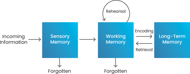
FIGURE 1.36 The model for cognitive load theory. Information enters our senses (such as what we read on a website or hear in a song) and moves through our memory until it is forgotten entirely or encoded in our long-term memory.
17 www.mindtools.com/pages/article/cognitive-load-theory.htm
Having an understanding of how people process information greatly influences how we design experiences. Ideally, we create experiences that have a low impact on sensory memory and help users avoid needing to access their long-term memory. As designers, we want to enable our users to solve their problems in usable, useful, and delightful ways. Producing cognitive load in our users is something we should strive to avoid.
The issue with the car website is that there are too many design elements that overload sensory memory—we simply have too many things to process into our working memory. As a result, we slow down, we struggle to make sense of the experience, and worst of all, we fail to easily accomplish our goal with the product—to find a car to buy.
Examples of Cognitive Overload
As designers, we have two ways to mitigate cognitive overload:
Reduce the impact on sensory memory. Less information to process upfront means we can process the information that is present more easily.
Reduce the need to draw from long-term memory. More information immediately available to us allows us to avoid pulling from our past experiences to make sense of our current one.
Both sensory and long-term memory directly affect working memory, and by balancing these, we can avoid cognitive overload. Let’s look at some examples of cognitive overload and how we might be able to address them.
Internal Inconsistency
The design patterns we create in our experiences establish rules for our users. If we deviate from the rules we establish, we create confusion.
A coffee company that sells coffee, tea, food, and other products uses a lot of different visual elements to engage users (FIGURE 1.37). Unfortunately, those elements have different interaction design rules for how they operate. Some of the links have different colors, so it is unclear immediately what is or isn’t interactive. Additionally, when hovering over those links, there is no change in state to indicate that the element is interactive.
FIGURE 1.37 A coffee company’s homepage. Their design is internally inconsistent—while no one design decision is “better” than another, when used together, they mislead the user.
From a layout perspective, the sections are misaligned. The typography changes as you move through the experience, using different kerning, font weights, sizes, and capitalizations without a consistent set of rules.
In essence, this product is inconsistent with how it displays its visuals and its rules of interactivity.
How could we fix this? Well, as designers, we can create a set of rules for our visual design. We can come up with typography styles and use cases for each of those styles. We can choose a common color for our interactive elements and indicate at a glance which elements are meant to be interactive (FIGURE 1.38).
FIGURE 1.38 A UI style guide published via Figma’s community. It outlines rules for the visual elements in a product so that the product can be internally consistent across screens.
Establishing these rules for our product, via a design system or a style guide,18 would greatly reduce the cognitive load of the users who use it.
Unnecessary Actions
A user’s sensory memory is dependent on the information that they process, so the more information we present to users, the more they have to process. Therefore, if we can remove information from our products but still allow users to accomplish their goals, then we are reducing their cognitive load in a positive, helpful way.
Consider the e-commerce process of buying an item from a website. If you could eliminate a step in that process, you would reduce the cognitive load of users trying to purchase things from that site. Traditionally, users add an item to a virtual shopping cart, navigate to that shopping cart to view all their items, and then purchase those items on a separate series of pages (FIGURE 1.39).
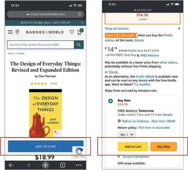
FIGURE 1.39 The product detail pages for Barnes & Noble (left) and Amazon (right). Barnes & Noble has two steps to checkout, while Amazon has one, which removes the cognitive load of an extra action.
For e-commerce design, it is becoming more common to reduce steps in the checkout process. Amazon introduced a way to “buy now” instead of adding an item to a cart. This takes the process from multiple steps (add to cart, go to cart, check out from cart) to a single step (buy now). Reducing steps in the process helps users avoid processing unnecessary steps when trying to solve their problems.
Difficult-to-Discover Information
Another way we can inadvertently overload working memory is by making information difficult to discover. This can occur when we bury information in a website or make our website too distracting to notice information—overloading sensory memory. If users rely on their long-term memory to recall common places to look for that information and don’t find it in those places, then we tax long-term memory as users continue to access it.
One example of a UI that has hard-to-discover information is Teaa Cafe’s website,19 shown in FIGURE 1.40.

FIGURE 1.40 Teaa Cafe’s website for its various drink options. There is no information about price, nutritional facts, sizes, or other elements someone would want to know in order to make a purchasing decision.
On their menu page, we can see all the tea options they sell online. However, there is no additional information here—no nutritional information, product details (size of drink? taste?), or price. At the least, some indication of price or quantity would greatly assist users in evaluating their choices. Unfortunately, that information isn’t available in their menu, as none of these cards are interactive—it is just a list with pictures.
A fix for this would be to follow the common conventions that other products in the same space have. If many other products offer the same type of information in the same spots on the screen or in the product, then we should probably do the same for our product. There is an expectation that prices are associated with an item in an e-commerce setting, for example, and we should closely link those pieces of information to avoid hiding it from our users unintentionally. For example, Starbucks20 (FIGURE 1.41) is one of the largest beverage companies in the world, and they have a similar UI to Teaa Cafe. However, each of these cards is interactive and provides more details if you click it, such as price, nutritional info, and the ability to add it to your cart.
FIGURE 1.41 Starbucks’ online menu. Clicking an image provides information like size, price, availability, and more.
Too Many Choices
Author’s Note
Hick’s law describes this phenomenon. It states that the time it takes to make a decision increases with the number of and complexity of choices. A large library of content will increase the amount of time it takes for a user to find content they want to consume—which has helped lead to a trend around personalization and recommendations.
Another way to overload working memory is by presenting a user with too many choices in the UI. This may not overload sensory memory—it may be easy to understand each option in a streaming service, for example. But the challenge is that working memory must evaluate each option and decide. To hold all those items in working memory is a challenge and will eventually become an overload. This may have happened to you as you scrolled Netflix (FIGURE 1.42) looking for something to watch.
FIGURE 1.42 Netflix’s UI for browsing content to watch. Netflix has hundreds of options to choose from, which can lead to choice paralysis for users.
One way to address this issue would be to provide other ways for users to navigate the choices you provide them. Netflix provides recommendations, the ability to search for any content item, and, if you scroll far enough, a randomizer that picks a show for you. Netflix realizes that finding something to watch is a problem for their users, even when they provide thousands of options for users to choose from.
Overstimulation
If we present too many options to sensory memory, then it may feel like too many things are “talking” to our users at the same time. A combination of color, images, animation, and audio all trying to communicate simultaneously can result in too much stimulation (FIGURE 1.43).
FIGURE 1.43 A category page for Ling’s Cars. As with its homepage, several design elements lead to overstimulation, like text outside its containers, cars moving when hovered over, and a live counter for website visitors.
We’ve already discussed the homepage of the Ling’s Cars site, but the issues of overstimulation find their way into other parts of the website as well. Text extends out of textboxes, breaking the layout. Various gradients communicate different sections of the website. Each card has different visual treatment, using color as either a signifier or a decorative element—do the blue, yellow, and red behind each card have a meaning in this UI or is it for aesthetics? It’s unclear.
The only way to address overstimulation is to reduce. Cut functionality, visual elements, or content in a way that allows users to easily navigate the product.
Reduce Cognitive Overload for Your Users
Every time the user must think while using a product, their working memory is weighed down. The more things a user must process while interacting with a product, the harder it is to complete their goals with that product.
As designers, it’s our job to manage the cognitive load of our users. If we have too many design elements or put those elements in the “wrong” places, the cognitive load of our users will increase until they overload and are unable to use our product.
Every design decision we make has the chance of affecting cognitive load. As you make decisions in your work, ask yourself whether your design choices help people reduce their working memory, avoid cognitive overload, and accomplish their goals.
Let’s Work Together!
Up to this point, we’ve covered general definitions and theories for design thinking. Now that we’re getting into more practical, hands-on work, we’re going to change things up a bit. Together we are going to apply the design thinking process, from start to finish, on a specific problem using the Nielsen Norman Group’s model.
Author’s Note
People really do learn better when they actively apply what they learn. To get the most out of this book, I highly recommend applying the techniques covered here on a problem. If you’re transitioning into design, you can even use it as a case study.
I’ll start by introducing a problem, then we’ll walk through each step of the design thinking process, exploring the problem. I’ll introduce a concept or component of the design thinking process, provide examples, then encourage you to do work on that part of the process.
If you have a problem in mind that you’d rather work on, go for it! Otherwise, I recommend working on the problem I present so you can practice the concepts we talk about as they come up. This will lead to better retention of these concepts over time.
The problem we’ll be working on is the idea of solo travel—how we encourage it, what issues do people experience when traveling alone, and what motivates them to do so in the first place.
For the exercises I propose, Appendix at the end of this book will include example “What Good Looks Like” solutions. I encourage you to follow along!