
If you’re like most people, the first time you used a word-processing application, you accepted the default Times New Roman 12-point font and never looked back. If you still treat your computer like a glorified word processor, you’re not taking advantage of the full communicative and creative power of type.
The best designers are experts in type and typesetting because they understand that well-styled type not only sets the document’s tone but also directly impacts its readability, legibility and visual hierarchy. Failure to follow best typesetting practices, at best, can leave your audience with a negative impression and, at worst, can leave you with no audience at all.
This chapter talks all about fonts, including styling them for both function and aesthetics.
Font, Typeface, Font Family, Glyph
To begin at the beginning, a font is a complete set of characters in a particular size and style of type. This includes the letter set, number set and all of the special characters you get by pressing the shift, option or command/control keys.
A typeface or font family contains a series of fonts. For instance, Times Bold, Times Italic and Times Roman are actually three fonts, even though people often refer to one entire font family as a font.
A glyph is an individual character of a font. Glyphs are not limited to upper- and lowercase letters. There are glyphs for punctuation, glyphs for special characters such as copyright and trademark symbols and even glyphs that are purely decorative. Most fonts have a set of 265 glyphs. Fonts in the Open Type® format, a format created jointly by Microsoft and Adobe, are cross-platform and can have as many as 65,000 glyphs.

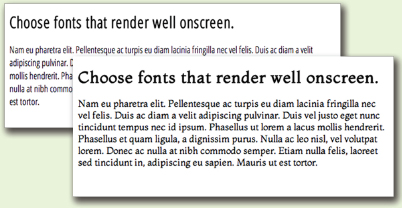
Type sets the tone. Well-styled, properly set type sets the overall tone of the layout. It impacts readability, legibility and visual hierarchy as well.
Font Categories
In the same way we organize plants and animals into genus and species, we can organize fonts into categories. The shape of a font’s glyphs determines its category. Learning to recognize and identify font categories is an important first step in selecting the right font for the right job. It’s also essential in creating harmonious, not discordant, font pairings. The ability to categorize fonts comes down to training your eye to see subtleties. It’s worth your time to develop this skill.
Fonts have a complex anatomy, and the names of some font parts are known only to font designers and true type enthusiasts. This diagram illustrates some of the more commonly known parts of fonts.

A Field Guide to Basic Font Categories
Depending on the source you consult, you’ll find many different font categories. We’ll stick to a few of the most common and offer general recommendations for their use.
Old Style & Transitional
Characteristics: Classic and traditional, old style fonts have serifs, little “feet,” at the tips of glyphs. Old style serifs are bracketed: They start thick and taper to thin at an angle, creating little triangles. Old style fonts also contain thick stem strokes and thinner hairline strokes, though the difference between the thick and thin is not extreme. Old style fonts often have diagonal stress, which means that a line intersecting the thinnest parts of O-shaped glyphs is diagonal.
Transitional fonts evolved from old style and share many of the same characteristics. The biggest difference is that the diagonal stress is missing or not as prominent in transitional fonts.
Because they are so similar, throughout this text we refer to both types as simply old style.

Note Goudy Old Style’s diagonal stress (left) compared to the vertical stress of the transitional font Baskerville (right).
BEST USES:
For print body copy, old style fonts are the most readable. Larger bolder versions can work for headlines. But old style’s hairline strokes and tapered serifs can get lost when reversed.
Serifs and fine strokes also get lost on computer and television screens. Onscreen, old style fonts are best when big and bold in headlines or other short bits of copy.
Sans Serif
Grotesque Humanist Geometric
Characteristics: Contemporary in style, sans serif (French for “without serif”) fonts have no serifs. Variations of sans serif fonts include Grotesque (strokes have uniform thickness), Humanist (variations in stroke thickness) and Geometric (letterforms have geometric shapes). For simplicity, we refer to all forms as sans serif.
BEST USES:
In print, sans serif fonts are best used for headlines and other quick nuggets of text such as sidebars and cutlines. They work well when reversed. Humanist forms, with their stroke thickness variations, are the most readable of the sans serif fonts.
Onscreen, sans serif fonts rule in the readability department. Among the most readable onscreen fonts are Helvetica, Verdana and Arial. Their larger x-heights and open letterforms add to their online readablity. Bigger, bolder versions make excellent headings and subheadings.

Characteristics: If the type style looks like it belongs on a wedding invitation, it’s most likely a script font. Script fonts tend toward formality and often resemble old-fashioned penmanship. Like cursive writing, the glyphs in script fonts tend to be connected on the downstroke. As a whole, script fonts can be difficult to read, though some are more readable than others.
BEST USES: Because of readability and legibility issues, script fonts are best limited to small amounts of copy in both print and screen applications. Individual characters of script fonts make interesting decorative elements in watermarks and logos. They also make beautiful drop caps.

Characteristics: The characteristics of decorative fonts widely vary. They can resemble hand lettering, vintage type, grunge type or whimsical lettering. Consider these examples:
BEST USES: For both print and screen applications, limit the use of decorative fonts to headlines, decorative details, ornaments or very small amounts of type. They are not a good choice for reading copy. Reversing depends on the thicknesses of the parts of each glyph, and those with fine detail will not reverse well. Many place Blackface fonts, like Blackmoor above, in their own font category. They were used for body copy in the early days of the printing press. Today we find them difficult to read. Treat them like decorative fonts: Use them sparingly and with care.

Characteristics: As the name implies, slab serif fonts have uniformly thick, fat serifs. Some slab serif fonts look like a hybrid between an old style font and a sans serif font. The result is sort of a sans serif with fat serifs, if you will.
BEST USES: Slab serif fonts were invented for retail display advertising so they work well in print headlines. Some slab serif fonts can work for body copy, but old style fonts are generally a better choice. Slab serif fonts tend to work a little better in reverse because of their beefier serifs.
Slab serif fonts also work for Web and television but in the same limited way as decorative fonts.
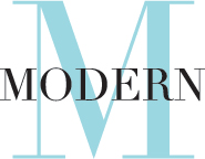
Characteristics: Modern fonts have extremely thin serifs, and their stress lies on the vertical, unlike old style’s diagonal stress.
BEST USES: Modern fonts work well for headlines, decorative details or ornaments. They are not a good choice for reading copy, and reversing them is not a good idea because of their ultra-thin serifs. Likewise, they are not a good choice for screen applications.

Dangerous Curves. Curvy script fonts contrast beautifully with rectangular pages. Because script fonts are typically ornate, pair them with simpler fonts such as old style or sans serif.
Reproduced by permission of the USF College of the Arts.
Choosing & Using Fonts
Understandably, most graphic designers love fonts. We want bumper stickers that say, “The one who dies with the most fonts wins.”
Once you discover the big wide world of fonts, it’s easy to go nuts. But. Please. Resist. This. Urge. Nothing screams “amateur” louder than using too many competing font styles.
Choose One Font for your Body Copy.
The No. 1 consideration in choosing a body font for print or screen is readability. As We’ve already mentioned, old style fonts are best for print readability while sans serif fonts are the most readable onscreen.
We recommend selecting a body font from a larger typeface. By nature, all the fonts in a typeface get along visually because they’re related. By using fonts from the same typeface, you get both flexibility and a consistent unified look. For example, the typeface Adobe Garamond Pro contains a “regular” font that is great for body copy. But it also contains bold, italic, semibold and several other variations that can be used for subheadings and captions, or to create emphasis.
You can take a similar approach when choosing Web fonts. Many of the fonts available through online font services include related variations. These variations may include different bold weights, italics and even condensed or wide options. Look for and specify from these sets.
Choose a Second Contrasting Font for Headlines.
If you choose an old style font for body copy, you can pick a contrasting headline font from almost any category. Think of old style fonts as the “basic black” of fonts. They go with everything. Your headline font, then, can be wild and decorative, script and elegant, or sans serif and ultra hip and still work. Or you could choose a headline font from the same typeface as the body and create your contrast through point size or weight. However you do it, you want the body copy to contrast with the headline.
Choosing Fonts for the Web
In general, you choose fonts for your Web project the same way you choose for print: for style, readability, and contrast. Alas, technology makes choosing Web fonts a bit more difficult.
The future of Web type. Designers are already embracing Web-hosted fonts despite rendering issues on some browsers. Fortunately, this technology is evolving rapidly.
Fonts used: Open Sans by Steve Matteson and Montaga by Alejandra Rodriguez.
The number of Web fonts is limted. For years, Web designers have been limited to using a very small font set. Most designers stuck to Arial or Helvetica, and here’s why: When you access a website, your browser reads the page code for instructions on how to render the page. If font specifications are included, your browser searches your local computer for the specified fonts. If the fonts are present, the page renders as intended. If not, the browser substitutes boring or ugly defaults.
Web designers prevented this unwanted font substitution by choosing and using only fonts common across computer platforms. As mentioned, this Web-safe font list is woefully short. The other equally poor solution was to turn non-Web safe type into graphics. This preserved the font appearance, but killed search engine readability and made editing difficult.
Web font options are growing rapidly. Fortunately, innovations in Web typography are changing the way Web designers specify type.
The introduction of Cascading Style Sheets (CSS), a language for applying Web styling, gave Web designers the ability to specify fonts beyond browser defaults. CSS version two went a step further and included the “@font-face rule.” This rule established a string of code that allowed browsers to access and display any font a designer loaded to the server. This eliminated the need for fonts to be available on local computers. In theory, this opened up all fonts for potential Web use. However, fonts originally designed for print do not necessarily present well on the Web. Different browsers use different rendering engines, and the result is less-than-stellar font clarity and readability.
In addition, many font foundries cried foul as loading fonts on servers made it possible for anyone to download those fonts without permission. Currently, the best approach to Web typography is to take advantage of Web-hosted fonts available through online font services. There are several services to choose from, some free and others subscription-based. Font service fonts tend to be designed for the Web or have been test-driven for functionality so there are fewer rendering issues. They also have End User Licensing Agreements (EULA) in place so you can avoid copyright infringement.
The number of Web fonts is still limited. While these new Web font options are exciting, there is still nowhere near the same number of quality Web fonts available as there are fonts for print. Plus, not all Web fonts are created equal. Some come in limted sizes and weights. Some do not render well across all browsers. While it’s great to have options, it takes trial and error to find just the right fonts.
10 Points is 10 Points, Right?
Wrong. While each of the fonts used below is 10 points, each takes up different amounts of vertical and horizontal space. For print, 10 or 11 point old style is a good baseline for reading copy. For other font categories and for the Web, use your judgment when picking the perfect size between mousetype and horsey.

Sans serif fonts are also rather neutral and play nicely with most other fonts. Make them your go-to fonts for the screen.
Pairing decorative fonts together is almost always a bad idea. They compete with each other. Script fonts have the same problem. Think of decorative fonts and script fonts as the divas of the font world. You just can’t put the two of them in the same dressing room.
Modern and slab serif fonts also can present difficulties. Since modern and slab serif fonts are similar in shape to old style fonts, they may not have enough contrasting elements to make them stand out as distinctive from the print body copy. When using modern and slab serif fonts, trust your eyes. If the pairing looks like you’ve simply made a font error instead of a deliberate design choice then the pairing isn’t working. You might be able to make such pairings work if you apply contrast in another way by varying size, weight or color.
No matter which font categories you choose for your onscreen project, make sure you don’t choose fonts with a lot of fine detail. Thin strokes and serifs often don’t read well onscreen. When in doubt, test your choices on different computers using different browsers. Be sure to test-drive any variants of your chosen fonts, too, especially italics. Italicized fonts may also lose legibility onscreen.
Applying Additional Font Styling
Choosing the right typeface will give you the option of using bold, italic, semibold and other type styling options. You may also have the ability to apply some additional font styling options such as leading, kerning and tracking adjustments to impact your design’s readability and visual appeal.
Font Size.
In your typesetting workflow, choose your fonts first, and then choose your font sizes. Layout programs, including Web page editors, come with default size settings, and somehow the default is never the right size.
When selecting a font size for body copy, choose a size large enough to be easily readable. For print projects, start by trying a setting of 10 or 11 points, but be prepared to change the size again. Font size is calculated by measuring the distance from the top of the ascenders to the bottom of the descenders. The length of ascenders and descenders relative to x-height may make some fonts appear smaller and some appear larger. You’ll have to learn to trust your judgment on choosing a font size that hits the correct note between mousetype and horsey.

Size matters. When typesetting headlines, subheadings and other non-body copy, make sure you provide clear contrast of size, font style or both. Don’t be scared of “too big.” This website concept title font is 100pts compared to a body font of 9pts. We’re pretty sure that qualifies as clear contrast.
Don’t forget to consider your audience. If your target audience is middle-aged or older, go larger rather than smaller. The older people get the more likely they are to need reading glasses. They’ll appreciate bigger fonts. Trust us.
Choose font sizes for headings, cutlines and other non-body uses based on both readability and contrast. Headings must contrast with body copy, so make them really contrast. A 12-point heading barely contrasts with a 10-point body copy font; a 36-point headline greatly contrasts.
Finding the “right” font size for a Web project is especially difficult because there are factors beyond your control that impact the way fonts appear onscreen. Personal browser choice, browser settings and whether the site is viewed on a monitor, tablet or smartphone all impact font size.
Classic. Use of all caps can be classic and elegant as in the heading above. But used in body copy, all caps become difficult to read. Bottom line? If you use all caps, do it with purpose and intent.
Since the best website designs are responsive—that is, they automatically adjust to the viewing device—we need font size specifications that adjust as well. Rather than set Web font sizes in non-flexible points or pixels, font sizes should be set in adjustable “ems.” Em size is adjusted up or down via percentages. If this is absolute Greek to you, don’t worry. We discuss ems in more detail in Chapter 13.
Even though ems are flexible, you still have to establish a baseline size. Which means you’re still going to have to experiment to find the right size between mousetype and horsey. Again, test-drive your choices on different browsers and different platforms.
Bold & Italic Type.
Both bold type and italic type can create emphasis in short copy situations, such as headings, subheadings or short body copy.
Did we mention short copy situations? Use bolding or italics sparingly. Neither bold nor italic is appropriate for entire pages or long paragraphs of type. Ugh. Too much italic is hard to read, particularly onscreen. And too much bold defeats the purpose of having bold at all. When there’s too much of it, nothing stands out.
We also would like to point out that not all bolds are created equal. Some bold fonts are bolder than others. Sometimes a bigger font size, a different color or a different font altogether provides greater contrast than using just plain bold.
Avoid faux bold and italic. Some non-professional grade software packages and most Web page editors include buttons for faux bold and faux italic. You’ve seen these. They’re little squares with “b” or “i” on them. These buttons seem to let you apply bold or italic to any font.
But in truth, these buttons merely stroke or distort letterforms to appear as bold or italic. And using them can have disastrous results in commercial printing. Like crashing-the-printer’s-software disastrous. No kidding. You should avoid using these buttons to apply styling.
Faux styling can cause poor onscreen rendering as well, especially with italics. So you should avoid faux onscreen, too.
So how do you apply bold and italic? Choose a font specifically designed as bold or italic. Remember our advice to choose typefaces with multiple fonts? Here’s where that advice comes into play. Choose and use bold fonts and italic fonts from larger typefaces and you’ll save yourself a boatload of printing and rendering headaches.
All Caps.
All caps are an old-school style of emphasis. Type set in all caps cuts down on readability. When we first learn to read, we are taught the shape of each letter and its corresponding sound. We put letters and their sounds together to make words. Over time, our mental process shifts to the point where we recognize shapes of words without the need for scanning and adding up individual characters. But when you capitalize words, they lose the ascenders and descenders that make up their unique shapes. Every word becomes a rectangle, and our brains have to work just a little bit harder to recognize the word.
To add insult to injury, we have come to associate all caps with shouting. And nobody likes to be shouted at.
If you want to use all caps, make sure they don’t interfere with your visual communication purpose, including readability.
Spacing.
Leading. Pronounced “ledding,” leading is the technical term for line spacing. It comes from the days of setting type by hand. Once upon a time, typesetters used a slug of lead to separate each line of type.
Today, your computer calculates leading. Every font size has a corresponding default number (a percentage of the font size) that serves as line spacing. This default number works okay most of the time. However, there are times when you need to adjust it.
What’s it Called?
Leading/line spacing is the space between lines. Decrease it when you are creating large multi-line headlines. See the difference?
Big headlines
need adjusting
Big headlines
need adjusting
Tracking refers to adjusting the spacing between characters across a string of characters. It can be increased or decreased for copyfitting or for effect.
Tracking increased
Tracking decreased
Kerning refers to adjusting the space between individual glyphs. We applied a kerning adjustment of -78 to the pair on the right.
W e We

Fine-tuning your type.
Increased tracking on the headline and increased leading on the copy give this ad an open, airy quality.
When the body copy font has a large x-height, thus reducing the crispness of the shapes of words, additional space between lines of type can improve readability. A little extra leading increases readability, too, when the body copy is set in a sans serif font or when the eye must track across a very long line of type, as in wide columns or no columns. Be careful not to overdo additional leading, as too much space also cuts down on flow and readability.
You might add extra leading for decorative purposes, too, but only for limited amounts of type because of the negative impact on flow and readability. A little extra leading can give the sense of elegance or lightness/airiness, if that serves your communication purpose. Just remember to balance it with readability and flow.
On the other hand, when creating large headlines, reducing leading is essential. Because leading is mathematically calculated based on font size, as the font size increases, so does the leading— exponentially. For headlines more than one line deep, decrease the leading to bring the lines closer together (i.e., clumping). Beginning designers often overlook this step, leaving headline gaps you could drive a bus through.
Kerning. Manually adjusting the negative space between two characters is called kerning. Most design programs are set to adjust these spaces automatically. However, you still may need to do some fine-tuning.
When uppercase letters have diagonal lines, such as on the capital W, adjacent letters may appear too far away, particularly when font sizes are large. You also may need to adjust the kerning in large headline words that begin with the capital letters T, P and F.
Tracking. Adjusting letter spacing across a string of characters, such as a sentence or paragraph, is called tracking. You also can manipulate tracking for decorative purposes to create tightly packed or loosely spaced words.
Sometimes tracking becomes useful for copy fitting. For example, when you have a widow at the end of a column, decreasing the tracking on that sentence may pull the lone word up to the previous line. Your reader will never notice the difference.
Adjust tracking with care. It’s easy to go overboard and end up with squished text. Try to limit tracking adjustments to “-10” or less.
Availability of leading (line spacing), kerning and tracking on the Web. You can apply leading (referred to as line spacing in the context of websites), tracking and kerning to Web type, too. In the case of line spacing and tracking, Web designers write specifications (lines of coded visual instructions for Web browsers) in Cascading Style Sheets (CSS) to control how much space appears between glyphs or between lines of copy.
Kerning on the Web requires a bit more effort, specifically, a little programming/scripting. But it is possible.
Before you get excited about creating widely-tracked headlines on your website, a word of warning: The CSS specifications exist, but they are not universally supported on all browsers. Typesetting that looks great on your computer screen may not appear at all on your best friend’s computer. Don’t let this stop you from experimenting. Just remember to test, test, test.
Tabs & Tab/Dot Leaders.
Sometimes, in order to keep things aligned, you need tabs. Use tabs for columns of numbers, too, and pay attention to aligning decimal places. Sometimes tabs space out farther than the eye can travel without some help. In those cases, instead of making readers’ eyes do the typographic equivalent of a stunt jump across a Grand Canyon of negative space, tab or dot leaders can function like visual bridges. They assist flow by leading the eye along their line of sight.
|
|
Jumbo Shrimp with Garlic |
|
Ducient peribus, apid ullab inum quassin ihitisqui dolorem reperia tiusae nullitiae minus, cus dollate corit volut il in non estinve nimped |
8 |
Prosciutto & Melon |
|
On erferum et exceatur, occatest di ommolup taquae mod eum nienderendae |
7 |
Mozzarella Caprese |
|
Itatiam senessecum inia nobitio nserio quosae sinvenimi, sum in eum fugit fugiasim uibusci |
6 |
Bruschetta |
|
Di dem sanditam, sum am ut expernat prati dene cuptatqui iundusapid etur sit es ipsandam nossim nimille ntibusda |
9 |
|
|
Pasta E Fagioli |
|
Igendus molores sitatur sed quo |
4 |
|
|
Classic Caesar |
|
Quiasped estis nis id ut iliquia erferepta que ea que prorporia quo voluptaspis |
7 |
Insalata Caprese |
|
Uptios dicias dolor ad utemo et laceatur, nullupt atempelitam nonsequo |
8 |
Escarole Siciliano |
|
Is sendus quias aut doloribus nobisto es dit omnihicab in utatum, nam res vel ius sinte et lacepro reritinci cus aut prem |
8 |
|
|
Bistecca Al Barolo |
|
Uptios dicias dolor ad utemo et laceatur, nullupt esciet auda sam sequam quassin iatempore eaquam quatio qui in parcipis |
21 |
Costata Di Vitello |
|
Is sendus quias aut doloribus nobisto es dit utatum, nam res vel ius sinte et |
17 |
Costata D’Agnello |
|
Aqui dellationem cus dolora conecerero eum re magnima adi con commo bla vereperum nobis |
18 |
|
|
Linguine Alla Napoletana |
|
Am laut opta doloritatum vendae Nam rest alit qui corem apiet quos eum delene plabores a poreper |
14 |
Spaghetti Al Pomodoro |
|
Itas aut aut faccabo mi, int dundae nulparume placilit occus alist |
12 |
Fettuccine Alfredo |
|
Quiasped estis nis id ut iliquia erferepta que |
12 |
 A
AWe’ll have the bruschetta. This menu design utilizes different types of font styling such as tabs and tab leaders to create order and organization.
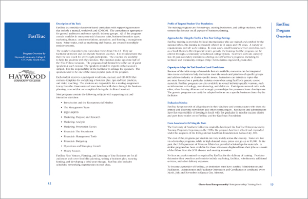
Breaking up the gray. Bold colorful subheadings, column guides and bulleted lists break up this text-heavy document.
Typesetting Lengthy Copy
Page after page of nothing but boring gray words scares people, even when the words are set in a nice readable old style font. The prospect of slogging through all that reading is discouraging at best. The good news is that when the content we must communicate comes in the form of substantial amounts of copy, there are tactics for carving intimidating text into bite-size pieces.
Paragraph Indicators.
Paragraphs are traditionally indicated either by a first line indent or by additional leading after each paragraph. Unfortunately, most people use default tabs or an extra hard return to create paragraphs. Visually, these default keystrokes result in spaces that are too large.
In print projects, you set paragraph indents or paragraph space-afters using the specific tools for those tasks that your design software provides.
For Web projects, your best bet is spacing after paragraphs. And again, using double hard returns to achieve this results in too much space. Not to mention it’s just plain lazy. Instead, specify a bit of extra bottom margin on your paragraph element in your CSS.
How big should the spaces be? Use your best judgment. First line indents should be consistent. They need to be just big enough to communicate their presence and do their visual indicator job, but not big enough to distract. If you choose to indicate paragraphs with the indent, remember the first graph or lead does not indent. Or, if you decide to space between paragraphs, don’t overdo the space, but do be consistent.
Still not sure about size? Pay attention to publications around you. Educate your eye on what pleasing spacing looks like. Then use it in your own design projects. While you’re at it, keep paragraph length short, as well, to hook lazy readers.
Headings & Subheads.
Main headers and subheads also provide a great way to break up blocks of text. When styled for contrast, headings and subheads create a sort of navigational rhythm throughout the design.
Proper spacing for headings and subheads increases readers’ understanding, too. Remember to position headers closer to the content they reference (clustering) and farther away from unrelated content.
Additionally, remember that headings and subheads should indicate a hierarchy of content. As you might guess, the bigger the headline, the more important it and its related content become. By graduating the size of subheads, the corresponding copy’s importance increases or decreases. Keep track of your levels of headings, along with your own decisions about typesetting them consistently.
Headings are particulaly important in Web design. When your headings are “tagged” as such in the code, and those headings include keywords, you’ve taken key steps in making your site search engine friendly.
Display Fonts.
If your design requires large headline sizes, choose a typeface that includes display fonts as part of the family. Display fonts are specially drawn to look proportionate at larger point sizes. This makes display fonts perfect for poster, newspaper, magazine and advertising design. The general rule is to use a display font if your headline will be 20 points or larger.
Bulleted Lists.
You can’t beat a bulleted list for delivering information quickly and concisely. Bullets serve as eye entry points, letting the reader know in an instant that a new important idea starts here. And the easy scanability of bulleted lists makes them ideal for Web content.
Tips for Creating Bulleted Lists
» When the list flows with the text, make it match the text
» When the list is in a sidebar, make it contrast with the text
» Consider indenting the entire list for additional impact
» Use “hanging indents”
» Increase leading or paragraph spacing between bullet items for greater readability
» Choose your bullets wisely
» Don’t use asterisks as decorative bullets

Newsletters utilize many of the same typesetting techniques as newspapers. Both use graduated headline styles to create hierarchy. Use of columns makes both newsletters and newspapers more reader-friendly.
When typesetting bulleted lists, you have two options: either match the bulleted list with the surrounding body type or make it contrast.
When your bulleted list is embedded within and flows along with the rest of the copy, it should match in terms of font style, size and color.
If your bulleted list flows with the copy, consider indenting the whole list. You’ll have to use your judgment on how much to indent. Too little and the indentation looks like a mistake. Too much and you’ll have a distracting gaping hole in your layout.
If your bulleted list sits in a sidebar or is otherwise visually separated from the rest of the copy, make it contrast with the surrounding body type. For example, if your body copy is set in an old style font, consider a sans serif for your visually separated bullet list.
Hanging indents. Whether your list is inline or in a separate box, a bulleted list requires a hanging indent. In a hanging indent, the first line of a paragraph “hangs” out—juts out—into the left margin. It’s sort of the opposite or reverse of an indent. A hanging indent pushes the organizing numerals or bullets to the left and aligns all the remaining text together along a single axis.
When setting hanging indents, consider adding extra leading between each list item. The extra negative space helps isolate each item and makes it easier to digest the list. This is white space and clustering to the communication rescue.
Finally, choose your bullets wisely. You can dress up a list with decorative bullets, but as with most design decisions, just because you can doesn’t mean you should. If you want a bullet with more personality, consider pulling a shape from one of the many symbol-based font sets out there. Choose something that matches the tone of your layout.
Adding a bit of color to your bullets is also an option. A small pop of color at the beginning of each line can aid the reader in navigating your list. But keep it to one color, please. You don’t want your bullet list to look like the inside of a bag of jellybeans.
Onulputet lum zzril ullam inci tat lutat. Ut la commod ea acilla facip er se volore feu feuipsusto dunt ilit at.
Ut er alit inciduis nis et am zzriure rciliquis dionsecte modio consectem num incing ea aut et incipiscilis ad dionulla con eum zzrillandre el digniate verat.
Duipit dolor se diat, volor se magnis nis nullam, consed ming ea consectet dui eu feum vullandre molumsan hent dolor alit nos num ip elit aliquat at veliquip
Get out your canoe paddles…
Fully justified text can create ugly rivers of white space unless the ratio of font size to column width is just right. Newspaper designers are professionals and can pull this off. You, however, should not try this at home.
How many white gaps can you find in the column above?
Taking a Page from Newspaper Design
For presenting extensive amounts of type in a digestible format, newspapers rule. Designers of daily broadsheet newspapers manage to lay out five or six text-heavy stories on a single front page each day, with each story clearly delineated in a visual hierarchy. Much of this fantastic feat is accomplished with typesetting. And the best part? These tactics adapt to Web design and other types of print design, too.
Story Headlines.
Headlines are the billboards of newspaper design. A well-styled headline is like a big smack on the nose that says, “Read me!” Newspaper designers are experts at creating interest and visual hierarchy through techniques like page position and font contrast.
Graduated headline sizes also reinforce the idea that some stories are more important than others. The bigger the headline, the more important the story. Headline font sizes vary, but it’s unusual to see them set less than 24 points, which means leading adjustments, too, for headlines that run more than one line deep.
Another trick is to choose a condensed font for headlines. Writing news-style headlines can be tricky. They need to be pithy, but keeping them concise can be difficult. Condensed fonts are drawn to be narrower than standard fonts. Since condensed fonts take up less space, they offer an extra bit of wiggle room for copyfitting headlines. You don’t need to be a news pro, either, to take advantage of that kind of help.
We keep going on about columns, but newspapers are set in columns because it’s easier for the eye to track back and forth across a few inches as opposed to the width of an entire screen or page. To review, newspapers teach us that about two inches make a good-sized column width—not too wide or too narrow.
In printed newspapers the recommended length for legs of body copy is at least two inches deep but no more than 10–12 inches. Keeping leg length shorter also applies to news website home pages, where the goal is to introduce multiple stories in the same space. In fact, leg length on news home pages should be significantly shorter than 10–12 inches. Once the reader clicks through to get to the full story, the copy is likely to be set in a single column and length is no longer an issue.
Even if you don’t want the look of columns in your document, you can take advantage of the principle of narrower lines of type for the eye to scan by increasing margins and decreasing line length.

Letterforms are interesting and can replace images as the focal point of your layout.
Justification.
One thing beginning designers should not emulate is the full justification of newspaper type.
Technically, justification refers to all forms of copy alignment, including left justified (flush left with ragged right edge), right justified (flush right with ragged left edge), centered, or fully justified (right and left edges perfectly squared).
The best justification for reading is always left justified (flush left with ragged right). It accommodates natural word spacing and provides easy eye tracking. Poorly handled full justification results in unsightly gaps in copy. Not only does this look awful, it cuts down on readability.
Full justification can be particularly problematic in websites. Well-designed, responsive pages adjust in size to fit the viewing device (phone, tablet) or browser window size. It’s difficult to control rivers of white space in print when you have total control of the design. Web design never affords you 100 percent control of appearance so you can never guarantee a site viewer won’t get rivers.
Type: Not Just for Reading Anymore
In addition to type tricks that encourage reading to convey information, there are type techniques that set the piece’s overall tone and create visual interest. Obviously, any selection from the huge range of decorative fonts can help set mood and tone. But don’t discount using more traditional fonts in creative ways. No matter which route you choose, exercise caution when using type creatively. It is easy to go from type that communicates to type that clutters.
Bold & Italic.
We’ve already discussed how bold and italic fonts create emphasis. But bold and italic fonts also have decorative uses. Both type treatments make interesting pull quotes, decks, cutlines, headlines and other short blocks of type.
Small Caps.
A variation on all caps, small caps are all uppercase letters with a slightly larger first-letter capitalization. Small caps suffer from the same readability issues as all caps and should be used with caution—and only in short copy situations.
Reversed Type.
Reversed type is light type against a dark background. It’s a common technique used in creating headlines, sidebars and other layout elements. Like all caps, it’s best used sparingly. Reading a lot of reversed copy may reduce readability or tire the eye. If you expect your reader to digest significant amounts of copy, then you don’t want to reduce your type’s readability or tire readers’ eyes.
If you choose to employ reversed type, choose your font carefully. Some fonts lose legibility more than others when set in reverse. Modern fonts, with their ultra thin horizontals, are notoriously bad in the reversing department. Reversing works best with slightly thicker sans serif fonts, though slab serif, bold versions of old style fonts and some decorative fonts are equally effective.

Enjoy in moderation. While reversed type creates visual interest, it also cuts down on readability. If you choose to use reversed type, use it sparingly. And pick bolder fonts, or those with more uniform thickness. See how much easier it is to read the sans serif example?
Those really huge single letters (or words) that appear at the start of the first paragraph are called drop caps and initial caps. Drop caps drop down into several lines of the paragraph. Initial caps sit on the baseline and rise upward well above the line.
Both are excellent ways to create a dynamic eye entry point for your lead. You can set their color and size (in points or numbers of characters deep/tall). You might even set the font to something that contrasts with your body font.
It’s best to use only one drop cap per page or story and only at the very beginning. While it is possible to use more than one across a multiple-page spread, don’t deploy them in every single paragraph. And if you do use more than one drop cap on a spread, make sure your drop caps don’t accidentally spell out something offensive. You laugh, but it can happen.
Newspapers and other publications are dotted with examples of type used creatively. You’ll commonly see logos, folios, pull quotes and other typographic design details giving life and order to otherwise dull pages.
Typeset Like a Pro: Typesetter’s Punctuation
Letterforms themselves can be interesting with angles and curves that contrast nicely with the rectangular shape of most screens and pages. Creative designers often manipulate the scale and orientation of fonts to turn type into visual focal points in lieu of photos, line art or other graphics. That’s when things get really fun.
Icing on the Cake
Although most fonts have 265 characters, that’s a far greater number than the sum of adding up upper-and lowercase letters, numbers and basic punctuation. So what’s up with the other 100-plus characters?
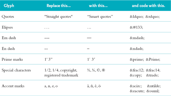
Typesetter’s Punctuation.
If you’re still typing ellipses as “period space period space period space,” you’re doing it wrong. Among those 265 characters are punctuation marks specifically drawn and spaced to match the rest of the glyphs in the font. If you know where to look, you’ll also find a variety of specific punctuation glyphs you may not know exist, even though such glyphs are routinely necessary to produce professional-grade type.

Amazing OpenType.
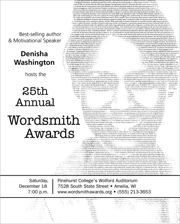
This ad makes full use of swash alternates and old style figures in the copy at bottom.
For example, you need smart quotes (curly quotes) for quotations. You need the straight version of quote marks called prime marks for notating inches and feet without writing out the words “inches” and “feet.”
While you need the hyphen to create compound words, you need en dashes (historically the width of a lowercase n) for punctuating such things as the implied “to” in “3–4 weeks.” Then you’ll need the slightly wider em dash—historically the width of a lowercase m—for dashes used to replace commas, colons and parentheses—when you’re trying to be slightly more emphatic.
Typesetter’s punctuation is available for websites, too. Some Web coding software provides palettes or menus that allow you to access and insert the character of choice. Punctuation can also be inserted manually by plugging the proper HTML code in the right location.
A Liga-What?
Confused about the difference between swash alternates and ligatures? Let us explain.

Swash alternates are different versions of individual glyphs in a typeface. The first letter in the pairing is the standard italic glyph. The second is the swash alternate.

Ligatures are decorative replacements for common glyph pairs. They address troublesome pairings like “f” and “i” in which the terminal of the “f” bumps into the dot on the “i.” Some classic ligatures are shown here. Note the solution to the “f” and “i” collision.
If you don’t think the proper symbols look better than type kluges, we’ll give you your money back. Okay, not really. But do check out what proper punctuation looks like and figure out how to use it. Because what you don’t know about type can hurt you.
OpenType for Print Design.
OpenType fonts go well beyond the standard 265 characters. Designed to be functional across platforms to work on both Macs and PCs, these fonts may have as many as 65,000 characters. In addition to all the traditional punctuation marks and accent marks, OpenType fonts offer some or all of the following type options:
Ligatures. Ligatures are specially designed letter pairs—a single glyph meant to take the place of two traditional letters. Ligatures were created for certain letter pairs that join awkwardly because of the position of the dot of the “i” or hook of the “f,” for example.
Swash alternates. These are just what they sound like: decorative alternatives to traditional italic letterforms. While swash alternates don’t work well for body copy, they can be beautiful when used in large decorative headlines, as initial caps or in pull quotes.
Old style figures. Ever notice that normal numbers often look too big and clunky when typed in with the normal flow of text? That’s because the height of regular numerals is the same as uppercase letters. Regular numerals have the visual feel of all caps. An alternative is to use old style figures. Old style figures have varying x-heights, ascenders and descenders just like the rest of the letters in a font. Visually, they blend in much better with text.
Dingbats. If you’ve ever seen a decorative ornament to indicate that you’ve reached the end of the narrative, you’ve seen a dingbat. They look like little tiny pictures, but they really are font characters. Many fonts have a few as part of the 265-character set. Typically, OpenType fonts have more of them. Then there are fonts made up of nothing but dingbats.
Because they are technically font characters, you can style dingbats as you would fonts. You can change their size, color and orientation. They also can function as bullets, although, as always, use some discipline. Not all dingbats make good bullets.
Paired with letterforms, dingbats can be logos. Strings of them can become section breaks or borders. Or they can stand alone as artwork.
Still think type is boring? Neither do we. It is perhaps the most important tool in your visual communication toolbox. Use it. Don’t abuse it.

Have you seen me? Dingbats look like little tiny pictures, but they really are font characters. Each of these dingbats has been used somewhere in this book. Can you find them? How are they used? Are you getting creatively inspired yet?
► Try This
1. Start a “swipe file” of neat typography and typesetting techniques. Look for anything with interesting type: logos; headline styles from magazines, newspapers and websites; sidebars and infographics; bulleted lists; opening slides from video clips; or interesting product packaging. Look for dingbats, ligatures, swash alternates and other uses of extended character sets, too.
Assemble your examples in a scrapbook. Annotate your examples with notes on why you like them and why they work. Categorize your selections by style: corporate, kid-friendly, grunge, romantic, extreme, etc.
2. Go to the candy aisle at your grocery store. Look for packages of the following types of candy: Gummy bears, traditional stick chewing gum, a milk chocolate bar, a chocolate bar with additional ingredients such as nuts or caramel and an expensive bar of dark chocolate. Look at the font choices on each package.
What categories of fonts does your candy-wrapper collection exhibit? Are the font choices appropriate for the target audience? Explain. Design a candy wrapper for your own favorite candy. Write rationales for your choices.
3. Design a type-only logo for yourself. Use your logo to create your own set of custom business cards and letterhead. Or use your logo as the basis for a new resume design.
4. Create your one-color typographic self-portrait. Using only glyphs (including numerals and punctuation but not dingbats) create a close-up mug shot of yourself. Size contrast will be important. Direction, in the literal sense of turning glyphs topsy-turvy, also will be important. Otherwise, the rules go out the window since you’re not using type to convey narrative information.
5. Research a famous font artist. Write a short history (a paragraph or two) and create a one-page layout using your history as the content. Use only fonts designed by your artist, and use only type in your design. No photos or illustrations allowed.
6. Create a vertically folding restaurant menu with a flat size at 8.5 inches wide by 11 inches high folded to a finished size of 4.25 inches by 11 inches. You’ll need to design a cover and a two-page inside spread. A design for the back cover is optional. Begin with some menu copywriting.
Use typography to convey the kind of restaurant (casual Thai or upscale French, for instance). Create a visual hierarchy and a sense of visual order, too.
Demonstrate appropriate punctuation marks, paragraph indicators, bulleted lists and hanging indents, tabs and tab leaders, and whatever else is appropriate to your design.
OpenType is either a registered trademark or trademark of Microsoft Corporation in the United States and/or other countries.
What you Need to know About Logo Design
Professional designers make logo design look easy. Some of the most powerful recognizable logos in the world are pictures of simplicity. The elegant appearance of these marks belies the fact that most logos require hundreds of hours of brainstorming, sketching, rendering, rejecting and approving before they are launched. The stakes are high. One tiny little picture, or word and picture combination, must encompass the philosophy, activity, spirit and brand promise of an organization. This is why logo design is best left to professionals.
That said, you will have to work with logos in some form. Maybe you’ve hired a designer to create a logo for a new product launch. Or perhaps you need something simple for internal purposes, and you just don’t have the budget to hire a designer. Whether you need to evaluate logos provided by a designer or you need to design something yourself, here are a few things you should know:

The incredible shrinking logo. Your logo may be used on a billboard. It also may be used on a business card. And it must look crisp in both places. Logos must be rendered as vector graphics to allow for scalability.
Logos should be unique to the subject/product/organization. Avoid anything too generic. If the design in question easily could represent another organization with the same name and a different mission, then go back to the drawing board.
Logos must be scalable. The design needs to be as clear and readable at the size of a postage stamp as it is at the size of an outdoor board. Avoid fine lines and details that disappear when a logo is reduced in size. If a logo uses more than one font, make sure both fonts are readable even when the logo is small.
The only scalable file format is vector so make sure you get vector versions of the finished logo. Vector filenames often end with the. eps extension. Photos are bitmap images and can’t be scaled without loss of resolution. Never use a photo in a logo because photos lose resolution when scaled.
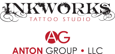
Choose your font pairings carefully. Shrinking the Inkworks logo could cause the smaller “Tattoo Studio” subheading to be illegible. The fonts in the Anton Group logo are more uniform and will maintain legibility even at small sizes.
Inkworks logo inspired by the Inked God font by Gyom Séguin.
Simplicity is a virtue. What you want in a logo design is versatility. The highly complex illustrated logo may look great on the large sign outside, but what if you want to embroider the logo on polo shirts? Commercial embroidery companies will have a difficult time rendering your logo if it has too many details or fine elements, including serifs on fonts. If you must have a complex logo, make sure you have a simplified version as well.
Limit the number of colors. Simplicity also applies to the logo’s color. The more colors a logo uses, the higher the printing costs. A good economical approach is to use two spot colors, often black plus another color. Spot colors are pre-established printing ink colors. Choosing a spot color is similar to choosing a paint color from swatches at a home improvement store. Because spot colors come “out of the can,” they are consistent. This is important if you’re trying to build consistent visual branding.
Make sure the logo is reproducible in black only. Sometimes printing in color is not an option for budgetary or technical reasons. A logo must look clear and crisp printed anywhere. So it needs a black and white version. Black means black, too, not gray.
Make sure you can “reverse out” your logo. Reversing out is the design term for a logo appearing in white on colored or photographic backgrounds. Again, this is a flexibility issue. The logo needs to be clear and readable in all possible places it might appear. Hint: If the logo works in all black, it will reverse easily.
Be wary of designs that are too horizontal or too vertical. Such designs can be difficult to incorporate into layouts. If you’re considering a design that is strongly horizontal, consider asking the designer to provide an alternate vertical version. This ensures that you have a good logo shape for any compositional situation.

Simplicity rules.
These logos use one or two colors, readable fonts and simple shapes.
Logos: Epic Fail

Clip art and the Comic Sans typeface are never a good idea.

Poor contrast and an over-used font (Zapfino) make this logo a failure. The font stroke limits legibility and gradients cause printing problems.

Pretty, but this logo can’t be reduced, reversed or rendered in black-only without losing character.
If you must design a logo on your own:
First, purchase and learn to use a vector graphic program. Seriously. Logos need to be in vector format in order to be scalable.
If we still haven’t convinced you to hire a logo designer:
Consider a type-only logo.
Sometimes called a wordmark, type-only logos are perhaps a bit easier for beginning designers to manage. But only if you have the eye to classify and pair fonts. If you choose to use more than one font in your wordmark, make sure they contrast well but look good together. Think romance: “They make such an attractive couple.”

Type-based logos like this one are a good starting point for beginning logo designers.
Avoid using the font-du-jour. A few fonts get done to death each decade. Some fonts were so over-used they’ve become synonymous with time periods. Some recent grossly overused fonts include Mistral, Papyrus, Copperplate Gothic and Zapfino.
If the font came installed on your computer, don’t use it in a logo. Buy something new. Or download something new for free (but beware of copyright issues on free fonts). Or commission a font artist to create something new just for you.
No clip art. If you must add a graphic (often called an icon or symbol), consider a decorative dingbat or type ornament. But use care in your selection. A smiley face dingbat is no better than smiley face clip art.
Add a simple shape. If you’re really feeling brave, consider adding a simple shape to your logo, such as a square, circle or rule. Pairing simple shapes with interesting glyphs can result in creative icons. For inspiration and guidance, revisit mini art school and the Gestalt Laws.
Test it out. Try the design out in different layout such as a Web page or a newsletter to see how the logo looks in context. You may find that what looks good standing alone on a presentation board doesn’t hold up so well sitting atop a busy photo on your brochure cover.
Turn fonts to graphics. Once you’ve settled on a good design, turn all fonts to graphics by using your vector program’s “outline fonts” function. This prevents your logo font from getting accidentally replaced by something ugly, like Courier, when you send your logo to others for use.