7. add a chart
Excel includes a powerful and flexible charting feature that enables you to create charts based on worksheet information. Its chart formatting commands and options make it easy to create charts to your specifications. Best of all, if any of the data in a source worksheet changes, the chart automatically changes accordingly.
In Excel, charts can be inserted into a workbook file in two ways:
• A chart sheet, as discussed in Chapter 2 and shown below, displays a chart on a separate workbook sheet.
• An embedded chart is a chart that is added as a graphic object to a worksheet.
In this chapter, we’ll create a pie chart of actual expenses for the quarter as a separate sheet within our Budget workbook file.

hide a row
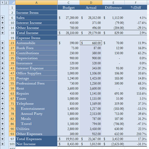
Our chart will include all expense categories from the Quarter 1 file. Before we select the information to chart, however, we’ll hide the row labeled Travel & Entertainment, which has no values, so it does not appear in the chart.
1. Click the Quarter 1 sheet tab to activate that sheet.
![]()
2. Click on the row heading number for row 72 to select it.
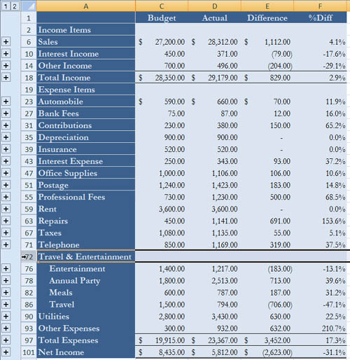
The row disappears.
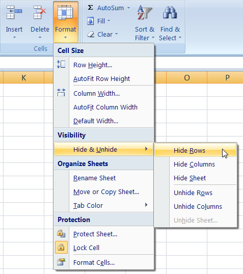
3. Choose Hide Rows from the Hide & Unhide submenu under the Format menu in the Cells group of the Ribbon’s Home tab.
insert a chart
The first step in creating a chart is to select the information you want to include in the chart. This includes both values and corresponding labels. Then choose an option to insert the type of chart you want.
1. Select cells A23 to A93 and cells D23 to D93. Remember, you must hold down the Control key to select multiple ranges.
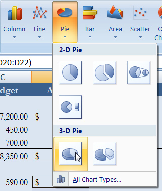
2. Click the Insert tab on the Ribbon.
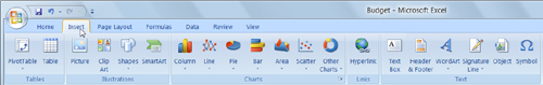
3. Choose the first 3-D Pie option from the Pie button in the Chart group.
create a chart sheet
To create a chart sheet, you must move an existing chart to its own sheet.
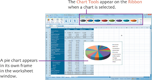
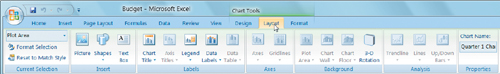
1. Click anywhere inside the chart to select the chart and display the Chart Tools on the Ribbon (as shown on the previous page).
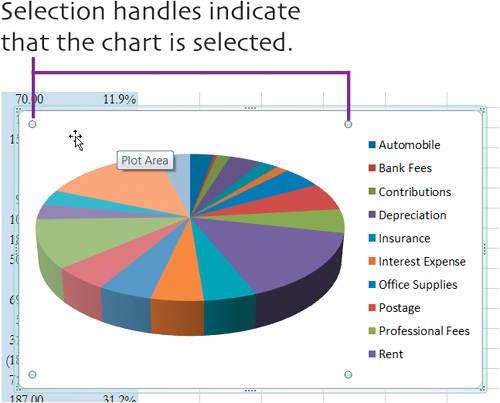
2. Click the Move Chart button in the Location group on the Design tab.
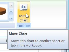
The Move Chart dialog appears.
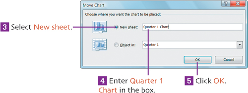
The chart is moved to its own sheet in the workbook.
Save your work.
Click the Save button on the Quick Access toolbar to save your work up to this point.

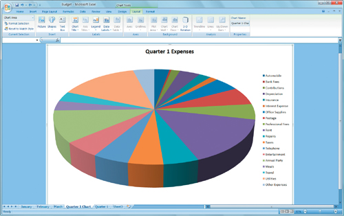
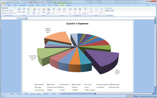
add a chart title
Although the chart sheet has a name, it doesn’t have a title that will appear on the sheet. Let’s add one.
1. If necessary, click anywhere in the chart sheet to select it and display the Chart Tools on the Ribbon.
2. Click the Layout tab on the Ribbon.
3. Choose Above Chart from the Chart Title menu in the Labels group of the Ribbon’s Layout tab.
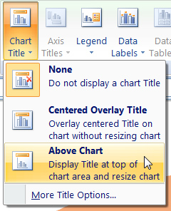
The words Chart Title appear in a selected box at the top of the chart sheet.
4. Double-click to select the text in the box.
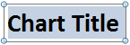
5. Type Quarter 1 Expenses.
6. Click anywhere else in the chart sheet to accept the text you typed and deselect the title box.
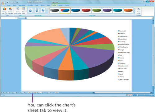
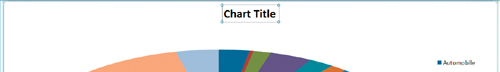
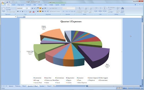
The chart sheet should look like this when you’re done:
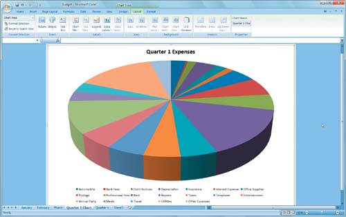
move the legend
To give the chart sheet a more symetrical appearance, let’s move the legend to the bottom of the chart.
1. If necessary, select the chart to display the Chart Tools on the Ribbon, then click the Layout tab.
2. Choose Show Legend at Bottom from the Legend menu in the Labels group of the Ribbon’s Layout tab.
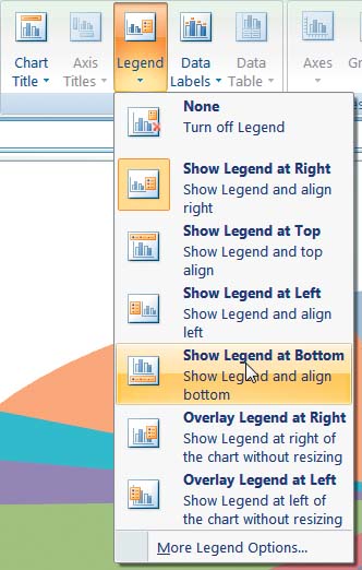
The legend shifts so it appears at the bottom of the chart.
explode a pie
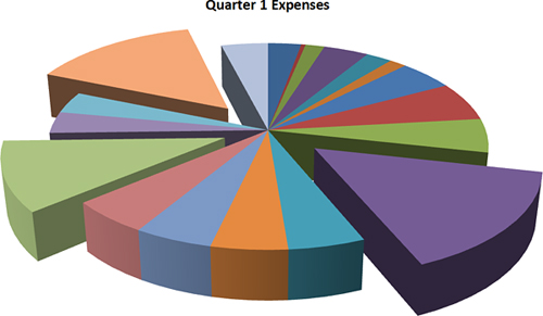
You can make one or more pieces of a pie chart really stand out by “exploding” them away from the pie. In our example, we’ll emphasize the pie pieces that represent the top three expense items: Rent, Utilities, and Annual Party.
1. Click the piece of pie representing Rent. (You’ll know you have the right one when “Rent” appears in its tooltip.) The entire pie chart becomes selected.
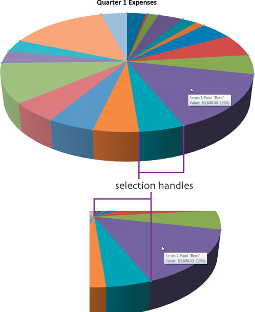
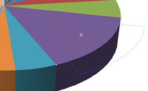
2. Click the pie piece so selection handles appear around it.
3. Drag the piece of pie away from the center of the pie. An outline of the pie moves as you drag.
4. Release the mouse button. The pie is redrawn with the piece you dragged “exploded” away.

5. Repeat steps 2 through 4 for the pie pieces representing Utilities and Annual Party.
When you’re finished, the pie chart should look like this:
add data labels
Data labels provide information about data in a chart. Although this chart includes a color-coded legend, we’ll provide additional information about the three biggest expenses using data labels.
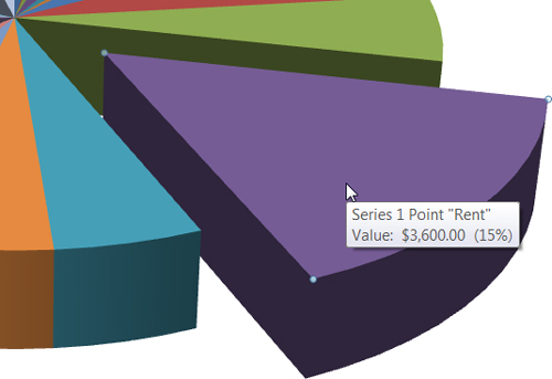
1. Click the pie piece for Rent. If the entire chart becomes selected, click it again so only the Rent piece is selected.
2. If necessary, click the Layout tab on the Ribbon.
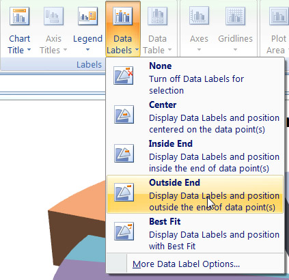
3. Choose Outside End from the Data Labels menu in the Labels group of the Ribbon’s Layout tab.
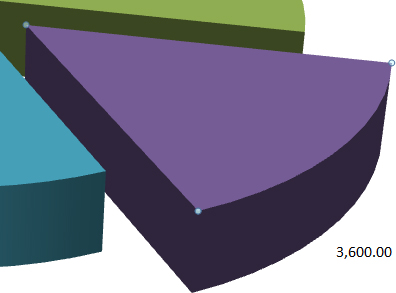
The pie piece value appears at the wide end of the pie piece.
4. Click the data label you created to select it.
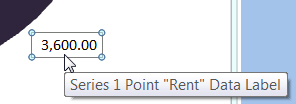
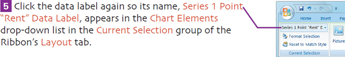
6. Click the Format Selection button in the Current Selection group of the Ribbon’s Layout tab.
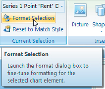
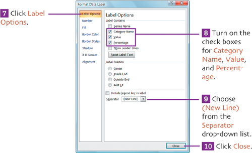
The Format Data Label dialog appears.
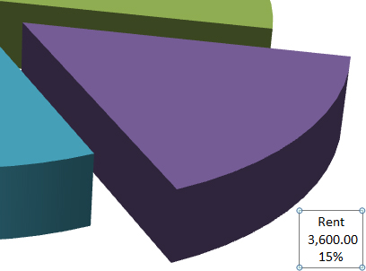
The formatted data label should look like this:
11. Repeat steps 1 through 10 for Utilities and Annual Party.
When you’re finished, the pie chart should look like this:
format chart text
Since the rest of the workbook uses Garamond as its font, let’s change the text in the chart to match it.
1. If necessary, click the Ribbon’s Layout tab to display its options.
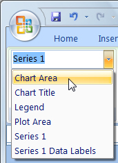
2. Choose Chart Area from the Chart Elements drop-down list in the Current Selection group of the Ribbon’s Layout tab.
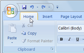
3. Click the Ribbon’s Home tab.
4. Choose Garamond from the Font drop-down list in the Font group.
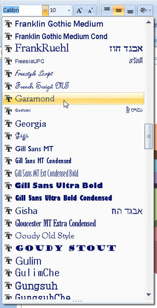
The font of all text characters on the chart change to Garamond.
Save your work.
Click the Save button on the Quick Access toolbar to save your work up to this point.
extra bits
insert a chart p. 87
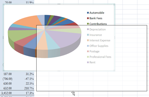
• You can move a chart inserted on a worksheet by dragging its border. As you drag, an outline of the chart moves (see below). When you release the mouse button, the chart moves.
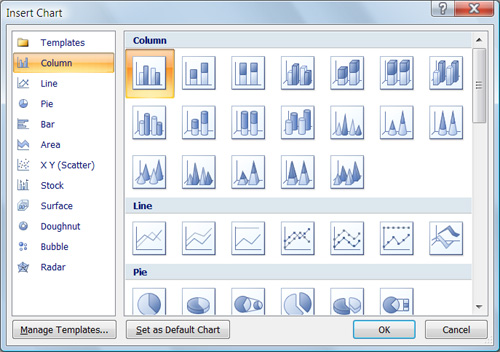
• Choosing All Chart Types from the Pie menu in the Charts group dislays the Insert Chart dialog, which you can use to insert any type of chart.
add a chart title p. 90–91
• You can move a chart title by selecting it and dragging its border. When you release the mouse button, it appears in the new position.
move the legend p. 92
• The position of a chart’s legend will impact the size of the chart. You can see this for yourself by trying different Legend options.
explode a pie pp. 93–94
• Exploding a pie may make the pie smaller. The farther out you drag a piece of pie, the smaller the pie may become.
add data labels pp. 95–97
• If you wanted data labels to appear for all pieces of the pie, select the entire pie (rather than just one piece) in step 1. Then, when setting options, make sure Series 1 appears in the Chart Element drop-down list in step
• You can move a data label by selecting it and dragging its border. When you release the mouse button, it appears in the new position.
format chart text p. 98
• To format just some of the text in a chart, select the text you want to format and apply formatting with the Home tab’s Font group commands.