Chapter 1. Typography, Layout & Design
It All Starts with Words on a Page

SLIDE LAYOUT— 5 DO’S & 5 DON’TS 12


SELECTING AND INSTALLING FONTS 17

REPLACING FONTS GLOBALLY AND LOCALLY 20

ORGANIZING INFORMATION FOR CLARITY 23


ADDING AND CUSTOMIZING SHADOWS 29

USING BULLET POINTS EFFECTIVELY 31


SPELL CHECK AND SPECIAL CHARACTERS 34


ELNUR AMIKISHIYEV/ISTOCKPHOTO
What’s in a Theme?
When is the Font Comic Sans Appropriate?

Clarity is Key
It Looks Cool, but I Can’t Read It.

OLEG PRIKHODKO/ISTOCKPHOTO
Slide Layout—5 Do’s & 5 Don’ts
When used properly, every tool can achieve the desired result. When used improperly, a tool can create a very undesirable effect. A hammer is a great tool for installing a new roof on your house. That same hammer might have an undesirable effect if your dentist used it to install your next filling. Don’t hammer your audience with bad slides.
Do—Keep it Simple
Simple slides will help guide your audience to your desired outcome. Think of the slides like road signs on an unfamiliar highway. Their message should be brief. Your audience is running at 75 miles per hour; their minds should not be cluttered up with several images competing for attention. Next time you are on a highway, peek at the billboards. Which ones are the most effective?

Do—Stay Consistent
Consistency will allow your audience to focus on your content and not what font you decide to use next or where in the rainbow your next background color will fall. Font colors, sizes, weights, and styles should remain consistent throughout your presentation. A color palette should be decided upon and adhered to. Remember our road sign analogy. What if every road sign you passed in an unfamiliar city had a different font, color, and layout. How quickly would you be able to identify where your next turn should be? To see at a glance how consistent your presentation is, view it in Slide Sorter view.
Do—Build Your Presentation for Your Audience
If you are planning on building a presentation that is meant to stand alone without a presenter, your text and imagery must be able to act as a self-guided tour. Remember, PowerPoint is a tool that works best when kept simple and brief. If you want to pass along a detailed report for your audience, then use a page layout program and create handouts. If you plan on being there to present the information, think of yourself as the anchor on the evening news. You are delivering the story, and the slides are behind you to help reinforce your key points.

Do—Keep Bullet Points Short and Clear
Most people will zone out or get distracted during a presentation. Make sure that if they do, they can glance at your bullet points and understand where you are going. In just a few words you should attempt to make a clear, complete thought. Random buzzwords are great for conference room chatter; however, they will not make your audience understand the point you are trying to make.

Do—Use Beautiful High Quality Images
Junky, poorly lit, out-of-focus, discolored, low-resolution images say one thing to your audience: you’re not worth my fine china. Here is a paper plate. Enjoy. Large, beautiful, and powerful images are the ones that command attention. Think of a gallery exhibition of fine photography. How would you react if you walked along a long white wall of perfectly mounted photographs and halfway through you saw a photocopy of an image that once appeared in a newspaper tacked up?

Don’t—Use Too Many Elements on a Slide
Break down complex ideas to their simplest forms. Charts with gobs of icons and arrows pointing in all different directions will confuse your audience. Paragraphs of text will tempt people to read a slide while you are trying to engage them. If it is absolutely necessary to have a large amount of content, break it up among several slides, keeping each slide clean and simple so it’s easy to follow.
Less Is More. Shorter slides with less material are easier for an audience to understand. In advertising, the use of white space (empty area around the text and images) is a classic technique employed to improve comprehension and retention.
Don’t—Build a Presentation Based on Bullets
Presentations that consist of slide after slide, each with a series of bullets, will bore your audience into complacency. Use bullet slides sparingly, broken up with large beautiful images—or wake up your audience with a slide that contains nothing but a clear concise statement, in HUGE type.

Don’t—Place Images Randomly
There are many ways to lay out a presentation. We’ve seen highly effective presentations that use words very sparingly and center all text and images on a simple white background. We’ve also seen well-laid-out presentations where images are placed based on a grid system. Either way the audience comes to expect images to be in a certain area. This expectation allows them to focus on your content and message more clearly.

Don’t—Use Slides Presented on Screen as a Handout
If you prepare your slides so they will also function as a handout, then you probably have too much information on them. If you need to cover important points, you can either build your presentation with detailed speaking notes for each slide (or series of slides) or create a similarly branded handout in a page layout program to be distributed at the closing of your presentation.
Don’t—Overdo Word Art
Try to keep type as clean and readable as possible. There are tons of possibilities for making type look cool and funky. Make sure that when you step back from your screen, the type that you just jazzed up doesn’t get lost in the background or get so jumbled up with depth and shadows that it’s difficult to read. ![]()

Using PowerPoint Themes
Using PowerPoint Themes can give you a jumpstart on a great presentation. You can modify an existing theme to differentiate your presentation from any others or create a new custom presentation. The good news is there is a wealth of resources to help you find all the elements you’ll need.

What Makes a Good Theme?
The two things that you should look for in a theme are simplicity and versatility. The simpler your theme, the less distracting it will be from your content and message. Also, look for theme colors that are harmonious with each other. The great thing about PowerPoint Themes is that if you love the look of a theme but the color of the fonts and accents are not exactly what you want, you can change them.
How to Start
Do you have existing corporate colors? Do you have a team logo or school mascot that you would like your presentation to complement? Is your presentation to physicians or engineers—sports enthusiasts or recording artists? Is your audience very familiar with your Web site? These are some of the questions to ask yourself before you set out on a theme quest. Existing branding can determine which colors and designs you choose. Knowing your audience can also help you determine what colors and designs are appropriate.
Where to Look
Start right within PowerPoint. Once you have your basic slide outline put together, make sure that you are in the Normal Slide view and click the Design Tab in your Ribbon. You’ll see several thumbnails in the Theme group. Roll over some of the thumbnails with your mouse and watch your slides integrate into each theme before your eyes. Make sure to allow your computer’s processor to catch up to your rollovers. If you see a layout that fits your audience and message, click it.
Taking the Search Online
In the Theme group, click the more arrow in the scroll bar next to the theme thumbnails A. You can search on Microsoft’s online library by selecting the More Themes on Microsoft Office Online button B. This will open up your browser and allow you to search for themes (or templates that you can save as themes) by keyword and category.
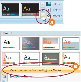
Use Internet Explorer to Search. The advantage to using Microsoft’s own Internet Explorer is that when you find the template or theme of your dreams, it will automatically be installed correctly into the appropriate Office application you are working with.
Modifying to Match Your Style
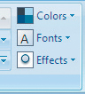
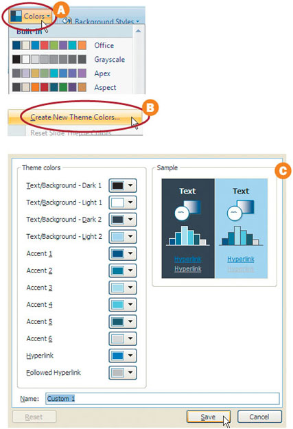
Under the Design tab in the Ribbon, click the Colors drop-down menu under the Themes Group A. Roll over some of the color swatch groups and monitor how these colors change the look of your slide theme. Select a color palette that is close to your desired colors. If the colors are close but not exactly what you want, then click the Create New Theme Colors button under the Colors drop-down menu B. This will open up a window that will allow you to modify the colors to your liking, and give you visual feedback in the sample area on the right C. ![]()
Selecting and Installing Fonts
When building a presentation, chances are you randomly select a font. You’ll pick one from the list, and then eventually try another. If you truly understand the characteristics of fonts, then you can make better decisions about which font to use. Picking the “right” font is a combination of several factors. You’ll need to weigh issues such as readability with others like aesthetics and style. Additionally, you’ll have to keep in mind the availability of the fonts and whether they support all of the characters you need in your presentation.
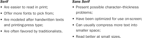
Serif Versus Sans Serif
With fonts there are two major distinctions: serif and sans serif. Serif fonts (such as Times, Garamond, and New York) are generally easier for your audience to read. They have small strokes at the end of the larger strokes. The alternative is sans-serif fonts (such as Gill Sans, Helvetica, and Arial). They have a cleaner style and generally use even-weighted lines.

X-Height
One of the most defining characteristics of a font is its x-height (the distance from the top of a lowercase x to the bottom). The x is a clean letter, which is easy to discern, and it does a lot to describe the character of a font. The visual distinctiveness of a font is judged by its x-height and also the height of its ascenders (the letters l and t) and descenders (y and p), both which grow from the center of the space occupied by the letter.

Learn More about Type. Want to learn more about type? Check out Microsoft’s typography area on its Web site at www.microsoft.com/typography.
Font Weight
A truly useful font will have multiple weights. A font generally has a book (or Roman) weight. A font family may also contain Light, Medium, Bold, Black, Italic, and more alternates. These alternate weights are useful as they provide more design options without mixing fonts.

Keep It in the family. Staying with a font family is often a good idea when creating a cohesive look. Try to find a font that contains several weight variations to give you design flexibility.
On-Screen Appearance
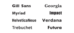
First and foremost, you are designing your presentation to be viewed on-screen. You’ll want to test out fonts to see how they look on your computer display. If the fonts are too busy or have too many elaborate serifs, you may want to make them inactive or remove them from your computer. Most modern fonts look very good on-screen; these include Gill Sans, Georgia, Myriad, Impact, Helvetica Neue, Verdana, Trebuchet, and Futura.
Style
Ask yourself, what is the presentation all about? Draw up a list of 10–20 adjectives that describe your presentation or subject matter. Use these words to help select fonts. You can use a more distinctive display font for the title pages, but you should select a cleaner body font for the bullets and secondary text.

Finding Fonts Online
There are lots of font Web sites out there to choose from. Here are a few places to get fonts for use in your presentation. These are where we personally shop for new fonts.
• www.chank.com (free and for sale)
• www.fonthead.com (free and for sale)
• www.myfonts.com (for sale)
• www.t26.com (for sale)
• www.adobe.com/type/index.html (for sale)
• www.girlswhowearglasses.com (free)
What the Font? If you are trying to match a font (say to a logo or a magazine ad) you could be guessing for a long time. Or, you could harness the power of the Web. Check out the Web site www.whatthefont.com, which allows you to load a sample graphic that is then analyzed against a large database of fonts to find a match.
Installing Your Selected Font
Once you find a font that you want to install, you’ll need activate the font. If you are using a font manager, skip ahead to the next section. Otherwise, you can activate a font using the following steps. Make sure that the fonts you need are copied to your local computer.
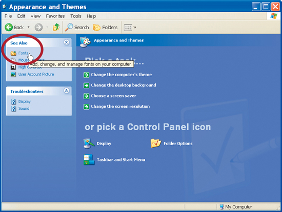
1. From the Start menu, choose Control Panel, then select the Appearance and Themes category.
2. In the See Also panel (in the upper left corner), choose Fonts.
3. From the File menu, select Install New Font.
4. In the navigation box, select the drive, then folder that contains the fonts you want to load. Select the fonts you want and click OK.
How Many Fonts to Load
When we look at most peoples’ computers, we are amazed at how many fonts they have active on their systems. While most of our computers have 3,000 or more fonts loaded on the hard drive, we rarely keep more than 75 active at any time. If you have hundreds (or even thousands) of fonts loaded, you’ll have an unmanageable mess. A better idea is to keep your fonts organized with a font manager.
Want to practice? You’ll find some free fonts in the Chapter 1 folder on the CD-ROM that you can install.
Be sure to check out one of these tools:
• Extensis Suitcase for Windows—www.extensis.com
• MainType—www.high-logic.com
• Font Wrangler—www.mindworkshop.com![]()
Replacing Fonts Globally and Locally
Making Font Changes Is Simple When Your Entire Presentation Is Built on a Theme

1. Prepare Your Files
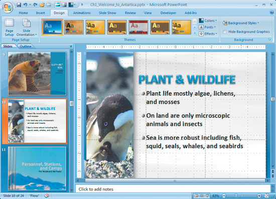
In order to complete this exercise (and others in this chapter) you’ll need to copy the files to your local computer. From the project CD-ROM, open the HTW Project Files folder and copy the Chapter 1 folder to your local hard drive. This folder contains all of the files needed for this chapter. Open the file Ch1_Welcome_to_Antarctica.pptx and switch to slide 4.
2. Master Your Fonts
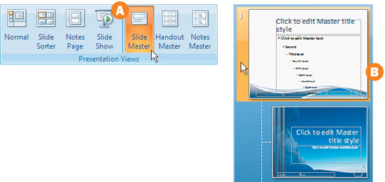
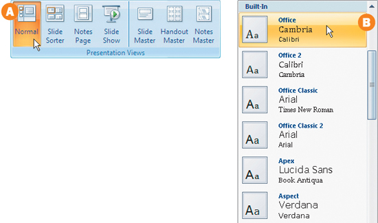
Under the View Tab in the Ribbon, click the Slide Master button in the Presentation Views group A. Then click the first slide in the thumbnail view on the left-hand side of your window B.
In the main presentation window, select the title or bullet point that you would like to modify. Hover your cursor over the selected text and slowly roll above it. A small editing toolbar will appear that will allow you to modify the selected text’s font.
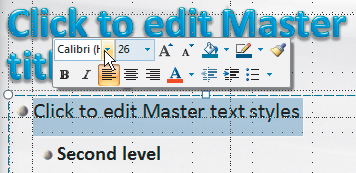
4. Modify Text
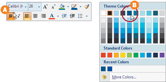
Within the mini-toolbar you can modify the font, color, size, level of indentation, and more. Make the font bold by clicking the B button A. This modification will make a global change on all of the slides using the bullet level that you modified. Also, you can change the font to a dark blue color in the theme B.
5. Global Quick Change
Go to the View tab in the Ribbon and then select the Normal button in the Presentation Views group A. Once normal mode has been selected, click the Design tab in the Ribbon. Click the Fonts drop-down menu in the Themes group. Roll over each group to see a live preview in your main slide view B. Select the theme called Office. Click each slide thumbnail to see how this global font theme has affected the overall look of your presentation.
Undesired Ragging. When you globally change your fonts, your lines of text may break in unexpected ways due to subtle differences in font properties so check them carefully.
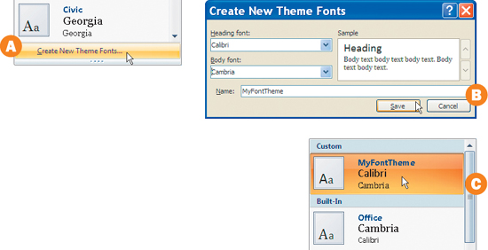
If your organization has a style guide that specifies a headline font and a body copy font for presentations, you can create your own theme fonts. With the fonts drop-down menu open in the Themes group, select the Create New Theme Fonts button A. A new window will open that will allow you to select a main Heading font as well as a main Body font. Select a font from each drop-down menu. In the Name field rename your font theme MyFontTheme and select save B. Next, click the Fonts drop-down menu in the Themes group. Your new font theme is available for all future presentations C.
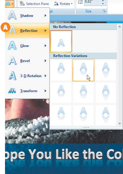
7. Local Font Change
Click the slide 3 thumbnail in your presentation. Click the text on the bottom of the slide. Next, click in front of the first letter and drag to the right to select all of the letters in the text box. With the text selected, click the Format tab beneath the Drawing Tools tab in the Ribbon. Click the Text Effects button in the Word Art Group. Select one of the Reflection presets from the drop-down menu A. ![]()
When It’s OK to be Inconsistent. Every once in a while there is a need to add special emphasis to a word or phrase. As long as you use special fonts very sparingly, they will add emphasis when appropriate.
Organizing Information for Clarity
The main goal for just about every presentation is to supply information to an audience in a way that is easily understood. The other goal is to motivate an audience to take some sort of action. To achieve both of these goals, you must constantly take a step back and ask yourself, “Am I presenting this information in its clearest and simplest form?”
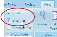
What and Where Is the Grid?
Print designers are trained to build layouts based on a grid. You can use these same principles when laying out your PowerPoint slides. Under the View tab in the Ribbon in the Show/Hide group are two check boxes called Ruler and Gridlines. When both boxes are checked, you’ll be able to see a series of lines that will help you position elements accurately on your slides and slide masters.
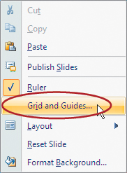
Modifying the Grid and Guides
Right-click anywhere in your main slide viewing window and a menu will appear. Click the Grid and Guides button. This will open up a dialog box that will allow you to modify the grid and drawing guides that you can create to help layout your slides.
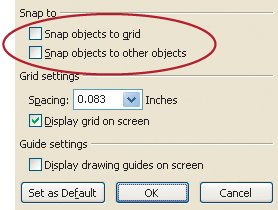
Snapping and Grid Settings
In the Snap to group, the Snap objects to grid and Snap objects to other objects check boxes will cause items to align precisely to the grid lines that appear on your slide, or to other objects that are adjacent to the object you are moving. The Grid settings drop-down menu will allow you to select from default grid spacing or type in your own custom spacing parameters. Display grid on screen will allow you to position items precisely during the creation of your presentation, but will not be visible in presentation mode.
Drawing Guides
You’ll notice that in addition to the grid you can see two lines that intersect at the center of your slide. Those are your drawing guides. You can modify these by clicking and dragging them. To add additional drawing guides, Control click on an existing guide and drag it to your desired position. In the sample presentation we have added two additional guides to help with layout.
Don’t See Your Guides? If you can’t see guides, right-click on a slide and choose grid and guides. you can then check the box next to display drawing guides on screen.
The Rule of Thirds
Directors, designers, and photographers compose their work based on a simple grid that is split into thirds at all times. In fact, many cameras have this same grid build right into their viewfinder to aid in composition. When composing a slide or selecting photography for a slide, it is usually pleasing to the eye to have a dominant feature of the photo, illustration or text fall on or near a gridline.

Drawing a Grid of Thirds
You can quickly divide your layout into thirds by moving the Drawing Guides that we discussed earlier. Make sure that your drawing guides are visible by right-clicking in your main slide window and selecting the Display drawing guides on-screen checkbox in your Grid and Guides window. Then drag the vertical guide to the left to about the 1.66″ mark. Don’t worry if it is not exactly at that point. Create a new line by Control dragging the vertical line to the right to the 1.66″ point on the right side of the slide. Repeat this process to create two horizontal lines that are on the 1.25″ point on the top and bottom of your slide.
Using the Grid of Thirds
The grid is there for you as a guide. You’ll run into situations where you’ll need to deviate from the grid in order to accommodate certain slide elements. However, when you are trying to decide where to place an image or text, the grid will lead you in the right direction. Keep in mind that you don’t always have to have the edge of a photo on a gridline. If you are using a large photo or a full-screen photo, use the grid to position the most dominant element or the image itself.

Using the Grid of Thirds for Text Placement
Use the gridlines to help you decide where to position text or to align a series of bullets on a page A. You can also use this grid to place short blocks of text on a full-screen photo B. The Rule of Thirds is not absolute, but in most cases it can really help a design.
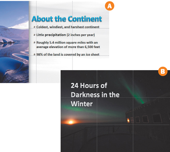
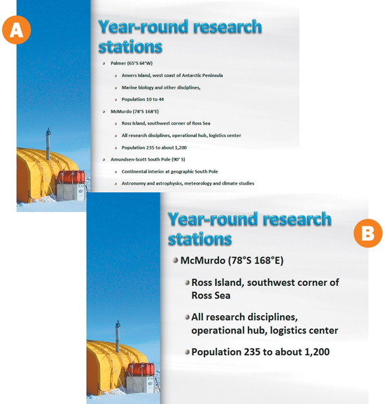
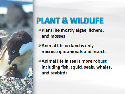
Using Color and Shape to Define Key Points
Within your theme, you’ll have a color palette. You can use this color palette to decide which colors to use to help define key points. In this example there were originally three text bullet points to explain the summer temperature of three different research stations. By using SmartArt (located in the Illustrations Group under the Insert tab) you can illustrate bullet points in a clearer, more visual manner. We’ll talk more about SmartArt in Chapter 2.

Adding Impact to Statistical Information
Statistical information tends to be dry and forgettable. Using a high-impact photo or illustration that supports your statistic will make the numbers and statements more meaningful and memorable A. Many times it will be difficult to find the perfect photo to support your statistic. In cases like this a simple chart with type set very large can have a great impact on your audience B. ![]()

Improving Readability
Living and working in the Washington, D.C., area has allowed us to enjoy countless presentations that include the colors red, white, and blue. Those colors can work if used correctly, or they can embody a cardinal sin in readability. Color is just one parameter that can affect readability. Text size, contrast, texture, kerning, and leading can also affect your audience’s ability to read your content.
Good Colors Gone Bad
While we’re quite fond of red, white, and blue, these colors will “vibrate” when placed on top of one another. High color contrast is important when deciding on text and background colors. Your goal is to achieve instant recognition of your message. If the colors of your text and background are competing with each other for attention, it will make the text difficult to read. Also notice how a serif typeface set too small is difficult to read.
Image-Based Backgrounds
It has become quite trendy to use a photograph as a background for slides. The key to pulling this off is to remember that there needs to be a high level of contrast between your image or texture and your text. Select a photograph that already has an area that is soft in texture and includes only subtle changes in color. Overlay a semitransparent shape (Insert tab) on your background image. You can adjust the color and transparency by selecting the shape, right-clicking, and then selecting the Format Shape button. Now you can place text on top of your shape. This will provide the contrast that you need to separate your text from the background image.

Texture-Based Backgrounds
If you intend to use a texture of any kind for a slide or shape background, make sure that the color or contrast does not compete with the text or images on your page. If the texture does not add anything to your overall theme or message, consider dropping it or swapping it out for a solid color. Avoid using a logo that’s repeated to form a pattern. It’s incredibly distracting and cheapens your logo.

Spreading Out your Content
When it’s important to have a large amount of text in a presentation, it’s better to spread the text over several slides then to try to cram it all onto one A. Divide your text at the most natural breaking point to prevent the front row from reading ahead and the back row from squinting to see the small font size B.
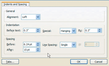
Adjusting Paragraph Spacing
To prevent all of your text or bullets from running together on the page, separate each line and each paragraph individually. You can make these adjustments in your Slide Master view by selecting the first thumbnail on the left side of your view panel and right-clicking in the text box with your bullet hierarchy. Select the Paragraph button and adjust the line spacing so that the space between paragraphs is visually greater than the space between lines.
Alignment
Hands down, the easiest text to read is text aligned to the left. When you have to incorporate several lines, it’s best to stay in the fast lane by aligning your blocks of text to the left and staying consistent with this approach throughout the presentation. However, when using less text and larger typefaces (which is what we hope you’ll be doing anyway), alignment is less of an issue. It’s easy to decipher small bites of texts regardless of what alignment they are formatted in.
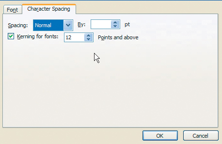
Character Spacing
Sometimes after modifying a font with word art or using faux bold on a font (using the B button in the type toolbar) you’ll notice that the letters look a little too close together. You can modify the character spacing (also known as tracking). Select the type, then choose the Home tab from the Ribbon. Click Character Spacing to choose a new value; positive numbers increase spacing, negative numbers decrease it. This option will also come in handy to expand or contract the letter spacing when you have an unusually ornate or decorative font.
Creating a Hierarchy of Importance
Take a step back and look at your slide. Do the type and graphical elements compete with one another? It’s important to guide your audience visually through your layout by attributing a hierarchy of importance using size, color, and contrast. The eye has a tendency to land on a full-opacity, large image first. Then it goes to the highest contrast, largest typeface, and so on. If a high-contrast headline, phrase, or number is set very large and surrounded by negative space, the eye will have a tendency to begin scanning the page there (even if a large photo or illustration accompanies it).

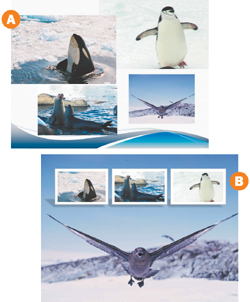
Grouping and Aligning
Avoid at all costs placing items randomly on a slide A. If you have a series of photos (even if they’re different sizes), find a way to align them. You can select all the photos and then within the Arrange group under the Format tab, select the Align button. You can then align the photos consistently with each other as well as distribute them evenly vertically or horizontally B. Refer back to your rule of thirds to help you with placement. ![]()
Adding and Customizing Shadows
Customizing Shadows Can Improve Readability

1. Determine the Need for Shadows
Many objects will benefit from the addition of a drop-shadow. Oftentimes on a slide, you will have text or an object that is placed over a textured background (such as a photo). Because colors in the background may be similar to the color of the overlaying object, readability can become an issue. This is referred to as “type on pattern.” If you have text or logos that do not significantly contrast with the background, the addition of a shadow will help.

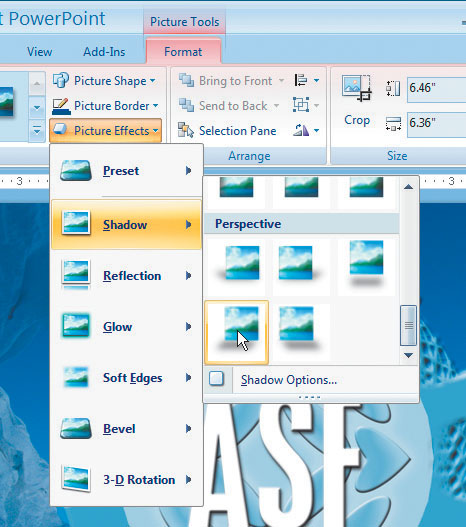
2. Select the Logo
Switch to slide 24 in the presentation and examine the logo. Notice how the blues of the logo are similar to the background? A shadow will help the logo stand out a bit more. Click the ASF logo so it is active.
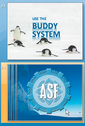
In order to add a shadow, click the Format tab in the Ribbon. Next click Picture Effects in the Picture Style group. Choose “Shadow,” then scroll down to the Perspective group. Select Perspective Diagonal Lower Left to apply a shadow preset. A drop-shadow is added, and the logo now looks like it is casting a shadow on the snow. The effect is good, but can be refined.
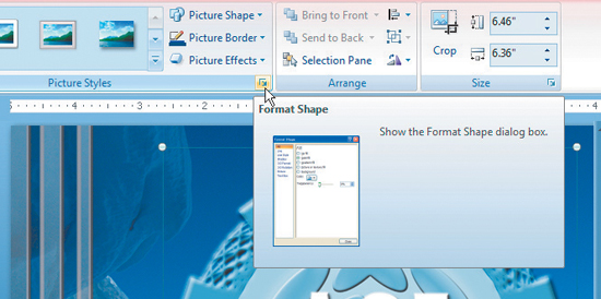
4. Access the Format Shape Dialog Box
The drop-shadow can be further customized by accessing the Format Shape dialog box. The dialog box is somewhat hidden, but offers powerful controls in one window. To access it, click the small box and arrow at the bottom of the Picture Styles group. A new window opens.
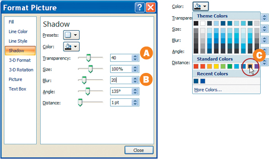
5. Customize the Shadow
In the Format Shape dialog box, click the shadow tab. You can now customize the shadow. Darken the shadow by reducing Transparency to 40 percent A. Soften the shadow by increasing the Blur to 20 pt B. Finally, you should customize the shadow color. Shadows are rarely pure black; rather, they pick up color from the surrounding areas. Click the paint bucket icon and choose Dark Blue from the Standard Colors list C. ![]()
Using Bullet Points Effectively
While bullet points are the staple ingredient of many presentations, they must be used properly. Too many bullet points can bore and confuse your audience (we refer to bullet points as open captions for the thinking impaired). It is important to know when (and when not) to use bullets as well as how to properly balance the use of text on screen. Here are our rules for using bullet points effectively.
When to Use Bullets
A bullet point is a phrase meant to help your audience remember the key points of your presentation. Bullet points should be used as triggers or memory joggers, not as a replacement for your speech. Many presenters feel a need to put too many words on the screen. In fact, they overload their bullet points until they have a line of text for almost every point they make. This approach is often referred to as “death by bullets,” and is one of audiences’ major complaints about presenters. For nearly every presenter, the use of shorter (and fewer) bullet points will benefit their presentation style.
Why is it Called a Bullet Point? The name comes from the resemblance of the typographical mark to the shape of a bullet hole.
What Makes a Good Bullet
Remember, your bullets should be kept short. This means you’ll likely use one to seven words for each bullet. A bullet doesn’t need to be a full sentence, but it should not be a jumbled mess of abbreviations and abrupt phrases. The easiest way to generate a good bullet point is to think like an audience member. Ask yourself, what phrase would you write down after hearing that part of the presentation?

How Many Bullets to Use
It is important to not clutter your slide with too many bullet points. If your slide does include bullets, we recommend using between three and seven bullets per page. There is no law that says you must fit all bullet points on one page. It is more than acceptable to equally divide your bullet points for a topic and spread them across multiple slides. In this case, just keep a consistent title at the top of each slide in the set to help your audience’s comprehension.
Let ’em Breathe. Shorter bullet points should not lead you to pack more words on a slide. Instead, increase the space after each bullet point to put greater separation between individual points.
Design for Readability
It is important to keep your bullets large enough to read. The font size should be smaller than the title on the page (smaller text size denotes order of importance—this is information that supports the title or topic). However, you must keep the bullets large enough to read A. Our advice is to design for the back of the room B. The most important decision-makers usually arrive later (because they are busy), and they sit toward the back of a presentation. Make sure your text is big enough to be easily seen by them.
Test Your Bullets. If you’d like to “try out” a presentation, you can launch your slide show (F5), then step away from your computer. In fact, you’ll want to stand at least 20 feet away and look at the screen. Can you still read your presentation?

Be Consistent
Many presenters deviate from their presentation’s style when creating bullet points. It is important that you establish rules for bullets, so you (or team members) do not drift. Here are common problems to avoid:
• Inconsistent capitalization— Are you using sentence case (where only the first word and proper nouns receive capital letters) or Title Case (where most words are capitalized)?
• Inconsistent punctuation— Are you using periods at the end of each bullet? A
• Improper use of formatting— Are you using bold and italics in your bullets? If so, be sure you use them for the same reasons in all cases B.
• Failure to proofread— As most users rush through creating their bullet points, they tend to make spelling errors. Be sure to proofread to catch both grammar and spelling errors (don’t be overly reliant on the built-in spell checker) C.
When Not to Use Bullets
There are plenty of reasons to not use bullet points on a slide. It is a good idea to challenge yourself regularly to decide if you really need them. For example, is a powerful photo enough? Would a chart better illustrate the data? Can a product sample or demo be used? Would a handout or brochure deliver your message better? There is nothing wrong with bullet points, but it is important to remember that they are only one part of an effective presentation. ![]()

Customizing Bullets
PowerPoint Offers Several Bullets to Choose From
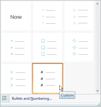
1. Select the Bullets to Modify
You need to select a slide with bullets that need modifying. Select slide 4, which contains a block of text with bullets. Click in the text block to activate it, then press Ctrl+A to select all of the text.
2. Customize the Bullets
Click the Home tab to access text controls. From the Paragraph Group click the arrow next to the Bullets button to choose a different bullet style. You can select from the available list or choose Bullets and Numbering for more options.
![]()
3. Select an Option
You can modify several properties from the dialog box including size and color. Click Picture A to browse available image bullets (checking the box Include content from Office Online gives even more options). You can also click Customize B to pick a different character or symbol from the font. For this presentation, change the bullets to 105 percent C to make them slightly larger, then click OK. ![]()

Spell Check and Special Characters
Text Will Often Need Special Tweaks to Achieve Perfection

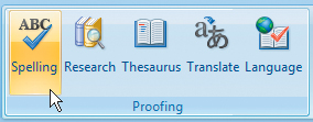
1. Check Spelling for Your Slide Show
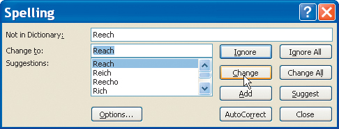
PowerPoint has a built-in spell check that you can run to look for spelling errors. In the Ribbon, click the Review tab. From the Proofing group, click the Spelling button. The Spelling window opens and PowerPoint highlights the first misspelling in the presentation.
2. Fix Errors
We purposely left two spelling errors to illustrate how to correct them. In the Spelling window, the first misspelling is selected. In the context of the sentence, Reech should be Reach. You can select the proper replacement from the Change to: list. Click “Change” to substitute the word and move onto the next. The second misspelling is Tempurature; select the correct replacement from the Change to list and click Change.
Ewe Mite Style Have Eros. Just because the check spelling command says your slides are error free, don’t become overconfident. Computers are not very good at catching grammar and logic errors. Always read through your slides to look for errors (better yet get a colleague to double-check them).
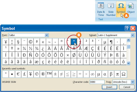
Sometimes you’ll need special characters to communicate meaning. While many letters and popular symbols are on your keyboard, many other are not (such as ¢, ©, ™, ![]() , £, etc.). Fortunately, most characters are accessible through a keyboard map. On slide 17, there is a missing degrees symbol (°). In the Palmer Station text block, click between the 55 and the F. Then select the Insert tab in the Ribbon. From the Text group click Symbol A. Choose the ° symbol B and click Insert, then click Close to add the missing character.
, £, etc.). Fortunately, most characters are accessible through a keyboard map. On slide 17, there is a missing degrees symbol (°). In the Palmer Station text block, click between the 55 and the F. Then select the Insert tab in the Ribbon. From the Text group click Symbol A. Choose the ° symbol B and click Insert, then click Close to add the missing character. ![]()