Yo, we got some Jay-Z up in the house (that’s my sad attempt at trying to sound “street.” Seriously, is there nothing sadder than some 40-something guy trying to sound like he’s 17 because he’s trying to appeal to a demographic with huge amounts of disposable income? That’s exactly why I would never stoop to those tactics. Yo dog, I just ain’t all that)! Anyway, his song “99 Problems” is actually a pretty decent song, even though when I watched the video in Apple’s iTunes, a lot of the words had been blanked out (there were gaps in the vocals—his mouth was moving, but you couldn’t hear what he was saying). For example, at one point he says, “In my rear view mirror is...” and then the next few phrases are blanked out. So, I guess we’re to form our own conclusions about what Jay-Z was seeing in his rear view mirror. You know what I think he was seeing? I think it was probably a billboard advertising a local dry cleaner, and they had one of those “Spring Cleaning” specials where you get like 20% off when they clean your comforters, blankets, or quilts, and you know they really have to give a pretty decent discount like that because it’s already spring, and you won’t be using that stuff again until next fall, but then it will be full price, so it’s probably good if you take advantage of that discount now. Anyway, I’ll bet Jay-Z saw something like that, and since they weren’t paying Jay-Z a promotional fee, he wasn’t going to give the name of the dry cleaner out—or their special offer—without “gettin’ some bank” (dig my street lingo), right? So, in the studio, they probably blanked out that part. Yeah, that’s probably what it was. Yo!
You can shoot outside all day and be getting shots that look just great, but step indoors and everything changes. The culprit is Auto white balance (the default setting on digital cameras, and most people never change from this default). With Auto white balance, shooting indoors (like the interior shot shown below) you get what you see here—a photo that looks way too yellow (or if I had shot in an office, where the standard is fluorescent lighting, it would be too blue). You don’t have to reach for Curves to fix this—it’s simple in Camera Raw (even for JPEGs).
Step One:
Here’s the interior photo, taken under standard household lighting (called “tungsten lighting” by photographers, people who sell home lighting for a living, and people who are seriously geeky). In our example, the photo was shot in RAW format, so when you open the photo from Adobe Bridge (or wherever), it opens in the Camera Raw dialog (shown here). Now, you can use Camera Raw to process your JPEG photos (as you’ll see in Step Four), but adjusting white balance is one area where you get better results from RAW than from JPEG (as you’ll soon see).

SCOTT KELBY
Step Two:
Since you took the shot indoors (under tungsten lighting) and you shot in RAW, you can take the easy way out and simply choose Tungsten from the White Balance pop-up menu (as shown here). Just look at the immediate difference (the labels are white again!). By the way, if you had changed your camera’s White Balance setting to Tungsten before you took the shot, you wouldn’t even be reading this page, so it’s worth it to get it right in the camera, rather than having to waste time fixing it later in Photoshop. Hey, I’m sorry—this is “tough love.”

Step Three:
After you choose Tungsten, see if the wall on the left side of the photo doesn’t look a little red to you (it did to me). Luckily, that’s easy to fix—just go to the Tint slider and drag slowly to the left away from magenta until the reddish look disappears. If it still looks a little yellow, drag the Temperature slider to the left a little, too (as shown here). By the way, if for some reason choosing the Tungsten preset in Camera Raw doesn’t look good, then instead set the White Balance pop-up menu back to As Shot, and just drag the Temperature slider to the left until the yellowing goes away.

Step Four:
If you shot in JPEG, to use Camera Raw to adjust your white balance, in the Open (PC: Open As) dialog, choose Camera Raw from the Format (PC: Open As) pop-up menu. The problem is there is no Tungsten preset for JPEGs or TIFFs—just As Shot and Auto (neither of which looks good for this photo). So, all you can do is either try to find a neutral gray and click on it with the Eyedropper tool (I) (I had some luck clicking on the left edge of the wall), or you can drag the Temperature slider to the left until the yellowing goes away, and if the reddish look persists, you can drag the Tint slider to the left a little bit. This was as close as I was able to come with a JPEG (you can see on the next page the advantage of RAW in this instance).


Before


JPEG (after adjusting the white balance in Camera Raw)
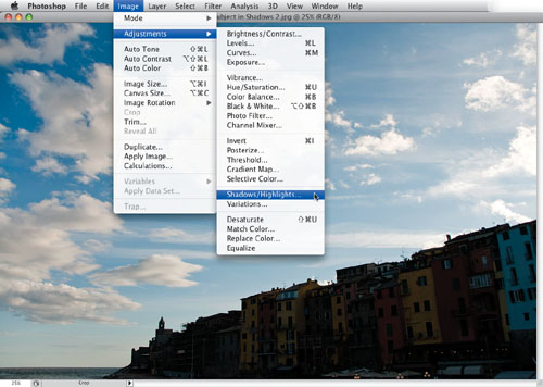
We all wind up shooting subjects that are backlit (where the sun is behind your subject). That’s because our eyes automatically adjust to the situation and we see the subject just fine in our viewfinder. The problem is our cameras aren’t nearly as sophisticated as our eyes are, so you’re almost guaranteed to get some shots where the subject is way too dark when you open them in Photoshop. That’s why Shadows/Highlights rocks, and here you’ll learn how easy it is to use, and a cool trick at the end that makes it non-destructive and totally editable.
Step One:
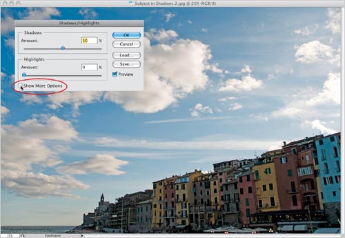
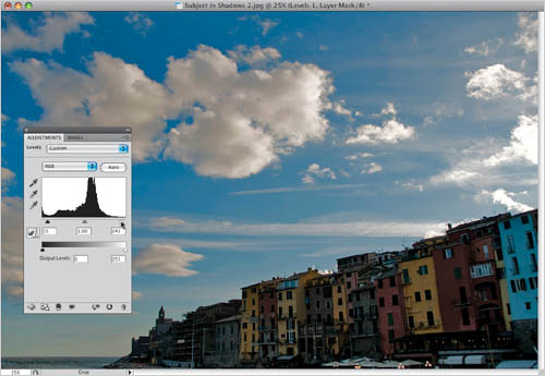
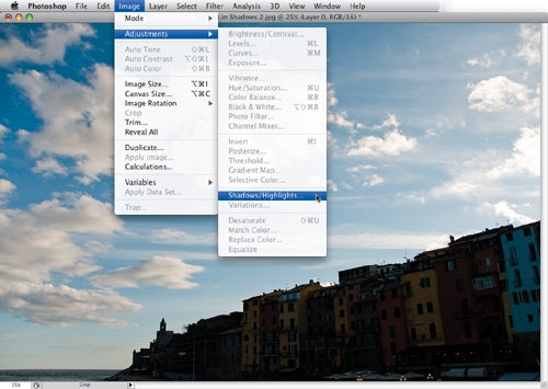
Open a photo containing shadow or highlight areas that need adjusting (in this case, it’s a photo of the Italian coast). In this example, the light is coming from behind the buildings, and I’m standing in front of them shooting into the shadow areas, so ideally we’d like to open up the shadows on this side. The other problem is the sky is a bit washed out on the right, so I’d like to darken the sky by pulling back the highlights. That’s when you reach for Shadows/Highlights—it’s found under the Image menu, under Adjustments (as shown here).
SCOTT KELBY
Step Two:
Adobe knows that if you’re choosing Shadows/Highlights, you probably have a problem in the shadow areas. That’s why, by default, it’s set to open up (lighten) the shadow areas in your photo by 50% (as seen here). Here’s the thing: to me, that 50% default setting seems like too much lightening (look at the photo shown here), so the first thing I do is lower the Shadows Amount until it looks better. There’s another problem with opening the shadows 50% or more—it looks a bit fake, and your photos tend to look “milky” and overadjusted. To get around that, turn on the Show More Options checkbox, as shown here.
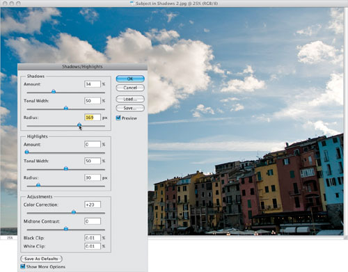
Step Three:
This brings up an expanded version of the dialog (as shown here). I have a little formula that I use that usually gives me the opened up shadow areas I need, without looking totally fake. First, I lower the Amount to somewhere between 25% and 35% (the final amount depends on the individual photo—I start at 25% and drag up a little to see if I can get away with 35%). Then, I drag the Shadows Radius slider to the right to between 160 and 190 (as shown here), which smoothes out the effect even more.
TIP: Save a New Default
If you find a setting you like better than the default 50% Shadows Amount setting, dial in that setting, then click the Save As Defaults button in the bottom-left corner of the dialog.
Step Four:
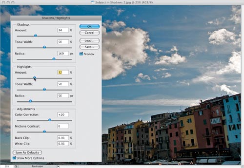
Now that the shadows are opened up (and look reasonably realistic), you can work on the highlights. In most cases, you’ll only be working on one or the other—the shadows or the highlights, but not both. It takes someone special to actually take a photo that is so wrong on every level that it needs both areas adjusted. So, to pull back (darken) the highlights in the sky, you go to the Highlights section and drag the Amount slider to the right (as shown here). This darkens the highlights, which is good, but in our case it also introduced a new problem—a white glow around the tops of the buildings. Luckily, that’s easy enough to fix.
Step Five:
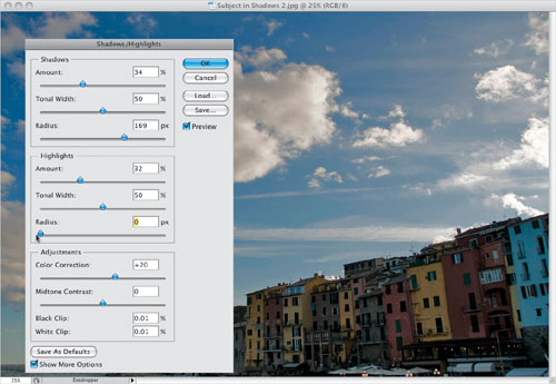
To get rid of those white halos around the tops of the buildings, in the Highlights section drag the Radius slider all the way to the left (as shown here), and the halos are gone. By the way, before we move on, here’s what the Tonal Width, Radius, and Adjustments sliders actually do: If you’re tweaking shadows, lowering the Tonal Width lets you affect only the darkest shadow areas; increasing it affects a wider range of shadows. Increase it a bunch, and it’ll start to affect the midtones, as well. It works similarly for the highlights. The Radius amount determines how many pixels each adjustment affects, so to affect a wider range of pixels, increase the amount. If you increase the shadow detail, the colors may become too saturated. If that’s the case, reduce the Color Correction amount (which basically only affects the area you’re adjusting). You can also adjust the contrast in the midtones using the Midtone Contrast slider.
Step Six:
Go ahead and click OK to apply your Shadows/Highlights edits. Lastly, go to the Adjustments panel and click on the Levels icon to create a Levels adjustment layer, which we’ll use to add some contrast back into the photo and saturate the colors a bit. So, grab the Highlights slider (on the far right under the histogram), and drag it to the left to brighten the highlights (as shown here). Then drag the Shadows slider (the black triangle on the far left) to the right to darken the shadows, and click OK to get the final image shown below.
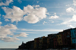
Before
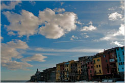
After (opening up the shadows, pulling back the highlights, and making a simple Levels adjustment)
Step Seven:
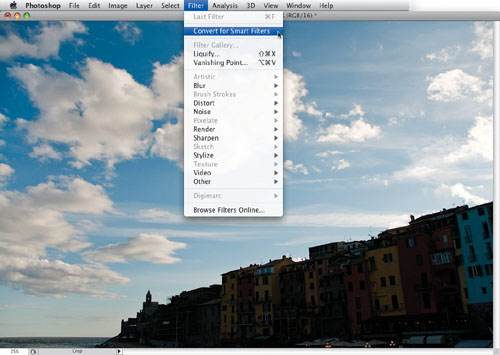
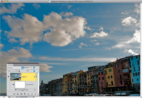
Okay, remember that cool trick I mentioned in the intro? Well, here it is: I’m going to show you a way that you can apply the Shadows/Highlights as a totally editable, non-destructive Smart Filter, even though it’s not a filter (oh yeah, baby—this sounds sa-weet!!!). There are two prep steps, but you only have to do this first prep step if your photo is a standard 8-bit image (so if it’s a 16-bit RAW photo, you can skip #1): (1) Go under the Image menu, under Mode, and choose 16-Bits/Channel. The look of your photo won’t change, but we have to be in 16-bit for this trick to work. Then, (2) go under the Filter menu and choose Convert for Smart Filters (as shown here), which basically turns your photo into a Smart Object.
Step Eight:
Now, just like before, go under the Image menu, under Adjustments, and you’ll see that every adjustment is grayed-out but one—Shadows/Highlights—so go ahead and choose it (as shown here). This brings up the regular Shadows/Highlights dialog just like always, and you can go ahead and adjust the photo using the techniques you learned on the previous pages, then click OK. This is where everything changes.
Step Nine:
When you go to the Layers panel, you’ll see that your Shadows/Highlights adjustment has been added to your photo as a Smart Filter. What that means is this: a new layer (actually, a layer mask) has been added below your photo (you can choose a brush, set your Foreground color to black, click on that mask layer, and start painting over any areas where you want the Shadows/Highlights effect removed, and if you paint in white, it brings the effect back, so it works like an adjustment layer). But there’s more: If you double-click directly on Shadows/Highlights, it brings back up the Shadows/Highlights dialog with the last settings you entered, so you can edit it after the fact. If you want to hide the effect altogether, click on the Eye icon to the left of the words “Shadows/Highlights” (just like you’d hide a layer).
Step 10:
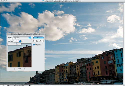
Another feature of this Smart Filter that makes it more like an adjustment layer is that if you double-click directly on the little Edit Blending Options icon to the far right of your Shadows/Highlights filter in the Layers panel (you can see it in the previous step), it brings up a dialog where you can choose a layer blend mode for your Shadows/Highlights adjustment, and you can control the opacity of the effect. In the example shown here, I lightened the effect by choosing the Lighten blend mode from the pop-up menu, and then I lowered the Opacity to 70%.
Step 11:
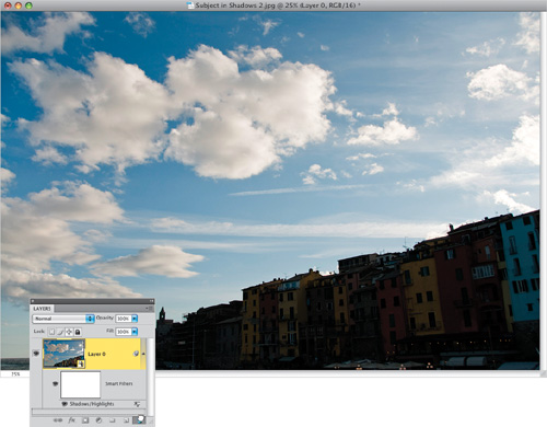
Again, like an adjustment layer, your Shadows/Highlights Smart Filter is non-destructive, so if you decide that later you want to remove the Shadows/Highlights adjustment altogether, just go directly to the Layers panel, click on the Shadows/Highlights layer, and drag it into the Trash at the bottom of the panel.
This is a tonal correction for people who don’t like making tonal corrections (more than 60 million Americans suffer from the paralyzing fear of MTC [Making Tonal Corrections]). Since this technique requires no knowledge of Levels or Curves, it’s very popular, and even though it’s incredibly simple to perform, it does a pretty incredible job of fixing both underexposed and overexposed photos, and the only difference between the two is one simple change.
Step One:
We’ll start by fixing a dark, underexposed photo, and once you learn this technique, the overexposed fix is almost the same (with just one small change). This photo was taken of a white wall (which gives you an idea of how underexposed this shot really is). The first step is just to duplicate the Background layer (as seen here) by dragging it onto the Create a New Layer icon at the bottom of the Layers panel.
SCOTT KELBY
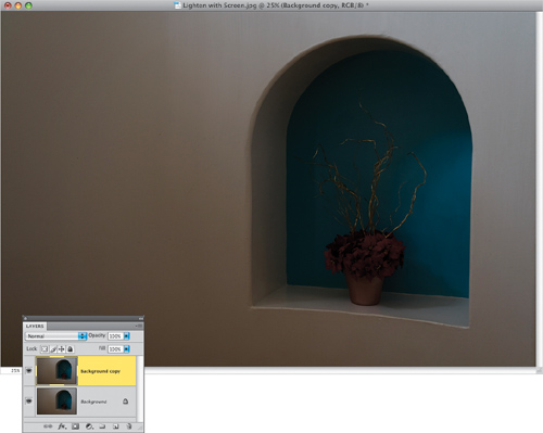
Step Two:
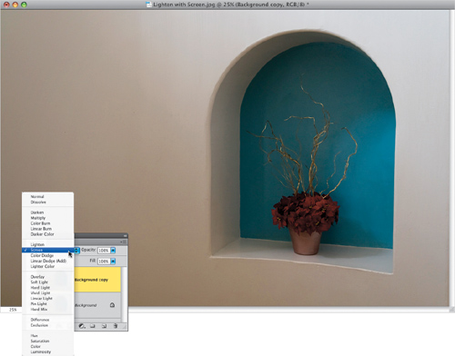
On this new layer, change the layer blend mode at the top of the Layers panel from Normal to Screen to lighten the entire photo (as shown here).
Step Three:
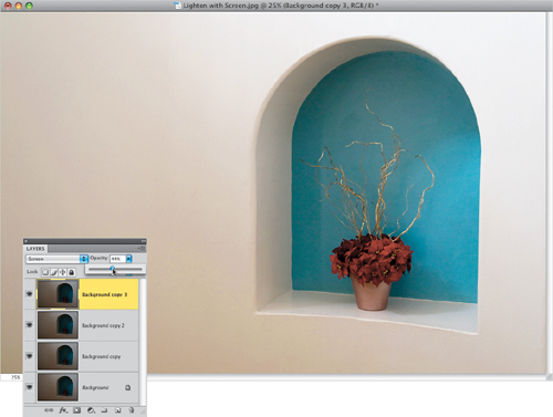
If the photo is still too dark, press Command-J (PC: Ctrl-J) to duplicate this Screen layer, which makes the photo that much lighter again. You can keep adding layers until it’s light enough. In this case, adding a fourth layer helped, but it also made it look slightly overexposed. So, lower the opacity of this layer (as shown here) to “dial in” the perfect amount of lightening. The opacity lets you choose anything between the full brightness of this fourth layer (at 100%) and no Screen layer at all (at 0%). Once the photo looks properly exposed, choose Flatten Image from the Layers panel’s flyout menu. You can see the before/after on the next page.
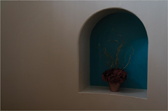
After (using three Screen blend mode layers)
Step Four:
Now, for an overexposed photo you pretty much do the same thing: you start by duplicating the Background layer (as shown here), so it’s exactly the same thus far.
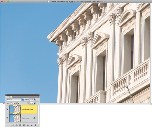
SCOTT KELBY
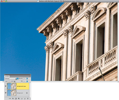
Step Five:
The only difference in the technique is that instead of choosing Screen mode (which makes things lighter), you choose Multiply, which makes the image darker (as shown here). Even just adding one Multiply layer looks dramatically better. In the After example shown below, I duplicated the Multiply layer twice (for a total of three layers) to get the face of the building dark enough, and lowered the Opacity slider a bit. So, the next time you run across a photo that’s too light or too dark, give these two 15-second fixes a try. By the way, these techniques are particularly handy when you’re working on restoring old scanned family photos.

Before

After (using three Multiply blend mode layers)
Photoshop CS4 is the first version of Photoshop where it’s safe to use the Dodge and Burn tools for lightening and darkening different parts of your image. In the past, we had to come up with an entirely different way to dodge and burn, because the tools were way too coarse, and they were totally off-limits for using on portraits, where even minor burning-in would make your subjects look sunburned. Luckily, that’s all changed in CS4, but I’m going to include the old version, as well, which still works fine—it’s just not as necessary as it once was.
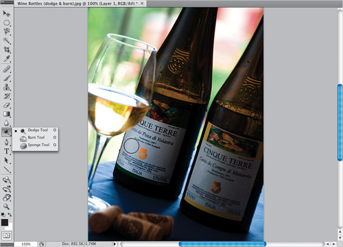
Step One:
In this photo, the light simply didn’t fall where we wish it had. So, here we’re going to dodge (lighten) the wine labels (so they’re easier to read), and the wine in the bottles themselves, along with the corks in the foreground. Then, we’re going to burn (darken) the areas that we wish were darker (like the background behind the bottles and the wine in the glass). Basically, we’re just going to rearrange how the light is falling on our photo. Now, I don’t dodge and burn directly on the photo. Instead, press Command-J (PC: Ctrl-J) to duplicate the layer. That way, if we don’t like what we’ve done, we can lessen the effect (by lowering the layer’s opacity) or undo it altogether by throwing the layer away.
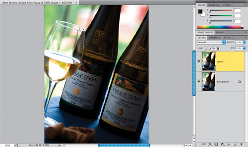
SCOTT KELBY
Step Two:
Get the Dodge tool (O) from the Toolbox (as shown here), and begin painting over the area you want to lighten (in our case, we’ll start by painting over the label on the left—you can see the brush cursor on the label in the example shown here). Keep holding the mouse button down as you paint, because the Dodge and Burn tools have a build-up effect—each time you release the mouse button and start painting again, the amount of Dodge (or Burn) builds up.
TIP: Your Brush Cursor Works Better
In CS4, Adobe tweaked how the brush tip cursor works, so that if you move it over something darker than it is (which happens very often), it actually has a very tiny glow around it, so now you can see the size and location of your brush dramatically easier when you’re over dark areas.
Step Three:
Release the mouse button, and paint over that same label again, and you’ll see how it gets another level brighter. Now go ahead and paint (dodge) over the corks, and the bottle right above the label, as well. Remember—while the mouse button is held down, you’re painting one level of brightness. Release the mouse button, then click-and-paint over that area, and you’re painting over the original brightness with more brightness, and so on (it’s kind of like polishing a silver platter—the more times you polish it, the brighter it gets). Now look at how much brighter the label, bottle, and corks are here, compared with the original image in Step One.
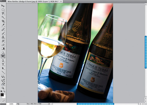
Step Four:
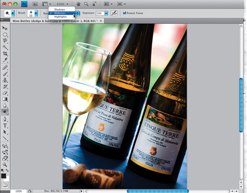
Here I’ve pushed it a little farther than I probably would, just to show you what can be done by simply building up that dodging a bit. I’ve gone two more times over the labels, the bottles, and the corks. Look at the detail and light we’ve been able to bring out in the bottles. Now, before we switch to burning in the background, take a look up in the Options Bar for this tool, and you can see that we’ve been dodging just the Midtones (and that’s generally where I do my dodging and burning), but if you wanted the tool to just affect the Highlight or Shadow areas, you can choose it from the pop-up menu. Also, the 50% Exposure amount is fine for something like this, but if I were doing this on a portrait, I’d usually want something much more subtle, and I’d lower the amount to around 10%–15%.
Step Five:
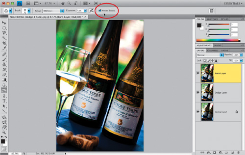
Now let’s switch to burning: first start by pressing Command-J (PC: Ctrl-J) to duplicate your top layer (so, at this point, you’ve got the original untouched image as your Background layer, the brightened Dodge layer in the middle (I renamed it “Dodge Layer” just to make it easier to see), and a copy of the brightened layer on top, which is the one we’re going to burn on (I named it “Burn Layer”). By keeping everything on separate layers, if you don’t like the burning effect, you can reduce it by lowering the opacity, or delete it altogether and you won’t lose the dodging you did on the layer below it. Now get the Burn tool (as shown here), and paint over the background behind the wine glass, paint over the wine glass itself, and paint that bright area behind the bottles on the right side of the photo. This darkens those areas, and puts the focus on the bottles and labels even more (you’re painting with light).
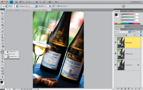
Step Six:
If you want it to be darker, just release the mouse button, and paint over the background area again. Also, don’t forget the background areas between the two bottles. One more thing: up in the Options Bar you’ll see a new checkbox for Protect Tones. That’s the checkbox that helps to keep the color of what you’re dodging and burning intact, so things just get brighter or darker, and not sunburned and color saturated. I leave this on all the time, even when I’m not dodging and burning portraits (which is when it’s most useful). The next page shows a before/after, and again, I took things a little farther than I normally would, just to show a clear example of the power of dodging and burning.
Step Seven:
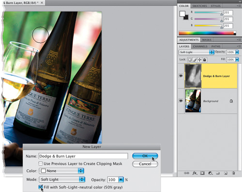
The old version works like this: Press Command-Shift-N (PC: Ctrl-Shift-N) to bring up the New Layer dialog (seen here). Change the Mode to Soft Light, then right below it, turn on the checkbox for Fill with Soft-Light-Neutral Color (50% Gray), as shown here. This creates a new layer filled with 50% gray above your Background layer. (When you change the blend mode to Soft Light, Photoshop ignores the gray color.) Now get the Brush tool, lower the Opacity to around 30% (up in the Options Bar) and paint in white on this layer to dodge or in black to burn. As you paint, in the Layers panel, you’ll see strokes appear on the thumbnail of your gray layer, but on your photo you’ll see those areas simply getting lighter or darker.

Before

After
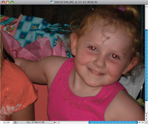
When I see a digital camera with the flash mounted directly above the lens, I think, “Hey, there’s a red-eye maker.” If you’re a pro, you probably don’t have to deal with this as much, because your flash probably isn’t mounted directly above your lens—you’re using bounce flash, using off-camera wireless flash, using studio strobes, or one of a dozen other techniques that avoid red eye. But even when the pros pick up a point-and-shoot camera, red eye can find them (it senses fear). Here’s the quick “I-just-want-it-gone” technique for getting rid of red eye fast.
Step One:
Open a photo where the subject has red eye, like the one shown here.
DAVID SINGER
Step Two:
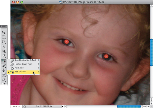
Press Z to get the Zoom tool and zoom in on the eyes by clicking-and-dragging out a rectangle around them. Now get the Red Eye tool from the Toolbox (it’s nested under the Spot Healing Brush, or you can press Shift-J until you get the tool).
TIP: Zooming In Really, Really Close
You won’t see this neat little enhancement Adobe snuck into CS4 unless you zoom in to 600% magnification or more—it’s a little pixel grid that appears that makes it visually easier to tell pixels apart when you’re zoomed in crazy tight. It’s on by default (give it a try—zoom in crazy tight and see), but if you want to turn it off, just go under the View menu, under Show, and choose Pixel Grid.
Step Three:
Tools don’t get much easier to use than this—click it once on the red area of the eye, and in just a second or two the red is gone (as shown here, where I just clicked it in the red area of her left eye). Think of it as a “Red Eye Magic Wand” because it automatically selects all the red area with just one click. Now, what do you do if you click in the red area, and you don’t like the results? Well, there are two controls that can help you tweak the performance of the Red Eye tool: Pupil Size and Darken Amount (you find both of these in the Options Bar).
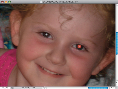
Step Four:
Think of the Pupil Size control like you would the Threshold setting for the Magic Wand tool—the higher the amount, the more colors it will select. So if your first try doesn’t select all the red, increase the Pupil Size. The Darken Amount basically determines how dark the color is that replaces the red eye. The default setting of 50% gives you a very dark gray pupil. If you want a pure black pupil, just increase the amount. To complete the retouch, just click the Red Eye tool once in the right eye (you did the left eye earlier). Press Command-0 (zero; PC: Ctrl-0) to fit your image onscreen, and you’ll have the red-eye retouched photo you see here.
I get more requests for how to fix this problem than probably all the rest combined. The reason is it’s so darn hard to fix. If you’re lucky, you get to spend an hour or more desperately cloning. In many cases, you’re just stuck with it. However, if you’re smart, you’ll invest an extra 30 seconds while shooting to take one shot with the glasses off (or ideally, one “glasses off” shot for each new pose). Do that, and Photoshop will make this fix absolutely simple. If this sounds like a pain, then you’ve never spent an hour desperately cloning away a reflection.
Step One:
Before we get into this, make sure you read the short intro up top here first, or you’re going to wonder what’s going on in Step Two. Okay, here’s a photo of my buddy Larry Becker (the Director of the National Association of Photoshop Professionals).
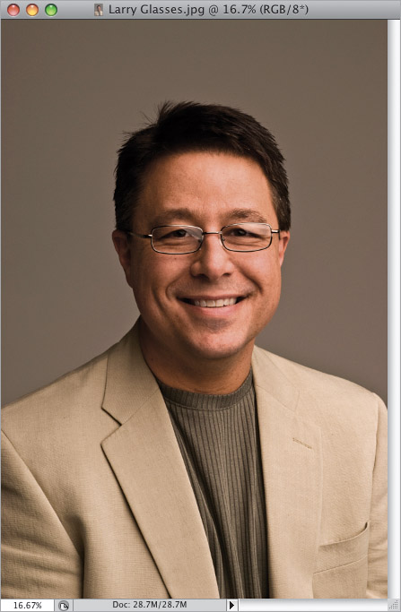
BRAD MOORE
Step Two:
I could see right away that we were going to have a reflection in his glasses, so I told him after the shot not to move his head, but just to reach up and remove his glasses, and then we took another shot. Now, with both images open, get the Move tool (V), press-and-hold the Shift key, and click-and-drag the “no glasses” shot on top of the “glasses” photo.
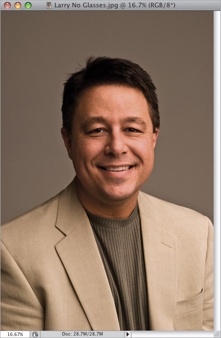
BRAD MOORE
Step Three:
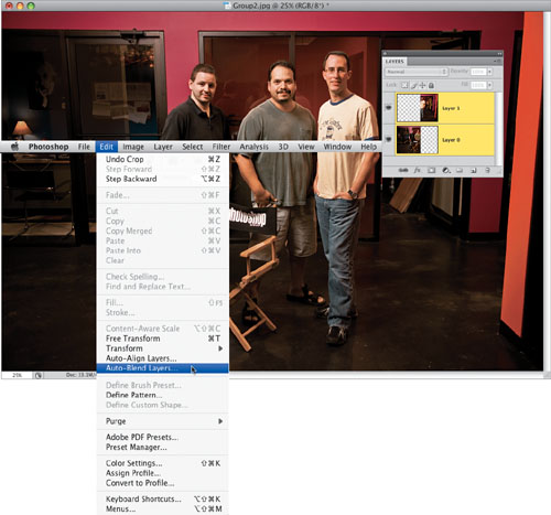
Holding the Shift key will help get the alignment of the two layers somewhat close, but in this case, it’s still off by a bit because the shot was hand-held. Anyway, for this to work, the two photos have to be lined up with each other right on the money, and in CS4, Photoshop will do it for you. You start by going to the Layers panel, clicking on the Background layer, then pressing-and-holding the Command (PC: Ctrl) key and clicking on Layer 1 to select them both (you can see they’re both highlighted here). Then go under the Edit menu and choose Auto-Align Layers (if that function is grayed out, it’s because you don’t have both layers selected). When the dialog appears, leave it set to Auto and just click OK.
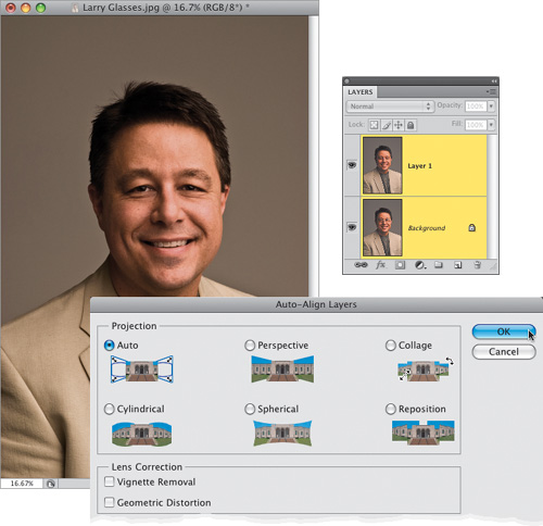
Step Four:
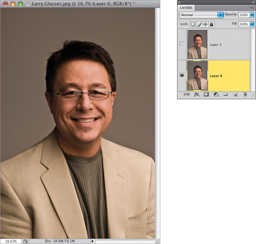
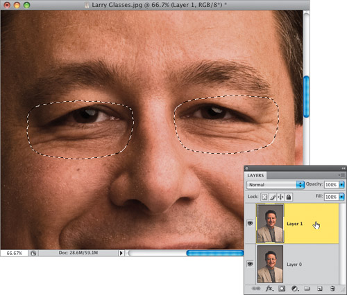
A little progress bar will appear telling you that it’s aligning the selected layers based on their content, and within a few seconds the two layers will be precisely lined up (as shown here. Of course, it’s hard for you to tell they’re precisely lined up unless you’ve downloaded these two photos and checked it yourself. What? You didn’t know you could download these same photos and follow along? That’s only because you skipped “Five Quick Things You’ll Wish You Had Known Before Reading This Book” at the front of the book). Once your images are aligned, use the Crop tool (C) to crop away any transparent areas. Okay, now you’ll need to hide the top layer by clicking on the little Eye icon to the left of the layer, then click once on the Background layer (as shown here). Now you’re seeing the original shot, with the reflection in the glasses.
Step Five:
You’re going to need to select the inside area of both lenses, and you can use whichever selection tool you’re most comfortable with (like the Magnetic Lasso tool perhaps), but for a job like this, I think the Pen tool is perfect. If you choose to go the Pen tool route, get the Pen tool (P), then go up to the Options Bar and click on the second icon from the left (so it just draws a path). Then click the Pen tool once on a lower part of one of the glass lenses, move your cursor over to the left, and click, hold, and drag slightly to the left (as shown here). This draws a slightly curved path between the two points (the farther you drag after clicking, the more the curve bends).
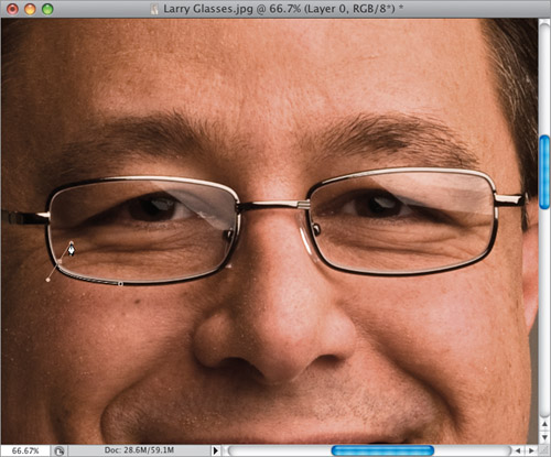
Step Six:
So basically, that’s how it works—you move a little further along the lens, click, hold, and drag. Move again—click, hold, and drag, and continue this as you’re basically going to trace around the lens with a path. When you get back to the point where you started, a little circle appears in the bottom-right corner of your Pen tool’s icon letting you know you’ve come “full circle.” Click on that point to close your path. Now do the same thing to the other lens. Once you’ve gotten paths drawn around both lenses, press Command-Return (PC: Ctrl-Enter) to turn your paths into a selection (as shown here). Remember, you don’t have to do this using the Pen tool—use any selection tool(s) you’re comfortable with.
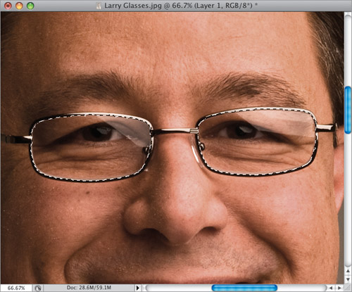
Step Seven:
After your selection is in place, make the top layer visible again (seen here) by clicking in the first column on the Layers panel where the Eye icon used to be. Then, click on the top layer to select it.
Step Eight:
To complete the effect, just click the Add Layer Mask icon at the bottom of the Layers panel (as shown here) and the eyes from the top layer replace the eyes from the original glasses layer, and your reflection problems are gone.
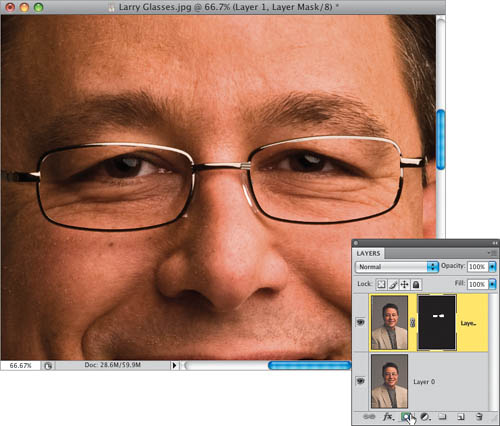

Before (notice the reflection—most visible in the right eye)

After (the reflection is gone)
Group shots are always a challenge because, without a doubt, somebody in the group will be totally hammered (at least, that’s been the experience with my family. You know I’m kidding, right?). Okay, the real problem is that in group photos there’s always one or more people who blinked at just the wrong time, or forgot to smile, or weren’t looking at the camera, etc. Of course, you could just take their expression from another frame and combine it with this one, but that takes a lot of work. Well, at least it did before the Auto Blend feature. This thing rocks!
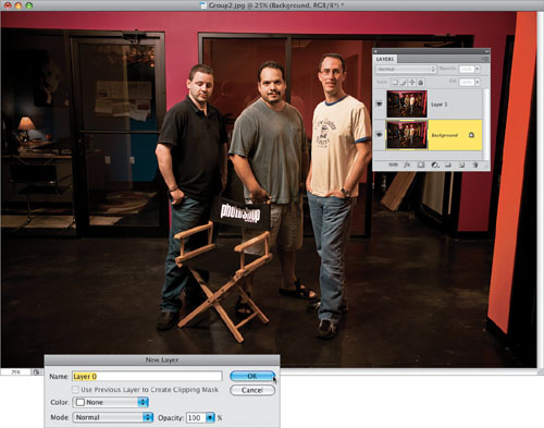
Step One:
Here’s a photo of my friends and NAPP Curriculum Developers, Corey Barker, RC Concepcion, and Matt Kloskowski, taken at NAPP’s headquarters. The problem here is Corey (on the left) has his eyes closed and RC (in the middle) is not really smiling.
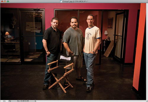
BRAD MOORE
Step Two:
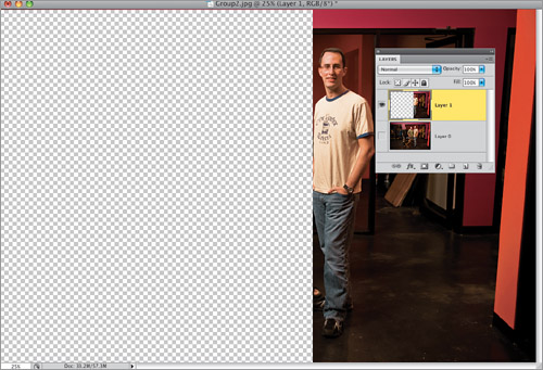
Of course, with group shots you take as many shots as the group will endure, and luckily in the very next frame there was a great shot of Corey with his eyes open, and RC has a little bit of a smile, but now Matt (on the right) has his eyes closed. So, the idea is to take Corey and RC from this shot, and combine them with the previous photo, where Matt has his eyes open.
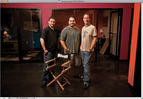
BRAD MOORE
Step Three:
Start by dragging the two photos into the same document: get the Move tool (V), press-and-hold the Shift key, and click-and-drag one photo over onto the other (it will appear as its own layer in the other document, as you can see in the Layers panel shown here). Now, you’ll need to convert the Background layer into a regular layer, so go to the Layers panel and double-click directly on the Background layer. This brings up the New Layer dialog (shown here), which by default renames your Background layer as Layer 0. Just click OK and it’s now a regular ol’ Photoshop layer.
TIP: Auto-Align Can Help
In this case, the photos lined up pretty well because the shots were taken on a tripod, but if you’re hand-holding, you might want to select both layers and choose Auto-Align Layers from the Edit menu first, to have Photoshop CS4 align the two layers for you. Then just use the Crop tool (C) to crop away any transparent areas.
Step Four:
The next two steps couldn’t be easier: First, in the Layers panel, hide Layer 0 from view by clicking on the little Eye icon to the left of the layer. Then click on Layer 1. Now, get the Rectangular Marquee tool (M) and draw a rectangular selection over the parts of this layer that don’t look good (in other words, you’re going to delete everything you don’t want to keep—so put a selection around the two guys on the left) and hit the Delete (PC: Backspace) key. This leaves you with just the part of this layer you want to keep. Now, Deselect by pressing Command-D (PC: Ctrl-D).
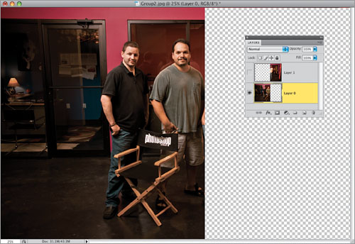
Step Five:
Now hide that top layer from view, and make Layer 0 visible again by clicking once in the first column where the little Eye icon used to be. Click on Layer 0, then do the same thing—erase what you don’t want (in this case, you’re putting a Rectangular Marquee selection around Matt with his eyes closed), then press the Delete (PC: Backspace) key, so you have the image you see here. Now you can Deselect. The key thing to remember here is this: make sure these two layers overlap, because CS4 needs some overlapping area to do its blending (in other words, don’t erase so much that there’s any gap between the two layers—it’s got to overlap. I’d shoot for a 20% overlap if you can, although I didn’t have that much here, because RC shifted position, moving the shoulder closest to Matt).
Step Six:
Go to the Layers panel and make both layers visible (as seen here). Now, you have the right poses together, but you also have a very harsh seam moving right through Matt’s arm, and look at the extra shadows that appear on the floor. It looks “pieced together” big time. Of course, you could add layer masks and try blending the edges yourself with the Brush tool, but that’s what makes this technique so sweet: CS4 will do a brilliant job of all that for you—in just seconds.
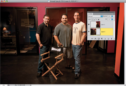
Step Seven:
Here’s the last step: select both layers in the Layers panel (click on one layer, press-and-hold the Command [PC: Ctrl] key, then click on the other layer to select it as well), then once both layers are selected, go under the Edit menu, choose Auto-Blend Layers, and click OK in the resulting dialog. That’s it—in just seconds you have a perfectly smooth, seamless blend of the two photos, and Photoshop did all the hard work. You can see the before/after below and look close—that seam is 100% gone! It does leave the layer masks that Auto-Blend Layers creates in place, just in case you want to tweak them, but I haven’t come up with an instance where I needed to yet. Just choose Flatten Image from the Layers panel’s flyout menu, and you’re done.
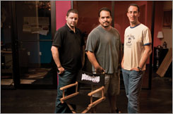
Before (the two guys on the left are in bad poses—one has his eyes closed, one’s not smiling)
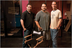
After (the first photo is seamlessly blended with the second photo, replacing the two guys on the left with their better poses from a different frame)
If you’re shooting with a macro lens, you know how incredibly shallow the depth of field is, even when shooting at f/22. If you shoot something really tight in, like a flower, your front petals may be in focus, but the petals an inch or so back can be totally out of focus. In the past, we’d shoot a number of different shots, each focusing just a little further into the flower, and then we’d go through the painstaking process of masking the in-focus areas together to create a level of depth our lenses can’t capture. Now, Photoshop can do all that for you (well, not the shooting—the other stuff).
Step One:
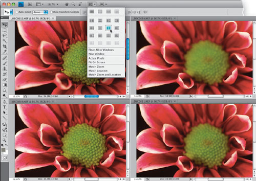
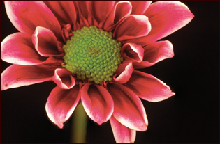
This technique definitely does start with the shoot, and you’ll need to shoot close-up macro shots on a tripod, so nothing moves or changes between shots, and so your images are sharp and in focus. Once you get your camera on a tripod, and positioned, you’ll need to take multiple shots of your subject (in my example here, it’s a flower) and make each shot have a different focus point. For example, here I have the tips of the petals in focus, and then the next shot I focused a little farther in, and then the next farther in yet, and lastly, I focused on the stigma. Here are the four shots I took, displayed in a four-up view (you get the view you see here by opening four images, then choosing 4-up from the Arrange Documents pop-up menu in the Application Bar, as shown here).
SCOTT KELBY
Step Two:
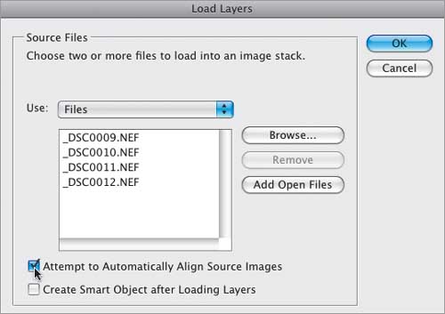
Now you’ll need to get all four images into the same single document as individual layers, but rather than dragging-and-dropping them, go under the File menu, under Scripts, and choose Load Files into Stack. When the dialog appears, click the Add Open Files button, and then turn on the Attempt to Automatically Align Source Images checkbox (as shown here), which is the advantage of using the script rather than dragging-and-dropping. Then, click OK.
Step Three:
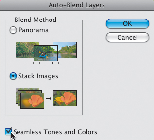
Once the stacking script is done, and all your images are perfectly aligned by Photoshop (it’ll take a minute or two for all this to happen), you’ll need to go to the Layers panel, press-and-hold the Command (PC: Ctrl) key, and click on all four layers to select them. Then go under the Edit menu and choose Auto-Blend Layers (this is the function that will analyze the focus points of each flower and combine and mask them for you). When the Auto-Blend Layers dialog appears (seen here), make sure you have Stack Images chosen (take a look at the little graphic, which actually shows a stack of flower photos, with the top one having a blurry background, and then it becomes the image with a deeper depth of field). Also turn on the Seamless Tones and Colors checkbox, which is critical to this process, as it measures the color and tone of each image and helps combine them into one seamless looking image.
Step Four:
Now click OK, then sit back and relax, because this is going to take a few minutes. Once it’s done, you’re presented with the final image (as seen here), where you’ve got depth all the way through the flower. In the Layers panel, you’ll see the layer masks it had to create on each layer to combine these four images into one seamless final result. Now, I personally don’t mess with those masks at all—I just flatten the image (from the Layers panel’s flyout menu), then use the Clone Stamp tool (S) to fix any minor ghosting that may occur (you may occasionally see an area with a ghosted image along the petal of a flower, or another part of your photo, in which case, I just take the Clone Stamp tool and quickly clone it away).
In CS4, Adobe added one of those seemingly little things that is actually a really big thing—the ability to resize your brush visually onscreen. I’ve been using the Left and Right Brackets keys to change brush sizes for years, and that works pretty well, but you never get exactly the size you want (because they jump between preset increments), and you never get there fast enough. But now, not only do you finally get the exact size you want really fast—the first time—you can use a slight variation of the technique to change the hardness of your brush, as well. Ahhh, it’s always the little things, isn’t it?
Step One (Mac):
When you have a Brush tool selected, just press-and-hold Option-Control and then click-and-drag onscreen. A red brush preview will appear inside your cursor (as seen here)—drag outward to increase the brush size preview or inward to shrink the size. When you’re done, just release those keys and you’re set. Not only is this the fastest way to resize, it shows you more than just the round brush-size cursor—it includes the feathered edges of the brush, so you see the real size of what you’ll be painting with (see how the feathered edge extends beyond the usual round brush size cursor)?
Step Two (Mac):
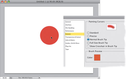
To change the Hardness setting, you just add one key—now you press-and-hold Command-Option-Control and click-and-drag inward to harden the edges, and outward to make them softer (here I dragged in so far that it’s perfectly hard-edged now). If you want to change the color of your brush preview, go to Photoshop’s Preferences (Command-K [PC: Ctrl-K]), click on Cursors on the left, and in the Brush Preview section, click on the red Color swatch (seen here), which brings up a Color Picker where you can choose a new color.
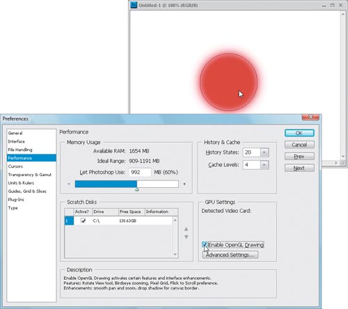
Step Three (PC):
To get the red brush preview on a PC, you’ll need to turn on a preference first. So, go to Photoshop’s preferences (Ctrl-K), and click on Performance on the left side. In the GPU Settings section near the bottom right, turn on the Enable OpenGL Drawing checkbox, then restart Photoshop. Now, when you have a Brush tool selected, press-and-hold the Alt key and Right-click-and-drag onscreen. The red brush preview described in Step One will appear inside your cursor (as seen here)—drag outward to increase the brush size preview or inward to shrink the size.
Step Four (PC):
To change the Hardness setting, you’ll need to add two keys—just press-and-hold Ctrl-Alt-Shift and Right-click-and drag. To change the color of your brush preview, see Step Two on the previous page.