The chapter title above is actually the name of a band. I ran across their song “Love Broke” as I was searching in Apple’s iTunes Store under the word “Special.” Of course, iTunes came up with songs from bands like .38 Special, as well as a band called The Specials, but somehow in the midst of all this, another title caught my eye. The song was named “Specinal” (which is either a typo, or a very clever misspelling of Special designed to throw off authors using iTunes as a research tool for naming chapters), but it wasn’t the name of the song that drew me to it, it was the name of the band—Dufus. That’s right, they named their band Dufus. Now, I’m not entirely sure, but the name Dufus might not be the best name for attracting members of the opposite sex (if you can, indeed, determine what that would be). I mean, imagine the following conversation between the bass player for Dufus and a potential date chosen at random from the crowd before they take the stage. Bass player: “So, we haven’t met. I’m Mike, the bass player for Dufus.” Audience member: “Buh-bye, Dufus.” See what I mean? It’s hard to put a good spin on that name. I think I might call a band meeting and politely request a snappier name, citing the bass player’s bad experience transcribed above. Some alternate names might be The Studs. Or The Heartbreak Kids, or even Eddie from Ohio. So, let’s try that scenario again, but using one of these new and improved names. Bass player: “So, we haven’t met. I’m Mike, the bass player for Eddie from Ohio.” Audience member: “Can you introduce me to Eddie?” Bass player: “Uh, I dunno, he’s pretty busy.” Audience member: “Leave me alone, you Dufus.”
If you’ve ever wondered how the pros get those deep, rich-looking B&W photos, you might be surprised to learn that what you were looking at weren’t just regular B&W photos, instead they were quadtones or tritones—B&W photos made up of three or four different grays and/or brown colors to make what appears to be a B&W photo, but with much greater depth. For years, Photoshop had a bunch of very slick presets buried somewhere on your computer, but luckily in CS4, they’re now just one click away.
Step One:
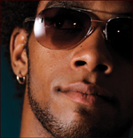
Open the photo you want to apply your quadtoning effect to (the term quadtoning just means the final photo will use four different inks mixed together to achieve the effect. Tritones use three inks, and do I really have to mention how many duotones use?). Quadtoning effects seem to look best with (but are not limited to) two kinds of photos: (1) landscapes, and (2) people.
©ISTOCKPHOTO/ALEXANDER HAFEMANN
Step Two:
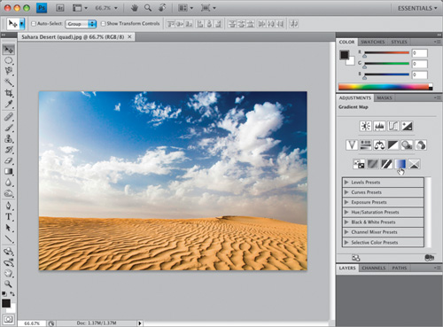
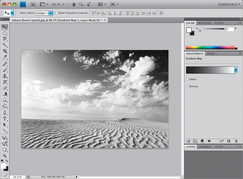
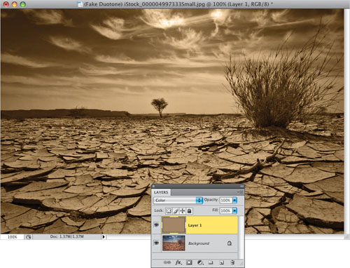
To create a quadtone, you’ll have to convert to Grayscale mode first, but by now you know what a flat-looking B&W photo that creates, so instead use whichever method from the B&W chapter (Chapter 8) of this book you like best (in the example shown here, I used the simple Gradient Map adjustment layer method, but here it looks a little light, so we’ll need to add a color stop in the center of our gradient to darken up the midtones a bit—which we’ll cover in the next step.
Step Three:
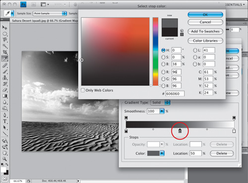
In the Gradient Map Adjustments panel, click on the gradient, and when the Gradient Editor appears, click right in the center below the gradient to add a stop. It adds a black stop, but you want a dark gray one (as shown circled here in red), so double-click on that stop to bring up the Color Picker. Choose a dark gray, click OK, and then close the Gradient Editor by clicking OK. You’ll see this gives us a much richer B&W look. Now that your photo looks black and white, it’s okay to convert to Grayscale mode. This won’t change the look of the photo, it will just change the mode, and at this point (when the color’s already gone), it’s harmless.
Step Four:
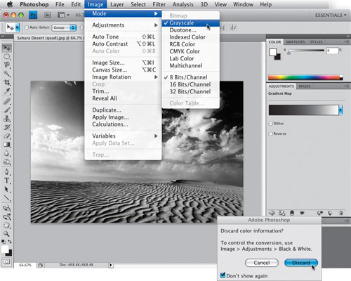
Go under the Image menu, under Mode, and choose Grayscale. When you do this, it will ask you if you want to flatten your layers (along with your Background layer, you also have a Gradient Map adjustment layer), so click the Flatten button (if you keep the Gradient Map adjustment layer as its own layer, it changes the look of your photo because the gradient map relies on the color channels to do its thing. Taking them away changes its effectiveness, so that’s why you should click the Flatten button). This brings up another dialog, asking if you really want to discard the color information (shown here), and saying that you should be using the Black & White adjustment to make your conversion. Click the Discard button, but before you do, may I recommend turning on the Don’t Show Again checkbox? If you don’t turn this on, you’ll become well acquainted with this well-meaning, yet incredibly annoying, warning dialog.
Step Five:
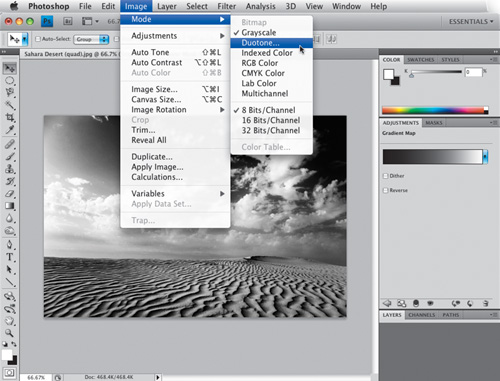
Once your photo is in Grayscale mode, the Duotone menu item (which has been grayed out and unchoosable until this very moment) is now open for business. So, go under the Image menu, under Mode, and choose Duotone (if Duotone is still grayed out, you forgot Step Four—converting to grayscale).
Step Six:
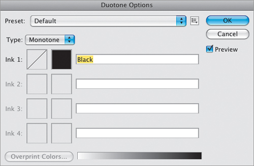
When you choose Duotone, the Duotone Options dialog appears (shown here), but don’t let it throw you off that, even though you chose Duotone and you’re in the Duotone Options dialog, the default Type setting is for a one-color Mono tone. (I’ll bet some nights the Adobe engineers who designed this sit at a restaurant with glasses of wine and just laugh and laugh when they think about the looks on our faces when we see Monotone as the default type.) Luckily, in CS4 you don’t even have to mess with the Type setting, because we’re going to use the built-in presets instead, and unlike in all previous versions of Photoshop, they’re not buried somewhere inside a half-dozen nested folders. Now you can access them from the Preset menu at the top of the Duotone Options dialog.
Step Seven:
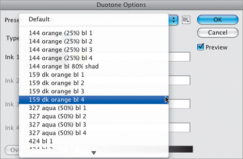
If you click-and-hold on the Preset popup menu at the top of the dialog, a list of literally 137 built-in presets (I actually counted them) appears for you to choose from. Now, you’d think they’d be organized by duotones first, tritones, then quadtones, right? No, that makes too much sense, and people would easily understand it. Instead, they’re organized in a way that makes it just about an allout guessing game. First, there’s a bunch of duotones ordered by number, then tritones, then back to duotones, then quadtones, then back to duotones, and so on. So, what I thought I’d do is give you a few of my favorites to get you started.
TIP: Try Different Photos
One thing about these multi-ink looks: they look different depending on the photo you apply them to, so make sure you give at least a few of them a try on different photos and you’ll see what I mean.
Step Eight:
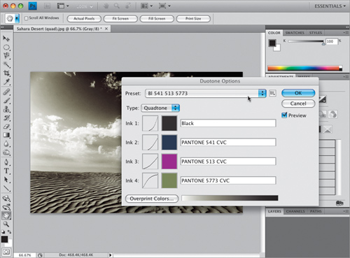
One I use often is named “BL 541 513 5773” (to make it easy. Listen closely, and you can hear those Adobe engineers giggling uncontrollably. Seriously, why can’t it be named “Quad: BL 541 513 5773”? Don’t get me started). Anyway, the BL stands for black, and the three sets of numbers are the PMS numbers of the three other Pantone colors used to make the quadtone. So, we are actually able to figure out which are which by spending a moment looking at each one and counting the number of PMS colors listed in the name. (Of course, just adding Duo, Tri, or Quad to the name would make it much easier, but obviously easy isn’t the goal. Arrrggg!)
Step Nine:
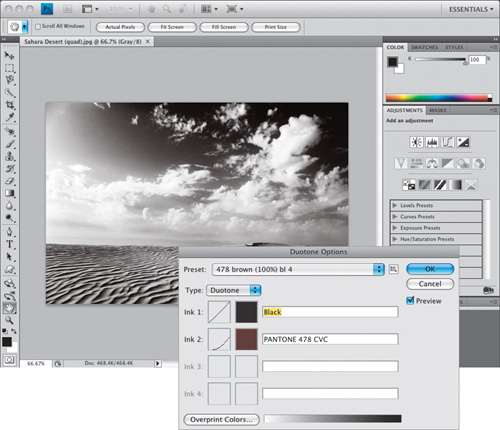
How about a nice duotone? This one uses black and it adds a reddish brown to the mix. It’s called “478 brown (100%) bl 4,” and really works well for certain photos (that goes back to my “give at least a few of them a try on different photos” tip on the previous page. You’ll be surprised at how different these same exact quadtones, tritones, and duotones will look when applied to different photos).
Step 10:
There’s a nice tritone that uses black and two grays named “BL WmGray 7 WmGray 2” (exactly what I would have named it. By the way, I did some research and learned that the “BL” doesn’t stand for Black. It actually stands for “Big Laugh”).
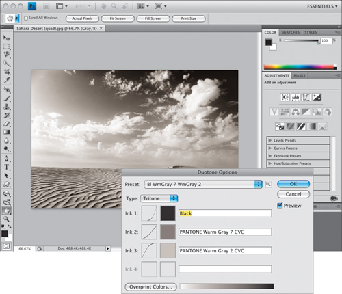
Step 11:
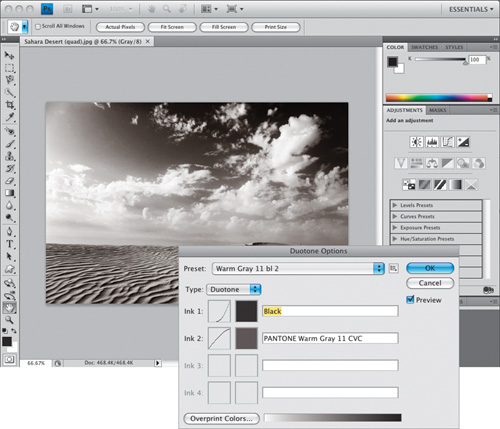
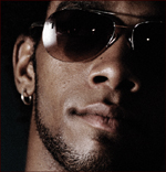
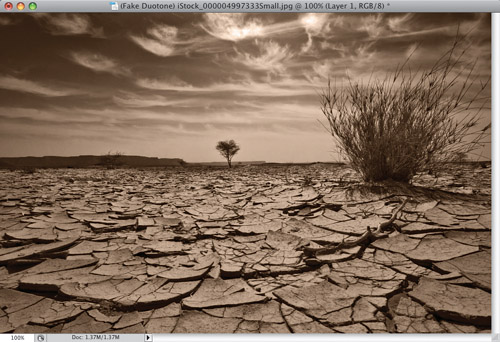
We’ll wrap things up with another nice duotone—this one’s named “Warm Gray 11 bl 2,” which gives you the duotone effect shown here. Below is a before/after showing the regular B&W image, and the quadtone I showed back in Step Eight. See how much warmer the image looks, and how much more depth it appears to have next to the cold, flat B&W image? Well, there you have it—four of my favorites (and don’t forget, when you’re done, convert back to RGB mode).
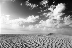
Before
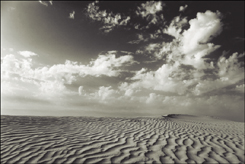
After
Sometimes the light falls where you don’t want it, and sometimes you just mess up (like in the case here, where not enough attention was paid to the spread of the light, and both the bride’s face and the flowers she’s holding share pretty much the same intensity of light. The subject really is the bride’s face, and the flowers are just playing a supporting role, but she was lit like they’re sharing the starring role). Luckily, it’s pretty easy to tame and refocus the light in Photoshop (though it’s better to do it right when you shoot it).
Step One:
As I mentioned above, here’s the shot where the bride’s face and the flowers are both equally as bright, which is not a good thing (in fact, the flowers may even be a little brighter, and are drawing your attention away from the bride, which is absolutely not what you, or the bride, want). So, we’re going to tame our light using a very simple Levels move. Click on the Levels icon near the top of the Adjustments panel (as shown here).
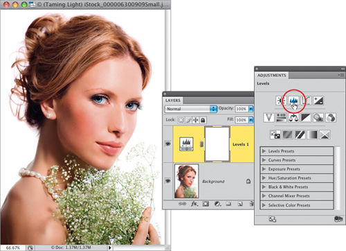
©ISTOCKPHOTO/KATERYNA GOVORUSHCHENKO
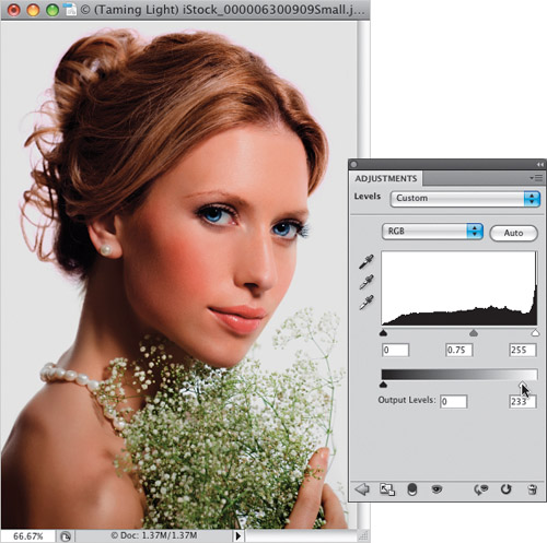
Step Two:
The changes I make in the Levels Adjustments panel will affect the entire photo, but since adjustment layers come with their own built-in mask, we’ll be able to tweak things very easily after the fact. At this point, you want to darken the flowers, so drag the Input Levels middle slider to the right a bit to darken the midtones (and the flowers), and then drag the bottom-right Output Levels slider to the left a little bit to darken the overall photo (as shown here). One downside is that this oversaturates the colors quite a bit, which can also draw attention away from the face, but that’s easy to fix.
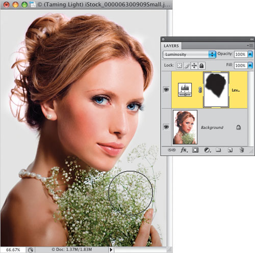
Step Three:
First, to reduce the oversaturation caused by our Levels move, go to the Layers panel and change the blend mode of the Levels adjustment layer from Normal to Luminosity. This keeps the darkening without oversaturating the color. Next, press Command-I (PC: Ctrl-I) to Invert the layer mask, which hides the darkening added by our Levels move behind a black mask. Now, get the Brush tool (B), make sure your Foreground color is set to white, then paint over everything in the photo except for her face and hair. As you paint, it darkens those areas (as shown here where I’m darkening the flowers, so now the bride’s face is once again the focus).
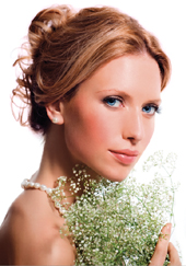
Before (the flowers have at least as much or more light than the bride’s face)
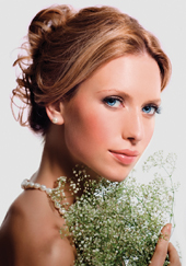
After (everything else is darkened, leaving the bride’s face nicely lit and making it the visual focus of the portrait)
Okay, so why isn’t this in the color correction chapter? It’s because this isn’t color correction. We’re not trying to make colors look as they did, we’re punching up the colors big time so they look better, more vibrant, and more contrasty than the scene really looked when the shot was taken. It’s totally a color effect and what you’re about to learn is a much simplified version of a Lab color technique I learned from Dan Margulis, master of all things color. The full-blown technique is found in Dan’s amazing book Photoshop LAB Color.
Step One:
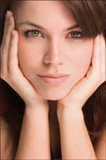
This technique works best on photos that are kind of flat and drab. If you apply this to an already colorful photo, it will pretty much take the color right over the top, so choose an appropriate photo whose color needs some serious pumping up (I’m going to totally resist the urge to use a Saturday Night Live reference, like “We’re here to pump—you—up!” Oh rats, I just did it, didn’t I? My bad).

©ISTOCKPHOTO/SHAUN LOWE
Step Two:
This is a Lab color move, so go under the Image menu, under Mode, and choose Lab Color (as shown here). This is a totally non-destructive move (moving from RGB to Lab color and back), so don’t hesitate to jump over there whenever you feel the need.

Step Three:
There’s no need to head over to the Channels panel, because you’re going to be doing your work in the Apply Image dialog. So, go under the Image menu and choose Apply Image. Now, before we start working in Apply Image, here’s a little background: You know how we have layer blend modes (like Multiply, Screen, Overlay, etc.)? Well, in the Channels panel, there is no channel blend mode pop-up menu like there is for layers in the Layers panel, so to get channels to blend using blend modes, you use Apply Image to apply a channel to itself. When the Apply Image dialog appears, by default the blend mode is set to Multiply (which always seems too dark), so to get to the starting place for our effect, change the Blending pop-up menu to Overlay, as shown here. As you can see, it looks pretty sweet! If anything, Overlay mode may make your photo look too vivid and contrasty, but we’ll deal with that soon.

Step Four:
The nice thing about using Apply Image is that you get at least three different “looks,” and you simply have to choose which one looks best to you (they look different depending on the photo, so you have to try all three). By default, you’re seeing the full Lab color channel (that’s seen back in Step Three), so once you’ve seen that channel, then click on the Channel pop-up menu and choose “a” (as shown here) to see how the “a” channel looks blended with an invisible copy of itself in Overlay mode. It certainly looks better than the original, but I don’t think it looks as good as the Lab channel did in Step Three.

Step Five:
Now try the “b” channel by choosing “b” from the Channel pop-up menu (as shown here). This channel usually adds more yellow and warm tones to the photo (as seen in the example here). In fact, if you want to make an outdoor scene instantly look like a fall color scene somewhere in the Northeast, convert to Lab Color mode, choose Apply Image, switch to Overlay mode, and simply choose the “b” channel—voilá—instant fall colors. Now, back to our project: in the example shown here, it’s very yellowish, and if you like that look—you’re done—just click OK. If not, continue on with me.

Step Six:
So far, you’ve seen the photo blending in Overlay mode (which is a pretty punchy mode), using the Lab channel, the “a” channel, and the “b” channel. Personally, I like the Lab channel by far, and if you feel it’s the best of the three, but think it might actually be a little too “punchy,” then change the Blending pop-up menu to Soft Light (as shown here). This is a more mellow mode than Overlay (how’s that for a New Age explanation), and if Overlay is too intense for you, you’ll probably love Soft Light. I don’t mind admitting that I probably use Soft Light more than Overlay. It’s probably from burning incense and sitting in the Lotus position (by the way, I have no idea what the Lotus position is, but it sounds painful).

Step Seven:
There is another way to go if you think Overlay is too intense, and that’s to use the volume knob. Well, I call it the volume knob, but it’s actually the Opacity amount (which appears just below the Blending pop-up menu). The lower the opacity, the lower the amount of the effect. In the example shown here, I switched back to the Lab channel, chose Overlay in the Blending pop-up menu, but then lowered the Opacity to 80%. The After photo below was done using those same exact settings.

TIP: Creating an Action
This Apply Image trick is a great thing to record as an action. But once you create it, go to the Actions panel and click in the second column, beside the words “Apply Image” (a dialog icon will appear), and then when you run the action, the Apply Image dialog will appear onscreen for you to try your three choices. Once you make your choice, click OK, and the action will continue, and will convert you back to RGB.

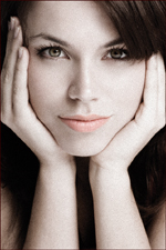
Before

After (using the Lab channel in Overlay mode at 80%—no Curves, no Levels, no nuthin’)
This is just about the hottest Photoshop portrait technique out there right now, and you see it popping up everywhere, from covers of magazines to CD covers, from print ads to Hollywood movie posters, and from editorial images to billboards. It seems right now everybody wants this effect (and you’re about to be able to deliver it in roughly 60 seconds flat using the simplified method shown here!).
Step One:
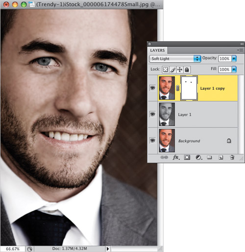
Open the photo you want to apply this trendy high-contrast portrait effect to. Duplicate the Background layer by pressing Command-J (PC: Ctrl-J). Then duplicate this layer using the same shortcut (so you have three layers in all, which all look the same, as shown here).
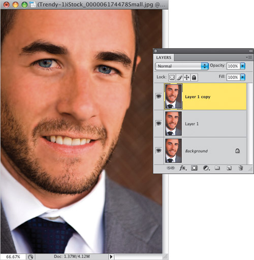
©ISTOCKPHOTO/BRAD WIELAND
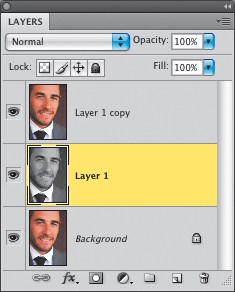
Step Two:
In the Layers panel, click on the middle layer (Layer 1) to make it the active layer, then press Command-Shift-U (PC: Ctrl-Shift-U) to Desaturate and remove all the color from that layer. Of course, there’s still a color photo on the top of the layer stack, so you won’t see anything change onscreen (you’ll still see your color photo), but if you look in the Layers panel, you’ll see the thumbnail for the center layer is in black and white (as seen here).
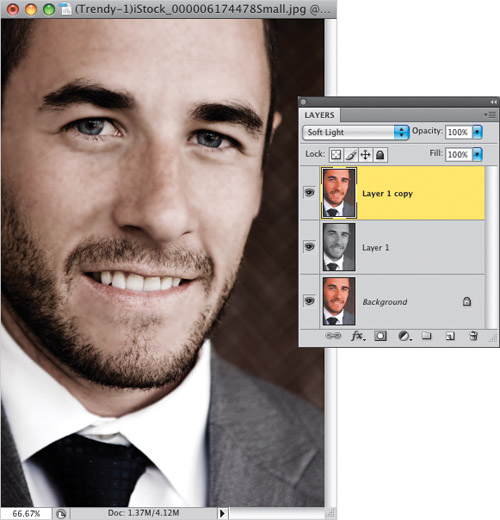
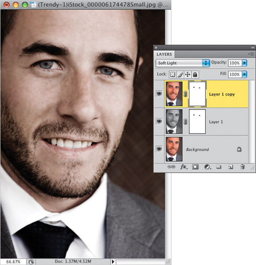
Step Three:
In the Layers panel, click on the top layer in the stack (Layer 1 copy), then switch its layer blend mode from Normal to Soft Light (as shown here), which brings the effect into play. Now, Soft Light brings a very nice, subtle version of the effect, but if you want something a bit edgier with even more contrast, try using Overlay mode instead. If the Overlay version is a bit too intense, try lowering the Opacity of the layer a bit until it looks good to you.
Step Four:
Fairly often, you’ll find that the person’s eyes really stand out when you see this effect, and that’s usually because it brings the original eye color and intensity back (this is an optional step, but if your subject has blue or green eyes, it’s usually worth the extra 15 seconds of effort). It’s just two quick steps: Start by clicking on the Add Layer Mask icon at the bottom of the Layers panel. Then get the Brush tool (B), choose a small, soft-edged brush from the Brush Picker up in the Options Bar, press X to set your Foreground color to black, and paint right over both eyes (not the whites of the eyes—just the irises and the pupils). This will seem kind of weird, because since you knocked a hole out of the eyes on this layer, you’re now only seeing the eyes on the B&W layer below it, but you’re going to fix that in the next step.
Step Five:
To knock the exact same hole out of the B&W layer (which means there will be “eye holes” knocked out of the top two layers, so you’ll see the original eyes from the Background layer), just press-and-hold the Option (PC: Alt) key, click directly on the layer mask thumbnail itself on the top layer, and drag it to the middle layer. This puts an exact copy of the top layer’s layer mask on your middle layer (as shown here). Now you’re seeing the original full-color unretouched eyes from the Background layer. Pretty neat little trick, eh?
Step Six:
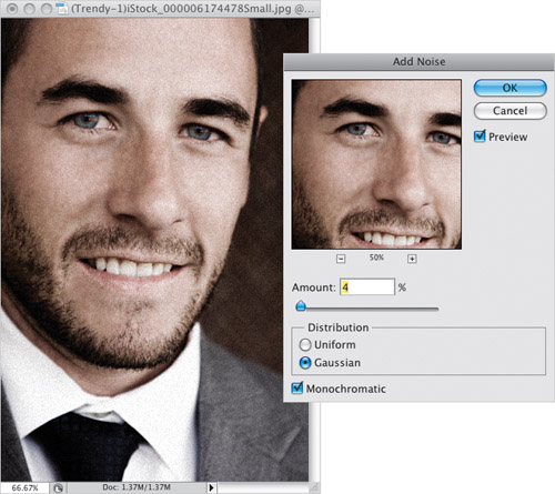
Now flatten the image by choosing Flatten Image from the Layers panel’s fly out menu. The final step is to add some noise, so go under the Filter menu, under Noise, and choose Add Noise. When the Add Noise filter dialog appears (seen here), set the Distribution to Gaussian, and turn on the Monochromatic checkbox (otherwise, your noise will appear as little red, green, and blue specks, which looks really lame). Lastly, dial in an amount of noise that while visible, isn’t overly noisy. I’m working on a very low-resolution version, so I only used 4%, but on a high-res digital camera photo, you’ll probably have to use between 10% and 12% to see much of anything. You can see the before/after at the top of the next page. Beyond that, I gave you some other examples of how this effect looks on other portraits.

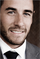
After (applying the effect and revealing the eyes)
Step Seven:
Here’s another example using the exact same technique, and you can see how different the effect looks on a completely different image. I particularly love the almost bronze skin tone it creates in this image. Very cool stuff. Turn the page for more examples.
Before
©ISTOCKPHOTO/ROXANA GONZALEZ
After
TIP: Don’t Add Too Much Noise
Be careful not to add too much noise, because when you add an Unsharp Mask to the image (which you would do at the very end, right before you save the file), it enhances and brings out any noise (intentional or otherwise) in the photo.
ANOTHER TIP: Background Only
I once saw this effect used in a motorcycle print ad. They applied the effect to the background, and then masked (knocked out) the bike so it was in full color. It really looked very slick (almost eerie in a cool eerie way).
Step Eight:
Here’s the same technique applied to a photo of a woman, however I didn’t knock out the eyes because her eye color was pretty subtle. Instead I lowered the Brush tool’s opacity to 50% and painted over her lips on the top layer, then copied that layer mask down to the B&W layer (just like before with the eyes—same technique with the mask). Without doing that, her lips looked pretty cold, and this way the subtle 50% pink looks right with the rest of the photo.
Before
©ISTOCKPHOTO/JASON STITT
After
Step Nine:
Here’s the final example, and there’s a version of that bronze skin again. I love what it did to his skin (kind of blowing out the highlights in a cool way).
Before
©ISTOCKPHOTO/EVA SERRABASSA
After
TIP: Vary the Opacity
Here are a couple of variations you can try with this effect: If the effect seems too subtle when you first apply it, of course you could try Overlay mode as I mentioned earlier, but before you try that, try duplicating the Soft Light layer once and watch how that pumps up the effect. Of course, you can lower the opacity of that layer if it’s too much. Another trick to try is to lower the opacity of the original Soft Light layer to 70%, which brings back some color with almost a tinting effect. Give it a shot and see what you think. One last thing: wouldn’t this be a great effect to apply as an action? Oh yeah—that’s what I’m talkin’ ’bout!
The duotone tinting look is all the rage right now, but creating a real two-color duotone, complete with curves that will separate in just two colors on press, is a bit of a chore. However, if you’re outputting to an inkjet printer, or to a printing press as a full-color job, then you don’t need all that complicated stuff—you can create a fake duotone that looks at least as good (if not better).
Step One:
Open the color RGB photo that you want to convert into a duotone (again, I’m calling it a duotone, but we’re going to stay in RGB mode the whole time, so you can just treat this like any other color photo). Now, the hard part of this is choosing which color to make your duotone. I always see other people’s duotones and think, “Yeah, that’s the color I want!” but when I go to the Foreground color swatch and try to create a similar color in the Color Picker, it’s always hit or miss (usually miss). That’s why you’ll want to know this next trick.
©ISTOCKPHOTO/TOBIAS HELBIG
Step Two:
If you can find another duotone photo that has a color you like, you’re set. So I usually go to a stock photo website (like iStockphoto.com) and search for “duotones.” When I find one I like, I return to Photoshop, press I to get the Eye dropper tool, click-and-hold anywhere within my image area, and then (while keeping the mouse button held down) I drag my cursor outside Photoshop and onto the photo in my Web browser to sample the color I want. Now, mind you, I did not and would not take a single pixel from someone else’s photo—I’m just sampling a color (take a look at your Foreground color swatch to see the sampled color).
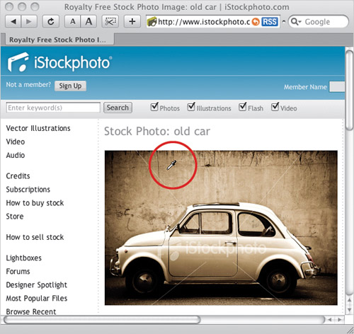
©ISTOCKPHOTO/CLAUDIO ARNESE
Step Three:
Release the mouse button, then return to your image in Photoshop. Go to the Layers panel and click on the Create a New Layer icon at the bottom of the panel. Then, press Option-Delete (PC: Alt-Backspace) to fill this new blank layer with your sampled color. The color will fill your image area, hiding your photo, but we’ll fix that.
Step Four:
While still in the Layers panel, change the blend mode of this sampled color layer to Color (as shown here).
Step Five:
If your duotone seems too dark, you can lessen the effect by clicking on the Background layer, and then going under the Image menu, under Adjustments, and choosing Desaturate. This removes the color from your RGB photo without changing its color mode, while lightening the overall image. Pretty sneaky, eh? If you don’t like the original color you chose—no sweat—just take the Eyedropper tool back to that stock photo and choose a different color (as I did here), and refill that color layer with your new color.
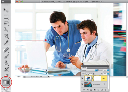
Photoshop collage techniques could easily fill a whole chapter—maybe a whole book—but the technique shown here (using layer masks) is probably the most popular, and one of the most powerful collage techniques used by professionals. Note: The term “collage” has kind of emerged as the word most often used to describe combining photos like this in Photoshop, but I’ve been told (in quite a harshly worded note, mind you) that they are actually photo “montages,” so don’t make the same horrible mistake I made. ;-)
Step One:
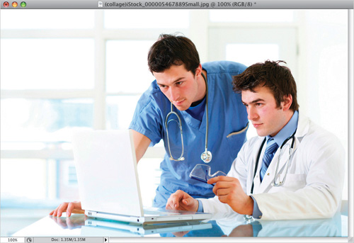
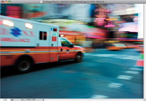
Here are the three photos we’re going to collage together in Photoshop. I usually choose one of the photos as the “base” photo, which will act as the background for the other photos to blend into. In this case, I’m going to choose the ambulance photo, but I could just as easily have chosen any one of the three.
©ISTOCKPHOTO/GÜNAY MUTLU
©ISTOCKPHOTO/LISA GAGNE
©ISTOCKPHOTO/CLINT HILD
Step Two:
Go to the first photo that you want to collage with your background ambulance photo (in this case, it’s the doctors). Press the letter V to switch to the Move tool, and then click-and-drag the photo right onto your background photo (as shown here). It will appear on its own separate layer above your Background layer.
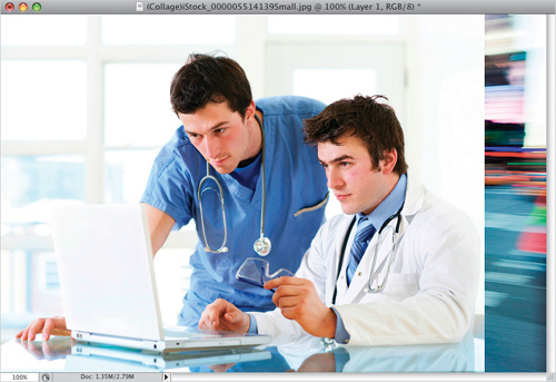
Step Three:
Click on the Add Layer Mask icon at the bottom of the Layers panel (it’s circled here in red) to add a layer mask to your doctors layer.
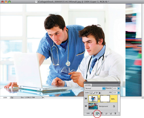
Step Four:
Then, press the letter G to get the Gradient tool from the Toolbox (shown circled here). You need to use a black-to-white gradient, so you can either use: (a) the default gradient, which uses your current Foreground and Background colors, and if that’s the case, just press the letter D, then X, on your keyboard to get them to black and white (respectively); or (b) you can go up to the Gradient Picker (in the Options Bar) and choose the third gradient in the top row (which is the Black, White gradient). Once you’ve got a black-to-white gradient chosen, click the Gradient tool on the photo at the spot you’d like to be 100% transparent, and drag to the right to the spot where you’d like the photo to be 100% solid (as shown here, where the direction is indicated with a red arrow). You’ll need to start dragging well inside the edge of the photo because you want that hard edge to be totally transparent.
Step Five:
When you release the mouse button, the photo on the top layer will smoothly blend from a solid image (on the right) to transparent (as it overlaps the ambulance on the layer below it). Once the blend is in place, if you don’t like how it blended (or worse yet—you see the hard edge on the left of the doctors photo), then just press Command-Z (PC: Ctrl-Z) to undo your drag of the gradient and then try again. Remember, if you see that left edge, you’re dragging too close to it. Start an inch or so to the right of the edge, then drag (this shouldn’t be a problem with this example, though, because the doctors photo was placed all the way on the left of the ambulance photo).
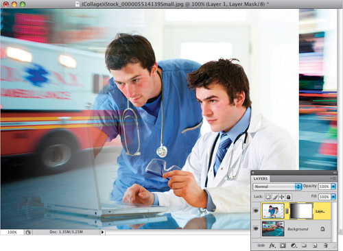
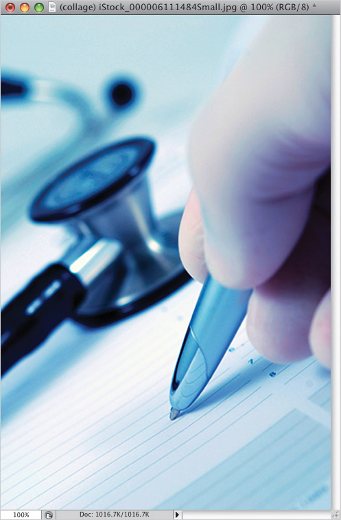
Step Six:
Open another photo you’d like to blend in with your existing two photos (in this case, it’s a photo of someone writing with a pen). Switch to the Move tool (V), and click-and-drag this photo onto the top of your collage-in-progress (as shown here). You can reposition your photo where you’d like it while you’ve still got the Move tool. In the example shown here, I dragged it over to the right so the pen photo was offset to the far right of the document.
Step Seven:
Click on the Add Layer Mask icon again at the bottom of the Layers panel to add a layer mask to this new layer. Switch back to the Gradient tool (press the letter G), then click the Gradient tool about a half an inch inside the left edge of the pen photo, and drag to the right, to where you’re almost touching the hand.
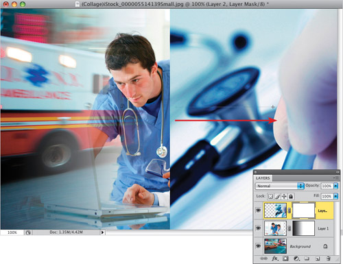
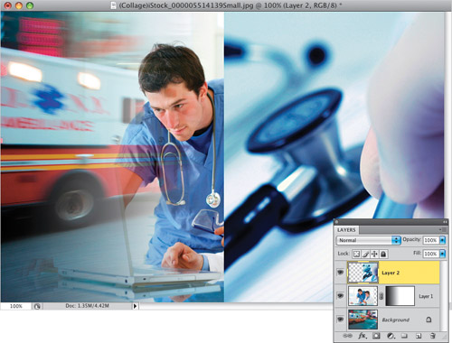
Step Eight:
When you release the mouse button, the pen photo now blends in with the rest of the photo (as seen here). You can also manually tweak the blend. For example, if you wanted to make the stethoscope less transparent, you could switch to the Brush tool (B), choose a soft-edged brush, set your Foreground color to black, and with the top layer’s mask active, paint over the stethoscope, bringing just the area where you paint back to full 100% opacity. The final step here is simply to add some text. The font shown here is Helvetica Neue, which comes with the Adobe Creative Suite, so click the Type tool (T) on your photo and add your text to the final collage (shown here).

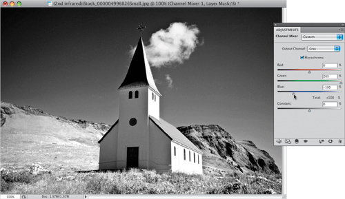
Here’s my digital twist on getting an infrared look from regular photos taken with your digital camera. The first three steps give you the standard infrared look, which I totally love (and which makes it kinda look like you popped a Hoya R72 infrared filter on your lens), and the last steps let you bleed some color in for some really interesting looks.
Step One:
Open the RGB photo you want to apply an infrared effect to in Photoshop. Go to the Adjustments panel and click on the Channel Mixer icon, as shown here (it’s the icon with three overlapping circles on the far right of the second row).
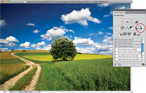
©ISTOCKPHOTO/OLAF LOOSE
Step Two:
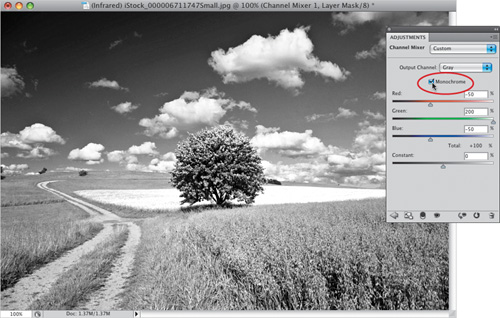
When the Channel Mixer options appear, turn on the Monochrome checkbox at the top of the panel first (it’s shown circled here in red). Then, drag the Red channel slider to the left to –50% (it’s actually quicker to just type –50 in the field at the top right of the Red slider); set the Green channel to 200%; and set the Blue channel to –50% for the subtle infrared effect you see here. Note: There is a built-in Black & White Infrared (RGB) preset conversion you can choose from the Channel Mixer Presets on the main Adjustments panel, but I think in most cases it creates too light an effect, especially in the sky where it should be almost black.
Step Three:
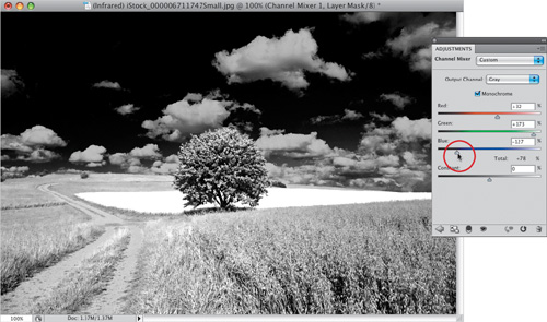
So, think of the settings you just entered as a starting place. In this photo, to make the light green grass even whiter and the blue sky darker, raise the Red back up to 32%, lower the Green to 173%, and lower the Blue to –127 (as shown here), which for photos like this is a pretty darn good recipe for a B&W infrared. Now, if you’re wondering how I knew which way to drag the sliders to make the grass behind the tree whiter—I didn’t. That is, until I dragged them back and forth to see what they would do to the photo. When the green and yellow highlights got brighter, I was happy. Lowering the amount of Blue to make the blue sky darker was pretty easy to figure out.
Step Four:
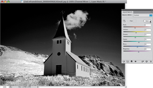
Here’s a different photo, and I thought I’d demonstrate the difference between a standard B&W photo and a B&W infrared. Click on the Black & White icon in the Adjustments panel (the fourth icon from the left, in the second row), then click the Auto button (as shown here) to give you an auto B&W conversion. It ain’t great, but it gives you the idea.
©ISTOCKPHOTO/ALEXANDER HAFEMANN
Step Five:
Now click the Trash icon at the bottom of the panel, and click on the Channel Mixer icon instead. Input similar settings to what we used in Steps Two and Three, and look at the difference. If you’d like a color infrared effect, then try this: duplicate the Background layer, drag it to the top of your layer stack (in the Layers panel), change the layer blend mode at the top of the Layers panel to Overlay, then lower the Opacity to 50%. Not bad, eh?
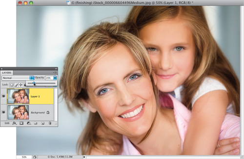
One of the questions I get asked most about my portraits is how do they look so sharp, but at the same time have a soft quality to them? It’s because for all portraits of women, children, or families, I apply a three-step Photoshop finishing technique that does the trick. It actually combines two techniques you’ve already learned, and introduces a third. They’re all exceedingly easy (in fact, you can write an action to apply all three steps with the click of one button)—it’s just the order you do them in, and the settings you use. Here’s exactly what I do:
Step One:
Once you’ve color corrected the photo, done any retouching, etc., that’s when you add these three finishing steps. The first step is to add a lot of sharpening to the photo (because in the second step, you’re going to blur the entire photo). I always use Lab sharpening for this, so go under the Image menu, under Mode, and choose Lab Color.
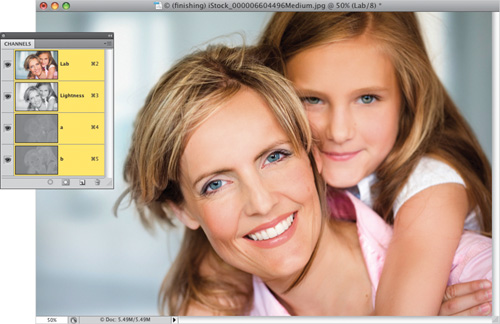
©ISTOCKPHOTO/KATERYNA GOVORUSHCHENKO
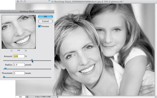
Step Two:
Go to the Channels panel and click on the Lightness channel, so your sharpening is applied to just the detail areas of the photo, not the color areas. When you do this, it displays the grayscale Lightness channel (as seen here). Now go under the Filter menu, under Sharpen, and choose Unsharp Mask. The settings I use are pretty strong—Amount: 120%, Radius: 1, and Threshold: 3—but you generally need it (however, if you have a small, low-resolution file, you’ll need to lower the Amount to 80%). Click OK, click back on the Lab channel, then switch back to RGB mode.
Step Three:
Duplicate the Background layer by pressing Command-J (PC: Ctrl-J), then you’re going to apply a pretty significant Gaussian Blur (20 pixels) to this layer. So, go under the Filter menu, under Blur, and choose Gaussian Blur. When the dialog appears, enter 20 pixels for a regular high-res digital camera photo (for a low-res file, only use 6 pixels), then click OK to apply the blur to this layer.
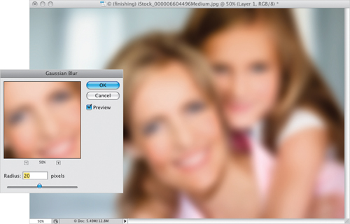
Step Four:
Now, in the Layers panel, lower the layer Opacity of this blurry layer to just 20% (as shown here), which gives the photo almost a glow quality to it, but the glow is subtle enough that you don’t lose sharpness (look at the detail in the hair and eyes).
Step Five:
Press Command-E (PC: Ctrl-E) to merge those two layers together and flatten the photo. Now, you’re going to add an edge vignette effect (which looks great for portraits), so start by duplicating the Background layer again (you know the keyboard shortcut, right? Oh come on, you just did it in Step Three. I thought I was the only one with the memory retention of a hamster). Anyway, once you duplicate the layer, change the blend mode of the layer to Multiply (which makes the layer much darker). Then get the Rectangular Marquee tool (M) and draw a rectangular selection that is about ½″ to 1″ inside the edges of your photo (as shown here).
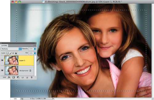
Step Six:
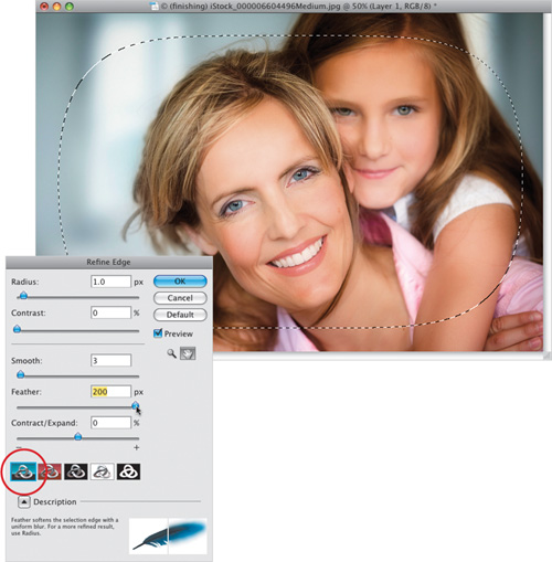
Now you’re going to majorly soften the edges of your rectangular selection, so go up to the Options Bar and click on the Refine Edge button to bring up the Refine Edge dialog (shown here). Below the five sliders, click on the first icon on the left (shown circled here in red), so you view your photo as a full-color composite image. Now, to soften the edges, drag the Feather slider all the way to 200 pixels (if you’re using a lowres file, only feather 100 pixels). One advantage of this Refine Edge dialog is you can see the amount of feathering as you move the slider. Now press the Delete (PC: Backspace) key on your keyboard to knock a soft-edged hole out of your darker Multiply layer (as seen here).
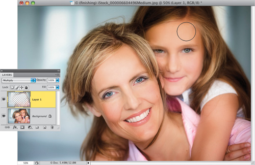
Step Seven:
Press Command-D (PC: Ctrl-D) to Deselect, and you’ll see the effect is like a really soft spotlight aimed at your subjects. If the edge darkening actually is close enough to their faces to matter, get the Eraser tool (E), choose a soft-edged brush, and simply paint over the top of the head and hair (as shown here) to remove the edge vignetting in just that area. The final photo is seen below right. Notice the sharp eyes and hair, and general overall sharpness, but there’s also a general overall softness, enhanced even more by that soft spotlight vignette you added at the end. Again, this is a perfect routine to turn into an action so it’s always just one click away.

Before

After (applying all three steps)
I used to have an entire segment in my live Photoshop seminars where I’d show you the seven things you needed to do with your camera to shoot a pano that Photoshop would merge seamlessly together. Then Adobe improved the Photomerge feature so vastly that you only needed to do one simple thing (more on that in a moment), and in CS4, they added a few extra features that make it produce the best results yet. In fact, it’s so easy now, there’s no reason not to be shooting panos every chance you get. Here’s how:
Step One:
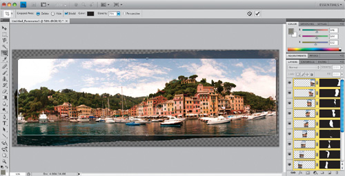
This first thing isn’t technically a Photoshop thing, but if you do it, it sure will make working with panos easier. When you’re out shooting, and you’re about to shoot a pano, before you shoot your first pano frame, hold your index finger up in front of your lens and take a photo. Then go ahead and take your pano, and right after you shoot your last frame, hold up two fingers in front of your lens and take another photo. Here’s where this pays off: When you open all your photos from that day’s shoot in Bridge, you could easily have hundreds of photos (especially if these are vacation photos). As you scroll through, as soon as you see an index finger, you know these are your pano photos (by the way, if you have that whole self-loathing thing going on, or if you’re a teen, you don’t have to use your index finger). Plus, it not only tells you that you shot a pano, it tells you exactly where it starts and where it ends (as seen here). It sounds silly, but if you don’t do this, you’ll actually miss panos you took, and you’ll just kind of wonder, “What was I thinking when I took those?” and you’ll scroll right by them. It’s happened to me, and so many of my friends, that we now all use this technique, and we never miss a pano.
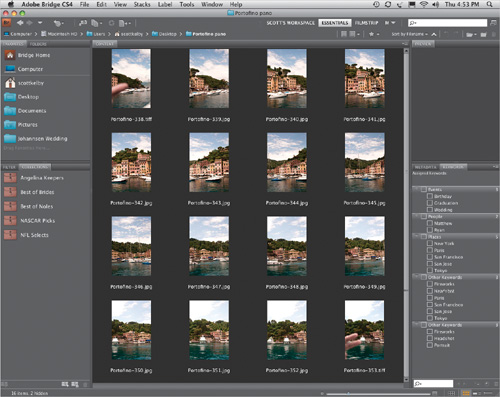
SCOTT KELBY
Step Two:
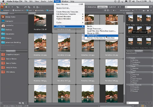
You can start by selecting the individual pieces of your pano in Bridge (as I have here, where I took 14 individual photos, hand-held, standing on a small moving boat, something I never would have tried even two years ago. That’s how good this new Photomerge feature is). You just select everything between the two finger shots, go under the Tools menu, under Photoshop, and choose Photomerge (as shown here). Note: If you already have your photos open in Photoshop, then you can go under the File menu, under Automate, and choose Photomerge. Either way—they both will get you to the same place.
Step Three:
When you choose Photomerge, it brings up the dialog you see here, with the images you selected listed in the center column. (Note: If you opened your pano photos from within Photoshop, the center column will be empty, so you’ll click the Add Open Files button.) We’ll look at the Layout part in the next step, and jump down below that center column. Leave the Blend Images Together checkbox turned on. Now, there are two other options (both new in CS4) you may need, depending on how you shot your pano: (1) If you have lens vignetting (the edges of your images appear darkened), then turn on Vignette Removal, and although it will take a little longer to render your pano, it will try to remove the vignetting during the process (it does a pretty decent job). If you’re using a Nikon, Sigma, or Canon fisheye lens to shoot your panos, then turn on the Geometric Distortion Correction checkbox at the bottom to correct the fisheye distortion.
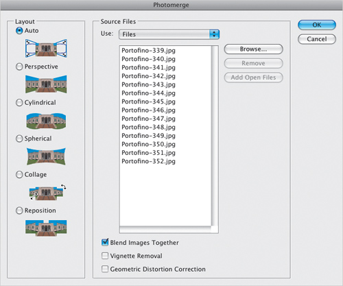
Step Four:
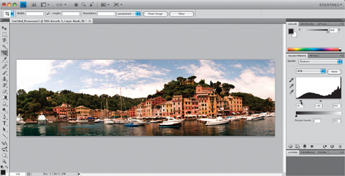
In the Layout section on the left, the default setting is Auto (as seen in Step Three), and I recommend leaving that set to Auto to get the standard wide pano we’re looking for. The five Layout choices below Auto (Perspective, Cylindrical, Spherical, Collage, and Reposition) all give you...well...funky looking panos (that’s the best description I can give you), but suffice it to say—they don’t give you that nice wide pano most of us are looking for. So, let’s just stick with Auto. Click OK, and within a few minutes (depending on how many photos you shot for your pano), your pano is seamlessly stitched together (as seen here), and you’ll see status bars that let you know that Auto-Align Layers and Auto-Blend Layers are both being applied to make this mini-miracle happen.
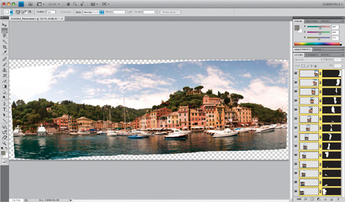
Step Five:
To make your pano fit perfectly together, Photomerge has to move and rearrange things in a way that will cause you to have to crop the photo down to get the final result you want (we get the easy job—cropping only takes about 10 seconds). So, get the Crop tool (C) and drag out your cropping border (like you see here, encompassing as much of the pano as possible without leaving any gaps).
Step Six:
Press Return (PC: Enter), and your pano is cropped down to size (as shown here) and you can make any other adjustments you want. Now, for Photoshop to pull this mini-miracle off, there’s just one rule to remember when you’re shooting: overlap each photo segment by around 20%. That’s the one rule I still teach. Do that, and the rest will take care of itself.
TIP: Why Make Panos with Photomerge Instead of Auto-Align Layers?
If you use Auto-Align Layers in CS4, you’ll notice that many of the layout features seem the same as in Photomerge. So, why use Photomerge for stitching? It’s because Photomerge does more than just align layers—it stacks all your images into one document, then it aligns them (like Auto-Align Layers), but then it blends them together into one seamless pano. It does all three things at once. So don’t let the Photomerge dialog fool you—it’s doing more than it seems.
Okay, the Clone Source panel itself might not be new (it was added in CS3), but they added some nice tweaks in CS4—not just to the panel, but to how the Clone Stamp tool works—that make cloning away unwanted objects easier than ever. In the project below, we want to remove the distracting power line running through (and ruining) our seaside shot.
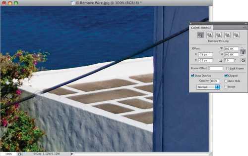
Step One:
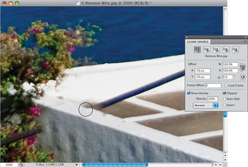
Getting rid of the power line in the bushes and over the wall on the top-right corner is going to be no problem—the sticky part will be removing it along that half-wall in the center, and keeping that nice crisp edge on both sides of the wall. That’s where having a live preview of the area you’re cloning over (courtesy of the Clone Source panel) comes in really handy, because with it, this once tricky repair becomes just plain simple. First, open the Clone Source panel. Now get the Clone Stamp tool (S) from the Toolbox, then press-and-hold the Option (PC: Alt) key and click once directly on the front edge of the half wall (as shown here) to sample that part of the wall.

SCOTT KELBY
Step Two:
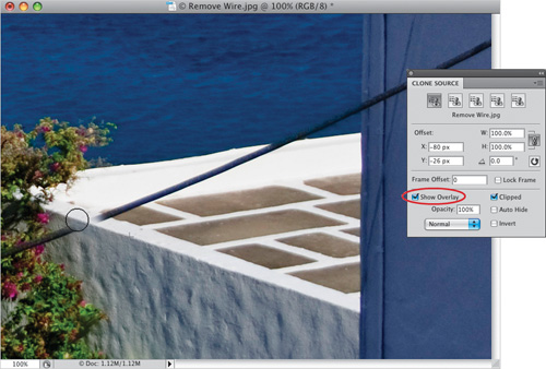
Now move your cursor to the left, down the half-wall, right over the power line (don’t click—just hover it there for now). Look inside your brush tip—you see a preview of the area you just sampled appear right within your round brush cursor. Just move the brush a little until the preview of what you’re about to clone (the edge of the wall), is perfectly in line with the area you’re cloning over (as seen here). This live preview makes it so easy to line stuff up like this because now you can finally see what you’re doing before you do it.
Step Three:
Once you can see it’s lined up right, just start painting and the preview will go away, and you can paint that nice clean edge right in (as seen here). This preview is controlled from right within the Clone Source panel itself, at the bottom of the panel. By default, this preview is clipped so it only appears inside your cursor (you’ll see why you do and don’t want that on the next page, but it’s on by default). If you find this distracting, you can turn it off by turning off the Show Overlay checkbox (shown circled here in red). We’ve got a little more to do, but while we’re here, I want to point out those five Clone Stamp tool icons across the top of the panel. You can sample from (and have Photoshop remember) up to five separate photos (it keeps track of which open photo you sampled from as you click on the different Clone Stamp tool icons). For example, if you thought you might like to add a potted plant to the deck from another photo, you could jump over to that image, sample the edge of the potted plant, then come back to this one. When you’re ready for it, you’d click the second icon from the left, and just start painting. Pretty handy.
Step Four:
Let’s finish this one off by doing the other side of the short wall (after all, we still have some power line left). Option-click (PC: Alt-click) on the right side edge of the half-wall to sample it, then use that live preview to line up the edge again, and start painting (cloning) right down that wall to the left (as seen here). Now we have both sides nice and crisp. Next, you might try cloning the brown floor over to the left to cover over the line in that area (that preview thing will be helpful here, too).
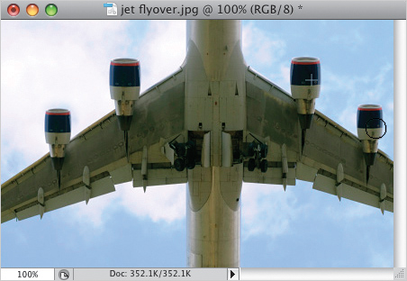
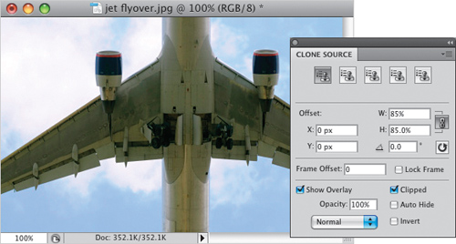
Step Five:
Now let’s switch to a different cloning situation: cloning something, but the thing we need to clone has to be smaller after we clone it. We’re going to use the preview differently here. We want to add two more engines to the plane (on the outside of the existing engines), but we need them to be around 15% smaller (this would be a lot trickier to do without the Clone Source panel). Now we can enter the percentage size (larger or smaller) that we want our clone to be. In our case, I need the clones to be only 85% of the size of the existing area we’re going to sample (the engines), so in the W and H (width and height) fields, enter 85% (as seen here). By the way, the W and H fields are linked by default, so when you enter the width at 85%, the height goes to 85% automatically. If you don’t want these linked, click on the little link button to the right.
©ISTOCKPHOTO
Step Six:
In the Clone Source panel, turn off the checkbox for Clipped (near the bottom right), so you’ll see a full-size preview of what you’re about to clone, and not just a small area that fits inside your brush cursor. At the bottom of the panel, lower the Opacity amount to 50%, so you’ll be able to see through the 15% smaller version of the photo you’ll be working with in just a moment. Option-click (PC: Alt-click) on the left side of the left engine, then move over to the left, and as you do, a ghosted preview of an 85% smaller plane appears attached to your cursor, as shown here. Just move your cursor to position your ghost engine where you’d like it to appear on your wing (as seen here, where I used the left wing to help line things up).

Step Seven:
Now click and start painting (cloning) in the new extra engine (as shown here—the crosshair cursor shows where I sampled from, and the round brush cursor is where my brush is now cloning). Did you notice that the moment you actually started painting (and not just hovering your cursor over the area), the preview went away? That’s because of a feature in the Clone Source panel called Auto Hide (shown circled here in red). When it’s turned on (and luckily it’s on by default), as soon as you actually start cloning, it turns the preview off (after all, you don’t need the preview anymore—now you’re actually painting...er...cloning. You know what I mean!). Hey, while we’re here, under the W and H fields is a Rotation field for when you want your cloning to be rotated as you clone—just type in the angle amount.
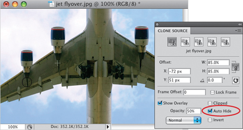
Step Eight:
When you’re done adding the extra left engine, try adding the right side one. Option-click (PC: Alt-click) the right side center of the right engine (to sample it), then move your cursor over the right wing where you think you want this smaller engine clone. As you do, the large full-size preview comes back so you can line things up again (that 50% opacity thing really makes sense now, eh? Without it, your preview would just cover everything behind it, so you wouldn’t be able to see the wing or precisely line up the edges). Once you can see it’s lined up right, just start painting and the engine will be added, as shown here.