Chapter 7. Basic Image Retouching
You may be perfectly happy using Elements only in Quick Fix mode. And that’s fine, as long as you understand that you’ve hardly scratched the surface of what the program can do for you. Sooner or later, though, you’re probably going to run across a photo where your best Quick Fix efforts just aren’t good enough. Or you may just be curious to see what else Elements has under its hood. That’s when you finally get to put all your image-selecting and layering skills to good use.
Elements gives you loads of ways to fix your photos beyond the limited options in Quick Fix. This chapter guides you through fixing basic exposure problems, shows you new ways of sharpening your photos, and most important, helps you understand how to improve the colors in your photos. You’ll also learn how to use the amazing new Smart Brush tool that lets you apply many common fixes by just brushing over the area you want to correct.
If you want to get the most out of Elements, you need to understand a little about how your camera, computer, and printer think about color. Along with resolution, color is the most important concept in Elements. After all, almost all the adjustments that image-editing programs make consist of changing the color of pixels. So quite a bit of this chapter is about understanding how Elements—and by extension, you—can manipulate your image’s color.
Tip
Most of Elements’ advanced-fixes dialog boxes have a “preview” checkbox, which lets you watch what’s happening as you adjust the settings. It’s a good idea to keep these checkboxes turned on so you can decide if you’re improving things. And for a handy “before” and “after” comparison, toggle the checkbox on and off.
Fixing Exposure Problems
Incorrectly exposed photos are the number one problem all photographers face. No matter how carefully you set up your shot and how many different settings you try on your camera, it always seems like the picture you really, really want to keep is the one that’s over- or underexposed.
The Quick Fix commands (The Quick Fix Window) can really help your photo, but if you’ve tried to bring back a picture that’s badly over- or underexposed, you’ve probably run into the limitations of what Quick Fix can do. Similarly, the Shadows/Highlights command (Contrast) can do a lot, but it’s not intended to fix a photo whose exposure is totally botched—just ones where the contrast between light and dark areas needs a bit of help. And if you push Smart Fix to its limits, your results may be a little strange. In those situations, you need to move on to some of Elements’ more powerful tools to help improve your exposure.
Tip
In this section, you’ll learn about the more traditional ways of correcting exposure in Elements, as well as how to use the new Smart Brush tool for corrections. But also be sure to check out the Elements Camera Raw Converter (Using the Raw Converter), which can help with your JPEG and TIFF photos, too. Your results with non-Raw photos may vary, but the Raw Converter just might turn out to be your best choice.
Deciding Which Exposure Fix to Use
When you open a poorly exposed photo in Elements, the first thing to do is figure out what’s wrong with it, just like a doctor diagnosing a patient. If the exposure’s not perfect, what exactly is wrong? Here’s a list of common symptoms to help figure out where to go next:
Everything is too dark. If your photo is really dark, try adding a Screen layer, as explained on Fixing Major Exposure Problems. If it’s just a bit too dark, try using Levels (Using Levels).
Everything is too light. If the whole photo looks washed out, try adding a Multiply layer (explained on Fixing Major Exposure Problems). If it’s just a bit too light, try Levels (Using Levels).
The photo is mostly OK, but your subject is too dark or the light parts of the photo are too light. Try the Shadows/Highlights adjustment (The Shadows/Highlights Command) or the new Smart Brush tool (Correcting color with a brush).
Of course, if you’re lucky (or a really skilled photographer), you may not see any of these problems, in which case, skip to Using Levels if you want to do something to make your colors pop.
Note
You may have noticed that you didn’t see Brightness/Contrast mentioned anywhere in the previous list. A lot of people tend to jump for the Brightness/Contrast controls when facing a poorly exposed photo. That’s logical—after all, these dials usually help improve the picture on your TV. But in Elements, about 99 percent of the time, you’ve got a whole slew of powerful tools—like Levels and the Shadows/Highlights command—that can do much more than Brightness/Contrast can. However, in recent versions of Elements, Brightness/Contrast is much improved from earlier versions, so feel free to give it a try when you only need to make very subtle changes.
Fixing Major Exposure Problems
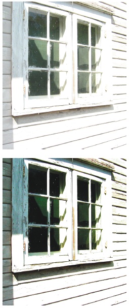
If your photo is completely over- or underexposed, you need to add special layers to correct the problems. You follow the same steps to fix either problem. The only difference is the layer blend mode (Blend Mode) you choose: Multiply layers darken your image’s exposure while Screen layers lighten it. Figure 7-1 shows Multiply layers in action (and also gives you an idea of the limitations of this technique if your exposure is really far gone). You can download the file window.jpg from the Missing CD page at www.missingmanuals.com if you’d like to try the different exposure fixes for yourself.
Be careful, though. If your entire photo isn’t out of whack, using Multiply or Screen layers can ruin the exposure of the parts that were OK to start with, because they’ll increase or decrease the exposure on the entire photo. Your properly exposed areas may blow out (see The Shadows/Highlights Command) and lose the details if you apply a Screen layer, for example. So, if your exposure problem is spotty (as opposed to problems that affect the entire image), try the new Smart Brush (Using Levels) or Shadows/Highlights (The Shadows/Highlights Command) first. If your whole photo needs an exposure correction, here’s how to use layers to fix it:
Create a duplicate layer.
Open your photo and press Ctrl+J or go to Layer → Duplicate Layer. Check to be sure the duplicate layer is the active layer.
In the Layers palette, change the mode for the new layer in the pop-up menu.
Choose Multiply if your photo is overexposed, or Screen if it’s underexposed. Make sure you change the mode of the duplicate layer, not the original layer.
Adjust the opacity of the layer if needed.
If the effect of the new layer is too strong, in the Layers palette, move the Opacity slider to the left to reduce the new layer’s opacity.
Figure 7-1. For those who think photographically, each Multiply layer you add is roughly equivalent to stopping your camera down one f-stop, at least as far as the dark areas are concerned. Top: This photo is totally overexposed, and it looks like there’s no detail there at all. Multiply layers darken things enough to bring back a lot of the washed-out areas. This technique can bring out the detail quite a bit. Bottom: As you can see in the corrected photo, even Elements can’t do much in areas where there’s no detail at all.Repeat as necessary.
You may need to use as many as five or six layers if your photo is in really bad shape. If you need extra layers, you’ll probably want them at 100 percent opacity, so you can just keep pressing Ctrl+J, which will duplicate the current top layer.
You’re more likely to need several layers to fix overexposure than you are for underexposure. And, of course, there are limits to what even Elements can do for a blindingly overexposed image. Overexposure is usually tougher to fix than underexposure, especially if the area is blown out, as explained in the box on The Shadows/Highlights Command.
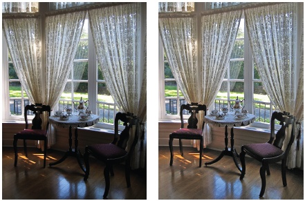
The Shadows/Highlights Command
The Shadows/Highlights command is one of the best features in Elements. It’s an incredibly powerful tool for adjusting only the dark or light areas of your photo without messing up the rest of it. Figure 7-2 shows what a great help it can be.
The Shadows/Highlights command in the Full Editor works pretty much the same way it does in Quick Fix (Contrast). The single flaw in this great tool is that you can’t apply it as an Adjustment layer (Adding Fill and Adjustment Layers), so you may want to apply Shadows/Highlights to a duplicate layer. Then, later on, you can discard the changes if you want to take another whack at adjusting the photo. In any case, it’s not difficult at all to make amazing changes to your photos with Shadows/Highlights. Here’s how:
Open your photo and duplicate the layer (Ctrl+J) if you want to.
Duplicating your layer makes it easier to undo Shadows/Highlights later if you change your mind.
Go to Enhance → Adjust Lighting → Shadows/Highlights.
Your photo immediately becomes about 30 shades lighter. Don’t panic. As soon as you select the command, the Lighten Shadows setting automatically jumps to 25 percent, which is way too much for most photos. Just shove the slider back to 0 to undo this change before you start making your corrections.
Move the sliders around until you like what you see.
The sliders do exactly what they say: Lighten Shadows makes the dark areas of your photo lighter, and Darken Highlights makes the light areas darker. Pushing the slider to the right increases the effect for either one.
Click OK when you’re happy.
The Shadows/Highlights tool is a cinch to use because you just make decisions based on what you’re seeing. Keep these tips in mind:
You may want to add a smidgen of the opposite tool to balance things out a little. In other words, if you’re lightening shadows, you may get better results by giving the Darken Highlights slider a teeny nudge, too.
Midtone Contrast is there because your photo may look kind of flat after you’re done with Shadows/Highlights, especially if you’ve made big adjustments. Move the Midtone Contrast slider to the right to increase the contrast in your photo. It usually adds a bit of a darkening effect, so you may need to go back to one of the other sliders to tweak your photo after you use it.
You can overdo the Shadows/Highlights tool. When you see halos around the objects in your photo, you’ve pushed the settings too far.
Tip
If the Shadows/Highlights tool looks like it washed out your photo’s colors—making everyone look like they’ve been through the laundry too many times—adjust the color intensity with one of the Saturation commands, either in Quick Fix or in the Full Editor (as described on Making Your Colors More Vibrant). Watch people’s skin tones when increasing the saturation—if the subjects in your photo start looking like sunless-tanning lotion disaster victims, you’ve gone too far. Also check out the Vibrance slider in the Raw Converter (Adjusting Vibrance and Saturation), or you can try adjusting colors with Elements’ Color Curves feature (Color Curves: Enhancing Tone and Contrast).
Correcting Part of an Image
Shadows/Highlights is great if you want to adjust all the light or dark areas of a photo, but what if you want to tweak the exposure only in certain areas? Or what if you like the photo’s background just fine, but you want to tweak the subject a little? Of course, you can always make a selection in your photo (see Chapter 5 for more about selecting), or copy the selected area to a new layer, and then make your adjustments to that layer. But in Elements 7, Adobe has provided a super simple way to apply a correction to just the area you want, using the new Smart Brush tools.
Correcting color with a brush
The Smart Brush is actually two different tools (the Smart Brush and the Detail Smart Brush) that work just like the Quick Selection tool and the regular Selection brush, respectively—only instead of merely selecting a region of your photo, they also edit it as you brush. So you may be able to do very tightly targeted adjustments to different areas of your photo, just by drawing a line over it. The Smart Brushes don’t always work, but they’re truly amazing when they do.
In this section you’ll learn how to use the Smart Brush to correct exposure, but you have a whole menu of different things you can choose to do with the Smart Brush: Change the color of someone’s jacket, apply different special effects, add lipstick to a woman’s lips, convert the area you select to black and white—the list goes on and on. As a matter of fact, if you’ve been using the Quick Fix, you may well have met the Smart Brush already, although it doesn’t go by that name there: The new Touch Up tools (Touch Ups) in the Quick Fix all use the Smart Brush to apply their effects.
Here’s how to put this nifty pair of tools to work:
Open a photo in Full Edit, and then activate the Smart Brush.
Click its icon in the Toolbox (it’s the brush with the gears next to it) or press F. Use the flyout menu to be sure you have the regular Smart Brush. It shares its Toolbox slot with the Detail Smart Brush, which works like the Selection Brush. That is, it changes only the area directly under the brush, instead of automatically expanding your selection to include the entire object you brush over. For now, see if the regular Smart Brush is smart enough to select the area you want.
Choose the correction you want to apply.
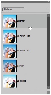
Go to the Options Bar, and then, choose from the pull-down menu. (Both Smart Brushes have the same options bar settings, discussed below. The important one is explained in Figure 7-3.) Adobe calls these choices Smart Paint.
Drag over the area you want to change.
This step is just like using the Quick Selection tool—no need to make a careful selection, since Elements calculates the area it thinks you want to include and create the selection for you. A simple line should do it.
Figure 7-3. Your Smart Paint options (the things you can do with the Smart Brush) are grouped into the categories listed in the pull-down menu. Each thumbnail picture shows an individual option applied to the same photo. For exposure issues, start by looking at the choices in the Lighting section. You can choose to make the area darker, brighter, make the contrast low or high, or even put a spotlight effect on it. Just scroll through the list to find the effect you want, click it, and then click somewhere outside your photo to minimize the menu list again. You can also tear the list loose from the Options bar and place it where you want, if you’d like to keep it available and out of the way of your photo.Tweak the selection, if necessary.
If Elements didn’t quite select everything you want, then you can add to the selection by brushing again. If you still need to modify the selection, then use the selection editing tools, explained in Figure 7-4. If you’re really unhappy with the Smart Brush’s selection talents, then head back to the Toolbox, and try the Detail Smart Brush.
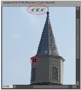
Figure 7-4. Once you’ve used the Smart Brush, a pin (circled) appears in your photo, indicating that the selected region is now under the power of the Smart Brush. Click it, and you see a trio of icons (circled) which let you edit your selected area. From left to right the icons mean New Selection, “Add to Selection”, and “Remove from Selection”. If you’re pressed for time, there’s an even quicker route to modifying your selection: Just drag again to add to the area affected by the Smart Brush (or to use the same adjustment on another part of your photo) or Alt-drag to remove changes from an area. You see the pin any time the Smart Brush is activated again, even after you’ve closed and saved your photo.You can invert a selection (Changing and Moving Selections) by turning on the Inverse box in the Options bar. Then what you select with the brush is excluded from your selection; everything else is included in the selection. You can turn on the checkbox before or after using the Smart Brush, as long as it’s still the active tool. If you come back to the Smart Brush after using another tool, then you need to click the pin shown in Figure 7-4 before you can invert the selection, thus inverting the area covered by the effect.
Once you like the selection, you can also adjust the effect, if you want.
The Smart Brush gives you several ways to change what it’s done:
Change what happens to the selected area. While the selection is active, in the Options bar, just go to the Smart Paint setting, and then choose a different Smart Paint adjustment. It automatically updates your previous choice.
Add a different kind of Smart Paint. At the far left of the Options bar, click the tiny triangle and choose Reset Tool. Then the Smart Brush puts down an additional adjustment when you use it, instead of just changing what you’ve already done. You can also use this to double up an effect—to add Lipstick twice, for instance, if you thought the first pass was too faint. Each Smart Brush adjustment gets its own pin, so if you have two Smart Brush adjustments in your photo, then you have two pins in it, too. Each pin is a different color.
Change the settings for Smart Paint you’ve already applied. Rather than adding another Smart Paint layer to increase the effect, you can just adjust the settings for the changes you’ve already made. Right-click the pin in your image, and then choose Change Adjustment Settings to bring up a dialog box where you can adjust the effect you’re brushing on. The Smart Brush uses Adjustment layers for the changes it makes. The available settings that are the same as they would be if you created a regular Adjustment layer—if you’re using the Brighter option, as shown in Figure 7-4, for example, then you get the settings for a Brightness/Contrast Adjustment layer.
When you’re happy with what you have, you’re all done.
You can always go back to your Smart Paint changes again. Just activate the Smart Brush (click it in the Toolbox or press F) and the pin(s) appear again, to let you easily change what you’ve done. You can eliminate Smart Brush changes by right-clicking the adjusted area, and then choosing Delete Adjustment (the Smart Brush needs to be active), or by going to the Layers palette and discarding their layers (you can do this anytime, whether the Smart Brush is active or not). You can also edit the Layer mask of a Smart Brush adjustment the way you’d edit any other Layer mask, as described on Editing a layer mask. But usually it’s easier just to click the pin, and then adjust your selection.
The Smart Brush is especially handy for projects like creating images that are partly in color and partly black and white, or even for silly special effects like making one object from your photo look like it’s been isolated on a 60’s-style psychedelic background.
The Smart Brush has several Options bar settings, but you usually don’t need to use them:
New Selection. Click the left brush icon, and you can add the same effect elsewhere in your photo. Actually, though, just clicking someplace else with the brush does the same thing.
Add to Selection. You can click this option to put the Smart Brush in add-to-selection mode, but again, the brush does that automatically without using the icon.
Remove from Selection. Did the Smart Brush take in more area than you wanted? Click this icon before brushing away what you don’t want, or just Alt-drag.
Brush characteristics. You can change the size, hardness, spacing, angle, or roundness of the brush here.
Inverse. If you want to apply your chosen correction to the area you didn’t select with the Smart Brush, then just turn on this checkbox to invert the selection.
Refine Edge. Use this if you want to make the edges of your effect sleeker. See Refine Edge.
Smart Paint. Click the thumbnail for a pop-out menu of all the possible Smart Brush adjustments, grouped into categories. (Incidentally, if you hover your mouse over the thumbnail, then the tooltips text just says “Choose a Preset”, but Adobe calls these settings Smart Paint in the Help files and elsewhere.)
If you like the idea of the Smart Brush, but never seem to find exactly the adjustments you want, or if you always find that you want to change the settings you apply, then you can even create your own Smart Paint options, as described in the box on Controlling the Colors You See.
Note
If you make a mistake creating your preset, and don’t catch it till after starting the Editor again, correct it, go to C:ProgramDataAdobePhotoshop Elements7.0Localeen_US (this is different if you aren’t in the US), and then delete MediaDatabase.db3 to refresh the list of presets, if you’re using Vista. In XP, it’s in C:Documents and SettingsAll UsersApplication DataAdobePhotoshop Elements7.0 Localeen_US (or your location).
Controlling the Colors You See
You want your photos to look as good as possible and to have beautiful, breathtaking color, right? That’s probably why you bought Elements. But now that you’ve got the program, you’re having a little trouble getting things to look the way you want. Does this sound familiar?
Your photos look great onscreen but your prints are washed out, too dark, or the colors are all a little wrong.
Your photos look just fine in other programs like Word or Windows Explorer, but they look just awful in Elements.
What’s going on? The answer has to do with the fact that Elements is a color-managed program. That means that Elements uses your monitor information for guidance when deciding how to display images. Color management is the science of making sure that the color in your images is always exactly the same, no matter who opens your file or what kind of hardware they’re viewing it on or printing it from. If you think of all the different monitor and printer models out there, you get an idea of what a big job this is.
Graphics pros spend their whole lives grappling with color management, and you can find plenty of books about the finer points of color management. On the most sophisticated level, color management is complicated enough to make you curl up into the fetal position and swear never to create another picture.
Lucky for you, Elements makes color management a whole lot easier. Most of the time, you have only two things to deal with: your monitor calibration and your color space. The following pages cover both.
Note
There are a couple of other color-related settings for printing, too, but you can deal with those when you get ready to print. Chapter 16 explains them.
Calibrating Your Monitor
Most of programs pay no attention to your monitor’s color settings, but a color-managed application like Elements relies on the profile—the information your computer stores about your monitor’s settings—when it decides how to print or display a photo onscreen. If that profile isn’t accurate, neither is the color in Elements.
So, you may need to calibrate your monitor, which is a way of adjusting its settings. A properly calibrated monitor makes all the difference in the world in getting great-looking results. If your photos look bad only in Elements, or if your pictures in print don’t look anything like they look onscreen, you can start fixing the problem by calibrating your monitor.
Getting started with calibrating
Calibrating a monitor sounds intimidating, but it’s actually not that difficult—some people think it’s even kind of fun. You get an extra added benefit in that your monitor may look about a thousand times better than you thought it could. Calibrating may even make it easier to read text in Word, for instance, because the contrast is better. Your options for calibrating your monitor, from best to only okay, are:
Use a colorimeter. This method may sound disturbingly scientific, but it’s actually the easiest. A colorimeter is just a hardware device with special software that does your calibration for you. The device is much more accurate than calibrating by eye. For a long time, only a pro could afford one, but these days if you shop around you can find the Pantone Huey or the Spyder2Express for about $70 or less. More pro-oriented calibrators like the Eye One Display 2 or the Monaco Optix Spyder are about $200 or less. If you’re serious about controlling your colors in Elements, hardware is by far your best option for calibrating.
Note
Your calibration software probably asks you to set the brightness and contrast before you begin, even though most newer LCD monitors don’t have adjustable dials for these anymore. If you’re happy with your monitor’s current brightness and contrast, you can safely ignore this step. And unless you have a reason to choose differently, for an LCD monitor you usually want to set your white point to 6500 (Kelvin) and your gamma to 2.2.
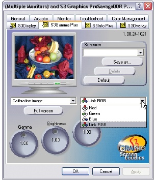
Software on your computer. There’s a good chance that the drivers (utility software) for your graphics card include some kind of calibration tool. Figure 7-5 shows a typical example. Right-click anywhere on the desktop and choose Display Settings → Color Management (in Windows XP: Display → Properties → Settings → Advanced) to see what you have.
Adobe Gamma. If you have an older version of Elements (Elements 5 or earlier) you may have this program, which used to come with Elements. It’s pretty ancient, was never meant to work with anything but the old CRT monitors (the big fat ones like old-fashioned televisions), and will not work in Vista at all. If you happen to have Adobe Gamma, it may be better than nothing, but it’s probably less useful than any other utility you might have for adjusting your display.
If your photos still look a little odd even after you’ve calibrated your monitor, you may need to turn on the Ignore EXIF setting in the Editor’s preferences; see Figure 7-6.
Choosing a Color Space
The other thing you may need to do to get good color from Elements is to check the color space Elements is using. Color space refers to which standard (out of several possibilities) Elements uses to define your colors. Color space can seem pretty abstruse the first time you hear about it, but it’s simply a way of defining what colors mean. For example, when someone says “green,” what do you envision: a lush emerald color, a deep forest green, a bright lime, or something else?
Choosing a color space is a way to make sure that everything that handles a digital file—Elements, your monitor, your printer—sees the same colors the same way. Over the years, the graphics industry has agreed on standards so that everyone has the same understanding of what you mean when you say red or green—as long as you specify which set of standards you’re using.
Elements only gives you two color spaces to pick from: sRGB (also called sRGB IEC61966-2.1 if you want to impress your geek friends) and Adobe RGB. When you choose a color space, you tell Elements which set of standards you want it to apply to your photos.
If you’re happy with the color you see on your monitor in Elements and you like the prints you’re getting, you don’t need to make any changes. If, on the other hand, you aren’t perfectly satisfied with what Elements is giving you, you’ll probably want to modify your color space, which you can do in the Color Settings dialog box. Go to Edit → Color Settings or press Shift+Ctrl+K. Here are your choices:
No Color Management. Elements ignores any information that your file already contains, like color space information from your camera, and doesn’t attempt to add any color info to the file data. (When you do a Save As, there’s a checkbox that offers you the option of embedding your monitor profile. Don’t turn on this checkbox, since your monitor profile is best left for the monitor’s own use, and putting the profile into your file can make trouble if you ever send the file someplace else for printing.)
Always Optimize Colors for Computer Screens. Choose this option and you’re looking at your photo in the sRGB color space, which is what most Web browsers use; this is a good choice for when you’re preparing graphics for the Web. Many online printing services also prefer sRGB files. (If you’ve used an early version of Elements, this is the same as the old Limited Color Management option.)
Always Optimize for Printing. This option uses the Adobe RGB color space, which is a wider color space than sRGB. In other words, it allows more gradations of color than sRGB. Sometimes this is your best choice for printing—but not always. So despite the note you’ll see in the Color Settings dialog box about “commonly used for printing,” don’t be afraid to try one of the other two settings instead. Many home inkjet printers actually cope better with sRGB or no color management than with Adobe RGB. (For old Elements hands, this setting used to be called Full Color Management.)
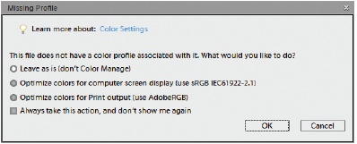
Allow Me to Choose. This option assumes that you’re using the sRGB space, but lets you assign either an Adobe RGB tag, an sRGB tag, or no tag at all. If you’ve selected “Allow Me to Choose”, each time you open a file that isn’t sRGB, you see the dialog box shown in Figure 7-7. You can use this dialog box to assign a different profile to a photo. Just save it once without a profile (turn off the ICC [International Color Consortium] Profile checkbox in the Save As dialog box), and then reopen it and choose the profile you want from the dialog box. Or there’s an easier way to convert a color profile if you need to make a change. See the box on Using Levels to learn how.
Note
Elements automatically opens files tagged with a color space other than the one you’re working in without letting you know what it’s just done. (Except when you open a file in a color mode that Elements can’t handle at all, like CMYK. In that case, Elements offers to convert it to a mode you can use.) So, if you have an Adobe RGB file and you’re working in “Always Optimize Colors for Computer Screens”, Elements doesn’t warn you about the profile mismatch the way early versions of the program did—it just opens the file.
So what’s your best option? Once again, if everything is looking good, leave it alone. Otherwise, for general use, you’re probably best off starting with No Color Management. Then try the others if that doesn’t work well for you.
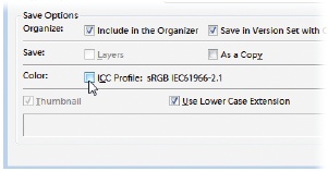
If you choose one of the other three options, when you save your file, Elements attempts to embed the file with a tag, or information about the file’s color space—either Adobe RGB or sRGB. (Incidentally, this tag isn’t related to the Organizer tags that you read about in Chapter 2.) If you don’t want a color tag—also known as an ICC Profile—in your file, just turn off the checkbox before you save your file. Figure 7-8 shows where to find the profile information in the Save As dialog box, and how to turn the whole process off.
Using Levels
People who’ve used Elements for a while will tell you that the Levels command is one of the program’s most essential tools. You can fix an amazing array of problems simply by adjusting the level of each color channel. (On your monitor, each color you see is composed of red, green, and blue. In Elements, you can make very precise adjustments to your images by adjusting these color channels separately.)
Just as its name suggests, Levels adjusts the amount, or level, of each color within an image. There are several different adjustments you can make using Levels, from general brightening of your colors to fixing a color cast (more about color casts later in this chapter). Many digital photo enthusiasts treat almost every picture they take to a dose of Levels, because there’s no better way to polish up the color in your photo.
The way Levels works is fairly complex. Start by thinking of the possible range of brightness in any photo on a scale from 0 (black) to 255 (white). Some photos may have pixels in them that fall at both those extremes, but most photos don’t. And even the ones that do may not have the full range of brightness in each individual color channel. Most of the time, there’s going to be some empty space at one or both ends of the scale.
When you use Levels, you tell Elements to consider the range of colors available in your photo as the total tonal range it has to work with. Elements redistributes your colors accordingly. Basically, you just get rid of the empty space at the ends of the scale of possibilities. This can dramatically readjust the color distribution in your photo, as you can see in Figure 7-9.
It’s much, much easier to use Levels than to understand it, as you know if you’ve already tried Auto Levels in Quick Fix (Adjusting Lighting and Contrast). That command is great for, well, quick fixes. But if you really need to massage your image, Levels has a lot more under the hood than you can see there. The next section shows you how to get at these settings.
Understanding the Histogram
Before you can get started adjusting Levels, you first need to understand the heart, soul, and brain of the Levels dialog box: the Histogram (shown in Figure 7-10).
The Histogram is the black bumpy mound in the window. It’s really nothing more than a bar graph indicating the distribution of the colors in your photo. (It’s a bar graph, but there’s no space between the bars, which is what causes the mountainous look.)
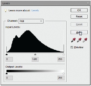
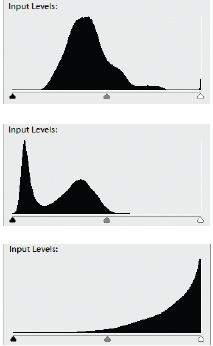
From left to right, the Histogram shows the brightness range from dark to light (the 0 to 255 mentioned earlier in this section). The height of the “mountain” at any given point shows how many pixels in your photo are that particular brightness. You can tell a lot about your photo by where the mound of color is before you adjust it, as demonstrated in Figure 7-11.
If you look above the Histogram, you can see that there’s a little menu that says RGB. If you pull that down, you can also see a separate Histogram for each individual color. You can adjust all three channels at once in the RGB setting, or change each channel separately for maximum control of your colors.
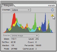
The Histogram contains so much information about your photo that Adobe also makes it available in the Full Editor in its own palette (Figure 7-12); this way, you can always see it and use it to monitor how you’re changing the colors in an image. Once you get fluent in reading Histogramese, you’ll probably want to keep this palette around.
The Histogram is just a graph, and you don’t do anything to it directly. What you do when you use Levels is use the Histogram as a guide so that you can tell Elements what to consider as the black and white points—that is, the darkest and lightest points, in your photo. (Remember, you’re thinking in terms of brightness values, not shades of color, for these settings.)
Once you’ve set the end points, you can adjust the midtones—the tones in between that would appear gray in a black-and-white photo. If that seems complicated, it’s not—at least, not when you’re actually doing it. Once you’ve made a Levels adjustment, the next time you open the Levels dialog box, you’ll see that your Histogram now runs the entire length of the scale because you’ve told Elements to redistribute your colors so that they cover the full dark-to-light range.
The next two sections show you—finally!—how to actually adjust your image’s Levels.
Tip
Once you learn how to interpret the Histograms in Elements, you can try your hand with your camera’s histogram (if it has one). It’s really hard to judge how well your picture turned out when all you have to go by is your camera’s tiny LCD screen, so the histogram can be a big help. By looking at your camera’s histogram, you can tell how well exposed your shot was.
Adjusting Levels: The Eyedropper Method
One way to adjust Levels is to set the black, white, and/or gray points by using the eyedroppers on the right side of the Levels dialog box. It’s quite simple—just follow these steps:
Bring up the Levels dialog box by selecting Layer → New Adjustment Layer → Levels.
If for some reason you don’t want a separate layer for your Levels adjustment, go to Enhance → Adjust Lighting → Levels or press Ctrl+L instead. But making the Levels changes on an Adjustment layer gives you more flexibility for making changes in the future.
Move the Levels dialog box out of the way so that you get a good view of your photo.
The dialog box loves to plunk itself down smack in the middle of the most important part of your image. Just grab it by the top bar and drag it to where it’s not covering up a crucial part of your photo.
In the Levels dialog box, click the black eyedropper.
From left to right, the eyedroppers are black, gray, and white.
Move your cursor back over your photo and click an area of your photo that should be black.
Should be, not is. That’s a mistake lots of people make the first time they use the Levels eyedroppers. They click a spot that appears the same color as the eye-dropper rather than one that ought to be that color.
Repeat with the other eyedroppers for their respective colors.
In other words, now find a white point and a gray point. That’s the way it’s supposed to work, but it’s not always possible to use all of the eyedroppers in any one photo. Experiment to see what gives you the best-looking results.
When you’re happy with what you see, click OK.
See, it’s not so hard. If you mess up, just click the Reset button, and you can start over again.
Adjusting Levels: The Slider Controls
The eyedropper method works fine if your photo has spots that should be black, white, or gray, but a lot of the time, your picture may not have any of these colors.
Fortunately, the Levels sliders give you yet another way to apply Levels, and it’s by far the most popular method, giving you maximum control over your colors.
If you look directly under the Histogram, you’ll see three little triangles, called Input sliders. The left triangle is the slider for setting the black point in your photo, the right slider sets the white point, and the middle slider adjusts your midtones (gray). You just drag them to make changes to the color levels in your photo, as shown in Figure 7-13.
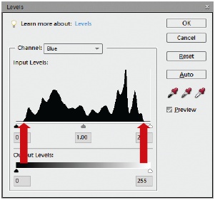
When you move the left Input slider, you tell Levels, “Take all the pixels from this point down and consider them black.” With the right slider, you’re saying, “Make this pixel and all higher values white.” The middle slider, the midtones slider, adjusts the brightness values that are considered medium gray. All three adjustments improve the contrast of your image.
Note
If there are small amounts of data, like a flat line at the ends or if all your data is bunched in the middle of the graph, watch the preview in your photo to decide how far toward the mountain you should bring the sliders. Moving it all the way in may be too drastic. Your own taste should always be the deciding factor when you’re adjusting a photo.
The easiest way to use the Levels sliders is to:
Bring up the Levels dialog box.
Use one of the methods described in step 1 of the Eyedropper method (Adjusting Levels: The Slider Controls).
Move the Levels dialog box so you’ve got a clear view of your photo and then grab the black Input slider.
That’s the one on the left side of the Histogram box.
Slide it to the right, if necessary.
Move it over until it’s under the farthest left part of the Histogram that has a mound of color in it. If you glance back at Figure 7-13, you’d move the left slider to where the left red arrow is. (Incidentally, although you’re adjusting the colors in your image, the Levels Histogram stays black and white no matter what you do—you don’t get any color in the dialog box itself.)
You may not need to move the slider at all if there’s already a good bit of data at the end of the Histogram. It’s not mandatory to adjust each slider every time.
Grab the white slider (the one on the right side) and move it left, if necessary.
Bring it under the farthest right area of the Histogram that has a mound of data in it.
Now adjust the gray slider.
This is called the midtones slider, and it adjusts the midtones of your photo. Move it back and forth while watching your photo until you like what you see. Midtones makes the most impact on the overall result, so take some time to play with this slider.
Click OK.
You can adjust your entire image or just each color channel individually. The most accurate way is to first choose each color channel separately from the Channel drop-down menu in the Levels dialog box. Adjust the end points for each channel by itself, and then go back to RGB and tweak just the gamma slider.
Tip
If you know the numerical value of the pixels you want to designate for any of these settings—you geek!—you can type that information into the Input Levels boxes. You can set the gamma value from .10 to 9.99. It’s set at 1.00 automatically.
The last control you may want to use in the Levels dialog box is the Output Levels slider. Output Levels work roughly the same way as your brightness and contrast controls on your TV. Moving these sliders makes the darkest pixels darker and the lightest pixels lighter. Among pros, this is known as adjusting the tonal range of a photo.
Adjusting Levels will improve almost every photo you take, but if your photo has a bad color cast—if it’s too orange or too blue—you may need something else. The next section shows you how to get rid of unwanted color.
Removing Unwanted Color
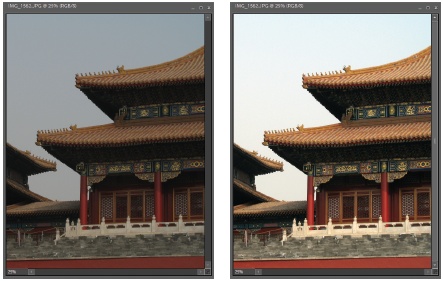
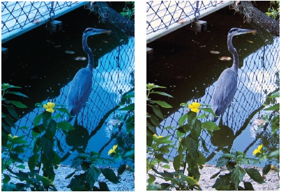
It’s not uncommon for an otherwise good photo to have a color cast—that is, to have all the tonal values shifted so that the photo is too blue, like Figure 7-14, or too orange.
Elements gives you several ways to correct color cast problems:
Auto Color Correction doesn’t give you any control over the changes, but it often does a good job. To use it, go to Enhance → Auto Color Correction or press Ctrl+Shift+B.
The Raw Converter may be the easiest way to fix problems, though it works only on Raw, JPEG, and TIFF files. Just run your photo through the Raw converter (Using the Raw Converter) and adjust your white balance there.
Levels gives you the finest control of all the methods in this list. You can often eliminate a color cast by adjusting the individual color channels till the extra color is gone (as explained in the previous section). The drawbacks are that Levels can be very fiddly for this sort of work, sometimes this method doesn’t work at all if the problem is severe, and one of the other ways may be much faster at getting you the results you want.
Remove Color Cast is the special command for correcting a color cast with one-click ease. The next section explains how to use this tool.
The Color Variations dialog box is helpful in figuring out which colors you need more or less of, but it has some limitations. It’s covered on Using Color Variations.
The Photo Filter command gives you much more control than the Color Cast tool, and you can apply Photo Filters as Adjustment layers, too. Photo Filters are covered on Photo Filter.
The Average Blur Filter, used along with a blend mode, lets you fix a color cast. As you’ll read on Color correcting with the Average Blur filter, it’s something like creating a custom photo filter.
Adjust Color for Skin Tone lets Elements adjust your photos based on the skin colors in the image. In practice, this adjustment may be more likely to introduce a color cast than to correct one, but if your photo has a slight bluish cast that’s visible in the skin of the people in the photo (as explained on Adjusting Skin Tones), it may do the trick. This option works best for slight, annoying casts that are too subtle for the other methods in this list.
All these tools are useful for fixing a color cast, depending on exactly what your problem is. Usually you’d start with Levels and then move on to the Color Cast tool or the Photo Filter. (To practice any of the fixes you’re about to learn, download the photo heron.jpg from the Missing CD page at www.missingmanuals.com.)
Using the Color Cast Tool
The Color Cast tool is another eyedropper sampling tool that adjusts the colors in your photo based on the pixels you click. In this case, you show Elements where a neutral color should be. As you saw with the heron in Figure 7-14, the Color Cast command can make a big difference with just one click. To use it:
Go to Enhance → Adjust Color → Remove Color Cast.
Your cursor should change to an eyedropper when you move it over your photo. If it doesn’t change, go to the dialog box and click the Eyedropper icon.
Click an area that should be gray, white, or black.
You only have to click once in your photo for this tool to work. As with the Levels eyedropper tool, click an area that should be gray, white, or black (as opposed to looking for an area that’s currently one of these colors). If several of these colors appear, you can try different spots in your photo, clicking Reset in between each sample, until you find the spot that gives you the most natural-looking color.
Click OK.
The Color Cast tool works pretty well if your image has areas that should be black, white, or gray, even if they’re very tiny. The tricky thing is when you have an image that doesn’t have a good area to sample—when there isn’t any black, white, or gray anywhere in the picture. If that’s the case, consider using the Photo Filter (Photo Filter).
Using Color Variations
The Color Variations window (Figure 7-15) is very appealing to many Elements beginners, because it gives you a visual clue about what to do to fix the color in your photo. You just click the little preview thumbnail that shows the color balance you like best, and Elements applies the necessary change to make your photo look like the thumbnail.
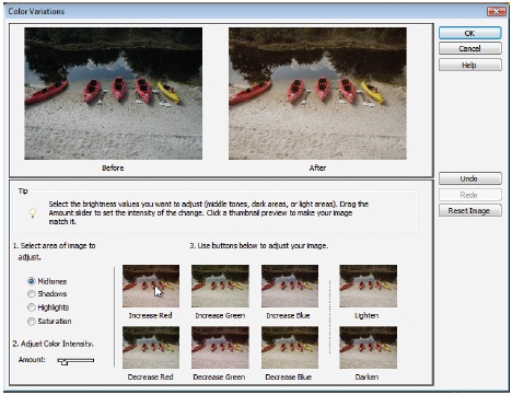
However, Color Variations has some pretty severe limitations, most notably the microscopic size of the thumbnails. It’s very hard to see what you’re doing, and even newcomers can usually get better results in Quick Fix (Using the Color sliders).
Still, Color Variations is useful for those times when you know something is not quite right in your color but you can’t figure out exactly what to do about it. And because it’s adjustable, Color Variations is good for when you do know what you want but you want to make only the tiniest sliver of a difference to your photo’s color. To use the Color Variations tool:
Open your photo.
You may want to make a duplicate layer (Deleting Layers) for the adjustments, so that you’ll have the option to discard your changes if you’re not happy with them. If you don’t work on a duplicate, keep in mind that the changes you make here aren’t undoable after you’ve closed the photo.
Go to Enhance → Adjust Color → Color Variations.
You see the dialog box pictured in Figure 7-15.
On the lower-left corner of the dialog box (where it says “Select area of image to adjust”), click a radio button to choose whether you want to adjust midtones, shadows, highlights, or saturation.
Color Variations begins by selecting midtones, which is usually what you want. But experiment with the other settings to see what they do. The Saturation button works just like Saturation in Quick Fix (Using the Color sliders).
Use the slider at the bottom of the dialog box to control how drastic the adjustment should be.
The farther you push the slider to the right, the more dramatic the change. Usually, just a smidgen is enough to make a noticeable change.
Just below where it says “Use buttons below to adjust your image”, click one of the color buttons to make your photo look more like one of the thumbnail photos.
You can always Undo or Redo using the buttons on the right side of the window, or use Reset Image to put your photo back to where it was when you started.
When you’re happy with the result, click OK.
Choosing the Color You Want
So far, the color corrections you’ve been reading about in this chapter have all done most of the color assigning for you. But a lot of the time, you want to be able to tell Elements what colors to work with—like when you’re selecting the color for a background or Fill layer (Adding Fill and Adjustment Layers), or when you want to paint on an image.
Although you can use any of the millions of colors your screen can display, Elements loads only two colors at a time. You choose these colors using the Foreground and Background color squares at the bottom of the Toolbox (see Figure 7-16).
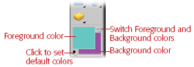
Foreground and Background mean just what they sound like—use the Background color to fill in backgrounds, and use the Foreground color with Elements tools, like the Brush or the Paint Bucket. You can use as many colors as you want, of course. The color-picking tools at the bottom of the Toolbox let you control the color you’re using in a number of different ways:
Reset default colors. Click the tiny black and white squares to return to the standard settings of black for the Foreground color and white for the Background color.
Switch Foreground and Background colors. Click the little curved arrows above and to the right of the squares, and your Background color becomes the Foreground color, and vice versa. This is very helpful when you’ve inadvertently made your color selection in the wrong box. (For example, if you’ve set the Foreground color to yellow, but you actually meant to make the Background color yellow, just click these arrows, and you’re all set.)
Change either the Foreground or Background color to whatever color you want. You can choose any color you like for either color square. Click either square to call up the Color Picker (explained later) to make your new choice. There’s no limit on the colors you can select to use in Elements. Well, technically there is, but it’s in the millions, so you should find enough choices for anything you want to do.
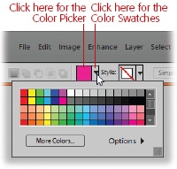
You actually have a few different ways to select your Foreground and Background colors. The next few sections show you how to use the Color Picker, the Eyedropper tool (to pick a color from an existing image), or the Color Swatches palette.
When working with some of the Elements tools, like the Type tool, you can choose a color in the tool’s Options bar settings. Adobe knows that, given a choice, most people prefer to work with either Color Swatches or the Color Picker, so they’ve come up with a clever way to accommodate both camps, as shown in Figure 7-17.
The Color Picker
Figure 7-18 shows you the Color Picker. It has an intimidating number of options, but, most of the time, you don’t need them all. Picking a color is as easy as clicking wherever you see the color you want.
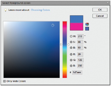
The Color Picker is actually pretty simple to use:
Click the Foreground or Background color square in the Toolbox.
The Color Picker launches. Some other tools—like the Paint Bucket (The Paint Bucket) and the mask color option for the Selection brush (The Selection Brush)—also use the Color Picker. It works the same way no matter how you get to it.
Choose the color range you want to select from.
Use the vertical Color Slider in the middle of the Color Picker. Slide through the spectrum until you see the color you want in the Color Field.
Click the exact spot in the Color Field where you see the particular shade you want.
You can keep clicking around to watch the color in the top box in the window change to reflect the color you’ve chosen. The bottom box continues to show your original color for comparison.
Click OK.
The color you selected is now your option in the Foreground or Background square in the Toolbox.
That’s the basic way to use the Color Picker. See the box on Saving colors in the Swatches palette for ways to enter a numeric value for your color if you know it, or to change the shades the Color Picker is offering you.
Tip
You’re not limited to Elements’ Color Picker. You can also opt to use the Windows Color Picker instead, if you prefer. (If you’re used to working with the Windows Picker, you might want to use what you’re most comfortable with, for example.) To change the Color Picker, in the Elements Editor, go to Edit → Preferences → General. The Windows Color Picker opens up looking pretty feeble—just a few colored squares and some plain white ones, but if you click “Define Custom Colors”, it expands, giving you access to most of the features in the Adobe picker. (The plain white squares are like little pigeonholes where you can save your color choices.)
The Eyedropper Tool
If you’ve ever repainted your house, you’ve probably had the frustrating experience of spotting the exact color you want somewhere—if only there were a way to capture that color. That’s one problem you’ll never run into in Elements, thanks to the handy Eyedropper tool that lets you sample any color you see on your monitor and then automatically make it the Foreground color in Elements. If you can get a color into your computer, Elements can grab it.
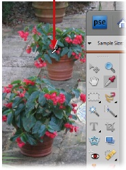
Sampling a color (that is, snagging it for your own use) couldn’t be simpler than it is with the Eyedropper. Just move your cursor over the color you want and click. It even works on colors that aren’t already in Elements, as explained in Figure 7-19. Sampling is perfect for projects like scrapbook pages, where you might want to use, say, the color from an event program cover as a theme color for the project. Just scan the program and sample the color with the Eyedropper.
By now, you may be thinking that Elements has more eyedroppers than your medicine cabinet. But this time, the Eyedropper in question is the Official Elements Eyedropper tool that has its own place in the Toolbox. It’s one of the easiest tools to use:
Click the Eyedropper in the Toolbox or just press I.
Your cursor changes into a tiny eyedropper.
Move the Eyedropper over the color you want to sample.
If you want to watch the color change in the Foreground color box as you move the Eyedropper around, hold the mouse button down as you go.
Click when you see the color you want.
Your color choice is loaded up, ready to use, as your Foreground color in the Color Squares. To make it a Background color instead, Alt+click the color in your source.
If you want to keep your color sample around so that you can use it another time without having to get the Eyedropper out again, you can save your color samples in the Swatches palette. Then you can quickly choose those exact colors again any time you want. See the next section for directions on how to do this.
Tip
Since there may be some slight pixel-to-pixel variation in a color, you can set the Eyedropper to sample a little block of pixels and average them. In the Eyedropper Options bar settings, you can choose between the exact pixel you click (point sample), a 3-pixel square average or a 5-pixel square average. Oddly enough, this Eyedropper setting also applies to the Magic Wand. Change it here and you change it for the Wand, too.
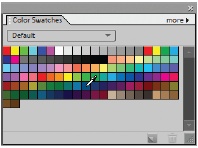
The Color Swatches Palette
The Color Swatches palette holds several little preloaded libraries of sample colors for you to use in picking a color. Go to Window → Color Swatches to call up the Color Swatches palette. You can park the Color Swatches palette in the Palette bin just like any other palette, if you like, or leave it floating on your desktop. When you’re ready to choose a color, just click the swatch you want, and it appears in the Foreground color square or the color box of the tool you’re using.
The Color Swatches palette is very handy when you want to keep certain color choices at your fingertips. For instance, you can put your logo colors into it, and then you always have those colors available for any graphics or ads you create in Elements.
Elements starts you off with several different libraries (groups) of Color Swatches. Click the pull-down menu on the Swatches palette to see them all. A swatch you create appears at the bottom of the current library, and you can save it there, or you can create your own swatch libraries if you’d rather do that.
Using the Color Swatches to select your Foreground or Background color is as easy as using the Eyedropper tool. Figure 7-20 shows you how.
To use the Color Swatches palette:
To pick a foreground color: Click the color you want. It appears as the Foreground color choice.
To pick a background color: Ctrl+click a color, and Elements makes it the Background color.
You can also change the way the Color Swatches palette displays swatch information, as shown in Figure 7-21.
Saving colors in the Swatches palette
Any colors you’ve picked using the Color Picker or Eyedropper tool, you can save as swatches. If you don’t save them, you lose them as soon as you select a different library or close the palette.
To add a swatch, you can do one of two things:
Click the New Swatch icon at the bottom of the Color Swatch palette. It’s the same square that stands for “new” in the Layers palette.
Click the More button on the palette, and choose New Swatch.
In either case, you get a chance to name and save the new swatch. The name shows up as a pop-up label when you hover your mouse over the swatch in the palette. (Don’t change the save location if you want Elements to continue to recognize it as a swatch.) Your swatch gets saved at the bottom of the current swatch library. To delete a swatch that you’ve saved, drag it to the Trash icon in the Color Swatches palette, or Alt+Click the swatch.
You can also create your own libraries, if you want to keep your own swatches separate from the ones Elements gives you. Go to the More button on the palette and pick Save Swatches. Then give your new library a name and save it.
Sharpening Your Images
Digital cameras are wonderful, but often it’s hard to tell how well you’ve focused until you download the photos to your computer. And because of the way a camera’s digital sensors process information, most digital image data usually needs to be sharpened. Sharpening is an image-editing trick that makes your pictures look more clearly focused.
Elements includes some almost miraculous tools for sharpening your images. (It’s pretty darned good at blurring them, too, if you want; see Radial Blur: Producing a sense of motion.)
Note
If you’ve used early versions of Elements, you may be searching in vain on the Filter menu for the Sharpen filters. It’s true—your old friends Sharpen and Sharpen More are gone. In their place, Adjust Sharpness appears at the bottom of the Enhance menu, along with Unsharp Mask. (Both of these features are explained in the following sections.) If you miss the one-click ease of Sharpen and Sharpen More, just head over to the Quick Fix and use its Auto button to get the same effect.
Unsharp Mask
Although it sounds like the last thing you’d ever want to do to a photo, Unsharp Mask reigned as the Supreme Sharpener for many generations of image correction, despite the fact that it has the most counterintuitive name in all of Elements.
To be fair, it’s not Adobe’s fault. Unsharp Mask is an old darkroom term, and it actually does make sense if you know how our film ancestors used to improve a picture’s focus. (Its name refers to a complicated darkroom technique that involved making a blurred copy of the photo at one point in the process.)
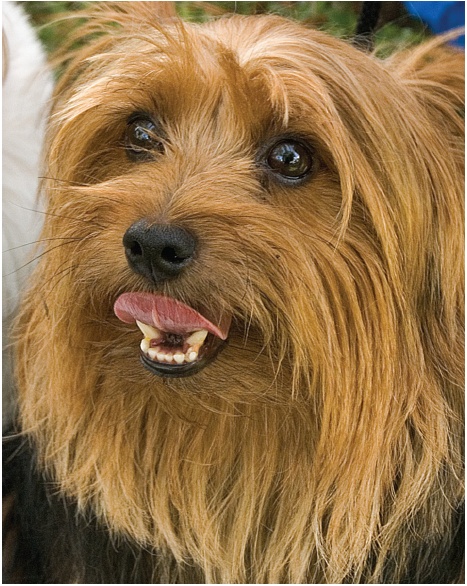
For several versions of Elements, Unsharp Mask ranked right up there with Levels as a contender for most useful tool in Elements, and some people still think it’s the best way to sharpen a photo. Figure 7-22 shows how much a little Unsharp Mask can do for your photos.
To use Unsharp Mask, first finish all your other corrections and changes. Unsharp Mask (or any sharpening tool) can undermine other adjustments you make later on, so always sharpen as the very last step. A good rule to remember when sharpening is “last and once.” Repeatedly applying sharpening can degrade your image’s quality.
Note
An exception to the rule about sharpening only once occurs when you’re converting Raw images (Adjusting Vibrance and Saturation). You can usually sharpen both in the Raw converter and then again as a last step without causing problems.
If you’re sharpening an image with layers, be sure the active layer has something in it. Applying sharpening to a Levels Adjustment layer, for example, won’t do anything. Also, perform any format conversions (Changing the File Format) before applying sharpening. Finally, you may want a duplicate layer for the sharpening if you want the ability to undo your changes later on. Press Ctrl+J to create the duplicate layer.
Note
It’s helpful to understand just exactly what Elements does when it “sharpens” your photo. It doesn’t magically correct the focus. As a matter of fact, it doesn’t really sharpen anything. What it does is deepen the contrast where colors meet, giving the impression of a crisper focus. So while Elements can dramatically improve a shot that’s just faintly out of focus or a little soft, even Elements can’t fix that old double exposure or a shot where the subject is just a blur of motion.
When you’re ready to apply Unsharp Mask:
You can use Unsharp Mask in either Full Edit or the Quick Fix.
Adjust the settings in the Unsharp Mask dialog box until you like what you see.
Move the sliders until you’re happy with the sharpness of your photo. Your adjustment options are explained in the following list. In the Preview window, you can zoom in and out and grab the photo to adjust which part you see. It’s also a good idea to drag the dialog box off to the side so that you can watch your actual image for a more global view of the changes you’re making.
When you’re satisfied, click OK.
The sliders for Unsharp Mask work very much like the sliders in several of the other tools:
Amount tells Elements how much to sharpen, in percent terms. A higher number means more sharpening.
Radius lets Elements know how far from an edge it should look when increasing the contrast.
Threshold is how different a pixel needs to be from the surrounding pixels before Elements should consider it an edge and sharpen it. If the threshold is left at zero—which is the standard setting—Elements sharpens all the pixels in an image.
There are many, many different schools of thought about which values to plug into each box. Whatever works for you is fine. The one thing you want to watch out for is oversharpening. Figure 7-23 tells you how to know if you’ve gone too far.
You’ll probably need to do a bit of experimenting to find out which settings work best for you. Photos you want to print usually need to be sharpened to an extent that makes them look oversharpened when viewed on your monitor. Therefore, you may want to create separate versions of your photo (one for onscreen viewing and one for printing). Version sets (Saving Your Work) in the Organizer are great for keeping track of multiple copies like this.
Adjust Sharpness
Unsharp Mask has been around since long before digital imaging. A lot of people (including the folks at Adobe) have been thinking that, in the computer age, there’s got to be a better way to sharpen, and now there is. The latest tool in the war on poor focus is Adjust Sharpness.
The Unsharp Mask tool you learned about in the previous section helps boost a photo’s sharpness by a process something like reducing Gaussian blur (Radial Blur: Producing a sense of motion). Problem is, Gaussian blurring is rarely the cause of your picture’s poor focus, so there’s only so much Unsharp Mask can fix. In real life, blurry photos usually come from one of two causes:
Lens blur. Your camera’s prime focal point is not directly over your subject. Or perhaps your lens is not quite as sharp as you’d like it to be.
Motion blur. You moved the camera—or your subject moved—while you pressed the shutter.
Adjust Sharpness is as easy to use as Unsharp Mask, and it gives you settings to correct all three kinds of blur—Gaussian, lens, and motion. When you first open the Adjust Sharpness dialog box, its settings are almost identical to Unsharp Mask. It’s the extra things Adjust Sharpness can do that make it a more versatile tool. Here’s how to use it:
Make sure the layer you want to sharpen is the active layer in your photo.
See Chapter 6 if you need a refresher on layers.
Go to Enhance → Adjust Sharpness.
You can reach this menu item from either Full Edit or Quick Fix.
Make your adjustments in the Adjust Sharpness dialog box.
As shown in Figure 7-24, the dialog box gives you a nice big preview. It’s usually best to stick to 50 or 100 percent zoom (use the plus and minus buttons below the preview) for the most accurate view. The settings are explained in detail in the list below.
When you like the way your photo is sharpened, click OK.
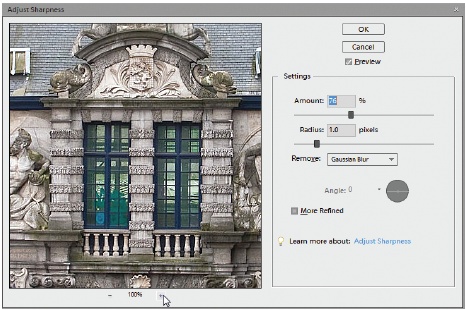
The first two settings in the Adjust Sharpness dialog box, Amount and Radius, work exactly the same way they do in Unsharp Mask. Adjust Sharpness also has a couple of additional settings of its own:
Remove. Here’s where you choose what kind of fuzziness to fix: Gaussian, lens, or motion blur, as explained on Adjust Sharpness. If you aren’t sure which you want, try all three and see which best suits your photo.
Angle. In a motion blur, you can improve your results by telling Elements the angle of the motion. For example, if your grip on the camera slipped, the direction of motion would be downward. Move the line in the little circle or type a number in degrees to approximate the angle. (It’s awfully tricky to get the angle exactly right, so you may find it easier to sharpen without messing with this setting.)
More Refined. Turn this checkbox on, and Elements takes a tad longer to apply sharpening since it sharpens more details. Generally you’ll want to leave this setting off for photos with lots of little details, like leaves or fur (and people’s faces, unless you like to look at pores). But you might want it on for bold desert landscapes, for example, or other subjects without lots of fiddly small parts. Noise, artifacts, and dust become much more prominent when you turn on More Refined, since they get sharpened along with the details of your photo. Experiment, and watch the main image window as well as the preview, to see how it’s affecting your photo.
Tip
Although Amount and Radius mean the same things as they do in Unsharp Mask, don’t assume that you can just plug your favorite Unsharp Mask settings into Adjust Sharpness and get the same results. Experiment, and don’t be surprised if you prefer very different numbers in these settings for the new tool.
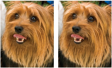
Many people who’ve used Smart Sharpening in the full-featured Photoshop swear they’ll never go back to plain Unsharp Mask. Try out Adjust Sharpness—the Elements version of Smart Sharpening—and see if you agree. To give you an idea of the difference between the two methods, Figure 7-25 shows the dog from Figure 7-22 again, only this time with Adjust Sharpness instead of Unsharp Mask.
The High-Pass Filter
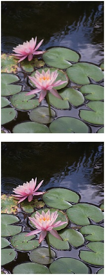
Unsharp Mask is definitely the traditional favorite, and Adjust Sharpness is the latest thing in sharpening, but there’s an alternative method that many people prefer because you do it on a dedicated layer and can back the effect off later by adjusting the layer’s opacity, if you like. Moreover, you can use this method to punch up the colors in your photo as you sharpen. It’s called High-Pass sharpening. All sharpening methods have their virtues, and you may find that you choose your technique according to the content of your photo. Try the following procedure out for yourself by downloading the photo waterlillies.jpg from the Missing CD page at www.missingmanuals.com.
Open your photo and make sure the layer you want to sharpen is the active layer.
Duplicate your layer by pressing Ctrl+J.
If you have a multi-layered image and you want to sharpen all the layers, first flatten your image or use the Stamp Visible command (see the box on Merging and Flattening Layers), so everything is all in one layer.
Go to Filter → Other → High-Pass.
Your photo now looks like the victim of a mudslide, buried in featureless gray. That’s what you want for right now.
Move the slider until you can barely see the outline of your subject.
Usually that means picking a setting somewhere roughly between 1.5 and 3.5. If you can see colors, your setting is too high. If you can’t quite eliminate every trace of color without totally losing the outline, a tiny bit of color is OK. Keep in mind that the edges you see through the gray are the ones that you’ll be sharpening the most. Use that as your guide to how much detail to include.
Click OK.
In the Layers palette, set the blend mode for the new layer to Overlay.
Ta-da! Your subject is back again in glowing, sharper color, as shown in Figure 7-26.
Tip
There’s yet another way to create “pop” in your photos. Check out the Clarity setting in the Raw converter (Adjusting Vibrance and Saturation), which sharpens and enhances contrast at the same time. (If you know what “local contrast enhancement” means, this setting does something similar.) You can use it on Raw, JPEG, and TIFF files. It’s especially useful for clearing haze from your shots.
The Sharpen Tool
Elements also gives you a dedicated Sharpen tool. It’s a special brush that sharpens instead of adding color to the areas you drag it over; Figure 7-27 shows it in action. To get to it, go to the Blur tool or press R, and choose the Sharpen tool from the pop-out menu.
The Sharpen tool has some of the same Options bar settings as the Brush tool (see Picking and Using a Basic Brush for more about brush settings). It also has a couple of settings of its very own:
Mode lets you increase the visibility of an object’s edge by choosing from several different blend modes, but usually Normal gives the most predictable results.
Strength adjusts how much the brush sharpens what it passes over. A higher number means more sharpening.
All Layers causes the Sharpen tool to work on all the visible layers in your image. Leave it off if you want to sharpen only the active layer.