Chapter 13. Filters, Effects, Layer Styles, and Gradients
There’s a popular saying among artistic types who use software in their studios: Tools don’t equal talent. And it’s true: No mere program is going to turn a klutz into a Klimt. But Elements has a few special tools—filters, effects, and Layer styles—that can sure help you fool a lot of people. It’s amazing what a difference you can make to the appearance of any image with only a couple of clicks.
Filters are a jaw-droppingly easy way to change the appearance of your image. You can use certain filters for enhancing and correcting your image, but Elements also gives you a bunch of other filters that are great for unleashing all your artistic impulses, as shown in Figure 13-1. You’ll find the original photos (courthouse.jpg and paulownia.jpg) on the Missing CD page at www.missingmanuals.com, if you want to play around with these images yourself.
Most filters have settings you can adjust to control how the filter changes your photo. You get more than a hundred different filters with Elements, so there isn’t room in this chapter to cover each filter individually, but you’ll learn the basics of applying filters, and you’ll get in-depth coverage of some of the filters you’re most likely to use frequently.
Effects are like little macros or scripts, designed to make very elaborate changes to your image, like creating a three-dimensional frame around it or making it look like a pencil sketch or an oil pastel. They’re super easy to apply—you just double-click a button—but you can’t tweak their settings as easily as you can with filters, since effects are programmed to make very specific changes. (Adobe calls them Photo Effects, but you can apply them to any kind of image, not just a photo.)
If you’ve used Elements before, then you may know that the Effects are also known as actions. Full-featured Photoshop lets you record and save your own actions, and install actions created by others. Power users could always use these actions in a limited way in Elements, but it took a lot of doing. One of the great new features in Elements 7 is an actions player that lets you easily use Photoshop actions in Elements. You still can’t create actions in Elements, but you can run them once someone creates them for you.

Layer styles change the appearance of just one layer of your photo (see Chapter 6 for more about layers). They’re very popular for creating impressive-looking text, but you also can apply them to objects and shapes. Most Layer styles include settings you can easily modify.
You can combine filters, effects, and Layer styles on the same image if you like. And you may spend hours trying different groupings, because it’s addicting to watch the often-unpredictable results you get when mixing them up.
The last section of this chapter focuses on gradients. A gradient is a rainbow-like range of color that you can use to color in an object or a background. But that’s not all gradients are good for. You can also use gradients and Gradient Maps—gradients that get distributed according to the brightness values in your photo—for very precise retouching effects.
Using Filters
Filters let you change the look of your photos in very complex ways. Using them is as easy as double-clicking a button. Elements gives you a huge number of filters, grouped in categories to help you choose the one that does what you need. This section offers a quick tour through the filter categories as well as some information about using a few of the most popular filters, like the Noise and Blur filters.
To make it easy to apply filters, Elements presents your filters in two different places: the Filter menu, where you choose them from the list that appears, and the Effects palette. (The menu is the only place where you can see every filter. Some filters, like the Adjustment filters, don’t appear in the palette.) Elements also has a Filter Gallery, a great feature that makes it very easy to get a good idea of how your photo will look when you apply the artistic filters. The next part of this section explains how to use all three methods.
Applying Filters
In the Filter menu, you choose a filter by name from the list. In the Effects palette, thumbnail images give you a preview of what the filters do. The filters do exactly the same thing no matter which way you choose them.
The Filter Gallery gives you a good preview of what a filter looks like when applied to your image. Some filters automatically open the Filter Gallery when you choose them from the menu or the palette. Or you can call up the Gallery itself (without first choosing a filter) by going to Filter → Filter Gallery. You can’t apply every filter from the Gallery—only some of the filters with adjustable settings.
Tip
In Elements, you can easily apply the same filter repeatedly. Press the Ctrl+F keyboard shortcut, and Elements automatically applies the last filter you used, with whatever settings you last used. The top listing in the Filter menu also shows the name of this same filter (selecting it works the same way as the keyboard shortcut: You get the same settings you just used). Press Ctrl+Alt+F to bring up the last filter you used, but with the dialog box open in case you want to change your settings.
Filter menu
The Filter menu groups filters into 14 main categories. Correct Camera Distortion (Correcting Lens Distortion) is all by itself at the top of the list. You’ll also see a divider below the bottom category (called Other). When you first install Elements, the Digimarc filter is the only filter below this line, but other filters you download or purchase will appear here, too.
When you choose a filter from the list, one of three things happens:
Elements applies the filter automatically. This happens if the filter’s name in the list doesn’t have an ellipsis (…) after it. Just look at the result in your photo, and then undo it (Ctrl+Z) if you don’t like its effect. If you do like it, then you don’t have to do anything else. If you don’t, then you have no options for adjusting the settings on these filters.
You see a dialog box. Elements filters that have adjustable settings have an ellipsis (…) after their names. Some of them (mostly corrective filters) open a dialog box where you can tweak the settings. Set everything as you want it, watching the small preview in the dialog box to see what you’re doing. Then click OK.
You see the Filter Gallery. Some of the more artistic, adjustable filters automatically call up the Filter Gallery so that you can get a nice large preview of what you’re doing, and also rearrange the order of multiple filters before applying them. Applying filters from the Gallery is explained later.
Regardless of how you’ve applied the filter, once you’re done, you can always undo it (Ctrl+Z) if you’re not happy with the effect. If you like it, then there’s no need to do anything else, except of course to eventually save your image.
Effects palette
If you’re more comfortable with visual clues when choosing a filter, then you can also find most filters in the Effects palette (Figure 13-2), which is, logically enough, also where you apply effects.

The Effects palette is one of the palettes in the Palette bin the first time you launch Elements. If it’s not there waiting for you, go to Window → Effects, and then click the Filters button. Choose a Filter category from the pull-down menu or choose Show All. The categories are the same ones you see in the Filter menu, except that Adjustments is available only through the menu, and Sharpen appears in the palette but not the Filter menu.
To apply a filter from the palette, double-click its thumbnail, or drag the thumbnail onto your image. If the filter has adjustable settings, you see the same dialog box or Filter Gallery you’d see when applying the filter from the Filter menu, as described earlier.
One small drawback to applying filters from the palette is that you can’t tell from the thumbnail whether a filter is one that applies automatically, with no adjustable settings. Elements doesn’t give you any clue like an ellipsis (…) to tell you which group a filter falls into.
Filter Gallery
The Filter Gallery, shown in Figure 13-3, is one of Elements’ more popular features. It gives you a large preview window, a look at all the little green apple thumbnails so you have a visual guide to what your filter will do, and, most important, it lets you apply filters like layers—you can stack them up and change the order in which they’re applied to your image. Changing the order of filters can make some big differences in how they affect your image. For example, you get very different results if you apply Ink Outlines after the Sprayed Strokes filter compared to the other way around. The Gallery makes it easy to play around and see which order gives you the look you want. The layer-like behavior of the filters in the gallery is only for previewing, though—you don’t end up with real layers.

The Gallery is more for artistic filters than corrective filters. You can’t apply the Adjustment or Noise filters from the Gallery, for instance. All the Gallery filters are in the artistic, brushstroke, distort, sketch, stylize, and texture categories. (See the next section for an overview of all the filter categories.)
The Filter Gallery is divided into three panes. On the left side is a preview of what your image will look like when you apply the filter. The center holds the thumbnails for the different filters, and the right side contains the settings for the currently chosen filter. Your filter layers are at the bottom of the settings pane. You can see what filters you’ve applied, add or subtract layers, and rearrange their order here.
Note
Filter layers work something like regular layers (see Chapter 6) with one important difference: Your filter layers are what you might call “working layers.” In other words, you have separate filter layers only until you click OK. Then all your chosen filters get applied to your image at once. You can’t close your photo, come back later and still expect to see the filters as individual, changeable layers after you’ve actually applied the filters. And most important, your filters become part of the layer to which you apply them. You aren’t creating a new permanent layer when you use the Filter Gallery.
If you’ve used the latest version of the full featured Photoshop, then be aware that Elements doesn’t create editable smart filters the way Photoshop does—it handles filters the way earlier versions of Photoshop (Photoshop CS2 and below) did. This trait is good to keep in mind if you’re trying to do something based on instructions written for Photoshop (instructions you’ve found online, say).
In addition to letting you adjust the settings for a given filter, the Filter Gallery lets you perform a few other tricks:
Adjust the preview magnification of your image. In the Gallery’s lower-left corner, click directly on the percentage listing or click the arrow next to it for a list of preset sizes to choose from. You can also click the + and – buttons to zoom the view in or out. Easier still, use the Ctrl+= (the Ctrl key plus the equal sign key) and Ctrl+– (the Ctrl key plus the minus key) shortcuts to zoom in and out from the keyboard.
Choose a new filter. Just click a filter’s thumbnail once, and you get the settings for the new filter and the preview image updates right away—usually. (See the box on Useful Filter Solutions for details.)
Add a new filter layer. Each time you click the New Filter Layer icon (see Figure 13-4), you add another filter layer to the ones you already have.
Figure 13-4. If you’ve used layers before (see Chapter 6), then these little icons (circled) should look familiar. In the Filter Gallery, they make new filter layers instead of regular layers. Click the square icon (shown at the bottom of this figure) to add a new filter layer to your image. Click the Trash can icon to delete a filter layer. The eye icons next to your filter layers turn visibility on and off just as they do in the Layers palette. It’s true that the filters preview in layers, but they don’t show up as real layers in the Layers palette—only in the Filter Gallery.Change the position of filter layers. Just drag them up and down in the stack to change the order in which they’ll get applied to your image.
Hide filter layers. Click the eye next to a filter layer in the filter layer palette to turn off visibility, just like in the regular Layers palette (Organizing Your Photos).
Delete filter layers. Highlight any filter layer by clicking it, and then click the trash icon to delete it.
Change the content of a layer. You can change what kind of filter is in a particular layer. For instance, if you applied, say, the Smudge Stick, and you like all your other changes but wish you had used the Glass filter instead, then you don’t have to delete the Smudge Stick layer. Instead, just highlight the Smudge layer, and then click the Glass filter button to change the layer’s contents.

Filter Categories
Elements divides filters into categories to help you more easily track down the one you want. Some of the categories, like Distort, contain filters that vary hugely in what they do to your photo. Other categories, like the Brush Stroke filters, contain filters that are all pretty obviously related to one another. Here’s a quick breakdown of the categories:
Correct Camera Distortion. This filter lets you correct perspective distortion (think: tall buildings) as well as vignetting (shadows) caused by your camera’s lens. It’s explained in detail on Correcting Lens Distortion.
Adjustments. These filters apply some photographic, stylistic, and artistic changes to your photo. Most of the adjustments are explained on Special Effects; the Photo Filters are covered on Photo Filter.
Artistic. This is a huge group of filters that do everything from give your photo a cut-from-paper look (Cutout) to make it resemble a quick sketch (Rough Pastels). You generally get the best effects with these filters by using multiple filters or applying the same one multiple times.
Blur. The blur filters let you soften focus and add artistic effects. They’re explained later in this chapter.
Brush Strokes. These filters apply brushstroke effects, and generate a hand-painted look.
Distort. These filters warp images in a great variety of ways. The Liquify filter is the most powerful, and you’ll find a tutorial for using it on Applying the Liquify Filter to Type.
Noise. Use these filters to add or remove grain. They’re explained later in this chapter.
Pixelate. The Pixelate filters break your image up in different ways, making it show the dot pattern of a magazine or newspaper’s printed image (Halftone), or the fragmented look you see on television when a show is concealing someone’s identity.
Note
The Color Halftone filter makes your photo look like a one-color halftone, an image whose dots simulate the shades of gray you see in a black-and-white photo. It’s not the same as true halftone screening, which isn’t available in Elements. If the print shop you’re working with needs a halftone, you need to either use the full-featured Photoshop or ask the printer to do the conversion for you.
Render. This group includes a pretty diverse bunch of filters that let you do things like create a lens flare effect (Lens Flare), transform a flat object so it looks three-dimensional (3D Transform), and make an effect that looks like fibers (Fibers) or clouds (Clouds). The Lighting Effects filter, a powerful but confusing filter that’s like a whole program in itself, helps you change the way lighting appears in your image. For a full rundown on what this filter does, as well as how to use it, check out the Missing CD page at www.missingmanuals.com.
Sharpen. Unsharp Mask (Sharpening Your Images) appears in the palette but not the Filter menu. (The sharpening commands are in the Enhance menu.)
Sketch. These filters can make your photo look like it was drawn with charcoal, chalk, crayon, or some other material—and they can also make the photo look like it was embossed in wet plaster, photocopied, or stamped with a rubber stamp.
Stylize. These filters create special effects by increasing the contrast in your photo, and displacing pixels. You can make your photo look radioactive, reduce it to outlines, or make it look like it’s moving quickly.
Texture. These filters change the surface of your photo to look like it was made from another material. Use them to create a crackled finish (the Craquelure filter), a stained glass look (Stained Glass), or a mosaic effect (Mosaic Tiles).
Video. These filters are for creating and editing images for (and from) videos.
Other. This is a group of fairly technical filters that you can highly customize. The High Pass filter is explained on The High-Pass Filter. You can use Offset to shift an image or a layer a little bit, or to position tiled image layers.
Digimarc. Use this filter to check for Digimarc watermarks in photos. Digimarc is a company that lets subscribers enter their information in a database so that anyone who gets one of their photos can find out who holds the copyright.
You can find a number of filter plug-ins online, ranging from free to very expensive. Free Stuff from the Internet gives you some suggestions for places to start looking. Once you’ve installed new filters, you access them in the Filter menu, at the bottom of the list.
Useful Filter Solutions
This section shows how to use some of Elements’ most popular and useful filters to correct your photos and create a few special effects. For instance, you’ll learn how to modify graininess to create an aged effect or smooth out a repair job. And you’ll also see how to blur photos to create a soft-focus effect, or to make subjects look like they’re moving.
Removing noise: Getting rid of graininess
Noise, the appearance of undesired graininess in an image, is a big problem with many digital cameras, especially those with small sensors and high megapixel counts. It’s rare to find a fixed-lens camera with more than 5 megapixels that doesn’t have some trouble with noise, especially in underexposed areas. If you shoot using the Raw format, then you can correct a fair amount of noise right in the Raw Converter (Adjusting Vibrance and Saturation). But the Raw Converter may give unpredictable results if you use it on JPEGs. And even Raw files may need further noise reduction once you’ve edited your photo after converting it.
Elements includes the Reduce Noise filter, which is designed specifically to help get rid of noise in your photos. To get to it, go to Filter → Noise → Reduce Noise. You get a dialog box with a preview window on the left and settings adjustments on the right. To use the filter, first use the controls below the preview to set the view to at least 100 percent, or preferably even higher. You need to see the pixels in your photo so you can see how the filter is changing them as you adjust the settings.
You get three settings, each of which you control by using a slider:
Strength. This setting controls the overall impact of the filter. It reduces the same kind of noise as the Luminance Smoothing setting in the Raw converter (Adjusting Vibrance and Saturation). The stronger you set it, the greater the risk of softening your photo.
Preserve Details. Using noise reduction can soften the appearance of your photo. This setting tells Elements how much care to take to preserve the details of your image.
Reduce Color Noise. This control adjusts uneven distribution of color in your image. You can set the slider pretty high without a negative impact on your photo.
You also have a checkbox for minimizing JPEG artifacts—the uneven areas of color caused by JPEG compression (see About JPEGs). A mottled pattern in what should be a clear blue sky is one classic example of JPEG artifacting that you may have experienced. Turn on the checkbox to help smooth things out.
For each setting, move the slider to the right if you want more and to the left if you want less; watch the effect in the preview window to see how you like the changes. You may notice a little lag time before the preview updates. When you see what you want, click OK to apply the filter.
The Elements Reduce Noise filter does an OK job on areas with a small amount of noise, like the sky in many JPEG photos, but it’s not one of the strongest tools in Elements. If your camera has major noise problems, you may find you still need third-party noise reduction software. Some of the most popular programs are Noise Ninja (www.picturecode.com), Neat Image (www.neatimage.com), and Noiseware (www.imagenomic.com). All have demo versions you can download to try out the programs. If you search on Google for “noise reduction software,” you’ll get a variety of other options as well, including several free programs.
Adding noise: Smoothing out repair jobs
Elements also gives you a filter for creating noise. Why do that when most of the time you try so hard to get rid of noise? One reason is when you’re trying to age the appearance of your photo. If you wanted to make a photo look like it came from an old newspaper, for instance, you’d add some noise.
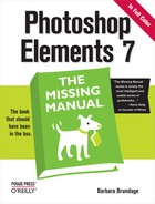
The other most common use for noise is to help make repaired spots blend in with the rest of an image. If you’ve altered part of a photo in Elements, especially by painting on it, odds are the repaired area is going to look perfectly smooth. That’s great if the rest of the photo is noise free. But if the rest of the photo is a little grainy, that smooth patch is going to stand out like a sore thumb. Add a bit of noise to make it blend in better with the rest of the photo, as shown in Figure 13-5. Also, if you see color banding when you print, adding a little noise to the photo may help fix that in your next print.
To add noise to a photo, start by selecting the area where you want to add the noise. Using a duplicate layer (Ctrl+J) for the noise is a safe step, since you can always undo changes if you’ve got them on a layer.
Go to Filter → Noise → Add Noise to bring up the dialog box with the settings for the filter.
Adjust the settings to your liking.
The settings are explained in the following list. In the dialog box, use the preview window to check how the changes are affecting your photo.
When you’re satisfied, click OK.
You have three options in the Add Noise dialog box:
Amount. This option controls how heavy the noise is going to be. Just drag the slider to the right for more noise or to the left for less. You can also type in a number. A higher percentage means more noise.
Uniform or Gaussian. These buttons let you control how the noise gets distributed through your image. Uniform is just what it says—the same all over. Gaussian distributes the noise to produce a more speckled effect.
If you’re adding noise to duplicate existing noise in a grainy photo, then you probably want a Gaussian distribution. For an old newspaper photo look, try Uniform. In either case, experiment until you get what you want.
Monochromatic. This setting limits you to grayscale noise. Take a look at the middle image in Figure 13-6, and notice how many more colors you can see inside the noise, compared to the solid red of the original. The noise was applied with the Monochromatic setting turned off.
Noise can also help when you want to apply special effects to blocks of solid color, as shown in Figure 13-7. If you try to apply the Angled Strokes filter to a solid color, then you don’t see the strokes. Adding noise gives the filter something to work on.

Gaussian Blur: Drawing attention to a foreground object
Probably the most frequently used of the Blur filters, the Gaussian Blur filter lets you control how much an image is blurred. Besides using it to blur large areas of a photo, like the background in Figure 13-7, bottom, you can apply the Gaussian Blur filter at a very low setting to soften lines—very useful when trying to achieve a sketched effect. If you’d like to try out the different blurs, download the hawk photo (hawk.jpg) from the Missing CD page at www.missingmanuals.com.
When using the Gaussian Blur, you have to set the radius, which controls how much the filter blurs things. A higher radius produces more blurring; use the filter’s preview window to see what you’re doing.
Radial Blur: Producing a sense of motion
As you can see in Figure 13-8, the Radial Blur really produces a sense of motion. It has two available styles: Zoom, which is designed to give the effect of a camera zooming in, and Spin, which produces a circular effect around your designated center point.
The Radial Blur dialog box may look a bit complicated, but it’s really not. Unfortunately, you don’t get a preview with this filter, because it drains so much processor power. That’s why you have a choice between Draft, Good, and Best Quality. Use Draft for a quick look at roughly what you’ll get. Then, most of the time, choose Good for the final version. Good and Best aren’t very different except on large images, so don’t feel that you must choose Best for the final version all the time.


Once you’ve chosen your method (Zoom or Spin), set the amount, which controls the intensity of the blur that’s applied. Next, click inside the Blur Center box to identify the point where you want the blur to center, as shown in Figure 13-9. Finally, click OK when you’re finished.

Color correcting with the Average Blur filter
If you’ve already given the Average Blur filter a whirl, then you may be wondering what on earth Adobe was thinking when they created it. Use it on your entire photo, and your image disappears under a hideous soup, something like what you’d get by pureeing together all the colors in your photo. Oddly enough, this effect makes the filter a great tool for getting rid of color casts (Removing Unwanted Color). You can use the Average Blur to create a sort of custom Photo Filter (Photo Filter) toned specially for the image you use it on. The secret is in using blend modes (Blend Mode). Here’s how:
Open your image and make a duplicate layer.
Just press Ctrl+J, or go to Layer → Duplicate Layer.
Apply the Average Blur filter.
Make sure your duplicate layer is the active layer (click it in the Layers palette if it isn’t), and then go to Filter → Blur → Average. Your photo disappears under a layer of (probably) very unpleasing solid color, but you’ll fix that next.
Change the blur layer’s blend mode.
In the Layers palette, from the Mode pull-down menu, choose Color. Already things are starting to look better.
Invert the blur layer.
Press Ctrl+I to invert the colors.
Reduce the opacity of the blur layer, and do other tweaking, if necessary.
Use the Layers palette’s opacity slider. Start with 50 percent. By now, the color should look right—no more color cast. Tweak if necessary, and then save your work.
You may want to add a Hue/Saturation layer (Using an Adjustment Layer) if you find that no matter how you adjust the opacity slider, the photo looks a little flat.
The Average Blur filter is a particularly good way to color-correct underwater photos, where it’s very hard to get a realistic white balance using your camera’s built-in settings.
Improving skin texture with the Surface Blur filter
Elements 7 brings yet another way to blur your photos—the Surface Blur filter. At this point you may be thinking that you have enough ways to eliminate details in your photos, but the Surface Blur filter is actually very handy, especially if you take pictures of people. The Surface Blur filter is smart enough to avoid blurring details and areas of high contrast, which makes it very handy for fixing skin. If you want to eliminate pores, for instance, or reduce the visibility of freckles, this is your tool, as shown in Figure 13-10, and it’s pretty simple to use, too:
Open your image, and then make a duplicate layer.
Just press Ctrl+J, or go to Layer → Duplicate Layer.
Tip
For best results, you may want to start by selecting the area you want to blur (see Chapter 5 for help with selections). Then make your duplicate layer from the selection, in order to maintain maximum detail in the areas you aren’t trying to fix. For example, select only the skin areas of your subject’s face, leaving out the mouth and eye areas, so they won’t be affected at all by the blur.
Apply the Surface Blur filter.
Make sure your duplicate layer is the active layer (click it in the Layers palette if it isn’t already), and then go to Filter → Blur → Surface Blur. Move the dialog box out of the way, if necessary, so that you can watch what you’re doing in the main image window as well as in the small preview area of the dialog box.
Tweak the filter settings till you like the effect.
The sliders are explained below. Be cautious—it doesn’t take much to make your photo start to look like a painting. Click OK when you’ve got the flaws concealed as much as possible without losing important details like eyelashes.
If you want, change the blend mode and/or the opacity for the duplicate layer.
Use the Layers palette sliders to do this step. If you want to eliminate skin blemishes, try Lighten blend mode, for example.

The Surface Blur filter isn’t at all hard to understand, but you usually have to do a fair amount of fiddling with the sliders to get the best balance for the blur effect. Here’s what the sliders do:
Radius. As with other filters, this one controls how far Elements should blur your image. Move the slider to the left for a smaller blur, and to the right for a wider blur.
Threshold. This slider controls the level at which Elements begins to blur. A low setting here means you see less blurring, a higher setting means more blurring.
Adding Effects
Like filters, effects give you loads of ways to modify your photo’s appearance—from adding green slime textures to surrounding your image with classy picture frames. Although you apply effects with a simple double-click of your mouse, these clicks actually trigger a sequence of changes that Elements diligently applies. Some effects involve many complex steps, although Elements works so quickly you might not even notice all the changes taking place.
Note
You usually can’t customize or change an effect’s settings. Effects are typically an all-or-nothing deal. For example, if you use one of the Frame effects, then you either take the frame size as Elements applies it to your image, or you don’t. No need to ask if you can adjust the scale of the frame relative to your photo—you can’t. (This quality is why most of the frames are now Smart Objects [Creating Multipage Documents] that you apply from the Content palette, rather than effects—you have more control over Smart Objects.)
You’ll find effects in a few different spots throughout Elements:
The Effects paletteis home to most photo effects—things like photo tinting (Figure 13-11)—and a few frames. Coverage starts after this bullet list.
The Content palette houses some effects. They’re intended primarily for text, but sometimes you can use them for other purposes. They create cool results on shapes, too, for instance. The Content Palette has the full scoop.
Guided Edit. Elements 7 has a few new effects that Adobe included as part of its let-us-show-you-how section; you’ll find them at the very bottom of the list of tasks, and Guided Edit walks you through applying them. Getting Help tells you more about using Guided Edit.
To apply an effect from the Effects palette, choose Window → Effects, and then click the Photo Effects button. Just as with filters, use the pull-down menu on the Effects palette to see all your choices, or pick from only one category. The thumbnail images give you a preview of how the effect changes your image.
To apply an effect, in the Effects palette, double-click its thumbnail, or click the thumbnail once, and then click Apply. You can also just drag the thumbnail onto your photo. That’s all there is to it. If you don’t like the result, press Ctrl+Z to undo it, but you can’t tweak much in the effects.
Here are a few other effects-related tips to help maximize these nifty but-quirky features:
A few effects flatten (Flattening an image) or simplify (Ellipse) your image. Therefore, it’s usually best to make a copy of your image, or wait until you’re done making all your other edits, before applying an effect.
Many effects create additional layers; check the Layers palette once you’re done applying them. You may want to flatten your image to reduce the file size before printing or storing it. (See Chapter 6 if you need a refresher on using layers.)

Using Actions in Elements
If you hang around people who use Photoshop, then you’ll hear a lot of talk about actions and how useful they are. An action is a little script, like a macro in a program like Word, that automates the steps for doing something, thus saving you a ton of time. For example, you might create an action that applies your favorite filter and crops a photo to a certain size, or one that creates a complicated artistic effect, like a colorful watercolor look that would take many steps to do manually. Wouldn’t it be great to be able to use actions in Elements?
Well, in a way Elements has always been able to use actions—under the hood, effects are really actions. And you could always add some Photoshop actions to Elements, although it’s been pretty complicated to do so. Not any more, though—one of Elements 7’s greatest new features is the Action Player, which lets you run many Photoshop actions right in Elements.
It’s extremely easy to use actions in Elements 7. Adobe gives you a few useful ones to get you started, and you can add your own, too, as explained later in this section. To run an action:
Open a photo in the Editor, and then go to the Action Player.
Click the Edit tab → Guided → Automated Actions → Action Player.
From the first pull-down menu, choose the Action set you want.
Action sets are groups of related actions. (Earlier versions of Elements didn’t understand action sets at all, so this is a big deal in Elements 7.) The action sets that come with Elements let you choose between actions to add captions (and canvas to display the captions), trim weight from your subjects, resize and crop your photos, or apply special effects to them.
From the second pull-down menu, choose the specific action you want to use.
You can choose how much thinner to make someone with the Lose Weight actions, for example, or what color canvas (white, gray, or black) to add for a caption.
Run the action.
Just click Play Action. If you don’t like the results, click Reset or press Ctrl+Z to undo the action, and then try another action instead. (You can’t step backwards in the Elements Action Player.)
When you like the result, click Done.
If you decide you don’t want to use an action after all, click Cancel instead.
One of the Elements 7 Action Player’s great qualities is that you can easily add more actions to it. You can’t create new actions in Elements—you need Photoshop to record actions—but you’ll find literally thousands of free actions available on the Internet that you can download and add to Elements. Free Stuff from the Internet gives you some places to look for them.
Once you download an action, if you’re using Vista, just pop it into C:ProgramDataAdobePhotoshop Elements7.0Localeen_US (this is different if you aren’t in the US)Workflow PanelsActions. For Windows XP, it’s C:Documents and SettingsAll UsersApplication DataAdobePhotoshop Elements7.0Localeen_US(this is different if you aren’t in the US)Workflow PanelsActions. (You need to turn on hidden folder viewing for either operating system, since these are hidden files.) The next time you start Elements, you’ll see your action in the drop-down menu shown in Figure 13-12.

It’s important to understand a few differences between actions in Photoshop and in Elements. Photoshop can run an action on a whole folder full of images at once. Not so in Elements, where you’re restricted to one photo at a time. Also, Elements can’t quite carry out actions that invoke Photoshop-only commands. For example, if you run an action that includes the creation of a history snapshot, then you see the dialog box shown in Figure 13-13.
If you like to play it safe, you can find a number of actions written specifically for Elements. Free Stuff from the Internet tells you where to look for them.
Note
While the Actions player is great, there’s one disadvantage to having it in Guided Edit: You don’t have access to the Layers palette, which is annoying for those actions which require you to choose a layer to use in mid-action. The good news is that you can still install actions in the Effects palette, using exactly the same steps that you would have used in Elements 6. This lets you use actions in Full Edit, where you can get over to the Layers palette any time an action requires it. You can still use the various add-on tools to Elements that are actually actions, like the various free tool sets available online. You’ll find much more about downloading and installing these in Chapter 19.
Adding Layer Styles
Like filters and effects, Layer styles let you transform objects by giving them new characteristics, like Drop Shadows, for instance. Layer styles are especially useful for modifying individual objects, like text and buttons, because you can edit the text and change the button’s shape even after you’ve applied the Layer style.
Layer styles, as their name suggests, work on the contents of one layer—rather than on your whole image. That’s important. A Layer style affects the entire contents of a layer. If you want to apply a Layer style to just one object in your picture, select the object, and then put it on a layer of its own (Ctrl+J or Layer → New → “Layer via Copy”, or Ctrl+Shft+J or New → “Layer via Cut”). Figure 13-14 shows what you can do with Layer styles.
You apply Layer styles from the Effects palette (Window → Effects). Click the Layer Styles button, and then—from the pull-down menu—choose a Layer style category, or choose Show All. Finally, select the layer you want to modify (by highlighting it in the Layers palette), and then click the Layer style you want to use. The box on Applying Gradients shows you how to modify any style’s settings.

Note
Some tools, like the Type tool (see Adding Type to an Image), have an Options bar setting that lets you choose a Layer style.
Here’s a quick rundown of the choices available in each Layer style category:
Bevels give objects a 3-D look by making them appear raised from the page or embossed into it. Figure 13-15 shows an example of how combining a bevel and a drop shadow can add a lot of dimension to even a simple shape.
Complex includes a variety of elaborate Layer styles that make an object look like it’s made from metal, cactus, or several other materials. These styles are particularly useful for applying to type.
Drop Shadows adds shadow effects that make your object look like it’s floating above the page.
Note
Adding a drop shadow to an entire photo requires adding canvas (see Adding Canvas) to give the shadow someplace to fall.
Glass Buttons are supposed to make objects look like glass buttons, but many people think they look more like plastic. They’re useful for creating Web page buttons.
Image Effects give you a wealth of ways to transform your photo, including fading it and making it look like the pieces of a puzzle or a tile mosaic.
Inner Glows add light around the inside edge of your object.
Inner Shadows give your image a hollow or recessed effect by casting a shadow within the object, rather than outside it the way drop shadows do.
Outer Glows create the same kind of light effects that Inner Glows do, only they go around the outer edge of your image.
Patterns apply an overall pattern to your image. Want to make something look like it’s made from metal or dried mud, or want to fill in a dull background with a really vivid pattern? You’ll find lots of choices here.
Photographic Effects include several favorite traditional photographic techniques. You can add a variety of monochrome effects, like good old-fashioned sepia.
Strokes let you put a black or colored border around the edge of a layer, or an object on its own layer. They’re great for making outlined text, too.
Visibility changes the opacity and visibility of your layer. Use them to create a ghosted effect—or when you’re applying multiple Layer styles, and you want to use the outlined shape of an object without having the object itself visible.
Wow Chrome, Neon, and Plastic Styles make an object look like it’s made from shiny chrome, outlined in neon, or made from plastic.
Note
You can apply Layer styles only to regular layers, so if you try to apply one to a Background layer, then Elements asks you to convert it to a regular layer before the style can take effect.
If someone sends you a file made using Layer styles that you don’t have, then you can snag them for your own use by highlighting the layer with the styles on it, and then going to Layer → Layer Style → Copy Layer Style. Then, in an image where you want to use the styles, click the layer that you want to modify, and then choose Layer → Layer Style → Paste Layer Style. This command applies all the styles used in the original image to the layer you targeted.
To remove a Layer style, in the Layers palette, right-click the layer, and then choose Clear Layer Style, or go to Layer → Layer Style → Clear Layer Style. These commands are all-or-nothing: If your layer has multiple styles, they all go away at once. To remove one style at a time, use the Undo History palette (The one rule of Elements).
Tip
If you want to see what your image looks like without the styles you’ve applied to it, then go to Layer → Layer Style → Hide All Effects.
You can download hundreds of additional Layer styles from the Web (see Free Stuff from the Internet for tips on where to look and how to install them). It’s easy to get addicted to collecting Layer styles because they’re so much fun to use.
Applying Gradients
You may have noticed that a few of the Layer styles and Photo Effects fade out a color at the edges. In fact, Elements lets you fade and blend colors in almost any way you can imagine by using gradients. Use gradients to create anything from a multicolor rainbow extravaganza to a single color that fades away into transparency. Figure 13-17 shows you a few examples of what you can do with gradients. The only limit is your imagination.

You can apply gradients directly to your image using the Gradient tool, or you can create Gradient Fill layers, which are entire layers filled with—you guessed it—gradients. You can even edit gradients and create new ones using the Gradient Editor. Finally, there’s a special kind of gradient called a Gradient Map that lets you replace the colors in your image with the colors from a gradient. This section covers the basics of using all these tools and methods.
The Gradient Tool
If you want to apply a gradient to a particular object in your image, then the Gradient tool is the fastest way to do so. This tool may seem complicated when you first see it, but it’s actually pretty easy to use. Start by activating the Gradient tool in the Toolbox (the yellow and blue rectangle) or by pressing G. Figure 13-18 shows the Gradient tool’s Options bar.


Using the Gradient tool is as easy as dragging. Click where you want the gradient to begin, and then drag to the point where you want it to stop (you’ll see a line connecting your beginning and ending points). When you release the mouse, the gradient covers the entire available space.
For example, say you’re using a yellow-to-white gradient. If you click to end the gradient one-third of the way into your photo, the yellow stops transitioning at that point, but the remaining two-thirds of your photo is covered with white. Drag the gradient within a selection if you want to confine the area it covers (see Chapter 5 if you need a refresher on making selections).
Tip
The Gradient tool puts the gradient on the same layer as the image you apply it to, which means that it’s hard to change anything about your gradient after it’s applied. If you think you might want to alter your gradient, use the Gradient Fill layer, described later.
Some of the gradients available in Elements use your chosen foreground and background colors as the two colors that generate the gradient. But Elements also offers a number of preset gradients, which are gradients in different color schemes that Adobe has created for you.
Click the arrow to the right of the gradient thumbnail in the Options bar, and you see a little palette of different gradients, some of which use your selected colors, and others that are preset with their own color schemes. The gradients are grouped into categories; you can work only with the gradients in one category at a time.
In the upper-right corner of the gradient thumbnails pop-out menu, click the arrows to see all the available gradient categories. Choose one, and the available gradients change to reflect those in the new category.
You can also download gradients from the Web and add them to your library using the Preset Manager (see When You Really Need Photoshop), or you can create your own gradients from scratch. (See Free Stuff from the Internet for some suggestions of where to look for new gradients.) Creating and editing gradients is explained later, in the section about the Gradient Editor.
You can customize your gradient in several ways, even without using the Gradient Editor. When the Gradient tool is active, the Options bar offers several choices:
Gradient. Click the arrow to the right of the thumbnail to choose a different gradient from the one displayed.
Edit. Click this button to bring up the Gradient Editor (explained starting on Editing a Gradient).
Gradient types. Use this setting to determine the way the colors flow in your gradient. Click a thumbnail to choose how to apply the gradient. From left to right, your choices are: Linear (in a straight line), Radial (a sunburst effect), Angle (a counterclockwise sweep around the starting point), Reflected (from the center out to each edge in a mirror image), and Diamond. Figure 13-19 shows what each one looks like.
Mode. You can apply a gradient in any blend mode (see Blend Mode).
Opacity. If you want your image to be visible through the gradient, then reduce the opacity here.
Reverse. This setting changes the direction in which the colors are applied so that instead of yellow to blue from left to right, you get blue to yellow, for instance.
Dither. Turning on this checkbox uses fewer colors but simulates the full color range using a noise pattern. It can help to prevent banding of your colors, making smoother transitions between them.
Transparency. If you want to shade to transparency anywhere in your gradient, then turn Transparency on. Otherwise, the gradient can’t show transparent regions.

Using the Gradient tool
To apply a gradient with the Gradient tool, first make a selection if you don’t want to see the gradient in your whole image. Then:
Choose the colors you want to use for your gradient.
Click the Foreground/Background color squares (Choosing the Color You Want) to choose colors. (Some gradient choices ignore these colors and use their own preset colors instead.)
Activate the Gradient tool.
Click it in the Toolbox or press G.
Select a gradient.
Go to the Options bar, click the Gradient thumbnail, and then choose the gradient style you want. Then make any other necessary changes to the Options bar settings, like reversing the gradient.
Drag in your image from the starting point to the ending point, marking where the gradient should run. If you’re using a linear gradient, then you can make the gradient run vertically by dragging up or down. Or you can make it go left to right by dragging sideways. For Radial, Reflection, and Diamond gradients, try dragging from the center of your image to one edge. If you don’t like the result, press Ctrl+Z to undo it. Once you like the way the gradient looks in your image, you don’t need to do anything special to accept it, except of course to save your image before you close it.
Gradient Fill Layer
You can also apply your gradient using a special fill layer. Most of the time, this choice is better than the Gradient tool, especially if you want to be able to make changes to your gradient later on.
To create a Gradient Fill layer, go to Layer → New Fill Layer → Gradient. The New Layer dialog box appears, which lets you set the opacity for the layer, and choose a blend mode (Blend Mode), if you like. Once you click OK, the new layer immediately fills with the currently selected gradient, and the dialog box shown in Figure 13-20 pops up. You can change many of the settings for your gradient here or choose a different gradient.

The settings in the Gradient Fill dialog box are pretty much the same as those in the Options bar for the Gradient tool:
Gradient. To choose a different gradient, click the arrow next to the thumbnail for the Gradient palette. To choose from a different gradient category, click the arrow on the palette, and then choose the category you want.
Style. You get the same choices you do for the tool (for example, Linear, Diamond, and so on). In this case, you see only the name of the style. Choose a different style and it previews in the layer itself.
Angle. This setting controls the direction the colors will run. Enter a number in degrees or spin the line in the circle by moving it with your mouse to change the direction of the flow.
Scale. This setting determines how large your gradient is relative to the layer. 100 percent means they’re the same size. If you choose 150 percent, then the gradient exceeds the size of your layer, which means you see only a portion of the gradient in the layer. For example, if you had a black-to-white gradient, you’d see only shades of gray in your image. If you turn off “Align with layer”, you can adjust the location of the gradient relative to your image. Just drag the gradient in your image.
Reverse. Turn Reverse on to make colors flow in the opposite direction.
Dither. Use this setting to avoid banding, and create smooth color transitions.
Align with Layer. This setting keeps the gradient in line with the layer. Turn it off, and you can pull the gradient around in your image to place it exactly where you want it.
When you’ve gotten the gradient looking the way you like, click OK to create your layer. You can edit it later in the Layers palette by double-clicking the left icon for the layer.
Editing a Gradient
The Elements Gradient Editor lets you create gradients that include any color combination you like. You can even make gradients in which the color fades to transparency, or you can modify existing gradients. For instance, you can easily make a two-color gradient where the fade is very one-sided, if you want a large plain area where you can put text (the plain area helps keep the text readable).
The Gradient Editor isn’t the easiest tool in the world to use. This section will give you the basics you need to get started. Then, as happens so often with Elements features, a little bit of playing around with the Gradient Editor will help you understand how it works.
The Gradient tool must be active to launch the Gradient Editor. In the Options bar, click the Edit button to see the Gradient Editor (see Figure 13-21).
The Gradient Editor opens showing the currently selected gradient. You can choose a different gradient by picking from the thumbnails at the top of the Gradient Editor window, or by clicking the More button to the right, and then choosing a new category from the list. You’ll learn how to save your gradients later in this chapter.
Using the Gradient Editor
To get started using the Gradient Editor, first choose your gradient’s type and smoothness settings:
Gradient Type. Your choices are Solid or Noise. Solid gradients are the most common; they let you create transitions between solid blocks of color. Noise gradients, which are covered later in this section, produce bands of color, as you might see in a spectrometer.
Smoothness. This setting controls how even the transition appears between colors.

Most of the work you do in the Gradient Editor takes place in the Gradient bar, the long colored bar where your chosen gradient is displayed. The little boxes (also called stops) and diamonds surrounding the Gradient bar let you control the color and transparency of your gradient.
For now, you care only about the stops beneath the Gradient bar. Each is a Color Stop; it represents where a particular color falls in the gradient. You always need at least two Color Stops in a gradient.
If you click a stop, then the pointed end becomes colored, letting you know that it’s the active stop. Anything you do at this point is going to affect the area governed by that stop. You can slide the stops around to change where the colors transition in your gradients. The Color Stops let you customize your gradient in lots of different ways. Using them, you can:
Change where the color transitions. Click a Color Stop, and you see a tiny diamond appear under the bar. The diamond is the midpoint of the color change. Diamonds always appear between two Color Stops. You can drag the diamond in either direction to skew the color range between two Color Stops so that it more heavily represents one color over another. (You know you’ve successfully grabbed the diamond when it shows color.) Wherever you place the diamond tells Elements the point at which the color change should be half completed.
Change one of the colors in the gradient. Click any Color Stop, and then click the color square (at the bottom of the Gradient Editor, in the Stops section) to bring up the Color Picker (The Color Picker). Choose a new color, and the gradient automatically alters to reflect your change. You can also pick a new color by moving your cursor over the Gradient bar. The cursor turns to an eyedropper that lets you sample a color from the bar or from anywhere in your image.
Add a color to the gradient. Click a Color Stop, and then click again (not in the bar, but anywhere just beneath it) to indicate where you want the new color to appear. You see a new Color Stop where you clicked. Next, click the color-picking window to choose the color you want to add. The new color appears in the gradient at the new stop. Repeat as many times as you want, adding a new color each time.
Remove a color from a gradient. If a gradient is almost what you want but you don’t like one of the colors, you don’t have to live with it. You can remove a color by clicking its stop to make it the active color. Then click the Delete button to remove that color, or just drag its stop downward off the bar. The Delete button is grayed out if no Color Stop is active.
Transparency in gradients
You can also use the Gradient Editor to adjust the transparency in a gradient. Elements gives you nearly unlimited control over the transparency in your gradients, and the opacity of any color at any point in the gradient. Adjusting opacity in the Gradient Editor works very much like using the Color Stops to edit the colors. Instead of Color Stops, you use Opacity Stops.
Tip
Transparency is particularly nice in images for Web use, but remember that you need to save in a format that preserves transparency, like GIF, or you lose the transparency. If you save your file as a JPEG, the transparent areas become opaque white. See Image Formats and the Web for more about file formats for the Web.
The Opacity Stops are the little boxes above the Gradient bar. You can move an Opacity Stop to wherever you want, and then adjust the transparency by using the settings in the Gradient Editor’s Stops section. Click the Gradient bar wherever you want to add more Opacity Stops (click above the Gradient bar, rather than in it). The more Opacity Stops your Gradient bar has, the more points you have at which you can adjust your gradient’s opacity.
Here’s how to add an Opacity Stop, and then adjust its opacity setting:
Click one of the existing Opacity Stops.
If the little square on the stop is black, it means the stop is completely opaque. A white square is totally transparent. The new stop has the same opacity as the stop you click, but you can adjust the new stop once you’ve created it.
Add a stop.
Click anywhere along the Gradient bar where you want to add a stop. If you want your gradient to be precisely positioned, then you can enter numbers (indicating percentage) in the Location box below the gradient bar. For example, 50 percent positions a stop at the midpoint of the Gradient bar.
Adjust the new stop’s opacity.
Go to the Opacity box below the Gradient bar, either enter a percentage or click the arrow to the right of the number, and then move the slider to change the opacity setting. If you want to get rid of a stop, click its tab, and then press Delete, or drag it upward away from the bar.
By adding stops, you can make your gradient fade in and out, as shown in the background of Figure 13-22, which shows a simple vertical blue to transparent linear gradient that’s been edited so that it fades in and out a few times.

Creating noise gradients
Elements also lets you create what Adobe calls noise gradients. A noise gradient isn’t speckled (as you might expect if you’re thinking of camera noise). Instead, noise gradients randomly distribute their colors within the range you specify, giving a banded or spectrometer-like effect to the gradient. The effect is interesting, but noise gradients can be a bit unpredictable. The noisier a gradient is, the more stripes of the colors you see, and the greater the number of random colors.
You can create a noise gradient by clicking the More button (the arrow at the upper right) on the Options bar gradient pop-out menu, and then, in the pop-out list of categories, selecting Noise Samples. Or you can click the Edit button to bring up the Gradient Editor, and then choose Noise as your Gradient Type.
Noise gradients have some special settings of their own in the Gradient Editor:
Roughness controls how often the gradient transitions (see Figure 13-23).
Color Model determines which color mode you work in—RGB or HSB. RGB gives you red, green, and blue color sliders, while HSB lets you set hue, saturation, and brightness (see Saving colors in the Swatches palette for more information about these settings).
Restrict Colors keeps your colors from getting too saturated.
Add Transparency puts random amounts of transparency into your gradient.
Randomize. Click this button to add random colors (and transparency if you turned on that checkbox). Keep clicking the Randomize button until you see an effect you like.

Saving Gradients
After all that work, you probably want to save your gradient so you can use it again. To save a gradient, you have two options:
In the Editor, click the New button. In the Name box, enter a name for your new gradient. Your gradient gets added to the current category. Elements creates a new preset gradient for you that’s now available in the Gradient thumbnails, in the currently visible set of gradients.
Click Save. The Save dialog box appears, and Elements asks you to name the gradient. You’ll save the new gradients in a special Gradients folder, which Elements automatically takes you to in the Save dialog box. When you want to use the gradient again, click Load, and then select it from the list of gradients that appears.
Gradient Maps
Gradient Maps let you use gradients in nonlinear ways. In other words, instead of a rainbow that shades from one direction to another, in a Gradient Map, the gradient colors are substituted for the existing colors in your image. You can use Gradient Maps for funky special effects or for serious photo corrections.
When you create a Gradient Map, Elements maps the brightness values of your image to a gradient (light to dark), and then replace the existing colors with the gradient you choose, using the lightness values as a guide for which color goes where.
That may sound complicated, but if you try it, you’ll quickly see what’s going on. Take a look at Figure 13-24, for instance. Applying a Gradient Map dramatically livens up this really dull photo, but that’s not all Gradient Maps are good for. Gradients and Gradient Maps can also be valuable tools for straight retouching. See the box on Gradient Maps for how to use gradients to fix the color in your photo.

You can apply a Gradient Map directly to your image by going to Filter → Adjustments → Gradient Map. (You can also apply a Gradient Map with the Smart Brush [Correcting color with a brush]. In the Smart Paint setting, choose Special Effects → Rainbow Map.) But most times, for maximum control you’ll want to use a Gradient Map Adjustment layer, because it’s easier to edit after you’ve created the layer. Here’s how:
Create a Gradient Map Adjustment layer.
Go to Layer → New Adjustment Layer → Gradient Map. You see the dialog box shown in Figure 13-25.
Figure 13-25. The Gradient Map Adjustment layer dialog box. Clicking the tiny arrow at the right of the thumbnail (where the cursor is in the figure) gives you a drop-down menu showing the available gradient patterns. Click in the pattern preview area to bring up the Gradient Editor (Editing a Gradient) if you want to make changes to the gradient you’ve chosen.In the dialog box, you see a gradient. The gradient color is based on your current Foreground/Background colors (see Choosing the Color You Want). That’s the map of the lightness/darkness values that Elements has made for your image. If you want your image to show color, then you need to choose a color gradient. At the right of the Gradient bar, click the arrow, and then choose a color gradient.
The Dither setting adds a little random noise to make smoother transitions. The Reverse setting switches the direction the gradient is applied to the map. For example, if you chose a red-to-green gradient, then reversing it would put green where it would have previously put red, and vice versa. It’s worth giving this setting a try—you can get some very interesting effects.
Click OK when you’re satisfied with the result.
Elements automatically replaces the colors in your image with the equivalent values from the gradient you chose.

Remember, too, that you don’t have to use your gradient in Normal mode. You can use any blend mode (Blend Mode). You can spend hours playing around with the different effects you can get with the Gradient Map. Other filters and adjustments can produce unexpected results when used with it.
Tip
Try Equalizing your image (Filter → Adjustments → Equalize) after applying a Gradient Map adjustment. The colors can shift quite dramatically. Equalize is a good thing to try if you find that your Gradient Map makes your image look dull or dingy. However, you may need to merge the layers (Merging and Flattening Layers) to get this command to work, since you can’t equalize an Adjustment layer. (See Special Effects for more about the Equalize command.)