Chapter 10. Removing and Adding Color
If you love classic black-and-white photography, or if you yearn to be the next Ansel Adams, then you’ll be over the moon with the high-quality black-and-white conversion in Elements. If you can’t imagine why anyone would willingly abandon color, consider that in a world crammed full of eye-popping colors, black and white really stands out. Also, you may be planning to have something printed where you can’t use color illustrations. And, of course, for artistic photography there’s still nothing like black and white, where tone and contrast make or break the photo, without any pretty colors to distract you from the picture’s underlying structure.
In this chapter, you’ll learn how to make a color photo black and white, and how to create images that are partly in color and partly in black and white. You’ll also learn how to colorize a black-and-white image, and, along the way, how to use and edit layer masks, an important technique for advanced Elements work.
Method One: Making Color Photos Black and White
A good black-and-white image is so much more than just a color photo without color. Generally, just removing the color from a photo produces a pretty flat-looking, uninteresting image. A good black-and-white photo usually needs more contrast. You can create very different effects and totally different moods in your photo, depending on what you decide to emphasize in the black-and-white version.
Black-and-white conversion has traditionally been regarded as a pretty complicated process. When you do a Google search, you can find literally dozens of different recipes for making conversions. Fortunately for you, Elements makes it really easy to perform these conversions, and even to do sophisticated tweaking of the different color channels.
Just follow these steps:
Open the photo you want to convert.
If the photo has multiple layers, then flatten it (Layer → Flatten Image), or make sure the layer you want to convert is the active layer (click it in the Layers palette). If you want to convert only a part of your photo, then select the area you want to make black and white. As always, it’s best to do this on a copy, not your original photo.
Go to Enhance → "Convert to Black and White”, or press Alt+Ctrl+B.
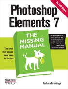
The “Convert to Black and White” dialog box appears. It includes a helpful before and after preview of your image, and the controls shown in Figure 10-1.
Choose a conversion style.
Elements gives you various preset styles for the conversion. Click a style in the list to apply it to your photo. Try different styles to see which suits your photo best.
Tweak the conversion, if necessary.
Use the Adjustment Intensity sliders below the preview area (Red, Green, and so on) to increase or decrease the prominence of each color channel. Watch the preview to see how you’re changing your photo. Go gently—it doesn’t take much to make quite a difference in your image.
Once you move a slider, Undo and Redo buttons appear. Use them to step backwards and forwards through your changes. If you want to start from scratch, then click Reset.
When you’re satisfied with how your photo looks, click OK.
Be sure to examine your actual image carefully. Don’t rely on just the smallish preview window. Move the "Convert to Black and White” dialog box around your screen so that you can see all the regions of your photo before you accept the conversion. If you decide against creating a black-and-white image, then click Cancel.
Tip
Very often, you may prefer to emphasize certain details in your photo without making additional changes to the overall tonality. To do that, use the Dodge and Burn tools (Dodging and Burning), once you’ve completed your conversion.
While the different conversion styles have descriptive names, like Portraits and Scenic Landscape, don’t put too much stock in the names themselves. Instead, test out the various styles to see which best matches your photo. For instance, you may vastly prefer the way Uncle Julio looks when you choose the Newspaper style instead of the Portraits style. Basically, the names are just a less intimidating way of describing preset collections of settings to the color channels in your photo.
But wait a minute: changes to the color channels? That’s right. Back in Chapter 7, you read about how your photo consists of three separate color channels: red, blue, and green. What you may not realize is that, in your original camera file, each of these channels is recorded merely as variations in light and dark tones; in other words, a black-and-white image. Your image file tells the computer or printer to render a particular channel as all red, blue, or green, and the blending of the three monotone channels makes all the colors you see.
Now when you convert your photo back to black and white, each of these channels contains varying amounts of details from your photo, depending on the color of your original subject. So, the green channel might have more detail from your subject’s eyelashes, while the red channel may have more detail from the bark on the tree she’s standing under. (Remember, the color channels themselves don’t necessarily correspond to the color of the objects you see in your final photo. Or, put another way: Your camera needs to use a mixture of red, blue, and green to create what looks like bark to us humans.) Noise (graininess) often happens much more in one channel than the others, as well.
The Adjustment Intensity sliders in the dialog box (More Red, More Green, and so on) let you increase or decrease the presence of each color channel. So you can adjust how prominent various details in your photo are by changing the importance of that color channel in the complete photo. These adjustments can greatly change the appearance of the final conversion. The Contrast slider adjusts the contrast for the combined channels.
That’s the theory behind those color channel sliders, but fortunately you don’t have to understand it to use them effectively. Just be sure you can get a good view of your photo (zoom and, if necessary, move the dialog box around), and slide till you’re happy with what you see. If you plan to print your converted photo, read the box on Method Two: Removing Color from a Photo for some tips on how to get a good black-and-white print from a color inkjet printer.
Note
Elements gives you an easier way to convert your photo to black and white, but it’s an all-or-nothing scenario—you don’t get any options for adjusting the tones in your image. The Effects palette includes a very nice black-and-white tint effect. Go to Effects → Photo Effects → Monotone Color, and then double-click the black-and-white apple to apply the effect. Also, some frames in the Frames section of the Content palette (The Content Palette)—like some of the Color Tint frames—automatically convert your photo to black and white when you place it in the frame. See Photo Collages for details on how to use these frames.
Method Two: Removing Color from a Photo
Since one size never fits all, Elements gives you a few other, fundamentally different ways to remove the color from your image. Most times, you should follow the instructions in the preceding section to convert your photo to black and white. But if you want to drain the color from a particular part of your photo, or if you’re looking to do something artistic, like changing a color photo into a drawing or a painting, then you’ll probably want to try one of these three methods:
Convert Mode. You may remember from Choosing Color Mode that you need to choose a color mode for your photo: RGB, Bitmap, or Grayscale. You can remove the color from your photo by changing its mode to Grayscale. Choose Image → Mode → Grayscale. This method is quick, but it’s also a bit destructive, since you can’t apply it to a layer: Your entire photo is either grayscale or not.
Remove Color. You can also keep your photo as an RGB file and drain the color from it, by going to Enhance → Adjust Color → Remove Color (or pressing Shift+Ctrl+U). This command removes the color only from the active layer, so if your photo has more than one layer, then you need to flatten it first (Layer → Flatten Image), or the other layers keep their color.
Remove Color is really just another way to completely desaturate your photo—just as you might when using the Hue/Saturation command (described in the next option). Remove Color is faster but you don’t get the control that the Hue/Saturation command gives you. Figure 10-2 shows the difference between applying the Remove Color command versus converting your entire image to grayscale.
Hue/Saturation. You can also call up the Hue/Saturation dialog box (Making Your Colors More Vibrant), and move the Saturation slider all the way to the left, or type –100 into the Saturation box. The advantage of this method is that if you don’t care for the shade of gray you get, then you can desaturate each color channel separately by using the pull-down menu in the dialog box. With this method, you can tweak your settings a bit to eliminate any color cast you may get from your printer.

Tip
If you’re planning to print the results of your conversion, the paper you use can make a big difference in the gray tones you get. If you don’t like the results from your usual paper, try a different weight or brand. You’ll need to experiment because the inks for different printer models react differently with different brands of paper.
Creating Spot Color
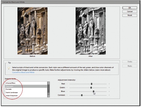
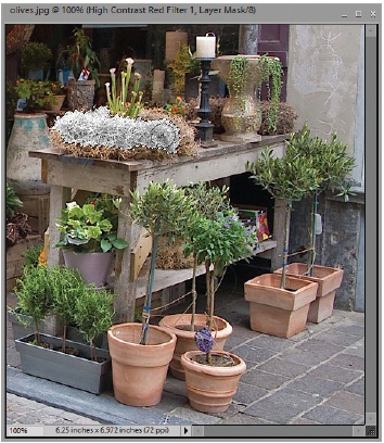
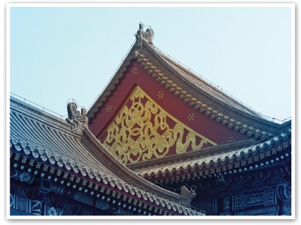
Removing almost all the color from a photo but leaving one or two objects in vivid tones, called spot color, is a very effective artistic device that’s long been popular in the print industry. (The term can also have a different meaning among those in the commercial printing business, where it refers to the use of special ink for a particular color in a multicolor image.)
Figure 10-3 shows an example of spot color. To practice the maneuvers you’re about to learn, download the photo (barn.jpg) from the Missing CD page at www.missingmanuals.com.
This section walks you through four of the easiest methods to create spot color. (The fifth way, explained earlier in this chapter [Method One: Making Color Photos Black and White], is to select the area you want to make black and white, and then use “Convert to Black and White”.) You can paint out color, erase your way back to color, change only a selected area to black and white, or use an Adjustment layer. With the last method, you’ll also learn how to edit the layer mask of an Adjustment layer so that you can change the area that the adjustment affects.
The end result looks the same no matter which method you choose. Just select the one you find easiest for the particular photo you want to change.
Tip
If you have a newish digital camera, check your special effects settings for a spot or accent color setting. Many cameras can now create a black-and-white image with only one shade left in color.
Brushing Away Color
Creating black-and-white areas in a color photo has never been as easy as it is in Elements 7. You can use the new Smart Brush to convert an area to black and white while making your selection (see Figure 10-4). In other words, you paint the object you wish to make black and white, and Elements selects and converts it—all while preserving the color in the rest of your photo. If you want to keep most of your image in color while converting only small portions of it to black and white, this method is definitely the one to try first.
To paint away color with the Smart Brush:
Open a photo in Full Edit mode, and then activate the Smart Brush.
Press F, or click its icon in the Toolbox, and then choose the brush from the pop-out menu. The Smart Brush puts its changes on their own layer, so you don’t need to create a duplicate layer before using it.
Choose the style of black and white conversion you want.
At the right end of the Smart Brush options, you’ll see a small thumbnail. This is actually the pop-out menu for the Smart Brush presets (which Adobe calls Smart Paint). Go to the “Black and White” section, and then choose the thumbnail that looks most like what you want. (If you don’t like it once it’s applied, you can always change it later.) Elements has a number of different conversion styles, and the names don’t mean much, really. It’s best to go by the thumbnail preview when choosing a conversion style.
Drag over the object in your photo that you want to make black and white.
The Smart Brush should select the object and convert it, all in one go. If you have a hard time getting a good selection, then go back to Elements’ main Toolbox, and use the Detail Smart Brush (Correcting color with a brush) instead. (That one works like the regular Selection brush, changing only the area directly under the cursor, so you’ll have more work to do, but you’ll get a more accurate selection.)
That’s all there is to it. If you don’t like the conversion style you’ve chosen, or want to change the area the brush affects, then just click the pin that appears when the Smart Brush is active; then make your changes. See Correcting color with a brush for more about how to fine-tune Smart Brush edits. You can also adjust the affected area by editing the Smart Brush’s layer mask, as explained on Editing a layer mask.
The Smart Brush is great when you want a photo that’s mostly in color with only a small area of black and white showing. If you want a photo that’s mostly black and white with only a small area of color, brush over the area you want to keep in color and then, in the Options bar, turn on the Invert checkbox, which reverses the area changed by the effect. The part of your image you made black and white gets recolored, while the rest of the photo (where you didn’t brush) turns black and white. You can also use one of the methods listed in the following sections.
Erasing Colors from a Duplicate Layer
You can also easily remove colors from parts of your image with the Eraser tool. (See Using the Eraser for more about the different Erasers.) Using this method, you place a color-free layer over your colored original, and then erase bits of the top layer to let the color below show through.
Make a duplicate layer.
Press Ctrl+J or go to Layer → Duplicate Layer. This layer is going to be black and white.
Remove the color from the new top layer.
Go to Enhance → "Convert to Black and White”, or to Enhance → Adjust Color → Remove Color. (Be sure the top layer is the active one before you do this.) You should now see only a black-and-white image.
Erase the areas on the top layer where you want to see color.
Use the Eraser tool (Using the Eraser) to remove parts of the top layer so the colored layer underneath shows through. Usually you’ll get the best results with a fairly soft brush.
If you want an image that’s mostly colored with only a few black-and-white areas, then reverse the technique—remove the color from the bottom layer, and leave the top layer in color. Then erase as described above.
When finished, you can flatten the layers if you want. But by keeping them separate, you preserve the option to go back and erase more of the top layer later on. And you’ll still have the option of trashing the layer you erased and making a new duplicate of the bottom layer, if you want to start over.
Removing Color from Selections
If you don’t want to have multiple layers, you can also use the Enhance menu’s “Convert to Black and White” option or the Remove Color command on a selection. Just make sure you save your image as a version (Saving Your Work) or perform this method on a copy, if your photo isn’t in the Organizer. You don’t want to risk wrecking your original photo. While the Smart Brush is the handiest tool for uncoloring small areas, as explained above, the method described here is best if you don’t like any of the Smart Paint presets or if you’re absolutely dead set against having a new layer.
The procedure for changing a selected area to black and white is very simple:
Mask out the area where you want to keep the color in your image.
Use the Selection brush in Mask mode (see The Selection Brush) to paint a mask over the area where you want to keep the color, to protect it from being changed in step 2. In other words, you’re going to make everything black and white except where you paint with the Selection brush.
If you want to keep the color in most of your photo and remove the color from only one or two objects, then paint over them with the brush in Selection mode instead of Mask mode, or use the Quick Selection tool.
Remove the color from the selected area.
Go to Enhance → “Convert to Black and White”, or to Enhance → Adjust Color → Remove Color, or press Shift+Ctrl+U. The color disappears from the areas not protected by the mask, but the area under the mask is untouched. (You can also do this step by going to Enhance → Adjust Color → Adjust Hue/Saturation, and then moving the Saturation slider all the way to the left.)
You should see a photo with color only in the areas that you didn’t select. This method is the least flexible of all the ones described in this chapter. Once you close your image, the change is permanent and not undoable, which is why you don’t want to use this method on your original photo.
Using an Adjustment Layer and the Saturation Slider
If you’d like to keep the option of easily changing your mind about which areas keep the color, and you don’t like any of the Smart Brush presets, it’s best to remove the color with a Hue/Saturation Adjustment layer. This choice is the most flexible (though it doesn’t offer you the tone adjustments you can make when using the Enhance menu’s “Convert to Black and White” option). Using an Adjustment layer lets you both add and subtract areas of color later if you like.
Select the area where you want to remove the color.
Use any Selection tool you like (see Chapter 5 for more about Selection tools). If you think it would be easier to select the area where you want to keep the color, do that. Then press Shift+Ctrl+I to invert your selection—now the area that’s going to lose the color is selected instead.
Create a Hue/Saturation Adjustment layer.
Go to Layer → New Adjustment Layer → Hue/Saturation, or click the New Adjustment Layer icon on the Layers palette, and then choose a Hue/Saturation layer.
In the Hue/Saturation dialog box that appears, remove the color.
Move the Saturation slider all the way to the left to remove the color.
Why is this method better? Well, for one thing, you can always discard the Adjustment layer if you change your mind. But that’s not all. You can actually edit the Adjustment layer’s layer mask (see Layer Masks for more about layer masks) so that you can change which parts of your photo are in color, even days or weeks later.
Don’t want that tree as well as the vine on the house? Or maybe you wish you’d left all the window frames in color? You can easily fix everything by editing the layer mask. The next section tells you how.
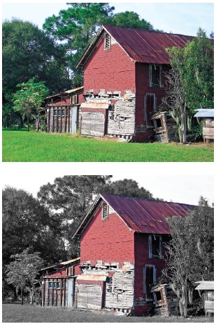
Editing a layer mask
Elements lets you make changes to the layer mask of an Adjustment layer any time you want—as long as the layer hasn’t been merged into another layer and the image hasn’t been flattened. You may want to edit your layer mask if you think your original selection needs some cleaning up, or you want to make changes to the area the Adjustment layer affects. You can use this same technique to change the area affected by a Smart Brush adjustment, too, although usually it’s simpler just to click the pin in the image and activate the layer mask that way (see Correcting color with a brush for more details on how all that works).
Note
Remember that masking something means it won’t be affected by a change. So the area that shows up in black or red on your layer mask is the area that isn’t going to be changed by your adjustment. If you don’t see any black or red when looking at a layer mask, then the Adjustment layer is going to change your whole photo.
You can work on the mask directly, or make the layer mask visible and work on the mask itself. Here’s the simplest way to make changes to the area covered by a layer mask:
Make sure the Adjustment layer is the active layer.
If it isn’t, then click it in the Layers palette.
Set your foreground/background colors to black and white.
Just press D. If you want to paint with white, press X to swap the colors so that white (the background) becomes the foreground color.
Paint directly on your image.
Use the Brush tool to paint on the image. Paint with black to keep an area from being affected by your adjustment. Paint with white to increase the area affected by the adjustment. In other words, black masks an area, while white increases your selected area.
You can also use the Selection tools (the same way you would on any other selection) to change the mask’s area. Just keep in mind that what’s selected gets changed by the adjustment, while what’s masked doesn’t change. See Chapter 5 if you need help making selections. If you watch the layer mask icon in the layers palette, then you’ll see that it also changes to show where you’ve painted.
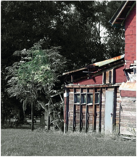
To make a layer mask visible, click it in the Layers palette. Elements gives you a choice of two different ways to see the masked area, as shown in Figure 10-5. You merely Alt+click the right thumbnail for the Adjustment layer in the Layers palette, and then you’ll see the black layer mask (instead of your photo) in the image window. Add the Shift key when you click to see a red overlay on the photo instead of the black-and-white view. Press the same keys again to get back to a regular view of your image.
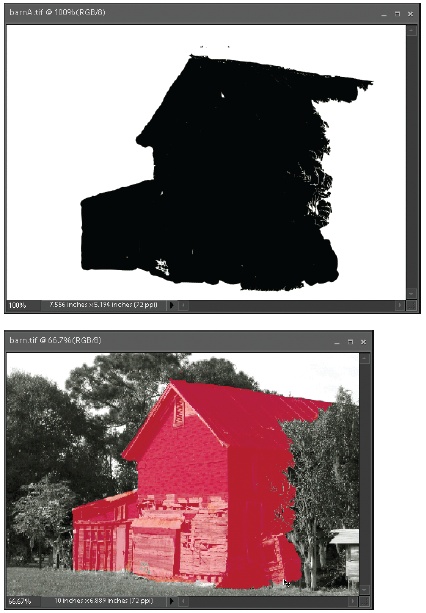
The black mask view shows only the mask itself, not your photo beneath it. This is a good choice when checking to see how clean the edges of your selection are. If you’re adding or subtracting areas of your photo, then choose the red overlay view so you can see the objects in your photo as you paint over them. You can use the method described above to paint in either view.
That’s all there is to it, but that’s not all you can do to edit a layer mask. You can use shades of gray to adjust the transparency of the mask. When you paint on your mask with gray, you can change the opacity of the changes made by the Adjustment layer. You can let a little color show through the mask, for instance, without letting the full vividness of the color come through. Figure 10-6 shows an example of how you’d use this technique. The lighter the shade of gray you choose, the more color shows through.
Colorizing a Black-and-White Photo
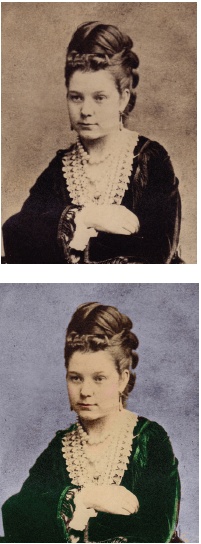
So far, you’ve read about ways to make all or part of a color photo black and white. But what about when you’ve got a black-and-white photo and you want to add color to it? Elements makes things easy (or if not easy, then at least possible). For instance, you can give an old photo the sort of hand-tinted effect you sometimes see in antique prints, as shown in Figure 10-7.
You can easily color things with Elements. Before you start tinting a photo, first make any needed repairs. See The Clone Stamp for repair strategies. For fixes to the exposure, see Deciding Which Exposure Fix to Use.
Make sure your photo is in RGB mode.
Go to Image → Mode → RGB Color. Your photo must be in RGB mode or you can’t color it.
Create a new layer in Color blend mode.
Go to Layer → New → Layer and select Color as the layer mode. By choosing Color as your layer mode, you can paint on the layer and the image details still show through.
Paint on the layer.
Use the Brush tool (Picking and Using a Basic Brush) and choose a color in the Toolbox’s Foreground color square (Choosing the Color You Want). Keep changing the foreground color as much as you need to. If the coverage is too heavy, then in the Options bar, reduce the opacity of the brush.
You can also paint directly on the original layer. (Try switching the brush blend mode to Color for this.) But with that method, you’ll find it far more difficult to fix things if you make a mistake when you’re well into your project. Using the original layer also doesn’t give you much of an out if you decide later on that the lip color you painted first doesn’t look so great with the skin color you just chose.
The method just described is handy for when you want to use many different colors on a photo, but if you want to add only a single color to part of the photo, in Elements 7 the easiest way is to use the Smart Brush:
Be sure your photo is in RGB mode.
Go to Image → Mode → RGB Color. Your photo must be in RGB mode or the Smart Brush only paints in shades of gray rather than the color you select.
Activate the Smart Brush, and then choose a color to paint with.
Press F or click the Smart Brush in the Toolbox, and then go to the Smart Paint setting in the Options bar (the thumbnail to the right of Refine Edge) and choose Color. From the menu thumbnails, select the color you want.
Drag over what you want to color.
The Smart Brush automatically creates your selection, and colors it. If you don’t get a good selection with the regular Smart Brush, switch to the Detail Smart Brush.
Tweak the effect.
The color choices tend to be pretty heavy, so you may prefer to go to the Layers palette and reduce the opacity of the Smart Brush layer (see Managing Layers for more about layer opacity).
The Smart Brush works well if you happen to like one of the available color choices. If you don’t like any of the colors it offers, then use the new layer method described earlier in this section, which is much more flexible, since you can choose any color you want.
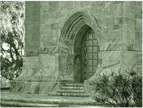
Tinting an Entire Photo
You can give an entire photo a single color tint all over, even if the original is a grayscale photo. Tinting is a great way to create a variety of different moods.
You have two basic ways to tint photos. Actually, there are a lot more than two, but two should get you started. The first method (Layer style) described here is faster, but the second (Colorize) lets you tweak your settings more. Figure 10-8 shows the result of using the Layer style method on a color photo. (For a more subtle effect, you can also use Photo Filters, described on Photo Filter.) Photo Effects also has some terrific monotone tint effects, as explained on Using Actions in Elements.
For either method, if you want to keep the original color (or lack thereof) in part of your photo, then use the Selection brush in Mask mode (The Selection Brush) to mask out the area you don’t want to change.
Tip
Some of the frame effects in the Content palette automatically add a tint to your photo when you apply them. The Effects palette also has some handy monochrome tint effects in its Photo Effects section.
Using a Layer style
Although many people never dig down far enough to find them, Adobe gives you some Photographic Effects Layer styles that make tinting a photo as easy as double-clicking. You’ll learn more about Layer styles on Adding Layer Styles, but this section tells you all you need to know to use the Photographic styles. It’s a very simple procedure:
Create a duplicate layer.
Go to Layer → Duplicate Layer or press Ctrl+J. (If you don’t create a duplicate layer and your original has only a Background layer, then you’ll get asked to convert it to a layer when you apply the style. Say yes.)
If necessary, change the mode to RGB.
Go to Image → Mode → RGB Color. With this method, it doesn’t matter if your original is in color or not. The Layer style gets rid of the original color, and tints the photo all at the same time.
Choose a Layer style.
Go to the Effects palette → Layer Styles → Photographic Effects. Double-click the style of your choice, drag it to the photo, or click it once in the palette, and then click Apply. You can click around and try different styles to see which you prefer. Undo (Ctrl+Z) after each style that you try.
When you see what you like, click OK.
The drawback to this method is that you can’t easily go back and edit the color you get from the Layer style. When you call up the Style Settings (see Applying Gradients), you don’t see any active checkboxes, because these styles don’t use those settings. Instead, you’d need to use a Hue/Saturation adjustment (see Making Your Colors More Vibrant) or Color Variations (Using Color Variations) to go back later and change the Layer style’s tint color.
Additional tint effects from the Content palette
The Content palette includes some frames that automatically apply a tint to your photo, as shown in Figure 10-9. These range from simple all-over colors like Sepia, to fading gradients. (See Applying Gradients for more about gradients.)
You can read more about using the Frames from the Content palette on Photo Collages. To tint your photo, choose Type → Frames, and then scroll down towards the bottom of the list of thumbnails.
The Photo Effects section of the Effects palette also has some very effective color tints. Read about how to apply Effects on Using Actions in Elements.
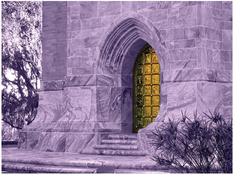
Using Colorize
You can use the Colorize checkbox in the Hue/Saturation dialog box to add a color tint to a grayscale photo or to change the color of a photo that already has color in it. With this method, you can choose any color you like, as opposed to the limited color choices of the Layer styles in the previous section. You can also adjust the intensity of the color with the Saturation slider once you’ve selected the shade you want.
Figure 10-10 explains how the Colorize setting changes the way the Hue/Saturation command works.
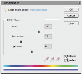
Make sure your photo is in RGB mode.
Go to Image → Mode → RGB Color.
Remove the color from your photo, if necessary.
Press Shift+Ctrl+U to remove the color. Do this if the photo has become yellowed or discolored (because of age, for example). If your whites are really dingy, then you might want to make a Levels adjustment (Using Levels) to brighten them back up before removing the color.
Colorize your photo on a new layer.
Go to Layer → New Adjustment Layer → Hue/Saturation, and then turn on the Colorize checkbox. When you turn this setting on, your image becomes filled with the foreground color. If you don’t like it, that’s fine. You’re going to change it right now.
Adjust the color until it looks the way you want it to.
Move the sliders for Hue, Saturation, and Lightness until you find the look you want, and then click OK. Figure 10-11 shows the results.
Tip
Want to turn a full-color photo to a monotone image in a hurry? Just turn on the Colorize checkbox—no need to remove the color first. Colorize automatically reduces your photo to just one color. The advantage to using the Colorize method (versus the layer style) is that you can use the sliders to create any color you want.
If you selected and masked an area, then that part should still show the original color.
You can change your mind about the colorizing by double-clicking the left icon on the layer in the Layers palette. That brings up the controls for the Hue/Saturation adjustment again so you can change your settings. And you can also edit the layer mask, as described on Editing a layer mask, if you want to change the area that’s affected by the Adjustment layer.
When you’re done, if you merge layers (or press Ctrl+Alt+Shift+E to produce a new merged layer above the existing layers), then you can use Levels (Using Levels), Color Variations (Using Color Variations), and the other color-editing tools to tweak the tint effect.