Chapter 14. Type in Elements
If you want to add text to your images, Elements makes it easy. You can quickly create all kinds of fancy text to use on greeting cards, as newsletter headlines, or as graphics for Web pages.
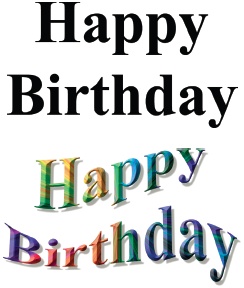
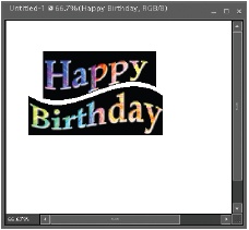
Elements gives you lots of ways to jazz up your text: you can apply Layer styles, Effects, and gradients, or you can warp your type into psychedelic shapes. And the Type Mask tools let you fill individual letters with the contents of a photo. Best of all, most type tools let you change your text with just a few button clicks (see Figure 14-1). By the time you finish this chapter, you’ll have learned about all the ways that Elements can add pizzazz to your text.
Adding Type to an Image
It’s a cinch to add text to an image in Elements. Just select the Type tool, choose your font from the Options bar, and type away. The Type tool has a Toolbox icon that’s easy to recognize: a capital T. Elements actually gives you four different type tools, all of which are hidden behind the Toolbox icon’s pop-out menu: the Horizontal Type tool, the Vertical Type tool, the Horizontal Type Mask, and the Vertical Type Mask.
You’ll learn about the Type Mask tools later in this chapter (see Type Masks: Setting an Image in Type). To get started, you’ll focus on the regular Horizontal and Vertical Type tools. As their names imply, the Horizontal Type tool lets you enter type that runs left to right, while the Vertical Type tool is for creating type that runs down the page.
When you use the Type tools, Elements automatically puts your text on its own layer, which makes it easy to throw out that text and start over again later.
Type Options
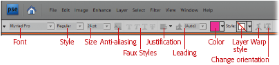
Whether you select the Horizontal or Vertical Type tool, the first thing you’re going to want to do is take a look at the many settings available in the Options bar (Figure 14-2). These choices let you control pretty much every aspect of your type, including font selection, font color, and alignment.
Your choices from left to right are:
Font Family. Choose your font, listed here by name. Elements uses the fonts installed on your computer.
Tip
The font menu displays the word “Sample” in the actual fonts to make it easier for you to find the one you want. To see all your fonts, in the Options bar, click the down arrow to the right of the font name box for a pop-out menu. You can also adjust the size of the preview samples by going to Edit → Preferences → Type.
Font Style. Here’s where you select the styles available for your font, like Bold or Italic.
Size. This is where you choose how big your type should be. Text is traditionally measured in points. You can choose from the list of preset sizes in the pull-down menu or just type in the size you want. You aren’t limited to the sizes shown in the menu—you can type in any number you want. See the box on Warping Type for help understanding the relationship between points and actual size in Elements.
If points make you nervous, you can change the type measurement unit to millimeters, pixels, or points in Edit → Preferences → “Units and Rulers”.
Anti-aliasing. This setting smoothes the edges of your type. Turn it on or off by clicking the little square with the two As on it. Anti-aliasing is explained later, but usually you want it turned on.
Faux Styles. Faux as in “fake.” If your chosen font doesn’t have a Bold, Italic, Underline, or Strikethrough version, you can tell Elements to simulate it here by clicking the appropriate icon. (This option isn’t available for some fonts.)
Justification. This pull-down menu tells Elements how to align your text, just like in a word processor. If you enter multiple lines of type, here’s where you tell Elements whether you want it lined up left, right, or centered (for horizontal type). If you select the Vertical Type tool, you can align top, bottom, or middle.
Note
If you choose the Vertical Type tool, your columns of type run from right to left (each time you start a new column) instead of left to right. If you want vertical type columns to run left to right, you need to put each column on its own layer and position them manually. You can use the Move tool’s Distribute option to space them evenly (Grouping and Linking Layers).
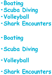
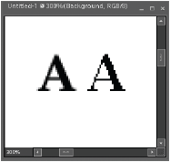
Leading (rhymes with “bedding”). This setting controls the amount of spacing between the lines of type, measured in points. For horizontal type, leading is the difference between the baselines (the bottom of the letters) on each line. For vertical type, leading is the distance from the center of one column to the center of the column next to it. Figure 14-3 demonstrates what a difference leading can make in the appearance of your text. The first setting you’ll always see is Auto, which is Elements’ guess about what looks best. You can change leading by choosing a number from the list or entering the amount you want (in points, unless you changed the measurement unit in the preferences).
Figure 14-3. Leading is the space between lines of type. Top: A list of four items with Auto leading. Bottom: The same list with the leading number set much higher. (If you change the leading of vertical type, you change the space between the vertical columns of type, rather than the space between letters in an individual column. See the box on Warping Type for how to tighten up the space between letters that are stacked vertically.)Color. Click this square to set the color of your text. Or click the arrow to the right of the color square to bring up Color Swatches (The Color Swatches Palette). When you’ve made your selection, the Foreground color square (Choosing the Color You Want) changes to show the new color.
Note
When the Type tool cursor is active in your image, you can’t use the keyboard commands to reset Elements’ standard colors (black and white) or to switch them. You’ll need to click the relevant buttons in the Toolbox instead. (See Choosing the Color You Want for how to use the Toolbox’s color picking squares.)
Layer style. You can add funky visual effects to your type with Layer styles (Adding Layer Styles). First, enter some text and then, on the Options bar, click the Commit button (the green checkmark). Next, click the Layer style box and choose a style from the pop-out palette. If you want to remove a style that you’ve just applied, choose Remove Style from the More button’s menu (the double arrows on the upper-right corner of the Layers palette), or go to Layer → Layer Style → Clear Layer Style.
The next two choices are grayed out until you create some text for them to work on:
Warp. The little T over a curved line hides a multitude of options for distorting your type in lots of interesting ways. There’s more about this option on Warping Type. (The Warp Text command is also available from Layer → Type → Warp Text.)
Orientation. This button changes your text from horizontal to vertical, or vice versa. You can also change type orientation by going to Layer → Type → Horizontal or Vertical.
These two choices don’t show up at all until you’ve typed something:
Cancel. When you add type to your image, the text automatically gets placed on its own layer. Click the Cancel button to delete this newly created text layer. This button works only if you click it before you click the Commit checkmark. To delete text after you’ve committed it, drag its layer to the Trash in the Layers palette.
Commit. Click this green checkmark after you type on your image to tell Elements that yes, you want the text to remain as it appears. Committing your type gives you access to the other tools again.
If you see either of these buttons, you haven’t committed your type, and many menu selections and other tools won’t be available until you do. When you see the Cancel and Commit buttons in the Options bar, you’re in what Elements calls “Edit mode”, where you can make changes to your type, but most of the rest of Elements isn’t available to you. Just click Commit or Cancel to get the rest of the program options back.
Creating Text
Now that you’re familiar with the choices you’ve got in the Options bar, you’re ready to start adding text to your image. You can add type to an existing image, or start by creating a new file (if you want to create type to use as a graphic by itself). To use either the Horizontal or Vertical Type tools, just follow these steps:
Activate the Type tool.
Click the tool in the Toolbox or press T, and then select the Horizontal Type tool or the Vertical Type tool from the pop-out menu.
Modify any settings you want to change on the Options bar.
See the list in the previous section for a rundown of your choices. You can make changes after you enter your type, too, so your choices aren’t set in stone yet. Elements lets you edit your type until you simplify the layer. (See Ellipse for more about what simplifying a layer means.)
Click in your image where you’d like your text to go and then begin typing. The Type tools automatically create a new layer for your text. If you’re using the Horizontal Type tool, the horizontal line you see is the baseline your letters sit on. If you’re typing vertically, the vertical part of the cursor is the centerline of your character.
Type the way you would in a word processor, using the Enter key to create a new line. If you want Elements to wrap your type (adjust it to fit a given space), drag a text box with the Type tool before you start typing. Otherwise, you need to make your returns manually. If you create a text box, you can resize it to adjust the type flow by dragging the handles after you finish typing. This won’t work anymore after you simplify the layer.
As noted earlier, if you want to use the Vertical Type tool, you can’t make the columns of type run left to right. If you need multiple vertical columns of English language text, enter one column and then click the Commit button. Then start over again for the next column, so that each column is on its own layer.
Move your text if you don’t like where it’s positioned.
Sometimes the text isn’t placed exactly where you want it. You can move text with the Text tool before committing it—just grab the little black square at the beginning of the baseline and drag. If you have trouble moving your text, try the Move tool, but note that switching to the Move tool automatically commits your text (see step 5). If you need to move vertical type columns, wait until you’ve committed the type to rearrange the columns.
If you like what you see, click the checkmark in the Options bar to commit the type.
When you commit your type, you tell Elements that you accept what you’ve created. The Type tool cursor is no longer active in your photo once you commit. If, on the other hand, you don’t like what you typed, click the Cancel button in the Options bar, and the whole type layer goes away.
Once you’ve entered type, you can modify it using most of Elements editing tools—add Layer styles (Adding Layer Styles), move it with the Move tool (The Move tool), rotate it, make color adjustments, and so on.
Note
If you try to paste text into Elements by copying it from your word processor, the results are unpredictable. Sometimes things work fine, but you may find the text comes in as one endlessly long line of words. If that happens, it’s often easier to type your text in Elements from scratch than to try to reformat the text.
Editing Type
In Elements, you can change your text after you’ve entered it, just like in a word processor. Elements lets you change not only words, but the font and its size, too, even if you’ve applied lots of Layer styles (see Figure 14-4). You modify text by highlighting it and making the correction or changing your settings in the Options bar.
Tip
As mentioned earlier, you can see the word “Sample” in the menu displayed in the actual fonts themselves. Even better, Elements also gives you a quick way to preview what your actual text will look like in other fonts. First, select the text, and then click in the Font box in the Options bar. Use the up and down arrow keys to run down the font list. You’ll see your words appear in each font as you go down the list.
You can make all these changes as long as you don’t simplify your type. Simplifying is the process of changing text from a vector shape that’s easy to edit to a rasterized graphic (see the box on Ellipse). In this respect, text works just like the shapes you learned about in Chapter 12: Once you simplify text, Elements doesn’t see it as text anymore, just as a bunch of regular pixels.
You can either choose to simplify text yourself (by selecting Layer → Simplify Layer), or wait for Elements to prompt you to simplify, which it will do when you try to do things like apply a filter or add an effect to your type.
Note
While the text effects included with Elements don’t simplify your text, it’s possible that effects you download may automatically simplify your text without asking first. So it’s a good idea to make sure you’ve made all the edits you want to your text before using these effects.
Smoothing type: anti-aliasing
Anti-aliasing smoothes the edges of your type. It gets rid of the “jaggies” by blending the edge pixels on letters to make the outline look even, as shown in Figure 14-5. In Chapter 5 (The Lasso Tools), you read about anti-aliasing for graphics; anti-aliasing has a similar effect on type.
Elements always starts you off with anti-aliasing turned on, and 99 percent of the time you’ll want to keep it on. The main reason to turn it off is to avoid fringing—a line of unwanted pixels that make it look like the text was cut out from an image with a colored background.
You turn anti-aliasing on and off by clicking the Anti-aliasing button (the two As) in the Options bar. The button shows a dark outline when anti-aliasing is on. You can also turn anti-aliasing off and on by going to Layer → Type → Anti-Alias Off or Anti-Alias On. Once you simplify type, you can’t change the anti-aliasing setting for the type.
Tip
If you’re seeing really jagged type even with anti-aliasing turned on, check your resolution. Type often looks poor at low resolution settings—just as photos do. See Changing the Size of Your Image for more about resolution.
Warping Type
With Elements, you can warp the shape of your type in all sorts of fun ways. You can make it wave like a flag, bulge out, twist like a fish, arc up or down, and lots more. These complex effects are really easy, too, and best of all, you can still edit the type once you’ve applied the effects. Figure 14-6 shows just a few examples of what you can do. If you add a Layer style (explained on Adding Layer Styles), warping is even more effective.
To warp your type, follow these steps:
Enter the text you want.
Use the Move tool (The Move tool) to reposition your text if necessary.
Select the text you want to warp.
Make sure the Text layer is the active layer, or you won’t be able to select what you typed. Click the Text layer in the Layers palette if it’s not already highlighted there.
Click the Create Warped Text button in the Options bar.
The Type tool must be active for the Warped Text button to appear. It’s the T with a curved line under it. The Warp Text dialog box, shown in Figure 14-7, appears.
Tell Elements how to warp your text.
Select a warp style from the pull-down list. Next, make any changes you want to the sliders or the horizontal/vertical orientation of the warp. Tweaking these settings can radically alter the effect. Push the sliders around to experiment.
Figure 14-7. As you can see, you have lots of ways to warp your text. Once you choose a warp style, you see sliders in the dialog box that you can use to further customize the effect.You can preview the results right in your image. Your choices are described in more detail in the next section.
When you come up with something you like, click OK.
Note
You can’t warp type that has the Faux Bold style applied to it. If you forget and try to do so, Elements politely reminds you. The program even offers to remove the style and continue with your warp.
Elements gives you lots of different warp styles to choose from, and you can customize the look of each style by using the settings in the Warp Text dialog box, described in the next section.
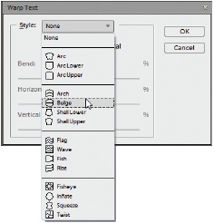
The Warp Text Dialog Box
The little dialog box that comes up when you click the Create Warped Text button is pretty straightforward. Your setting choices are:
Warp Style. This is where you choose between warping patterns like Arc, Flag, and so on. To help you select, Elements gives you thumbnail icons demonstrating the general shape of each warp.
Horizontal/Vertical. These radio buttons control the orientation of the warping. Most of the time, you’ll want to leave the button the same as the text’s orientation, but you can get interesting effects by warping the opposite way.
A vertical warp on horizontal text gives more of a perspective effect, like the text is moving towards you or away from you. You can get some very funky effects by putting a horizontal warp on vertical text.
Bend. This is where you tell Elements how much of an arc you want. If you want to change the arc from Element’s standard setting, type a percentage in the box or just move the slider until you get what you want. A higher positive percentage makes a bigger warp. A negative number makes your text warp in the opposite direction. For example, if you want an inverted arc, choose the Arc style and move the slider into the negative region.
Horizontal/Vertical Distortion. These settings control how much your text warps in the horizontal or vertical plane. Moving the sliders gives you a very high degree of control over just how and where your text warps. They work pretty much the same way as the Bend setting—type a negative or positive percentage or move the sliders.
The best way to find the look you want is to experiment. It’s lots of fun, especially if you apply a Layer style first (Adding Layer Styles) to give your type a 3-D look before warping it.
Tip
Many of the warps look best on two lines of type, so that the lines bend in opposite directions. However, you can also get very interesting effects by putting two lines of type on separate layers and applying a different warp to each.
To edit your warp after it’s done, double-click the Warp thumbnail icon for the text layer in the Layers palette. Doing that automatically makes the text layer active and highlights the text. Then, click the Create Warped Text button in the Options bar. The Warp dialog box opens and shows your current settings. Make any changes you want or set the style to None to get rid of it.
Adding Special Effects
Besides warping your type, you can apply all kinds of Layer styles, filters, and special Text effects to give text a more elaborate appearance. You can change the color of your text, make the letters look 3-D, add brushstrokes for a painted effect, and so on. (There’s more about Layer styles, filters, and effects in Chapter 13.)
Elements gives you lots of different ways to add special effects to your text. The following sections demonstrate three of the most interesting: applying the Text effects, using a gradient to make rainbow-colored type, and using the Liquify filter to warp text in truly odd ways.
Text Effects
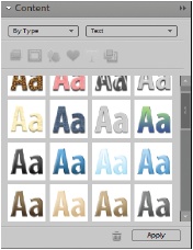
The Content palette contains an entire category dedicated to special Text effects (Figure 14-8). You apply Text effects just the way you would apply any other effect—make the type layer active and double-click the effect you want.
If you already have Layer styles on your text, it’s hard to predict how much the effects will respect the existing Layer styles. Some effects build onto the changes you’ve previously made with Layer styles; most undo anything you’ve done before. Experimenting is the best way to find out what happens when you combine Layer styles and effects.
Type Gradients
Gradient palette patterns fill your text with a spectrum of color. The simplest way to get these rainbow effects is to apply one of the Layer styles or Text effects that include a gradient. On the other hand, these features give you no control over the colors or direction of the gradient. If you have a specific look in mind, you may have to start from scratch and do it yourself. The easiest way is to start with a Type Mask, as explained on Type Masks: Setting an Image in Type. But if you already have some existing text, as long as it’s not yet simplified, you can easily fill it with a gradient.
Tip
A heavier, chunky font shows off your rainbow better than a thin, spidery one. Fonts with names that end in Extended, Black, or Extra Bold are good, like Arial Black or Rockwell Extra Bold.
First, make sure you’ve got some text in your image, and then follow these steps:
Create a new layer for your gradient. Make sure it’s directly above your text layer in the Layers palette.
You’re going to group the two layers, which is why they need to be next to each other. To create the new layer, press Ctrl+Shift+N or go to Layer → New → Layer. In the New Layer dialog box, turn on “Group with Previous Layer”.
Look at the Layers palette to be sure the new layer is the active layer. If it isn’t, give it a click in the Layers palette to highlight it.
Activate the Gradient tool.
Click the Gradient tool in the Toolbox and choose a gradient style in the Options bar. (See Applying Gradients for more about how to select, modify, and apply gradients.)
Drag across your new layer in the direction you want the gradient to run.
Because the layers are grouped, the gradient appears only in your type. If you don’t like the effect, press Ctrl+Z and drag again until you like what you see. That’s all you have to do, except of course, save your work if you want to keep it.
Note
You may have noticed that the new Smart Brush tool (Correcting color with a brush) includes Rainbow Map as one of the adjustments you can brush on to your image. Sounds like it might be just the ticket for avoiding all this layer creation and so on, doesn’t it? Unfortunately, it applies a gradient map (see Saving Gradients), not a regular gradient, to your image. Your type is all the same tonal level, so you’ll just get a one-color result on the letters with the Smart Brush Rainbow Map, not a rainbow at all.
However, there are a number of gradients in the Text effects, so you might want to check out the Content Palette before trying the steps above. If you find an effect that’s exactly what you want, you’ll save yourself some effort.
Applying the Liquify Filter to Type
The Create Warped Text button in the Options bar (explained earlier on Warping Type) gives you lots of ways to reshape your type. But there’s an even more powerful way to warp type: the Liquify filter (see Figure 14-9).
Note
You can actually use the Liquify filter to warp anything in an image—not just text. Use it to alter objects in photographs and drawings, for example. Fix someone’s nose, make your brother look like E.T., give a scene a watery reflection, and so on.

To use the Liquify filter, you first need to simplify the layer your text is on (Layer → Simplify Layer, or just click OK when the Liquify filter asks if you want to simplify). (Remember, you can no longer edit your text once you simplify it.) Then, call up the Liquify filter dialog box by going to Filter → Distort → Liquify. You can also get to it by double-clicking the Liquify filter thumbnail in the Distort section of the filters in the Effects palette.
You see yet another large Elements dialog box. Like most of them, it’s fairly straightforward once you learn your way around it. In the upper-left corner of the Liquify dialog box is a little toolbox with some very special tools in it (see Figure 14-10).
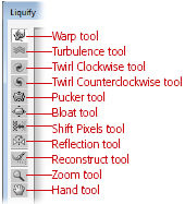
From top to bottom they are:
Warp tool. This lets you push the pixels of your image in whichever direction you want, although it usually takes a fair amount of coaxing to create much of an effect.
Turbulence tool. You can use the Turbulence tool to create clouds and waves. This tool is dependent on the Turbulent Jitter setting on the right side of the window (explained later). A higher number creates a smoother effect.
Twirl Clockwise tool. Hold this tool down on your image, and the pixels under your cursor spin in a clockwise direction. The longer you apply this tool, the more extreme the spin effect.
Twirl Counterclockwise tool. The opposite of the Twirl Clockwise tool, it makes the pixels under the cursor spin counterclockwise.
Pucker tool. This tool makes the pixels under the cursor move toward the center of the brush.
Bloat tool. The opposite of the Pucker tool, it makes pixels move away from the center of the brush.
Shift Pixels tool. The pixels you drag this tool over move perpendicularly in relation to the direction of your stroke. For example, if you drag from the top of an image in a straight line down, the pixels you pass over will move to the right. Alt+drag to change the direction of the shift.
Reflection tool. Drag to create a reflection of the area the tool passes over. Overlapping strokes create a watery effect.
Reconstruct tool. Pass this wonderful tool over areas where you’ve gone too far, and you selectively return them to their original condition without wrecking the rest of your changes.
Zoom and Hand tools. These are the same Zoom (The Zoom Tool) and Hand (The Hand Tool) tools you find elsewhere in Elements.
Your image appears in the preview window in the center of the dialog box. You can adjust the view with the Zoom tool or by using the magnification menu in the lower-left corner of the image area.
Tip
It often helps to zoom in very close when using the Liquify filter. If you’ve added text to a large image, select the text with the Marquee tool (Selecting Rectangular and Elliptical Areas) before activating the Liquify filter. Then you’ll see only the selected area in the filter preview, which makes it easier to get a high zoom level.
At the right side of the dialog box are the Tool Options settings:
Brush Size. You can enter a number as low as 1 pixel or as large as 600 in the space provided.
Brush Pressure. This is how much the brush affects the pixels you drag over. The range is from 1 to 100. The higher the pressure, the stronger the effect of the brush. If you’re using a graphics tablet, turn on Stylus Pressure so that the harder you press, the more effect you get.
Turbulent Jitter. This controls how smooth your changes look. The higher the number, the smoother the effect you get from your changes.
Stylus Pressure. Turn this on if you’re using a graphics tablet (Sharing Photos with Yahoo Maps) and you want the tool to be sensitive to how hard you press.
To use the filter, just pick your tool, modify your Tool Options (if you want), and then drag across your image. This is a very processor-intense filter, so there may be a fair amount of lag time before you see results, especially if your computer’s slow. Give the filter time to work.
If you like what you see in the preview, click OK and wait a few seconds while Elements applies your transformations. Then you’re done. But if you don’t like what you see, you can always have another go at it. Use the Revert button, which returns your image to its original condition before you started using the Liquify filter. Another option is to Alt+click the Cancel button to turn it to a Reset button (which resets the tool settings as well as your image).
Type Masks: Setting an Image in Type
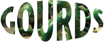
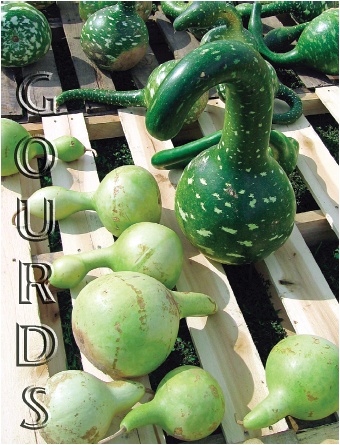
So far in this chapter, you’ve been reading about how to create regular type and how to glam it up by applying Layer styles and effects. But in Elements, you can also create type by filling letters with the contents of a photo, as shown in Figure 14-11. (You’ll find gourds.jpg, the photo used as the basis for Figure 14-11 and Figure 14-13, on the Missing CD page at www.missingmanuals.com.)
The Type Mask tools work by making a selection in the shape of your letters. Essentially, you’re creating a kind of stencil that you’ll place on top of your image.
Once you’ve used the Type Mask to create your text-shaped selections, you can perform all sorts of neat modifications to your text: emboss type into your image (which makes it looks like it’s been stamped into your image); apply a stroke to the outline of your text (useful if your font doesn’t have a built-in outline option); or copy and move your text to another document entirely.
Using the Type Mask Tools
The following steps show how to create a Type Mask and lay it over an image so that the letters you create are filled with whatever’s in your image:
Open the image that you want to use as your source for creating the text.
Activate the Type Mask tool.
Click the Type tool in the Toolbox or press T. Select the Type Mask tool you want—horizontal or vertical. (Use the pop-out menu.) The Type Mask tools behave just like the regular Type tools—a horizontal mask goes across the page, a vertical mask goes up and down. The Type Mask tool has the same Options bar settings as the regular Type tool, except for Color and Style.
Click your image and start typing.
When you click, a red film covers your entire image. The red indicates the area that won’t be part of your letters. By typing, you’re going to cut a visible selection through the red area (see Chapter 5 if you need a refresher on selections).
When you type, instead of creating regular type, you’re creating a type-shaped selection. You can see the shape of the selection as you go.
It’s important to choose a very blocky font for the type mask, since you can’t see much of the image if you use thin or small type.
It’s hard to reposition your words once you’ve committed them, so take a good look at what you’ve got. While the mask is active, you can move the mask by dragging it, as explained in Figure 14-12.
Figure 14-12. Once you’ve activated the Type Mask tool and clicked on your image, you’ll see a red mask appear over your picture. As you start typing, your text appears, as shown here. To move a selection made with the Type Mask tool, hold down Ctrl, and then you can easily drag your selection around in your image as long as you haven’t committed it yet.Don’t click the Commit button until you’re satisfied with what you have.
Once you click the Commit button (the green checkmark on the right side of the Options bar), you can’t alter your type as easily as you can with the regular Type tool. That’s because the regular tools create their own layers, while the Type Mask tools just create selections. Once you commit, your type is just like any other selection—Elements doesn’t see it as type anymore, so you can no longer change the size by highlighting the text and picking a different size, for example.
When you’re happy with your selection, finish by clicking the Commit button.
Once you click the Commit button, you see the outline of your type as an active selection. You can move the selection outline by nudging it with the arrow keys.
Remove the non-text portion of your image.
Go to Select → Inverse and press Backspace to remove the rest of the image. Or you can copy and paste the selection into another document.
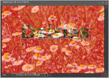
Figure 14-13 shows the effect of pressing Ctrl+J and placing a Type Mask selection on a duplicate layer of its own, and then adding Layer styles (Adding Layer Styles) to the new layer.
Creating Outlined Type
If the font you’re using doesn’t come with a built-in outline style, there are three ways to create outlined type in Elements. The Text Effects in the Content palette (Text Effects) include an outlined type effect that you can apply with just a double click. If you don’t like what you get with that, you can also use the Stroke Layer styles or the Type Mask tools to outline type. Both these methods are easy, but do require a bit more time than using the Content palette. The tradeoff is that you have more control over what you wind up with. Use the Layer styles if you want your text outline to be filled in, since the Type Mask gives you an empty outline.
Using the Stroke Layer style
To add an outline to type:
Open your image or create a new one; then activate the Type tool.
Click it in the Toolbox or press T until you get either the Horizontal or Vertical Type tool (not the Type Mask tool).
Choose your Options bar settings.
Select the font, size, style, and so on that you want.
Enter the type and commit it.
Press Enter or the checkmark in the Options bar.
Apply a Stroke Layer style.
Go to the Effects palette → Layer styles → Strokes and double click the one you want. If you don’t like any of the Stroke styles, that’s okay because you can edit the result in the next step.
Edit the outline if you wish.
In the Layers palette, double click the Layer style icon for the text layer to bring up the Layer style editor. This is where you can change the width and color of the stroke (see Applying Gradients).
Using the Type Mask tool
To make a text outline like the one shown in Figure 14-14:
Open your image or create a new one (if you just want the type by itself). Activate the Type Mask tool of your choice.
Click the Type tool or press T. Then select either of the Type Mask tools.
Choose your font and size.
Use the settings in the Options bar. Outlined type works better with a fairly heavy font rather than a slender one. Bold fonts also work well here, rather than regular fonts.
Enter your type.
Type in your image where you want the text to go. If you want to warp your type, do it now, before you commit the type.
Click the Commit button (the checkmark).
Be sure you like what you’ve got before you do, because once you commit the text, it changes to a selection that’s hard to edit. If you’d rather start over, click the Cancel button (the “no” symbol) instead.
Add a stroke to your outline.
Be sure the type selection is active, and then go to Edit → Stroke (Outline) Selection. Choose a line width in pixels and the color you want, and then click OK. (There’s more about your choices in the dialog box on The Cookie Cutter.) Your selection is now a linear outline of the text you typed.

Note
You can also create a hollow outline using the Stroke Layer styles. Just simplify the layer (Layer → Simplify), then select the inside color of the text with the Magic Wand (The Magic Wand; be sure to turn off Contiguous). Then delete the selected color. The downside to this approach is that your text is no longer editable once you simplify it.