Buttons and selectors are the simplest Mojo widgets. Earlier in the chapter, you saw how to use a toggle button; all the other buttons and selectors work in a very similar way. In this section, we’ll work directly with the Button widget, adding one to the News application, and we’ll touch on the other widgets in this group: Toggle Button, Check Box, Radio Button, List Selector, and Slider.
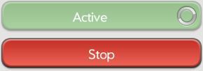
You can use simple HTML divs styled as button widgets; these will work quite well in many cases. Button widgets, can behave dynamically, for example, displaying a spinner to show activity. Figure 3-1 shows an example of the Button widget.
Buttons are the most basic UI element, bounding an action to a region. When a user pushes a button, the button can change state and then gracefully return to the previous state, much like a doorbell. You can create unstyled buttons, or you can style them as objects, and you can label them in some way with text or images. You can disable Mojo buttons, and you can configure them to show activity indicators.
Use an HTML button for initiating actions, but use a Button widget when you are combining an action initiation with an indicator, or for any asynchronous actions. As we did in Chapter 2 for switching scenes, declare HTML buttons in your view file using conventional HTML notation.
Assigning the button div’s class to palm-button means the
button will display like a Mojo Button widget. The framework applies the
same style to HTML buttons of class palm-button as it does to
Mojo Button widgets.
If desired, you can override the style for either type of button in your CSS. The most typical style modification is to adjust the button width, which, by default, is centered across the width of the card’s window. There are additional styles when a button is used as the primary or secondary choice, or to indicate dismissal, affirmative, or negative actions. Include any of these styles in your declaration, and the framework will apply default styling.
At the end of Chapter 2, we added a scene to the News application using HTML buttons and the back gesture. While it’s not really visible in the UI, we’re going to replace the HTML buttons with Button widgets so you can see how to add a simple widget. If you think you are already clear on how this works, you can skip ahead to the section on Lists.
The first change is simple: replace the button tags in storyView-scene.html with widget declarations:
<div id="storyViewScene">
    <div class="palm-page-header multi-line">
        <div class="palm-page-header-wrapper">
            <div id="storyViewTitle" class="title left">
            </div>
        </div>
    </div>
    <div class="palm-text-wrapper">
        <div id="storyViewSummary" class="palm-body-text">
        </div>
    </div>

    <div x-mojo-element="Button" id="previousStory"></div>
    <div x-mojo-element="Button" id="nextStory"></div>

</div>
The next change is to the storyView-assistant.js; add the widget
setup in front of the listeners for the button taps. We’re not
changing the button id in either
case, so we don’t have to change the listener setup functions at
all:
StoryViewAssistant.prototype.setup = function() {
    this.nextModel = {disabled: false};
    this.previousModel = {disabled: false};

    if (this.storyIndex === 0)    {
        this.previousModel.disabled = true;
    }

    if (this.storyIndex == this.storyFeed.stories.length-1)    {
        this.nextModel.disabled = true;
    }

    this.controller.setupWidget("previousStory", {label: "Previous"},
    this.previousModel);
    this.controller.setupWidget("nextStory", {label: "Next"}, this.nextModel);

    this.nextStoryHandler = this.nextStory.bindAsEventListener(this);
    this.previousStoryHandler = this.previousStory.bindAsEventListener(this);
    this.controller.listen("nextStory", Mojo.Event.tap,
      this.nextStoryHandler);
    this.controller.listen("previousStory", Mojo.Event.tap,
      this.previousStoryHandler);

    // Update story title in header and summary
    var storyViewTitleElement = this.controller.get("storyViewTitle");
    var storyViewSummaryElement = this.controller.get("storyViewSummary");
    storyViewTitleElement.innerHTML = this.storyFeed.stories[this.storyIndex].title;
    storyViewSummaryElement.innerHTML = this.storyFeed.stories[this.storyIndex].text;
};
The rest of the code stays the same. When you run this version of the application, it behaves the same as the previous version even though it uses Button widgets instead of the HTML button.
The simple selectors will be used in other parts of the News application, shown in later examples. For now, let’s look briefly at each of the selectors and how you can use them in your application.
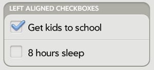
A Check Box widget (Figure 3-2) controls and indicates a binary state value in one element.
Tapping a check box on the screen will toggle its state, presenting or removing a checkmark, depending on the previous state. The framework handles the display changes and will manage the widget’s data model for you, toggling between two states that you defined at setup time.
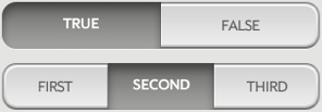
The Toggle Button is another widget for displaying and controlling a binary state value. As with a check box, a toggle button (Figure 3-3) will switch between two states each time it is tapped.
If you need a single widget to select from among multiple choices while also showing selection status, then a Radio Button (Figure 3-4) is a good choice. Mojo provides a classic radio button, which presents each button as a labeled selection option in a horizontal array, where only one option can be selected at a time.
The number of options is variable, constrained only by the width of the display and the minimum button size that can be pleasingly presented or selected. You can expect to handle between two and five states, given the typical screen size for a webOS device, but the framework won’t limit you.
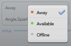
Even though you might expect to find the List Selector as one of the List widgets, it behaves and is managed as a selector. It enables the selection of one of many options, presented in a pop-up list in which there is no practical limit to the number of options presented. It is similar to the Submenu widget’s behavior. Figure 3-5 shows an example of the List Selector widget.
The selection options are defined in a required choices array, which defines each selection’s displayed label and a corresponding value. If the choices are static, meaning they never change over the life of the scene, you define the array as a property in the widget’s attributes. If the choices are subject to change, attach them as a model property instead.
The List Selector is like the List widget in its styling. To have the webOS look and feel, you’ll need to wrap your widget declaration with styling divs like those used with the List widget, and you may need to style those List classes with your own CSS. See the below section for more information.
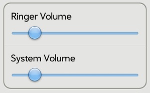
The last widget in this group of selectors is the Slider, which presents a range of selection options in the form of a horizontal slider with a control knob that users can drag to the desired location. You must specify minimum (leftmost) and maximum (rightmost) values for the slider. Figure 3-6 shows an example of the Slider widget.

