There is a legacy of great text-centric applications on Palm devices. The original Palm OS included a whole new writing system, Graffiti, to provide simple, effective tools for entering and editing text, and one of the Treō’s hallmarks was a terrific “thumbable” keyboard and a system optimized for messaging and email applications. So naturally, Palm webOS has some powerful text features, including a simple text widget, to embed text in your applications.
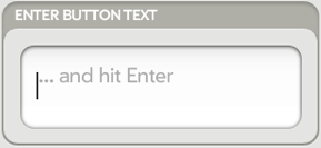
This section will start with the Text Field (shown in Figure 3-10), the base text widget that supports all general text requirements: single-line or multi-line text entry, with common styles for labels, titles, headings, body text, line items, and item details. The editing tools include basic entry and deletion, symbol and alternate character sets, cursor movement, selection, cut/copy/paste, and auto text correction.
In most cases, TextField will
address your text needs, but there are three specialized widgets:
In all of the text widgets, the framework will handle all user interactions with the text field, returning the entered string when the field loses focus or the user keys Enter (where enabled). Mojo text fields are smart text fields by default. Autocapitalization and correction for common typing mistakes are performed on all fields unless explicitly disabled.
There are a number of ways to style text fields, depending on whether you are grouping fields together as you would for a form or using them singly or within other widgets. Chapter 7 has more information on styling text fields as well as other advanced styling topics.
We only have one example of a text field in the News application:
adding a newsfeed requires text fields to enter the feed
URL and name. The Text Fields will be put below the list of feeds within
the feedList scene and a Drawer widget will hide the Text Fields until triggered by
the Add Feed action on the feedListWgt widget.
Drawers are container widgets that can be open, allowing child content to be
displayed normally, or closed, keeping it out of view. The
state of the drawer depends on a single model property, although there
are also exposed widget functions (toggleState,
getOpenState, and setOpenState) available for opening and
closing a drawer.
Add the Text Field declarations within a styled palm-group into the feedList-scene.html file. We’re going to
wrap the Text Fields with the Drawer and several layers of styling div
tags:
<div id='feedDrawer' x-mojo-element="Drawer">
    <div id="add-feed-title" class="palm-dialog-title">
        Add Feed
    </div>

    <div class="palm-list">
        <div class="palm-row first">
            <div class="palm-row-wrapper textfield-group"
              x-mojo-focus-highlight="true">
                <div class="title">
                   <div x-mojo-element="TextField" id="newFeedURL"></div>
                </div>
            </div>
        </div>
        <div class='palm-row last'>
            <div class="palm-row-wrapper textfield-group"
              x-mojo-focus-highlight="true">
                <div class="title">
                    <div x-mojo-element="TextField" id="newFeedName"></div>
                </div>
            </div>
        </div>
    </div>
    <div x-mojo-element="Button" id="okButton"></div>
    <div x-mojo-element="Button" id="cancelButton"></div>
</div>
At the beginning of the file there is a style class to create the
“Add Feed” title. The next style class, palm-list, creates a
list-style group with row dividers into which we’ll put our text fields.
We wrap each of the fields with palm-row and palm-row-wrapper
classes and add a div with the title
class to complete the styling. The text field widgets are declared
within all those layers of styling classes. Button widgets are declared
at the bottom to approve the feed entry and submit it for addition to
the list, or to cancel the action
and close the drawer.
Next, set up the Drawer, Text Fields, and Buttons in the setup method of the feedList-assistant.js:
//  Setup Drawer for add Feed; closed to start
this.controller.setupWidget('feedDrawer', {}, this.addDrawerModel={open: false});

// Set the add feed drawer title to Add Feed
var addFeedTitleElement = this.controller.get("add-feed-title");
addFeedTitleElement.innerHTML = "Add News Feed Source";

// Setup text field for the add new feed's URL
this.controller.setupWidget(
    "newFeedURL",
    {
          hintText: "RSS or ATOM feed URL",
          autoFocus: true,
          autoReplace: false,
          textCase: Mojo.Widget.steModeLowerCase,
          enterSubmits: false
    },
    this.urlModel = {value : ""});

// Setup text field for the new feed's name
this.controller.setupWidget(
    "newFeedName",
    {
          hintText: "Title (Optional)",
          autoReplace: false,
          textCase: Mojo.Widget.steModeTitleCase,
          enterSubmits: false
    },
    this.nameModel = {value : ""});

// Setup OK  & Cancel buttons
//   OK button is an activity button which will be active
//   while processing and adding feed. Cancel will just cancel the
//   action and close the scene
this.okButtonModel = {label: "OK", disabled: false};
this.controller.setupWidget("okButton", {type: Mojo.Widget.activityButton},
    this.okButtonModel);
this.okButtonActive = false;
this.okButton = this.controller.get("okButton");
this.checkFeedHandler = this.checkFeed.bindAsEventListener(this);
this.controller.listen("okButton", Mojo.Event.tap,
  this.checkFeedHandler);

this.cancelButtonModel = {label: "Cancel", disabled: false};
this.controller.setupWidget("cancelButton", {type: Mojo.Widget.defaultButton},
    this.cancelButtonModel);
this.closeAddFeedHandler = this.closeAddFeed.bindAsEventListener(this);
this.controller.listen("cancelButton", Mojo.Event.tap,
  this.closeAddFeedHandler);
The first setupWidget call
creates the Drawer, which is initially closed. The next setupWidget creates the URL field with some
hint text and setting focus to the field. The name field is set up with
the hint text indicating that the field is optional—if not entered,
we’ll use the name provided in the feed after it’s loaded.
The first button is set up with an OK label and declared as an activity button, which will be used to show activity while we are checking and loading the feed. A second button is set up to cancel the operation.
We still need a selector to open the Drawer. The List widget has
an ideal feature to use for that selector, the Add Item option, which
generates a Mojo.Event.listAdd
event when tapped. Insert the addItemLabel property to the feedListWgt setup to enable a selector to add
a new feed. You will see that new property added to our previous setup
function, just below the renderLimit
property:
this.controller.setupWidget("feedListWgt",
   this.feedWgtAttr = {
         itemTemplate: "feedList/feedRowTemplate",
         listTemplate: "feedList/feedListTemplate",
         swipeToDelete: true,
         renderLimit: 40,
         addItemLabel: "Add...",
         reorderable: true
   },
   this.feedWgtModel = {items: feedList});
Add a listener for the Mojo.Event.listAdd event and specify a handler
to open the Drawer:
// addNewFeed - triggered by "Add..." item in feed list
FeedListAssistant.prototype.addNewFeed = function() {
    this.addDrawerModel.open = true;
    this.controller.modelChanged(this.addDrawerModel);
};
When the user taps the Add item at the end of the list, the
listAdd event causes the addNewFeed handler to open the Drawer. From
there, the feed’s URL is entered, the Add Feed button tapped to generate
a tap event on the button, and the checkIt handler called
to process the feed. The drawer will stay open until a feed is
completely added or the user taps the Cancel button.
Since we’re demonstrating the Text Field widget, we haven’t
included all the code for this.checkIt, but you can refer to Appendix D, where the News application
source is reproduced in it’s entirety. Just know that the version of
this.checkIt in Appendix D is built for use within a
dialog, which is eventually where this Add Feed function will be
handled. If you try to use it in this drawer case, you’ll need to remove
the sceneAssistant references for
all the scene controller method calls.
The handlers will submit an Ajax request for the entered feed. If
it’s a valid feed, ProcessFeed will
be called with the result and will add the processed feed to the end of
the feed list. The Drawer is closed at the end if the feed is added
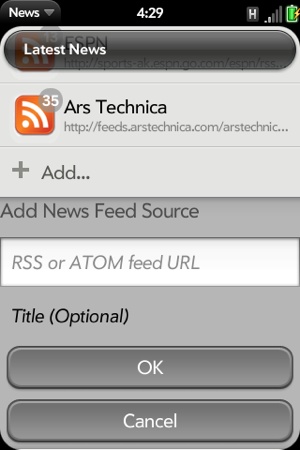
successfully. Figure 3-11
shows the new feedList scene with the
Drawer in the open position and the text fields.
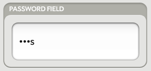
If you need a text field that will be used for passwords or some
other type of confidential information, the Password Field provides many of the Text Field
features, but masks the display. Any entered text is displayed as a
bullet (•) character. As with the Text Field, the framework handles all
of the editing logic within the field and generates a Mojo.Event.propertyChange event when the field
has been updated. Figure 3-12
shows an example of a Password Field widget.
If you require a text field to filter down the contents of an offline list, you can use the Filter Field. It can be applied to any case where you want to process the field contents and update on-screen elements based on the entered string.
Filter Field is hidden until displayed by the framework in response to the user entering text when there isn’t focus on any text field. In other words, the filter field is given focus for any text input on scene where it is present and another text field hasn’t been explicitly been given focus.
Along with displaying the field, the framework will call a provided filter function to handle the entered text after a specified delay. It’s up to you to respond appropriately, but the framework will continue to display new text input and to call the filter function until the field is closed.
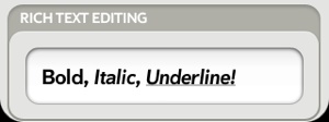
There is a simple Rich Text Edit widget (see Figure 3-13), which is similar to a multi-line text field, but also supports applying bold, italic, and underline styles to arbitrary runs of text within the field.
To create support for this styling, enable the RichTextEditItems
property in the Application menu (see Chapter 4 for information on the Application menu).
The user will then be able to apply bold, italic, and underline style to
the current text selection.


