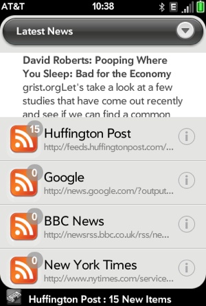
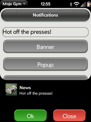
You can post a banner notification, which appears subtly in the notification bar below the main window and is typically followed by a dashboard panel to allow for deferred action on the notification. For more urgent actions, you can use a pop-up notification, which slides up out of the notification bar and reduces the window size of the Card view or foreground card. All notifications and dashboards are nonmodal, meaning users can continue to interact with whatever is in the foreground view until they are ready to address the notifications or interact with the dashboard.
A banner includes an icon and a short message accompanied by an audible alert signaling the user to the presence of the banner. After a few seconds, the banner is removed. The banner is usually accompanied by a dashboard summary, which serves as a reminder of the notification and can provide additional details about the notification.
Each time new stories are added during an update cycle, News will post
a banner notification with the
name of the feed and number of new stories, as shown in Figure 10-1. We’ll add the code to actually post
the notification in the feedRequestSuccess() method, but we’ll
add an initial condition that will inhibit notifications when they are
turned off in the application’s preferences scene. The code for the
preferences scene change isn’t shown, but you can see it in Appendix D:
// If successful processFeed returns News.errorNone,
if (feedError == News.errorNone)    {
    var appController = Mojo.Controller.getAppController();

    // Post a notification if new stories and application is minimized
    if (this.list[this.feedIndex].newStoryCount > 0)   {
        Mojo.Log.info("New Stories: ", this.list[this.feedIndex].title," : ",
          this.list[this.feedIndex].newStoryCount, " New Items");
        if (News.notificationEnable)   {
            var bannerParams = {
        // ** These next two lines are wrapped for book formatting only **
                messageText: this.list[this.feedIndex].title+": "
                  +this.list[this.feedIndex].newStoryCount+" New Items"
            };

            appController.showBanner(bannerParams, {},
             this.list[this.feedIndex].url);

        }
    }
} else     {

    // There was a feed process error; unlikely, but could happen if the
    // feed was changed by the feed service. Log the error.
    if (feedError == News.invalidFeedError)    {
        Mojo.Log.info("Feed ", this.nameModel.value, " is not a supported
 feed type.");
    }
} .....
Get the application controller, then call its showBanner() method.
This will post a single line of text, truncated to fit the screen
width, and a scaled version of the calling application’s icon, shown
immediately to the left of the message. The argument, bannerParams, includes
the message string. It isn’t necessary for News, but you can add a
soundClass
property for an audible alert; currently, the only supported value for
soundClass is
alerts.
If the user taps on the banner as it is displayed in the
notification bar, the framework will relaunch your application. This
will be described in more detail in the following section on Advanced
Applications, where you’ll see how to use an explicit handleLaunch() method
in the application assistant to receive these and other launch
requests. In this simple form, the framework will activate the scene
at the top of the News scene stack when the user taps the banner. The
second argument to showBanner() is an empty object
representing the launch parameters.
Note
Even when there are no launch parameters, you still need to provide an object for them (in this case, an empty object). If no object is passed at all, tapping the notification will not launch your application.
You can include the optional third argument, category, to
distinguish banner notifications within your application. Since
banners are displayed for a fixed length of time (five seconds as of
this writing), they can back up if multiple requests are made before
they can be displayed. If there is more than one banner notification
within a named category, the framework will discard all but the last
of them. If you are using banner notifications from different sources,
you may want to identify them through a category.
Any notification that doesn’t include a specific category
belongs by default to the banner
category.
Note
Banners from separate applications are always distinct. Category is only needed when there are multiple banner categories within an application.
Generally, you should avoid using notifications when your application is maximized, meaning it is the current foreground card. Use banner notifications when not in focus, either minimized (with a card view but not the foreground card) or in the background (without a card stage). When maximized, your application should use on screen representations that show visible changes to dynamic data or dialog boxes for critical alerts or events.
You can receive events for maximize/minimize transitions by adding
listeners to your stage controller’s document for the Mojo.Event.stageActivate and Mojo.Event.stageDeactivate events. However, in
this case, we’ll use a stage controller method, isActiveAndHasScenes(), which returns
true when the stage controller is the active stage
controller and there are scenes displayed within the stage:
if (!Mojo.Controller.stageController.isActiveAndHasScenes()
 && News.notificationEnable) {
     var bannerParams = {
// ** These next two lines are wrapped for book formatting only **
         messageText: this.list[this.feedIndex].title+":
           "+this.list[this.feedIndex].newStoryCount+" New Items"
      };

      appController.showBanner(bannerParams, {action: "notification",
          index: this.feedIndex}, this.list[this.feedIndex].url);

}
With these changes, News will only post banner notifications when minimized. This is the recommended behavior for most applications.
Use a pop-up notification when you need to get the user’s attention urgently. These notifications slide up from the Notification bar with a message and one or more selection options. For example, calendar events and incoming phone calls use pop-up notifications; you can see a phone pop-up notification when you connect your phone to a computer using USB.
You shouldn’t use pop-up notifications very often, as they are disruptive by design, taking up as much as half the screen. You can generate a pop-up by creating a stage and pushing a pop-up scene onto it:
var appController = Mojo.Controller.getAppController();
var pushPopup = function(stageController)  {
    stageController.pushScene('myPopup', "Hot off the presses!");
};
appController.createStageWithCallback({name: "popupStage",
  lightweight: true, height: 200}, pushPopup, 'popupalert'),
Pop-up stages take the same stage arguments as the card and
dashboard stage examples, with an optional height property. Indicate that this is a
pop-up stage by using 'popupalert' as
the final argument. Typically, you specify the stage name and lightweight properties, and include the
callback function as the second argument.
Specific to pop-ups is the option to set the height property. The
default pop-up height is 200 pixels on the Palm Prē, but you can override it to
a maximum of 400 pixels. It’s recommended that you use the default at
all times, but the flexibility is there if you have an unusual
requirement that needs a different height.
Customize the pop-up notification in the scene assistant and views. As an example, you can generate the notification shown in Figure 10-2 by first creating a main pop-up scene in views/popup/popup-scene.html:
<div class="notification-panel">
    <div class="notification-container" x-palm-popup-content="">
        <div id="notification-icon" class="notification-icon"></div>
        <div id="info"></div>
    </div>
    <br>
    <br>
    <br>
    <div class="popupdiv">
        <div class="palm-button affirmative popupbutton" id="addButton">
          Ok
        </div>
        <div class="palm-button negative popupbutton" id="closeButton">
          Close
        </div>
    </div>
</div>
The attribute x-palm-popup-content=""
is used within the pop-up scene div, which contains the main content for
the pop-up. The System UI will use this special attribute to draw only
the main content area of the pop-up in the lock screen when the display
is turned on from sleep. The pop-up’s buttons should be kept outside of
this div, as they are not actionable when the device is locked.
Add a template named popup/item-info.html, for rendering the
variable content into the info div
above:
<div id='notification-title' class="notification-title">
  #{subject}
</div>
<div id='notification-subtitle' class="notification-subtitle">
  #{eventSubtitle}
</div>You can see that we’re using a lot of specific notification style classes to lay out the pop-up scene to follow the System UI conventions and to style the title and subtitle text. The framework doesn’t load some of the common styles used with cards with dashboard or pop-up stages, so you may have to create your own in those cases. The styles in this example are from the Calendar application and are not provided by the framework. In this example, you would add these CSS rules to your application’s CSS file:
/* Pop-up notifications */

    .notification-panel    {
            background: #000;
            color: #fff;
            overflow: hidden;
            padding: 15px;
            top: 0;
            width: 320px;
    }

    .notification-container                {
            width: 290px;
            height: 48px;
            padding: 0;
            position: fixed;
            top: 10px;
            display: table-cell;
            vertical-align: middle;
    }

    .notification-container .notification-icon    {
            width: 48px;
            height: 48px;
            margin-right: 5px;
            float: left;
            background: url(../images/dashboard-icon-news.png) top left no-repeat;
    }

    .notification-container .notification-title    {
            width: 230px;
            height: 18px;
            margin-top: 5px;
            margin-bottom: 3px;
            padding-bottom:5px;
            overflow: hidden;
            text-overflow: ellipsis;
            white-space: nowrap;
            color: #fff;
            font-size: 16px;
            font-weight: bold;
    }

    .notification-container .notification-subtitle    {
            margin-top:-5px;
            width: 230px;
            height: 18px;
            overflow: hidden;
            text-overflow: ellipsis;
            color: #fff;
            font-size: 14px;
            white-space: nowrap;
    }

    .notification-container .notification-title span,
    .notification-container .notification-subtitle span {
            font-weight: normal;
    }
A pop-up’s scene assistant is a conventional scene assistant. In this case, we’ve created popup-assistant.js in the assistants directory. The assistant accepts a message string as an argument and inserts that message into the popup/item-info.html template:
function PopupAssistant(message) {
      this.message = message;
 }

PopupAssistant.prototype.setup = function() {
    this.update(this.message);

    this.okButton = this.controller.get("okButton");
    this.okHandler = this.handleOk.bindAsEventListener(this);
    Mojo.Event.listen(this.okButton, Mojo.Event.tap, this.okHandler);

    this.closeButton = this.controller.get("closeButton");
    this.closeHandler = this.handleClose.bindAsEventListener(this);
    Mojo.Event.listen(this.closeButton, Mojo.Event.tap, this.closeHandler);
};

PopupAssistant.prototype.update = function(message) {
    this.info = {eventSubtitle: message, subject: "News"};
    Mojo.Log.info("Popup Update");
    //  Use render to convert the object and its properties
    // along with a view file into a string containing HTML
    var renderedInfo = Mojo.View.render({
        object: this.info,
        template: 'popup/item-info'
    });

    var infoElement = this.controller.get('info'),
    infoElement.innerHTML = renderedInfo;
};

PopupAssistant.prototype.handleOk = function(){
    Mojo.Log.info("Ok received");
};

PopupAssistant.prototype.handleClose = function(){
    this.controller.window.close();
};
PopupAssistant.prototype.cleanup = function(){
    Mojo.Event.stopListening(this.okButton, Mojo.Event.tap, this.okHandler);
    Mojo.Event.stopListening(this.closeButton Mojo.Event.tap, this.closeHandler);
};
You can do almost anything within a pop-up scene that you can do in any other scene, but you should limit your actions to simple messages and selections. Your pop-up assistant must close the window on exit to close the stage and remove it from the display. Don’t forget to clean up any event listeners when the stage is closed.


