Chapter 5
Two-Dimensional Plots
Plots are a very useful tool for presenting information. This is true in any field, but especially in science and engineering, where MATLAB is mostly used. MATLAB has many commands that can be used for creating different types of plots. These include standard plots with linear axes, plots with logarithmic and semi-logarithmic axes, bar and stairs plots, polar plots, three-dimensional contour surface and mesh plots, and many more. The plots can be formatted to have a desired appearance. The line type (solid, dashed, etc.), color, and thickness can be prescribed, line markers and grid lines can be added, as can titles and text comments. Several graphs can be created in the same plot, and several plots can be placed on the same page. When a plot contains several graphs and/or data points, a legend can be added to the plot as well.
This chapter describes how MATLAB can be used to create and format many types of two-dimensional plots. Three-dimensional plots are addressed separately in Chapter 9. An example of a simple two-dimensional plot that was created with MATLAB is shown in Figure 5-1. The figure contains two curves that show the variation of light intensity with distance. One curve is constructed from data points measured in an experiment, and the other curve shows the variation of light as predicted by a theoretical model. The axes in the figure are both linear, and different types of lines (one solid and one dashed) are used for the curves. The theoretical curve is shown with a solid line, while the experimental points are connected with a dashed line. Each data point is marked with a circular marker. The dashed line that connects the experimental points is actually red when the plot is displayed in the Figure Window. As shown, the plot in Figure 5-1 is formatted to have a title, axis titles, a legend, markers, and a boxed text label.

Figure 5-1: Example of a formatted two-dimensional plot.
5.1 THE plot COMMAND
The plot command is used to create two-dimensional plots. The simplest form of the command is:

The arguments x and y are each a vector (one-dimensional array). The two vectors must have the same number of elements. When the plot command is executed, a figure is created in the Figure Window. If not already open, the Figure Window opens automatically when the command is executed. The figure has a single curve with the x values on the abscissa (horizontal axis) and the y values on the ordinate (vertical axis). The curve is constructed of straight-line segments that connect the points whose coordinates are defined by the elements of the vectors x and y. Each of the vectors, of course, can have any name. The vector that is typed first in the plot command is used for the horizontal axis, and the vector that is typed second is used for the vertical axis. If only one vector is entered as an input argument in the plot command (for example plot(y)) than the figure will show a plot of the values of the elements of the vector (y(1), y(2), y(3), ...) versus the element number (1, 2, 3, ... ).
The figure that is created has axes with a linear scale and default range. For example, if a vector x has the elements 1, 2, 3, 5, 7, 7.5, 8, 10, and a vector y has the elements 2, 6.5, 7, 7, 5.5, 4, 6, 8, a simple plot of y versus x can be created by typing the following in the Command Window:
>> x=[1.1  1.8  3.2  5.5  7  7.5  8  10];

>> y=[2  6.5  7  7  5.5  4  6  8];

>> plot(x,y)
Once the plot command is executed, the Figure Window opens and the plot is displayed, as shown in Figure 5-2.

Figure 5-2: The Figure Window with a simple plot.
The plot appears on the screen in blue, which is the default line color.
The plot command has additional, optional arguments that can be used to specify the color and style of the line and the color and type of markers, if any are desired. With these options the command has the form:

Line Specifiers:
Line specifiers are optional and can be used to define the style and color of the line and the type of markers (if markers are desired). The line style specifiers are:

The line color specifiers are:

The marker type specifiers are:
Notes about using the specifiers:
• The specifiers are typed inside the plot command as strings.
• Within the string the specifiers can be typed in any order.
• The specifiers are optional. This means that none, one, two, or all three types can be included in a command.
Some examples:
plot(x,y) |
A blue solid line connects the points with no markers (default). |
plot(x,y,‘r’) |
A red solid line connects the points. |
plot(x,y,‘--y’) |
A yellow dashed line connects the points. |
plot(x,y,‘*’) |
The points are marked with * (no line between the points). |
plot(x,y,‘g:d’) |
A green dotted line connects the points that are marked with diamond markers. |
Property Name and Property Value:
Properties are optional and can be used to specify the thickness of the line, the size of the marker, and the colors of the marker’s edge line and fill. The Property Name is typed as a string, followed by a comma and a value for the property, all inside the plot command.
Four properties and their possible values are:

For example, the command
plot(x,y,'-mo','LineWidth',2,'markersize',12,

      'MarkerEdgeColor','g','markerfacecolor','y')
creates a plot that connects the points with a magenta solid line and circles as markers at the points. The line width is 2 points and the size of the circle markers is 12 points. The markers have a green edge line and yellow filling.
A note about line specifiers and properties:
The three line specifiers, which indicate the style and color of the line, and the type of the marker can also be assigned with a PropertyName argument followed by a PropertyValue argument. The Property Names for the line specifiers are:

As with any command, the plot command can be typed in the Command Window, or it can be included in a script file. It also can be used in a function file (explained in Chapter 7). It should also be remembered that before the plot command can be executed, the vectors x and y must have assigned elements. This can be done, as was explained in Chapter 2, by entering values directly, by using commands, or as the result of mathematical operations. The next two subsections show examples of creating simple plots.
5.1.1 Plot of Given Data
In this case given data is used to create vectors that are then used in the plot command. The following table contains sales data of a company from 1988 to 1994.

To plot this data, the list of years is assigned to one vector (named yr), and the corresponding sales data is assigned to a second vector (named sle). The Command Window where the vectors are created and the plot command is used is shown below:

Once the plot command is executed, the Figure Window with the plot, as shown in Figure 5-3, opens. The plot appears on the screen in red.

Figure 5-3: The Figure Window with a plot of the sales data.
5.1.2 Plot of a Function
In many situations there is a need to plot a given function. This can be done in MATLAB by using the plot or the fplot command. The use of the plot command is explained below. The fplot command is explained in detail in the next section.
In order to plot a function y = ƒ(x) with the plot command, the user needs to first create a vector of values of x for the domain over which the function will be plotted. Then a vector y is created with the corresponding values of f(x) by using element-by-element calculations (see Chapter 3). Once the two vectors are defined, they can be used in the plot command.
As an example, the plot command is used to plot the function y = 3.5−0.5x cos(6x) for −2 ≤ x ≤ 4. A program that plots this function is shown in the following script file.

Once the script file is executed, the plot is created in the Figure Window, as shown in Figure 5-4. Since the plot is made up of segments of straight lines that connect the points, to obtain an accurate plot of a function, the spacing between the elements of the vector x must be appropriate. Smaller spacing is needed for a function that changes rapidly. In the last example a small spacing of 0.01 produced the plot that is shown in Figure 5-4. However, if the same function in the same domain is plotted with much larger spacing—for example, 0.3—the plot that is obtained, shown in Figure 5-5, gives a distorted picture of the function. Note also that in Figure 5-4 the plot is shown with the Figure Window, while in Figure 5-5 only the plot is shown. The plot can be copied from the Figure Window (in the Edit menu, select Copy Figure) and then pasted into other applications.

Figure 5-4: The Figure Window with a plot of the function y = 3.5−0.5x cos(6x).

Figure 5-5: A plot of the function y = 3.5−0.5x cos(6x) with large spacing.
5.2 THE fplot COMMAND
The fplot command plots a function with the form y = ƒ(x) between specified limits. The command has the form:

‘function’: The function can be typed directly as a string inside the command. For example, if the function that is being plotted is ƒ(x) = 8x2 + 5cos(x), it is typed as: ‘8*x^2+5*cos(x)’. The functions can include MATLAB built-in functions and functions that are created by the user (covered in Chapter 6).
• The function to be plotted can be typed as a function of any letter. For example, the function in the previous paragraph can be typed as ‘8*z^2+5*cos(z)’ or ‘8*t^2+5*cos(t)’.
• The function cannot include previously defined variables. For example, in the function above it is not possible to assign 8 to a variable, and then use the variable when the function is typed in the fplot command.
limits: The limits argument is a vector with two elements that specify the domain of x [xmin,xmax], or a vector with four elements that specifies the domain of x and the limits of the y-axis [xmin,xmax,ymin,ymax].
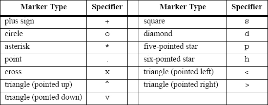
line specifiers: The line specifiers are the same as in the plot command. For example, a plot of the function y = x2 + 4 sin(2x) − 1 for −3 ≤ x ≤ 3 can be created with the fplot command by typing:
![]()
in the Command Window. The figure that is obtained in the Figure Window is shown in Figure 5-6.
Figure 5-6: A plot of the function y = x2 + 4 sin(2x) − 1.
5.3 PLOTTING MULTIPLE GRAPHS IN THE SAME PLOT
In many situations, there is a need to make several graphs in the same plot. This is shown, for example, in Figure 5-1 where two graphs are plotted in the same figure. There are three methods to plot multiple graphs in one figure. One is by using the plot command, the second is by using the hold on and hold off commands, and the third is by using the line command.
5.3.1 Using the plot Command
Two or more graphs can be created in the same plot by typing pairs of vectors inside the plot command. The command
plot(x,y,u,v,t,h)
creates three graphs—y vs. x, v vs. u, and h vs. t—all in the same plot. The vectors of each pair must be of the same length. MATLAB automatically plots the graphs in different colors so that they can be identified. It is also possible to add line specifiers following each pair. For example the command
plot(x,y,‘-b’,u,v,‘--r’,t,h,‘g:’)
plots y vs. x with a solid blue line, v vs.u with a dashed red line, and h vs. t with a dotted green line.
![]()
Sample Problem 5-1: Plotting a function and its derivatives
Plot the function y = 3x3, − 26x + 10, and its first and second derivatives, for −2 ≤ x ≤ 4, all in the same plot.
Solution
The first derivative of the function is: y′ = 9x2 − 26.
The second derivative of the function is: y″ = 18x.
A script file that creates a vector x and calculates the values of y, y′, and y″ is:

The plot that is created is shown in Figure 5-7.

Figure 5-7: A plot of the function y = 3x3, − 26x + 10 and its first and second derivatives.
![]()
5.3.2 Using the hold on and hold off Commands
To plot several graphs using the hold on and hold off commands, one graph is plotted first with the plot command. Then the hold on command is typed. This keeps the Figure Window with the first plot open, including the axis properties and formatting (see Section 5.4) if any was done. Additional graphs can be added with plot commands that are typed next. Each plot command creates a graph that is added to that figure. The hold off command stops this process. It returns MATLAB to the default mode, in which the plot command erases the previous plot and resets the axis properties.
As an example, a solution of Sample Problem 5-1 using the hold on and hold off commands is shown in the following script file:

5.3.3 Using the line Command
With the line command additional graphs (lines) can be added to a plot that already exists. The form of the line command is:

The format of the line command is almost the same as the plot command (see Section 5.1). The line command does not have the line specifiers, but the line style, color, and marker can be specified with the Property Name and property value features. The properties are optional, and if none are entered MATLAB uses default properties and values. For example, the command:
line(x,y,‘linestyle’,‘--’,‘color’,‘r’,‘marker’,‘o’)
will add a dashed red line with circular markers to a plot that already exists.
The major difference between the plot and line commands is that the plot command starts a new plot every time it is executed, while the line command adds lines to a plot that already exists. To make a plot that has several graphs, a plot command is typed first and then line commands are typed for additional graphs. (If a line command is entered before a plot command, an error message is displayed.)
The solution to Sample Problem 5-1, which is the plot in Figure 5-7, can be obtained by using the plot and line commands as shown in the following script file:

5.4 FORMATTING A PLOT
The plot and fplot commands create bare plots. Usually, however, a figure that contains a plot needs to be formatted to have a specific look and to display information in addition to the graph itself. This can include specifying axis labels, plot title, legend, grid, range of custom axis, and text labels.
Plots can be formatted by using MATLAB commands that follow the plot or fplot command, or interactively by using the plot editor in the Figure Window. The first method is useful when a plot command is a part of a computer program (script file). When the formatting commands are included in the program, a formatted plot is created every time the program is executed. On the other hand, formatting that is done in the Figure Window with the plot editor after a plot has been created holds only for that specific plot, and will have to be repeated the next time the plot is created.
5.4.1 Formatting a Plot Using Commands
The formatting commands are entered after the plot or the fplot command. The various formatting commands are:
The xlabel and ylabel commands:
Labels can be placed next to the axes with the xlabel and ylabel command which have the form:

The title command:
A title can be added to the plot with the command:
![]()
The text is placed at the top of the figure as a title.
The text command:
A text label can be placed in the plot with the text or gtext commands:

The text command places the text in the figure such that the first character is positioned at the point with the coordinates x, y (according to the axes of the figure). The gtext command places the text at a position specified by the user. When the command is executed, the Figure Window opens and the user specifies the position with the mouse.
The legend command:
The legend command places a legend on the plot. The legend shows a sample of the line type of each graph that is plotted, and places a label, specified by the user, beside the line sample. The form of the command is:
legend(‘string1’,‘string2’, ..... , pos)
The strings are the labels that are placed next to the line sample. Their order corresponds to the order in which the graphs were created. The pos is an optional number that specifies where in the figure the legend is to be placed. The options are:
pos = -1 |
Places the legend outside the axes boundaries on the right side. |
pos = 0 |
Places the legend inside the axes boundaries in a location that interferes the least with the graphs. |
pos = 1 |
Places the legend at the upper-right corner of the plot (default). |
pos = 2 |
Places the legend at the upper-left corner of the plot. |
pos = 3 |
Places the legend at the lower-left corner of the plot. |
pos = 4 |
Places the legend at the lower-right corner of the plot. |
Formatting the text within the xlabel, ylabel, title, text and legend commands:
The text in the string that is included in the command and is displayed when the command is executed can be formatted. The formatting can be used to define the font, size, position (superscript, subscript), style (italic, bold, etc.), and color of the characters, the color of the background, and many other details of the display. Some of the more common formatting possibilities are described below. A complete explanation of all the formatting features can be found in the Help Window under Text and Text Properties. The formatting can be done either by adding modifiers inside the string, or by adding to the command optional PropertyName and PropertyValue arguments following the string.
The modifiers are characters that are inserted within the string. Some of the modifiers that can be added are:

These modifiers affect the text from the point at which they are inserted until the end of the string. It is also possible to have the modifiers applied to only a section of the string by typing the modifier and the text to be affected inside braces { }.
Subscript and superscript:
A single character can be displayed as a subscript or a superscript by typing _ (the underscore character) or ^ in front of the character, respectively. Several consecutive characters can be displayed as a subscript or a superscript by typing the characters inside braces { } following the _ or the ^.
Greek characters:
Greek characters can be included in the text by typing
ame of the letter within the string. To display a lowercase Greek letter, the name of the letter should be typed in all lowercase English characters. To display a capital Greek letter, the name of the letter should start with a capital letter. Some examples are:

Formatting of the text that is displayed by the xlabel, ylabel, title, and text commands can also be done by adding optional PropertyName and PropertyValue arguments following the string inside the command. With this option, the text command, for example, has the form:
![]()
In the other three commands the PropertyName and PropertyValue arguments are added in the same way. The PropertyName is typed as a string, and the PropertyValue is typed as a number if the property value is a number and as a string if the property value is a word or a letter character. Some of the Property Names and corresponding possible Property Values are:

The axis command:
When the plot(x,y) command is executed, MATLAB creates axes with limits that are based on the minimum and maximum values of the elements of x and y. The axis command can be used to change the range and the appearance of the axes. In many situations, a graph looks better if the range of the axes extend beyond the range of the data. The following are some of the possible forms of the axis command:
axis([xmin,xmax,ymin,ymax]) |
Sets the limits of both the x and y axes (xmin, xmax, ymin, and ymax are numbers). |
axis equal |
Sets the same scale for both axes. |
axis square |
Sets the axes region to be square. |
axis tight |
Sets the axis limits to the range of the data. |
The grid command:
grid on |
Adds grid lines to the plot. |
grid off |
Removes grid lines from the plot. |
An example of formatting a plot by using commands is given in the following script file that was used to generate the formatted plot in Figure 5-1.

5.4.2 Formatting a Plot Using the Plot Editor
A plot can be formatted interactively in the Figure Window by clicking on the plot and/or using the menus. Figure 5-8 shows the Figure Window with the plot of Figure 5-1. The Plot Editor can be used to introduce new formatting items or to modify formatting that was initially introduced with the formatting commands.

Figure 5-8: Formatting a plot using the Plot Editor.
5.5 PLOTS WITH LOGARITHMIC AXES
Many science and engineering applications require plots in which one or both axes have a logarithmic (log) scale. Log scales provide means for presenting data over a wide range of values. It also provides a tool for identifying characteristics of data and possible forms of mathematical relationships that can be appropriate for modeling the data (see Section 8.2.2).
MATLAB commands for making plots with log axes are:
semilogy(x,y) |
Plots y versus x with a log (base 10) scale for the y axis and linear scale for the x axis. |
semilogx(x,y) |
Plots y versus x with a log (base 10) scale for the x axis and linear scale for the y axis. |
loglog(x,y) |
Plots y versus x with a log (base 10) scale for both axes. |
Line specifiers and Property Name and Property Value arguments can be added to the commands (optional) just as in the plot command. As an example, Figure 5-9 shows a plot of the function y = 2(− 0.2x + 10) for 0.1 ≤ x ≤ 60. The figure shows four plots of the same function: one with linear axes, one with a log scale for the y axis, one with a log scale for the x axis, and one with a log scale on both axes.
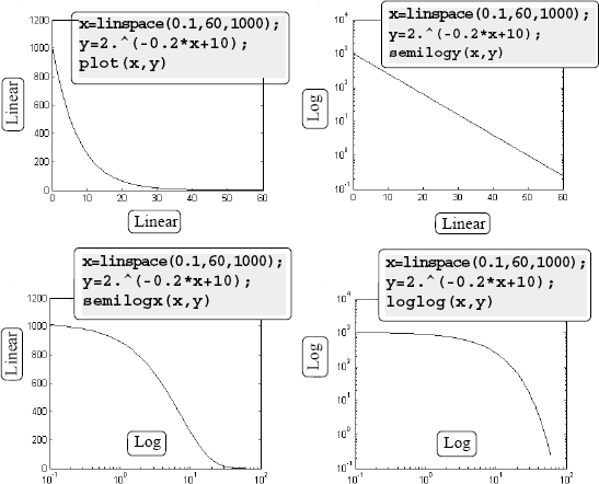
Figure 5-9: Plots of y = 2(− 0.2x + 10) with linear, semilog, and log-log scales.
Notes for plots with logarithmic axes:
• The number zero cannot be plotted on a log scale (since a log of zero is not defined).
• Negative numbers cannot be plotted on log scales (since a log of a negative number is not defined).
5.6 PLOTS WITH ERROR BARS
Experimental data that is measured and then displayed in plots frequently contains error and scatter. Even data that is generated by computational models includes error or uncertainty that depends on the accuracy of the input parameters and the assumptions in the mathematical models that are used. One method of plotting data that displays the error, or uncertainty, is by using error bars. An error bar is typically a short vertical line that is attached to a data point in a plot. It shows the magnitude of the error that is associated with the value that is displayed by the data point. For example, Figure 5-10 shows a plot with error bars for the experimental data from Figure 5-1.

Figure 5-10: A plot with error bars.
Plots with error bars can be done in MATLAB with the errorbar command. Two forms of the command, one for making plots with symmetric error bars (with respect to the value of the data point) and the other for nonsymmetric error bars at each point, are presented. When the error is symmetric, the error bar extends the same length above and below the data point, and the command has the form:

• The lengths of the three vectors x, y, and e must be the same.
• The length of the error bar is twice the value of e. At each point the error bar extends from y(i)-e(i) to y(i)+e(i).
The plot in Figure 5-10, which has symmetric error bars, was done by executing the following code:

The command for making a plot with error bars that are not symmetric is:

• The lengths of the four vectors x, y, d, and u must be the same.
• At each point the error bar extends from y(i)-d(i) to y(i)+u(i).
5.7 PLOTS WITH SPECIAL GRAPHICS
All the plots that have been presented so far in this chapter are line plots in which the data points are connected by lines. In many situations plots with different graphics or geometry can present data more effectively. MATLAB has many options for creating a wide variety of plots. These include bar, stairs, stem, and pie plots and many more. Following are some of the special graphics plots that can be created with MATLAB. A complete list of the plotting functions that MATLAB offers and information on how to use them can be found in the Help Window. In this window first choose “Functions by Category,” then select “Graphics” and then select “Basic Plots and Graphs” or “Specialized Plotting.”
Bar (vertical and horizontal), stairs, and stem plots are presented in the following charts using the sales data from Section 5.1.1.


Pie charts are useful for visualizing the relative sizes of different but related quantities. For example, the table below shows the grades that were assigned to a class. The data is used to create the pie chart that follows.

5.8 HISTOGRAMS
Histograms are plots that show the distribution of data. The overall range of a given set of data points is divided into subranges (bins), and the histogram shows how many data points are in each bin. The histogram is a vertical bar plot in which the width of each bar is equal to the range of the corresponding bin and the height of the bar corresponds to the number of data points in the bin. Histograms are created in MATLAB with the hist command. The simplest form of the command is:
![]()
y |
is a vector with the data points. MATLAB divides the range of the data points into 10 equally spaced subranges (bins) and then plots the number of data points in each bin. |
For example, the following data points are the daily maximum temperature (in °F) in Washington, DC, during the month of April 2002: 58 73 73 53 50 48 56 73 73 66 69 63 74 82 84 91 93 89 91 80 59 69 56 64 63 66 64 74 63 69 (data from the U.S. National Oceanic and Atmospheric Administration). A histogram of this data is obtained with the commands:

The plot that is generated is shown in Figure 5-11 (the axis titles were added using the Plot Editor). The smallest value in the data set is 48 and the largest is 93, which means that the range is 45 and the width of each bin is 4.5. The range of the first bin is from 48 to 52.5 and contains two points. The range of the second bin is from 52.5 to 57 and contains three points, and so on. Two of the bins (75 to 79.5 and 84 to 88.5) do not contain any points.

Figure 5-11: Histogram of temperature data.
Since the division of the data range into 10 equally spaced bins might not be the division that is preferred by the user, the number of bins can be defined to be different than 10. This can be done either by specifying the number of bins, or by specifying the center point of each bin as shown in the following two forms of the hist command:
![]()
nbins |
is a scalar that defines the number of bins. MATLAB divides the range in equally spaced subranges. |
x |
is a vector that specifies the location of the center of each bin (the distance between the centers does not have to be the same for all the bins). The edges of the bins are at the middle point between the centers. |
In the example above the user might prefer to divide the temperature range into three bins. This can be done with the command:
![]()

As shown in the top graph, the histogram that is generated has three equally spaced bins.

The number and width of the bins can also be specified by a vector x whose elements define the centers of the bins. For example, shown in the lower graph is a histogram that displays the temperature data from above in six bins with an equal width of 10 degrees. The elements of the vector x for this plot are 45, 55, 65, 75, 85, and 95. The plot was obtained with the following commands:

The hist command can be used with options that provide numerical output in addition to plotting a histogram. An output of the number of data points in each bin can be obtained with one of the following commands:
![]()
The output n is a vector. The number of elements in n is equal to the number of bins, and the value of each element of n is the number of data points (frequency count) in the corresponding bin. For example, the histogram in Figure 5-11 can also be created with the following command:

The vector n shows that the first bin has two data points, the second bin has three data points, and so on.
An additional, optional numerical output is the location of the bins. This output can be obtained with one of the following commands:
![]()
xout is a vector in which the value of each element is the location of the center of the corresponding bin. For example, for the histogram in Figure 5-11:

The vector xout shows that the center of the first bin is at 50.25, the center of the second bin is at 54.75, and so on.
5.9 POLAR PLOTS
Polar coordinates, in which the position of a point in a plane is defined by the angle θ and the radius (distance) to the point, are frequently used in the solution of science and engineering problems. The polar command is used to plot functions in polar coordinates. The command has the form:


where theta and radius are vectors whose elements define the coordinates of the points to be plotted. The polar command plots the points and draws the polar grid. The line specifiers are the same as in the plot command. To plot a function r = ƒ(θ) in a certain domain, a vector for values of θ is created first, and then a vector r with the corresponding values of ƒ(θ) is created using element-by-element calculations. The two vectors are then used in the polar command.
For example, a plot of the function r = 3 cos2(0.5θ) + θ for 0 ≤ θ ≤ 2π is shown below.

5.10 PUTTING MULTIPLE PLOTS ON THE SAME PAGE
Multiple plots can be created on the same page with the subplot command, which has the form:
![]()
The command divides the Figure Window (and the page when printed) into m × n rectangular subplots. The subplots are arranged like elements in an m × n matrix where each element is a subplot. The subplots are numbered from 1 through m · n. The upper left subplot is numbered 1, and the lower right subplot is numbered m · n. The numbers increase from left to right within a row, from the first row to the last. The command subplot (m,n,p) makes the subplot p current. This means that the next plot command (and any formatting commands) will create a plot (with the corresponding format) in this subplot. For example, the command subplot(3,2,1) creates six areas arranged in three rows and two columns as shown, and makes the upper left subplot current. An example of using the subplot command is shown in the solution of Sample Problem 5-2.

5.11 MULTIPLE FIGURE WINDOWS
When plot or any other command that generates a plot is executed, the Figure Window opens (if not already open) and displays the plot. MATLAB labels the Figure Window as Figure 1 (see the top left corner of the Figure Window that is displayed in Figure 5-4). If the Figure Window is already open when the plot or any other command that generates a plot is executed, a new plot is displayed in the Figure Window (replacing the existing plot). Commands that format plots are applied to the plot in the Figure Window that is open.
It is possible, however, to open additional Figure Windows and have several of them open (with plots) at the same time. This is done by typing the command figure. Every time the command figure is entered, MATLAB opens a new Figure Window. If a command that creates a plot is entered after a figure command, MATLAB generates and displays the new plot in the last Figure Window that was opened, which is called the active or current window. MATLAB labels the new Figure Windows successively; i.e., Figure 2, Figure 3, and so on. For example, after the following three commands are entered, the two Figure Windows that are shown in Figure 5-12 are displayed.

Figure 5-12: Two open Figure Windows.
The figure command can also have an input argument that is a number (integer), of the form figure(n). The number corresponds to the number of the corresponding Figure Window. When the command is executed, window number n becomes the active Figure Window (if a Figure Window with this number does not exist, a new window with this number opens). When commands that create new plots are executed, the plots that they generate are displayed in the active Figure Window. In the same way, commands that format plots are applied to the plot in the active window. The figure(n) command provides means for having a program in a script file that opens and makes plots in a few defined Figure Windows. (If several figure commands are used in a program instead, new Figure Windows will open every time the script file is executed.)
Figure Windows can be closed with the close command. Several forms of the command are:
close closes the active Figure Window.
close(n) closes the nth Figure Window.
close all closes all Figure Windows that are open.
5.12 PLOTTING USING THE PLOTS TOOLSTRIP
Plots can also be constructed interactively by using the PLOTS Toolstrip in the Command Window. The PLOTS Toolstrip, as shown in Fig. 5-13, is displayed when the PLOTS tab is selected. To make a two-dimensional plot, the vectors with the data points that will be used for the plot have to be already assigned and displayed in the Workspace Window (see Section 4.1). To make a plot, select a variable in the Workspace Window and then, holding the CTRL key, select any additional variables needed. Once a selection of variables has been made, the Toolstrip shows icons with images of plot types that can be created with the selected variables (e.g. line graph, scatter plot, bar graph, pie chart, etc.). Clicking on an icon opens a Figure Window with the corresponding figure displayed. In addition, the MATLAB command that created the plot is displayed in the Command Window. The user can then copy the command and paste it into a script file such that in the future the same figure will be created when the script file is executed. On the right side of the Toolstrip the user can choose to view different plot types in the same Figure Window (Reuse Figure), or to view a new figure type in a new Figure Window (New Figure), such that figure types can be compared side by side.
Using the Plots Toolstrip is useful when the user wants to examine different plot options for given data. For example, Figure 5-13 shows the default layout of MATLAB with the PLOTS Toolstrip displayed. In the Command Window, the sales data from Section 5.1.1 are assigned to two vectors yr and sle. The vectors are also displayed (and selected) in the Workspace Window. Icons with images of various type of plots that can be created are displayed in the PLOTS Toolstrip at the top. Additional types of plots can be displayed by clicking on the down-arrow on the right.

Figure 5-13: Using the PLOTS Toolstrip.

Figure 5-14: Using the PLOTS Toolstrip.
As an example, two different figures, one with line plot and the other with bar plot, were created using the two vectors yr and sle. The two figures are displayed in Figure 5-14 and the commands that created the plots are displayed in the Command Window in Figure 5-13.
Additional notes:
• When selecting variables for the plot (in the Workspace Window), the first to be selected will be the independent variable (horizontal axis) and the second will be the dependent variable (vertical axis). After the selection, the variables can be switched by clicking on the Switch icon.

• If only one variable (vector) is selected for a figure, the values of the vector elements will be plotted versus the number of the element.
5.13 EXAMPLES OF MATLAB APPLICATIONS
![]()
Sample Problem 5-2: Piston-crank mechanism
The piston-rod-crank mechanism is used in many engineering applications. In the mechanism shown in the following figure, the crank is rotating at a constant speed of 500 rpm.

Calculate and plot the position, velocity, and acceleration of the piston for one revolution of the crank. Make the three plots on the same page. Set θ = 0° when t = 0.
Solution
The crank is rotating with a constant angular velocity ![]() . This means that if we set θ = 0° when t = 0, then at time t the angle θ is given by
. This means that if we set θ = 0° when t = 0, then at time t the angle θ is given by ![]() , and means that
, and means that ![]() at all times.
at all times.
The distances d1 and h are given by:
d1 = r cos θ and h = rsin θ

With h known, the distance d2 can be calculated using the Pythagorean Theorem:
d2 = (c2 − h2)1/2 = (c2 − r2sin2θ)1/2
The position x of the piston is then given by:
x = d1 + d2 = rcosθ + (c2 − r2 sin2θ)1/2
The derivative of x with respect to time gives the velocity of the piston:
![]()
The second derivative of x with respect to time gives the acceleration of the piston:
![]()
In the equation above, ![]() was taken to be zero.
was taken to be zero.
A MATLAB program (script file) that calculates and plots the position, velocity, and acceleration of the piston for one revolution of the crank is shown below.


When the script file runs it generates the three plots on the same page as shown in Figure 5-13. The figure nicely shows that the velocity of the piston is zero at the end points of the travel range where the piston changes the direction of the motion. The acceleration is maximum (directed to the left) when the piston is at the right end.

Figure 5-15: Position, velocity, and acceleration of the piston vs. time.
![]()
Sample Problem 5-3: Electric Dipole
The electric field at a point due to a charge is a vector E with magnitude E given by Coulomb’s law:
![]()
where ![]() is the permittivity constant, q is the magnitude of the charge, and r is the distance between the charge and the point. The direction of E is along the line that connects the charge with the point. E points outward from q if q is positive, and toward q if q is negative. An electric dipole is created when a positive charge and a negative charge of equal magnitude are placed some distance apart. The electric field, E, at any point is obtained by superposition of the electric field of each charge.
is the permittivity constant, q is the magnitude of the charge, and r is the distance between the charge and the point. The direction of E is along the line that connects the charge with the point. E points outward from q if q is positive, and toward q if q is negative. An electric dipole is created when a positive charge and a negative charge of equal magnitude are placed some distance apart. The electric field, E, at any point is obtained by superposition of the electric field of each charge.

An electric dipole with q = 12 × 10−9 C is created, as shown in the figure. Determine and plot the magnitude of the electric field along the x axis from x = −5 cm to x = 5 cm.

Solution
The electric field E at any point (x, 0) along the x axis is obtained by adding the electric field vectors due to each of the charges.
E = E− + E+

The magnitude of the electric field is the length of the vector E.
The problem is solved by following these steps:
Step 1: Create a vector x for points along the x axis.
Step 2: Calculate the distance (and distance squared) from each charge to the points on the x axis.
![]()
Step 3: Write unit vectors in the direction from each charge to the points on the x axis.

Step 4: Calculate the magnitude of the vector E– and E+ at each point by using Coulomb’s law.
![]()
Step 5: Create the vectors E– and E+ by multiplying the unit vectors by the magnitudes.
Step 6: Create the vector E by adding the vectors E– and E+.
Step 7: Calculate E, the magnitude (length) of E.
Step 8: Plot E as a function of x.
A program in a script file that solves the problem is:

When this script file is executed in the Command Window, the following figure is created in the Figure Window:

![]()
5.14 PROBLEMS
1. Plot the function ![]() for −1 ≤ x ≤ 5.
for −1 ≤ x ≤ 5.
2. Plot the function ƒ(x) = (3 cosx − sinx)e−0.2x for −4 ≤ x ≤ 9.
3. Plot the function ![]() for −4 ≤ x ≤ 4.
for −4 ≤ x ≤ 4.
4. Plot the function ƒ(x) = x3 − 2x2 − 10sin2x − e0.9x and its derivative for −2 ≤ x ≤ 4 in one figure. Plot the function with a solid line, and the derivative with a dashed line. Add a legend and label the axes.
5. Make two separate plots of the function ƒ(x) = −3x4 + 10x2 − 3, one plot for −4 ≤ x ≤ 3 and one for −4 ≤ x ≤ 4.
6. Use the fplot command to plot the function ƒ(x) = (sin2x + cos25x)e−0.2x in the domain −6 ≤ x ≤ 6.
7. Plot the function ƒ(x) = sin2(x) cos(2x) and its derivative, both on the same plot, for 0 ≤ x ≤ 2π. Plot the function with a solid line, and the derivative with a dashed line. Add a legend and label the axes.
8. Make a plot of a circle with its center at (4.2, 2.7) and radius of 7.5.
9. A parametric equation is given by
x = sin(t)cos(t), y = 1.5cos(t)
Plot the function for −π ≤ t ≤ π. Format the plot such that the both axes will range from –2 to 2.
10. Two parametric equations are given by:
x = cos3 (t), y = sin3 (t)
u = sin(t), v = cos (t)
In one figure, make plots of y versus x and v versus u for 0 ≤ t ≤ 2π. Format the plot such that the both axes will range from –2 to 2.
11. Plot the function ![]() in the domain −1 ≤ x ≤ 7. Notice that the function has a vertical asymptote at x = 3. Plot the function by creating two vectors for the domain of x. The first vector (name it x1) includes elements from –1 to 2.9, and the second vector (name it x2) includes elements from 3.1 to 7. For each x vector create a y vector (name them y1 and y2) with the corresponding values of y according to the function. To plot the function make two curves in the same plot (y1 vs. x1, and y2 vs. x2). Format the plot such that the y-axis ranges from –20 to 20.
in the domain −1 ≤ x ≤ 7. Notice that the function has a vertical asymptote at x = 3. Plot the function by creating two vectors for the domain of x. The first vector (name it x1) includes elements from –1 to 2.9, and the second vector (name it x2) includes elements from 3.1 to 7. For each x vector create a y vector (name them y1 and y2) with the corresponding values of y according to the function. To plot the function make two curves in the same plot (y1 vs. x1, and y2 vs. x2). Format the plot such that the y-axis ranges from –20 to 20.
12. Plot the function ![]() for −4 ≤ x ≤ 9. Notice that the function has two vertical asymptotes. Plot the function by dividing the domain of x into three parts: one from –4 to near the left asymptote, one between the two asymptotes, and one from near the right asymptote to 9. Set the range of the y axis from –20 to 20.
for −4 ≤ x ≤ 9. Notice that the function has two vertical asymptotes. Plot the function by dividing the domain of x into three parts: one from –4 to near the left asymptote, one between the two asymptotes, and one from near the right asymptote to 9. Set the range of the y axis from –20 to 20.
13. A parametric equation is given by:
![]()
(Note that the denominator approaches 0 when t approaches –1.) Plot the function (the plot is called the Folium of Descartes) by plotting two curves in the same plot—one for −30 ≤ t ≤ −1.6 and the other for −0.6 ≤ t ≤ 40.
14. An epicycloid is a curve (shown partly in the figure) obtained by tracing a point on a circle that rolls around a fixed circle. The parametric equation of a cycloid is given by:

x = 13 cos(t) − 2 cos (6.5t)
y = 13 sin(t) − 2 sin (6.5t)
Plot the cycloid for 0 ≤ t ≤ 4π.

15. The shape of the pretzel shown is given by the following parametric equations:
x = (3.3 − 0.4t2) sin(t) y = (2.5 − 0.3t2) cos(t)
where −4 ≤ t ≤ 3. Make a plot of the pretzel.
16. Make a polar plot of the function r = 2sin(3θ) sinθ for 0 ≤ θ ≤ 2π.
17. Plot an ellipse with major axes of a = 10 and b = 4 and a center at x = 2 and y = 3.

18. The following data gives the approximate population of the world for selected years from 1850 until 2000.
![]()
The population, P, since 1900 can be modeled by the logistic function:
![]()
where P is in billions and t is years since 1850. Make a plot of population versus years. The figure should show the information from the table above as data points and the population modeled by the equation as a solid line. Set the range of the horizontal axis from 1800 to 2200. Add a legend, and label the axes.
19. The force F (in N) acting between a particle with a charge q and a round disk with a radius R and a charge Q is given by the equation:
![]()

where ε0 = 0.885 × 10⁻¹² C2/(Nm2) is the permittivity constant and z is the distance to the particle. Consider the case where Q = 9.4 × 10⁻⁶ C, q = 2.4 × 10⁻⁵ C, and R = 0.1 m. Make a plot of F as a function of z for 0 ≤ z ≤ 0.3 m. Use MATLAB’s built-in function max to find the maximum value of F and the corresponding distance z.
20. The position as a function of time of a squirrel running on a grass field is given in polar coordinates by:

![]()
(a) Plot the trajectory (position) of the squirrel for 0 ≤ t ≤ 20 s.
21. Consider the motion of the squirrel in the previous problem. The components of the velocity vector of the squirrel are given by ![]() and
and ![]() . The speed of the squirrel is
. The speed of the squirrel is ![]() . Plot for the speed of the squirrel as a function of time for 0 ≤ t ≤ 20 s.
. Plot for the speed of the squirrel as a function of time for 0 ≤ t ≤ 20 s.
22. The curvilinear motion of a particle is defined by the following parametric equations:
x = 52t − 9t2 m and y = 125 − 5t2 m
The velocity of the particle is given by ![]() , where
, where ![]() and
and ![]() .
.

For 0 ≤ t ≤ 5 s make one plot that shows the position of the particle (y versus x), and a second plot (on the same page) of the velocity of the particle as a function of time. In addition, by using MATLAB’s min function, determine the time at which the velocity is the lowest, and the corresponding position of the particle. Using an asterisk marker, show the position of the particle in the first plot. For time use a vector with spacing of 0.1 s.
23. The demand for water during a fire is often the most important factor in the design of distribution storage tanks and pumps. For communities with populations less than 200,000, the demand Q (in gallons/min) can be calculated by:
![]()
where P is the population in thousands. Plot the water demand Q as a function of the population P (in thousands) for 0 ≤ P ≤ 200. Label the axes and provide a title for the plot.
24. The position x as a function of time of a particle that moves along a straight line is given by:
x(t) = (−3 + 4t)e−0.4t ft
The velocity v(t) of the particle is determined by the derivative of x(t) with respect to t, and the acceleration a(t) is determined by the derivative of v(t) with respect to t.
Derive the expressions for the velocity and acceleration of the particle, and make plots of the position, velocity, and acceleration as functions of time for 0 ≤ t ≤ 20 s. Use the subplot command to make the three plots on the same page with the plot of the position on the top, the velocity in the middle, and the acceleration at the bottom. Label the axes appropriately with the correct units.
25. The area of the aortic valve, AV in cm2, can be estimated by the equation (Hakki Formula):
![]()
where Q is the cardiac output in L/min, and PG is the difference between the left ventricular systolic pressure and the aortic systolic pressure (in mm Hg). Make one plot with two curves of AV versus PG, for 2 ≤ PG ≤ 60 mm Hg—one curve for Q = 4 L/min and the other for Q = 5 L/min. Label the axes and use a legend.
26. A bandpass filter passes signals with frequencies that are within a certain range. In this filter the ratio of the magnitudes of the voltages is given by
![]()

where ω is the frequency of the input signal. Given R = 200 Ω, L = 8 mH, and C = 5 μF, make two plots of RV as a function of ω for 10 ≤ ω ≤ 500000. In the first plot use linear scale for both axis, and in the second plot use logarithmic scale for the horizontal (ω) axis, and linear scale for the vertical axis. Which plot provides a better illustration of the filter?
27. A resistor, R = 4 Ω, and an inductor, L = 1.3 H, are connected in a circuit to a voltage source as shown in Figure (a) (an RL circuit). When the voltage

source applies a rectangular voltage pulse with an amplitude of V = 12 V and a duration of 0.5 s, as shown in Figure (b), the current i(t) in the circuit as a function of time is given by:

Make a plot of the current as a function of time for 0 ≤ t ≤ 2 s.
28. In a typical tension test a dog bone shaped specimen is pulled in a machine. During the test, the force F needed to pull the specimen and the length L of a gauge section are measured. This data is used for plotting a stress-strain diagram of the material. Two definitions, engineering and true, exist for stress and strain. The engineering stress σe and strain εe are defined by

![]() and
and ![]() , where L0 and A0 are the initial gauge length and the initial cross-sectional area of the specimen, respectively. The true stress σt and strain εt are defined by
, where L0 and A0 are the initial gauge length and the initial cross-sectional area of the specimen, respectively. The true stress σt and strain εt are defined by ![]() and
and ![]() .
.
The following are measurements of force and gauge length from a tension test with an aluminum specimen. The specimen has a round cross section with radius 6.4 mm (before the test). The initial gauge length is L0 = 25 mm. Use the data to calculate and generate the engineering and true stress-strain curves, both on the same plot. Label the axes and use a legend to identify the curves. Units: When the force is measured in newtons (N) and the area is calculated in m2, the unit of the stress is pascals (Pa).

29. According to special relativity, a rod of length L moving at velocity v will shorten by an amount δ, given by:
![]()
where c is the speed of light (about 300 × 106 m/s). Consider a rod of 2 m long, and make three plots of δ as a function of v for 0 ≤ v ≤ 300 × 106 m/s. In the first plot use linear scale for both axes. In the second plot use logarithmic scale for v and linear scale for δ, and in the third plot use logarithmic scale for both v and δ. Which of the plots is the most informative?
30. The shape of a symmetrical four-digit NACA airfoil is described by the equation
![]()
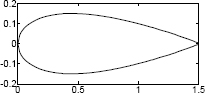
where c is the cord length and t is the maximum thickness as a fraction of the cord length (tc = maximum thickness). Symmetrical four-digit NACA airfoils are designated NACA 00XX, where XX is 100t (i.e., NACA 0012 has t = 0.12). Plot the shape of a NACA 0020 airfoil with a cord length of 1.5 m.
31. The ideal gas law relates the pressure P, volume V, and temperature T of an ideal gas:
PV = nRT
where n is the number of moles and R = 8.3145 J/(K mol). Plots of pressure versus volume at constant temperature are called isotherms. Plot the isotherms for one mole of an ideal gas for volume ranging from 1 to 10 m3, at temperatures of T = 100, 200, 300, and 400 K (four curves in one plot). Label the axes and display a legend. The units for pressure are Pa.
32. The vibrations of the body of a helicopter due to the periodic force applied by the rotation of the rotor can be modeled by a frictionless spring-mass-damper system subjected to an external periodic force. The position x(t) of the mass is given by the equation:

![]()
where F(t) = F0sin ωt, and ƒ0 = F0/m, ω is the frequency of the applied force, and ωn is the natural frequency of the helicopter. When the value of ω is close to the value of ωn, the vibration consists of fast oscillation with slowly changing amplitude called beat. Use F0/m = 12 N/kg, ωn = 10 rad/s, and ω = 12 rad/s to plot x(t) as a function of t for 0 ≤ t ≤ 10 s.
33. A railroad bumper is designed to slow down a rapidly moving railroad car. After a 20,000 kg railroad car traveling at 20 m/s engages the bumper, its displacement x (in meters) and velocity v (in m/s) as a function of time t (in seconds) is given by:
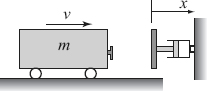
x(t) = 4.219(e−1.58t − e−6.32t) and v(t) = 26.67e−6.32t − 6.67e−1.58t
Plot the displacement and the velocity as a function of time for 0 ≤ t ≤ 4s. Make two plots on one page.
34. Consider the diode circuit shown in the figure. The current iD and the voltage vD can be determined from the solution of the following system of equations:

![]()
The system can be solved numerically or graphically. The graphical solution is found by plotting iD as a function of vD from both equations. The solution is the intersection of the two curves. Make the plots and estimate the solution for the case where I0 = 10−14 A, vs = 1.5 V, R = 1200 Ω, and ![]()
35. When monochromatic light passes through a narrow slit it produces on a screen a diffraction pattern consisting of bright and dark fringes. The intensity of the bright fringes, I, as a function of θ can be calculated by
![]() , where
, where ![]()

where λ is the light wave length and a is the width of the slit. Plot the relative intensity I/Imax as a function of θ for −20° ≤ θ ≤ 20°.
Make one plot that contains three graphs for the cases a = 10λ, a = 5λ, and a = λ. Label the axes, and display a legend.
36. A simply supported beam is subjected to distributed loads w1 and w2 as shown. The bending moment as a function of x is given by the following equations:

![]() for 0 ≤ x ≤ a
for 0 ≤ x ≤ a
![]() for a ≤ x ≤ (a + b)
for a ≤ x ≤ (a + b)
![]() for (a + b) ≤ x ≤ L
for (a + b) ≤ x ≤ L
where RA = [w1a(2L − a) + w2c2]/(2L) and RB = [w2c(2L − a) + w1a2]/(2L) are the reactions at the supports. Make a plot of the bending moment M as a function of x (one plot that shows the moment for 0 ≤ x ≤ L). Take L = 16 ft, a = b = 6 ft, w1 = 400 lb/ft, and w2 = 200 lb/ft.
37. Biological oxygen demand (BOD) is a measure of the relative oxygen depletion effect of a waste contaminant and is widely used to assess the amount of pollution in a water source. The BOD in the effluent (Lc in mg/L) of a rock filter without recirculation is given by:

where L0 is influent BOD (mg/L), D is the depth of the filter (m), and Q is the hydraulic flow rate (L/(m2-day)). Assuming Q = 300 L/(m2-day) plot the effluent BOD as a function of the depth of the filter (100 ≤ D ≤ 2000m) for L0 = 5, 10, and 20 mg/L. Make the three plots in one figure and estimate the depth of filter required for each of these cases to obtain drinkable water. Label the axes and display a legend.
38. The temperature dependence of the diffusion coefficient D (cm2/s) is given by an Arrhenius type equation:
![]()
where D0 (cm2/s) is pre-exponential constant, Ea (J/mol) is activation energy for diffusion, R = 8.31 (J/mol-K) is the gas constant, and T is temperature in Kelvin. For diffusion of carbon into stainless steel D0 = 6.18 cm2/s, and Ea = 187 KJ/mol. Make two plots of D versus T for 200 ≤ T ≤ 800 C. In the first plot use linear scale for both axes and in the second plot use linear scale for T and logarithmic scale for D. Which plot is more useful?
39. The resonant frequency f (in Hz) for the circuit shown is given by:
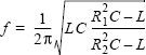

Given L = 0.2 H, C = 2 × 10⁻⁶F, make the following plots:
(a) f versus R2 for 500 ≤ R2 ≤ 2000 Ω, given R1 = 1500 Ω.
(b) f versus R1 for 500 ≤ R1 ≤ 2000 Ω, given R2 = 1500 Ω.
Plot both plots on a single page (two plots in a column).
40. The Taylor series for cos(x) is:
![]()

Plot the figure on the right, which shows, for −2π ≤ x ≤ 2π, the graph of the function cos(x) and graphs of the Taylor series expansion of cos(x) with two, four, and six terms. Label the axes and display a legend.