Chapter 13
Probability Density Functions
A volatility smile at a given maturity can be converted into an equivalent probability density function (pdf). The probability density function contains useful information because integrating an area under the curve gives the likelihood of spot being within the given range at maturity.
Starting with the simplest case, Exhibit 13.1 shows a 1yr volatility smile with 10% volatility for all strikes (i.e., pure Black-Scholes world).

Exhibit 13.1 Volatility smile with flat 10% implied volatility
This volatility smile generates the standard log-normal bell-shaped pdf shown in Exhibit 13.2. The method of generating pdfs from option prices is explored in Practical G.

Exhibit 13.2 Probability density function from flat 10% volatility smile
Exhibit 13.3 shows implied volatility rising to 15% for all strikes. Increased volatility widens the distribution and the pdf extends out on both sides as shown in Exhibit 13.4.

Exhibit 13.3 Volatility smiles with flat 10% and flat 15% implied volatility

Exhibit 13.4 Probability density functions from flat 10% and flat 15% volatility smiles
The area under the pdf represents a probability space. Therefore the total area under the pdf is always equal to 1 and the pdf function can never go negative. If the pdf does go negative, that indicates a potentially arbitrageable volatility surface. This can manifest itself in many different ways within pricing or risk management systems, most visibly via incorrect implied volatility or unstable gamma exposures.
Exhibit 13.5 shows how the volatility smile changes when positive wings are added.

Exhibit 13.5 Volatility smiles with flat 10% and positive wing implied volatility
As shown in Exhibit 13.6, higher wings in the volatility smile causes the pdf to rise in the wings (often called “fat tails”) and rise around the ATM but fall in between, although the total area under the pdf must remain unchanged. Distributions with this shape are known as leptokurtotic and they are often observed in financial markets.

Exhibit 13.6 Probability density functions from flat 10% and positive wing volatility smiles
Adding positive or negative skew causes the volatility smile to tilt one way or the other, as shown in Exhibit 13.7. The skew also causes the pdf to tilt. On the higher volatility side, the pdf stretches further as expected since the higher volatility causes the distribution to widen but the peak of the pdf moves the opposite direction. This occurs because the no-arbitrage condition ensures that the forward is the expected future value of spot. Therefore, if probability mass moves into the wings on one side of the smile due to higher volatility, the center of the probability mass must shift the other way. This is shown in Exhibit 13.8.

Exhibit 13.7 Volatility smiles with flat 10% and negative skew implied volatility

Exhibit 13.8 Probability density functions from flat 10% and negative skew volatility smiles
Fat-Tailed Distributions
The existence of fat-tailed distributions (i.e., excess kurtosis versus the normal distribution) in financial markets is a well-known phenomenon. Exhibit 13.9 shows the realized distribution of ten years of daily log-returns in USD/JPY spot versus the theoretical normal distribution with the same volatility.

Exhibit 13.9 USD/JPY realized versus theoretical log daily change distribution (2003 to 2013)
The difference around the peak is easy to see, but to see the wings more clearly a change to a log-scale for frequency is required as in Exhibit 13.10. Within this sample, the largest down moves occurred roughly ten million times more frequently than a normal distribution would suggest.

Exhibit 13.10 USD/JPY realized versus theoretical log daily change distribution (2003 to 2013/log scale)
Fat tails in the spot distribution can be most easily explained by volatility of volatility (in freely floating currency pairs) or spot jumps (in emerging market or pegged/managed currency pairs). The reality is usually a combination of these two effects but for simplicity they tend to be applied in isolation within financial models (see Chapter 19).
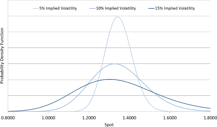
To understand how volatility of volatility generates fatter tails within the spot distribution, consider a simple model where the spot diffusion has an equal chance of having 5%, 10%, or 15% volatility. The three separate probability density functions are shown in Exhibit 13.11.

Exhibit 13.11 Three-state volatility model pdfs
The probability density function of the three-state model is an equal combination of the three states. Therefore, Exhibit 13.12 shows how averaging the pdfs gives a fat-tailed pdf compared to a static 10% volatility distribution. The low-volatility state contributes the higher peak while the high-volatility state contributes the fatter tails.

Exhibit 13.12 Three-state volatility model average pdf
The presence of spot jumps has a similar impact, pushing probability mass into the wings if a jump occurs and keeping it around current spot if a jump does not occur. As volatility of volatility increases or jumps increase in magnitude or frequency, the wings of the volatility smile move higher and the pdf gets fatter tails. See Chapter 19 for more details on FX derivatives pricing models.
Confidence Intervals
Probability density functions can also be used to generate confidence interval charts, which are an interesting way of visualizing how the volatility smile suggests spot may move in the future. For given probability intervals (e.g., 50% or 90%), the probability density function is queried for the appropriate spot levels. Exhibit 13.13 shows an example confidence interval chart in GBP/USD. The volatility surface suggests that, for example, there is a 50% chance of spot being within the 50% confidence interval bounds. Note how the bounds stretch further to the downside due to the downside skew in the GBP/USD volatility surface.

Exhibit 13.13 GBP/USD confidence intervals
Limitations of Volatility Smile Parameterization
Within FX derivatives trading desks, volatility smiles are expressed using a limited number of parameters. On some trading desks the five market instruments—ATM, 25d RR, 10d RR, 25d Fly, 10d Fly—are used; on others, perhaps just one ATM parameter, one wing parameter, and one skew parameter are used. In liquid currency pairs these reduced-form parameterizations work well and they allow a lot of information to be expressed in an efficient manner.
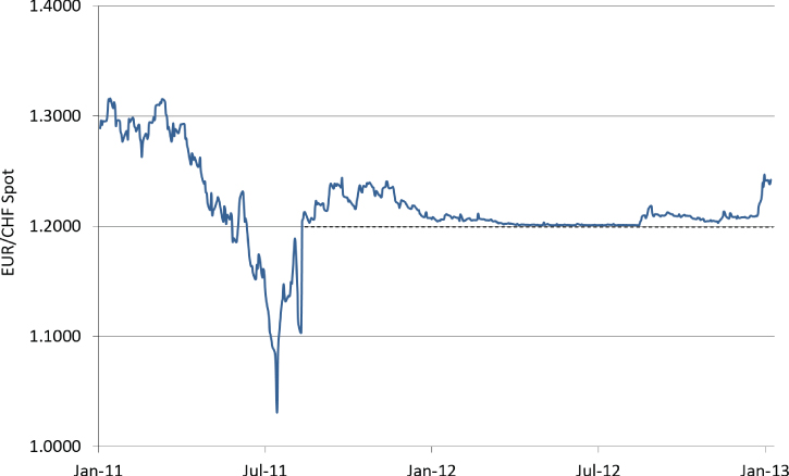
However, there are instances where these parameterizations cause problems. Exhibit 13.14 shows EUR/CHF spot from 2011 and 2012.

Exhibit 13.14 EUR/CHF spot in 2011 and 2012
In mid-2011, EUR/CHF was freely floating and the EUR/CHF market instruments at June 1, 2011 were as per Exhibit 13.15.
Exhibit 13.15 EUR/CHF 1mth and 1yr Market Instruments at June 1, 2011
| Tenor | ATM | 25d RR | 10d RR | 25d Fly | 10d Fly |
| 1mth | 11.15% | −1.75% | −2.65% | 0.25% | 0.70% |
| 1yr | 12.10% | −3.45% | −6.05% | 0.40% | 1.85% |
The corresponding volatility smile and probability density function for 1yr EUR/CHF are shown in Exhibit 13.16. As expected, the higher implied volatility for downside strikes (i.e., negative risk reversal) causes the probability density function to stretch more to the downside.

Exhibit 13.16 EUR/CHF 1yr implied volatility smile and pdf at June 1, 2011
A series of interventions and announcements from late 2011 onward saw the Swiss central bank establish a floor in the spot market at 1.2000, which they actively defended (i.e., they bought EUR/CHF spot in the market in order to prevent it going below 1.2000) until early 2015.
While the floor was actively defended, what should the probability density function look like? In a vastly simplified world there are two scenarios that could potentially have played out:
- The central bank successfully defends the 1.2000 level; spot floats freely above this level but cannot go any lower.
- The central bank decides to change its policy, at which point spot could have a big adjustment lower.
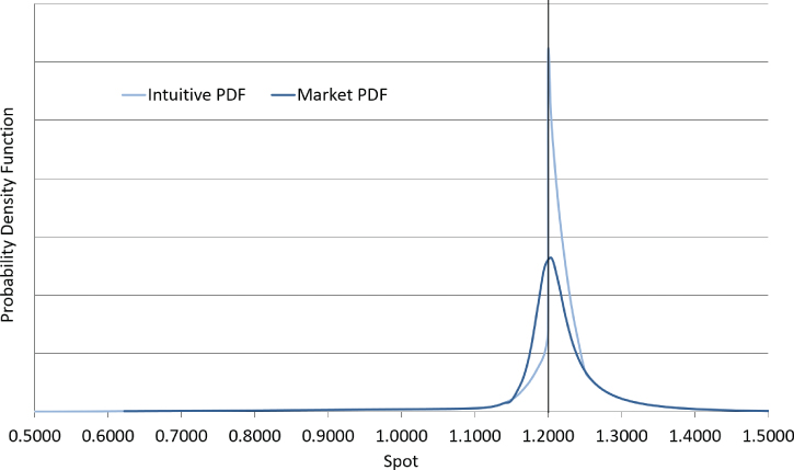
Given these scenarios, the pdf would intuitively be expected to look like Exhibit 13.17. The most likely spot position in one year is close to, but above, the intervention level. Plus, the downside of the pdf has a longer tail, because if the intervention level was removed, there is significant risk of spot jumping lower, as happened in practice.

Exhibit 13.17 EUR/CHF 1yr intuitive pdf
Exhibit 13.18 shows the market instruments one year later. The pdf derived from these quotes is overlaid onto the intuition in Exhibit 13.19.
Exhibit 13.18 EUR/CHF 1mth and 1yr Market Instruments at June 1, 2012
| Tenor | ATM | 25d RR | 10d RR | 25d Fly | 10d Fly |
| 1mth | 2.00% | –0.70% | –1.40% | 1.15% | 3.75% |
| 1yr | 6.70% | –4.60% | –9.65% | 1.80% | 6.10% |

Exhibit 13.19 EUR/CHF 1yr actual and intuitive pdfs at June 1, 2012
When constructing volatility surfaces using a limited parameter set, only certain types of volatility smile can be generated. This means that only certain types of unimodal (i.e., single peaked) probability density function can be generated, which presents a problem in currency pairs with more complex spot dynamics. In currency pairs where there is a peg, floor, intervention level, or similar, a more complex pdf would often better fit reality. Ideally the volatility surface construction should take into account the fact that spot ending just inside an intervention level is significantly more likely than spot ending just beyond an intervention level but there is no way to include this information within standard parameterizations.
The typical warning sign of this issue is that market instruments hit the correct market values but the implied volatility for individual strikes around key spot levels does not match the market, or vice versa.
