
CHAPTER 1
OVERVIEW OF WEB DEVELOPMENT TODAY
Since the early- to mid-1990s, the Web design industry has undergone many changes that make life easier for the Web designer. Designers used to have to worry about the download time of a website and how it would render differently in various browsers. The goal used to be that a page with all its code and images should be downloaded in less than 50k. The designer would also have to employ many tricks to ensure that the page looked the same in both Netscape and Internet Explorer. To a large extent, these are no longer issues for the designer, which allows much more flexibility and time to focus on the design itself.
Other areas of Web design have also become more complex. Search Engine Optimization (SEO) is a perfect example. Increased competition and the ever-changing requirements employed by search engines, such as Google, have forced designers to continually stay on top of changes and be creative in how they get users to a site.
Design, however, is going through very similar issues. Depending on which designer you ask, the industry will have reached Nirvana either when websites for all users are loaded with multimedia functionality or when they are stripped of all “excess” graphics and functionality.
Oddly enough, as the industry has evolved, the benchmark for aesthetic design has not always moved forward in equal measure. While there have been some fads that have required designers to create more aesthetically appealing designs, that is not always the case. Instead, the quality of Web design has actually taken a step backward in recent years. Whether it’s because of the designer’s drive or the client’s wishes, there is a mentality of playing it safe and designing sites exactly how most of the other sites are designed, which makes everything look the same. This issue, however, is not always one of style. Many times, the designer simply doesn’t know the technical methods to make a certain look-and-feel work. This is one of the main reasons why this book was written—to help designers create sites that allow them to do what they want and help their clients communicate as effectively as possible. For the designer who produces highly professional creative work, the market will always provide many opportunities. To be able to produce such sites, though, a Web designer needs to have a thorough understanding of the basics of Web design.
DEFINING WEB DESIGN
Web design is an ambiguous term. Web professionals define it differently all the time. While one person might define it as programming the back-end functionality of a site, another might define design as the development of the front-end look and feel that gives a sense of the company or individual it represents. The truth of the matter is that both of these definitions are correct.
In the “older” days of graphical Web development (circa 1995), Web design meant creating static HTML (Hypertext Markup Language) pages with linked text and graphics. All content and functionality was hard coded in each page. Today’s environment, however, involves creating dynamic websites that use other programming languages to interact with databases and browsers, along with XHTML (Extensible Hypertext Markup Language) pages, graphics, and CSS (Cascading Style Sheets).
A well-rounded Web designer needs to understand many of the technical and artistic aspects of Web design, although not necessarily specializing in both. Today’s technical standards, in many instances, involve creating dynamic database-driven sites that are versatile, scalable, efficient, and search-engine friendly. However, if such sites consist only of unformatted pages with black text on white screens, they will not communicate as effectively to the majority of their audiences. On the other hand, if a site uses the latest graphic design methods but consists of static pages that are difficult to update or that do not enhance or simplify the user’s experience, then the site is going to be more inflexible and, depending on the site’s requirements, impractical.
Many of the technical and artistic issues that Web designers should consider are discussed throughout this book. Here are a few examples and explanations of what a Web designer must consider before commencing.
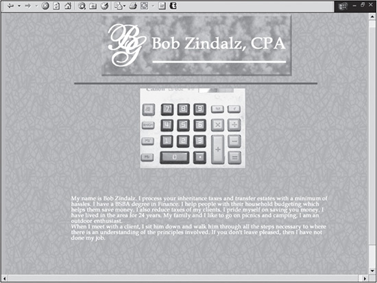
Figure 1.1 is an example of a design that is easy to update. Unfortunately, it employs little artistic design to make the site attractive to most users.
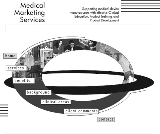
Figure 1.2 is an example of the opposite situation. It is more graphically appealing, but this design cannot be easily maintained or expanded because the page is almost entirely made up of graphics. Such a design not only requires the designer to rework the code but also to do much more graphics work.
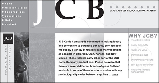
Figure 1.3 is an example of a nice blending of the two disciplines. Not only is it graphically appealing, but it is also a database-driven site that allows for text to be added without compromising the layout of the design when extended vertically.
Figure 1.1
Site that focuses more on the technical aspects.
© 2014 Cengage Learning.
Figure 1.2
Site that focuses more on the aesthetic aspects.
© 2014 Cengage Learning.
For example, in Figure 1.3, the color and line to the left of the cow repeat vertically no matter how long the page runs, while the photos stay in their respective positions. This allows the original look and feel of the initial screen area to remain the same no matter how much content is added. The site also makes use of images in their most optimal formats and compression, which keeps the file sizes small and the download times fast.
Figure 1.3
Website that brings together both the aesthetic and technical aspects of design.
© 2014 Cengage Learning.
KNOWING THE SEVEN RULES OF WEB DESIGN
There are seven basic rules that, if followed, will help a beginning or intermediate designer become a professional:
1. Just because you can does not mean you should. Web technology offers many options and tools to build websites; however, just because the technology is there does not mean a designer should use that technology just for the sake of using it. Many times, adding technology can impede the performance of a site or irritate users, causing them to leave the site. For example, this might occur if you used Flash to animate a logo of a site. While the company may want to show off its new logo, the user probably does not care or want to see it move every time she hits a page. When using a new technology, the important question to ask is, “Does the technology add value to the site, or is it being added strictly as a novelty?”
2. There is almost always an exception. There rarely are absolutes in Web design. A designer should be careful of ruling out a technology or design method simply because it did not work for another site. Take, for example, the rotating logo. While it’s not going to work for 99 percent of the world’s websites, a corporation that is running an extremely expensive global rebranding campaign may want to use animation to show off its new logo for a month or two. It may even elect to show the animation on the homepage, which probably is a better approach to showing the new image without forcing it on the user too frequently.
3. Users are the ultimate judges. Opinions are never lacking when a site is in the design process. While an experienced designer may think a site should function or appear a certain way, the designer’s boss may think differently. The bottom line is that the users are the bottom line. The site needs to make sense to them, so the site should be designed with them in mind.
4. Crossover experience is something a designer needs to always strive for. Professional Web design requires an understanding of the user’s needs, regardless of how the designer personally believes the aesthetic and technical aspects of the site should be designed. Whatever the issue may be, a designer benefits from a comprehensive understanding of the many technical aspects of the site’s design. A perfect example is that of forms. While it is important to make a form easy to use and attractive, the designer must also take technical considerations into mind. One pitfall a non-technical designer can fall into is creating a form field that may be layered above a down menu when it is expanded.
5. Humility is the best approach. Because there are so many intricacies to Web design, there are always going to be designers with more attractive sites, newer technology, or who use technology in a more creative way. If a designer does not let pride get in his way, learning from others can strengthen his skills.
6. It is impossible to please everyone. Whether it is the estimated 1.7 billion Web users around the world or three people in the office, a design is never going to make everyone happy. Everyone has an opinion. However, there is a fine line between making the majority happy and attempting to create a site that will actually be effective in communicating properly. A designer sometimes should take a stand to maintain certain functional and aesthetic aspects of a design.
7. Try to stay on top of specifications and standards. Web specifications and standards are constantly changing and will continue to do so. The designer should have a basic understanding of the latest techniques, which will affect future work. CSS-driven Web design is one such example, which is what the revision of this book explains. While the previous editions explained how to create table-driven Web designs, this edition now focuses on creating sites that enable CSS position and style elements.
UNDERSTANDING THREE WEB-DESIGN PHILOSOPHIES
One helpful way of understanding the hundreds of millions of websites in the world today is to divide them into three distinct philosophies: usability, multimedia, and mortised. Depending on the designer, any of the three philosophies can do a good job of satisfying the goal of a website, which is to communicate to the user in the most effective manner. While multimedia and usability represent the proverbial argument between form and function, respectively, mortising represents the coming together of these two philosophies. When considering the pros and cons of each philosophy, a designer should take into account how each philosophy addresses the following three factors of any site:
 Aesthetics: How professional is the look and feel of the site? Is it consistent with the desired branding of the business or individual?
Usability: How quickly and easily can a user find and process information while being able to perform necessary tasks?
Functionality: Does programming enable the functional aspects of the site, such as forms and database-driven content?
Because of the vast array of hardware, software, and users on the Internet, no one philosophy is the perfect answer for everyone. However, by understanding each philosophy and its strengths and weaknesses, a designer can have a clear understanding of which one will best address the requirements of a particular site.
Usability Philosophy
Usability is a universal term that can be used when describing any site. It represents the ease with which the user can find and process information, as well as perform certain tasks.
The philosophy of usability takes this term to its most far-reaching scope. It attempts to make sites easily usable for all members of their Internet audience.
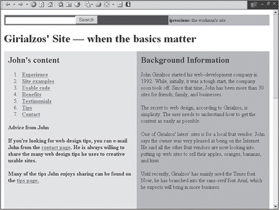
One method used to accomplish this goal is to strip down a site to its bare essentials, which includes deleting the majority, if not all, of its images. Some followers of the usability philosophy consider graphics to be a complication rather than a facilitation of the communication process. They also believe in designing sites that all browsers can view.
To better illustrate the philosophy of usability, Figure 1.4 shows an example of such a site. Notice that there is only HTML-generated color and no images. There is very little on this site that could be misconstrued by different browsers.
Figure 1.4
Site based on the usability philosophy.
© 2014 Cengage Learning.
Pros and Cons
As with any issue in life, there are always people with divergent views. Web design is no exception. The philosophy of usability falls at the most conservative side of the design spectrum, which, obviously, is going to have its detractors. Not all designers agree with this philosophy because of the simplicity of the designs, which resemble sites created in the 1990s. Visual usability is only one area that this philosophy addresses. There are also other technical and non-technical aspects that the usability philosophy takes into account. In accordance with the fourth rule of Web design, there are several practical points designers can and should take into consideration when designing:
Download time should always be as minimal as possible.
Navigation should be intuitive.
Consistent Web terminology and metaphors, such as the shopping cart system, should be used (unless there is a valid reason for an exception).
Writing should be clear and concise to expedite use.
Sites should always be tested by a variety of users in a variety of browser environments.
Accessibility for users with disabilities should be accounted for.
Anyone who has surfed the Internet would agree that finding information should be as easy as possible. No one likes to spend valuable time clicking all over a site to find a phone number or waste time with hyperlinks that do not go anywhere. This basis of the usability philosophy cannot be disputed for 99.9 percent of the world’s sites.
One of the perceptions of usability is to appeal to everyone. This is simply not true. The sixth rule of Web design is that it is impossible to please everyone. As the number of users increases, a design quickly becomes “too complicated,” “too simple,” “too colorful,” “too short,” “too long,” “too wild,” or “too conservative,” depending on the user.
This philosophy advocates limiting graphics to increase mass appeal. Graphics, however, often increase the usability of a site in four ways:
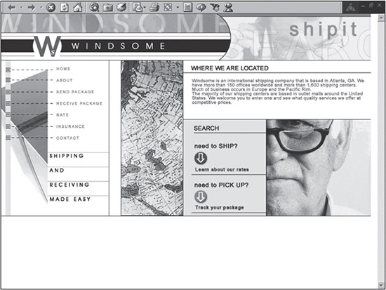
1. The impression of a site, thus the identity of a business or individual, is first judged visually. Most people form an immediate opinion when first coming to a site, if nothing more than at the subconscious level. If the site appears to be a five-minute design by an amateur, a user is going to question the professionalism and credibility of the business or individual and will very likely leave the site. The designer in Figure 1.5 valued aesthetics more than the designer of the site in Figure 1.4. Granted, the concept behind the site in Figure 1.4 is simplicity; however, the designer could have been more creative and used at least a couple of small 5KB to 10KB images to drastically improve the look of the site without noticeably increasing the download time.
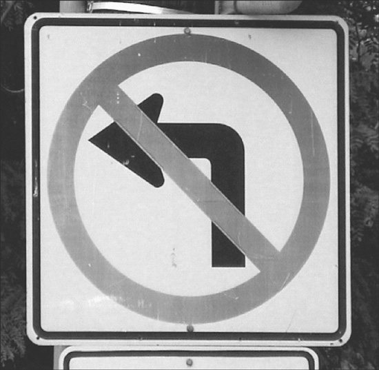
2. The brain processes images quicker than text. Many traffic signs, called ideograms, are designed for quick, initial recognition of motor vehicle warnings, laws, and conditions. The reason is that the brain can process a sign, such as that in Figure 1.6, exponentially quicker than if the sign were to read, “It is illegal to make a left-hand turn at this intersection.”
Web images work in the same way; they reduce the frustration of a user who is forced to read when a simple image will do. When a user looks at Figure 1.5, it is fairly obvious the site has something to do with shipping or a related industry. Whereas with Figure 1.4, there are no images cluing the user into the design’s meaning. The user, therefore, has to spend time reading the page.
Figure 1.5
Site where the effort spent creating the design is apparent.
© 2014 Cengage Learning.
Figure 1.6
Ideogram that is more quickly processed by the brain than text.
© 2014 Cengage Learning.
3. Graphics, along with color, help lead a person’s eye. Similar to using an image to help a user understand a concept quickly, graphics and colors can be used to help lead a user’s eye to where the designer intended. This is useful when a designer has prioritized content that the user should see first. Although Figure 1.5 is printed in black/white, it uses colored buttons to catch the viewer’s eye. The buttons are shortcuts to areas of the site that the two target audiences most likely come for: to ship or to pick up a shipment. The site in Figure 1.4 splits the site into two sides with no dominant color or images, leaving the user’s eyes floating.
Designing for Accessibility
When designing for accessibility, a designer should not rely solely on color because some users might have color blindness, which will affect their perception of the site.
4. Graphic technology can enhance functionality. Immersive imagery (360-degree photos) is one example of technology that designers can use in certain instances to improve a user’s experience and cognition. If a user were looking to spend $5,000 on a vacation to Mexico and wanted to view the rooms of hotels, would it be better to read about the rooms or look completely around them? If a picture is worth a thousand words, the entire page of Figure 1.4 would come up short when describing one room; the homepage, which stretches considerably farther than the figure depicts, has fewer than 900 words. It should be noted that in this example, immersive photos do require a longer download time. To make the site applicable to users with slow Internet connections, a designer should also provide traditional photographs as an alternative.
Multimedia Philosophy
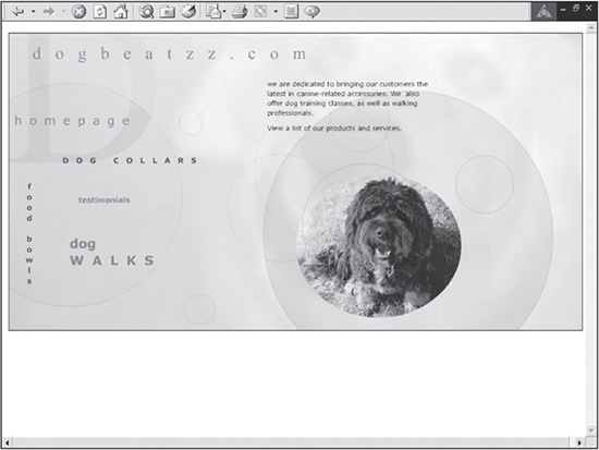
On the other end of the design spectrum from the usability philosophy is the multimedia philosophy. Multimedia sites use animation, audio, and video to create more interactive sites, such as Figure 1.7, which changes the image with different breeds of dogs, while the site plays an upbeat tempo in the background. Many sites use vector-based graphics, which can be compressed smaller than bitmap images and generally resized without much degradation of the images, unlike bitmap images.
Figure 1.7
Site based on the multimedia philosophy.
© 2014 Cengage Learning.
Many of these multimedia sites are called Flash sites because they are created with Adobe’s Flash animation software.
Pros and Cons
While many multimedia designers are still learning how to design effectively using this type of functionality, it is certainly an effective way to communicate via the Web. Some of the advantages of multimedia design include the following:
Much of the technology is vector- and mathematics-based image technology, which allows for higher compression and the ability to resize images without much loss of image quality.
It has a similar learning curve to XHTML and CSS. Most of the basic layout of simple content on a page can be easy to learn with programs like Flash; however, advanced capabilities of these programs can be a challenge.
It communicates multidimensionally with graphics, animation, and audio.
Unfortunately, the technology for multimedia sites is not only a strength but also a weakness. Multimedia sites are still not practical for the majority of Internet users for several reasons:
Browsers must have a plug-in for the user to view the graphics or site. While this isn’t so much of an issue with PCs, many smart phones don’t play Flash movies.
Multimedia software still does not integrate with databases as easily as existing Web technology, such as .NET, PHP, and JavaServer Pages.
Multimedia sites are usually more cost-prohibitive to the designer and to the client. In addition to graphics software, a designer needs animation and possibly audioediting software to create a multimedia site, depending on the site’s requirements. Because Flash sites generally aren’t as easy to update as XHTML sites, it usually takes more time and costs more to do so.
Many designers have yet to learn discretion when using the power of multimedia software. Although vector-based images compress well, the file sizes found on many multimedia sites are still considerably larger compared to traditional websites. This is because designers often use too much animation, graphics, and audio, which increases the download time of a page and which isn’t always apparent when a user has broadband access. This goes back to Rule 1: Just because you can does not mean you should. The issue is not just with the download time of a page. It is also frustrating for users to go to a site where they have to see the same intro animation every time they visit. It should not be required to have to click past an intro to get into the site.
Mortised Philosophy
David Siegel, in his best-selling book Creating Killer Web Sites (Hayden Books, 1997), described mortising as piecing two images together using a table. Mortising, however, can be a much broader term, which represents the philosophy of piecing together graphics, text, and functionality, to build striking, graphically appealing sites that are fast, highly usable, and flexible.
Such sites bring together the best of both usability and multimedia worlds, combining them into professional designs that can be viewed by nearly all of today’s Web users (see Figures 1.8 and 1.9). Mortising not only complements the functionality of a site, but it also enables designers to use techniques that the graphic design industry has spent decades perfecting without sacrificing download time.
Figure 1.8
Example of a mortised site.
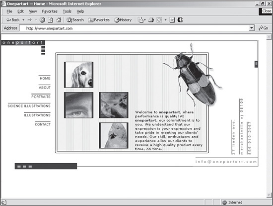
Source: Onepartart.com.
Figure 1.9
Site based on the mortised philosophy.
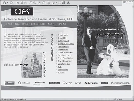
Source: colo-insurance.com.
Pros and Cons
While there is no “perfect” type of Web design, for many designers, mortised sites are the best current solution for communicating effectively to the largest possible audience on the Web. Following are some of the pros of this philosophy:
Per Andre Agassi, “Image is everything.” Mortised sites can be striking, fast, and highly usable, allowing clients to create powerful and lasting first impressions on their users.
Because the designer can use more graphics and less text, the user can more quickly understand concepts, ideas, and emotions used in designs. The use of graphics also allows designers to take better advantage of traditional, time-tested graphic design aspects, including layout, color theory, and typography.
Mortised sites not only work with static Web pages but also with dynamic database-driven sites. Because they use existing XHTML and CSS technology, such sites can be easily customized to work with Microsoft.NET, PHP technology, or Java technology, specifically JavaServer Pages.
The learning curve to build such sites is extremely low for experienced Web designers because the technology is not new. Methods used in this book employ simple, creative, and practical ways to use XHTML and CSS in creative, useful ways.
While they do not have to be, mortised sites can be easily designed to be scalable, database-driven sites. If a client or business wants to add three sections to a website, a well-designed mortised site can be easily expanded.
Mortised sites are modular. This enables a designer to take advantage of various design options, such as Flash, in selected portions of a page. For example, a designer may not want to create an entire site in Flash but only want an advertisement of a new product in the center of the page. With a mortised site, adding such an element is easy when the site is designed with such flexibility in mind.
While mortised sites satisfy the site requirements of the majority of the world’s websites, they are not the complete answer. They still face the same issues that usability and multimedia sites must contend with:
Similar to multimedia sites, mortised sites require plug-ins to use some of their elements, such as animation and audio.
Mortised sites are limited by the knowledge of the designer. A designer can create a similar-looking site in a WYSIWYG (What You See Is What You Get) editor, but such software is always going to limit the designer’s full potential in one way or the other if he doesn’t fully understand what goes on “under the hood.”
SUMMARY
There are seven rules of Web design that help a beginner develop into a professional designer: just because you can does not mean you should; there is almost always an exception; users are the ultimate judges; crossover experience is something a designer should always strive for; humility is the best approach; it is impossible to please everyone; and try to stay on top of specifications and standards. Each of these rules is applicable in certain instances when building a site.
The goal of a website is to communicate effectively to the largest audience possible. Any of these three design philosophies can be used to accomplish this goal: usability, multimedia, and mortised. Mortised sites typically offer the best of both worlds, which is why they are continually sought after by clients.