
CHAPTER 2
DESIGNING FOR THE PAST, PRESENT, AND FUTURE
A common struggle for a Web designer is designing for the largest audience possible without sacrificing the desired graphical and functional aspects. Since the 1990s, and probably earlier, this struggle has been a common issue with designers; unfortunately, it will continue to be an issue as long as newer technology and design methods are constantly being introduced.
While a designer might want to take advantage of the latest technology, there should also be a concern that the audience will think usability implications were not taken into consideration if newer technology is employed that is not fully supported by all hardware and software. When designing for the past, present, and future, a professional should design for the needs of the site. When creating sites for the largest possible audience, the designer should become resolved to the fact that it is not always possible to use the latest technology in most cases. The designer must focus on making the best use of the most practical technology that is available. Fortunately, as the Web industry has progressed since the 1990s, it has become increasingly easy to build highly usable, fast, graphical sites with existing technology.
FEELING BROWSER PAIN
Since the 1990s, designers had to always worry about how various browsers, such as Netscape and Internet Explorer and then Internet Explorer and Firefox, would output pages. It was a constant battle to add and manipulate code to ensure the pages were consistent.
Figure 2.1 is a site in Firefox 1.5.0.6. Figure 2.2 is the same site in IE 6.0. Figure 2.2 shows how a bug in IE 6.0 drastically displays floated containers nested in floated containers. In other words, all the content in the right column is placed below that in the left column. As the content in the left column grows vertically, so will the content in the right column be dropped.
Figure 2.1
Site viewed in Firefox 1.5.0.6.
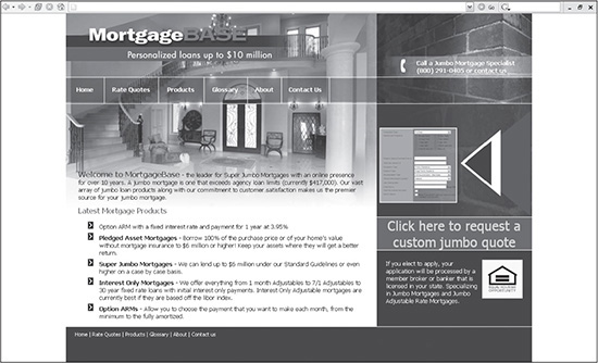
Source: mortgagebase.com.
While past issues, such as these, still exist as long as those versions of the browsers exist, the fact is that standards have now been employed among browsers to ensure they output code much more consistently. What used to involve hacks now only requires a slight tweaking of code, if issues ever appear.
Figure 2.2
Site viewed in IE 6.0.
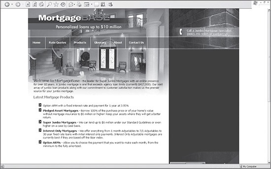
Source: mortgagebase.com.
INCORPORATING USAGE STATISTICS
Because there is a growing discrepancy in the number of browser versions, as well as monitors with varying resolutions and bandwidth issues, the Web user with the most outdated hardware and software continually lags behind. Therefore, it is nearly impossible to keep a user with the latest hardware and software satisfied while designing for those who might still be downloading sites with a dial-up modem, using IE 5.0, and viewing on a monitor with 800 × 600 resolution. This is why it is wise to base most Web design decisions on global usage statistics.
Global usage statistics give the designer useful information about the general population of Web users and allow the designer to create a site that will best suit as many users as possible. A designer can get usage statistics on browsers, versions of JavaScript used (if JavaScript is actually turned on), operating systems, and monitor resolution.
Basing a site’s design on general usage statistics is always a smart way to begin a site design. Once the site is created, however, the designer can then also use statistics specific to that site. How this works on a Windows server, for example, is that a log file is collected every day. It collects data that includes everything from what browser the user was using to each individual page the user visited (see Figure 2.3).
Figure 2.3
Log file created on a Windows server.

© 2014 Cengage Learning.
After the log information has been saved, Web analysis software then analyzes and displays the data. One of the most commonly analyzed statistics is page visits. Figure 2.4 outputs such data from the log file in Figure 2.3.
Figure 2.4
Page statistics captured for a website for one day.

© 2014 SmarterStats.
Another commonly used statistic is which search engines are hitting a site. This information allows the designer to track results and modify Search Engine Optimization efforts as needed (see Figure 2.5).
Figure 2.5
Search engine statistics for the image in Figure 2.3.
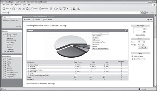
© 2014 SmarterStats.
The designer doesn’t need to collect and analyze log files with software. Google Analytics allows for tracking with a much simpler method. The way it works is that a designer logs into the Google Analytics site, adds a site to the account, copies prepared lines of JavaScript code, and then adds the code to any page that is to be tracked. Google then collects and displays the data in the Analytics account. The software provides a lot of flexibility for the designer to then use the data to improve the site.
BRANCHING PAGES
The inconsistent support of XHTML, JavaScript, and CSS by IE and Netscape years ago made some developers resort to branching their code. In other words, once a user hits a page, a basic JavaScript code is used to determine a parameter, which then determines which code could be used for whichever condition.
In the past, prior to CSS-driven drop-down menus, branching was advantageous to use with JavaScript drop-down menus that only worked with Netscape’s DOM (Document Object Model) or IE’s DOM. These days, with so many varying resolutions, a good use of branching code can be to serve up varying design widths, depending on the resolution and if it’s a mobile site.
UNDERSTANDING BANDWIDTH
Bandwidth is the amount of data that is either uploaded or downloaded over a specified time. In other words, for designers, how quickly a site can be downloaded without losing the user. Studies over the years have shown that the number one complaint of users is that a site is too slow, which made speed a high priority when designing.
For someone who began designing in the 1990s, today’s bandwidth standards are more than adequate when creating fast, striking sites. When the Internet first started becoming popular, the typical user usually had something comparable to a 9600bps (bits per second) modem.
As years passed, 14.4Kbps (kilobits per second) modems appeared and then the 28.8Kbps modems and 56Kbps modems arrived. Today, while there are still people using 14.4Kbps, 28.8Kbps, and 56Kbps modems, the majority of users have high-bandwidth connections, such as DSL or cable.
Because broadband is so prevalent today, designing sites with small downloads is not as important as it used to be, so the designer doesn’t need to be quite as concerned about how quickly a site downloads. Even the download speeds of smart phones are faster. Still, perfection is always a great goal. And when seeking perfection, the designer should try to build sites that download as quickly as possible.
What is a large page download for a site? Some designers like to determine the speed of a site by the time it takes to download. The problem with this type of measurement is that it is relative. The same site that might take 10 seconds to load on a laptop might take 30 seconds to load on a smart phone, depending on the user’s Internet connection, the total usage of the Internet at that time, or the usage of the site’s server(s) at that time, among other factors.
A more comparable method of determining the speed of a site is by the weight of a page (the amount of kilobytes). The previous standard was to keep the site under 35KB. With the growth of CSS-based sites and Flash, this standard has grown considerably to where a 500KB site is not unreasonable. These sizes include CSS, graphics, possible multimedia components, and the output XHTML. (Output XHTML is the eventual XHTML a database-driven site returns to the browser. The actual page on the server with all the programming code will generally be larger.)
Some designers believe it is impossible to build graphical sites and keep them fast. This is simply not true. Many of the sites that require a large download are designed incorrectly. One way to design a site correctly for a small download is to compress its images properly. Take, for example, Figures 2.6 and 2.7. Figure 2.6 was taken with a digital camera using no compression. Figure 2.7 is the same image after being compressed. When resized to 250 × 214 pixels, it is possible to compress it more than 66 percent from its original 76.0KB to 14.5KB with very little visible difference.
Once a designer knows the tricks of keeping a site download small, it is important to keep the goal in mind when designing a site. Whenever designing, it is a good practice for a designer to keep the download calculator going in her head and constantly keep track of how big the site will eventually be. Once the goal of, say, 200KB is met, the designer should stop to make sure that all necessary content has been added. If it has not, the designer should try to take away or reduce in size a design element to make up for the additional download size of the required content.
Figure 2.6
Uncompressed JPG photo that is 76KB.

© 2014 Cengage Learning.
Figure 2.7
Compressed JPG photo that is 14.5KB.

© 2014 Cengage Learning.
BUILDING ON PREVIOUS DESIGN WEAKNESSES
A designer should continually strive toward making sites technically and aesthetically superior to previous designs—a goal that sounds like common sense, but, surprisingly, isn’t always followed. Looking at Figure 2.8, it is fairly easy to find room for improvement—the color choice is too simple, the presentation of the artwork could be improved, and the layout does not make good use of space.
Figure 2.8
Site that could be designed to appear more professional.
© 2014 Cengage Learning.
When this book was first written, it was a naive assumption that design would get better over the years. This, however, is most definitely not the case. The standard of design is based more on each individual designer, rather than the collective consciousness. This is good news for the talented, discerning designer. Not only are there millions of sites that need to be redesigned, but as more businesses and individuals decide to put up new sites, there are also more opportunities to create sites that communicate more effectively.
Building more effective sites involves improving on past design weaknesses. The first step in accomplishing this is to understand and avoid such weaknesses. Following are some examples a designer should try to avoid.
IFrames and Frames
Multi-framed sites, for the most part, have gone the way of the dinosaur. IFrames, however, can still be beneficial to a designer. An IFrame is an individual frame that can be placed anywhere in a page, controlling how long a page could be. In other words, the designer can output a large amount of data, such as 150 countries with associated data for each, within 500 pixels of vertical space, without requiring the user to scroll down the screen many pages if the same data were output in a nonframed environment.
As for frames, although they are almost entirely extinct, clients may still occasionally ask about or request IFrames. Here are several reasons a designer could give a client as to why traditional framed sites should not be used:
1. Allowing a user to bookmark a site is impossible unless JavaScript is used. The problem is that when a user bookmarks a page, only one frame is bookmarked (usually, it is the last frame that was clicked in), rather than all the frames. As mentioned previously, this can be a benefit in some circumstances.
2. Targeting frames and passing programming variables is considerably more complicated than when using include files (that is, SSI, or Server Side include files).
3. Increasing the number of scrollbars decreases the amount of space a designer has to work with (see Figure 2.9).
4. Search engines do not like frames. Therefore the site will suffer in search-engine rankings, if it’s ranked at all.
For the most part, to even discuss framed sites is a moot point. Still, excess knowledge only helps a designer.
Figure 2.9
Site that uses an IFrame to control how much space a large amount of data takes up.
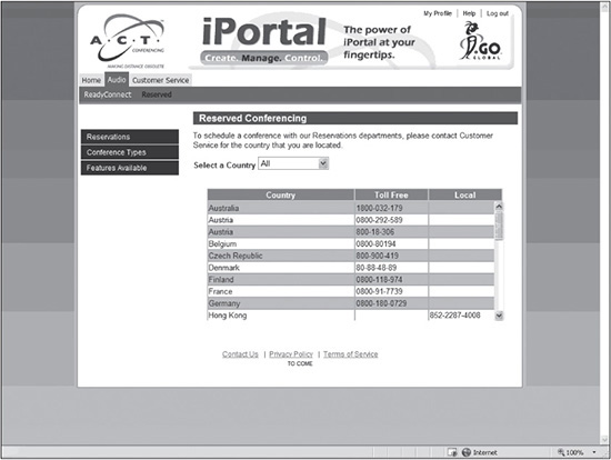
Source: ACT Conferencing.
Image Buttons
Creating menu items as images, rather than text, can be attractive because the designer can use any desired font since the browser doesn’t have to render it. However, simply for the advantage of a mouseover image, image buttons are not necessary or practical for four reasons:
1. Download time: A designer can drastically increase the download time of a site when using mouseover images as menu items, because the user has to download the images for both the On and Off states. In Figure 2.10, for example, the user has to download the eight images in the Off state and the eight images in the On state, which is shown in Figure 2.11.
The entire download size of the images for the menu in Figure 2.10 is 20KB. This is already nearly half of the goal for the entire homepage, which is 50KB. Granted, while limiting download time is not nearly as crucial these days, unless the designer preloads the buttons in their On state, see Figure 2.11, they will still most likely show a delay, no matter the download speed.
2. Maintenance: Creating, editing, and adding such buttons to a site is time-consuming.
3. Dynamic functionality: The advantage of database-driven sites is their ability to create pages on the fly and allow menus to be created dynamically as well. When a designer creates menu items as static images, it defeats the purpose of being able to create such items dynamically.
4. Search engines: When text is saved as an image, search engines don’t read it, although they can read the Alt tags. It’s wise to make your site as search-engine friendly as possible.
Figure 2.10
Menu items saved as images in the Off state.
© 2014 Cengage Learning.
Figure 2.11
Menu items saved as images in the On state (a white glow around the text).

© 2014 Cengage Learning.
CSS menus can use background images in menu items. Using such a method also enables the designer to lay text over the image, allowing for more flexibility. Such usage of background images is incorporated in many designs included with this book.
Background Images
Background images can enhance a website to give it mood and depth. While the use of background images has changed slightly over the years, the concepts are fairly similar. There are several uses of background images that the designer can be creative with. The first of which is using a background image to serve as the majority or entire backdrop of a website while layering the HTML and graphics on top of it. While this wasn’t advisable in the past, it now is much more acceptable with increased bandwidth and CSS-driven layouts, which require less download time. Figure 2.12 illustrates a site that uses one image to serve as the entire background.
Figure 2.13 is the background image that was used.
Another creative use of background images is giving the impression that a design has colors running down both sides of it indefinitely. Although this used to be an easy process with XHTML table sites, it now takes a little extra coding to accomplish the same result. Such a technique is explained in Chapter 12; however, Figure 2.14 illustrates the concept.
A third use of background images, as mentioned in the previous section, is using the images for menus. Using CSS, a designer can use an image for, say, a menu item, while not having to include the text with the image itself. In other words, the text is layered over the image. Figure 2.15 shows a site that does just that.
Figure 2.12
Site that uses a large image for its background.
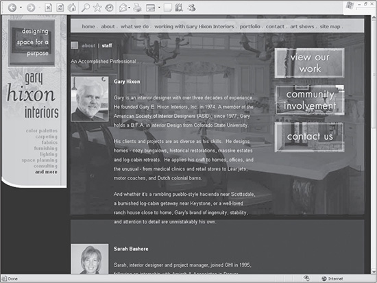
Source: Gary Hixon Interiors.
Figure 2.13
Image that was used for the entire background of the site in Figure 2.12.
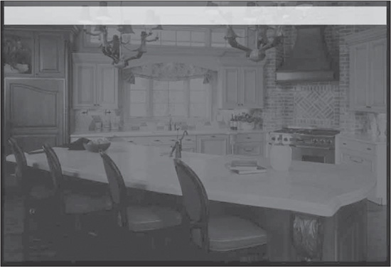
Source: Gary Hixon Interiors.
Figure 2.14
Site that uses background images to run colors down both sides of a design indefinitely, similar to how XHTML table designs work.
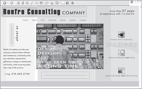
Source: renfroconsulting.com.
Figure 2.15
Background images that are used in a menu to show Over and Off states.
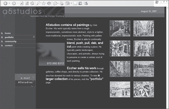
Source: a5studios.com.
Although many clients don’t always like the width of their sites changing because the content shifts around, a background image can be used to easily expand the look and feel. The designer has to be careful to make sure that the background image is designed correctly for higher resolutions, though. Some designers even use branching code to use different versions of the background, depending on the resolution. While the design in Figure 2.16 doesn’t expand horizontally, the background image does repeat horizontally at a higher resolution. Unfortunately, it does not look professional because the designer did not limit the background image from repeating. One instance that designers should probably stay away from is using a repeating background image endlessly, both horizontally and vertically. While it can work in certain situations, for the most part, it is amateurish looking. This is probably because it was so easy to do—since the dawning of graphical Web browsers, millions of sites used the technique, similar to glowing text. These days, sites similar to Figures 2.17 and 2.18 aren’t designed very often.
Figure 2.16
Page repeating an awkward-looking background image in a resolution higher than the design was created for.
© 2014 Cengage Learning.
Figure 2.17
Site that infinitely repeats the background image of a cloud both horizontally and vertically.

© 2014 Cengage Learning.
Figure 2.18
Background image that is repeated in Figure 2.17.

© 2014 Cengage Learning.
Uncontrolled Color
Color can make or break a website. Not only should the colors be appropriate and appealing to the target audience, but they should also be used with intention and discretion. One of the strengths of using color is that a designer can help lead the user’s eye. If a designer, on the other hand, uses too many colors, the user can quickly become confused as to what the most important information is. The user then has to start reading all the hyperlinks to find the desired content.
Uncompressed Images
Even with broadband, uncompressed images can still bog down a download. There are still designers who employ full-size images, but simply reduce their size on a website with the height and width attributes. Figure 2.19 shows a website that initially had the download size of 790KB, mainly because of the horizontal photo across the top and the image in the bottom left. With just two minutes of work, the designer could easily compress both those images to fit under 50KB, with no visual degradation.
In the early 1990s, the closest a designer could come to compressing an image was reducing the bit depth (2, 4, 8, 16, 32, 64, 128, or 256 colors) of a GIF or reducing the JPG compression percentage in increments of 10. Today, because of the vast improvement in graphics software, GIFs, for the most part, have been replaced with PNGs, which can be compressed one color at a time. And JPGs can even be compressed one percentage point at a time. With the power and ease of image-editing software, there is no reason for a designer not to drastically compress all images of a site.
Figure 2.19
Site that does not use compressed images.
© 2014 Cengage Learning.
Thumbnails
A thumbnail is a smaller version of an image, which allows the user to preview the larger version without having to actually download the image until it is clicked. A mistake that beginning Web designers tend to make at least once is in resizing images to appear as thumbnail images. Figure 2.20 illustrates a Web page that includes many thumbnails of larger photos.
Figure 2.20
Site that makes use of thumbnail images.
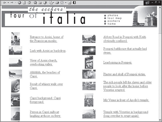
© 2014 Cengage Learning.
When the user clicks a thumbnail, an enlarged copy of the image is displayed (see Figure 2.21).
When a designer places an image in HTML, the height and width attributes can be changed to tell the browser to resize the viewable size of the image. For example, the designer could tell the browser to display an image from 500 × 500 pixels to 20 × 20 pixels.
Figure 2.21
Larger version of a thumbnail image.
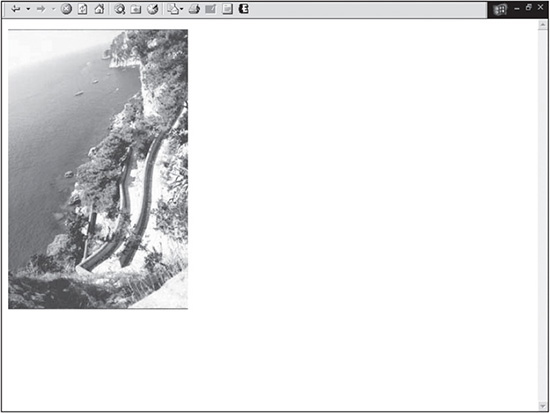
© 2014 Clint Eccher.
While it is possible to tell the browser to forcibly change the visual size of the image, it does not change the download size of the image. In other words, if the 500 × 500 image is 1000KB, it will remain 100KB when displayed at 20 × 20. If all 14 photos in Figure 2.20 were 1000KB, the download of the entire page would be nearly 1.4MB when it only needed to be 280KB if each image were compressed to be 20KB.
To create thumbnails correctly, a designer needs to make two images: the original photo and then the original photo resized smaller. While it is more work, the user will appreciate the increased speed of the download.
SUMMARY
Designers have been dealing with browser issues since the 1990s. While there are still some issues, they are comparatively minor and can be rectified fairly easily. A designer can and should determine design requirements based on usage statistics that not only provide browser information but also give information to monitor color depth, resolution, and JavaScript support, among other issues.
It is always smart to learn from the past. There are several mistakes that designers have made over the years that today’s designers can learn from and improve on, such as frames, image buttons, background images, uncontrolled color, uncompressed images, and thumbnails.