
 Note CSS’s ability to drive layout without driving developers crazy has been a long time coming. It’s pretty much always been a sore spot.
The web stack’s long history of somewhat less than stellar layout support is caused by a few things, in my opinion. First, we had tables, and tables sufficed to some degree. Sure, they were never the right place to define your layout, but were sufficient. Second, web development targets many browsers on a variety of devices, and attempts to define a document that adapts to its display. Contrast this to the print world where a standard sheet of paper never changes size and visual artifacts can be positioned anywhere.
Layout is still challenging in HTML, but gone are the days where developers are mourning their lack of options. Today we see more developers arguing constructively about which of the many options works best in a particular scenario.
Tables are a very early element in HTML. Chances are good that you’ve had some experience with HTML tables, but if you haven’t, then just know that they’ve been used for much more than tabular data. They’ve been used for layout as well.
The only HTML implement I would consider to be as rudimentary as tables (or perhaps even more so) is framesets. Websites have been laid out with navigation panes and header and footer panes, and framesets were the means to achieve them with different HTML files loading in each pane. Framesets brought their own set of pains both for the developers and the users, so the recommendation became the use of tables with all content defined in a single HTML file.
Besides tables, the topic of legacy layout should also include the use of plain old div elements with display and position properties used to wrangle them into place.
Table layout
Table layout is actually quite flexible and effective and I would imagine that a number of site designers are still relying on it today. I also bet those designers are keeping the fact a secret from their peers, because tables are by no means the current recommendation. They’re not recommended because they’re cross purpose to maintaining a separation of concerns and because they’re not adaptable - two core principles in web design.
Remember that HTML defines the structure and CSS defines the style? The HTML allows you to define the elements in use and their hierarchical relationship to each other, but should say nothing of the positioning of those elements. Layout, rather, is a style and it belongs in CSS. Putting your layout into your HTML in the form of tables may get the job done, but it results in a site that is not capable of being as adaptable as modern apps and devices need it to be.
Defining layout with a table makes certain assertions like “this content must be below this content” or “this content must be contained in this area,” and they lock the site into those assertions.
Listing 7-1 shows a table that may very well define the layout of a document.
Listing 7-1. The table element used as layout
<!-- HTML snippet -->
<table>
    <tr><td rowspan="3" id="nav"></td><td rowspan="3"></td><td></td></tr>
    <tr><td></td></tr>
    <tr><td></td></tr>
    <tr><td colspan="3" id="footer"></td></tr>
</table>

/* CSS snippet */
table{
    width:1100px;
    height: 560px;
    border-collapse: collapse;
}

table td {
    border: 2px solid black;
    padding: 5px;
}

#nav {
    width:180px;
}

#footer {
    height:80px;
}
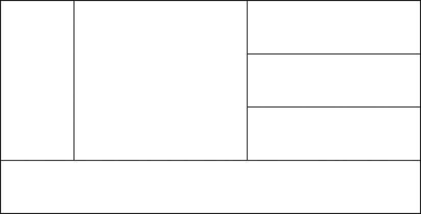
Figure 7-1. This sample layout looks pretty good, but using tables to define layout is never a good idea
If tables are taboo in layout, then what? The next more elegant solution is to use div elements with display and position properties to manually send them where they should go on the screen. A div (short for division) is an abstract element that is generally meant to separate bits of content from one another. It’s rendered in block mode which means that preceding and succeeding elements render above and below it. This is in contrast to inline elements, which flow like text in a word processor.
These div elements can be formatted and positioned with styling properties, which makes them a good replacement for tables in layout. They are ubiquitous on the web today, but that’s not to say they are a delight for a developer to deal with! The techniques that have been available for using div elements as layout have brought their own pains and that’s why web developers everywhere are excited about the advent of new formatting capabilities that are either here already or coming soon. Nevertheless, we’ll discuss classic div positioning in good detail here, because it’s foundational and because you’re sure to see it in the “wild.”
The display property determines how its target is going to be displayed and becomes a very important property in the subject of layout. The valid values for the display property (including the Microsoft vendor-specific values) are inline, block, list-item, run-in, inline-block, table, inline-table, table-row-group, table-header-group, table-footer-group, table-row, table-column-group, table-column, table-cell, table-caption, -ms-flexbox, -ms-inline-flexbox, -ms-grid, -ms-inline-grid, and none.
Display Properties
There are a lot of values, so I think we need at least a cursory introduction to some of the display properties to get a full understanding of layout.
inline
When an element is inline, it acts like text in a word processor—that is, it renders horizontal to its previous sibling element, it flows from one line to the next, and it affects its own line-height. Inline elements are not affected by attempts to size them with width and height.
block
Block elements take up as much width as they can, which forces them to be on their own line. Specifying multiple block elements results in the elements being stacked vertically when rendered. Block elements can be sized.
inline-block
Elements set to display as inline-block act like an inline element from its parent’s point of view, but they render themselves and their children as a block element. This is an effective way to create multiple div elements that show up next to one another like text does.
list-item
An element set to display: list-item renders as if it were an item in a list. A marker box and a block box are created for the element giving it a bullet and a left margin that you would expect.
run-in
The run-in value is an interesting and rather artistic single-use value that is often used for headers. If a header is set to display as run-in then it will render on the same line as a paragraph of text immediately below it and force the text to scoot over to make room.
inline-table and table-*
All of the behavior of the various components of a table (a row, a cell, etc.) can be emulated by setting an elements display to the various table properties. The reason, you’ll recall, that using tables in your HTML is bad practice is because layout is not the job for HTML. If you implement your tables using these style properties, though, then you get all of the layout benefits of tables without the drawbacks. I still don’t recommend it though.
-ms-flexbox and -ms-inline-flexbox
A flexbox is a really powerful element for laying out content. Flexboxes are intelligent about the way their children are rendered and give you the ability to flow, wrap, stretch, align, and do even more. There’s a whole section dedicated to flexboxes coming up. Using the -ms-flexbox value will create a block style element and using -ms-inline-flexbox will create an inline flexbox.
-ms-grid and -ms-inline-grid
Grids also give you some excellent control over how child elements are laid out. Grids allow specific placement of content in a way that can still adapt to changes in size and position. Just like flexbox there is a block and an inline version.
Once you have chosen the appropriate display value for your element, you should know your options for positioning it.
Positioning is done by way of the position property and the values are static, absolute, relative, and fixed. The value of static is the default. The benefits of the position values are described in the following sections.
static
The default static value doesn’t do any extra work to position the object. Whether it’s an inline or a block element, its position is determined by its position in the HTML file.
absolute
An absolute value sets an element up to be placed anywhere relative to its parent if its parent is positioned. If its parent is not positioned then it will be relative to the document body. Elements that are positioned absolutely are taken out of the document flow and stop affecting it. They no longer push other elements around or get pushed around by them.
relative
Like the absolute value, the relative value sets you up to explicitly place your element, but placement values are taken to be relative to where the element would have rendered if it were static. It’s a great way to move an element a little to the left.
fixed
The fixed value works similar to absolute, but it takes into account the viewport that it is in, so if it is rendered in a scrolling div, it can be placed relative to that div.
Every position value except for static sets you up to determine the placement of your element and you do so by specifying values for left, right, top, and bottom. For absolute and fixed positions, these properties determine the placement of the four edges of your element relative to another element, but for the relative position, they determine the placement of that edge relative to where the element would have been rendered if static.
Listing 7-2 shows an example of a simple row of square div elements (laid out using a flexbox which we’ll discuss soon). The third element is told to have a position value of relative (as opposed to the default of static) and then is told to scoot 15 pixels to the right and down. The effect is to displace the box from its place as you can see in Figure 7-2.
Listing 7-2. Setting an element’s position to relative and its left and top to 15 pixels
<!-- HTML snippet -->
<div id="dpFlexbox">
    <div></div>
    <div></div>
    <div></div>
    <div></div>
    <div></div>
</div>

/* CSS snippet */
#dpFlexbox {
    display: -ms-flexbox;
}

#dpFlexbox > div {
    border: 1px solid black;
    width: 100px;
    height: 100px;
    margin: 5px;
}

#dpFlexbox > div:nth-of-type(3) {
    position: relative;
    background-color: gray;
    left: 15px;
    top: 15px;
}
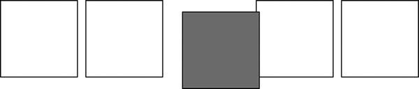
Figure 7-2. The element is offset from the space it would have occupied
Listing 7-3 shows the same five boxes with the third one again given values of 15 pixels for the left and top, but this time the position is set to absolute. As you can see, the gray box has now been moved to 15 pixels from the top-left corner of the document. Notice too in Figure 7-3 that the other div elements have collapsed together, since the third one was pulled out of the flow.
Listing 7-3. Setting the position to absolute this time
<!-- HTML snippet -->
<div id="dpFlexbox">
    <div></div>
    <div></div>
    <div></div>
    <div></div>
    <div></div>
</div>

/* CSS snippet */
#dpFlexbox {
    display: -ms-flexbox;
}

#dpFlexbox > div {
    border: 1px solid black;
    width: 100px;
    height: 100px;
    margin: 5px;
}

#dpFlexbox > div:nth-of-type(3) {
    position: absolute;
    background-color: gray;
    left: 15px;
    top: 15px;
}
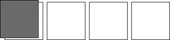
Figure 7-3. The element goes to the top-left corner of the document and loses its place in the list of div elements
We discussed the margin, border, and padding properties already, but I want to bring to your attention that they do play a big role in content layout. One of the core principles in Windows 8 design is that Less is More. It means that we aren’t trying to pack as much information on the screen as we can. We aren’t trying to keep the user one click from everything as seems to be the trend in website design. So we’re not afraid to add some intentional, purposeful breathing room to our content’s layout. This usually takes the form of a margin or a padding, so be ready to use them.
Block-level elements can be told to float using the float property. A floating element allows subsequent inline content to render next to itself (instead of below). You can provide values of left or right to determine which side of the block-level element content should populate.
When used as it was intended, floating works quite well, but web developers have been using it for some time to get block-level elements to facilitate layout.
Using float for layout though reminds you that it’s not so comfortable in its imposed role.
Luckily, we’re not restricted to the old way of laying out content. We have more modern facilities now that are expectedly simpler and more powerful at the same time. The particularly painful parts of web development have a way of provoking enough demand for something new.
Flexbox
There’s still quite a bit of tumult in the standards recommendations and implementations for flexboxes, but IE10 and Windows 8 has a good, solid implementation of this extremely helpful layout technique.
Flexboxes solve an old problem. The abstract div elements that we’ve been using for so long for laying out our content were designed as block elements. Modern user interfaces and especially the interface in Windows 8 are full of flowing lists of products, friends’ pictures, and pictures.
While it was rarely impossible to implement the necessary layout using classic div positioning and floating, it’s very often painful. Flexboxes alleviate most or all of that pain.
Directing a list of elements to lay out as a flexbox is as easy as setting display: -ms-flexbox; on its parent. The default layout direction is horizontal, so as soon as this one property is added, child elements will begin flowing from left to right. This is helpful on its own, but it’s only the start. Flexboxes also enable you to size the items and the space along the axis of layout and also perpendicular to the axis of layout. They also allow you to control the layout direction and order of your content regardless of how it is specified in the HTML.
Let me introduce you to the remainder of the flexbox related properties and values and explain their function. The following properties would be added to the parent element (the one we added display: -ms-flexbox; to).
-ms-flex-direction
Determines the direction that child elements flow. You would use the default value of row to lay items out left to right or column to lay items out top to bottom. You can also use row-reverse for right to left or column-reverse for bottom to top.
-ms-flex-align
The -ms-flex-align property handles the spacing perpendicular to the direction that items are laid out. Assuming we have a flexbox with a direction set to row, a value of start would line child elements up along the top of the row, center would line them up in the center, and end would line them up along the bottom. Additionally, baseline would line up the leading edges and stretch (which is the default) would grow each element to fit the space. And the inverse is true for flexboxes with a direction set to column.
-ms-flex-pack
Similar to how -ms-flex-align handles spacing perpendicular to the direction, -ms-flex-pack handles spacing inline with the direction. With a value of start, you can direct all child elements to pack into the left side (still assuming a flexbox with a direction of row), with center to pack into the center, with end to pack into the right, and with justify you can direct the child elements to equalize their spacing so they fit nicely from start to end in their allotted space.
-ms-flex-wrap
The -ms-flex-wrap property gives you control over what happens when the child elements reach the end of the flexbox. Wrapping is a great way to lay out content. Use wrap to turn on wrapping or leave it set to its default value of none to turn it off.
-ms-flex-flow
The -ms-flex-direction and -ms-flex-wrap are common properties and a shorthand property of -ms-flex-flow has been provided to encapsulate them.
Again, the properties mentioned so far should be applied to the parent element—the flexbox itself. The following properties, on the other hand, should be added to the child elements:
-ms-flex
The -ms-flex property is a rather important one. It takes up to three values (separated by spaces as you might guess) which are the amount of positive flex, the amount of negative flex, and the preferred size. You can also use the value of none which is equivalent to a value of 0 0 auto. An item’s positive flex is its ability to grow along the axis of direction, and its negative flex is its ability to shrink. The integer value you set for flex determines the relative (relative to other flex items, that is) size change. If this isn’t clear, then see the example in Listing 7-7.
-ms-flex-order
Finally, the -ms-flex-order is also an integer value and specifies the group that the child item belongs to. Setting a group may not seem related to ordering at first, but if you gave every item its own group number (0,1,2,3,…), then the flex order would arrange your items accordingly. If you don’t provide values for the flex order or if you put all of the items in the same group then their order will not change from how it is specified in the DOM.
That’s the breakdown on the properties, but let’s take a look at some flexboxes in action to get a good feel for when and how we should use them.
Listing 7-4 defines a very simple flexbox. This one requires a single line of CSS and effectively lays out the child elements horizontally.
Listing 7-4. Setting a parent div’s display property to -ms-flexbox
<!-- HTML snippet -->
<div id="flexbox">
    <div></div>
    <div></div>
    <div></div>
    <div></div>
    <div></div>
</div>

/* CSS snippet */
#flexbox {
    display: -ms-flexbox;
}

#flexbox > div {
    border: 1px solid black;
    width: 100px;
    height: 100px;
    margin: 5px;
}
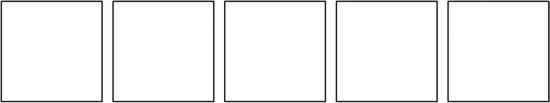
Figure 7-4. The flexbox is horizontal by default and lays our div elements out nicely
The flexbox value is lightweight and easy to define and you’ll find great uses for it all over the place once you start looking.
The flexbox in Figure 7-4 did not have a size specified, so it just conformed to the size of its contents. Note in Listing 7-5, how the contents are laid out when we add width and height properties (and add a border for visibility) to the flexbox.
Listing 7-5. Adding some dimensions and a border to the flexbox
<!-- HTML snippet -->
<div id="flexbox">
    <div></div>
    <div></div>
    <div></div>
    <div></div>
    <div></div>
</div>

/* CSS snippet */
#flexbox {
    display: -ms-flexbox;
    width: 800px;
    height: 300px;
    border: 3px solid lightgray;
}

#flexbox > div {
    border: 1px solid black;
    width: 100px;
    height: 100px;
    margin: 5px;
}
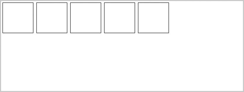
Figure 7-5. The child elements are all aligned to the top and left by default
The contents take the top and the left. All of the functionality that you see so far only involves a single flexbox-related property: the display: -ms-flexbox. The layout is being controlled by a number of default values. Let me bring those to light.
First, the direction property is defaulted to row, and that’s why the contents are laid out horizontally. Also, the pack and align properties are defaulted to start which puts the contents in the upper-left corner of the flexbox. We can get creative with these properties, however, and really control how these boxes behave.
In Listing 7-6, we set the pack of the flexbox to distribute. We also change the width and height of the boxes to be minimums and set them free to grow. The default value for the items to align property is stretch. Remember that the pack is the spacing along the direction of layout—horizontal in this case, and align is the spacing perpendicular to the direction of layout—vertical in this case.
Listing 7-6. Packing is set to distribute and alignment will adopt its default value of stretch
<!-- HTML snippet -->
<div id="flexbox">
    <div></div>
    <div></div>
    <div></div>
    <div></div>
    <div></div>
</div>

/* CSS snippet */
#flexbox {
    display: -ms-flexbox;
    -ms-flex-pack: distribute;
    width: 800px;
    height: 300px;
    border: 3px solid lightgray;
}

#flexbox > div {
    border: 1px solid black;
    min-width: 100px;
    min-height: 100px;
    margin: 5px;
}
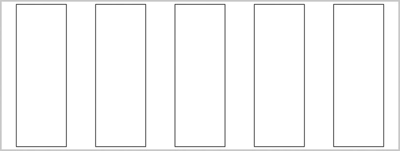
Figure 7-6. The child elements are spaced out evenly and stretch vertically to fill their container
Never before have we seen such simple control over item layout in HTML, and it doesn’t end here.
These elements have all been stretched to be the same height, but if they weren’t, then our align property would be able to handle many different configurations for lining them up.
Besides the alignment (-ms-flex-align) and packing (-ms-flex-pack) control, we also have some say in how the items flex. Flexing happens along the direction of layout and is the expanding or shrinking of an item to fill the void space. The properties we’ve set so far have been at the flexbox level, but the flex properties work on the items themselves since they all may be different values.
In Listing 7-7, we’ve removed the min-width value from the items, instructed the second and fourth items (the even items) to flex with a relative value of two, and told the first, third, and fifth items (the odd items) to flex with a relative value of one. In the result in Figure 7-7, you can see that the items have done just as we’ve asked and adopted their relative width values to fill all space in the flexbox. Tremendous!
Listing 7-7. Instructing the child items to “flex” with different relative flex values
<!-- HTML snippet -->
<div id="flexbox">
    <div></div>
    <div></div>
    <div></div>
    <div></div>
    <div></div>
</div>

/* CSS snippet */
#flexbox {
    display: -ms-flexbox;
    width: 800px;
    height: 300px;
    border: 3px solid lightgray;
}

#flexbox > div {
    border: 1px solid black;
    min-height: 100px;
    margin: 5px;
}

    flexbox > div:nth-child(odd) {
        -ms-flex: 1;
    }

    #flexbox > div:nth-child(even) {
        -ms-flex: 2;
    }
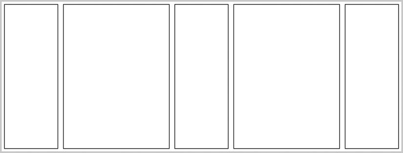
Figure 7-7. All items are flexing, but the even items are taking up twice the horizontal space
There’s one more flexbox talent that you should see before we move on to study the grid.
If a flexbox’s items do have explicit sizing and they overrun the flexbox, the flexbox handles them like any other div with overflow—by default it would show the overflow escaping its bounds. It would look something like Figure 7-8.
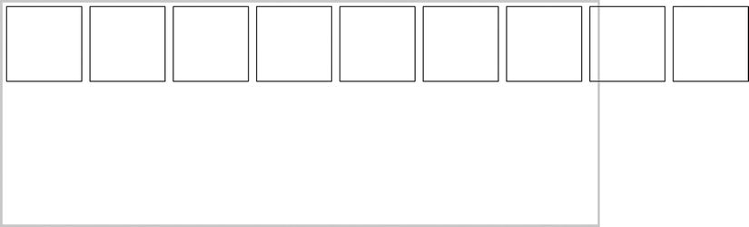
Figure 7-8. A flexbox with too many child items and no wrapping will overflow its bounds
Regular div elements allow us to hide or scroll the overflowing content, but a flexbox goes a step further and allows you to wrap the contents as you can see in Listing 7-8. Voila!
Listing 7-8. Add wrapping to the flexbox
<!-- HTML snippet -->
<div id="flexbox">
    <div></div>
    <div></div>
    <div></div>
    <div></div>
    <div></div>
    <div></div>
    <div></div>
    <div></div>
    <div></div>
</div>

/* CSS snippet */
#flexbox {
     display: -ms-flexbox;
     -ms-flex-wrap: wrap;
     width: 800px;
     height: 300px;
     border: 3px solid lightgray;
     -ms-flex-pack: start;
}

#flexbox > div {
    border: 1px solid black;
    width: 100px;
    height: 100px;
    margin: 5px;
}
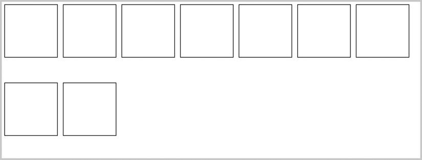
Figure 7-9. The items are wrapped to the next line
Using a Flexbox in a Windows 8 App
I’ve shown you technically what the various properties and features of a flexbox are, but I think it will help to see a flexbox in action in a Windows 8 app.
The goal in this example will be to create a container in which a single child item is in view and the subsequent child item is peeking in from the right, inviting the user to swipe to reveal it. Snap points should help the user bring the scroll position to exactly the next item. Flexboxes are very good at this scenario, so let’s see how we would implement this. Listing 7-9 shows a simple and effective solution that takes advantage of our friend the flexbox.
Listing 7-9. The complete HTML, CSS, and JavaScript to create a container with swipeable content
<!-- HTML snippet -->
<div class="swiper">
    <div>
        <h3>Lorem Ipsum</h3>
        <p>Lorem ipsum dolor sit amet, consectetur adipiscing. . .</p>
        <p>Donec dignissim tempor risus, in iaculis odio. . .</p>
    </div>
    <div>
        <h3>Maecenas velit</h3>
        <p>In hac habitasse platea dictumst. Quisque facilisis. . .</p>
        <p>Maecenas velit nisi, accumsan tempor tincidunt vel. . .</p>
    </div>
    <div>
        <h3>Nisl augue</h3>
        <p>Nulla rhoncus, nulla at convallis pretium, nisl augue. . .</p>
        <p>Donec tempor urna venenatis neque ornare congue. . .</p>
    </div>
</div>

/* CSS snippet */
.swiper {
    border:2px solid gray;
    display:-ms-flexbox;
    height:400px;
    width:600px;
    overflow-x:auto;
    -ms-scroll-snap-x:mandatory snapInterval(0%,80%);
}

.swiper > div {
    width: 80%;
    padding-left:40px;
    box-sizing: border-box;
    overflow-y:auto;
    margin-bottom:16px; /* room for vertical scrollbar */
    padding-right:16px; /* room for vertical scrollbar */
}

.swiper > div:last-child {
    width:100%;
}
This solution in Listing 7-9 does demand an explanation.
First, the HTML defines a simple div element with three child div elements, each containing its own content. The containing div has been assigned a class of swiper. Using a class to add this functionality is a smart way to do it because it means it will be simple to add this functionality to any element we wish by simply adding the class.
The first style rule targets elements with that swiper class. For this rule, we use the all-important display:-ms-flexbox; property. This property alone sets up all of the child elements to layout next to one another. The border and height and width properties are somewhat arbitrary and just used for visibility. The last two properties are important, though.
The overflow-x:auto; property sets the element to scroll horizontally if its content is wider than the container. The last property, -ms-scroll-snap-x:mandatory snapInterval(0%,80%);, is responsible for halting the user’s pan gestures at sensible increments, namely when an item’s edge is at the left side of the container. Notice that the second parameter to the snapInterval in that property value is 80%. The reason for that will be clear after seeing the determined width of child elements in the next style rule.
The next style rule’s selector is .swiper > div. You’ll recognize the child combinatory which makes the style rule that uses this selector target every div element that is a direct child of an element with a class of swiper.
The children of the flexbox should be 80% wide (and should match the value of the -ms-scroll-snap property of the containing element. This allows 20% of the content of the next child item to “peek” into the frame eluding to content to come and inviting the user to request it. Furthermore, each child should have 40 pixels of padding on the left side to separate them from each other, but that 80% width we selected should use a box-sizing value of border-box to include the padding value with the overall width.
It’s not ideal to allow any of the child items to overflow vertically. Doing so opens the user up to getting confused between the two different scroll directions. Nevertheless, the overflow-y: auto; property will assure that if content does get too tall at least it won’t spill over the bottom, but will render a scroll bar instead.
The last two properties for that rule provide bottom margin and right padding to allow room for the scroll bars to render without covering up the content.
The last style rule is a simple one that only states that the last child should not be 80% wide, but rather 100%. Without this property applying to the last child, the mandatory snap points will not allow you to navigate to the last element.
You can see the results of this code in Figure 7-10, but better yet you should explore the behavior of this solution by looking at the source code.
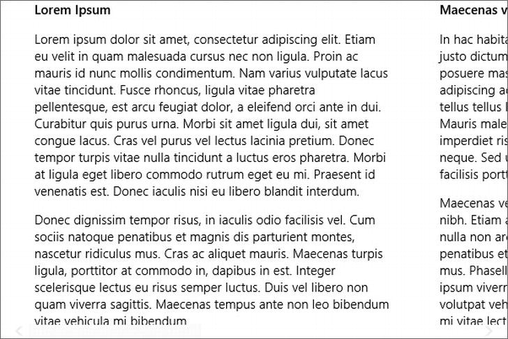
Figure 7-10. Subsequent content is available to the right and makes itself known by showing just a teaser
The flexbox is an exciting addition to the CSS family, but its primary function involves laying out data that should flow, flex, or form to the space it’s allotted. To take a bit more structured approach, take a look at the new CSS grid.
Grid
The grid serves a very different purpose than the flexbox. The flexbox would help you make a list of products for a catalog as an example, but the grid would layout your whole UI and strongly contribute to its adaptability as well.
An element is turned into a grid by simply adding the display property to it with a value of -ms-grid. Look at what happens to the stack of div elements in Listing 7-10 when the only change we make is to direct their parent to be a grid.
Listing 7-10. Set a div to have a display value of -ms-grid
<!-- HTML snippet -->
<div id="grid">
    <div id="a">A</div>
    <div id="b">B</div>
    <div id="c">C</div>
    <div id="d">D</div>
</div>

/* CSS snippet */
#grid {
    display: -ms-grid;
    width: 800px;
    height: 300px;
    border: 3px solid lightgray;
}

#grid > div {
    border: 1px solid black;
    width: 100px;
    height: 100px;
    margin: 5px;
}
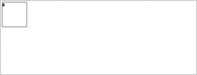
Figure 7-11. The child items are stacked one on top of another
That seems a little odd at first. All of the items are stacked right on top of each other. It doesn’t seem like much of a layout tool yet. To remedy this, we should also define some rows and columns. Listing 7-11 does just that, defining a simple two by two grid so that each of our boxes can have its own space. Besides defining the rows, however, we also have to tell each element which row and column it belongs in. Any child elements of a grid that are not assigned a row or column take the default value of 1 and show up in the first row or column.
Listing 7-11. Add column and row assignments for each child item
<!-- HTML snippet -->
<div id="grid">
    <div id="a">A</div>
    <div id="b">B</div>
    <div id="c">C</div>
    <div id="d">D</div>
</div>

/* CSS snippet */
#grid {
    display: -ms-grid;
    -ms-grid-rows: 1fr 1fr;
    -ms-grid-columns: 1fr 1fr;
    width: 800px;
    height: 300px;
    border: 3px solid lightgray;
}

#grid > div {
    border: 1px solid black;
    width: 100px;
    height: 100px;
    margin: 5px;
}

#a { -ms-grid-row: 1; -ms-grid-column: 1; }
#b { -ms-grid-row: 1; -ms-grid-column: 2; }
#c { -ms-grid-row: 2; -ms-grid-column: 1; }
#d { -ms-grid-row: 2; -ms-grid-column: 2; }
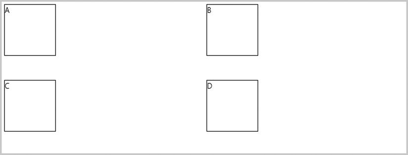
Figure 7-12. The child items go to their assigned cells
The rows for the grid have been defined as 1fr 1fr. This is a space-delimited list of the row height for all rows. In this case, we employ the fr unit designator, which stands for fraction. If all rows are given a fractional value of 1, then each will be granted an equal part of the available grid height.
It is also possible to define some rows to have an absolute height, in which case the fractional values determine each row’s part of the total height minus all absolute value definitions. A grid row definition of 100px 1fr 100px would create a grid with a 100-pixel row on the top and bottom with the remaining space given to the middle row.
The fractional parts apply to the fraction of the remaining space after all of the absolute lengths are applied. For example, a 1000-pixel wide grid with a column value of 200px 1fr 3fr would get a column of 200 pixels (absolutely defined) plus a column of 200 pixels (1/4 of the remaining 800 pixels) plus a column of 600 pixels (3/4 of the remaining 800 pixels).
Let’s say now that we want to define an app layout that includes a fixed header, some fixed space on the left, and then the remaining space divided equally in half (vertically). Take a look at Listing 7-12 to see how this would be done.
Listing 7-12. Set up an app layout using a grid
<!-- HTML snippet -->
<div id="grid">
    <div id="header">header</div>
    <div id="left">left</div>
    <div id="firstHalf">first half</div>
    <div id="secondHalf">second half</div>
</div>

/* CSS snippet */
#grid {
    display: -ms-grid;
    -ms-grid-rows: 120px 1fr;
    -ms-grid-columns: 120px 1fr 1fr;
    width: 1000px;
    height: 540px;
    border: 3px solid lightgray;
}

#grid > div {
    border: 1px solid black;
    margin: 5px;
    padding: 10px;
}

#header { -ms-grid-row: 1; -ms-grid-column: 1; }
#left { -ms-grid-row: 2; -ms-grid-column: 1; }
#firstHalf { -ms-grid-row: 2; -ms-grid-column: 2; }
#secondHalf { -ms-grid-row: 2; -ms-grid-column: 3; }
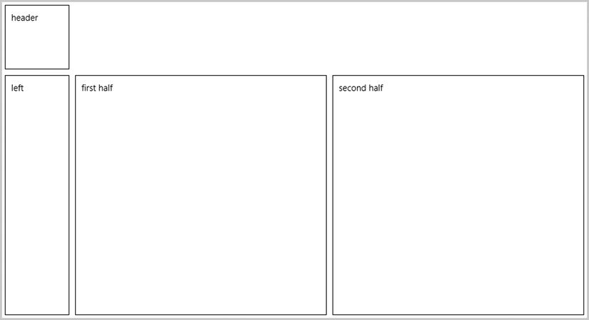
Figure 7-13. The layout is implemented with just one small problem
That layout looks pretty good, but we’ve got one small problem: the header item is only taking the first column. Another way the grid resembles its old table ancestor is in its ability to span rows or columns. In the previous example, we added a split in our main content session, but likely we would not want that to affect our header. The solution in Listing 7-13 simply defines our #header element to span three columns taking up the entire top of the layout. These span definitions apply to individual grid children, so it’s perfectly valid to instruct one element to land in a single cell and another to span multiple. This is a considerable advantage over tables.
Listing 7-13. Add cell spanning to the header child item
<!-- HTML snippet -->
<div id="grid">
    <div id="header">header</div>
    <div id="left">left</div>
    <div id="firstHalf">first half</div>
    <div id="secondHalf">second half</div>
</div>

/* CSS snippet */
#grid {
    display: -ms-grid;
    -ms-grid-rows: 120px 1fr;
    -ms-grid-columns: 120px 1fr 1fr;
    width: 1000px;
    height: 540px;
    border: 3px solid lightgray;
}

#grid > div {
    border: 1px solid black;
    margin: 5px;
    padding: 10px;
}

#header { -ms-grid-row: 1; -ms-grid-column: 1;-ms-grid-column-span: 3; }
#left { -ms-grid-row: 2; -ms-grid-column: 1; }
#firstHalf { -ms-grid-row: 2; -ms-grid-column: 2; }
#secondHalf { -ms-grid-row: 2; -ms-grid-column: 3; }
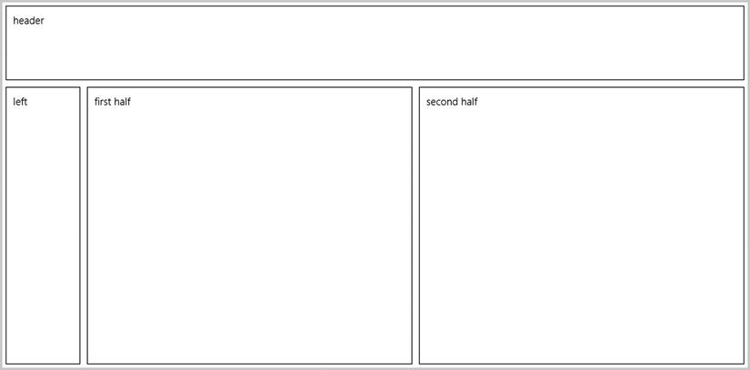
Figure 7-14. The header spans three columns and takes up the entire top of our app layout
Using a Grid in a Windows 8 App
Just like we did with the flexbox, we’ll look at an example of using a grid in a real live Windows 8 app.
Let’s imagine we’re displaying a user’s profile which includes his mug shot and a number of areas of information about him that form a layout something like what you see in Figure 7-15.
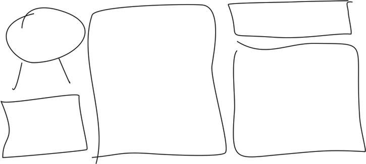
Figure 7-15. A rough depiction of the desired profile layout
This is a perfect candidate for a CSS grid. First, notice that our layout is arranged already into three columns. Next, notice that although our content does not form nice rows, we can achieve the same affect using three rows and then doing some spanning.
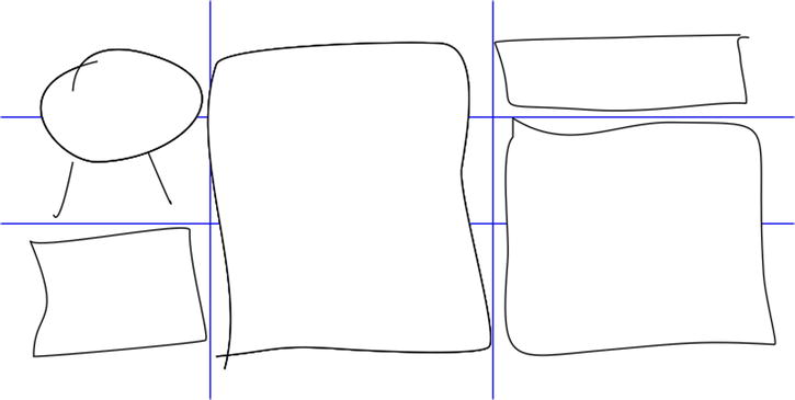
Figure 7-16. The profile layout with some overlaid lines depicting how our grid should be setup
Now let’s dive into the solution.
Listing 7-14. A grid is defined and individual elements are placed and spanned accordingly
<!-- HTML snippet -->
<div class="profile">
    <div class="image">image</div>
    <div class="section1">section 1</div>
    <div class="section2">section 2</div>
    <div class="section3">section 3</div>
    <div class="section4">section 4</div>
</div>

/* CSS snippet */
.profile {
    display:-ms-grid;
    width:1025px;
    height:576px;
    -ms-grid-columns: 7fr 14fr 9fr;
    -ms-grid-rows: 120px 2fr 3fr;
}

.profile > div {
    border: 1px solid black;
    margin: 5px;
    padding: 5px;
    font-size:x-large;
}

.image {
    -ms-grid-row-span: 2;
}

.section1 {
    -ms-grid-row: 3;
}

.section2 {
    -ms-grid-column: 2;
    -ms-grid-row-span: 3;
}

.section3 {
    -ms-grid-column: 3;
}

.section4 {
    -ms-grid-column: 3;
    -ms-grid-row: 2;
    -ms-grid-row-span: 2;
}
Figure 7-17 is the result and is roughly equivalent to the initial diagram. I hope this convinces you that custom layouts for your Windows 8 views are easy to achieve using the CSS grid functionality.
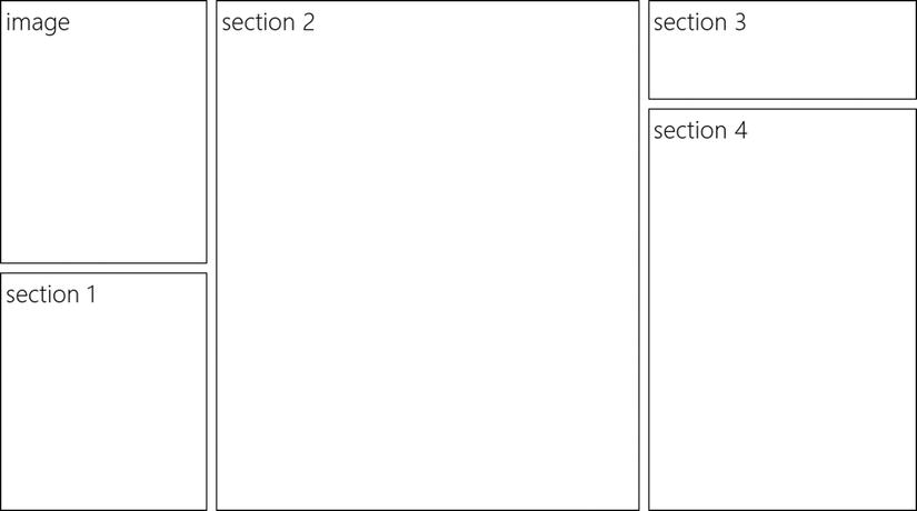
Figure 7-17. The end result looks much like the profile layout we were after
We’ve covered the legacy and modern layout implements offered to us by CSS, but when you’re working on a Windows 8 app, you have the Windows Library for JavaScript (WinJS) available and you’re provided some more modern layout control by WinJS. Even though they’re not CSS properties, they’re worth having a look at in the context of this book.
The first is the WinJS.UI.ViewBox. The ViewBox is a control that you can add content to when you want that content to scale automatically to changes in the app’s view state. If an app is running on a tablet, for instance, it might be rotated to a portrait orientation, and in that case, it may be desirable to scale up or down the content within. I’m not talking about a re-rendering of its contents based on new dimensions. I’m talking about a straight scaling of the content exactly as it would have been rendered before the intervention of the ViewBox.
This scaling is made possible thanks to the scaling and translate transform functions that we already learned in Chapter 6. The ViewBox is happy to apply this effect for you, and the only thing it asks is that you give it no more than a single child item. This doesn’t turn out to be much of a problem since even if you do have multiple child items all you really have to do is wrap them in a container like a simple div.
The ViewBox fits the child item without changing its aspect ratio as you can see in Figure 7-18. In a landscape orientation the height will constrain the child’s size and in a portrait orientation the width will be the constraint.
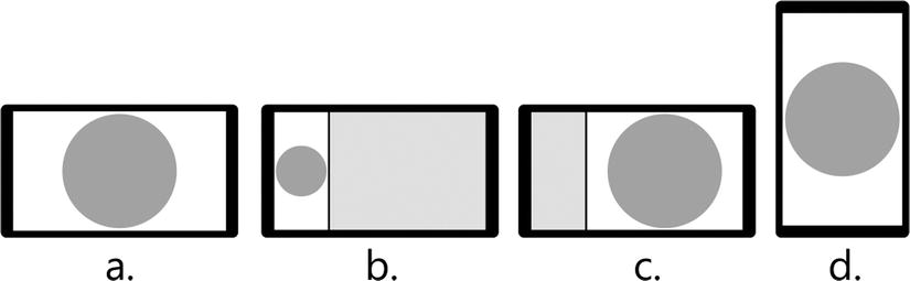
Figure 7-18. How a simple shape would be rendered in a ViewBox in the full (a), snapped (b), fill (c), and portrait (d) view states
Another WinJS provision on the topic of content layout is the very powerful WinJS.UI.ListView control. It’s very common to list things out in an app. We’re accustomed to seeing lists of friends, lists of stock prices, and lists of our email. These cases are covered well by the ListView, which is capable of laying out items as a grid with multiple rows and columns or as a vertical or horizontal list. The ListView has a few advantages over the more primitive flexboxes and grids, including but not limited to:
- Item selection
- Data binding to synchronous or asynchronous data sources
- Asymmetrical, cell-spanning layout
- Item grouping
- Custom render functions
Listing 7-15 shows the most basic ListView which is bound to the numbers one through eleven. Notice how a grid is used in the item template so that its contents can be centered horizontally and vertically.
Listing 7-15. The HTML, CSS, and JavaScript for implementing a ListView
<!-- HTML snippet -->
<div id="list" data-win-control="WinJS.UI.ListView"></div>
<div id="template" data-win-control="WinJS.Binding.Template">
    <div>
        <img data-win-bind="src:imageUrl" />
        <div data-win-bind="innerText:name"></div>
    </div>
</div>

/* CSS snippet */
.win-listview {
    height: 100%;
}

.win-listview .win-item .grid {
    display:-ms-grid;
    -ms-grid-rows:160px;
    -ms-grid-columns:160px;
    background-color:gray;
    color:white;
}

.win-listview .win-item .grid div {
    font-size: 36px;
    font-weight: bold;
    -ms-grid-column-align: center;
    -ms-grid-row-align: center;
}

// JavaScript snippet
var numbersList = new WinJS.Binding.List();

var list = document.getElementById("list").winControl;
list.itemTemplate = document.getElementById("template");
list.itemDataSource = numbersList.dataSource;

for (var i = 1; i <= 14; i++) {
    numbersList.push(i);
}
You may wonder if the ListView control itself uses a grid or a flexbox for its implementation, but actually it uses neither. The ListView is responsible for so many cases and combinations, that a bit more control was necessary, so it is implemented with custom positioning properties.
In Chapter 9, we will talk more about the ListView and learn how to target all of its individual components using CSS styling rules.
In Figure 7-19, you see a very basic ListView, but the ListView is capable of a lot of extended functionality including the grouping of items. In this case, headers are rendered above each group of items and the developer must provide a header template to define how that header should look.
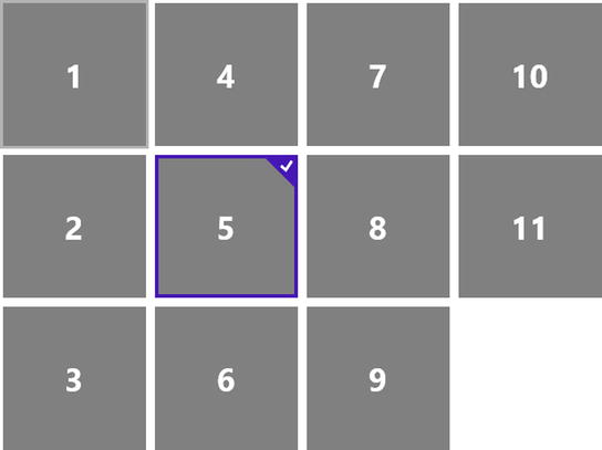
Figure 7-19. The ListView is implemented and a single item is selected for effect
Listing 7-16 starts with the same ListView from Listing 7-15, and then adds the header template and the JavaScript code necessary to do a simple grouping.
Listing 7-16. Add HTML and JavaScript to implement grouping on the ListView
<!-- HTML snippet -->
<div id="list" data-win-control="WinJS.UI.ListView"></div>
<div id="template" data-win-control="WinJS.Binding.Template">
    <div class="grid">
        <div data-win-bind="innerText:this"></div>
    </div>
</div>
<div id="headerTemplate" data-win-control="WinJS.Binding.Template">
    <h2 data-win-bind="innerText:this"></h2>
</div>

/* CSS snippet */
.win-listview {
    height: 100%;
}

.win-listview .win-item .grid {
    display:-ms-grid;
    -ms-grid-rows:160px;
    -ms-grid-columns:160px;
    background-color:gray;
    color:white;
}

.win-listview .win-item .grid div {
    font-size: 36px;
    font-weight: bold;
    -ms-grid-column-align: center;
    -ms-grid-row-align: center;
}

// JavaScript snippet
var numbersList = new WinJS.Binding.List().createGrouped(
    function(n) { return (n % 2 == 0 ? "even" : "odd"); },
    function(n) { return (n % 2 == 0 ? "even" : "odd"); }
) ;

var list = document.querySelector("#list").winControl;
list.itemTemplate = document.querySelector("#template");
list.itemDataSource = numbersList.dataSource;
list.itemHeaderTemplate = document.querySelector(“.lst0714 #headerTemplate”);
list.groupDataSource = numbersList.groups.dataSource;

for (var i = 1; i <= 11; i++) {
    numbersList.push(i);
}
As you can see in Figure 7-20, the even and odd numbered items are separated into different groups and the h2 element that we defined in our header template is announcing which is which. A couple of items have been selected for effect.
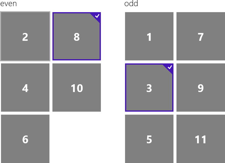
Figure 7-20. The ListView items are grouped by even and odd values
So far we’ve seen two ListViews that have symmetrically sized items, but it is possible to allow items to expand as long as they are even multiples of the smallest tile size in both width and height (plus the margin). The tiles in Listing 7-15 and Listing 7-16 are 160 pixels wide and high. A larger tile (expanded both in width and height) would be 330 pixels—160 times 2 plus the 10-pixel margin. We have to not only set some of our items to a new size, but we also must add a groupInfo function to our list’s layout. Listing 7-17 implements an asymmetrical ListView completely.
Listing 7-17. The ListView is upgraded to allow cell spanning
<!-- HTML snippet -->
<div id="list" data-win-control="WinJS.UI.ListView"></div>
<div id="template" data-win-control="WinJS.Binding.Template">
    <divdata-win-bind="className:size;" >
        <div data-win-bind="innerText:number" class="number"></div>
    </div>
</div>

/* CSS snippet */
.win-listview {
    height: 100%;
}

.normal {
    display:-ms-grid;
    -ms-grid-rows:160px;
    -ms-grid-columns:160px;
    background-color:gray;
    color:white;
}

.oversized {
    display:-ms-grid;
    -ms-grid-rows:330px;
    -ms-grid-columns:330px;
    background-color:gray;
    color:white;
}

.number {
    font-size: 36px;
    font-weight: bold;
    -ms-grid-column-align: center;
    -ms-grid-row-align: center;
}

// JavaScript snippet
var numbersList = new WinJS.Binding.List();

var list = document.querySelector(".lst0715 #list").winControl;
list.itemTemplate = document.querySelector(".lst0715 #template");
list.itemDataSource = numbersList.dataSource;
list.layout.groupInfo = function () {
    return { enableCellSpanning: true, cellWidth: 160, cellHeight: 160 };
};

for (var i = 1; i <= 11; i++) {
    numbersList.push({ number: i, size:calculateSize(i) });
}
function calculateSize(n) { return (n == 1 ? "oversized" : "normal"); }
Notice in Figure 7-21 that the second and third tiles were displaced by the first, but all of the slots were filled. If varying sized items are added to the ListView in the wrong order, it is possible to get gaps in the layout. It may be necessary to add some logic that assures the order in which items are added according to their size.
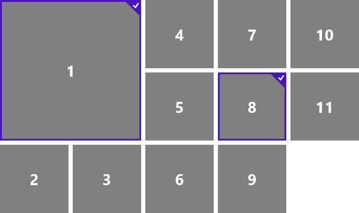
Figure 7-21. The ListView items are assymetrical with the first item being larger than the others
When the contents of an element overflow the bounds of the element and the element’s overflow property is set to auto or scroll, a scrollbar will be rendered and the user will be able to use the mouse or touch to scroll. It’s an old solution to the problem of having more content than we have screen.
Most of the control over how a container scrolls has traditionally been left up to the user agent, but some Microsoft vendor-specific properties give the app author some say in the matter. We’ll have say over the scrolling limits, rails, snap points, and over a behavior called chaining. We’ll look at each of these now.
Limits
The distance that a container has been scrolled is controlled by the scrollLeft DOM property and it is possible to set minimum and maximum values for this property and thus constrain the scrolling of a container by setting the -ms-scroll-limit-* properties.
Limit Properties
Let’s look at some limit properties.
-ms-scroll-limit-x-min and -ms-scroll-limit-y-min
Specify a length value for these properties to constrain a container’s minimum scrolling distance in the horizontal and vertical directions respectively. An -ms-scroll-limit-x-min value of 100px, for example, will cause a container to start out already scrolled 100 pixels and make it impossible to scroll left from there.
-ms-scroll-limit-x-max and -ms-scroll-limit-y-max
The maximum value determines how far from the start of content a user can scroll within a container. An -ms-scroll-limit-x-max value of 500px would make it impossible to scroll beyond 500 pixels from the start of the container’s content.
This shorthand property is available to set the -ms-scroll-limit-x-min, -ms-scroll-limit-y-min, -ms-scroll-limit-x-max, -ms-scroll-limit-y-max all at once.
I generally recommend using shorthand properties where you can because CSS can get awfully long sometimes and using a shorthand property is an opportunity to be a bit more concise.
Rails
The scroll properties also facilitate control over a behavior of scrolling known in Microsoft terminology as rails. When scrolling is in rails mode, the direction that content scrolls is locked to the first axis the user started scrolling in. If the user started scrolling down, then rails mode will allow scrolling along the vertical axis, but disallow it along the horizontal. When rails mode is off, a user can freely scroll in either direction.
The reason rails mode exists at all is because it is a common for a user browsing a web page to read a long vertical column of text and want to keep the horizontal scrolling position constant to maintain orientation. The rails behavior attempts to predict based on the user’s initial scroll direction whether this constraint should take effect. If a user scrolls vertically then scrolling will be locked to the y-axis. If the user scrolls horizontally then scrolling will be locked to the x-axis. If the user scrolls in any diagonal direction then scrolling will be free-form and the user will be allowed to scroll on either axis.
The sole property for giving your content rails is -ms-scroll-rails. The values are either none or railed and the default is railed.
Sometimes the content is entirely linear and should scroll smoothly from beginning to end stopping wherever the user stops it, but other times the content is arranged in digital units or sections and it makes more sense to help the user land so that the beginning of the next section snaps to the start of the container. These points are called snap points.
Microsoft has implemented snap points in its browser engine, though they do not exist in the CSS standard. This is why the related properties have the vendor-specific prefix.
You can define snap points in one of two ways: mandatory or proximity.
Defining a container to use mandatory snap points means that it will always stop at the nearest snap point. It will never stop somewhere in between. Defining it to use proximity snap points, however, means that if it ends up close enough to a snap point then it will find its way there, but if it’s not close enough then it will concede to coming to rest between points.
Snap Point Properties
Let’s look at some snap point properties.
-ms-scroll-snap-points-x and -ms-scroll-snap-points-y
The snap points are defined using one of two functions: snapInterval() or snapList().
The snapInterval() function takes a start length and a snap length. Passing in 0px and 100px will create snap points every 100 pixels starting at 0. Use snapInterval when your content is repeating and regular and you can predict the width.
The snapList() function is a better choice when content is not regular. You define snap points manually as parameters. So snapList(0px,200px,500px) will set snap points at 0, 200, and 500 pixels even though those obviously are not regular intervals.
The -ms-scroll-snap-type property gives the developer a chance to choose between proximity snap points and mandatory snap points. A value of proximity will snap to a snap point if the users panning action is going to come to a rest near that point, whereas a value of mandatory will never stop between two snap points.
-ms-scroll-snap-x and -ms-scroll-snap-y
The -ms-scroll-snap-x and -ms-scroll-snap-y properties are shorthand properties that encapsulate both the snap points and the type.
Look back at Listing 7-9 and notice that it is the -ms-scroll-snap-x snap point that is being used to set the points and the type at the same time. That property was -ms-scroll-snap-x:mandatory snapInterval(0%,80%), and it would require that the panning come to rest only at some increment of 80% of the flexbox’s width.
Chaining
Scroll chaining is the behavior of passing the user’s scroll gesture from a child container up to its parent container when the child has reached the end of its content. If you have, for instance a horizontally panning list view placed on a page that is capable of panning horizontally and the user touches the ListView and slides horizontally, the gesture will be recognized at the ListView level and it will pan its contents. Once the ListView runs out of content and reaches its limit, however, the same slide gesture will continue panning the overall page. The -ms-scroll-chaining property is the one responsible for this behavior. The default value of none will not pass the scrolling gesture to the parent, but will instead simply show a bounce animation to indicate the edge of the content. The value must instead be set to chained to get the chaining behavior.
We’ve covered a lot of content on the subject of layout. We looked at a couple of legacy methods for laying out content on the web, and then we looked at some exciting, modern alternatives.
The first legacy method we looked at was layout via tables. Tables are great for showing tabular data, but not a good idea for laying out your app. They’re unsuitable because being defined in your HTML markup makes them rigid and difficult to manipulate at run time. We also looked at using display and positioning properties on standard div elements for layout. This is a decent and rather popular strategy, but it has its pain points and easier and more expressive modern options exist now.
The modern layout techniques we’ve discussed are the CSS flexbox and grid, but we also looked at some controls available in a Windows 8 app by way of the WinJS JavaScript library called the ViewBox and the ListView that do some very helpful layout work for us.
I like to generalize that the flexbox flows its children and the grid places its children. The flexbox lets you easily lay out a few elements to create horizontal or vertical lists of content. Within the list, individual items can be packed, aligned, and sized to handle their space as the design dictates. The grid lets you create a framework within which it’s very easy to place children. Items can be place anywhere within the grid relative to any of the cells formed by the grid’s structure.
The ViewBox and ListView—the two WinJS layout implements that we explored—are native Windows 8 controls and not available (as they exist anyway) to the development of public websites. The ViewBox responds to changes in the users’ view state such as when the user rotates their tablet to a portrait orientation. It then applies CSS transforms to its contents to translate and scale them to fit. The ListView is the ultimate tool for laying out lists of data items. It facilitates item selection, sorting, grouping, and a whole lot more.
An app’s layout is the foundation of its design and its function, but web developers have traditionally had a relatively difficult time performing such a simple task as placing visual elements where they want. The Windows 8 implementation of the very latest CSS standards, however, provide some awesome functionality that will certainly ease this pain.
In Chapters 8, 9, and 10, we’ll look at a higher level view of the collections of style rules in the built-in WinJS library and our own homemade style sheets. We’ll also look at applying these rules to our app as well overriding and extending them to make them our own.
So shift gears with me and let’s keep cruising!