
![]()
Chapter 6 explored using time series charts to look at defect data over time, and this chapter looks at bar charts, which display ordinal or ranked data relative to a specific data set. They usually consist of an x- and y-axis, and have bars or colored rectangles to indicate values of categories.
William Playfair created the bar chart in the first edition of The Commercial and Political Atlas in 1786 to show Scotland’s import and export data to and from different parts of the world (see Figure 7-1). He created it out of necessity; the other charts in the atlas were time series charts demonstrating hundreds of years’ worth of trade data, but for Scotland there was only 1 years’ worth of data. While using the time series chart, Playfair saw it as an inferior visualization; a compromise with resources on hand because it “does not comprehend any portion of time, and it is much inferior in utility to those that do” (Playfair, 1786, p. 101).
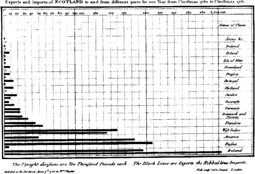
Figure 7-1. William Playfair’s bar chart showing Scotland’s import and export data
Playfair initially thought so little of his invention that he didn’t bother to include it in the subsequent second and third editions of the atlas. He went on to envision a different way to show parts of a whole; in doing so, he invented the pie chart for his Statistical Breviary published in 1801.
The bar chart is a great way to demonstrate ranked data not only because bars are a clear way to show differences in value but the pattern can also be extended to include more data points by using different types of bar charts such as stacked bar charts and grouped bar charts.
Standard Bar Chart
Let’s take data that you are already familiar with: the bugsBySeverity data from the last chapter:
> bugsBySeverity

              Blocker  Critical  Minor
  01-04-2013        0         0      2
  01-08-2013        1         0      3
  01-09-2013        3         0      2
You can create a new list with a sum of each bug type and visualize the totals in a bar chart like so:
totalBugsBySeverity <- c(sum(bugsBySeverity[,1]), sum(bugsBySeverity[,2]), sum(bugsBySeverity[,3]))
barplot(totalBugsBySeverity, main="Total Bugs by Severity")
axis(1, at=1: length(totalBugsBySeverity), lab=c("Blocker", "Critical", "Minor"))
This code produces the chart shown in Figure 7-2.
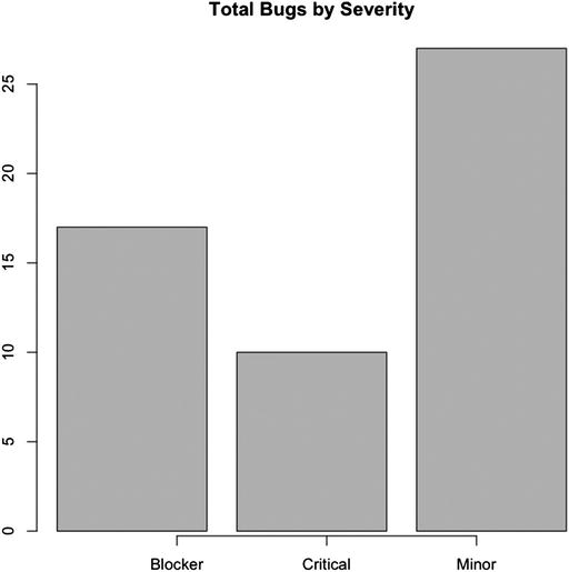
Figure 7-2. Bar chart of bugs by severity
Stacked Bar Chart
Stacked bar charts allow us to show subsections or segments within categories. Suppose you use the bugsBySeverity time series data and want to look at the breakdown of the criticality of the new bugs opened each day:
> t(bugsBySeverity)
            01-04-2013 01-08-2013 01-09-2013 01-10-2013
   Blocker           0          1          3          1
   Critical          0          0          0          0
   Minor             2          3          2          2
You can represent the following data with a stacked bar chart, as shown in Figure 7-3:
barplot(t(bugsBySeverity), col=c("#CCCCCC", "#666666", "#AAAAAA"))
legend("topleft", inset=.01, title="Legend", c("Blocker", "Criticals", "Minors"), fill=c("#CCCCCC", "#666666", "#AAAAAA"))
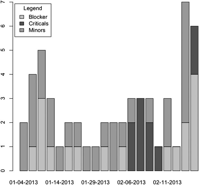
Figure 7-3. Stacked bar chart of bugs by severity and date
The total bugs are represented by the full height of the bar, and the colored segments of each bar represent the criticality of the bugs. On January 4th, there are two minor bugs; but the very next date has one blocker bug and three minor bugs, for a total of four bugs for that date. Stacked bar charts allow us to show nuance in our data.
Grouped Bar Chart
Grouped bar charts allow us to show the same nuance as stacked bar charts, but instead of placing the segments on top of each other, we split them into side-by-side groupings. Figure 7-4 shows that each date on the x-axis has three bars associated with it, one for each criticality category:
barplot(t(bugsBySeverity), beside=TRUE, col=c("#CCCCCC", "#666666", "#AAAAAA"))
legend("topleft", inset=.01, title="Legend", c("Blocker", "Criticals", "Minors"), fill=c("#CCCCCC", "#666666", "#AAAAAA"))
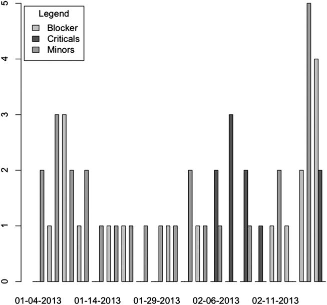
Figure 7-4. Grouped bar chart of bugs by severity and date
Visualizing and Analyzing Production Incidents
If you work on a product that gets used by someone—an end user, a consuming service, or even an internal customer—you most likely have experienced a production incident. Production incidents occur when some part of an application misbehaves for a user in production. It is very much like a bug, but it is a bug that is experienced and reported by your customer.
Just like bugs, production incidents are normal and expected results of software development. There are three main things to think about when talking about incidents:
- Severity, or how impactful is the error being reported: There is a big difference between a site outage and a small layout error.
- Frequency, or how often incidents are occurring or recurring: If your web app is riddled with issues, your customer experience, your brand, and your regular flow of work are all affected.
- Duration, or how long individual incidents linger: The longer they linger, the more customers are affected, and the worse the impact on your brand.
Handling production incidents is a big part of operationalizing your products and maturing your organization. Depending on how severe the incidents are, they can be disruptive to your regular body of work; the team might need to stop everything and work on a fix for the issue. Lesser-priority items can be queued and introduced to the regular body of work alongside regular feature work.
Just as important as handling production incidents is being able to analyze trends in production incidents to identify problem areas. Problem areas are usually features or sections that have frequent issues in production. Once we have identified problem areas, we can do root cause analysis and potentially start to build proactive scaffolding around these areas.
![]() Note Proactive scaffolding is a term I have coined that describes building fail-overs or additional safety rails to prevent issues in problem areas from recurring. Proactive scaffolding can be anything from detecting when users are close to capacity limits (such as the browser cookie limit, or application heap size and correcting before an issue happens), to noting performance issues with third-party assets and intercepting and optimizing them before they are presented to a client.
Note Proactive scaffolding is a term I have coined that describes building fail-overs or additional safety rails to prevent issues in problem areas from recurring. Proactive scaffolding can be anything from detecting when users are close to capacity limits (such as the browser cookie limit, or application heap size and correcting before an issue happens), to noting performance issues with third-party assets and intercepting and optimizing them before they are presented to a client.
Another interesting way to handle production incidents is how Heroku handles them: putting them up on a timeline along with a visualization of month-over-month uptime and making it publicly available. Heroku’s production incident timeline is available at https://status.heroku.com/; see Figure 7-5.
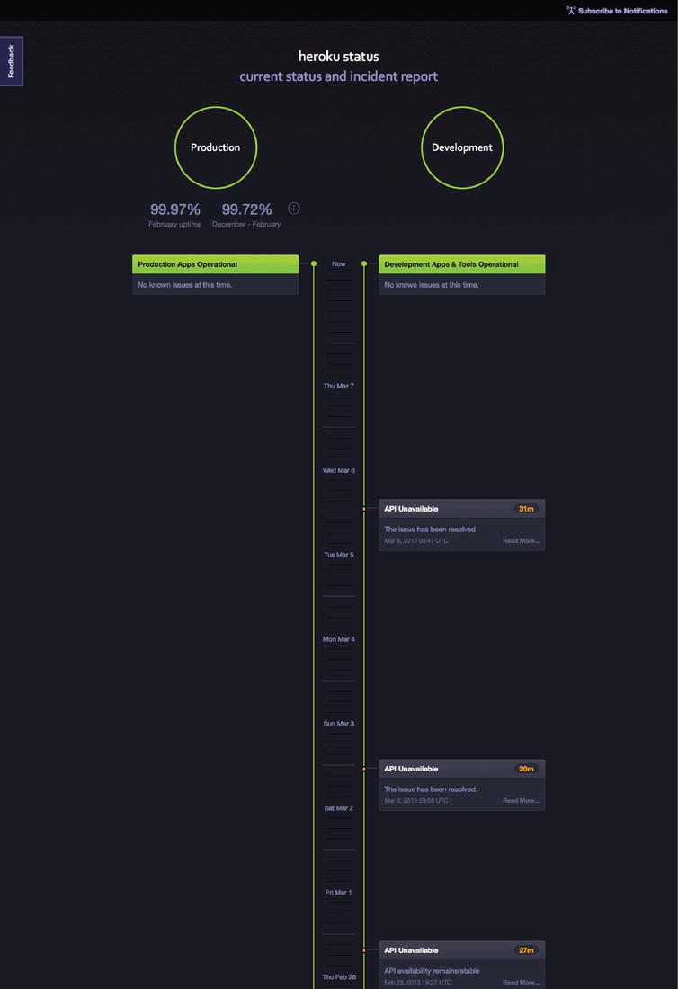
Figure 7-5. Heroku status page
Github also has a great status page that visualizes key metrics around their performance and uptime (see Figure 7-6).
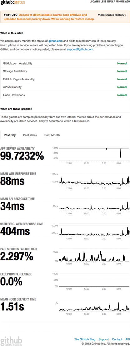
Figure 7-6. Github status page
For our purposes, this chapter uses bar charts to look at production incidents by feature to start to identify problem areas within our own products.
Plotting Data on a Bar Chart with R
If we want to plot out our production incidents, we must first get an export of the data, just as we needed to do for bugs. Because production incidents are generally single-hit items, companies usually use a range of methods to track them, from ticketing systems such as Jira (http://www.atlassian.com/software/jira/overview) to maintaining a spreadsheet of items. Whatever works—as long as we can retrieve the raw data. (Tom has made sample data available here: http://tom-barker.com/data/productionIncidents.txt.)
Once we have the raw data, it probably looks something like the following: a comma separated flat list with columns for an ID, a date stamp, and a description. There also should be a column that lists the feature or section of the application in which the incident occurred.
ID,DateOpened,DateClosed,Description,Feature,Severity
502,2013-03-09,2013-03-09,Site Down,Site,1
501,2013-03-07,2013-03-09,Videos Not Playing,Video,2
Let’s read the raw data into R and store it in a variable called prodData:
prodIncidentsFile <- '/Applications/MAMP/htdocs/productionIncidents.txt'
prodData <- read.table(prodIncidentsFile, sep=",", header=TRUE)
prodData
   ID DateOpened DateClosed  Description Feature Severity
1 502 2013-03-09 2013-03-09  Site Down    Site        1
2 501 2013-03-07 2013-03-09  Videos Not Playing Video 2
We want to group them by the Feature column so that we can chart feature totals. To do this, we use the aggregate() function in R. The aggregate() function takes an R object, a list to use as grouping elements, and a function to apply to the grouping elements. So suppose we call the aggregate() function, pass in the ID column as the R object, have it grouped by the Feature column, and have R get the length for each feature grouping:
prodIncidentByFeature <- aggregate(prodData$ID, by=list(Feature=prodData$Feature), FUN=length)
This code creates an object that looks like the following:
> prodIncidentByFeature
  Feature x
1    Cart 1
3 Logging 1
5    Site 1
2    Heap 3
4   Login 3
6   Video 5
We can then pass this object into the barplot() function to get the chart shown in Figure 7-7.
barplot(prodIncidentByFeature$x)
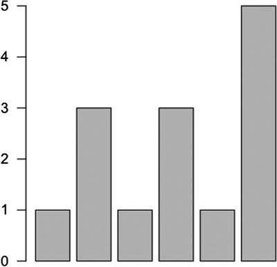
Figure 7-7. Beginning a bar chart
This is a nice start and does tell a story, but it’s not very descriptive. Besides the fact that the x-axis isn’t labeled, the problem areas are obscured by not ordering the results.
Ordering Results
Let’s use the order() function to order the results by the total count of each incident by feature:
prodIncidentByFeature <- prodIncidentByFeature[order(prodIncidentByFeature$x),]
We can then format the bar chart to highlight this ordering by layering the bars horizontally and rotating the text 90 degrees.
To rotate the text, we must change our graphical parameters using the par() function. Updating the graphical parameters has global implications, meaning that any chart that we create after updating inherits the changes, so we need to preserve the current settings and reset them after we create our bar chart. We store our current settings in a variable that we call opar:
opar <- par(no.readonly=TRUE)
![]() Note If you are following along in an R command line, the previous line by itself does not generate anything; it just sets graphical parameters.
Note If you are following along in an R command line, the previous line by itself does not generate anything; it just sets graphical parameters.
We then pass new parameters into the par() call. We can use the las parameter to format the axis. The las parameter accepts the following values:
par(las=1)
- 0 is the default behavior where the text is parallel to the axis
- 1 explicitly makes the text horizontal
- 2 makes the text perpendicular to the axis
- 3 explicitly makes the text vertical
We then call barplot() again, but this time pass in the parameter horiz=TRUE, to have R draw the bars horizontally instead of vertically:
barplot(prodIncidentByFeature$x, xlab="Number of Incidents", names.arg=prodIncidentByFeature$Feature,horiz=TRUE, space=1, cex.axis=0.6, cex.names=0.8, main="Production Incidents by Feature", col= "#CCCCCC")

And finally we restore the saved settings so that future charts don’t inherit this charts settings.

> par(opar)
This code produces the visualization shown in Figure 7-8.
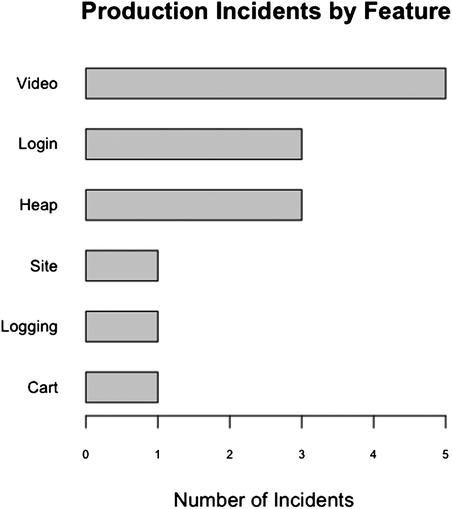
Figure 7-8. Bar chart of production incidents by feature
From this chart, you can see that the biggest problem area is video playback, followed by login and memory usage issues.
Creating a Stacked Bar Chart
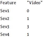
How severe are the issues around these features? Let’s next create a stacked bar chart to see the breakdown of severity for each production incident. To do that, we must create a table in which we break down our production incidents by feature and by severity. We can use the table() function for this, as we did for bugs in the last chapter:
prodIncidentByFeatureBySeverity <- table(factor(prodData$Feature),prodData$Severity)
This code creates a variable formatted as shown in Figure 7-9, with rows representing each feature and columns representing each level of severity:
> prodIncidentByFeatureBySeverity

          1 2 3 4
  Cart    1 0 0 0
  Heap    0 3 0 0
  Logging 0 0 0 1
  Login   0 3 0 0
  Site    1 0 0 0
  Video   0 1 3 1

opar <- par(no.readonly=TRUE)
par(las=1, mar=c(10,10,10,10))
barplot(t(prodIncidentByFeatureBySeverity), xlab="Number of Incidents", names.arg=rownames(prodIncidentByFeatureBySeverity), horiz=TRUE, space=1, cex.axis=0.6, cex.names=0.8, main="Production Incidents by Feature", col=c("#CCCCCC", "#666666", "#AAAAAA", "#333333"))
legend("bottomright", inset=.01, title="Legend", c("Sev1", "Sev2", "Sev3", "Sev4"), fill=c("#CCCCCC", "#666666", "#AAAAAA", "#333333"))
par(opar)
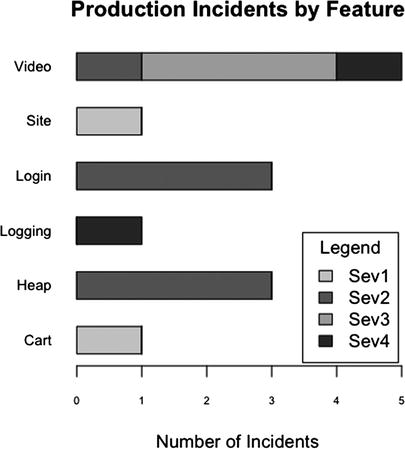
Figure 7-9. Stacked bar chart of production incidents by feature and by severity
Interesting! We lost our ordering, but that’s because we have a number of new data points to choose from. High-level aggregates are less relevant for this chart; more important is the breakdown of severity.
From this chart, you can see that although the video feature has the most number of production incidents, there also seems to be serious recurring issues with login and heap usage because they have the highest number of high severity production incidents—both have three Severity 2 incidents each. Site and login both had one Severity 1 issue each, but because they don’t seem to be recurring, there doesn’t look to be a problem area there, at least not that we can determine yet with the current sample size.
Bar Charts in D3
So now you know the benefits of having bar charts to aggregate data at a high level and of getting the granular breakdown that stacked bar charts can expose. Let’s switch gears and use D3 to see how to create a high–level bar chart that allows us to drill into each bar to see a granular representation of the data at runtime.
We start by creating a bar chart in D3 and then create a stacked bar chart. When our users mouse over the bar chart, we will overlay the stacked bar chart to show how the data is broken down in real time.
Creating a Vertical Bar Chart
Because we made a horizontal bar chart in D3 back in Chapter 4, we will now make a vertical bar chart. Following the same pattern that we established in previous chapters, we first create a base HTML skeletal structure that includes a link to the D3 library. We use the same base style rules that we used in the last chapter for body text and axis path, and an additional rule to color all elements within a bar class a dark grey:
<!DOCTYPE html>
<html>
<head>
<meta charset="utf-8">
<title></title>
<script src="d3.v3.js"></script>
<style type="text/css">
     body {
          font: 15px sans-serif;
     }
     .axis path{
          fill: none;
          stroke: #000;
          shape-rendering: crispEdges;
     }
     .bar {
          fill: #666666;
     }
</style>
</head>
<body></body>
</html>
Next, we create the script tag to hold all the charting code and the initial set of variables to hold the sizing information: the base height and width, D3 scale objects for the x- and y-coordinate information, an object to hold the margin information, and an adjusted height value that takes the top and bottom margins out of the total height:
<script>
var w = 960,
    h = 500,
    x = d3.scale.ordinal().rangeRoundBands([0, w]),
    y = d3.scale.linear().range([0, h]),
    z = d3.scale.ordinal().range(["lightpink", "darkgray", "lightblue"])
    margin = {top: 20, right: 20, bottom: 30, left: 40},
    adjustedHeight = 500 - margin.top - margin.bottom;
</script>
We next create the x-axis object. Remember from previous chapters that the axis is not yet drawn, so we need to call it later within the Scalable Vector Graphics (SVG) tag that we will create to draw the axis:
var xAxis = d3.svg.axis()
    .scale(x)
    .orient("bottom");
Let’s draw the SVG container to the page. This will be the parent container for everything else that we will draw to the page.
var svg = d3.select("body").append("svg")
    .attr("width", w)
    .attr("height", h)
  .append("g")
The next step is to read in the data. We will use the same data source as our R example: the flat file productionIncidents.txt. We can read this in using the d3.csv() function to read in and parse the file. Once the contents of the file are read in, they are stored in the variable data, but if any error occurs, we will store the error details in a variable that we call error.
d3.csv("productionIncidents.txt", function(error, data) {
}
Within the scope of this d3.csv() function is where we will put the majority of our remaining functionality because that functionality depends on having the data proceed.
Let’s aggregate the data by feature. To do this, we use the d3.nest() function and set the key to the Feature column:
nested_data = d3.nest()
     .key(function(d) { return d.Feature; })
     .entries(data);
This code creates an array of objects that looks like the following:
>>> nested_data
[Object {key="Site",  values=[1]},
     Object { key="Video",  values=[5]},
     Object { key="Cart",  values=[1]},
     Object { key="Logging",  values=[1]},
     Object { key="Login",  values=[3]},
     Object { key="Heap",  values=[3]}
]
Within this array, each object has a key that lists the feature and an array of objects that list each production incident. The objects should look like Figure 7-10.
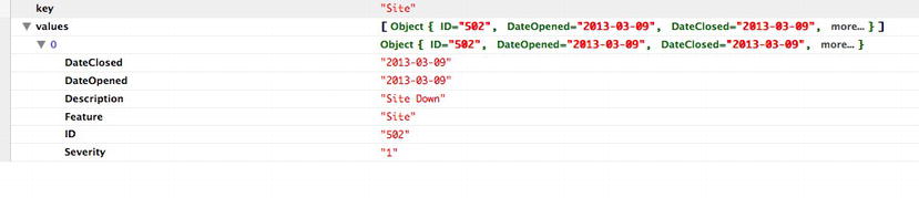
Figure 7-10. Inspecting the object in Firebug
We use this data structure to create the core bar chart. We make a function to do this:
function barchart(){
}
In this function, we set the transform attribute of the svg element, which sets the coordinates to contain the image that will be drawn. In this case, we constrain it to the margin left and top values:
svg.attr("transform", "translate(" + margin.left + "," + margin.top + ")");
We also create scale objects for the x- and y-axes. For bar charts, we generally use ordinal scales for the x-axis because they are used for discrete values such as categories. More information about ordinal scales in D3 can be found in the documentation at https://github.com/mbostock/d3/wiki/Ordinal-Scales.
We also create scale objects to map the data to the bounds of the chart:
var xScale = d3.scale.ordinal()
     .rangeRoundBands([0, w], .1);
var yScale = d3.scale.linear()
     .range([h, 0]);
xScale.domain(data.map(function(d) { return d.key; }));
yScale.domain([0, d3.max(nested_data, function(d) { return d.values.length; })]);
We next need to draw the bars. We create a selection based on the Cascading Style Sheets (CSS) class that we assign to the bars. We bind the nested_data to the bars, create SVG rectangles for each key value in nested_data, and assign the bar class to each rectangle; we’ll define the class style rule soon. We set the x coordinate of each bar to the ordinal scale, and set both the y coordinate and the height attribute to the linear scale.
We also add a mouseover event handler and put a call to a function that we will soon create called transitionVisualization(). This function transitions the stacked bar chart that we will make over the bar chart when we mouse over one of the bars.
svg.selectAll(".bar")
     .data(nested_data)
     .enter().append("rect")
     .attr("class", "bar")
     .attr("x", function(d) { return xScale(d.key); })
     .attr("width", xScale.rangeBand())
     .attr("y", function(d) { return yScale(d.values.length) - 50; })
     .attr("height", function(d) { return h - yScale(d.values.length); })
     .on("mouseover", function(d){
          transitionVisualization (1)
     })
Let’s also add in a call to a function that we will create called drawAxes():
drawAxes()
The complete barchart() function looks like this:
  function barchart(){
          svg.attr("transform", "translate(" + margin.left + "," + margin.top + ")");
          var xScale = d3.scale.ordinal()
              .rangeRoundBands([0, w], .1);
          var yScale = d3.scale.linear()
              .range([h, 0]);
      xScale.domain(nested_data.map(function(d) { return d.key; }));
      yScale.domain([0, d3.max(nested_data, function(d) { return d.values.length; })]);
      svg.selectAll(".bar")
          .data(nested_data)
        .enter().append("rect")
          .attr("class", "bar")
          .attr("x", function(d) { return xScale(d.key); })
          .attr("width", xScale.rangeBand())
          .attr("y", function(d) { return yScale(d.values.length) - 50; })
          .attr("height", function(d) { return h - yScale(d.values.length); })
          .on("mouseover", function(d){
                           transitionVisualization (1)
          })
    drawAxes()
  }
If we put a call to barchart()at the bottom of the script tag and we run what we have so far in a browser, the bar chart is nearly complete, as shown in Figure 7-11.
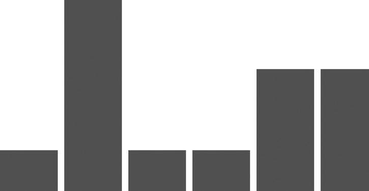
Figure 7-11. Beginings of a bar chart in D3
Let’s create the drawAxes() function. We place this function outside the scope of the d3.csv() function, out at the root of the script tag.
For this chart, let’s go with a little more of a minimalist approach and draw only the x-axis. Just like the last chapter, we draw SVG g elements and call the xAxis object:
function drawAxes(){
     svg.append("g")
          .attr("class", "x axis")
          .attr("transform", "translate(0," + adjustedHeight + ")")
          .call(xAxis);
}
This draws the x-axis that gives the bar chart its category labels shown in Figure 7-12.
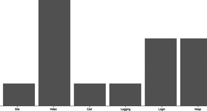
Figure 7-12. Bar chart with x-axis
Creating a Stacked Bar Chart
Now that we have a bar chart, let’s create a stacked bar chart. First, let’s shape the data. We want an array of objects in which each object represents a feature and has a count of total incidents for each level.
Let’s start with a new array called grouped_data:
var grouped_data = new Array();
Let’s iterate through nested_data because nested_data already has taken care of grouping by feature:
nested_data.forEach(function (d) {
}
Within each pass through nested_data, we create a temporary object and iterate through each incident within the values array:
tempObj = {"Feature": d.key, "Sev1":0, "Sev2":0, "Sev3":0, "Sev4":0};
     d.values.forEach(function(e){
     }
Within each iteration in the values array, we test the severity of the current incident and increment the appropriate property of the temporary object:
if(e.Severity == 1)
     tempObj.Sev1++;
else if(e.Severity == 2)
     tempObj.Sev2++
else if(e.Severity == 3)
     tempObj.Sev3++;
else if(e.Severity == 4)
     tempObj.Sev4++;
The complete code to create the grouped_data array looks like the following:
nested_data.forEach(function (d) {
     tempObj = {"Feature": d.key, "Sev1":0, "Sev2":0, "Sev3":0, "Sev4":0};
     d.values.forEach(function(e){
          if(e.Severity == 1)
               tempObj.Sev1++;
          else if(e.Severity == 2)
               tempObj.Sev2++
          else if(e.Severity == 3)
               tempObj.Sev3++;
          else if(e.Severity == 4)
               tempObj.Sev4++;
     })
     grouped_data[grouped_data.length] = tempObj
});
This code produces an array of objects that are all formatted as follows with a Feature attribute and a count for each level of severity:
Perfect! Next we create a function in which we draw the stacked bar chart within the scope of the d3.csv() function:
function stackedBarChart(){
}
Here’s where it gets interesting. Using the d3.layout.stack() function, we transpose our data so that we have an array in which each index represents one of the levels of severity and contains an object for each feature that has a count of each incident for the respective level of severity:
var sevStatus = d3.layout.stack()(["Sev1", "Sev2", "Sev3", "Sev4"].map(function(sevs)
     {
          return grouped_data.map(function(d) {
          return {x: d.Feature, y: +d[sevs]};
    });
  }));
The sevStatus array should look like the data structure shown in Figure 7-13.
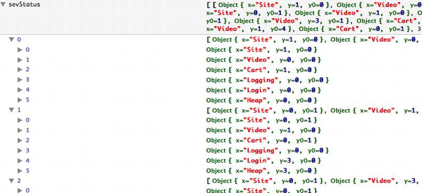
Figure 7-13. Inspecting the sevStatus array in Firebug
We next use sevStatus to create domain maps for the x- and y- values of the bar segments that we will draw:
x.domain(sevStatus[0].map(function(d) { return d.x; }));
y.domain([0, d3.max(sevStatus[sevStatus.length - 1], function(d) { return d.y0 + d.y; })]);
Next we draw SVG g elements for each index in the sevStatus array. They serve as containers in which we draw the bars. We bind sevStatus to these grouping elements and set the fill attribute to return one of the colors from the array of colors:
var sevs = svg.selectAll("g.sevs")
     .data(sevStatus)
     .enter().append("g")
     .attr("class", "sevs")
     .style("fill", function(d, i) { return z(i); });
Finally, we draw the bars within the groupings that we just created. We bind a generic function to the data attribute of the bars that just passes through whatever data is passed to it; this inherits from the SVG groupings.
We draw the bars with the opacity set to 0, so the bars are not initially visible. We also attach mouseover and mouseout event handlers, to call transitionVisualization() – passing 1 when the mouseover event is fired, and 0 when the mouseout event is fired (we will flesh out the functionality of transitionVisualization() very soon):
var rect = sevs.selectAll("rect")
     .data(function(data){ return data; })
     .enter().append("svg:rect")
     .attr("x", function(d) { return x(d.x) + 13; })
     .attr("y", function(d) { return -y(d.y0) - y(d.y) + adjustedHeight; })
     .attr("class", "groupedBar")
     .attr("opacity", 0)
     .attr("height", function(d) { return y(d.y) ; })
     .attr("width", x.rangeBand() - 20)
     .on("mouseover", function(d){
          transitionVisualization (1)
     })
     .on("mouseout", function(d){
     transitionVisualization (0)
     });
The complete stacked bar chart code should look like the following; it produces the stacked bar chart shown in Figure 7-14.
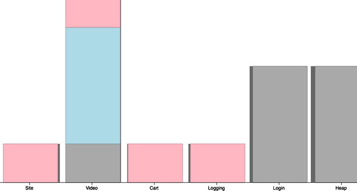
Figure 7-14. Stacked bar chart in D3
function groupedBarChart(){
     var sevStatus = d3.layout.stack()(["Sev1", "Sev2", "Sev3", "Sev4"].map(function(sevs)
     {
          return grouped_data.map(function(d) {
          return {x: d.Feature, y: +d[sevs]};
    });
  }));
     x.domain(sevStatus[0].map(function(d) { return d.x; }));
     y.domain([0, d3.max(sevStatus[sevStatus.length - 1], function(d) { return d.y0 + d.y; })]);
  // Add a group for each sev category.
     var sevs = svg.selectAll("g.sevs")
          .data(sevStatus)
          .enter().append("g")
          .attr("class", "sevs")
          .style("fill", function(d, i) { return z(i); })
          .style("stroke", function(d, i) { return d3.rgb(z(i)).darker(); });
     var rect = sevs.selectAll("rect")
          . data(function(data){ return data; })
          .enter().append("svg:rect")
          .attr("x", function(d) { return x(d.x) + 13; })
          .attr("y", function(d) { return -y(d.y0) - y(d.y) + adjustedHeight; })
           .attr("class", "groupedBar")
          .attr("opacity", 0)
          .attr("height", function(d) { return y(d.y) ; })
          .attr("width", x.rangeBand() - 20)
          .on("mouseover", function(d){
               transitionVisualization (1)
          })
          .on("mouseout", function(d){
          transitionVisualization (0)
          });
  }
Creating an Overlaid Visualization
But we’re not quite done yet. We’ve been referencing this transitionVisualization() function, but we haven’t yet defined it. Let’s take care of that right now. Remember how we’ve been using it: when a user mouses over a bar in our bar chart, we call transitionVisualization() and pass in a 1. When a user mouses over a bar in our stacked bar chart, we also call transitionVisualization() and pass in a 1. But when a user mouses off a bar in the stacked bar chart, we call transitionVisualization() and pass in a 0.
So the parameter that we pass in sets the opacity of our stacked bar chart. Because we initially draw the stacked bar chart with the opacity at 0, we only ever see it when a user rolls over a bar in the bar chart, and it gets hidden again when the user rolls off of the bar.
To create this effect, we use a D3 transition. Transitions are much like tweens in other languages such as ActionScript 3. We create a D3 selection (in this case, we can select all elements of class groupedBar), call transition(), and set the attributes of that selection that we want to change:
function transitionVisualization(vis){
     var rect = svg.selectAll(".groupedBar")
     .transition()
     .attr("opacity", vis)
}
The completed code looks like the following, and although it’s hard to demonstrate this functionality via a printed medium, you can see the working model on Tom’s web site (available at http://tom-barker.com/demo/data_vis/chapter7/chapter7example.htm) or put the code onto a local web server and run it yourself:
<!DOCTYPE html>
<html>
  <head>
          <meta charset="utf-8">
    <title></title>
        <script src="d3.v3.js"></script>
        <style type="text/css">
        body {
          font: 15px sans-serif;
        }
        .axis path{
          fill: none;
          stroke: #000;
          shape-rendering: crispEdges;
        }
        .bar {
          fill: #666666;
        }
    </style>  </head>
  <body>
    <script type="text/javascript">

var w = 960,
    h = 500,
    x = d3.scale.ordinal().rangeRoundBands([0, w]),
    y = d3.scale.linear().range([0,h]),
    z = d3.scale.ordinal().range(["lightpink", "darkgray", "lightblue"])
    margin = {top: 20, right: 20, bottom: 30, left: 40},
    adjustedHeight = 500 - margin.top - margin.bottom;

        var xAxis = d3.svg.axis()
            .scale(x)
            .orient("bottom");

        var svg = d3.select("body").append("svg")
            .attr("width", w)
            .attr("height", h)
          .append("g")

        function drawAxes(){
          svg.append("g")
              .attr("class", "x axis")
              .attr("transform", "translate(0," + adjustedHeight + ")")
              .call(xAxis);

         }

         function transitionVisuaization(vis){
                 var rect = svg.selectAll(".groupedBar")
                .transition()
                .attr("opacity", vis)
         }

        d3.csv("productionIncidents.txt", function(error, data) {

            nested_data = d3.nest()
                         .key(function(d) { return d.Feature; })
                         .entries(data);

                var grouped_data = new Array();

                //for stacked bar chart
                nested_data.forEach(function (d) {
                         tempObj = {"Feature": d.key, "Sev1":0, "Sev2":0, "Sev3":0, "Sev4":0};
                         d.values.forEach(function(e){
                                 if(e.Severity == 1)
                                 tempObj.Sev1++;
                                 else if(e.Severity == 2)
                                 tempObj.Sev2++
                                 else if(e.Severity == 3)
                                 tempObj.Sev3++;
                                 else if(e.Severity == 4)
                                 tempObj.Sev4++;
                         })
                         grouped_data[grouped_data.length] = tempObj
                });

function stackedBarChart(){
  var sevStatus = d3.layout.stack()(["Sev1", "Sev2", "Sev3", "Sev4"].map(function(sevs) {
    return grouped_data.map(function(d) {
      return {x: d.Feature, y: +d[sevs]};
    });
  }));

  x.domain(sevStatus[0].map(function(d) { return d.x; }));
  y.domain([0, d3.max(sevStatus[sevStatus.length - 1], function(d) { return d.y0 + d.y; })]);

  // Add a group for each sev category.
  var sevs = svg.selectAll("g.sevs")
      .data(sevStatus)
    .enter().append("g")
      .attr("class", "sevs")
      .style("fill", function(d, i) { return z(i); });

  var rect = sevs.selectAll("rect")
      .data(function(data){ return data; })
    .enter().append("svg:rect")
      .attr("x", function(d) { return x(d.x) + 13; })
      .attr("y", function(d) { return -y(d.y0) - y(d.y) + adjustedHeight; })
          .attr("class", "groupedBar")
          .attr("opacity", 0)
      .attr("height", function(d) { return y(d.y) ; })
      .attr("width", x.rangeBand() - 20)
          .on("mouseover", function(d){
                  transitionVisuaization(1)
          })
          .on("mouseout", function(d){
                  transitionVisuaization(0)
          });
  }

  function barchart(){
          svg.attr("transform", "translate(" + margin.left + "," + margin.top + ")");

          var xScale = d3.scale.ordinal()
              .rangeRoundBands([0, w], .1);

          var yScale = d3.scale.linear()
              .range([h, 0]);

      xScale.domain(nested_data.map(function(d) { return d.key; }));
      yScale.domain([0, d3.max(nested_data, function(d) { return d.values.length; })]);

      svg.selectAll(".bar")
          .data(nested_data)
        .enter().append("rect")
          .attr("class", "bar")
          .attr("x", function(d) { return xScale(d.key); })
          .attr("width", xScale.rangeBand())
          .attr("y", function(d) { return yScale(d.values.length) - 50; })
          .attr("height", function(d) { return h - yScale(d.values.length); })
          .on("mouseover", function(d){
                           transitionVisuaization(1)
          })

        stackedBarChart()
    drawAxes()

  }

  barchart();

});

    </script>
  </body>
</html>
Summary
This chapter looked at using bar charts to display ranked data in the context of production incidents. Because production incidents are essentially direct feedback from your user base around how your product is misbehaving or failing, managing production incidents is a critical piece of any mature engineering organization.
Managing production incidents isn’t simply about responding to issues as they arise, however; it is also about analyzing the data around your incidents: what areas of your application are breaking frequently, what unexpected patterns of use you see in production that could cause these recurring issues, how to build proactive scaffolding to prevent these and future issues. All these are questions you can answer only by fully understanding your product and your data. In this chapter, you took your first step toward that greater understanding.