
![]()
Visualizing the Balance of Delivery and Quality with Parallel Coordinates
The last chapter looked at using scatter plots to identify relationships between sets of data. It discussed the different types of relationships that could exist between data sets, such as positive and negative correlation. We couched this idea in the premise of team dynamics: Do you see any correlation between the amount of people on a team and the amount of work that the team can complete, or between the amount of work completed and the number of defects generated?
In this chapter we tie together the key concepts that we have been talking about: visualizing, team feature work, defects, and production incidents. We will tie them together using a data visualization called parallel coordinates to show the balance between these efforts.
What Are Parallel Coordinate Charts?
Parallel coordinate charts are a visualization that consists of N amount of vertical axes, each representing a unique data set, with lines drawn across the axes. The lines show the relationship between the axes, much like scatter plots, and the patterns that the lines form indicate the relationship. We can also gather details about the relationships between the axes when we see a clustering of lines. Let’s take a look at this using the chart in Figure 9-1 as an example.
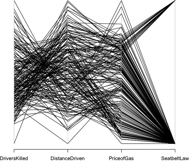
Figure 9-1. Parallel coordinates for Seatbelts data set
I constructed the chart in Figure 9-1 from the data set Seatbelts that comes built into R. To see a breakdown of the data set, type ?Seatbelts at the R command line. I extracted a subset of the columns available to better highlight the relationships in the data:
cardeaths <- data.frame(Seatbelts[,1], Seatbelts[,5], Seatbelts[,6], Seatbelts[,8])
colnames(cardeaths) <- c("DriversKilled", "DistanceDriven", "PriceofGas", "SeatbeltLaw")
The data set represents the number of drivers killed in car accidents in Great Britain before and after it became compulsory to wear seat belts. The axes represent the number of drivers killed, the distance driven, the cost of gas at the time, and whether there was a seat belt law in place.
There are a number of useful ways to look at parallel coordinates. If we look at the lines between a single pair of axes, we can see the relationships between those data sets. For example, if we look at the relationship between the price of gas and the seat belt law, we can see that the price of gas is constrained pretty tightly for when the seat belt law was in place, but covered a large range of prices for when the seat belt law was not in place (that is, a lot of disparate lines converge on the point that represents the time before the law, and a narrow band of lines converge on the time after the law was passed). This relationship could imply many different things, but because I know the data, I know it’s because we just have a much smaller sample size for deaths after the law was put in place: 14 years’ worth of data before the seat belt law, but only 2 years’ worth of data after the seat belt law.
We can also trace lines across all the axes to see how each of the axes relates. This is difficult to do with all the lines the same color, but when we change the color and shading of the lines, we can more easily see the patterns across the chart. Let’s take the existing chart and assign colors to the lines; (the results display in Figure 9-2):
parcoord(cardeaths, col=rainbow(length(cardeaths[,1])), var.label=TRUE)
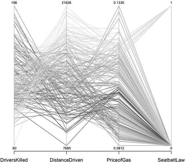
Figure 9-2. Parallel coordinates for Seatbelts data set, with each line a different shade of grey
![]() Note You need to import the MASS library to use the parcoord() function.
Note You need to import the MASS library to use the parcoord() function.
Figure 9-2 begins to show the patterns that exist in the data. The lines that have the lowest number of deaths also have the most distances driven and mainly fall into the point in time after the seat belt law was enacted. Again, note that we do have a much smaller sample size available for post–seat belt law than we do pre–seat belt law, but you can see how it becomes useful and telling to be able to trace the interconnectedness of these data points.
History of Parallel Coordinate Plots
The idea of using parallel coordinates on vertical axes was invented in 1885 by Maurice D’Ocagne when he created the nomograph and the field of nomography. Nomographs are tools to calculate values across mathematical rules. The classic example of a nomograph still in use today is the line on a thermometer that shows values in both Fahrenheit and Celsius. Or think of rulers that show values in inches on one side and centimeters on the other.
![]() Note Ron Doerfler has written an extensive thesis on nomography available here: http://myreckonings.com/wordpress/2008/01/09/the-art-of-nomography-i-geometric-design/. Doerfler also hosts a site called Modern Nomograms, (http://www.myreckonings.com/modernnomograms/ ) that “offers eye-catching and useful graphical calculators uniquely designed for today's applications.”
Note Ron Doerfler has written an extensive thesis on nomography available here: http://myreckonings.com/wordpress/2008/01/09/the-art-of-nomography-i-geometric-design/. Doerfler also hosts a site called Modern Nomograms, (http://www.myreckonings.com/modernnomograms/ ) that “offers eye-catching and useful graphical calculators uniquely designed for today's applications.”
You can see examples of modern nomograms, courtesy of Ron Doerfler, in Figures 9-3 and 9-4.
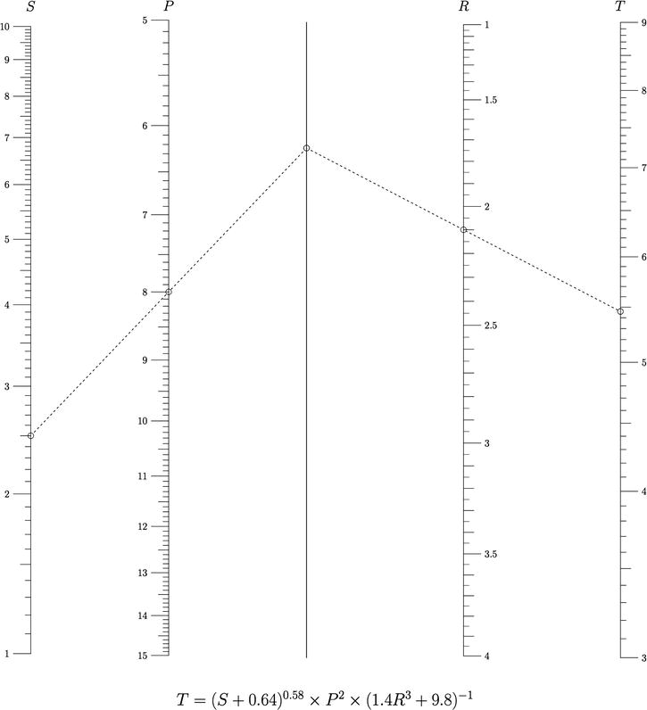
Figure 9-3. Nomogram demonstrating the conversion of values between the functions S, P, R, and T
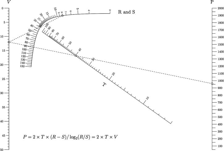
Figure 9-4. Curvel scale nomogram, courtesy of Ron Doerfler, Leif Roschier, and Joe Marasco
![]() Note The term parallel coordinates and the concept that it represents was popularized and rediscovered by Alfred Inselberg while studying at the University of Illinois. Dr. Inselberg is currently a professor at Tel Aviv University and a Senior Fellow at the San Diego Supercomputing Center. Dr. Inselberg has also published a book on the subject, Parallel Coordinates: Visual Multidimensional Geometry and Its Applications (Springer, 2009). He has also published a dissertation on how to effectively read and use parallel coordinates, entitled The Multidimensional Detective, available from the IEEE.
Note The term parallel coordinates and the concept that it represents was popularized and rediscovered by Alfred Inselberg while studying at the University of Illinois. Dr. Inselberg is currently a professor at Tel Aviv University and a Senior Fellow at the San Diego Supercomputing Center. Dr. Inselberg has also published a book on the subject, Parallel Coordinates: Visual Multidimensional Geometry and Its Applications (Springer, 2009). He has also published a dissertation on how to effectively read and use parallel coordinates, entitled The Multidimensional Detective, available from the IEEE.
We understand that parallel coordinates are used to visualize the relationship between multiple variables, but how does that apply to what we have been talking about so far this book? So far, we discussed quantifying and visualizing the defect backlog, the sources of the production incidents, and even the amount of work that our teams commit to. Arguably, balancing these aspects of product development can be one of the most challenging activities that a team does.
With each iteration, either formal or informal, team members have to decide how much effort they should put toward each of these concerns: working on new features, fixing bugs on existing features, and addressing production incidents from direct feedback from users. And these are just a sampling of the nuances that every product team must juggle; they also may have to factor in time to spend on technical debt or updating infrastructure.
We can use parallel coordinates to visualize this balance, both for documentation and as a tool for analysis when starting new sprints.
Creating a Parallel Coordinate Chart
There are several different approaches to creating a parallel coordinate chart. Using the data from the previous chapter, we could look at the running totals per iteration. Recall that the data was a total of points committed to per iteration, as well as a snapshot of how many bugs and production incidents were in each team’s backlog, how many new bugs were opened during the iteration, and how many members there were on the team. The data looked much like this:
  Sprint TotalPoints TotalDevs Team BugBacklog BugsOpened ProductionIncidents
1   12.10          25         6 Gold        125         10                   1
2   12.20          42         8 Gold        135         30                   3
3   12.30          45         8 Gold        150         25                   2
4   12.40          43         8 Gold        149         23                   3
5   12.50          32         6 Gold        155         24                   1
6   12.60          43         8 Gold        140         22                   4
7   12.70          35         7 Gold        132          9                   1

...
To make use of this data, we can read it in to R, just as we did in the last chapter:
tvFile <- "/Applications/MAMP/htdocs/teamvelocity.txt"
teamvelocity <- read.table(tvFile, sep=",", header=TRUE)
We then can create a new data frame with all the columns from the teamvelocity variable except the Team column. That column is a string, and the R parcoord() function, which we use in this example, throws an error if we include strings in the object that we pass in to it. Team information wouldn’t make sense in this context, either. The lines that will be drawn in the chart will be representative of our teams:
t<- data.frame(teamvelocity$Sprint, teamvelocity$TotalPoints, teamvelocity$TotalDevs, teamvelocity$BugBacklog, teamvelocity$BugsOpened, teamvelocity$ProductionIncidents)
colnames(t) <- c("sprint", "points", "devs", "total bugs", "new bugs", "prod incidents")
We pass the new object into the parcoord() function. We also pass the rainbow() function into the color parameter, as well as set the var.label parameter to true, to make the upper and lower boundaries of each axis visible on the chart:
parcoord(t, col=rainbow(length(t[,1])), var.label=TRUE)
This code produces the visualization shown in Figure 9-5.
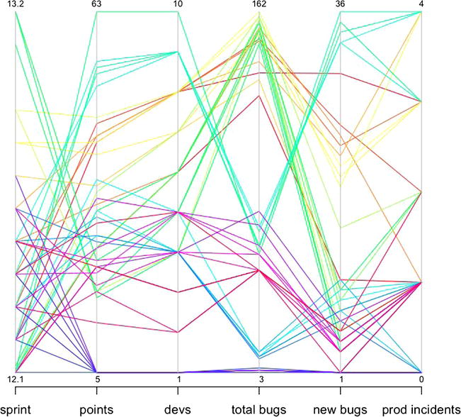
Figure 9-5. Parallel coordinate chart of different aspects of overall organizationa metrics, including points committed to per iteration, total developers by team, total bug backlog, new bugs open, and production incidents
Figure 9-5 presents some interesting stories for us. We can see that some teams in our data set create more bugs as they take on more points’ worth of work. Other teams have a large bug backlog while not creating a large number of new bugs during each iteration, which implies that they are not closing the bugs that they do open. Some teams are more consistent than others. All contain insights that the teams can use for reflection and continual improvement. But ultimately this chart is reactive and talks around the main issues. It tells us what the effects of each sprint are on our respective backlogs, both bugs and production incidents. It also tells us how many bugs were opened during each sprint.
What the figure doesn’t show is the amount of effort spent working against each backlog. To show that, we need to do a bit of prep work.
Past chapters I mentioned Greenhopper and Rally as ways to plan iterations, prioritize backlogs, and track progress on user stories. No matter the product you choose, it should provide some way to categorize or tag your user stories with metadata. Some very simple ways to accomplish this categorization without needing your software to support it include these:
- Put tagging in the title of each user story (see Figure 9-6 for an example of what this could look like in Rally). With this method, you need to sum the level of effort for each category, either manually or programmatically.
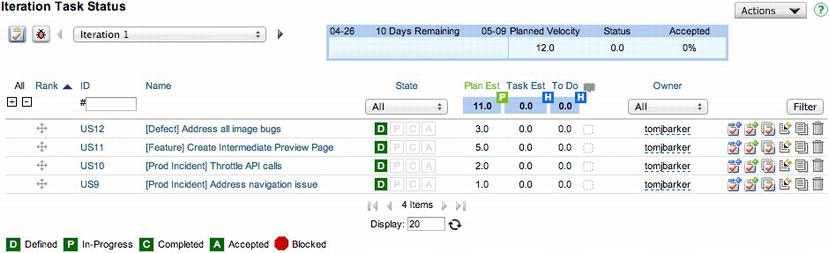
Figure 9-6. User stories tagged by category, Defect, Feature, or Prod Incident (courtesy of Rally)
- Nest subprojects for each delineation of effort.
However you go about creating these buckets, you should have a way to track the amount of effort spent during each sprint for your categories. To visualize this, just export it from your favorite tool into a flat file that resembles the structure shown here:
iteration,defect,prodincidents,features,techdebt,innovation
13.1,6,3,13,2,1
13.2,8,1,7,2,1
13.3,10,1,9,3,2
13.5,9,2,18,10,3
13.6,7,5,19,8,3
13.7,9,5,21,12,3
13.8,6,7,11,14,3
13.9,8,3,16,18,3
13.10,7,4,15,5,3
To begin using this data, we need to import the contents of the flat file into R. We store the data in a variable named teamEffort and pass teamEffort into the parcoord() function:
teFile <- "/Applications/MAMP/htdocs/teamEffort.txt"
teamEffort <- read.table(teFile, sep=",", header=TRUE)
parcoord(teamEffort, col=rainbow(length(teamEffort[,1])), var.label=TRUE, main="Level of Effort Spent")
This code produces the chart shown in Figure 9-7.
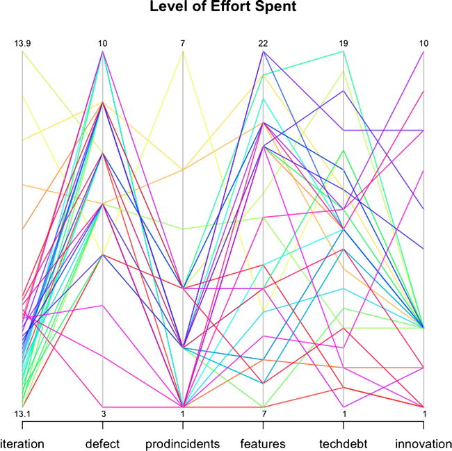
Figure 9-7. Parallel coordinate plot of level of effort spent toward each initiative
This chart is less about seeing relationships implied by data and more about seeing explicit levels of effort committed to each sprint. In a vacuum, these data points are meaningless, but when you look at both charts and compare the total bug backlog and total production incidents, compared with the level of effort spent addressing either, you begin to see blind spots that the team would need to address. Blind spots might be where teams that have high bug backlogs or production incident counts are not spending enough effort to address those backlogs.
Brushing Parallel Coordinate Charts with D3
The trick to reading dense parallel coordinate plots is to use a technique called brushing. Brushing fades the color or opacity of all the lines on the chart, except for the lines you want to trace across the axes. We can achieve this level of interactivity using D3.
Let’s start by creating a new HTML file using our base HTML skeletal structure:
<!DOCTYPE html>
<html>
  <head>
          <meta charset="utf-8">
    <title></title>
</head>
<body>
<script src="d3.v3.js"></script>
</body>
</html>
We then create a new script tag to hold the JavaScript for the chart. In this tag, we start by creating the variables needed to set the height and width of the chart, an object to hold the margin values, an array of axes column names, and the scale object for the x object.
We also create variables to reference the D3 SVG line object, a reference to the D3 axis, and a variable named foreground to hold the groupings of all the paths that will be the lines drawn between axes in the chart:
<script>

var margin = {top: 80, right: 160, bottom: 200, left: 160},
     width = 1280 - margin.left - margin.right,
     height = 800 - margin.top - margin.bottom,
         cols = ["iteration","defect","prodincidents","features","techdebt","innovation"]

var x = d3.scale.ordinal().domain(cols).rangePoints([0, width]),
    y = {};

var line = d3.svg.line(),
    axis = d3.svg.axis().orient("left"),
    foreground;
</script>
We draw the SVG element to the page and store it in a variable that we name svg:
var svg = d3.select("body").append("svg")
    .attr("width", width + margin.left + margin.right)
    .attr("height", height + margin.top + margin.bottom)
  .append("g")
    .attr("transform", "translate(" + margin.left + "," + margin.top + ")");
We use d3.csv to load in the teameffort.txt flat file:
d3.csv("teameffort.txt", function(error, data) {

}
So far, we’re following the same format as in previous chapters: lay out variables at the top, create the SVG element, and load in the data; most of the data-dependent logic happens in the anonymous function that fires when the data has been loaded.
For parallel coordinates, this process changes a bit right here because we need to create y-axes for each column in our data.
Creating a y-axis for Each Column
To create a y-axis for each column, we have to loop through the array that holds the column names, convert the contents of each column to explicitly be numbers, create an index in the y variable for each column, and create a D3 scale object for each column:
cols.forEach(function(d) {
        //convert to numbers
        data.forEach(function(p) { p[d] = +p[d]; });

        //create y scale for each column
        y[d] = d3.scale.linear()
                .domain(d3.extent(data, function(p) { return p[d]; }))
               .range([height, 0]);
});
We need to draw the lines that will traverse each axis, so we create an SVG grouping to aggregate and hold all the lines. We assign the foreground class to the grouping (doing so is important because we will handle the brushing of the lines via CSS):
foreground = svg.append("g")
        .attr("class", "foreground")
We append SVG paths to this grouping. We attach the data to the paths, set the color of the paths to randomly generated colors, and stub out mouseover and mouseout event handlers. We also set the d attribute of the paths to a function that we will create called path().
We’ll come back to those event handlers in a minute.
           foreground = svg.append("g")
               .attr("class", "foreground")
             .selectAll("path")
               .data(data)
             .enter().append("path")
           .attr("stroke", function(){return "#" + Math.floor(Math.random()*16777215).toString(16);})
               .attr("d", path)
               .attr("width", 16)
                   .on("mouseover", function(d){

                   })
                   .on("mouseout", function(d){

                   })
Let’s flesh out the path() function. In this function, we accept a parameter named d, which will be an index of the data variable. The function returns a mapping of the path coordinates with the x and y scales:
function path(d) {
     return line(cols.map(function(p) { return [x(p), y[p](d[p])]; }));
}
The path() function returns data that looks much like the following—a multidimensional array with each index and array consisting of two coordinate values:
[[0, 520], [192, 297.14285714285717], [384, 346.6666666666667], [576, 312], [768, 491.1111111111111], [960, 520]]
Let’s take a step back for a second. To handle the brushing, we need to create a style rule to fade the opacity of the lines. So let’s return to the head section of the page and create a style tag and some style rules.
We set path.fade as the selector and set the stroke-opacity to 40%. While we’re at it, we also set body font styles and path styles:
<style>
body {
  font: 15px sans-serif;
  font-weight:normal;
}
path{
  fill: none;
  shape-rendering: geometricPrecision;
  stroke-width:1;
}
path.fade {
  stroke: #000;
  stroke-opacity: .04;
}
</style>
Let’s return to the stubbed out event handlers. D3 provides a function called classed() that allows us to add classes to selections. In the mouseover handler, we use the classed() function to apply the fade style that we just created to every path in the foreground. It fades out each line. We’ll next target the current selection, using d3.select(this) and use classed() to turn off the fade styling.
In the mouseout handler, we turn off the fade style:
          foreground = svg.append("g")
               .attr("class", "foreground")
             .selectAll("path")
               .data(data)
             .enter().append("path")
           .attr("stroke", function(){return "#" + Math.floor(Math.random()*16777215).toString(16);})
               .attr("d", path)
               .attr("width", 16)
                   .on("mouseover", function(d){
                           foreground.classed("fade",true)
                           d3.select(this).classed("fade", false)
                  })
                  .on("mouseout", function(d){
                           foreground.classed("fade",false)
                  })
Finally, we need to create the axes:
var g = svg.selectAll(".column")
               .data(cols)
             .enter().append("svg:g")
               .attr("class", "column")
                   .attr("stroke", "#000000")
               .attr("transform", function(d) { return "translate(" + x(d) + ")"; })

           // Add an axis and title.
           g.append("g")
               .attr("class", "axis")
               .each(function(d) { d3.select(this).call(axis.scale(y[d])); })
             .append("svg:text")
               .attr("text-anchor", "middle")
               .attr("y", -19)
               .text(String);
Our complete code is as follows:
<!DOCTYPE html>
<html>
  <head>
          <meta charset="utf-8">
    <title></title>
<style>

body {
  font: 15px sans-serif;
  font-weight:normal;
}

path{
  fill: none;
  shape-rendering: geometricPrecision;
  stroke-width:1;
}

path.fade {
  stroke: #000;
  stroke-opacity: .04;
}

</style>
</head>
<body>
<script src="d3.v3.js"></script>
<script>

var margin = {top: 80, right: 160, bottom: 200, left: 160},
     width = 1280 - margin.left - margin.right,
     height = 800 - margin.top - margin.bottom,
         cols = ["iteration","defect","prodincidents","features","techdebt","innovation"]

var x = d3.scale.ordinal().domain(cols).rangePoints([0, width]),
    y = {};

var line = d3.svg.line(),
    axis = d3.svg.axis().orient("left"),
    foreground;

var svg = d3.select("body").append("svg")
    .attr("width", width + margin.left + margin.right)
    .attr("height", height + margin.top + margin.bottom)
  .append("g")
    .attr("transform", "translate(" + margin.left + "," + margin.top + ")");

d3.csv("teameffort.txt", function(error, data) {
        cols.forEach(function(d) {
                //convert to numbers
            data.forEach(function(p) { p[d] = +p[d]; });

            y[d] = d3.scale.linear()
                .domain(d3.extent(data, function(p) { return p[d]; }))
                .range([height, 0]);
                   });

           foreground = svg.append("g")
               .attr("class", "foreground")
             .selectAll("path")
               .data(data)
             .enter().append("path")
           .attr("stroke", function(){return "#" + Math.floor(Math.random()*16777215).toString(16);})
               .attr("d", path)
               .attr("width", 16)
                  .on("mouseover", function(d){
                          foreground.classed("fade",true)
                          d3.select(this).classed("fade", false)
                  })
                  .on("mouseout", function(d){
                           foreground.classed("fade",false)
                  })

           var g = svg.selectAll(".column")
               .data(cols)
             .enter().append("svg:g")
               .attr("class", "column")
                   .attr("stroke", "#000000")
               .attr("transform", function(d) { return "translate(" + x(d) + ")"; })

           // Add an axis and title.
           g.append("g")
               .attr("class", "axis")
               .each(function(d) { d3.select(this).call(axis.scale(y[d])); })
             .append("svg:text")
               .attr("text-anchor", "middle")
               .attr("y", -19)
               .text(String);

                function path(d) {
                     return line(cols.map(function(p) { return [x(p), y[p](d[p])]; }));
                 }

          });
</script>
</body>
</html>
This code produces the chart shown in Figure 9-8.
Figure 9-8. Parallel coordinate chart created in D3
If we roll over any of the lines, we see the brushing effect shown in Figure 9-9, in which the opacity of all the lines, except the one currently moused over, is scaled back.
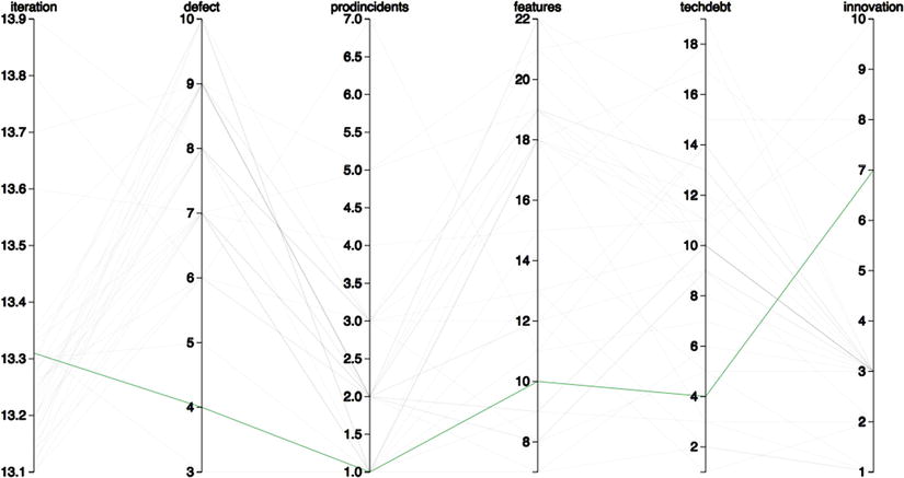
Figure 9-9. Parallel coordinate chart with interactive brushing
Summary
This chapter looked at parallel coordinate charts. You got a taste of their history—how they came about originally in the form of nomograms used to show value conversions. You looked at their practical application in the context of visualizing how teams balance the different aspects of product development in the course of an iteration.
Parallel coordinates are the last visualization type covered in this book, but it is far from the last type of visualization out there. And this book is far from the last word on the subject. Something that I tell my students at the end of each semester is that I hope they will continue to use what they have learned in my class. Only by using the language or subject that was covered, by continually playing with it, exploring it, and testing the boundaries of it will students incorporate this new tool into their own skillset. Otherwise, if they leave the class (or, in this case, close the book) and not think about the subject for a good while, they will probably forget much of what we went over.
If you are a developer or technical leader, I hope that you read this book and were inspired to begin tracking your own data. This was just a small sampling of things that you can track. You can instrument your code to track performance metrics, as covered in my book Pro JavaScript Performance: Monitoring and Visualization, or you can use tools such as Splunk to create dashboards to visualize usage data and error rates. You can tap right into the source code repository database to get such metrics as what times and days of the week have the most commit activity to avoid scheduling meetings during those times.
The point of all this data tracking is self-improvement. To establish baselines of where you currently are and track progress toward where you want to be, to constantly refine your craft, and excel at what you do.