
![]()
Visualizing Data Over Time
The last chapter discussed using access logs to create data maps representing the geographic location of users. We used the map and mapproj (for map projections) packages to create these visualizations.
This chapter explores creating time series charts, which are graphs that compare changes in values over time. They are generally read left to right with the x-axis representing some measure of time, and the y-axis representing the range of values. This chapter discusses visualizing defects over time.
Tracking defects over time allows us to identify not only spikes in issues but also larger patterns in workflows, especially when we include more granular details such as bug criticality, and include cross-referencing data such as dates for events like start and end of iteration. We begin to expose trends such as when during an iteration bugs get opened, when most of the blocker bugs get opened, or what iterations produce the highest number of bugs. This kind of self-evaluation and reflection are what allow us to identify and focus attention on blind spots or areas of improvement. It also allows us to recognize victories in a larger scope that might be missed when viewing the daily numbers without context.
A case in point: recently our organization set a larger group goal of achieving a certain bug number by the end of the year, a percent of the total open bugs that we had open at the beginning of the year. With our peers and our management staff, we coached all the developers, created process improvements, and won hearts and minds for this goal. At the end of the year, the number of bugs we had remaining open was about the same as when we had started. We were confused and concerned. But when we summed the daily numbers, we realized that we had achieved something larger than we anticipated: we actually opened one-third fewer bugs overall year over year from the previous year. This was huge and would easily have been missed if we weren’t looking at the data with a critical eye to the larger picture.
Gathering Data
The first step of creating a defect time series chart is to decide on a time period that we want to look at and gather the data. This means getting an export of all the bugs for a given time period.
This step is completely dependent on the bug tracing software that you may use. Maybe you use HP’s Quality Center because it makes sense with the rest of your organization’s testing needs (such as being able to work with LoadRunner). Maybe you use a hosted web-based solution such as Rally because you get defect management bundled in with your user story and release tracking. Maybe you have your own installation of Bugzilla because it’s open and free.
Whatever the case, all defect management software has a way to export your current bug list. Depending on the defect-tracking software used, you can export to a flat file, such as a comma or tab-separated file. The software can also allow access to its contents via an API so you can create a script that accesses the API and exposes the content.
Either way, there are two important main cases when looking at bugs over time:
For either of these cases, the minimum fields that we care about when we export from the bug tracking software are the following:
- Date opened
- Defect id
- Defect status
- Severity of defect
- Description of the defect
The exported bug data should look something like this:
Date, ID, Severity, Status, Summary
01-08-2013, DE45095, Minor, Open, alignment of left nav off
01-08-2013, DE45269, Blocker, Open, videos not playing
Let’s process the data to be able to visualize it.
The first thing is to read in and order the data. Assuming that data is exported to a flat file named allbugs.csv, we can read in the data as follows (we have provided sample data for it at http://www.tom-barker.com/data/allbugs.csv):
bugExport <- "/Applications/MAMP/htdocs/allbugs.csv"
bugs <- read.table(bugExport, header=TRUE, sep=",")
Let’s order the data frame by date. To do this, we have to convert the Date column, which is read in as a string, into a Date object using the as.Date() function. The as.Date() function accepts several symbols to signify how to read and structure the date object, as shown in Table 6-1.
Table 6-1. as.Date() function symbols
| Symbol | Meaning |
|---|---|
| %m | Numeric month |
| %b | Month name as string, abbreviated |
| %B | Full month name as string |
| %d | Numeric day |
| %a | Weekday as abbreviated string |
| %A | Full weekday as string |
| %y | Year as two-digit number |
| %Y | Year as four-digit number |
So for the date "04/01/2013", we pass in "%m/%d/%Y"; for "April 01, 13" we pass in "%B %d, %Y". You can see how the pattern matches up:
as.Date(bugs$Date,"%m-%d-%Y")
We’ll use the converted date in the order() function, which returns a list of index numbers from the bugs data frame, corresponding with the correct way to order the values in the data frame:
> order(as.Date(bugs$Date,"%m-%d-%Y"))
 [1] 13 14 2 3 16 17 18 19 20 21 22 23 24 25 26 27 28 4 29 32 34 31 33 30 35 15 37 6 7 38 8 9 39 10 11 40 12 41 42 43 45 15 36 44 47 48 49 46 50 51 52 53 54
Finally we’ll use the results of the order() function as the indexes of the bugs data frame and pass the results back into the bugs data frame:
bugs <- bugs[order(as.Date(bugs$Date,"%m-%d-%Y")),]
This code reorders the bugs data frame based on the order of the indexes returned in the order() function. It will be handy when we begin to slice up the data. The data frame should now be a chronologically ordered list of bugs, which looks like the following:
> bugs
 Date ID Severity Status Summary
13 01-04-2013 46250 Minor Open Data not showing
14 01-04-2013 46253 Minor Open Page unavailable
2 01-08-2013 45095 Minor Open Font color incorrect
3 01-08-2013 45269 Blocker Open Pixel alignment off
Let’s write this newly ordered list back out to a new file that we will reference later called allbugsOrdered.csv (we have provided sample data for it at http://www.tom-barker.com/data/allbugsOrdered.csv):
write.table(bugs, col.names=TRUE, row.names=FALSE, file="/Applications/MAMP/htdocs/allbugsOrdered.csv", quote = FALSE, sep = ",")
This will come in handy later when we look at this data in D3.
Calculating the Bug Count
Next we will calculate the total bug count by date. This will show how many new bugs are opened by day.
To do this, we pass bugs$Date into the table() function, which builds a data structure of counts of each date in the bugs data frame:
totalBugsByDate <- table(bugs$Date)
So the structure of totalBugsByDate looks like the following:
> totalBugsByDate

2013-01-04 2013-01-08 2013-01-09 2013-01-10 2013-01-14
 2 4 5 3 1
Let’s plot this data out to get an idea of how many bugs are opened each day:
plot(totalBugsByDate, type="l", main="New Bugs by Date", col="red", ylab="Bugs")
This code creates the chart shown in Figure 6-1.
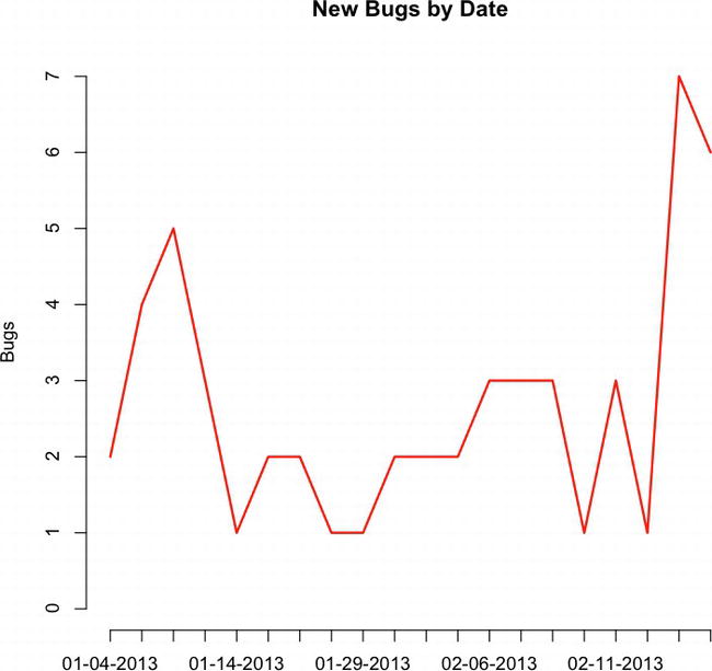
Figure 6-1. Time series of new bugs by date
Now that we have a count of how many bugs are generated each day, we can get a cumulative sum by using the cumsum() function. It takes the new bugs opened each day and creates a running sum of them, updating the total each day. It allows us to generate a trend line for the cumulative count of bugs over time:
> runningTotalBugs <- cumsum(totalBugsByDate)
>
> runningTotalBugs
01-04-2013 01-08-2013 01-09-2013 01-10-2013 01-14-2013 01-16-2013 2 6 11 14 15 17
This is exactly what we need to now plot out the way the bug backlog grows or shrinks each day. To do that, let’s pass runningTotalBugs to the plot() function. We set the type to "l" to signify that we are creating a line chart and then name the chart Cumulative Defects Over Time. In the plot() function, we also turn the axes off so that we can draw custom axes for this chart. We will want to draw custom axes so that we can specify the dates as the x-axis labels.
To draw custom axes, we use the axis() function. The first parameter in the axis() function is a number that tells R where to draw the axis:
- 1 corresponds to the x-axis at the bottom of the chart
- 2 to the left of the chart
- 3 to the top of the chart
- 4 to the right of the chart
plot(runningTotalBugs, type="l", xlab="", ylab="", pch=15, lty=1, col="red",
main="Cumulative Defects Over Time", axes=FALSE)
axis(1, at=1: length(runningTotalBugs), lab= row.names(totalBugsByDate))
axis(2, las=1, at=10*0:max(runningTotalBugs))
This code creates the time series chart shown in Figure 6-2.
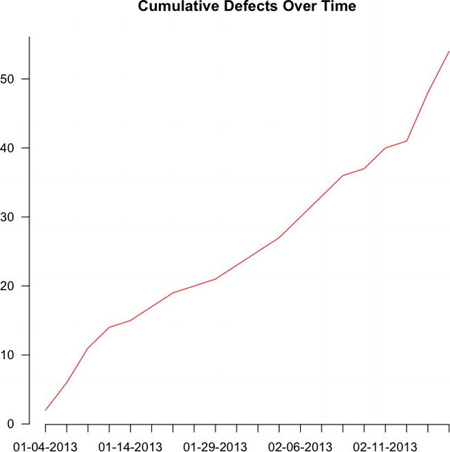
Figure 6-2. Cumulative defects over time
This shows the progressively increasing bug backlog, by date.
The complete R code so far is as follows:
bugExport <- "/Applications/MAMP/htdocs/allbugs.csv"
bugs <- read.table(bugExport, header=TRUE, sep=",")
bugs <- bugs[order(as.Date(bugs$Date,"%m-%d-%Y")),]

sprintDates <- "/Applications/MAMP/htdocs/iterationdates.csv"
sprintInfo <- read.table(sprintDates, header=TRUE, sep=",")
#output ordered list to new flat file
write.table(bugs, col.names=TRUE, row.names=FALSE, file="/Applications/MAMP/htdocs/allbugsOrdered.csv", quote = FALSE, sep = ",")
totalBugsByDate <- table(factor(bugs$Date))
plot(totalBugsByDate, type="l", main="New Bugs by Date", col="red")
runningTotalBugs <- cumsum(totalBugsByDate)
plot(runningTotalBugs, type="l", xlab="", ylab="", pch=15, lty=1, col="red", main="Cumulative Defects Over Time", axes=FALSE)
axis(1, at=1: length(runningTotalBugs), lab= row.names(totalBugsByDate))
axis(2, las=1, at=10*0:max(runningTotalBugs))

write.table(totalBugsByDate, col.names=TRUE, row.names=FALSE, file="/Applications/MAMP/htdocs/runningTotalBugs.csv", quote = FALSE, sep = ",")
Let’s take a look at the criticality of the bugs, which shows not just when the bugs are opened but also when the most severe (or non-severe) bugs are being opened.
Examining the Severity of the Bugs
Remember that when we exported the bug data we included the Severity field, which indicates the level of criticality of each bug. Each team and organization might have their own classification of severity, but generally they include these:
- Blockers are bugs so severe that they prevent the launch of a body of work. They generally have broken functionality or are missing sections of a widely used feature. They can also be discrepancies with contractually or legally binding features such as closed captioning or digital rights protection.
- Criticals are bugs that are severe but not so damaging that they gate a release. They can have broken functionality of less-used features. The scope of accessibility, or how widely used a feature is, is usually a determining factor between making a bug a blocker or a critical.
- Minors are bugs with very minimal if any impact and might not even be noticeable to an end user.
To break out the bugs by severity, we simply call the table() function, just as we did to break out bugs out by date, but this time add in the Severity column as well:
bugsBySeverity <- table(factor(bugs$Date),bugs$Severity)
This code creates a data structure that looks like so:
 Blocker Critical Minor
 01-04-2013 0 0 2
 01-08-2013 1 0 3
 01-09-2013 3 0 2
 01-10-2013 1 0 2
 01-14-2013 0 0 1
 01-16-2013 1 0 1
 01-22-2013 1 0 1
We can then plot this data object. The way we do this is to use the plot() function to create a chart for one of the columns and then use the lines() function to draw lines on the chart for the remaining columns:
plot(bugsBySeverity[,3], type="l", xlab="", ylab="", pch=15, lty=1, col="orange", main="New Bugs by Severity and Date", axes=FALSE)
lines(bugsBySeverity[,1], type="l", col="red", lty=1)
lines(bugsBySeverity[,2], type="l", col="yellow", lty=1)
axis(1, at=1: length(runningTotalBugs), lab= row.names(totalBugsByDate))
axis(2, las=1, at=0:max(bugsBySeverity[,3]))
legend("topleft", inset=.01, title="Legend", colnames(bugsBySeverity), lty=c(1,1,1), col= c("red", "yellow", "orange"))
This code produces the chart shown in Figure 6-3.
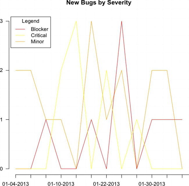
Figure 6-3. Our plot() and lines() functions drawing the chart of bugs by severity
This is great, but what if we want to see the cumulative bugs by severity? We can simply use the preceding R code, but instead of plotting out the columns, we can plot out the cumulative sum of each column:
plot(cumsum(bugsBySeverity[,3]), type="l", xlab="", ylab="", pch=15, lty=1, col="orange", main="Running Total of Bugs by Severity", axes=FALSE)
lines(cumsum(bugsBySeverity[,1]), type="l", col="red", lty=1)
lines(cumsum(bugsBySeverity[,2]), type="l", col="yellow", lty=1)
axis(1, at=1: length(runningTotalBugs), lab= row.names(totalBugsByDate))
axis(2, las=1, at=0:max(cumsum(bugsBySeverity[,3])))
legend("topleft", inset=.01, title="Legend", colnames(bugsBySeverity), lty=c(1,1,1), col= c("red", "yellow", "orange"))
This code produces the chart shown in Figure 6-4.
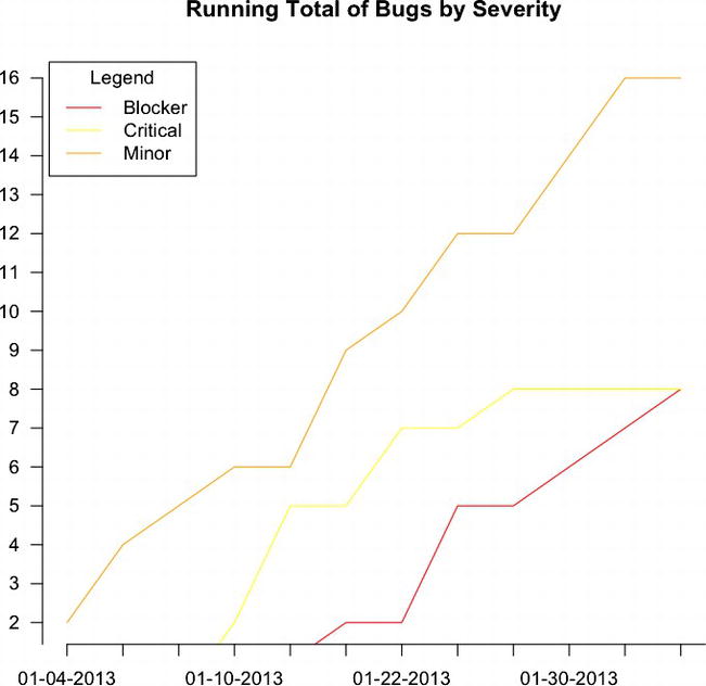
Figure 6-4. Running total of bugs by severity
We posted all the R code discussed so far on RPubs at http://rpubs.com/tomjbarker/4169.
Adding Interactivity with D3
The previous example is a great way to visualize and disseminate information around the creation of defects. But what if we could take it a step further and allow the consumers of our visualizations to dive deeper into the data points that interest them? Say we wanted to allow the user to mouse over a particular point in a time series and see a list of all the bugs that make up that data point. We can do just that with D3; let’s walk find out how.
First let’s create a new file with the base HTML skeletal structure with a reference to D3.js and save it as timeseriesGranular.htm.
<html>
<head></head>
<body>
<script src="d3.v3.js"></script>
</body>
</html>
Next we set some preliminary data in a new script tag. We create an object to hold margin data for the graphic, as well as height and width. We also create a D3 time formatter to convert the dates that are read in from string to a native Date object.
<script>
var margin = {top: 20, right: 20, bottom: 30, left: 50},
 width = 960 - margin.left - margin.right,
 height = 500 - margin.top - margin.bottom;
var parseDate = d3.time.format("%m-%d-%Y").parse;
</script>
Reading in the Data
We add in some code to read in the data (the allbugsOrdered.csv file that was output from R earlier). Recall that this file contains the entire bug data ordered by date.
We use the d3.csv() function to read this file:
- The first parameter is the path to the file.
- The second parameter is the function to execute once the data is read in. It is in this anonymous function that we add most of the functionality, or at least the functionality that is dependent on having data to process.
The anonymous function accepts two parameters
- The first catches any errors that may occur
- The second is the contents of the file being read in
In the function, we first loop through the contents of the data and use the date formatter to convert all the values in the Date column to a native JavaScript Date object:
d3.csv("allbugsOrdered.csv", function(error, data) {
        data.forEach(function(d) {
        d.Date = parseDate(d.Date);
});
});
If we were to console.log() the data, it would be an array of objects that look like Figure 6-5.
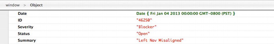
Figure 6-5. Our bug data object
Within the anonymous function but after the loop, we use the d3.nest() function to create a variable that holds the bug data grouped by date. We name this variable nested_data:
nested_data = d3.nest()
.key(function(d) { return d.Date; })
.entries(data);
The nested_data variable is now a tree structure—specifically a list that is indexed by date, and each index has a list of bugs. If we were to console.log() nested_data, it would be an array of objects that look like Figure 6-6.
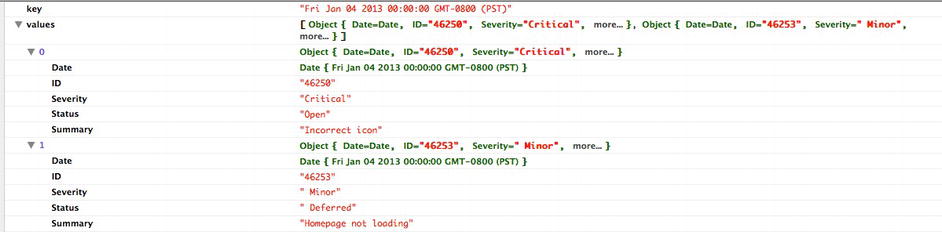
Figure 6-6. The array containing our bug data objects
Drawing on the Page
We are ready to start drawing to the page. So let’s step out of the callback function and go to the root of the script tag and write out the SVG tag to the page by using the margins, width, and height that defined previously:
var svg = d3.select("body").append("svg")
 .attr("width", width + margin.left + margin.right)
 .attr("height", height + margin.top + margin.bottom)
        .append("g")
 .attr("transform", "translate(" + margin.left + "," + margin.top + ")");
This is the container in which we draw the axes and the trend lines.
Still at the root level, we add a D3 scale object for both the x and y axes, using the width variable for the x-axis range and the height variable for the y-axis range. We add the x and y axes at the root level, passing in their respective scale objects, and orienting them at the bottom and left:
var xScale = d3.time.scale()
 .range([0, width]);
var yScale= d3.scale.linear()
 .range([height, 0]);
var xAxis = d3.svg.axis()
 .scale(xScale)
 .orient("bottom");
var yAxis = d3.svg.axis()
 .scale(yScale)
 .orient("left");
But they still aren’t showing on the page. We need to return to the anonymous function that we created in the d3.csv() call and add the nested_data list that we created as the domain data for the newly created scales:
xScale.domain(d3.extent(nested_data, function(d) { return new Date(d.key); }));
yScale.domain(d3.extent(nested_data, function(d) { return d.values.length; }));
From here, we need to generate the axes. We do this by adding and selecting an SVG g element, used for generic grouping, and adding this selection to the xAxis() and yAxis() D3 functions. This also goes in the anonymous callback function that gets invoked when the data is loaded.
We also need to transform the x-axis by adding the height of the chart so that it is drawn at the bottom of the graph.
svg.append("g")
 .attr("transform", "translate(0," + height + ")")
 .call(xAxis);

svg.append("g")
 .call(yAxis)
This creates the start of the chart with meaningful axes shown in Figure 6-7.
Figure 6-7. Time series beginning to form; x and y-axes but no line yet
The trend line needs to be added. Back at the root level, let’s create a variable named line to be an SVG line. Assume for a minute that we have already set the data property for the line. We haven’t yet, but we will in a minute. For the x value of the line, we will have a function that returns the date filtered through the xScale scale object. For the y value of the line, we will create a function that returns the bug count values run through the yScale scale object.
var line = d3.svg.line()
 .x(function(d) { return xScale(new Date(d.key)); })
 .y(function(d) { return yScale(d.values.length); });
Next, we return to the anonymous function that processes the data. Right below the added axes, we will append an SVG path. We set the nested_data variable as the datum for the path and the newly created line object as the d attribute. For reference, the d attribute is where we specify path descriptions. See here for documentation around the d attribute: https://developer.mozilla.org/en-US/docs/SVG/Attribute/d.
svg.append("path")
 .datum(nested_data)
 .attr("d", line);
We can now start to see something in a browser. The code so far should look like so:
<!DOCTYPE html>
<head>
<meta charset="utf-8">
</head>
<body>
        <script src="d3.v3.js"></script>
<script>
var margin = {top: 20, right: 20, bottom: 30, left: 50},
 width = 960 - margin.left - margin.right,
 height = 500 - margin.top - margin.bottom;

var parseDate = d3.time.format("%m-%d-%Y").parse;
var xScale = d3.time.scale()
 .range([0, width]);

var yScale = d3.scale.linear()
 .range([height, 0]);

var xAxis = d3.svg.axis()
         .scale(xScale)
         .orient("bottom");

var yAxis = d3.svg.axis()
         .scale(yScale)
         .orient("left");

var line = d3.svg.line()
 .x(function(d) { return xScale(new Date(d.key)); })
        .y(function(d) { return yScale(d.values.length); });

var svg = d3.select("body").append("svg")
 .attr("width", width + margin.left + margin.right)
 .attr("height", height + margin.top + margin.bottom)
        .append("g")
 .attr("transform", "translate(" + margin.left + "," + margin.top + ")");

d3.csv("allbugsOrdered.csv", function(error, data) {
        data.forEach(function(d) {
                d.Date = parseDate(d.Date);
        });

 nested_data = d3.nest()
                .key(function(d) { return d.Date; })
                .entries(data);

         xScale.domain(d3.extent(nested_data, function(d) { return new Date(d.key); }));
         yScale.domain(d3.extent(nested_data, function(d) { return d.values.length; }));
         svg.append("g")
         .attr("transform", "translate(0," + height + ")")
         .call(xAxis);
                svg.append("g")
                 .call(yAxis);
                svg.append("path")
                 .datum(nested_data)
                 .attr("d", line);

});

</script>
</body>
</html>
This code produces the graphic shown in Figure 6-8.
Figure 6-8. Time series with line data but incorrect fill
But this isn’t quite right. The shading of the path is based on the browser’s best guess of intent, shading what it perceives to be the closed areas. Let’s use CSS to explicitly turn off shading and instead set the color and width of the path line:
<style>
.trendLine {
 fill: none;
 stroke: #CC0000;
 stroke-width: 1.5px;
}
</style>
We created a style rule for any element on the page with the class trendLine. Let’s next add the class to the SVG path in the same block of code in which we create the path:
Svg.append("path")
 .datum(nested_data)
 .attr("d", line)
 .attr("class", "trendLine");
This code produces the chart shown in Figure 6-9.
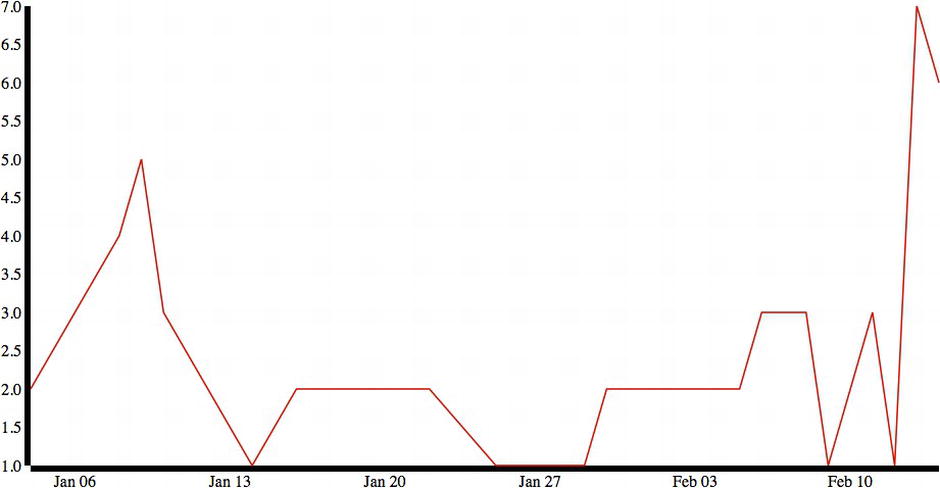
Figure 6-9. Time series with corrected line but unstyled axes
Looking much better! There are some minor things we should change, such as adding text labels to the y-axis and trimming the width of the axis lines to make them neater:
.axis path{
 fill: none;
 stroke: #000;
 shape-rendering: crispEdges;
}
This will give us tighter-looking axes. We just need to apply the style to the axes when we create them:
svg.append("g")
 .attr("transform", "translate(0," + height + ")")
 .call(xAxis)
 .attr("class", "axis");
svg.append("g")
 .call(yAxis)
 .attr("class", "axis");
The results can be seen in Figure 6-10.
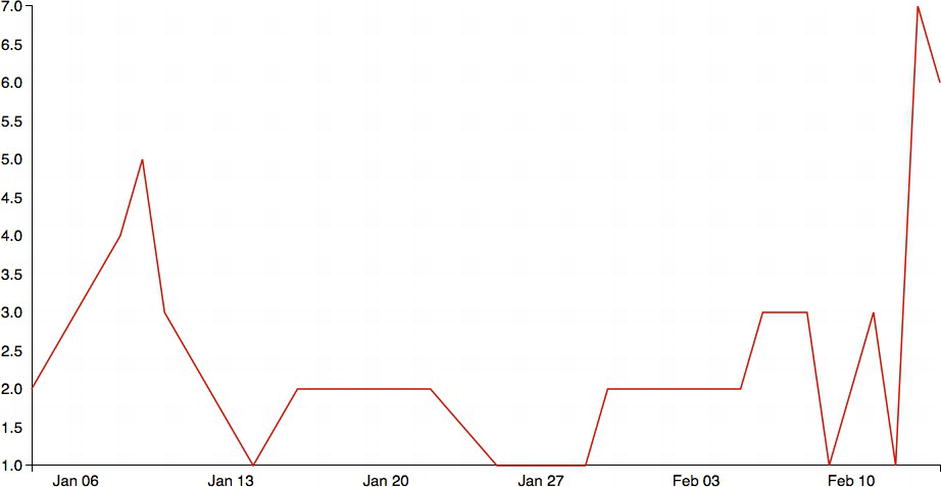
Figure 6-10. Time series upated with styled axes
This is great so far, but it shows no real benefit from doing this in R. In fact, we wrote quite a bit of additional code just to get parity and didn’t even do any data cleaning that we did in R.
The real benefit of using D3 is adding interactivity.
Adding Interactivity
Say we have this time series of new bugs, and we were curious what the bugs were in that large spike in mid-February. By taking advantage of the fact that we are working in HTML and JavaScript, we can extend this functionality by adding in a tooltip box that lists the bugs for each date.
To do this, we first should create obvious areas in which users can mouse over, such as red circles at each data point or discrete date. To do that, we simply need to create SVG circles right below where we added in the path, in the anonymous function that is fired when the external data is read in. We set the nested_data variable as the data attribute of the circles, make them red with a radius of 3.5, and set their x and y attributes to be tied to the date and bug totals, respectively:
svg.selectAll("circle")
.data(nested_data)
.enter().append("circle")
        .attr("r", 3.5)
        .attr("fill", "red")
        .attr("cx", function(d) { return xScale(new Date(d.key)); })
        .attr("cy", function(d) { return yScale(d.values.length);})
This code updates the existing time series so it looks like Figure 6-11. These red circles are now areas of focus in which users can mouse over and see additional information.
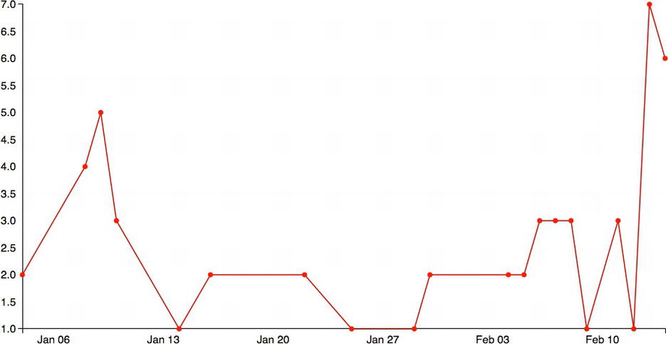
Figure 6-11. Circles added to each data point on the line
Let’s next code up a div to act as the tooltip that we will show with relevant bug data. To do this we will create a new div, right below where we created the line variable at the root of the script tag. We do this in D3 once again by selecting the body tag and appending a div to it, giving it a class and id of tooltip – both so that we can have the tooltip style apply to it (which we will create in just a minute) and so we can interact with it by ID later on in the chapter. We will have it be hidden by default. We will store a reference to this div in a variable that we will call tooltip:
var tooltip = d3.select("body")
 .append("div")
 .attr("class", "tooltip")
 .attr("id", "tooltip")
 .style("position", "absolute")
 .style("z-index", "10")
 .style("visibility", "hidden");
We next need to style this div using CSS. We adjust the opacity to be only 75 percent visible, so that when the tooltip shows up over a trend line we can see the trend line behind it. We align the text, set the font size, make the div have a white background, and give it rounded corners:
.tooltip{
        opacity: .75;
        text-align:center;
        font-size:12px;
        width:100px;
        padding:5px;
        border:1px solid #a8b6ba;
        background-color:#fff;
        margin-bottom:5px;
        border-radius: 19px;
        -moz-border-radius: 19px;
        -webkit-border-radius: 19px;
}
We next have to add a mouseover event handler to the circles to populate the tooltip with information and unhide the tooltip. To do this, we return to the block of code in which we created the circles and add in a mousemove event handler that fires off an anonymous function.
Inside the anonymous function, we overwrite the innerHTML of the tooltip to display the date of the current red circle and how many bugs are associated with that date. We then loop through that list of bugs and write out the ID of each bug.
svg.selectAll("circle")
 .data(nested_data)
 .enter().append("circle")
 .attr("r", 3.5)
 .attr("fill", "red")
 .attr("cx", function(d) { return xScale(new Date(d.key)); })
 .attr("cy", function(d) { return yScale(d.values.length);})
 .on("mouseover", function(d){
 document.getElementById("tooltip").innerHTML = d.key + " " + d.values.length + " bugs<br/>";
 for(x=0;x<d.values.length;x++){
 document.getElementById("tooltip").innerHTML += d.values[x].ID + "<br/>";
 }
 tooltip.style("visibility", "visible");
 })
If we want to take this even further, we can create links for each bug ID that link back to the bug tracking software; list descriptions of each bug; and if the bug tracking software has an API to interface with, we can even have form fields that could let us update bug information right from this tooltip. Only our imagination and the tools available to us limit the possibilities of how far we can extend this concept.
Finally, we add a mousemove event handler to the red circles so that we can reposition the tooltip contextually whenever the users mouse over a red circle. To do this, we use the d3.mouse object to get the current mouse coordinates. We use these coordinates to simply reposition the tooltip with CSS. So we don’t cover the red circle with the tooltip, we offset the top property by 25 pixels and the left property by 75 pixels.
svg.selectAll("circle")
 .data(nested_data)
 .enter().append("circle")
 .attr("r", 3.5)
 .attr("fill", "red")
 .attr("cx", function(d) { return xScale(new Date(d.key)); })
 .attr("cy", function(d) { return yScale(d.values.length);})
 .on("mouseover", function(d){
 document.getElementById("tooltip").innerHTML = d.key + " " + d.values.length + " bugs<br/>";
 for(x=0;x<d.values.length;x++){
 document.getElementById("tooltip").innerHTML += d.values[x].ID + "<br/>";
 }
 tooltip.style("visibility", "visible");
 })
 .on("mousemove", function(){
 return tooltip.style("top", (d3.mouse(this)[1] + 25)+"px").style("left", (d3.mouse(this)[0] + 70)+"px");
 });
A tooltip should display when the mouse hovers over one of the red circles (see Figure 6-12).
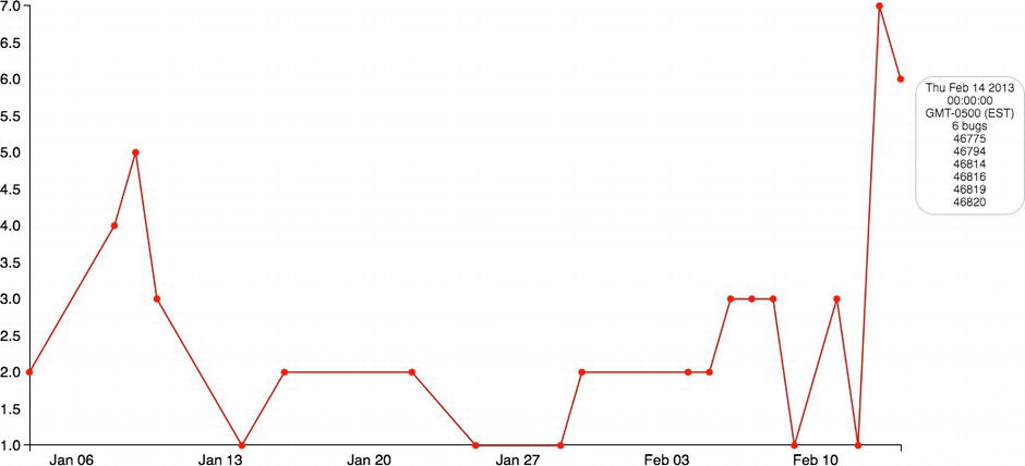
Figure 6-12. Completed time series with rollover shown
The complete source code should now look like this:
<!DOCTYPE html>
<html>
<meta charset="utf-8">
<head>
<style>
body {
 font: 15px sans-serif;
}
.trendLine {
 fill: none;
 stroke: #CC0000;
 stroke-width: 1.5px;
}
.axis path{
 fill: none;
 stroke: #000;
 shape-rendering: crispEdges;
}
.tooltip{
        opacity: .75;
        text-align:center;
        font-size:12px;
        width:100px;
        padding:5px;
        border:1px solid #a8b6ba;
        background-color:#fff;
        margin-bottom:5px;
        border-radius: 19px;
        -moz-border-radius: 19px;
        -webkit-border-radius: 19px;
}
</style>
</head>
<body>
        <script src="d3.v3.js"></script>
<script>
var margin = {top: 20, right: 20, bottom: 30, left: 50},
 width = 960 - margin.left - margin.right,
 height = 500 - margin.top - margin.bottom;

var parseDate = d3.time.format("%m-%d-%Y").parse;
var xScale = d3.time.scale()
 .range([0, width]);
var yScale = d3.scale.linear()
 .range([height, 0]);
var xAxis = d3.svg.axis()
         .scale(xScale)
         .orient("bottom");
var yAxis = d3.svg.axis()
         .scale(yScale)
         .orient("left");
var line = d3.svg.line()
 .x(function(d) { return xScale(new Date(d.key)); })
 .y(function(d) { return yScale(d.values.length); });
var tooltip = d3.select("body")
 .append("div")
 .attr("class", "tooltip")
 .attr("id", "tooltip")
 .style("position", "absolute")
 .style("z-index", "10")
 .style("visibility", "hidden");

var svg = d3.select("body").append("svg")
 .attr("width", width + margin.left + margin.right)
 .attr("height", height + margin.top + margin.bottom)
        .append("g")
 .attr("transform", "translate(" + margin.left + "," + margin.top + ")");

d3.csv("allbugsOrdered.csv", function(error, data) {
        data.forEach(function(d) {
                d.Date = parseDate(d.Date);
        });

 nested_data = d3.nest()
                .key(function(d) { return d.Date; })
                .entries(data);

         xScale.domain(d3.extent(nested_data, function(d) { return new Date(d.key); }));
         yScale.domain(d3.extent(nested_data, function(d) { return d.values.length; }));
         svg.append("g")
         .attr("transform", "translate(0," + height + ")")
         .call(xAxis)
         .attr("class", "axis");

                svg.append("g")
                 .call(yAxis)
         .attr("class", "axis");
                svg.append("path")
                 .datum(nested_data)
                 .attr("d", line)
         .attr("class", "trendLine");
                svg.selectAll("circle")
                 .data(nested_data)
                 .enter().append("circle")
                 .attr("r", 3.5)
                 .attr("fill", "red")
                 .attr("cx", function(d) { return xScale(new Date(d.key)); })
                 .attr("cy", function(d) { return yScale(d.values.length);})
                         .on("mouseover", function(d){
                                 document.getElementById("tooltip").innerHTML = d.key + " " + d.values.length + " bugs<br/>";
                                 for(x=0;x<d.values.length;x++){
                                         document.getElementById("tooltip").innerHTML += d.values[x].ID + "<br/>";
                               }
                                tooltip.style("visibility", "visible");
                })
                        .on("mousemove", function(){
                                return tooltip.style("top", (d3.mouse(this)[1] + 25)+"px").style("left", (d3.mouse(this)[0] + 70)+"px");
 });
});
</script>
</body>
</html>
Summary
This chapter explored time series plots, both philosophically and in the context of using them to track bug creation over time. We exported the raw bug data from the bug tracking software of choice and imported it into R to scrub and analyze.
Within R we looked at different ways we could model and visualize the data, looking at both aggregate and granular details such as how the new bugs contribute to a running total over time or when new bugs are introduced over time. This is especially valuable when we can put context to the dates we are looking at.
We then read the data into D3 and created an interactive time series that allowed us to drill down from the high-level trend data into very granular details around each bug created.
The next chapter explores creating bar charts and how to use them to identify areas of focus and improvement.