![]()
There is a new concept emerging in the field of web development: using data visualizations as communication tools. This concept is something that is already well established in other fields and departments. At the company where you work, your finance department probably uses data visualizations to represent fiscal information both internally and externally; just take a look at the quarterly earnings reports for almost any publicly traded company. They are full of charts to show revenue by quarter, or year over year earnings, or a plethora of other historic financial data. All are designed to show lots and lots of data points, potentially pages and pages of data points, in a single easily digestible graphic.
Compare the bar chart in Google’s quarterly earnings report from back in 2007 (see Figure 1-1) to a subset of the data it is based on in tabular format (see Figure 1-2).
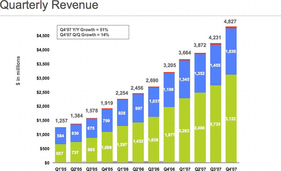
Figure 1-1. Google Q4 2007 quarterly revenue shown in a bar chart
Figure 1-2. Similar earnings data in tabular form
The bar chart is imminently more readable. We can clearly see by the shape of it that earnings are up and have been steadily going up each quarter. By the color-coding, we can see the sources of the earnings; and with the annotations, we can see both the precise numbers that those color-coding represent and what the year over year percentages are.
With the tabular data, you have to read labels on the left, line up the data on the right with those labels, do your own aggregation and comparison, and draw your own conclusions. There is a lot more upfront work needed to take in the tabular data, and there exists the very real possibility of your audience either not understanding the data (thus creating their own incorrect story around the data) or tuning out completely because of the sheer amount of work needed to take in the information.
It’s not just the Finance department that uses visualizations to communicate dense amounts of data. Maybe your Operations department uses charts to communicate server uptime, or your Customer Support department uses graphs to show call volume. Whatever the case, it’s about time Engineering and Web Development got on board with this.
As a department, group, and industry we have a huge amount of relevant data that is important for us to first be aware of so that we can refine and improve what we do; but also to communicate out to our stakeholders, to demonstrate our successes or validate resource needs, or to plan tactical roadmaps for the coming year.
Before we can do this, we need to understand what we are doing. We need to understand what data visualizations are, a general idea of their history, when to use them, and how to use them both technically and ethically.
What Is Data Visualization?
OK, so what exactly is data visualization? Data visualization is the art and practice of gathering, analyzing, and graphically representing empirical information. They are sometimes called information graphics, or even just charts and graphs. Whatever you call it, the goal of visualizing data is to tell the story in the data. Telling the story is predicated on understanding the data at a very deep level, and gathering insight from comparisons of data points in the numbers.
There exists syntax for crafting data visualizations, patterns in the form of charts that have an immediately known context. We devote a chapter to each of the significant chart types later in the book.
Time Series Charts
Time series charts show changes over time. See Figure 1-3 for a time series chart that shows the weighted popularity of the keyword “Data Visualization” from Google Trends (http://www.google.com/trends/).
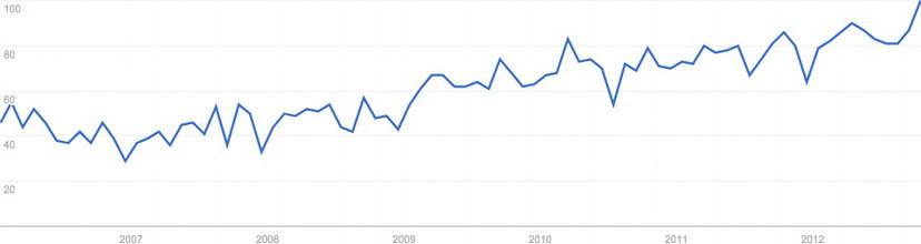
Figure 1-3. Time series of weighted trend for the keyword “Data Visualization” from Google Trends
Note that the vertical y axis shows a sequence of numbers that increment by 20 up to 100. These numbers represent the weighted search volume, where 100 is the peak search volume for our term. On the horizontal x axis, we see years going from 2007 to 2012. The line in the chart represents both axes, the given search volume for each date.
From just this small sample size, we can see that the term has more than tripled in popularity, from a low of 29 in the beginning of 2007 up to the ceiling of 100 by the end of 2012.
Bar Charts
Bar charts show comparisons of data points. See Figure 1-4 for a bar chart that demonstrates the search volume by country for the keyword “Data Visualization,” the data for which is also sourced from Google Trends.
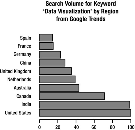
Figure 1-4. Google Trends breakdown of search volume by region for keyword “Data Visualization”
We can see the names of the countries on the y axis and the normalized search volume, from 0 to 100, on the x axis. Notice, though, that no time measure is given. Does this chart represent data for a day, a month, or a year?
Also note that we have no context for what the unit of measure is. I highlight these points not to answer them but to demonstrate the limitations and pitfalls of this particular chart type. We must always be aware that our audience does not bring the same experience and context that we bring, so we must strive to make the stories in our visualizations as self evident as possible.
Histograms
Histograms are a type of bar chart used to show the distribution of data or how often groups of information appear in the data. See Figure 1-5 for a histogram that shows how many articles the New York Times published each year, from 1980 to 2012, that related in some way to the subject of data visualization. We can see from the chart that the subject has been ramping up in frequency since 2009.
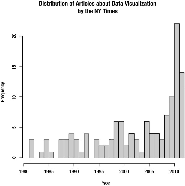
Figure 1-5. Histogram showing distribution of NY Times articles about data visualization
Data Maps
Data maps are used to show the distribution of information over a spatial region. Figure 1-6 shows a data map used to demonstrate the interest in the search term “Data Visualization” broken out by U.S. states.
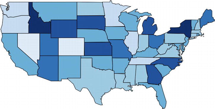
Figure 1-6. Data map of U.S. states by interest in “Data Visualization” (data from Google Trends)
In this example, the states with the darker shades indicate a greater interest in the search term. (This data also is derived from Google Trends, for which interest is demonstrated by how frequently the term “Data Visualization” is searched for on Google.)
Scatter Plots
Like bar charts, scatter plots are used to compare data, but specifically to suggest correlations in the data, or where the data may be dependent or related in some way. See Figure 1-7, in which we use data from Google Correlate, (http://www.google.com/trends/correlate), to look for a relationship between search volume for the keyword “What is Data Visualization” and the keyword “How to Create Data Visualization.”
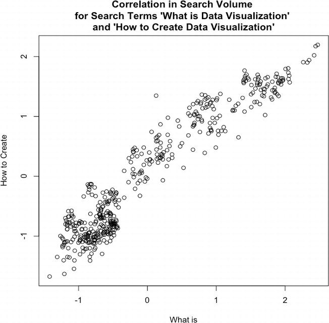
Figure 1-7. Scatter plot examining the correlation between search volume for terms related to “Data Visualization”, “How to Create” and “What is”
This chart suggests a positive correlation in the data, meaning that as one term rises in popularity the other also rises. So what this chart suggests is that as more people find out about data visualization, more people want to learn how to create data visualizations.
The important thing to remember about correlation is that it does not suggest a direct cause—correlation is not causation.
History
If we’re talking about the history of data visualization, the modern conception of data visualization largely started with William Playfair. William Playfair was, among other things, an engineer, an accountant, a banker, and an all-around Renaissance man who single handedly created the time series chart, the bar chart, and the bubble chart. Playfair’s charts were published in the late eighteenth century into the early nineteenth century. He was very aware that his innovations were the first of their kind, at least in the realm of communicating statistical information, and he spent a good amount of space in his books describing how to make the mental leap to seeing bars and lines as representing physical things like money.
Playfair is best known for two of his books: the Commercial and Political Atlas and the Statistical Breviary. The Commercial and Political Atlaswas published in 1786 and focused on different aspects of economic data from national debt, to trade figures, and even military spending. It also featured the first printed time series graph and bar chart.
His Statistical Breviaryfocused on statistical information around the resources of the major European countries of the time and introduced the bubble chart.
Playfair had several goals with his charts, among them perhaps stirring controversy, commenting on the diminishing spending power of the working class, and even demonstrating the balance of favor in the import and export figures of the British Empire, but ultimately his most wide-reaching goal was to communicate complex statistical information in an easily digested, universally understood format.
![]() Note Both books are back in print relatively recently, thanks to Howard Wainer, Ian Spence, and Cambridge University Press.
Note Both books are back in print relatively recently, thanks to Howard Wainer, Ian Spence, and Cambridge University Press.
Playfair had several contemporaries, including Dr. John Snow, who made my personal favorite chart: the cholera map. The cholera map is everything an informational graphic should be: it was simple to read; it was informative; and, most importantly, it solved a real problem.
The cholera map is a data map that outlined the location of all the diagnosed cases of cholera in the outbreak of London 1854 (see Figure 1-8). The shaded areas are recorded deaths from cholera, and the shaded circles on the map are water pumps. From careful inspection, the recorded deaths seemed to radiate out from the water pump on Broad Street.
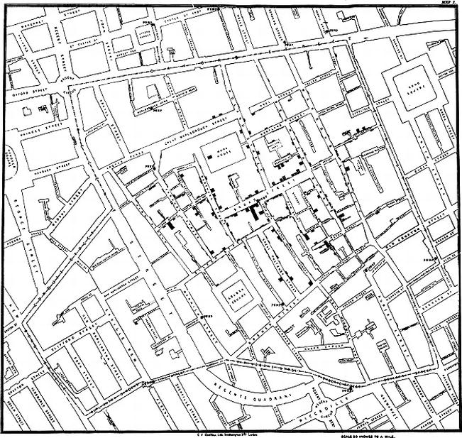
Figure 1-8. John Snow’s cholera map
Dr. Snow had the Broad Street water pump closed, and the outbreak ended.
Beautiful, concise, and logical.
Another historically significant information graphic is the Diagram of the Causes of Mortality in the Army in the East, by Florence Nightingale and William Farr. This chart is shown in Figure 1-9.
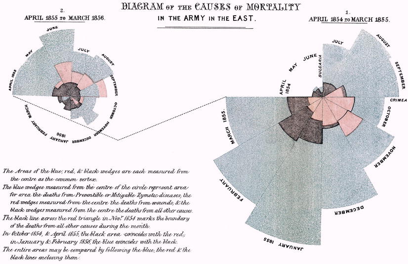
Figure 1-9. Florence Nightingale and William Farr’s Diagram of the Causes of Mortality in the Army in the East
Nightingale and Farr created this chart in 1856 to demonstrate the relative number of preventable deaths and, at a higher level, to improve the sanitary conditions of military installations. Note that the Nightingale and Farr visualization is a stylized pie chart. Pie charts are generally a circle representing the entirety of a given data set with slices of the circle representing percentages of a whole. The usefulness of pie charts is sometimes debated because it can be argued that it is harder to discern the difference in value between angles than it is to determine the length of a bar or the placement of a line against Cartesian coordinates. Nightingale seemingly avoids this pitfall by having not just the angle of the wedge hold value but by also altering the relative size of the slices so they eschew the confines of the containing circle and represent relative value.
All the above examples had specific goals or problems that they were trying to solve.
![]() Note A rich comprehensive history is beyond the scope of this book, but if you are interested in a thoughtful, incredibly researched analysis, be sure to read Edward Tufte’s The Visual Display of Quantitative Information.
Note A rich comprehensive history is beyond the scope of this book, but if you are interested in a thoughtful, incredibly researched analysis, be sure to read Edward Tufte’s The Visual Display of Quantitative Information.
Modern Landscape
Data visualization is in the midst of a modern revitalization due in large part to the proliferation of cheap storage space to store logs, and free and open source tools to analyze and chart the information in these logs.
From a consumption and appreciation perspective, there are websites that are dedicated to studying and talking about information graphics. There are generalized sites such as FlowingData that both aggregate and discuss data visualizations from around the web, from astrophysics timelines to mock visualizations used on the floor of Congress.
The mission statement from the FlowingData About page (http://flowingdata.com/about/) is appropriately the following: “FlowingData explores how designers, statisticians, and computer scientists use data to understand ourselves better—mainly through data visualization.”
There are more specialized sites such as quantifiedself.com that are focused on gathering and visualizing information about oneself. There are even web comics about data visualization, the quintessential one being xkcd.com, run by Randall Munroe. One of the most famous and topical visualizations that Randall has created thus far is the Radiation Dose Chart. We can see the Radiation Dose Chart in Figure 1-10 (it is available in high resolution here: http://xkcd.com/radiation/).
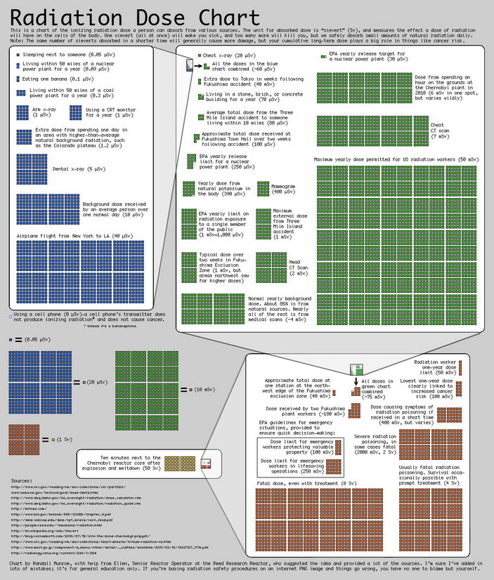
Figure 1-10. Radiation Dose Chart, by Randall Munroe. Note that the range in scale being represented in this visualization as a single block in one chart is exploded to show an entirely new microcosm of context and information. This pattern is repeated over and over again to show an incredible depth of information
This chart was created in response to the Fukushima Daiichi nuclear disaster of 2011, and sought to clear up misinformation and misunderstanding of comparisons being made around the disaster. It did this by demonstrating the differences in scale for the amount of radiation from sources such as other people or a banana, up to what a fatal dose of radiation ultimately would be—how all that compared to spending just ten minutes near the Chernobyl meltdown.
Over the last quarter of a century, Edward Tufte, author and professor emeritus at Yale University, has been working to raise the bar of information graphics. He published groundbreaking books detailing the history of data visualization, tracing its roots even further back than Playfair, to the beginnings of cartography. Among his principles is the idea to maximize the amount of information included in each graphic—both by increasing the amount of variables or data points in a chart and by eliminating the use of what he has coined chartjunk. Chartjunk, according to Tufte, is anything included in a graph that is not information, including ornamentation or thick, gaudy arrows.
Tufte also invented the sparkline, a time series chart with all axes removed and only the trendline remaining to show historic variations of a data point without concern for exact context. Sparklines are intended to be small enough to place in line with a body of text, similar in size to the surrounding characters, and to show the recent or historic trend of whatever the context of the text is.
Why Data Visualization?
In William Playfair’s introduction to the Commercial and Political Atlas, he rationalizes that just as algebra is the abbreviated shorthand for arithmetic, so are charts a way to “abbreviate and facilitate the modes of conveying information from one person to another.” Almost 300 years later, this principle remains the same.
Data visualizations are a universal way to present complex and varied amounts of information, as we saw in our opening example with the quarterly earnings report. They are also powerful ways to tell a story with data.
Imagine you have your Apache logs in front of you, with thousands of lines all resembling the following:
127.0.0.1 - - [10/Dec/2012:10:39:11 +0300] "GET / HTTP/1.1" 200 468 "-" "Mozilla/5.0 (X11; U; Linux i686; en-US; rv:1.8.1.3) Gecko/20061201 Firefox/2.0.0.3 (Ubuntu-feisty)"
127.0.0.1 - - [10/Dec/2012:10:39:11 +0300] "GET /favicon.ico HTTP/1.1" 200 766 "-" "Mozilla/5.0 (X11; U; Linux i686; en-US; rv:1.8.1.3) Gecko/20061201 Firefox/2.0.0.3 (Ubuntu-feisty)"
Among other things, we see IP address, date, requested resource, and client user agent. Now imagine this repeated thousands of times—so many times that your eyes kind of glaze over because each line so closely resembles the ones around it that it’s hard to discern where each line ends, let alone what cumulative trends exist within.
By using some analysis and visualization tools such as R, or even a commercial product such as Splunk, we can artfully pull out all kinds of meaningful and interesting stories out of this log, from how often certain HTTP errors occur and for which resources, to what our most widely used URLs are, to what the geographic distribution of our user base is.
This is just our Apache access log. Imagine casting a wider net, pulling in release information, bugs and production incidents. What insights we could gather about what we do: from how our velocity impacts our defect density to how our bugs are distributed across our feature sets. And what better way to communicate those findings and tell those stories than through a universally digestible medium, like data visualizations?
The point of this book is to explore how we as developers can leverage this practice and medium as part of continual improvement—both to identify and quantify our successes and opportunities for improvements, and more effectively communicate our learning and our progress.
Tools
There are a number of excellent tools, environments, and libraries that we can use both to analyze and visualize our data. The next two sections describe them.
Languages, Environments, and Libraries
The tools that are most relevant to web developers are Splunk, R, and the D3 JavaScript library. See Figure 1-11 for a comparison of interest over time for them (from Google Trends).
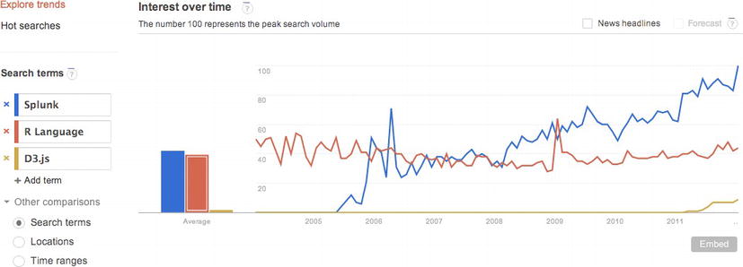
Figure 1-11. Google Trends analysis of interest over time in Splunk, R, and D3
From the figure we can see that R has had a steady consistent amount of interest since 200; Splunk had an introduction to the chart around 2005, had a spike of interest around 2006, and had steady growth since then. As for D3, we see it just start to peak around 2011 when it was introduced and its predecessor Protovis was sunsetted.
Let’s start with the tool of choice for many developers, scientists, and statisticians: the R language. We have a deep dive into the R environment and language in the next chapter, but for now it’s enough to know that it is an open source environment and language used for statistical analysis and graphical display. It is powerful, fun to use, and, best of all, it is free.
Splunk has seen a tremendous steady growth in interest over the last few years—and for good reason. It is easy to use once it’s set up, scales wonderfully, supports multiple concurrent users, and puts data reporting at the fingertips of everyone. You simply set it up to consume your log files; then you can go into the Splunk dashboard and run reports on key values within those logs. Splunk creates visualizations as part of its reporting capabilities, as well as alerting. While Splunk is a commercial product, it also offers a free version, available here: http://www.splunk.com/download.
D3 is a JavaScript library that allows us to craft interactive visualizations. It is the official follow-up to Protovis. Protovis was a JavaScript library created in 2009 by Stanford University’s Stanford Visualization Group. Protovis was sunsetted in 2011, and the creators unveiled D3. We explore the D3 library at length in Chapter 4.
Analysis Tools
Aside from the previously mentioned languages and environments, there are a number of analysis tools available online.
A great hosted tool for analysis and research is Google Trends. Google Trends allows you to compare trends on search terms. It provides all kinds of great statistical information around those trends, including comparing their relative search volume (see Figure 1-12), the geographic area those trends are coming from (see Figure 1-13), and related keywords.
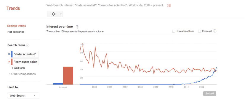
Figure 1-12. Google Trends for the terms “data scientist” and “computer scientist” over time; note the interest in the term “data scientist” growing rapidly from 2011 on to match the interest in the term “computer scientist”
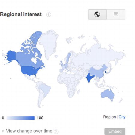
Figure 1-13. Google Trends data map showing geographic location where interest in the key words is originating
Another great tool for analysis is Wolfram|Alpha (http://wolframalpha.com). See Figure 1-14 for a screenshot of the Wolfram|Alpha homepage.
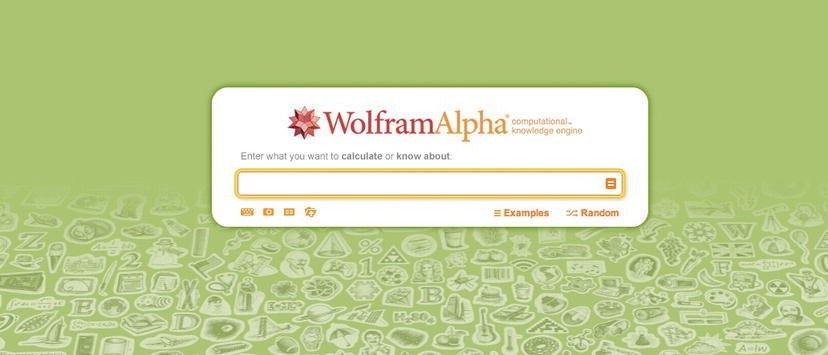
Figure 1-14. Home page for Wolfram|Alpha
Wolfram|Alpha is not a search engine. Search engines spider and index content. Wolfram|Alpha is instead a Question Answering (QA) engine that parses human readable sentences with natural language processing and responds with computed results. Say, for example, you want to search for the speed of light. You might go to the Wolfram|Alpha site and type in “What is the speed of light?” Remember that it uses natural language processing to parse your search query, not the keyword lookup.
The results of this query can be seen in Figure 1-15. Wolfram|Alpha essentially looks up all the data it has around the speed of light and presents it in a structured, categorized fashion. You can also export the raw data for each result.
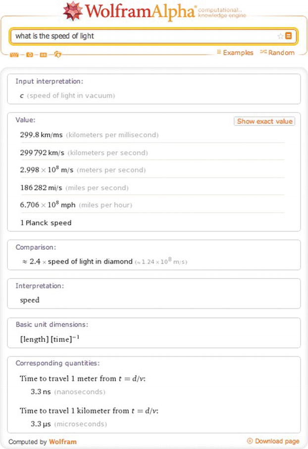
Figure 1-15. Wolfram|Alpha results for query What is the speed of light
So we understand what data visualization is, have a high-level understanding of the history of it and an idea of the current landscape. We’re beginning to get an inkling about how we can start to use this in our world. We know some of the tools that are available to us to facilitate the analysis and creation of our charts. Now let’s look at the process involved.
Creating data visualizations involves four core steps:
- Identify a problem.
- Gather the data.
- Analyze the data.
- Visualize the data.
Let’s walk through each step in the process and re-create one of the previous charts to demonstrate the process.
Identify a Problem
The very first step is to identify a problem we want to solve. This can be almost anything—from something as profound and wide-reaching as figuring out why your bug backlog doesn’t seem to go down and stay down, to seeing what feature releases over a given period in time caused the most production incidents, and why.
For our example, let’s re-create Figure 1-5 and try to quantify the interest in data visualization over time as represented by the number of New York Times articles on the subject.
Gather Data
We have an idea of what we want to investigate, so let’s dig in. If you are trying to solve a problem or tell a story around your own product, you would of course start with your own data—maybe your Apache logs, maybe your bug backlog, maybe exports from your project tracking software.
![]() Note If you are focusing on gathering metrics around your product and you don’t already have data handy, you need to invest in instrumentation. There are many ways to do this, usually by putting logging in your code. At the very least, you want to log error states and monitor those, but you may want to expand the scope of what you track to include for debugging purposes while still respecting both your user’s privacy and your company’s privacy policy. In my book, Pro JavaScript Performance: Monitoring and Visualization, I explore ways to track and visualize web and runtime performance.
Note If you are focusing on gathering metrics around your product and you don’t already have data handy, you need to invest in instrumentation. There are many ways to do this, usually by putting logging in your code. At the very least, you want to log error states and monitor those, but you may want to expand the scope of what you track to include for debugging purposes while still respecting both your user’s privacy and your company’s privacy policy. In my book, Pro JavaScript Performance: Monitoring and Visualization, I explore ways to track and visualize web and runtime performance.
One important aspect of data gathering is deciding which format your data should be in (if you're lucky) or discovering which format your data is available in. We’ll next be looking at some of the common data formats in use today.
JSON is an acronym that stands for JavaScript Object Notation. As you probably know, it is essentially a way to send data as serialized JavaScript objects. We format JSON as follows:
[object]{
    [attribute]: [value],
    [method] : function(){},
    [array]: [item, item]
}
Another way to transfer data is in XML format. XML has an expected syntax, in which elements can have attributes, which have values, values are always in quotes, and every element must have a closing element. XML looks like this:
<parent attribute="value">
    <child attribute="value">node data</child>
</parent>
Generally we can expect APIs to return XML or JSON to us, and our preference is usually JSON because as we can see it is a much more lightweight option just in sheer amount of characters used.
But if we are exporting data from an application, it most likely will be in the form of a comma separated value file, or CSV. A CSV is exactly what it sounds like: values separated by commas or some other sort of delimiter:
value1,value2,value3
value4,value5,value6
For our example, we’ll use the New York Times API Tool, available at http://prototype.nytimes.com/gst/apitool/index.html. The API Tool exposes all the APIs that the New York Times makes available, including the Article Search API, the Campaign Finance API, and the Movie Review API. All we need to do is select the Article Search API from the drop-down menu, type in our search query or the phrase that we want to search for, and click “Make Request”.
This queries the API and returns the data to us, formatted as JSON. We can see the results in Figure 1-16.
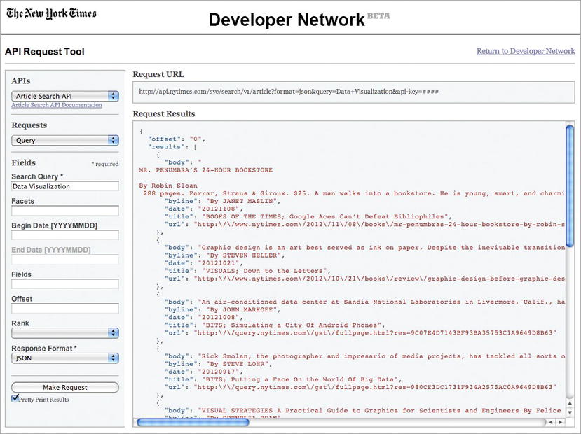
Figure 1-16. The NY Times API Tool
We can then copy and paste the returned JSON data to our own file or we could go the extra step to get an API key so that we can query the API from our own applications.
For the sake of our example, we will save the JSON data to a file that we will name jsNYTimesData. The contents of the file will be structured like so:
{
 "offset": "0",
 "results": [
   {
     "body": "BODY COPY",
     "byline": "By AUTHOR",
     "date": "20121011",
     "title": "TITLE",
     "url": "http:// www.nytimes.com/foo.html "
   }, {
     "body": "BODY COPY",
     "byline": "By AUTHOR",
     "date": "20121021",
     "title": "TITLE",
     "url": "http:// www.nytimes.com/bar.html "
   }
     ],
 "tokens": [
   "JavaScript"
 ],
 "total": 2
}
Looking at the high-level JSON structure, we see an attribute named offset, an array named results, an array named tokens, and another attribute named total. The offset variable is for pagination (what page full of results we are starting with). The total variable is just what it sounds like: the number of results that are returned for our query. It’s the results array that we really care about; it is an array of objects, each of which corresponds to an article.
The article objects have attributes named body, byline, date, title, and url.
We now have data that we can begin to look at. That takes us to our next step in the process, analyzing our data.
DATA SCRUBBING
There is often a hidden step here, one that anyone who’s dealt with data knows about: scrubbing the data. Often the data is either not formatted exactly as we need it or, in even worse cases, it is dirty or incomplete.
In the best-case scenario in which your data just needs to be reformatted or even concatenated, go ahead and do that, but be sure to not lose the integrity of the data.
Dirty data has fields out of order, fields with obviously bad information in them—think strings in ZIP codes—or gaps in the data. If your data is dirty, you have several choices:
- You could drop the rows in question, but that can harm the integrity of the data—a good example is if you are creating a histogram removing rows could change the distribution and change what your results will be.
- The better alternative is to reach out to whoever administers the source of your data and try and get a better version if it exists.
Whatever the case, if data is dirty or it just needs to be reformatted to be able to be imported into R, expect to have to scrub your data at some point before you begin your analysis.
Analyze Data
Having data is great, but what does it mean? We determine it through analysis.
Analysis is the most crucial piece of creating data visualizations. It’s only through analysis that we can understand our data, and it is only through understanding it that we can craft our story to share with others.
To begin analysis, let’s import our data into R. Don’t worry if you aren’t completely fluent in R; we do a deep dive into the language in the next chapter. If you aren’t familiar with R yet, don’t worry about coding along with the following examples: just follow along to get an idea of what is happening and return to these examples after reading Chapters 3 and 4.
Because our data is JSON, let’s use an R package called rjson. This will allow us to read in and parse JSON with the fromJSON() function:
library(rjson)
json_data <- fromJSON(paste(readLines("jsNYTimesData.txt"), collapse=""))
This is great, except the data is read in as pure text, including the date information. We can’t extract information from text because obviously text has no contextual meaning outside of being raw characters. So we need to iterate through the data and parse it to more meaningful types.
Let's create a data frame (an array-like data type specific to R that we talk about next chapter), loop through our json_data object; and parse year, month, and day parts out of the date attribute. Let’s also parse the author name out of the byline, and check to make sure that if the author’s name isn’t present we substitute the empty value with the string “unknown”.
df <- data.frame()
for(n in json_data$results){
        year <-substr(n$date, 0, 4)
        month <- substr(n$date, 5, 6)
        day <- substr(n$date, 7, 8)
        author <- substr(n$byline, 4, 30)
        title <- n$title
        if(length(author) < 1){
                author <- "unknown"
        }
Next, we can reassemble the date into a MM/DD/YYYY formatted string and convert it to a date object:
      datestamp <-paste(month, "/", day, "/", year, sep="")
      datestamp <- as.Date(datestamp,"%m/%d/%Y")
And finally before we leave the loop, we should add this newly parsed author and date information to a temporary row and add that row to our new data frame.
      newrow <- data.frame(datestamp, author, title, stringsAsFactors=FALSE, check.rows=FALSE)
      df <- rbind(df, newrow)
}
rownames(df) <- df$datestamp
Our complete loop should look like the following:
df <- data.frame()
for(n in json_data$results){
      year <-substr(n$date, 0, 4)
      month <- substr(n$date, 5, 6)
      day <- substr(n$date, 7, 8)
      author <- substr(n$byline, 4, 30)
      title <- n$title
      if(length(author) < 1){
            author <- "unknown"
      }
      datestamp <-paste(month, "/", day, "/", year, sep="")
      datestamp <- as.Date(datestamp,"%m/%d/%Y")
      newrow <- data.frame(datestamp, author, title, stringsAsFactors=FALSE, check.rows=FALSE)
      df <- rbind(df, newrow)
}
rownames(df) <- df$datestamp
Note that our example assumes that the data set returned has unique date values. If you get errors with this, you may need to scrub your returned data set to purge any duplicate rows.
Once our data frame is populated, we can start to do some analysis on the data. Let’s start out by pulling just the year from every entry, and quickly making a stem and leaf plot to see the shape of the data.
![]() Note John Tukey created the stem and leaf plot in his seminal work, Exploratory Data Analysis. Stem and leaf plots are quick, high-level ways to see the shape of data, much like a histogram. In the stem and leaf plot, we construct the “stem” column on the left and the “leaf” column on the right. The stem consists of the most significant unique elements in a result set. The leaf consists of the remainder of the values associated with each stem. In our stem and leaf plot below, the years are our stem and R shows zeroes for each row associated with a given year. Something else to note is that often alternating sequential rows are combined into a single row, in the interest of having a more concise visualization.
Note John Tukey created the stem and leaf plot in his seminal work, Exploratory Data Analysis. Stem and leaf plots are quick, high-level ways to see the shape of data, much like a histogram. In the stem and leaf plot, we construct the “stem” column on the left and the “leaf” column on the right. The stem consists of the most significant unique elements in a result set. The leaf consists of the remainder of the values associated with each stem. In our stem and leaf plot below, the years are our stem and R shows zeroes for each row associated with a given year. Something else to note is that often alternating sequential rows are combined into a single row, in the interest of having a more concise visualization.
First, we will create a new variable to hold the year information:
yearlist <- as.POSIXlt(df$datestamp)$year+1900
If we inspect this variable, we see that it looks something like this:
> yearlist
 [1] 2012 2012 2012 2012 2012 2012 2012 2012 2012 2012 2012 2012 2012 2011 2011 2011 2011 2011 2011 2011 2011 2011 2011 2011 2011 2011 2011 2011 2011
[30] 2011 2011 2011 2011 2010 2010 2010 2010 2010 2010 2010 2010 2010 2010 2009 2009 2009 2009 2009 2009 2009 2008 2008 2008 2007 2007 2007 2007 2006
[59] 2006 2006 2006 2005 2005 2005 2005 2005 2005 2004 2003 2003 2003 2002 2002 2002 2002 2001 2001 2000 2000 2000 2000 2000 2000 1999 1999 1999 1999
[88] 1999 1999 1998 1998 1998 1997 1997 1996 1996 1995 1995 1995 1993 1993 1993 1993 1992 1991 1991 1991 1990 1990 1990 1990 1989 1989 1989 1988 1988
[117] 1988 1986 1985 1985 1985 1984 1982 1982 1981
That’s great, that’s exactly what we want: a year to represent every article returned. Next let’s create the stem and leaf plot:
> stem(yearlist)
 1980 | 0
 1982 | 00
 1984 | 0000
 1986 | 0
 1988 | 000000
 1990 | 0000000
 1992 | 00000
 1994 | 000
 1996 | 0000
 1998 | 000000000
 2000 | 00000000
 2002 | 0000000
 2004 | 0000000
 2006 | 00000000
 2008 | 0000000000
 2010 | 000000000000000000000000000000
 2012 | 0000000000000
Very interesting. We see a gradual build with some dips in the mid-1990s, another gradual build with another dip in the mid-2000s and a strong explosion since 2010 (the stem and leaf plot groups years together in twos).
Looking at that, my mind starts to envision a story building about a subject growing in popularity. But what about the authors of these articles? Maybe they are the result of one or two very interested authors that have quite a bit to say on the subject.
Let’s explore that idea and take a look at the author data that we parsed out. Let’s look at just the unique authors from our data frame:
> length(unique(df$author))
[1] 81
We see that there are 81 unique authors or combination of authors for these articles! Just out of curiosity, let’s take a look at the breakdown by author for each article. Let’s quickly create a bar chart to see the overall shape of the data (the bar chart is shown in Figure 1-17):
plot(table(df$author), axes=FALSE)
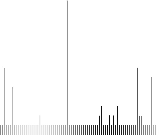
Figure 1-17. Bar chart of number of articles by author to quickly visualize
We remove the x and y axes to allow ourselves to focus just on the shape of the data without worrying too much about the granular details. From the shape, we can see a large number of bars with the same value; these are authors who have written a single article. The higher bars are authors who have written multiple articles. Essentially each bar is a unique author, and the height of the bar indicates the number of articles they have written. We can see that although there are roughly five standout contributors, most authors have average one article.
Note that we just created several visualizations as part of our analysis. The two steps aren’t mutually exclusive; we often times create quick visualizations to facilitate our own understanding of the data. It’s the intention with which they are created that make them part of the analysis phase. These visualizations are intended to improve our own understanding of the data so that we can accurately tell the story in the data.
What we’ve seen in this particular data set tells a story of a subject growing in popularity, demonstrated by the increasing number of articles by a variety of authors. Let’s now prepare it for mass consumption.
![]() Note We are not fabricating or inventing this story. Like information archaeologists, we are sifting through the raw data to uncover the story.
Note We are not fabricating or inventing this story. Like information archaeologists, we are sifting through the raw data to uncover the story.
Visualize Data
Once we’ve analyzed the data and understand it (and I mean really understand the data to the point where we are conversant in all the granular details around it), and once we’ve seen the story that the data has within, it is time to share that story.
For the current example, we’ve already crafted a stem and leaf plot as well as a bar chart as part of our analysis. However, stem and leaf plots are great for analyzing data, but not so great for messaging out about the findings. It is not immediately obvious what the context of the numbers in a stem and leaf plot represents. And the bar chart we created supported the main thesis of the story instead of communicating that thesis.
Since we want to demonstrate the distribution of articles by year, let’s instead use a histogram to tell the story:
hist(yearlist)
See Figure 1-18 for what this call to the hist() function generates.
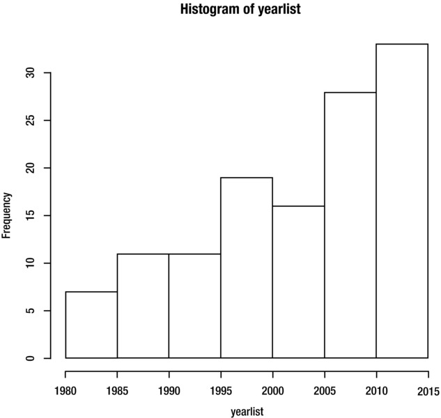
Figure 1-18. Histogram of yearlist
This is a good start, but let’s refine this further. Let’s color in the bars, give the chart a meaningful title, and strictly define the range of years.
hist(yearlist, breaks=(1981:2012), freq=TRUE, col="#CCCCCC", main="Distribution of Articles about Data Visualization
by the NY Times", xlab = "Year")
This produces the histogram that we see in Figure 1-5.
Ethics of Data Visualization
Remember Figure 1-3 from the beginning of this chapter where we looked at the weighted popularity of the search term “Data Visualization”? By constraining the data to 2006 to 2012, we told a story of a keyword growing in popularity, almost doubling in popularity over a six-year period. But what if we included more data points in our sample and extended our view to include 2004? See Figure 1-19 for this expanded time series chart.
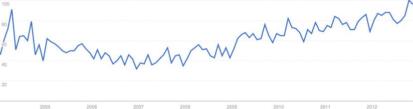
Figure 1-19. Google Trends time series chart with expanded time range. Note that the additional data points give a greater context and tell a different story
This expanded chart tells a different story: one that describes a dip in popularity between 2005 and 2009. This expanded chart also demonstrates how easy it is to misrepresent the truth intentionally or unintentionally with data visualizations.
Cite Sources
When Playfair first published his Commercial and Political Atlas, one of the biggest biases he had to battle was the inherent distrust his peers had of charts to accurately represent data. He tried to overcome this by including data tables in the first two editions of the book.
Similarly, we should always include our sources when distributing our charts so that our audience can go back and independently verify the data if they want to. This is important because we are trying to share information, not hoard it, and we should encourage others to inspect the data for themselves and be excited about the results.
Be Aware of Visual Cues
A side effect of using charts to function as visual shorthand is that we bring our own perspective and context to play when we view charts. We are used to certain things, such as the color red being used to signify danger or flagging for attention, or the color green signifying safety. These color connotations are part of a branch of color theory called color harmony, and it’s worth at least being aware of what your color choices could be implying.
When in doubt, get a second opinion. When creating our graphics, we can often get married to a certain layout or chart choice. This is natural because we have spent time invested in analyzing and crafting the chart. A fresh, objective set of eyes should point out unintentional meanings or overly complex designs, and make for a more crisp visualization.
Summary
This chapter took a look at some introductory concepts about data visualization, from conducting data gathering and exploration, to looking at the charts that make up the visual patterns that define how we communicate with data. We looked a little at the history of data visualization, from the early beginnings with William Playfair and Florence Nightingale to modern examples such as xkcd.com.
While we saw a little bit of code in this chapter, in the next chapter we start to dig in to the tactics of learning R and getting our hands dirty reading in data, shaping data, and crafting our own visualizations.