
![]()
Correlation Analysis with Scatter Plots
In the last chapter, you looked at using bar charts to analyze production incidents. You saw that bar charts are great for displaying the differences in a ranked data set, and you used this idea to identify areas in which issues recurred. You also used stacked bar charts to see the granular breakdown in the severity of production incidents.
This chapter looks at correlation analysis with scatter plots. Scatter plots are charts that plot two independent data sets on their own axes, displayed as points on a Cartesian grid (x- and y coordinates). As you’ll see, scatter plots are used to try and identify relationships between the two data points.
![]() Note Michael Friendly and Daniel Denis have published a thoughtful and thoroughly researched dissertation on the history of scatter plots, originally published by the Journal of the History of the Behavioral Sciences, Vol. 41 in 2005, and available on Friendly’s website at http://www.datavis.ca/papers/friendly-scat.pdf. This article is absolutely recommended reading because it tries to trace back the very first recorded scatter plots and the first time a chart was called a scatter plot, and very deftly delineates the difference between a scatter plot and a time series (a time series always has time as one of the data points, but scatter plots can have any discrete values as data points).
Note Michael Friendly and Daniel Denis have published a thoughtful and thoroughly researched dissertation on the history of scatter plots, originally published by the Journal of the History of the Behavioral Sciences, Vol. 41 in 2005, and available on Friendly’s website at http://www.datavis.ca/papers/friendly-scat.pdf. This article is absolutely recommended reading because it tries to trace back the very first recorded scatter plots and the first time a chart was called a scatter plot, and very deftly delineates the difference between a scatter plot and a time series (a time series always has time as one of the data points, but scatter plots can have any discrete values as data points).
Finding Relationships in Data
The pattern, or lack of a pattern, that the points form on a scatter plot indicates the relationship. At a very high level, relationships can be:
- Positive correlation, in which one variable increases as the other increases. This is demonstrated by the dots forming a line trending diagonally upward from left to right (see Figure 8-1).
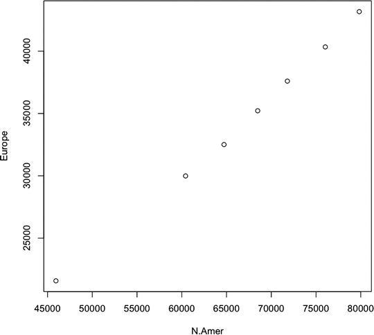
Figure 8-1. Scatter plot showing positive correlation between total phones in North America and Europe
- Negative correlation, in which one variable increases as the other decreases. This is demonstrated by the dots forming a line trending downward from left to right (see Figure 8-2).
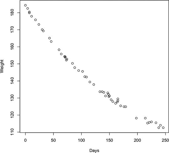
Figure 8-2. Scatter plot showing negative correlation between body weight and time passing (for a person on a diet)
- No correlation, demonstrated (or not) by a scatter plot that has no discernible trend line (see Figure 8-3).
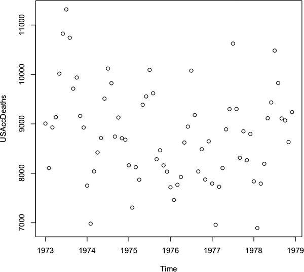
Figure 8-3. Scatter plot showing no correlation between number of accidental deaths in the United States over years
Of course, simply identifying correlation between two data points or data sets does not imply that there is direct cause in the relationship—hence the convention that correlation does not imply causation. For example, see the negative correlation chart in Figure 8-2. If we were to assume direct causation between the two axes—weight and number of days—we would be assuming that the passing of time caused body weight to decrease.
Although scatter plots are great for analyzing the relationship between two sets of data, there is a related pattern that can be used to introduce a third set of data as well. This visualization is called a bubble chart and it uses the radius of the points in a scatter plot to expose the third dimension of data.
See Figure 8-4 for a bubble chart that shows the correlation in length of tooth growth in guinea pigs and doses of vitamin C administered. The third data point is the method of delivery: either by vitamin supplement or by orange juice. It is added as the radius of each point in the graphic; the larger circle is the vitamin supplement and the smaller circle is orange juice.
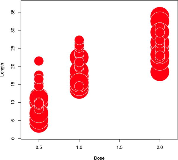
Figure 8-4. Correlation of tooth growth and doses of vitamin C in guinea pigs, both by vitamin supplement and by orange juice
For our purposes in this chapter, we will use scatter plots and bubble charts to look at the implied relationship that team velocity has with our other areas of focus, in effect doing correlation analysis on team dynamics. We will compare things like team size and velocity, velocity and production incidents, and so on.
Introductory Concepts of Agile Development
Let’s start by introducing some preliminary concepts of Agile development. If you are already versed in Agile, this section will be a bit of a review. There are many flavors of Agile development, but the high-level concepts that most have in common are the ideas of time boxing a body of work. Time boxing enables the team to focus on one thing and finish it, allowing the stakeholders to quickly give feedback on what was completed. This short feedback loop allows for teams and stakeholders to pivot, or react and change direction as requirements and even industries change.
This span of time that the team works on the body of work—whether it is 1 week, 3 weeks, or what have you—is called a sprint. At the end of a sprint, the team doing the work should have releasable code, though releasing after each sprint is not a requirement.
Sprints begin with a planning session in which teams define the body of work, and sprints end with a review session in which the team goes over the body of work completed. Periodically during a sprint, the team grooms new work to complete; it defines the work in user stories that list acceptance criteria. It is these user stories that get prioritized and committed to in the planning sessions held at the beginning of each sprint.
See Figure 8-5 for a high-level workflow of this process.
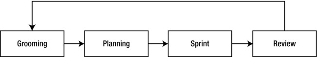
Figure 8-5. High-level workflow for Agile development
User stories have story points associated with them. Story points are estimates of the level of complexity for the story and are usually a numeric value. As teams complete sprints, they begin to form a consistent velocity. Velocity is the average amount of story points that a team will complete in a sprint.
Velocity is important because you use it to estimate how much your team can complete at the start of each sprint and to project out how much of your backlog of work the team may be able to complete from your roadmap over the course of the year.
There are a number of tools available to manage Agile projects, such as Rally (http://www.rallydev.com/) or Greenhopper from Atlassian (http://www.atlassian.com/software/greenhopper/overview), the same company that makes Jira and Confluence. Whatever tool you use should provide the ability to export your data, including user point counts for each sprint.
Correlation Analysis
To begin the analysis, let’s export a totaled sum of story points for each sprint along with the team name. We should compile all these data points into a single file that we will name teamvelocity.txt. Our file should look something like the following, which shows data for the 12.1 and 12.2 sprints for the teams named Red and Gold (arbitrary names for teams that are working on the same product just with different bodies of work):
Sprint,TotalPoints,Team
12.1,25,Gold
12.1,63,Red
12.2,54,Red
...
Let’s add an additional column in there to represent the total team members on each team for each sprint. The data should now look like so:
Sprint,TotalPoints,TotalDevs,Team
12.1,25,6,Gold
12.1,63,10,Red
12.2,54,9,Red
...
We have also made this sample data set available here: http://tom-barker.com/data/teamvelocity.txt.
Excellent, let’s now read this into R:
tvFile <- "/Applications/MAMP/htdocs/teamvelocity.txt"
teamvelocity <- read.table(tvFile, sep=",", header=TRUE)
Now create a scatter plot using the plot()function to compare the total points that the teams completed in each sprint against how many members were on the team for each sprint. We pass teamvelocity$TotalPoints and teamvelocity$TotalDevs as the first two parameters, set the type to p, and give meaningful labels for the axes:
plot(teamvelocity$TotalPoints,teamvelocity$TotalDevs, type="p", ylab="Team Members",
xlab="Velocity", bg="#CCCCCC", pch=21)
This creates the scatter plot that we can see in Figure 8-6; we can see that as we add more members to a team, the number of story points that they can complete in an iteration, or sprint, also increases.
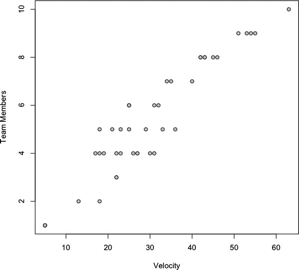
Figure 8-6. Correlation of team velocity and total team members
If we want a greater insight into the data that we have so far, for example, to show which points belong to which team, we could visualize that information with a bubble chart. We can create bubble charts using the symbols() function. We pass in TotalPoints and TotalDevs into symbols(), just as we did for plot(), but we also pass in the Team column into a parameter named circles. This specifies the radius of the circle to draw on the chart. Because for our example Team is a string, R converts it to a factor. We also set the color of the circle with the bg parameter and the stroke color of the circle with the fg parameter.
symbols(teamvelocity$TotalPoints, teamvelocity$TotalDevs, circles=teamvelocity$Team, inches=0.35, fg="#000000", bg="#CCCCCC", ylab="Team Members", xlab="Velocity")
The previous R code should produce a bubble chart that looks like Figure 8-7.
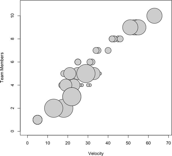
Figure 8-7. Correlation of team velocity, total team members, with size of bubble indicating team
The bubble chart shown in Figure 8-7 is of limited use, mainly because the team breakdown is not really a relevant data point. Let’s take the teamvelocity.txt file and begin to layer in more information. We already discussed tracking bug data back in Chapter 6; now let’s use our bug-tracking software and add in two new bug–related data points: the total bugs in each team’s backlog at the end of each sprint and how many bugs were opened within each sprint. We’ll name the columns for these new data points BugBacklog and BugsOpened, respectively.
The updated file should look something like this:
Sprint,TotalPoints,TotalDevs,Team,BugBacklog,BugsOpened
12.1,25,6,Gold,125,10
12.2,42,8,Gold,135,30
12.3,45,8,Gold,150,25
Let’s next create a scatter plot with this new data. We’ll first compare velocity against bugs opened during each iteration:
plot(teamvelocity$TotalPoints,teamvelocity$BugsOpened, type="p", xlab="Velocity", ylab="Bugs Opened During Sprint", bg="#CCCCCC", pch=21)
This creates the scatter plot shown in Figure 8-8.
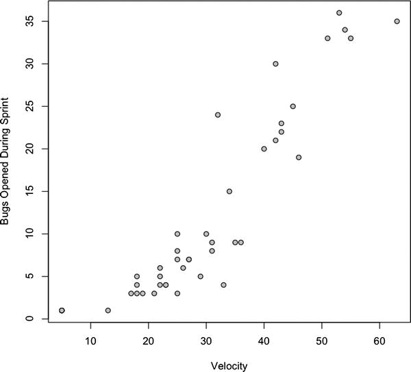
Figure 8-8. Correlation of team velocity and bugs opened
Now this is very interesting. There a positive correlation between having more people on a team and getting more done (or at least getting more complex work done), and the more story points that are completed, the more bugs are generated. So an increase in complexity correlates to an increase in the number of bugs created in a given sprint. At least that seems to be implied by my data.
Let’s reflect this new data point in the existing bubble chart; instead of sizing circles by team, we size them by bugs opened:
symbols(teamvelocity$TotalPoints, teamvelocity$TotalDevs, circles=teamvelocity$BugsOpened, inches=0.35, fg="#000000", bg="#CCCCCC", ylab="Team Members", xlab="Velocity", main = "Velocity by Team Size by Bugs Opened")
This code produces the bubble chart shown in Figure 8-9; you see that the sizing of the bubbles follows the existing pattern of positive correlation, in that the bubbles get larger as both the number of team members and the team velocity increases.
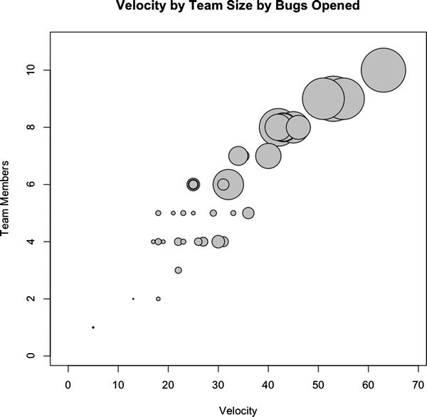
Figure 8-9. Correlation of team velocity and team size, where circle size indicates bugs opened
Let’s next create a scatter plot to look at the total bug backlog after each sprint:
plot(teamvelocity$TotalPoints,teamvelocity$BugBacklog, type="p", xlab="Velocity", ylab="Total Bug Backlog", bg="#CCCCCC", pch=21)
This code produces the chart shown in Figure 8-10.
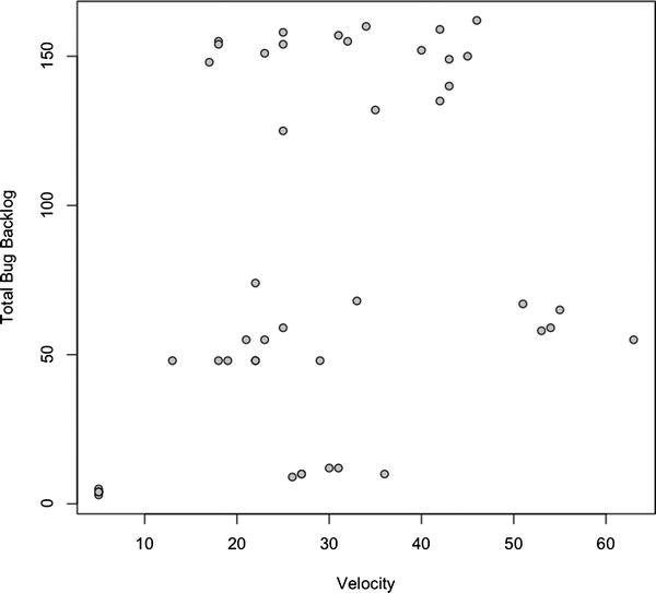
Figure 8-10. Correlation of team velocity by total bug backlog
This figure shows that no correlation exists. This could be because of any number of reasons: maybe the team has been fixing bugs during the sprint or maybe they are closing all the bugs opened during the course of the iteration. Determining the root cause is beyond the scope of the scatter plot, but we can tell that while the bugs being opened and the level of complexity increases, the total bug backlog does not increase.
Visualizing Production Incidents
Let’s next layer in another data point into the file; we’ll add a column for production incidents opened against the work done during the sprint. To be very specific, when a body of work in a sprint is completed, it is released to production, and a release number is generally associated with that release. This last data point we discuss is concerned with tracking issues in production against the release for a given iteration. Not issues that came in during the iteration; issues that came in once the work done in the iteration was pushed to production.
Now let’s add in the last column, named ProductionIncidents:
Sprint,TotalPoints,TotalDevs,Team,BugBacklog,BugsOpened,ProductionIncidents
12.1,25,6,Gold,125,10,1
12.2,42,8,Gold,135,30,3
12.3,45,8,Gold,150,25,2
Great, let’s next create a new bubble chart with this data, comparing total story points completed, bugs opened each iteration, and production incidents per release:
symbols(teamvelocity$TotalPoints, teamvelocity$BugsOpened, circles=teamvelocity$ProductionIncidents, inches=0.35, fg="#000000", bg="#CCCCCC", ylab="Bugs Opened", xlab="Velocity", main = "Velocity by Bugs Opened by Production Incidents Opened")
This code creates the chart shown in Figure 8-11.
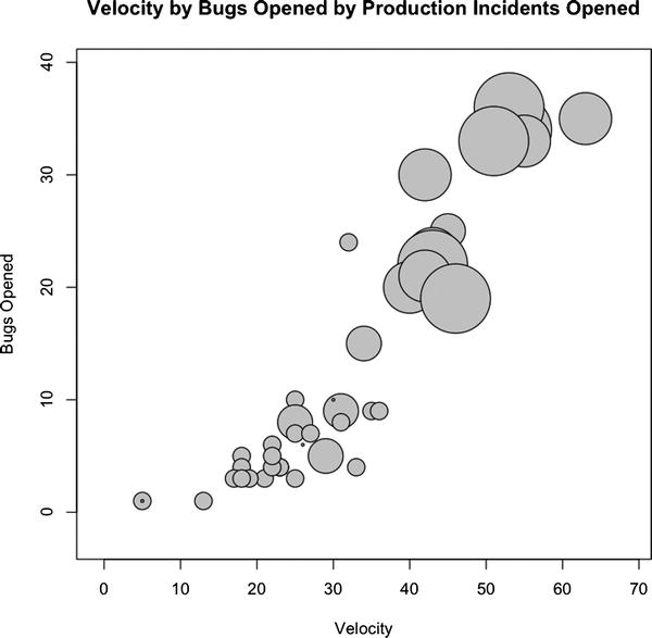
Figure 8-11. Correlation of team velocity and bugs opened, where the size of the circle indicates the number of production incidents
From this chart you can see that, at least according to our sample data, there exists a positive correlation between total story points completed, bugs opened, and production incidents opened for a given sprint.
Finally, now that all the data is layered into the flat file, we can create a scatter plot matrix. This is a matrix of all the columns compared with each other with scatter plots. We can use the scatter plot matrix to look at all the data at once and quickly pick out any correlation patterns that may exist in the data set. We can create a scatter plot matrix with just the plot() function or with the pairs() function in the graphics package:
plot(teamvelocity)
pairs(teamvelocity)
Either one produces the chart shown in Figure 8-12.
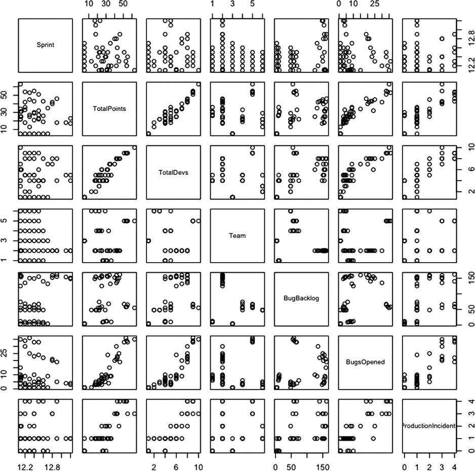
Figure 8-12. Scatter plot matrix of our complete data set
Figure 8-12, each row represents one of the columns in the data frame and each scatter plot represents the intersection of those columns. When you scan over each scatter plot in the matrix, you can clearly see the correlation patterns in the combinations already covered this chapter.
We made the R code from this chapter available on RPubs at this location: http://rpubs.com/tomjbarker/5461.
Interactive Scatter Plots in D3
So far in this chapter, we’ve been creating different scatter plots to represent the data combinations that we wanted to look at. But what if we want to create a scatter plot that allows us to select the data points on which the axes were based? With D3 we can do just that!
Adding the Base HTML and JavaScript
Let’s start with the base HTML structure that has d3.js included as well as the base CSS:
<!DOCTYPE html>
<html>
  <head>
          <meta charset="utf-8">
    <title></title>
<style>

body {
  font: 15px sans-serif;
}

.axis path{
  fill: none;
  stroke: #000;
  shape-rendering: crispEdges;
}


.dot {
  stroke: #000;
}

</style>
</head>
<body>
<script src="d3.v3.js"></script>
</body>
</html>
Let’s next add in the script tag to hold the chart. Just like the previous D3 examples, include the starting variables, margin, x and y range objects, and x and y axis objects:
<script>
var margin = {top: 20, right: 20, bottom: 30, left: 40},
    width = 960 - margin.left - margin.right,
    height = 500 - margin.top - margin.bottom;

var x = d3.scale.linear()
    .range([0, width]);

var y = d3.scale.linear()
    .range([height, 0]);

var xAxis = d3.svg.axis()
    .scale(x)
    .orient("bottom");

var yAxis = d3.svg.axis()
    .scale(y)
    .orient("left");
</script>
Let’s also create the SVG tag on the page as in the previous examples:
var svg = d3.select("body").append("svg")
    .attr("width", width + margin.left + margin.right)
    .attr("height", height + margin.top + margin.bottom)
  .append("g")
    .attr("transform", "translate(" + margin.left + "," + margin.top + ")");
Loading the Data
Now we need to load in the data using the d3.csv() function. In all previous D3 examples, most of the work was done in the scope of the callback function, but for this example we need to expose our functionality publicly so we can change the data points via form select elements. Yet we still need to drive the initial functionality from the callback function because that’s when we will have our data, so we will set up our callback function to call stubbed-out public functions.
We set a public variable that we call chartData to the data returned from the flat file and call two functions called removeDots() and setChartDots():
d3.csv("teamvelocity.txt", function(error, data) {
          chartData = data;
          removeDots()
          setChartDots("TotalDevs", "TotalPoints")
});
Notice that we passed in "TotalDevs" and "TotalPoints" to the setChartDots() function. This is to prime the pump because they will be the initial data points we show when the page loads.
Adding Interactive Functionality
Now we need to actually create the things we stubbed out. First, let’s create the variable chartData at the root of the script tag where we set the other variables:
var margin = {top: 20, right: 20, bottom: 30, left: 40},
    width = 960 - margin.left - margin.right,
    height = 500 - margin.top - margin.bottom,
    chartData;
Next, we create the removeDots() function, which selects any circles or axes on the page and removes them:
function removeDots(){
      svg.selectAll("circle")
           .transition()
               .duration(0)
               .remove()
      svg.selectAll(".axis")
             .transition()
             .duration(0)
             .remove()
}
And finally we create the setChartDots() functionality. The function accepts two parameters: xval and yval. Because we want to make sure that the D3 transitions are finished running and they have a 250-millisecond default runtime, even when we set the duration to 0, we will wrap the contents of the function in a setTimeout() call so we wait 300 milliseconds before starting to draw our chart. If we don’t do this, we could enter into a race condition in which we are drawing to screen as the transition is removing from the screen.
function setChartDots(xval, yval){
         setTimeout(function() {

         }, 300);
  }
Within the function, we set the domains of the x and y scale objects using the xval and yval parameters. These parameters correspond to the column names of the data points that we will be charting:
x.domain(d3.extent(chartData, function(d) { return d[xval];}));
y.domain(d3.extent(chartData, function(d) { return d[yval];}));
Next we draw the circles to the screen, using the global chartData variable to feed it and the passed-in columnal data as the x and y coordinates of the circles. We also grow the axes in this function, so that we redraw the values each time an axis is changed.
svg.selectAll(".dot")
     .data(chartData)
     .enter().append("circle")
     .attr("class", "dot")
     .attr("r", 3)
     .attr("cx", function(d) { return x(d[xval]);})
     .attr("cy", function(d) { return y(d[yval]);})
     .style("fill", "#CCCCCC");

svg.append("g")
     .attr("class", "axis")
     .attr("transform", "translate(0," + height + ")")
     .call(xAxis)

 svg.append("g")
     .attr("class", "axis")
     .call(yAxis)
The complete function should look like the following:
function setChartDots(xval, yval){
       setTimeout(function() {
        x.domain(d3.extent(chartData, function(d) { return d[xval];}));
        y.domain(d3.extent(chartData, function(d) { return d[yval];}));

        svg.selectAll(".dot")
            .data(chartData)
          .enter().append("circle")
            .attr("class", "dot")
            .attr("r", 3)
            .attr("cx", function(d) { return x(d[xval]);})
            .attr("cy", function(d) { return y(d[yval]);})
            .style("fill", "#CCCCCC");

            svg.append("g")
                .attr("class", "axis")
                .attr("transform", "translate(0," + height + ")")
                .call(xAxis)

            svg.append("g")
                .attr("class", "axis")
                .call(yAxis)

       }, 300);
}
Excellent!
Let’s next add in the form fields. We’ll add two select elements, where each option corresponds to a column in the flat file. The elements call a JavaScript function, getFormData(), that we will define shortly:
<form>
        Y-Axis:
        <select id="yval" onChange="getFormData()">
                 <option value="TotalPoints">Total Points</option>
                 <option value="TotalDevs">Total Devs</option>
                 <option value="Team">Team</option>
                 <option value="BugsOpened">Bugs Opened</option>
                 <option value="ProductionIncidents">Production Incidents</option>
        </select>
        X-Axis:
        <select id="xval" onChange="getFormData()">
                 <option value="TotalPoints">Total Points</option>
                 <option value="TotalDevs">Total Devs</option>
                 <option value="Team">Team</option>
                 <option value="BugsOpened">Bugs Opened</option>
                 <option value="ProductionIncidents">Production Incidents</option>
        </select>
</form>
The last bit of functionality left is to code the getFormData() function. This function pulls out the selected options from both select elements and use those values to pass in to setChartDots()—after calling removeDots(), of course.
function getFormData(){
       var xEl = document.getElementById("xval")
       var yEl = document.getElementById("yval")
       var x = xEl.options[xEl.selectedIndex].value
       var y = yEl.options[yEl.selectedIndex].value
       removeDots()
       setChartDots(x,y)
}
Great!
The complete source code should look like the following:
<!DOCTYPE html>
<html>
  <head>
          <meta charset="utf-8">
    <title></title>
<style>

body {
  font: 10px sans-serif;
}

.axis path,
.axis line {
  fill: none;
  stroke: #000;
  shape-rendering: crispEdges;
}

.dot {
  stroke: #000;
}

</style>
</head>
<body>
        <form>
                Y-Axis:
                <select id="yval" onChange="getFormData()">
                         <option value="TotalPoints">Total Points</option>
                         <option value="TotalDevs">Total Devs</option>
                         <option value="Team">Team</option>
                         <option value="BugsOpened">Bugs Opened</option>
                         <option value="ProductionIncidents">Production Incidents</option>
                </select>
                X-Axis:
                <select id="xval" onChange="getFormData()">
                         <option value="TotalPoints">Total Points</option>
                         <option value="TotalDevs">Total Devs</option>
                         <option value="Team">Team</option>
                         <option value="BugsOpened">Bugs Opened</option>
                         <option value="ProductionIncidents">Production Incidents</option>
                </select>
        </form>
<script src="d3.v3.js"></script>
<script>

var margin = {top: 20, right: 20, bottom: 30, left: 40},
    width = 960 - margin.left - margin.right,
    height = 500 - margin.top - margin.bottom,
        chartData;

var x = d3.scale.linear()
    .range([0, width]);

var y = d3.scale.linear()
    .range([height, 0]);

var xAxis = d3.svg.axis()
    .scale(x)
    .orient("bottom");

var yAxis = d3.svg.axis()
    .scale(y)
    .orient("left");

var svg = d3.select("body").append("svg")
    .attr("width", width + margin.left + margin.right)
    .attr("height", height + margin.top + margin.bottom)
  .append("g")
    .attr("transform", "translate(" + margin.left + "," + margin.top + ")");

    svg.append("g")
        .attr("class", "x axis")
        .attr("transform", "translate(0," + height + ")")
        .call(xAxis)

    svg.append("g")
        .attr("class", "y axis")
        .call(yAxis)

   function getFormData(){
          var xEl = document.getElementById("xval")
          var yEl = document.getElementById("yval")
          var x = xEl.options[xEl.selectedIndex].value
          var y = yEl.options[yEl.selectedIndex].value
          removeDots()
          setChartDots(x,y)
   }

   function removeDots(){
         svg.selectAll("circle")
              .transition()
                  .duration(0)
                  .remove()
         svg.selectAll(".axis")
                 .transition()
                .duration(0)
                .remove()
   }

  function setChartDots(xval, yval){
         setTimeout(function() {
          x.domain(d3.extent(chartData, function(d) { return d[xval];}));
          y.domain(d3.extent(chartData, function(d) { return d[yval];}));

          svg.selectAll(".dot")
              .data(chartData)
            .enter().append("circle")
              .attr("class", "dot")
              .attr("r", 3)
              .attr("cx", function(d) { return x(d[xval]);})
              .attr("cy", function(d) { return y(d[yval]);})
              .style("fill", "#CCCCCC");

               svg.append("g")
                  .attr("class", "axis")
                  .attr("transform", "translate(0," + height + ")")
                  .call(xAxis)

              svg.append("g")
                  .attr("class", "axis")
                  .call(yAxis)

         }, 300);
  }

d3.csv("teamvelocity.txt", function(error, data) {
          chartData = data;
          removeDots()
          setChartDots("TotalDevs", "TotalPoints")
});
</script>
</body>
</html>
And it should create the interactive visualization shown in Figure 8-13.
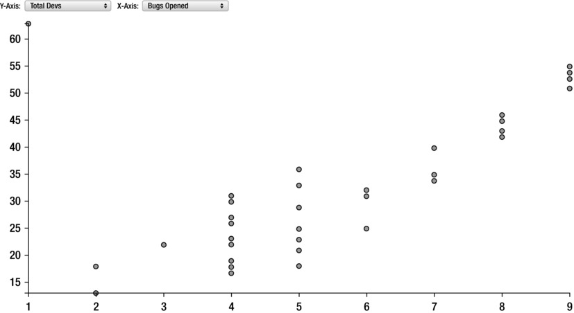
Figure 8-13. Interactive scatter plot with D3
Summary
This chapter looked at correlations between the speed at which a team moves and the opening of bugs and production issues. There is naturally a positive correlation between these data points: when we make new things, we create new opportunities for those new things and existing things to break.
Of course, that doesn’t mean that we should stop making new things, even if for some reason our business units and our very industries would allow it. It means that we need to find balance between making new things and nurturing and maintaining the things that we already have. This is exactly what we will look at in the next chapter.