
Developing Better Than Native Games
Back in Chapter 3, we covered the common pitfalls that cause a game to perform poorly, as well as the techniques to address them. Now we will tackle techniques to make your game look and feel just like a native one on mobile.
By applying the techniques learned from high performance JavaScript with the ones that we are about to cover, your game will both perform and look like its native counterparts while being cross-platform. It will be better than native.
Note that you will be able to see all the techniques in action in the demo available in the download pack from www.apress.com along with the source code.
The HTML5 Fullscreen API
The most prominent difference between a native game and a web game is certainly the browser and the system bars all around it. Thankfully, with the fullscreen API you can request a fullscreen status and make the game the center of the player’s attention.
Here’s how the API looks like for entering fullscreen:
canvas.requestFullscreen();
canvas.webkitRequestFullscreen(Element.ALLOW_KEYBOARD_INPUT);
canvas.mozRequestFullScreen();
And here’s how it looks for exiting fullscreen:
document.exitFullscreen();
document.webkitExitFullscreen();
document.mozCancelFullscreen();
Yep, that’s it. However, you can only enter fullscreen upon user interaction. That is, you must call fullscreen from a touch or click event handler; otherwise it won’t work, as shown in Figure 15-1. Figure 15-2 shows it running at full screen.
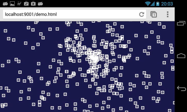
Figure 15-1. Our demo not running fullscreen
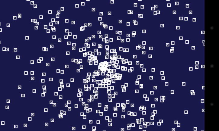
Figure 15-2. Our demo running fullscreen; note the lack of system and address bar
You can see from Figures 15-1 and 15-2 that fullscreen makes a huge difference for the player, who can now enjoy a fully immersive experience as opposed to one that just feels like browsing.
In order for your players to switch to fullscreen you need to provide them with a button. Remember that if you were to call the API programmatically it wouldn’t work; you have to call requestFullscreen from a touch or click event handler.
Since you should decouple event handling from your game loop (see Chapter 20), you may resort to using a DOM element on top of your game to serve as a fullscreen button as a quick solution. With event handling decoupled from your loop, you cannot call requestFullscreen from the loop when your code detects that an event has happened inside the boundaries of a button. Instead, you can either call requestFullscreen directly from your game’s touch or click handler, and in that case you need check the event coordinates against the button area, as shown in Listing 15-1.
Listing 15-1. Calling requestFullscreen directly from your game’s touch or click handler
onTouch = function(event){
        // retrieve first touch coordinates
        var x = event.touches[0].clientX,
            y = event.touches[0].clientY;

        // isInFullscreenButtonArea detects if the button have been clicked
        if(isInFullscreenButtonArea(x,y)){
                canvas.requestFullscreen();
}

else{ // fullscreen button haven’t been touched
        // record event coordinates for later use by our loop
        recordTouch(x, y);
}
};

canvas.addEventListener( 'touchstart', onTouch );
You could also create a DOM element such as a div with its own event handler to serve as a button, as shown in Listing 15-2.
Listing 15-2. Creating a DOM element with its own event handler to serve as a button
onTouch = function(event){
        canvas.requestFullscreen();
};

div.addEventListener( 'touchstart', onTouch );
Depending of the structure of your game, one approach might be more convenient to implement than another.
Losing Fullscreen and How to Handle It
On both desktop and mobile you may lose fullscreen state at any time. The user can exit fullscreen himself by hitting a key, by performing a gesture, or by rotating the device; he might also cause fullscreen to exit by switching apps or turning the screen off.
Whether the user exits fullscreen on purpose or accidentally, your game should be able to handle it. The browser fires the fullscreenchange event whenever it enters or exits fullscreen. When your user exits fullscreen, you should give the option to the user to go back fullscreen; you may also choose to pause the game. See the code in Listing 15-3.
Listing 15-3. Giving the user the option to go back fullscreen after exiting it
onFullscreenLose = function(){
        showFullscreenButton();
        pauseGame();
};

document.addEventListener("fullscreenchange", function () {
   if(document.fullscreen == false) onFullscreenLose();
}, false);

document.addEventListener("mozfullscreenchange", function () {
if(document.mozFullScreen == false) onFullscreenLose();
}, false);

document.addEventListener("webkitfullscreenchange", function () {
if(document.webkitIsFullScreen == false) onFullscreenLose();
}, false);
Going Further
The fullscreen API is still a working draft, and browsers are using prefixed names. I recommend abstracting the fullscreen API using screenfull.js, an awesome cross-browser wrapper for the fullscreen API by Sindre Sorhus. You can get it at https://github.com/sindresorhus/screenfull.js.
Also be aware that the fullscreen API isn’t available in all browsers at the time of writing; when it’s not available, you can resort to using some hacky techniques like scrolling programmatically to hide the address bar. Check HTML5Rocks for some fresh info on the subject at www.html5rocks.com/en/mobile/fullscreen.
Lowering the Resolution
Your game may very well benefit from lowering its resolution. While CPU power is certainly a bottleneck, fillrate is limited on mobile GPUs (graphics processing units). It is worth noting that fillrate limitations may impact your performance whenever you are using WebGL or Canvas2D since the latter is hardware accelerated and thus uses the GPU.
There is a trend of increased resolution for mobile screens while at the same time GPUs have constraints regarding power consumption and heat production. Not every device with a comfortable resolution will be able to render your game at 60 Hz if you size your canvas at 100% of the screen.
 Note The fillrate is the number of pixels a GPU can render during a second.
When to Lower Resolution
To test if you are fillrate bound on a device, lower the viewport dimensions. If the framerate increases, you are fillrate bound and will benefit from lowering your game resolution.
In the case of a 2D game, you could be fillrate bound because your game is using plenty of transparent layers. You may want to lower the number of transparent sprites before having to resort to lower the resolution. Also, note that if you are using WebGL, fillrate depends on shader complexity, so it’s always worth checking if you can simplify your fragment shader, for instance by moving code to your vertex shader.
Fillrate varies widely from one device to another, so it’s worth testing your game on as many devices as you can. Listing 15-4 shows some code to compute the frame rate.
Listing 15-4. Computing Frame Rate
var t = window.performance.now(),
    frame_count = 0, // increased on each Request Animation Frame (RAF)
                        //so we can compute avg_fps

    avg_fps = 0;     // FPS averaged over many frames

function tick() {
        requestAnimationFrame( tick );

      var n = window.performance.now(),
          raf_delta = n - t,
          current_fps = 1000 / raf_delta;

      t = n;

        // you could compute average fps over many frames
        avg_fps = (avg_fps * frame_count + current_fps) / ++frame_count;

        // you could also add some code to display current_fpsin a DOM element
        myElement.innerHTML = current_fps + "FPS";


        // read input, move things, render them
        game.step()
}
You could use the average frame rate to trigger resolution lowering (see the next section) but if you choose to do so you should keep in mind the JavaScript engine compilation time discussed previously, since your frame rate will suffer from it if your code hasn’t been optimized.
Performance varies widely from device to device, so it might be a good idea to notify the user that his device is not performing well when lowering resolution is not enough.
To lower the resolution and keep the game area the same size, you will downscale your viewport and canvas sizes, and then upscale the canvas using CSS. As a result, you will compute fewer pixels and the browser will upscale them almost for free. See Listing 15-5 for the code.
Listing 15-5. Lowering the Resolution
canvas.width  = width  * scaling;
canvas.height = height * scaling;
canvas.style.width = width + 'px';
gl.viewport( 0, 0, width * scaling, height * scaling );
Since you’re use WebGL and a matrix to transform the vertices, you don’t need to do anything else. If you were to use canvas 2D, you would have to scale your sprites and their coordinates to draw them at the right place. In Figure 15-4, you can see that the graphic quality of our demo is severely degraded compared to Figure 15-3. Figure 15-4 exhibits the Bad Way™ of resolution lowering. Next, we’ll discuss how to properly downscale your canvas while maintaining graphic quality.
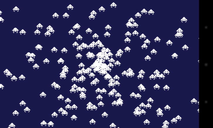
Figure 15-3. Our demo running at full resolution
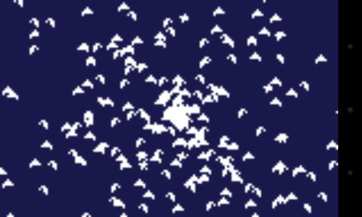
Figure 15-4. Our demo running at a 4x lower resolution without any optimization
Keeping Your Sprites Sharp
Blurry sprites look bad. In order for your sprites to keep maximum sharpness, they must be snapped to a pixel grid. See Figure 15-5.
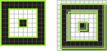
Figure 15-5. The left image shows how the particle sprite looks like when snapped to the grid at x:0, y:0. On the right you can see how it looks like at x:0.75, y: 0.75. The green lines represent the outlines of the sprite pixels
Snapping sprites to the pixel grid is very easy; you just have to round the coordinates before drawing, like this:
x = Math.round(x);
y = Math.round(y);
If you rescale your sprites and want them to stay sharp, you have to scale them by an integer value; otherwise the sprites pixels won’t be aligned to the grid and the results will be interpolated.
Staying Sharp Using Less Pixels
What about lowering the resolution? The most practical case is a “divided by 2” resolution so the pixel grid is twice as large and one pixel now covers the equivalent of four. It also means that you are rendering four times less pixels, and as you’ve seen before, it may save a lot of work for the GPU. See Figure 15-6.
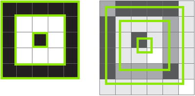
Figure 15-6. As you can see, snapping is even more important with a lower resolution. Since the grid is larger, interpolated sprites look muddy, and in the case of text using a pixel font, it would probably be illegible
To snap your sprite to a twice as large grid, you will round odd coordinates to even ones, like so:
x = Math.round(x);
if((x & 1) === 1){ x-- } // (x & 1) returns 1if xis odd
y = Math.round(y);
if((y & 1) === 1){ y-- }
Scaling is now much more constrained as you have to scale only by multiple of 2 if you want the sprites pixels to cover an area that can be expressed in round pixels of the new grid. You can see in Figure 15-8 that by snapping our sprites to a grid there is no visible difference compared with Figure 15-7 when halving the resolution.
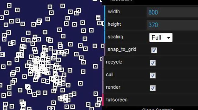
Figure 15-7. Our demo running at full resolution
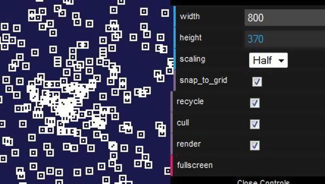
Figure 15-8. Our demo running at half resolution using grid snapping
As you can see, keeping your sprites sharp in the case of a lowered resolution is very important and requires some planning at the design stage. Obviously, being able to use the same assets at different resolutions is the cheapest solution but you may also use different spritesheets, each with art adapted to a specific resolution.
Whether you design a low-res spreadsheet or generate one offline, you can benefit from faster load times on less capable devices. A twice as small spritesheet means four times less pixels to send down the wire!
When scaling the canvas with CSS to compensate for a lower resolution in order to retain the same size in absolute pixels, the browser is responsible for the upscaling operation. As you probably know from Photoshop, there are different ways to scale an image. Indeed, once upon a time in a CSS3 draft, an “image-rendering” property was made available to hint to the browser about how to scale an image. Unfortunately that property isn’t part of the CSS3 final spec and has been moved to CSS4. However, Firefox has implemented it; others, like Chrome, haven’t at the time of writing.
canvas {
  image-rendering: optimize-contrast;
  image-rendering: -moz-crisp-edges;
  image-rendering: -webkit-optimize-contrast;
}
In the figures that follow, image-rendering is set to optimize-contrast, the intended value for pixel art to be scaled properly. Figure 15-9 was done in Firefox; Figure 15-10 was done using Chrome, which does not implement the “image-rendering” property at the time of writing.
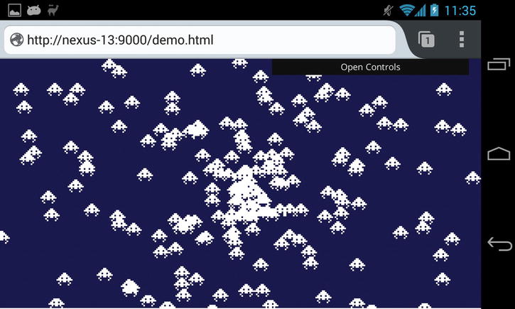
Figure 15-9. Our demo running in Firefox, where sprites are looking very sharp
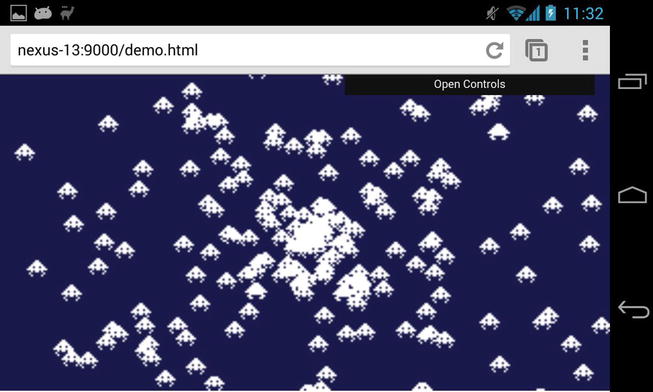
Figure 15-10. Our demo running in Chrome; note the slight blur and the soft edges
Device display panels can affect the sharpness of your sprites when they are moving or animating; LCD pixels take some time to switch from full brightness to black and from black back full brightness again. The result is that your fast-animated sprite can look blurry.
LCD response times vary widely, from 15ms to 35ms on mobile devices. However, OLED panels, a different technology used in some phones, have faster response times. As you can see, display panel responsiveness can have an effect on the look of your sprites. In Figure 15-11, the sprite is moving in a straight line, leaving ghosts behind. Imagine the mess if it was animated or rotating!
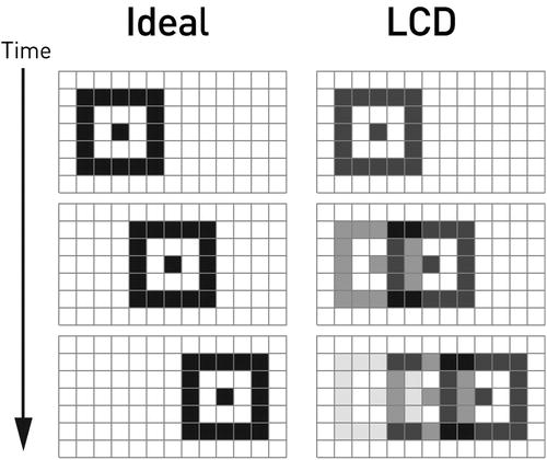
Figure 15-11. A sequence of images illustrating a sprite moving from left to right
Unfortunately, there is not much you can do about it in code. However, by taking motion blur into account at the design stage you can mitigate its effects, for instance by avoid high scrolling speed or using sprites with enough contrast so they don’t smudge into the background when moving.
Unwanted Behaviors
Unlike native games, ours live in the browser. With this comes pesky gestures like pinch zoom and constrains like the inability to lock the device display to a given orientation.
When playing a game it’s very easy to trigger the pinch zoom gesture by accident. To disable zooming, you can use the following line in the <head> of the HTML document:
<meta name="viewport" content="width=device-width, initial-scale=1.0, user-scalable=no">
Here you declare the viewport, which is the area where your page is being drawn, to be the same width as the device, set zoom or scale to 1.0, and remove the user’s ability to zoom your page.
Your game is probably designed to work in landscape or portrait mode, but not both. Currently a lockOrientation method is suggested in the Screen Orientation API draft. Unfortunately, browsers except for Firefox haven’t implemented it, and it is only available there for fullscreen or packaged web apps.
Since you cannot lock orientation, you have to tell the users how they should rotate their devices and prevent them from using the game until their devices are in the right orientation. To do so, you can use window.orientation to determine the current orientation, as shown in Listing 15-6.
Listing 15-6. Using window.orientation
checkOrientation = function(){
            if( window.orientation === 90 || window.orientation === -90 ){
                // handle portrait mode
            }
            else if( window.orientation === 0 || window.orientation === 180 ){
                // handle landscape mode
            }
            else{
               // handle not supported device orientation, probably a desktop
            }
};
If you want your game to be played in landscape mode, you can pause the game when in portrait and prompt the users to rotate their devices. Obviously you need to know when the orientation changes, so you need to listen for orientationchange, like so:
window.addEventListener("orientationchange", function() {
            checkOrientation();
        }, false);
Now when the device is in the desired orientation, you have to remove your prompt and let your users resume the game!
Home Screen
Once your game performs well, runs fullscreen, and feels like a native one, the missing piece is a way to launch it like a native game to remove the annoying requirement for the users to have to start the browser and look for your game every time they want to play.
With Safari on iOS and Chrome 32+ on Android, there is a way to declaratively indicate to the browser that your game can run standalone without the need of showing the browser chrome. To do so, you simply add the following meta tags in the <head> of your document:
<meta name="apple-mobile-web-app-capable" content="yes">
<meta name="mobile-web-app-capable" content="yes">
Now users are able to add a shortcut to their home screen, as shown in Figures 15-12 and 15-13.
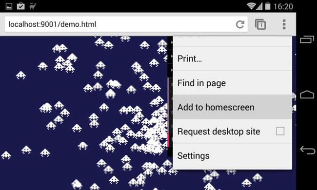
Figure 15-12. Chrome menu with the Add to homescreen item
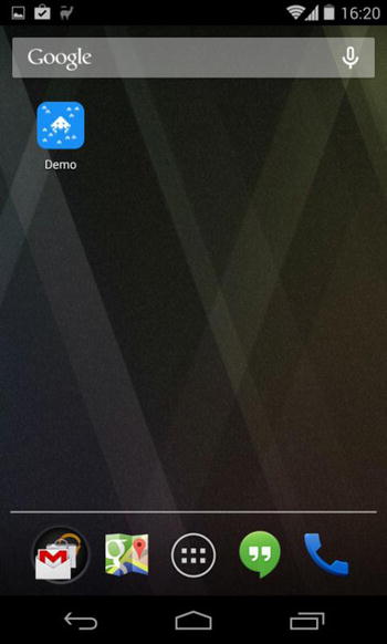
Figure 15-13. A shortcut to our demo has been added to the homescreen
What you have here is a glorified bookmark that will allow users to launch your game directly and without any browser chrome surrounding it. Firefox OS went a different route and does not have a declarative way to achieve the same thing; instead it requires a manifest file. This approach is a little bit more complex and is geared toward publishing on the Firefox Marketplace rather than providing a way to add shortcuts for public-facing web games to users devices.
You should also specify the icon to be used. iOS and Android do not use the same naming, nor do they recommend the same sizes, as you can see here:
<link rel="shortcut icon" sizes="196x196" href="android-hires.png">
<link rel="apple-touch-icon" sizes="76x76" href="ipad.png">
<link rel="apple-touch-icon" sizes="120x120" href="iphone-retina.png">
<link rel="apple-touch-icon" sizes="152x152" href="ipad-retina.png">
Android will use the largest shortcut icon available while iOS will pick the apple-touch-icon whose size is recommended for the device.
When a user launches the game using the home screen shortcut, the game will be fullscreen—or more accurately the document will be; in that case you won’t need to display a button to switch to fullscreen, as mentioned previously in the “The HTML5 Fullscreen API” section.
While iOS window.navigator.standalone is true when launched from the home screen, in Android there is no such thing, so you will have to guess, using the difference between the window height and the client height. Here’s a snippet that works for both Android and iOS:
standalone = window.navigator.standalone || ( window.screen.height - window.innerHeight < 40 );
At the time of writing, the Android system bar alone is 25px tall and the system bar added to the Chrome navigation bar makes a 73px tall block. In the snippet above, you check that the height difference between the window and the device screen is below 40px, so you have good safety margin in case any of those values change.
Further References
Every OS provides different ways for users to add a web game to their home screen, and these ways are likely to evolve, so be sure to check the links below so you can provide your users with the best experience possible.
A document detailing the home screen apps feature of Chrome for Android:
https://developers.google.com/chrome/mobile/docs/installtohomescreen
Information from Apple on how to build web applications for Safari:
https://developer.apple.com/library/safari/documentation/AppleApplications/Reference/SafariWebContent/ConfiguringWebApplications/ConfiguringWebApplications.html
All about the Open Web App manifest file for Firefox OS:
https://developer.mozilla.org/en-US/Apps/Developing/Manifest
Conclusion
In this chapter you saw how to make a web game feel like a native one by running it fullscreen while maintaining performance and sharpness. You also learned how to allow users to add your game amongst native ones on their home screen.
What is possible is to blur the lines between native and web games; this will continue evolve quickly, and we are likely to see new APIs in each browser whose implementation will differ until some standards emerges. As more exciting new features will be made possible for HTML5 games, you will have to keep an eye on what’s new if you wish to stay on top of the game!