
In the last chapter, I showed you how to create a line chart using a symbol in the Glyph pane. You also learned something more important, that if you bind a numerical field to the y-axis, glyphs will be plotted against this axis according to their value, regardless of their shape or size.

A Charticulator
The problem is that before you can create this bar chart, you must be aware of a key concept in Charticulator which is that the attributes of the plot segment determine the layout of a Charticulator chart. There are two different types of plot segment in Charticulator: 2D region and line. In this chapter, we will only be considering the 2D region plot segment (we will take a look at the line plot segment in Chapter 16) and will be taking a guided tour around the attributes of this chart element. In doing so, you will discover that it’s the sub-layout of the plot segment that is instrumental in determining the type of visual you will generate, whether it’s a column, bar, matrix, cloud, or jitter style of chart. You will also learn how to manage the more pedestrian elements of the chart design: the spacing, sorting, and alignment of the glyphs and also formatting axis labels and tick marks.

The 2D region plot segment with the plot segment toolbar
We’ve already seen the effect of binding fields to the X and Y Axis attributes of the plot segment and how this controls the layout of the glyphs within the chart. For instance, in Chapter 3, we saw that binding a categorical field to the X Axis attribute categorizes the glyphs along the x-axis according to that field. In Chapter 4, we bound a numerical field to the Y Axis attribute, and this generated a value axis that determined the layout of the glyphs on the chart, so much so that rectangle shapes behaved unintuitively and no longer sat neatly along the x-axis; see Figure 4-5.
In fact, the overriding factor in the layout of your chart is the fields you have bound to the x- and y-axes of the plot segment, the main layout if you like. Within these constraints, there is additional factor that influences the layout of the glyphs and that is the type of sub-layout that has been applied, from which there are six to choose. This is what will decide whether you end up with a column or bar chart, whether they’re stacked, clustered, or packed. It’s this attribute that will enable you to create the bar chart and indeed a host of alternative chart layouts. Sub-layouts are applied on top of the layout determined by the fields currently bound to the x- and y-axes, which always take precedence. This means that sometimes the sub-layout will be negated by the fields bound to the axes. For example, having two categorical axes will result in a grid layout even though the sub-layout is not set to “Grid” but to “Stack X.”
It’s the impact of axes, sub-layouts, and attributes of the plot segment that results in the final look and feel of your chart, and this is what you’ll be discovering in the content of this chapter.
Creating 2D Region Plot Segments

Creating a 2D region plot segment
Drawing the plot segment will generate a plot segment layer within the Chart layers in the Layers pane.
Using Plot Segment Sub-layouts
You can understand that if the layout of the chart is determined firstly by fields bound to the axes, either categorical or numerical, and then further influenced by a specific sub-layout that has been applied, the combination of these factors can quickly become overwhelming, and it’s easy to lose sight of where you need to head to achieve your desired chart. As we explore how sub-layouts impact on our chart, therefore, we will start with a very simple chart where there are no fields bound to the axes and a glyph that comprises a single rectangle shape. Then we can start to look at the combined effect of adding categorical fields bound to the axes and selecting different types of sub-layout. Later, we can explore sub-layouts using symbols with numerical axes.
The chart I will be using in my examples is shown in Figure 5-4 where I have also

A simple chart with no fields bound to axes

The sub-layouts of a Charticulator chart
Stack X (the default)
Stack Y
Grid
Packing
Jitter
Overlap
Let’s now explore each of these sub-layouts in turn.
Stack X

Stack X with no categorical or numerical axes uses the order of the fields to sort the glyphs
You could change this sorting order again by using the Options button, but nevertheless with no field bound to the x-axis, the sorting of the glyphs is not restrained by any x-axis grouping.
Stack X with a Categorical X-Axis

Binding a categorical field to the x-axis changes the layout
Once you have bound a categorical field to the axis, this will constrain the sorting of the glyphs to within each category.
Stack X with a Categorical Y-Axis

Binding a categorical field to the y-axis changes the layout

Using Stack X and a categorical y-axis to create a stacked bar chart
It’s worth mentioning here that it’s the binding of the data to the Width attribute that is instrumental in plotting the data and arriving at a meaningful visual.
Stack Y

The Stack Y sub-layout with no categorical axes
With regard to building our clustered bar chart, the chart in Figure 5-10 is looking promising. At least the glyphs are aligned in the correct direction.
Stack Y with a Categorical Y-Axis
All that’s now required to complete the bar chart is to bind a categorical field such as “Year” onto the y-axis. Then if you bind your numerical field to the Width attribute of the rectangle shape instead of the Height attribute, you’ll end up with a clustered bar chart. However, there is one thing still missing from our chart; a numerical legend on the x-axis to explain the lengths of the bars, so let’s now add in this legend.
Adding an X-Axis Numerical Legend

A with a legend on the x-axis
And that’s it. We’ve finally got there; we’ve built a clustered bar chart. But great progress as this is, we are still at the tip of the iceberg with regard to what sub-layouts can do for us.
Stack Y with a Categorical X-Axis

Stack Y with a produces a stacked column chart

The different combinations of Stack X and Stack Y
Understanding the stacking sub-layouts has enabled you to generate stacked and clustered bar and column charts. These types of charts are necessary when you are using two categorical fields, such as “Year” and “Salespeople,” so that both can be analyzed within the chart. What is particularly interesting about these two sub-layouts is what happens when you only have one category to worry about.
Stack X and Stack Y with One Category

Plotting only one category on the x-axis determines the layout

A stacked column chart with only one category, for example, “Salespeople”
The starting point is easy. You would just create a rectangle mark, bind a numerical field to the Height attribute and a categorical field to the Fill attribute, and then use the Stack Y sub-layout. Increasing the left and right margins of the chart canvas by dragging inwards on the guides will then reduce the width of the chart. The chart looks promising.

The chart is incorrect when a category is bound to the y-axis (on the right)
The chart was correct before we bound the y-axis field, so we need to remove this field from the Y Axis attribute. But how do we generate labels for the categories up the left side of the chart? To do this, you can attach a text mark to the left of the rectangle mark in the Glyph pane and bind the category to the Text attribute. The final embellishment is to add another text mark for the numerical value that shows inside the rectangle.
The moral of this story is that in Charticulator, you don’t always want to bind categories to axes! Charticulator is quite happy to render a chart with no fields bound to either the x- or y-axis.
Grid

How the Grid sub-layout changes the layout of the

Using the Grid sub-layout removes the need for

Grid sub-layout options on the
You can also find these options under the Sub-layout attributes of the plot segment, and you will discover a few more options besides. Take note that there is a Count attribute that controls the number of glyphs in each grid space. I’ll let you explore these options yourself and see how you can change the layout of the grid. Why don’t you try adding a few more categorical fields to your data and embark on a voyage of self-discovery with Charticulator’s Grid sub-layout?
In the meantime, just think on this; in Power BI, the equivalent visual that uses a grid-like structure is the Matrix visual. You can only put numbers (i.e. measures) into the values area of a Matrix, not multiple values, text values, or shapes. Here’s a challenge for you; would you be able to reproduce the chart in Figure 5-18 using a Power BI Matrix? You can see my attempt in Figure 5-20 where you can also observe that in Power BI you are restrained by the conventional cartesian layout, and so you must supply both row categories and column categories.

The Power BI Matrix visual requires row and column labels
The Grid sub-layout is great therefore for reproducing matrix style visuals but with many more design options.
Packing

The Packing sub-layout applied on top of a

on the Packing sub-layout using a symbol

Packing sub-layout with a symbol and a numerical
What a great visual for spotting outliers. What was salesperson “Charron” doing in 2020 that resulted in such an amazing sales performance?
Jitter
This sub-layout is used to show density of data points and works best when you have many data points to plot and with a symbol in the Glyph pane. To show you how it works, I’ve started with a new chart that has four categories, “Year,” “Month,” “Salespeople,” and “Regions,” and one numerical field, “Sales.”
The months should sort correctly when you click Save.

The compared with the Stack X sub-layout
The thing to understand regarding the Jitter sub-layout is that the positions of the symbols in the chart have no relationship with the data and are randomly arranged; it’s just the number that are present for any category that is important.
Overlap
The Overlap sub-layout is used by Charticulator when you bind a numerical field to the x- or y-axis generating a numerical axis. This allows Charticulator to plot the glyphs according to the categories on the categorical axis. For instance, multiple salespeople may have the same sales value in any year, and therefore the glyphs must be able to sit on top of each other. As we have seen in Chapter 4, when we looked at the difference between a numerical axis and a numerical legend, if you’re using a numerical axis, then it makes sense to also use a symbol in the Glyph pane, and we can produce a chart that will look similar to Figure 5-25 where you will note the Overlap sub-layout.

If you use a numerical axis, you get the Overlap sub-layout
We’ve now completed our exploration of Charticulator’s sub-layouts and from now on will be putting them to good use. I think you can appreciate that with Charticulator, to achieve your design objective, it’s all to do with how you combine your x- and y-axis fields with a specific plot segment sub-layout. This has been the most important lesson in understanding plot segments.
Let’s move on to look at some of the other attributes of the 2D region plot segment. These allow you to control some of the more mundane matters surrounding plot segments such as sorting axis labels and spacing out the glyphs, among other things. Simple and mundane as these are, what we’ll appreciate is that in Charticulator we have many more choices over how and what we can sort, space, and align than we would using a Power BI chart.

The plot segment toolbar showing the
With regard to options for spacing and formatting glyphs and axis labels, you will find these in the Attributes pane.
Sorting Glyphs and Labels
The attributes of the plot segment that we’re going to explore here are those concerned with sorting the glyphs in the plot segment. To appreciate how Charticulator deals with sorting and to put this into context, it might be a useful exercise to compare sorting in Charticulator with sorting elements in a chart generated in Power BI. What we’ll learn is that firstly Charticulator approaches sorting in a completely different way and secondly that Charticulator gives us a lot more control over what and how we sort the data.
Sorting a Power BI Chart

A clustered column chart generated in Power BI showing the absence of sorting options

Using a Power BI chart, you can expand into subcategories which allows sorting

In Power BI, the are sorted in the order they appear
There are a number of frustrations here. Firstly, in order to sort the columns, you have to use a hierarchical structure and drill down. Secondly, you can’t sort by the value within a category. For example, you can’t sort salesperson “Reyer’s” sales ascending by Sales value, only by Year. Finally, notice that I’ve used unconcatenated x-axis labels which can be particularly problematic to sort.
Sorting in a Charticulator Chart
I think we’re done with looking at Power BI and have concluded that the sorting options are limited. Let’s now look at how Charticulator manages sorting. A conventional approach would be to use the “More options” button top right of the Charticulator screen, just as you would for any Power BI visual. However, Charticulator has its own sorting options, and once you start using these, they will override Power BI’s sorting options, so it’s best to sort using the options inside Charticulator. One of the key differences is that unlike Power BI, where you can only sort either the categories or the value, in Charticulator you can sort both the glyphs and the axis labels in any combination that is allowed by the layout.
Sorting the Glyphs

The for the glyphs

Sorting the glyphs within each
If you want to sort by the x-axis labels, for example, by “Year” descending, you can’t do this from the plot segment toolbar despite the field listed on the sorting button because this only sorts within the x-axis categories. You must use the X Axis attribute in the Attributes pane (see the following section).
If you want to sort an axis by a numerical field, don’t bind a category to the axis. Use a text mark instead to label the categories.
The takeaway from this section on sorting glyphs is to remember that binding a categorical field to either an x- or y-axis will restrain the sorting of the glyphs to within the categories.
Sorting the Axis Labels

Sorting the axis labels
To produce custom sorting on x- or y-axes labels in a Power BI chart requires using a “sort column” in the underlying data and therefore, hopefully you’re thinking that this is a lot easier.
Spacing Glyphs and Labels
With regard to spacing out elements in your chart, again we can compare the limited choice in Power BI to the richer selection of options in Charticulator.
Spacing in a Power BI Chart

Power BI “Inner padding” option only changes the space between axis labels
This only allows you to change the spacing between the x-axis labels, not between the columns.
Spacing in a Charticulator Chart
However, in Charticulator, we have a lot more control over the spacing of the elements. The spacing options are similar to the sorting options in that there are two different spaces that you might want to change: the gap between the axis labels and the gap between glyphs.
Spacing the Glyphs

Spacing the
You can also just drag between glyphs to change the gap.
Spacing the Axis Labels

Spacing the
We’ve been concentrating on using these sorting and spacing options with a Stack X sub-layout but they are also applicable to any sub-layout.
Aligning the Glyphs

Aligning the glyphs
However, at the time of writing, if you align your glyphs at the top of the plot segment and you have a legend on the left, you are not able to invert the scale on the legend as you can in Power BI.
Axis Visibility and Position

Changing the position of the axis labels
In Figure 5-37, we have moved the labels to the opposite side and offset the labels by –40. Notice also that the Line Color attribute has been changed to no color (select “none” in the color palette).

and using a text mark instead
Using text marks in this way to label the axis categories gives you great flexibility in how data on the axis is displayed.
Formatting Axis Labels and Tick Lines
This brings us now to look at the formatting attributes of the plot segment.
Formatting options that are specific to a numerical axis will be covered in Chapter 7.

Formatting the axis labels and tick marks
As an example of how you could format the axis style, I have changed the line color to red, hid Tick Line, changed the label color to green, and increased the Font Size.
Gridlines

Gridlines on the y-axis
If you have a numerical x-axis, for example, in a bar type chart, you can also display vertical gridlines which can help clarify the data.
Hands-On with Plot Segment Attributes
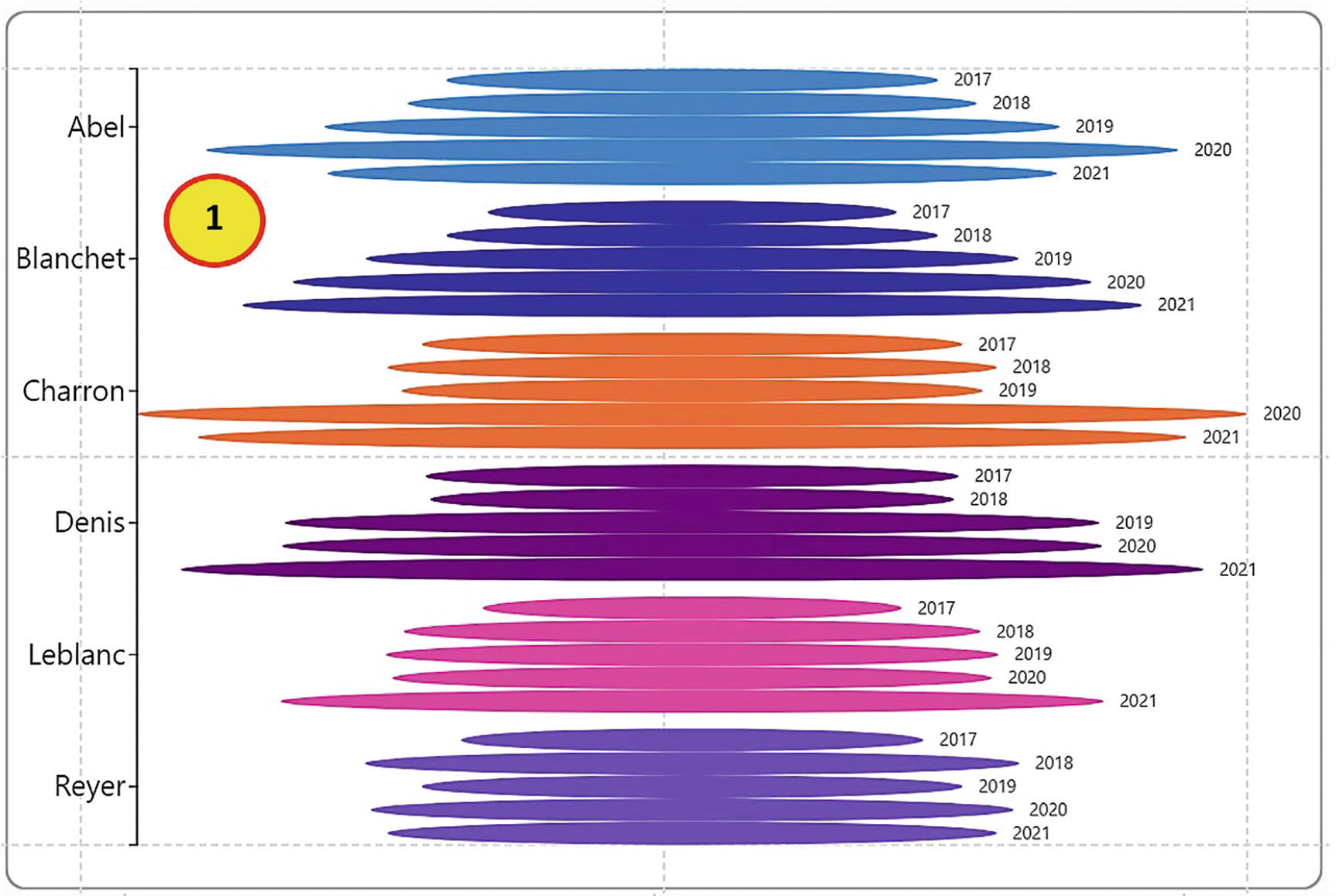
Chart #1

#2

#3
How the charts in Figure 5-41 were designed
Chart #1 | Chart #2 | Chart #3 |
|---|---|---|
• Ellipse Shape in Glyph pane • Stack Y • Salespeople bound to Y Axis • Sales bound to Width • Salespeople bound to Fill • Text mark for Year • Text mark Anchor X=Left and Anchor Y=Middle • Align Middle vertically | • Ellipse Shape in Glyph pane • Stack Y • Year bound to X Axis • Sales bound to Height • Salespeople bound to Fill • Text mark for Sales • Text mark Anchor Y=Middle • Align top vertically • Move Axis to opposite • Insert legend for Salespeople | • Line and symbol in Glyph pane • Stack Y • Year bound to X Axis • Sales bound to Y Span of Line • Salespeople bound to Stroke of line and Fill of symbol • Increase Line Width • Sales bound to Size of symbol • Sort by Sales • Insert Link line for Salespeople • Format Bezier link line • Insert legend for Salespeople |
You may think that the preceding charts are eye-catching and buck the trend of traditional charts, but to be quite honest with you, up to now most of our charts have been at best conventional and at worst plain dull, at least as far as Charticulator is concerned. We’re still stuck using a single categorical axis. What we have yet to explore is one of the great advantages of creating charts in Charticulator, and that is the ability to use two categorical axes and no value axis. Like the idea of this? Then you’ll need to move on to the next chapter.