
Have you been wondering why elements of your Charticulator chart won’t stay where you put them when you click the Save button? Have you attempted yet to put a title on your x- or y-axis but to then find it suddenly moves elsewhere on the canvas? If the answer is yes to these questions, then read through this chapter because by doing so you will learn that to prevent elements placed on the canvas or in the Glyph pane from wandering around, they must be anchored to either one of the default guides or to a custom guide that you have placed there. In this chapter, we will be looking at how we work with the default guides, how we can create our own guides, and how to anchor elements to these guides.

Chart elements are anchored to prevent wandering
When we save this chart, all these elements will stay where you see them now and won’t suddenly appear someplace else. To see how we arrived at this happy state of affairs, let’s first look at the two different types of guides to which we can anchor elements, that is, the default guides and user-created guides, and then we will focus on the anchoring process itself.
Default Guides
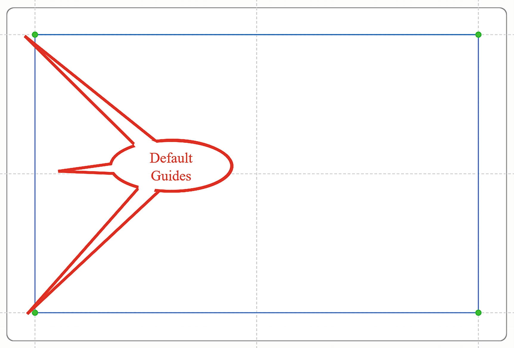
The plot segment anchored to the default guides on the canvas
You will also spot the green dots at the intersection of the margin guides. These are visual indicators that the plot segment (or any other chart element) has been anchored to the guides. If the dot is white, then the element has not been anchored (see the section on “Anchoring to Guides” below).
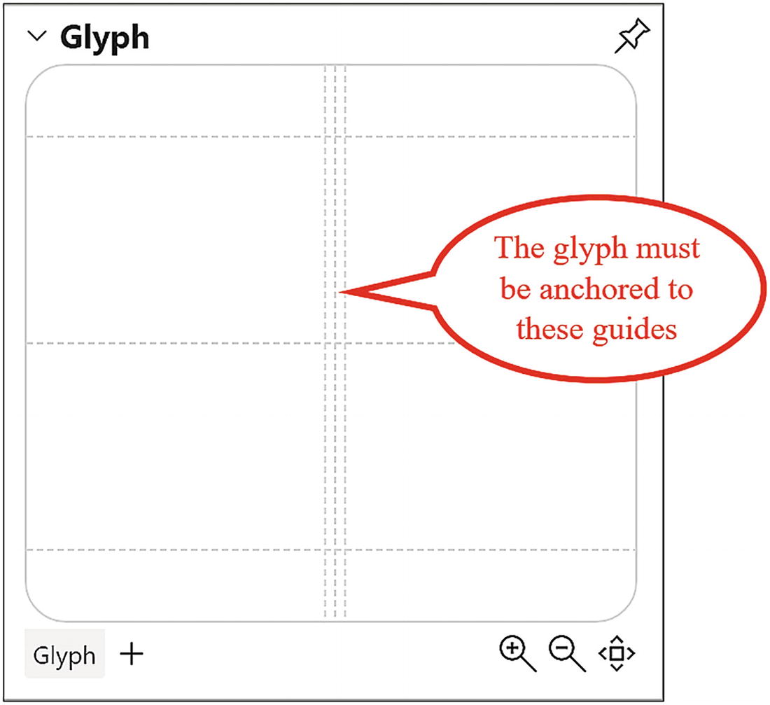
The glyph must be anchored to the default guides
However, you can add your own guides to the canvas or to the Glyph pane and anchor elements to them.
Creating Your Own Guides

Selecting guides or guide coordinators from the toolbar

Offsetting a custom guide from a default guide on the canvas
Of course, you can also just drag on a guide to reposition it. Any chart element anchored to the guide will move accordingly.
Creating Guide Coordinators

Positioning a horizontal guide coordinator in the Glyph pane
Once positioned on the canvas or in the Glyph pane, you are not able to drag to adjust their spacing as you can with vertical or horizontal guides.
Anchoring to Guides
Once you’ve added your guides or guide coordinators to the canvas or Glyph pane, you can start to anchor elements to them. Every element in your Charticulator chart must be anchored to either a default guide or a custom guide or guide coordinator. All chart elements have anchor handles that show as green dots. To anchor an element, either drag the anchor handle onto the intersection of a horizontal and a vertical guide or drag and draw the element inside the boundaries of a guide. For anchoring text marks, you can just click onto the intersection of a guide. You must ensure that the green anchor handles are anchored to a guide, or the element will move of its own accord when you save your chart.
If the dots are white with a green border, this indicates that the element has not been anchored.

Adding a text mark to the canvas for a chart or axis title

Anchoring chart elements and glyph elements to guides and guide coordinators

Guides used on the canvas and in the Glyph pane
In Figure 10-9, you can see that on the chart canvas we have added two vertical guides (Guide X) to anchor the y-axis title and the legend and two horizontal guides (Guide Y) to anchor the x-axis title and the chart title. In the Glyph pane, there are two horizontal guides to anchor the black symbol in the correct position on the glyph.
In this chapter, you’ve learned that all elements of a Charticulator chart must be anchored to a guide, and you must create your own guides to anchor any additional elements you’re thinking of placing on the canvas or in the Glyph pane. The upshot of this is that at long last you can put titles on your chart and on your x- and y-axes, something that up to this point, you weren’t able to achieve successfully. You may be thinking that adding titles to a chart is much simpler in a Power BI visual, but just consider the reality that in Power BI, you can’t place chart elements at specific positions, and so you’ve little control over where the elements lie.
Being able to anchor elements of your chart to custom guides also now enables you to move forward with exploring another key feature of Charticulator charts, and that is using multiple plot segments, each of which must be anchored to guides, in effect creating visuals within visuals. This is definitely one of Charticulator’s unique selling points, so without further ado, let’s move on to the next chapter where you will discover that by using more than one plot segment, you can step up your game in designing engaging visuals that truly tell the story of your data.