In this chapter, we’re putting the spotlight on Charticulator’s links, where you connect glyphs within a chart to show an association between them. We’re already familiar with the idea of the line chart where data points are joined to enable decoding of the data. Indeed, in Chapter 4, we successfully built line charts using the line link. However, Charticulator’s links encompass a number of more complex concepts, and Charticulator provides us with not just one way but three ways to connect glyphs within the visual, as follows:
1.
Link the same items in a particular field by using a line or band. The purpose of doing so is normally to show trends across time such as a line chart, but variations on the line chart might be the ribbon chart or a slope chart.
2.
Link different items within the same field to show some relationship between them, the co-occurrence and chord chart being the most obvious examples.
3.
The third way is to also link different items within the same field, but this time there is an implied categorization of the items. Often, these charts show a direction of flow, for example, in a Sankey chart, and organization charts might also fall into this method of linking.
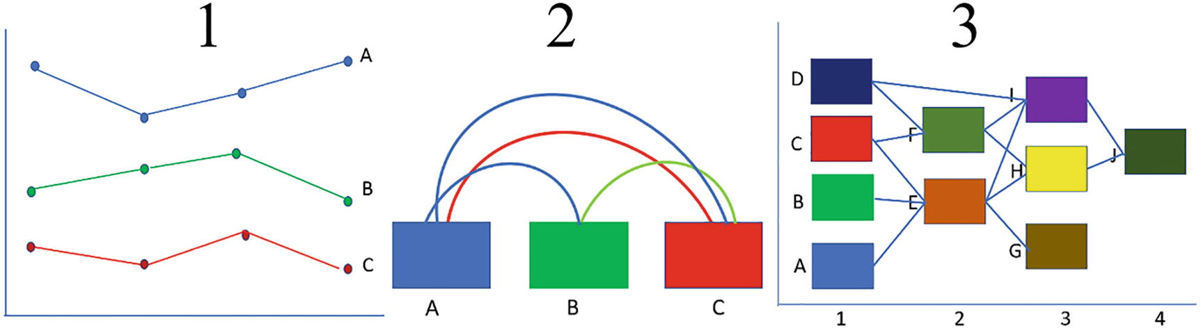
In Figure 15-1, you can see visual representations of these three types of link.
Figure 15-1
Three ways to link glyphs
In this chapter, we are going to delve into all three of these link types. However, Charticulator does not present the links to us in the context of these different types. Instead, it presents us with four different choices of linking glyphs depending on the composition of your chart. These are:
Linking categories
Linking plot segments
Linking categories within plot segments
Linking data
All Charticulator’s links are accessed from the Link button on the toolbar, and you can see the four different options in Figure 15-2. Notice that each choice also allows the selection of either a band link or a line link.
Figure 15-2
The four linking options on the Link button
It would seem sensible then for us to explore the links feature in the context of these four options. However, before we can do so, there is a precursor skill we need to acquire, and that is to understand how the links anchor themselves to the glyph and how to change the anchor points.
Anchoring Links
If you want to follow along with this section on anchoring, you will need to create a chart similar to the one in Figure 15-3 that has categorical x- and y-axes. Then use the Link button on the toolbar and select a line link and then a band link, in our examples linking by the “Year” field.
Figure 15-3
Create this chart and use the line and band links to follow along with this section
When you link glyphs that comprise a rectangle mark, the link is anchored either to a default point if you are using a line or to a default edge if you are using a band. However, you can change the anchor point or edge by selecting the Link in the Layers pane. When you do this, the anchor points are shown on the rectangle in the chart as green points or green edges. To change an anchor, click the anchor point or the edge where you want to move the anchor to; see Figure 15-4.
Figure 15-4
Changing the anchor points of a line link and a band link
Now that you know how to change the anchor points of the band or line, we are ready to move forward and look at the different ways we can connect up shapes and symbols comprising our chart. Let’s start with the first of these in Figure 15-2, and that is the simple linking of glyphs that represent items in each category.
Linking Categories
Here, we can remind ourselves what we learned in Chapter 4, where we plotted symbols against a numerical y-axis and then used the links feature to select a line link for the subcategory so that we could generate a line chart. We could have then hidden the symbols so only the linking lines show (Figure 15-5).
Figure 15-5
Creating line charts using the links feature
To give the line chart a Charticulator “makeover,” you could try changing the line type to Bezier. It might be worth noting here that in Chapter 19, we will find out how to add dynamic data labels to the line chart and highlight specific categories.
Ribbon Chart
What we didn’t explore in Chapter 4 was using a band to connect categories. In order to connect the glyphs, the band link needs a straight edge and so is not applicable to symbols. The band link is best used for connecting glyphs comprising a rectangle mark. In Figure 15-6, you can see that using this link and changing the Type attribute of the link to Bezier, you can produce a ribbon chart.
Figure 15-6
Using the band link on a rectangle mark produces a ribbon chart
The ribbon chart uses a Stack Y sub-layout, and changing the opacity of the band can give the ribbon a more fluid appearance.
Area Chart
If you want to create an area chart, the area or “fill” is produced by using a band link. Consider the chart in Figure 15-7 that you’ll be learning to build in this section and that also shows the fields that we will be using. For this, you will need to start over with a new chart.
Figure 15-7
To create an area chart, you need to use a band link
Although we have used the “Salespeople” and “Sales” fields extensively throughout this book, we have never used the “Month As Date” field. This is because this chart also highlights another aspect of plotting data in Charticulator that you’ve not yet met: plotting temporal or date type data such as monthly sales across years. The “Month As Date” column is a calculated column in a date dimension that associates each month with its start date; see Figure 15-8. The purpose of doing this is to generate a temporal field type that will be plotted correctly on the x-axis, creating a date x-axis that behaves just like a numerical axis. Using a month name field here wouldn’t work because that would produce a categorical field type.
Figure 15-8
The “Month As Date” field is a calculated column
Notice on the x-axis of the chart in Figure 15-7 that there are only labels for years, not months. In a similar way to Power BI, to avoid cluttering the x-axis, Charticulator will generate a “continuous” axis for temporal fields that displays just the years (or years and months if there is room on the axis).
As well as being able to plot the monthly data correctly on the x-axis, the other benefit of using a temporal field is that once bound to an x-axis, you can filter the date range you want to plot by using the attributes of the plot segment; see Figure 15-9.
Figure 15-9
You can edit the start and end dates of temporal data plotted on the axis
Let’s now focus back on using Charticulator’s links and build the chart that uses a band link to supply the “fill” of the area chart. In a new chart, first bind “Month As Date” to the x-axis.
Now we can build the glyph. We can’t use a symbol as our glyph and create a conventional line chart because you’ve learned that band links can only be used with rectangle marks, so we must use a rectangle mark in the area chart. However, we need a numerical y-axis to plot the “Sales” value, but you also know that rectangles can’t be plotted against a numerical axis. As a consequence, our only option is to use a data axis in the Glyph pane which will allow us to plot the rectangle mark representing the “Sales” against a numerical data axis.
You can see in Figure 15-10 how to complete the chart. Using a data axis, plot your numerical field such as “Sales” onto it and align a rectangle to the data point on the axis. The rectangle can now be given a width of 2 so that it hardly shows in the Glyph pane or in the chart. Now link the rectangles by the categorical field, for example, “Salespeople,” using a band, which will mimic the fill of an area chart. Once the band is in place, you can “remove” the rectangle completely by putting zero in the Width attribute.
Figure 15-10
The area chart uses a data axis with a rectangle mark aligned to the data point on the axis. The rectangle has a width of 0
You can then bind your categorical field such as the “Salespeople” field to the fill color of the band.
Linking Plot Segments
In Chapter 11, we built a visual comprising a number of plot segments. What we can do now is link glyphs between these plot segments.
Vertical Ribbon Chart
Consider the chart in Figure 15-11, a variation on the ribbon chart where we’ve used a band to link glyphs in two 2D region plot segments to compare the sales and quantity in each region. Note in this chart how the regions have been sorted ascending by their sales and quantity values to show this analysis more clearly.
Figure 15-11
Linking glyphs between two 2D region plot segments
Again, it’s best to start with a new chart if you want to build this visual yourself. This chart was produced by using two plot segments, each plot segment having its own glyph comprising a rectangle mark. Both plot segments use the Stack Y sub-layout, and the second plot segment is aligned on the right.
Tip
Remember you will need to create additional guides on the chart canvas on to which to anchor the plot segments.
One of the glyphs had the “Sales” field bound to the Width attribute, and the other had the “Quantity” field bound to the Width attribute. You will need to hold down the SHIFT key to generate a new scale when you bind the second numerical field to the Width attribute of the second rectangle. We then linked PlotSegments1 and 2 using a band link. The details of how the chart in Figure 15-11 was generated are shown in Figure 15-12.
Figure 15-12
Linking glyphs between two 2D region plot segments using a band link
Note the use of the text mark to label the y-axes with the region names. If we had used the “Regions” field on the y-axis, it would have prevented the sorting of the rectangles ascending by their numerical value (see Chapter 5 for details on sorting axis labels).
Proportion Plot
Building the proportion plot in Figure 15-13 uses much the same techniques as the previous chart, but this time we’re comparing sales in the current year to sales in the previous year. Again, start over with a new chart.
Figure 15-13
The proportion plot also links plot segments using a band
Figure 15-14 sets out how this visual was built. This was again created using two 2D region plot segments with Stack Y sub-layouts. The two separate rectangle glyphs were resized in the Glyph pane so they were half the width to allow room for the band link. The “Previous Yr” field was then bound to the Height attribute of the first rectangle, and just as before, use the SHIFT key when binding the “Current Yr” field to the second rectangle to generate two separate scales.
Figure 15-14
The proportion plot uses two 2D region plot segments and two glyphs linked by a band
The plot segments were then linked using a Bezier band. It was then finished with text marks for the regions and the percentages.
Linking Categories Within Plot Segments
One of the great advantages of using multiple plot segments is that you can design a visual that comprises multiple charts. The visual in Figure 15-15, for instance, contains a stacked column chart and line chart. The line chart at the bottom requires the glyphs to be connected by category, for instance, the “Salespeople” field. When you first click the Link button on the toolbar, it seems that you can only link the plot segments. To link categories within a plot segment, click the plot segment name in the Link dropdown, and it will expand to show the categories in that plot segment; see "Linking categories within plot segments" in Figure 15-2.
Figure 15-15
Click the plot segment name to link categories in one of the plot segments but not the other
Being able to build charts that comprise both linked and nonlinked glyphs in this manner allows you to mix and match charts within charts.
Linking Data
Up to now, all the links we have worked with have been linking the same values in a particular category, for example, linking the symbols that represent each salesperson in the line chart or linking the rectangles that represent each region when linking across plot segments. There is however another way to link glyphs, and that is by associating differentvalues within the same category to find associations between them. Consider the data in Figure 15-16 which comprises a table that lists countries that export and import goods and services between each other, and below this table is a co-occurrence chart that represents this traffic.
Figure 15-16
Countries that export and import between each other
Here, the values in the columns, that is, the country names, are interconnected between each other. In Charticulator, we can use the concept of linking data to link different items within the same field that share an association with each other.
Co-occurrence Chart
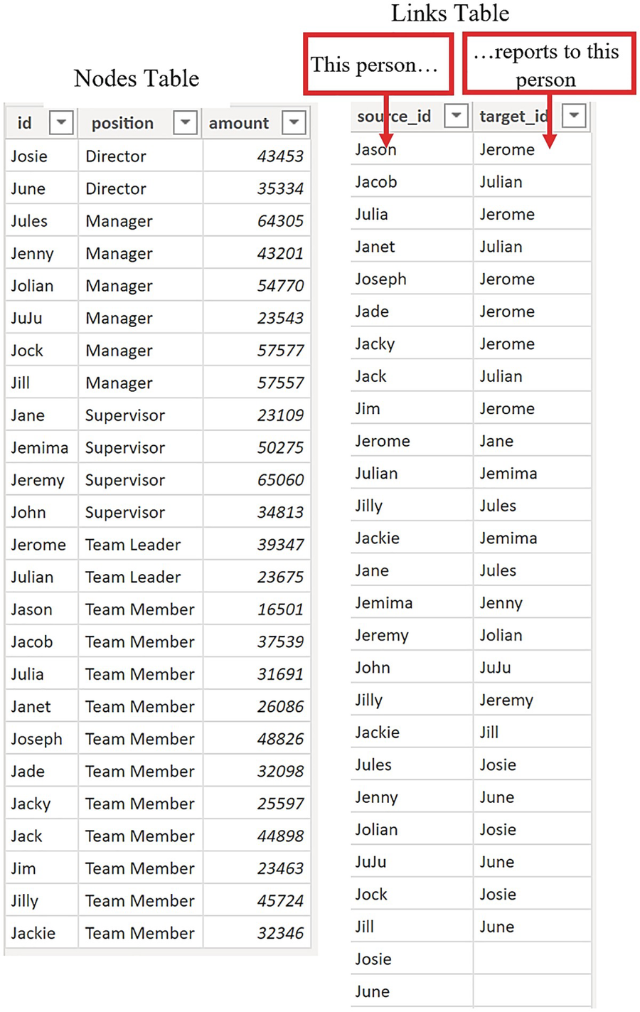
Let’s use the chart shown in Figure 15-16 as our example and examine the source data used to generate this visual shown in Figure 15-17. The table that contains the country names is called the “Nodes” table, and it also contains a field called “Value,” but this column is arbitrary. The only requirement is that the column that holds the entities in the Nodes table (the county names in our case) must be named “id,” and the name of the column must be in lowercase.
Figure 15-17
The two tables required to generate the visual in Figure 15-16
You must then create a table that links the nodes (i.e., the countries) to their respective counterparts. This is called the “Links” table, and it must contain a column called “source_id” (that lists the nodes) and a column called “target_id” that will link the nodes. These column names must be in lowercase. Note the two-way aspect of the data in this table.
Also note that “Spain” must be listed in the “source_id” column (despite the fact that it doesn’t export to any country) because there must be a match for every value in the “id” column with the values in the “source_id” column.
Note
Although you must name the columns “id,” “source_id,” and “target_id,” you can rename these columns when you put the fields in to the “Data” bucket. They can have different names in your data model. You can name the tables anything you like. They don’t have to be named “Nodes” and “Links.”
Once these two tables have been generated, you will need to create a one-to-many relationship between them in the model view of Power BI Desktop, linking the “id” column with the “source_id” column; see Figure 15-18. This creates the links between the nodes and therefore links the data.
Figure 15-18
Create a relationship between the Nodes table and the Links table
Now all that’s left is for us to create the chart and generate the links. In Power BI, when you first create the chart, put all the fields from the “Nodes” table into the Data bucket and all the fields from the “Links” table into the Links bucket; see Figure 15-19.
Figure 15-19
Place the fields in the correct buckets
Now in Charticulator, add a rectangle mark to the Glyph pane. If you have a numerical value, you can bind this to the Height attribute. You may also need to edit the End Range value of the Height scale to ensure the rectangles are not too high. You are now ready to link the data using the Link button on the toolbar which will invite you to use the link mode, “By Link Data”; see "Linking data" in Figure 15-2. The default is to link with a line, so all you need to do is click Create Links.
However, we’re still not quite there. Unfortunately, the linking lines are linked to the wrong anchor points on the rectangle glyph. Not only this but the export and import lines have not been identified individually; we only see that there is a link between the countries. This is because the link lines are anchored to the sameanchor points on the two rectangles, that is, the bottom center anchor, and so they don't distinguish between the “from” and “to” directions of the data.
Warning
This is an aspect of linking data that isn’t always apparent, so always check out the anchor points of the linking lines.
Therefore, not only do we need to change the position of the anchor so the lines emanate from the top of the rectangles, but also we need to select two different anchor points, one for exports and one for imports. You learned earlier in this chapter how to change the anchor points. Select the link in the Layers pane and click onto the correct anchor points in the chart; see Figure 15-20. You might note that in correcting the anchor points of the linking lines, the visual now identifies both the exports and imports.
Figure 15-20
Correcting the anchor points of the linking line separates the lines into “from” and “to”
To change the color of the linking lines, you must bind the “source_id” field to the Color attribute of the Link. Don’t use the “id” field as this won’t work. You can now change the color of the rectangles by binding the “id” field to the Fill attribute and add any text marks or symbols you require. For instance, in Figure 15-16, we used a symbol with a black fill to mark the anchor points of the rectangles to identify imports and exports.
Chord Chart
If you apply a polar scaffold to the visual in Figure 15-16, you will transform it into a chord chart (Figure 15-21), but note again that you can’t distinguish between imports and exports because of the anchor points that are used.
Figure 15-21
A chord chart generated from the chart in Figure 15-16 using the polar plot segment doesn’t identify “from” and “to” links
Before we leave the co-occurrence charts, if you want to browse through more examples of using data links to generate this type of chart, visit Charticulator’s video gallery:
There, you will find the spectacular Les Miserable co-occurrence chart that uses all the techniques that you have learned in this chapter.
Sankey Chart
There is another use of data linking in Charticulator, and that is to link different items within the same field where there is an implied grouping of the items creating charts that plot the flow of data from one group to another.
Consider the data in Figure 15-22 where a “Nodes” table comprises a list of staff members that have been grouped by the “position” field, implying a sorting or ranking order from Team Member through to Director. In the “Links” table, we have identified which staff member reports to whom. Notice again the naming of these fields; in the “Nodes” table, the “id” field lists the staff members. In the “Links” table, each staff member is listed in the “source_id” field and to whom they report in the “target_id” field; each member of staff reports to another member of staff, and they in turn report to someone else.
Figure 15-22
Shaping data to define who reports to whom
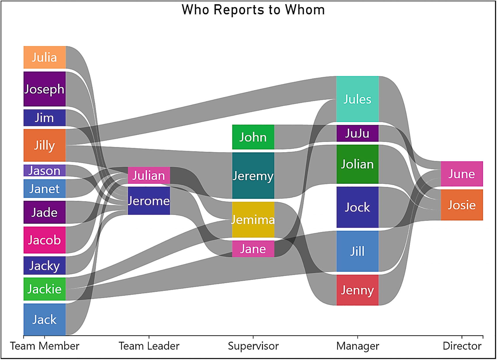
We want to create a visual that shows who reports to whom but with the added factor that the staff members will be grouped from the lowest ranking position to the highest. This visual is shown in Figure 15-23, which is a take on the idea of a Sankey chart.
Figure 15-23
The Sankey chart generated from the data in Figure 15-22
Notice that it’s the “position” field bound to the x-axis that is key to how the data is plotted in the chart. The “position” field identifies the groups, and this in turn drives the flow of data from left to right defining the ranking.
Let’s take a step-by-step look at how the Sankey chart in Figure 15-23 was built. After shaping the data correctly into Nodes and Links tables, the next step was to relate the “id” field with the “source_id” field using the model view in Power BI Desktop. The fields were then populated into the correct buckets in the Power BI Visualizations pane (Figure 15-24).
Figure 15-24
The Data and Links used in the Sankey chart
Inside Charticulator, the “position” field was bound to the x-axis, and the sub-layout of the plot segment changed to Stack Y and the alignment to middle. Next, a rectangle mark was placed in the Glyph pane and the “amount” field bound to the “Height” attribute and the “id” field to the Fill attribute. You may also need to increase the gap between the x-axis labels. You can see how the chart looked at this stage in Figure 15-25.
Figure 15-25
The Sankey chart before the links are added
We were then ready to insert the links from the Link button, ensuring to choose the band link and using the “By Link Data” link mode. At this point, the chart looked a bit chaotic; see Figure 15-26.
Figure 15-26
The Sankey type chart looks chaotic at first
However, all that was required was to change the link type from arc to Bezier and edit the anchor point of the first glyph to move it to the right side of the rectangle; see Figure 15-27.
Figure 15-27
You will need to move the anchor point of the band link in the Sankey chart
The creation of the Sankey chart concludes our exploration of Charticulator’s links. You have learned in this chapter that linking glyphs is not confined to line charts, but links can be used in a myriad of chart designs that, on first meeting, seem very different types of visual. Who would have thought that an area chart had anything in common with a chord chart? In Charticulator, we’ve learned to expect the unexpected, which leads us on to the next chapter where we will meet a concept that in charting terms is not to be expected either, and that is the idea of plotting data onto a single axis.