
In Chapter 3, you learned that whenever you bind data to an attribute, a scale will arrive in the Scales pane. You’ve also generated many charts that use both a numerical and a categorical legend. In the light of what you already know, you can now move forward with your knowledge of Charticulator’s scales and legends because in this chapter we will take a more detailed look at what they are and how we work with them. You will learn about the different scales that Charticulator generates and how you can edit and manage these scales. More importantly, you will at last get to grips with the challenging aspects of the numerical scale. For instance, what do the Domain and Range attributes of this type of scale do and what will be the impact on the chart by editing the values in them? In this chapter, we will answer these questions. What you will also understand is that inextricably linked to the scales are Charticulator’s legends, and therefore you’ll want to edit and control the look and format of legends too.
However, the starting point for this chapter will be to focus on Charticulator’s scales and then move forward to explore the various types of legends that can be added to a chart.
Charticulator Scales
Charticulator creates a scale for you whenever you bind data to an attribute, and then you will need to create a legend explaining the scale yourself. The scale determines how the data is mapped to the visual elements of the chart to determine the height, color, and size of marks, symbols, and lines. You can see these scales in the Scales pane that lists all the scales used by your chart along with the legends that describe each scale. It would be unusual to have a scale without an associated legend, and so you can think of a “scale” in Charticulator as any attribute of a shape or symbol where the bound field requires an explanation in a legend.

Numerical scales and color scales in Charticulator
“Scale2” is a color scale associated with the Fill attribute of the rectangle, and a legend has been added on the right to explain the colors used.
Properties of the Scale

Examples of the properties of scales that define the attributes to which data has been bound
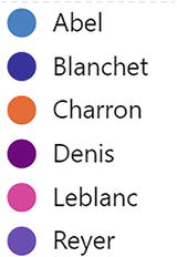
In Example #1, two different categorical fields have been bound to attributes generating two color scales. In “Scale1,” a categorical field has been bound to both the Fill and Stroke attributes of a shape. In “Scale2,” a different categorical field has been bound to the Fill and Stroke attributes of a symbol. Each scale maps a different collection of colors to the items in each categorical field.
In Example #2, the same numerical field or three different numerical fields have been bound to three different attributes. Either scenario would result in the generation of three separate numerical scales. Binding a numerical field to a different numerical attribute always generates a new scale, even if the field bound to the attribute is the same.
In Example #3, the same numerical field or different numerical fields have been bound to the same attribute of two different shapes and two different symbols. With respect to the rectangles, this could be because either the chart contains a glyph comprising two rectangle shapes or the chart contains two separate glyphs comprising a single rectangle shape (we will be using multiple glyphs in Chapter 11). This same arrangement could also apply to the two symbols. In both cases, each field that is bound to the same attribute will share the same scale. We take a detailed look at this scenario in the section on “Numerical Scales” below.
What you can infer from the preceding three examples is that color scales are specific to the categorical field that is bound to attributes (and can also be specific to numerical fields that are bound to nonnumerical attributes; see the section on “Color Scales” below). Numerical scales, on the other hand, are specific to the attribute whether the same or a different numerical field has been bound.
Perhaps, you will also appreciate at this stage that numerical scales will be more challenging to understand, so let’s start with something a little simpler and look more closely at Charticulator’s color scales.
Color Scales

Categorical and numerical color scales
We looked briefly at editing color scales in Chapter 3, so now let’s just recap on what we have learned regarding how color scales can be managed.
Editing Color Scales
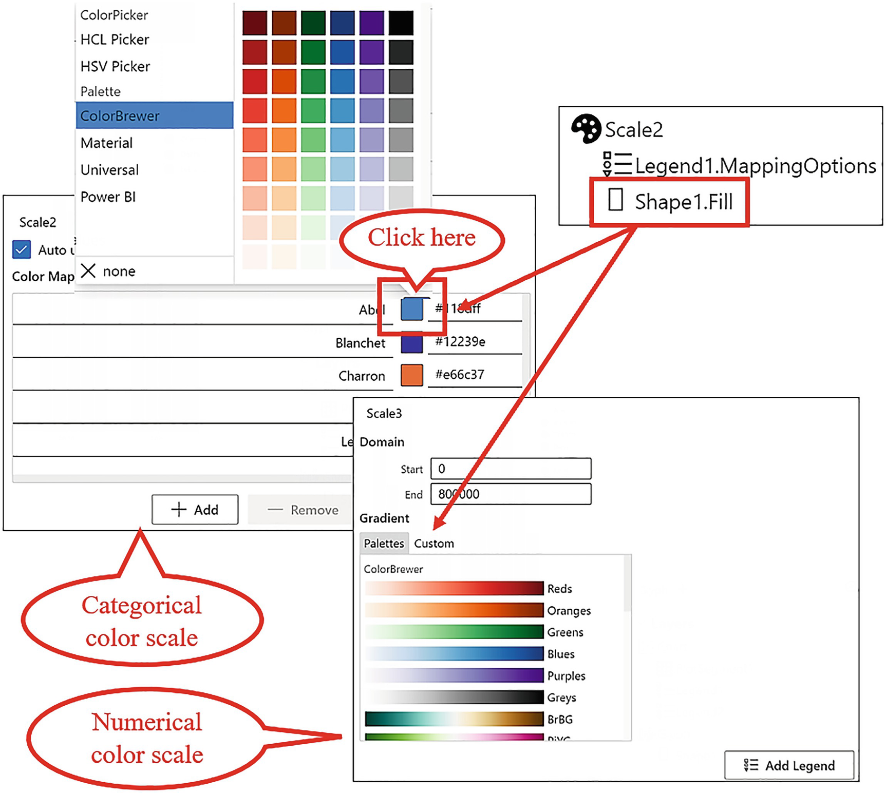
Editing color scales in Charticulator
To edit the categorical colors, click a color and then reselect a color from the color palette. To edit a gradient scale, select from the Palettes tab or use the Custom tab to create your own custom gradients.
It’s now time to turn our attention to the more problematic numerical scale.
Numerical Scales

Creating numerical scales
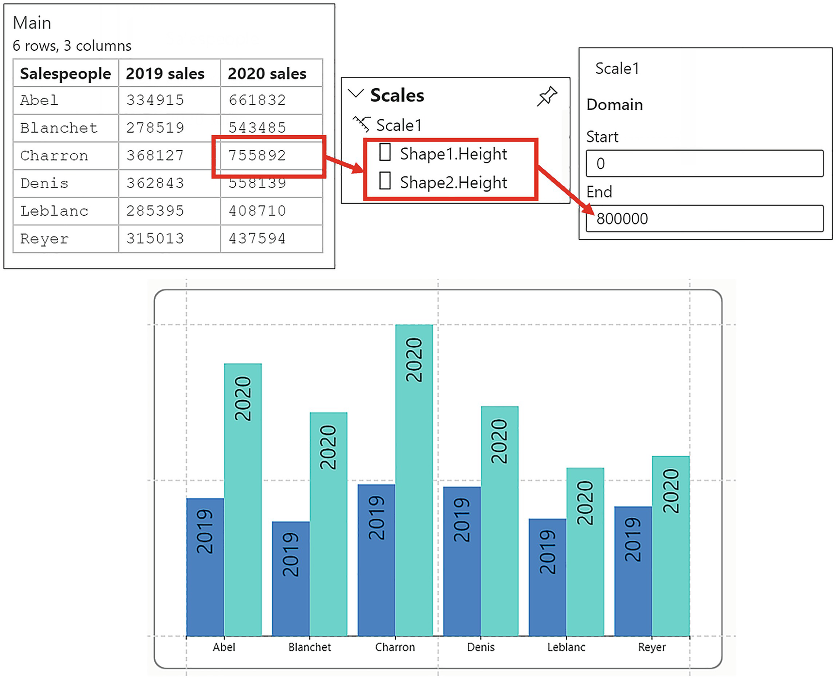
One of the most important things to understand when working with Charticulator’s numerical scales is that once Charticulator has generated a numerical scale to map a numerical field to a numerical attribute, that scale will be used for all subsequent mappings to that same attribute. Each mapping is listed as a property under the scale that has been set by the first bound field. For example, under “Scale1,” there may be two properties, “Shape1.Height” and “Shape2.Height,” where two different numerical fields have been bound to the Height attribute of two different rectangles that comprise the glyph (we will be doing this presently). When the second numerical field was bound to the Height attribute of the second rectangle, the scale had already been set by the first field that was bound.Therefore, the order that you bind the numerical fields is critical. Not understanding the impact of the order in which numerical fields are bound can result in unexpected behaviors of the glyph.

The rectangle mark for “2020 sales” spills out of the plot segment
These two numerical fields are two separate measures and are being used here solely as an example of how numerical scales are generated. We will be focusing on the different ways that multiple measures are managed in more detail in Chapter 14.
You can see that the rectangle mark for “2019 sales” is plotted correctly, but the rectangle mark for “2020 sales” spills outside the plot segment.
Why is the rectangle mark for “2020 sales” exhibiting this bizarre behavior? Before we answer this question, let’s get to grips with how the glyph comprising the two rectangles was generated.

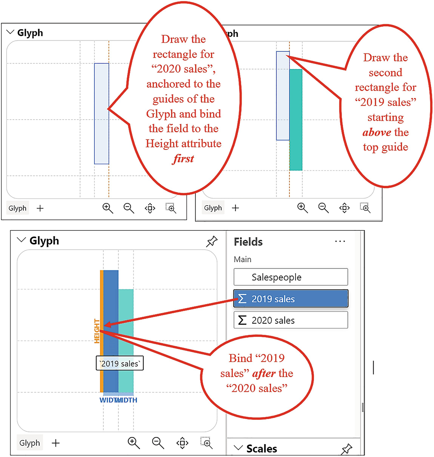
Creating the glyph to bind two numerical fields to the Height attribute of two rectangles. The order the fields are bound is critical
To start, the first rectangle was drawn inside the guides of the Glyph pane, ensuring that the rectangle was anchored to the top, vertical middle, side, and bottom guides of the glyph. The intuitive action to take next was to bind the first numerical field, that is, “2019 sales,” to the Height attribute of this shape generating “Scale1” in the Scales pane.
The second rectangle was drawn starting above the top guide of the glyph and then anchored to the vertical middle, side, and bottom guides. “2020 sales” was then bound to the Height attribute of the second rectangle, but this resulted in the rectangle spilling outside the plot segment.

The Domain End value for “Scale1” is set by the field that is bound first
Creating the glyph to bind two numerical fields to the Height attribute of two rectangles. The order the fields are bound is now correct
Binding “2020 sales” first sets the correct scale for the second numerical field
The takeaway from this section is not the specifics of building the clustered column chart using the two numerical fields, which you may feel at this stage is overly complicated. The takeaway is understanding how Charticulator calculates numerical scales and its implications on how the data is plotted on the chart: that binding the first numerical field always sets the numerical scale. You will have another shot at building a similar clustered column chart in Chapter 14 when we explore working with multiple measures, and we’ll find easier ways to construct it correctly.
Editing Numerical Scales

Editing numerical scales
We look at editing the Domain attribute in the section on legends (see the section on “Editing the Scale of a Numerical Legend” below), but for now, let’s focus on what the Range attribute can do for us.

Editing the Range attribute of the “Shape1.Height” scale

Editing the Range attribute of “Symbol1.Size”
Another example of using the End value of the Range attribute to control relative sizes is when you bind a numerical field to the Size attribute of a text mark. This will ensure that the text remains legible for small values but is never too big for the larger ones.
Creating Additional Scales When Mapping Data
You have already learned that when you bind the first numerical field to the Height attribute of a rectangle, this will set the height scale for all subsequent mappings to that attribute. The properties generated under the scale that map the values to the height of the rectangles are specific to the Height attribute rather than to the field, so different fields will always share the same numerical scale for heights. But what if your numerical fields hold values that require different scales to be used by the Height attribute? For example, you may want to compare sales and quantity in the heights of two rectangles in a clustered column chart.
With regard to categorical fields, there will only be one color scale generated for each categorical field, regardless as to which attribute it is bound. But what if you want different colors being used for each of your categorical items when bound to different attributes?

Using different scales for the same attribute

Creating new scales when binding data
When you do this, you will see a new scale has been created in the Scales pane. New numerical scales will be generated accordingly, but with color scales, you can now edit the colors used by the new scale and use the same color for different categorical items if required.
Reusing Scales

Reusing scales in different attributes
We’ve been focusing on Charticulator scales, learning how they are generated and how to manage them. However, once a scale has been created, you’ll want a way to visualize the values represented by the scale. Specifically, you’ll need an explanation of the height or width of a mark or the colors that represent the categories or gradients. This is where you’ll need to add Charticulator’s legends to your chart, so let’s move forward and take a closer look at how legends are created and edited.
Charticulator Legends

Two different types of legend
We will explore presently when we need to use a column names legend, but first let’s work through the different ways that legends can be created.
Creating Legends
There are several ways to create legends. The most intuitive way is to use the Legend button on the toolbar, and this is the only way that you can create a column names legend. This button lists all your fields, and you can select the field for which you want a legend. You can hold down the CTRL key to select multiple column names for the column names legend.
However, there are several drawbacks to using this method to add column values legends. The list of fields on the button dropdown doesn’t depend on the binding of data to an attribute, so it provides only “default” legends. Because of this, it’s ambiguous as to which scale the legend will be mapped. For instance, you may need two legends for the “Sales” field, one for a gradient color scale and one for a numerical scale, but you can only insert a legend for the numerical scale from the toolbar button.
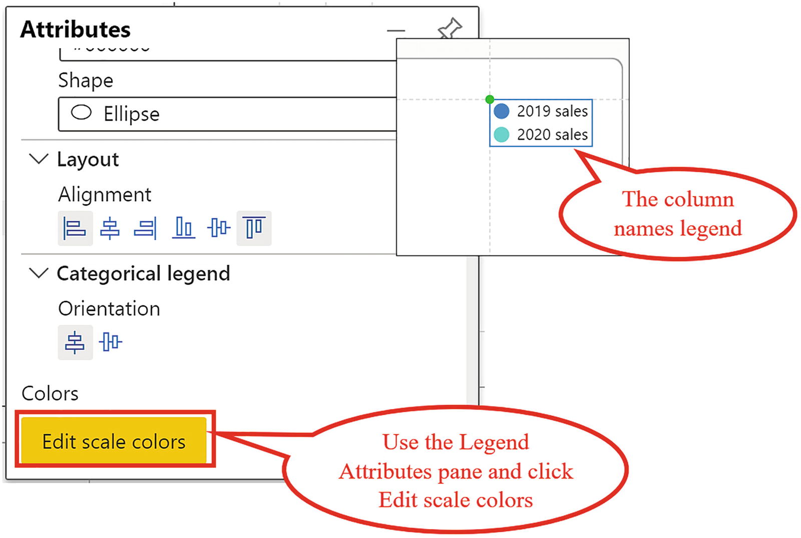
A better way to create column values legends is to use the Scales pane. The advantage of using the Scales pane, as we have seen earlier, is that it’s here that you can also edit the colors that are mapped to the scale or the behavior of a numerical scale. If you click a property under a scale in the Scales pane, for example, “Shape1.Height,” this will open up a Scales dialog from where you can add the Legend.
If you prefer, you can also click the attribute where the data has been bound and that has generated the scale, for example, on the Height attribute.
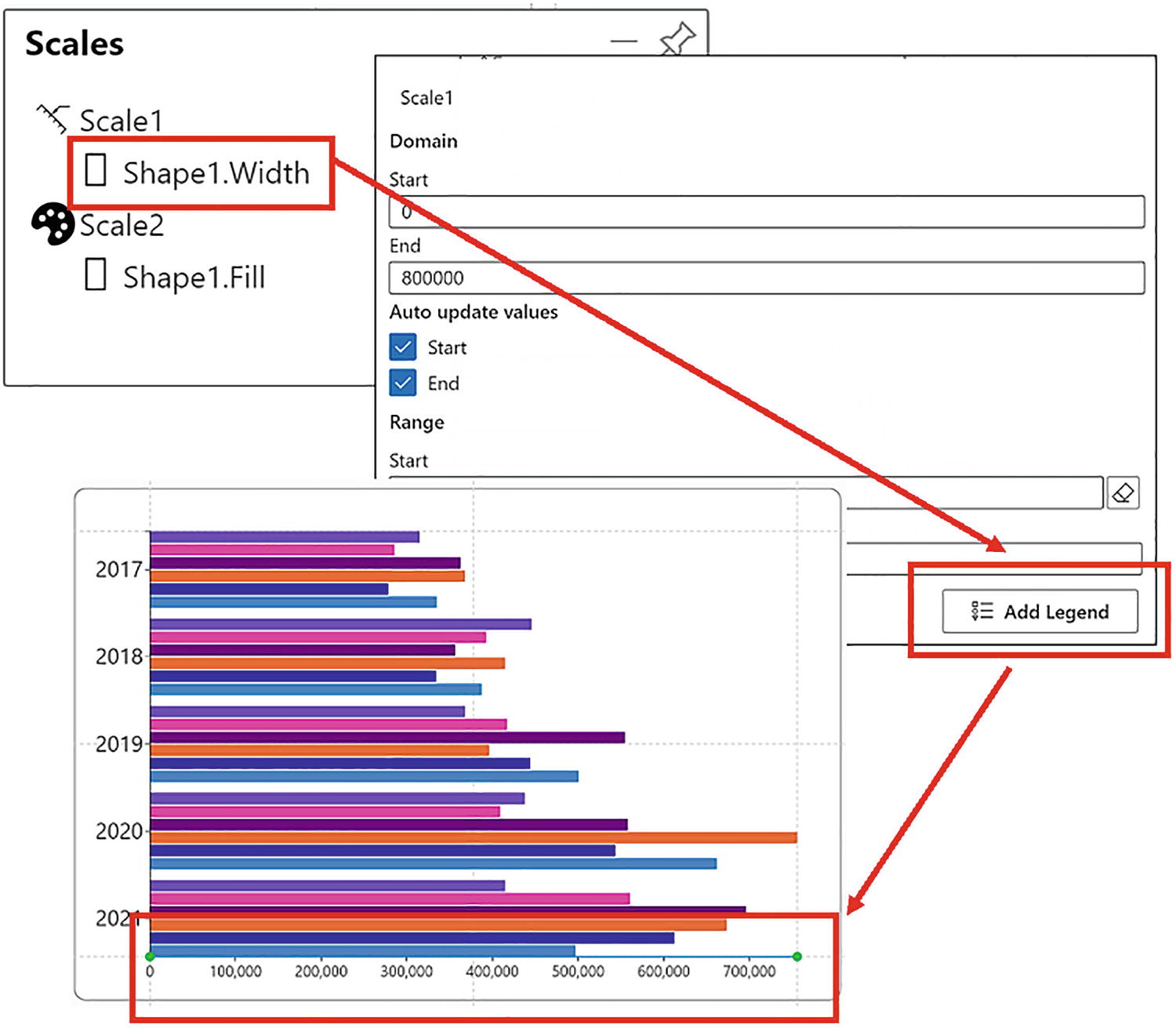
Creating a numerical legend for the x-axis
Using the Scales pane to generate legends in this way therefore gives you the option to both edit the scale and add the legend. Let’s now explore the differences in the two legend types: column values and column names.
Column Values Legends
When you create a column values legend in Charticulator, it’s listed in the Scales pane along with the scale whose data it maps.
- 1.
A category legend – The legend will map the colors to the categories.
- 2.
A gradient legend – The legend will show the values represented by the gradient.
- 3.
A numerical legend – A numerical legend that sits on the x- or y-axis. The numerical legend resembles a value axis, but as detailed in Chapter 4, it has no effect on how the data is plotted in the chart.
Charticulator column values legends
Category Legend | Gradient Legend | Numerical Legend |
|---|---|---|
|
|
|


All these legends are visual representations of the data that has been mapped by the scales.
Column Names Legends
The column names legend is used when you have plotted multiple numerical values in your chart. We had an example of this in the chart in Figure 9-10 where we plotted data for “2019 sales” and “2020 sales,” both of which had been bound to the Height attribute of two rectangles comprising the glyph.
Creating a column names legend
Note how by creating a column names legend this will generate a new scale in the Scales pane that maps the colors to each column name.
Using the column names legend in this way will be important to you when we explore Charticulator’s data axis in Chapter 14 and we understand the difference between plotting “wide” and “narrow” data.
Formatting and Moving Legends

Attributes for categorical and numerical legends
In the examples in Figure 9-20, we have moved the categorical legend to the top of the plot segment and changed the shape to a rectangle.
If you want to move a categorical legend elsewhere on the canvas, you’ll need to anchor the legend to a guide or guide coordinator, the subject of the next chapter.
In the numerical legend, the tick color has been colored green and the tick line color changed to red. The font size has also been increased.
Editing the Scale of a Numerical Legend

Edit the Start attribute of “Domain” to change the Start value of the legend

Increasing the End value of the legend
But as mentioned earlier when we were learning about scales, entering a value into the End option of the Range attribute will restrain the tallest shape when you resize the plot segment and generally renders the chart unpredictable.
As mentioned in previous chapters, if you edit the scale, don’t forget to check off the Start and End attributes under “Auto update values”; otherwise, the scale will revert when you save the chart.
If you select the Legend in the Layers pane, in the Attributes pane you can format the tick marks and change the number format as shown in Chapter 8.
Learning how to edit the scale of a numerical legend ends our journey through Charticulator’s scales and legends. I hope that now you’ve read through this chapter, the Scales pane inside Charticulator will no longer be a mystery to you. I certainly found it one of the more unfathomable parts of the Charticulator screen when I first started out. However, you will now understand the behavior of scales, that once a scale is generated for an attribute, it doesn’t change unless you hold down the SHIFT key when binding the field. You now also know what the Domain and Range attributes of the Scale are used for and how they are yet another important factor in controlling how the glyphs behave in the chart. In fact, you now know everything that’s important to know about Charticulator’s scales and legends, and this knowledge will be important to you as you move forward.
However, there is just one further mandatory skill you need to acquire before you can move on to tackle the construction of more challenging charts. I’m alluding to the practicalities of laying out elements on the chart canvas and in the Glyph pane. For this, you need to be competent in using Charticulator’s guides and guide coordinators and anchoring elements to them. If you’ve ever tried to move a categorical legend or a chart title, you may have noticed that it has a habit of wandering around the chart without your permission. If you want to remedy this sad situation, read on to the next chapter.