
With Charticulator’s recent (April 2021) integration into Power BI, you can now build customized charts, graphs, and data visualizations right inside Power BI. In the most fundamental of terms, Charticulator has a simple interface that hides a complex methodology under the hood.
Its greatest value is its immense power to generate a whole host of different visuals and graphics. The challenge is that there is a myriad of settings and options that can be combined in what appears to be limitless confusing combinations, making it intimidating to many. Unlike other custom Power BI visuals, Charticulator runs in a separate application window within Power BI with its own user interface, and therefore it requires a completely different set of interactions and associated knowledge.
In this chapter, we are going to get started with Charticulator. We will begin by importing Charticulator into Power BI; we’ll create a simple chart and take a tour of the Charticulator screen. Before we begin however, I want you to forget everything you think you know about creating charts and visuals where you are constrained by the limits of what you can plot on an x- or y-axis or the number of categories that you can use. Instead, think in terms of designing a representation of your data from scratch, where you are no longer restrained by your choice of visual.
Importing Charticulator in Power BI

Accessing the App Store

Select the Charticulator custom visual in the App Store

Charticulator has been successfully imported

Pinning Charticulator to the Visualizations gallery
Now that you have successfully imported Charticulator into Power BI, let’s move on to create a chart.
Create a Charticulator Chart

Examples of visualizations created in Charticulator
But here’s the heads-up. You’ll quickly learn to build some of these visuals, but as for the others, it won’t be until you’ve progressed through to the final chapters of this book that you’ll have discovered the secrets behind those, but it will be well worth the effort. When I first started using Charticulator, I thought it was like trying to rein in a willful child. I would think my commands to the software were clear, but it would be doing the contrary, and I would think, what on earth is going on here? You will see what I mean when you try using Charticulator for yourself. It takes time to understand this wayward piece of software, but it is worth the investment and the return is high. Stick with it and you too will soon be designing innovative visuals.

Your first Charticulator chart
I know you’re thinking, but I could easily create this chart in Power BI so why would I want to use Charticulator? I take your point, but remember what we said earlier, that Charticulator has a challenging methodology to get to grips with. However, if you start by creating a chart you can easily produce elsewhere, it’ll give you some context on which to hang your hat, and then you’ll be ready to move on and explore the more challenging concepts that underpin Charticulator.
If you want to follow along and create a similar chart yourself, all you need are three fields from your data model, two categorical fields and one numerical field, for example, we’re using “Year,” “Salespeople,” and “Sales.” The numerical field can be a numerical column or an explicit measure.
Now let’s fire up Charticulator! First, click the Charticulator icon in the Visualizations gallery to generate a placeholder for the visual on the Power BI canvas.
Selecting the Data

Charticulator placeholder with fields in the Data bucket

Power BI visual with “categorical” and “values” buckets
After all, don’t all Power BI visuals group and then aggregate data? In Charticulator, there is no concept of constraining fields to behave as a “value” or a “category.” However, if this is the case, how does Charticulator know which fields are to be plotted as values and which are to categorize the data? This question will be answered when we look at Charticulator’s Fields pane (see the section on “The Fields Pane” below).
Opening Charticulator
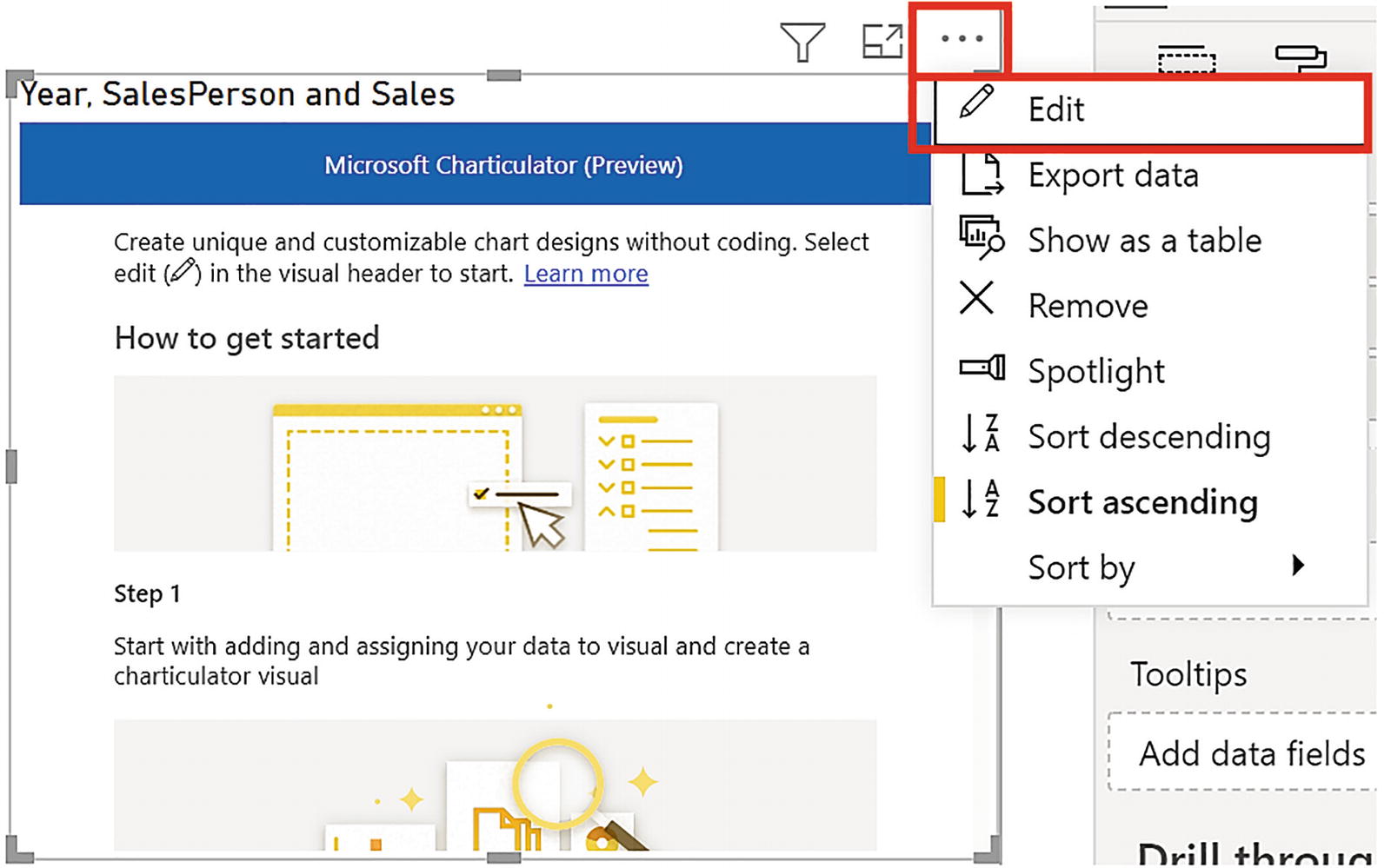
The Edit option on the Options button
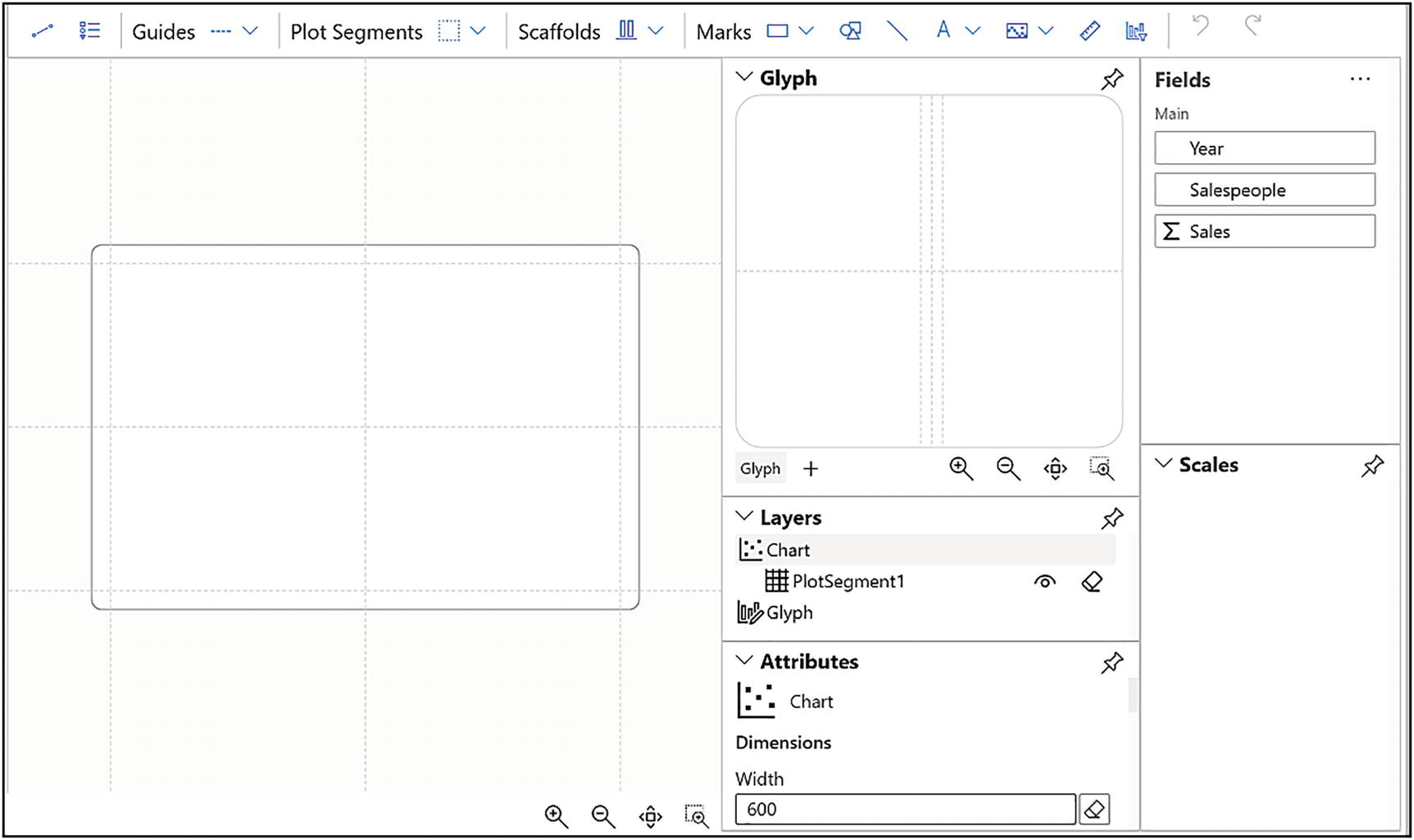
The Charticulator screen
Designing the Chart
Now that we’ve got Charticulator open, we can start to construct the chart as shown in Figure 1-6.
The purpose of this exercise is for you to have a Charticulator chart up and running quickly so that we can use it as the basis for the examples that follow. Because your knowledge of Charticulator is as yet limited, I’ll be keeping explanations to a minimum, appreciating that at this stage you probably won’t understand how it all works. Don’t worry, everything will be explained over the next few chapters and beyond.

Changing a numerical field to a categorical field
The first step in designing any Charticulator chart is rendering the glyph. The glyph is the visual representation of your data in the chart. In our chart, the glyph will be a simple rectangle shape that represents the columns of the clustered column chart.
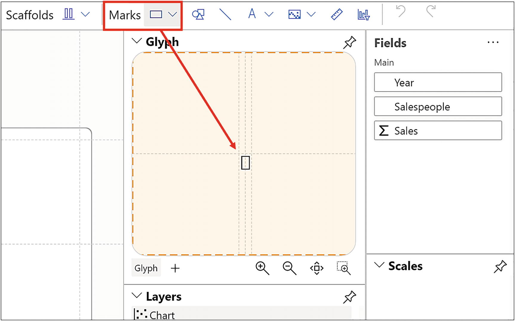
Dragging the mark into the Glyph pane

Glyphs are repeated on the chart canvas for every category

Drag and drop a category onto the x-axis

Drag a numerical field onto the HEIGHT of the rectangle

Attributing a color to each rectangle on the chart canvas
The last step in generating our clustered column chart is to add a “value” axis on the left of the chart so we can understand the numerical values being plotted. To create the y-axis scale, you need to insert a legend. I know it sounds bizarre that a numerical y-axis is referred to as a “legend” but just stick with it for now. We’ll be exploring Charticulator’s legends in more detail in later chapters.

Inserting Charticulator legends
You can also use this method to create a legend to explain category colors, for example, a legend for the “Salespeople” field, and this will be placed top right of the chart.
Saving the Chart in Power BI
Now click the Save button top left of Charticulator’s screen and click Back to Report at the very top left of the screen.

Your first Charticulator chart in Power BI
Tour of the Charticulator Screen
Now that we have a chart up and running inside Charticulator, we can take a trip around each of the panes of the screen, meeting the components that comprise a Charticulator chart. Please understand, however, that we’re only at the very tip of the iceberg of our knowledge. Many of the elements of Charticulator that we encounter now we will revisit in much greater detail in future chapters.
We will start by moving back into Charticulator from Power BI. Use the More Options button of the visual and click Edit.
- 1.
The chart canvas
- 2.
The Fields pane
- 3.
The Glyph pane
- 4.
The Layers pane
- 5.
The Attributes panes
- 6.
The Scales pane

The panes of the Charticulator screen
Click the pushpin top right of a pane to undock it, and you can then drag on the top edge of a pane to reposition it.
Minimize an undocked pane by clicking the minimize button top right. Click again to unminimize.
Resize an undocked pane by dragging on the bottom-right corner. You will find being able to enlarge the Glyph pane is a great benefit when you are working with many shapes that comprise the glyph.
However, you can’t undock the Fields pane.
The Chart Canvas

Managing the canvas
The rectangle zoom button bottom right of the canvas pane can be used as another means to zoom in. To use the rectangle zoom, simply drag over the area of the canvas you want to zoom in on.
You can also use the Attributes pane of the chart to make these adjustments. See the section on “The Attributes Panes” below.
The Fields Pane
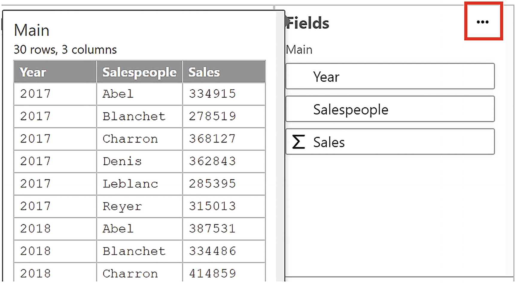
The Fields list showing the table of underlying data

Comparing the buckets in Power BI charts to Charticulator charts
With this in mind, how is Charticulator going to treat the data? It’s not always the case that you want a numerical column to be the “value” and be summarized. For example, you wouldn’t want to sum a field that contains peoples’ ages or indeed sum the year values of our chart. Charticulator will make assumptions about your data, and you can see this from the symbol that sits beside the field name in the Fields pane. A sigma indicates a numerical field type. This can be either a numerical column in your data model or an explicit measure. These will provide the values that will be associated with numerical “attributes” of the chart and glyph (see the section on “The Attributes Panes” below). Text type fields will usually provide the categories but so do some numerical fields. You may recall that when we were creating our clustered column chart earlier, we needed to change the numerical “Year” field, so it behaved as a category. We did this by clicking the sigma in the Fields list; see Figure 1-11. You may need to make similar changes to your fields.
The thing to note here is that with Charticulator, you don’t start by dictating where the field will be placed in the chart, whether it’s on the axis, in the legend, or comprises the values. Instead, you assign it a behavior through the field type. This means that you have the freedom to choose the role a field will play in the chart, change your mind, and try out different permutations. This is what gives Charticulator its great design flexibility.

Field of a date data type in the Fields pane
If you are using a Power BI date hierarchy, all the members of the hierarchy will have a temporal field type which are best changed to categorical field types. Using just the “Year” member from a date hierarchy will be plotted in the same way as the “Year” categorical field in our example data.

The order of the Fields determines the categorization
However, once you have selected your sort order in the Options button, rearranging the fields in the Data bucket will have no effect because the sorting is now determined by the selection in the Options button.
Glyphs and the Glyph Pane

The Glyph pane

The glyph represents the first row of your data
Consequently, you need to be vigilant if the first row of your data contains very small values in relation to other values or even contains zero. In this scenario, the glyph in the Glyph pane will be so small; it may not even show.
There is an exception to the glyph representing the first row. If you group a field, the glyph will represent the grouped data. We look at grouping data in a later chapter.

The glyph represented in the Glyph pane can be changed
On the chart canvas, the glyph is repeated for every row in the underlying data. For example, in our data, we have six salespeople and five years, so we get 30 glyphs in our chart, each representing the sales for each salesperson in each year.
The Layers Pane
Chart and glyph elements that are listed in the Layers pane
Chart | Glyph |
|---|---|
Plot segment Link Legend Text mark Guide or guide coordinator Shape Symbol Line Data axis Icons Images | Shape (i.e., a mark) Line Symbol Guide or guide coordinator Text mark Data axis Icon |

The Layers pane
You can hide or delete each element by using the “eye” and “eraser” buttons, respectively.
The order of the elements in the pane is important because it determines the stacking or “Z” order of the elements on the canvas or in the Glyph pane. You can change the “Z” order by dragging and dropping an element to change its position in the list. This is synonymous with “send backward” or “bring forward” that you may have met in other applications.
The Attributes Panes

The Attributes pane for the currently selected layer
The rectangle shape, for instance, has attributes such as Height, Width, Length, and Fill color. The chart has attributes such as Dimensions, Margins, and Background. You populate and edit these attributes to render the specific visual you require. This is why we populated the Fill attribute of “Shape1” with the “Salespeople” field to color the rectangles according to each salesperson. We will be looking more closely at the attributes of each chart and glyph element in succeeding chapters.

You can rename chart and glyph elements in the Attributes pane
In fact, you will find that every element of a Charticulator chart can be renamed using the Attributes pane.
The Scales Pane
The Scales pane lists all Charticulator’s scales used by the chart. Scales are usually created for you, and then if required, you will need to create a legend explaining the scale. Scales in Charticulator can be challenging to understand when you’re just starting out, and we will dedicate a whole chapter to learning about them.

The Scales pane
We will deep dive into the subject of Charticulator’s scales and legends in Chapter 9.
This completes our tour of the Charticulator screen, and hopefully you’re now conversant with all the different panes and are comfortable finding your way around the user interface. In this chapter, you also created your first Charticulator chart and learned what a glyph is and how the scales in the Scales pane are generated. In the next chapter, we focus on the glyph and take a detailed look at its composition discovering that a glyph can comprise more than just a simple and predictable rectangle shape.