
In Chapter 1, we explored the Charticulator screen and learned about the Attributes panes which list the attributes of the currently selected layer. Along the way, you dragged fields into some of these attributes to associate data with the height and color of the glyph and the x-axis of the chart. This enabled you to construct a typical clustered column chart. However, at that time there was no reason for you to understand the implications of what you were doing. Associating fields with attributes in this way is known as binding data and is a key concept underpinning the design of Charticulator charts. Binding data entails populating an attribute with a field, generating a scale that drives the behavior or format of that attribute based on the data within the field.
By working through this chapter, you will understand the implications of binding fields to attributes. Specifically, you will learn to identify the attributes to which binding data is possible and how to bind both categorical and numerical data to the attributes of marks and the plot segment’s axes. Lastly, you will discover how to bind images to categories that in turn are bound to the icon mark.
In addition to this, you will learn that the binding of data and the creation of the scale are inextricably linked. However, in this chapter we will focus just on the former, looking only briefly at the generation of the scale. This is because managing Charticulator scales is particularly challenging, and we dedicate a whole chapter to this topic later in this book (see Chapter 9). However, because binding categorical data generates color scales that determine the colors used by your chart, you will also learn how to edit these colors right here in this chapter.
How to Bind Data

The Bind data button in the Attributes pane

Examples of dropzones

Binding data to attributes drives the plotting of the data

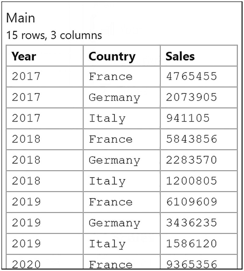
The chart that is used in our examples
“Year” to the X Axis of the plot segment
“Sales” to the Height of the rectangle mark
“Salespeople” to the Fill color of the rectangle mark
“Sales” to the Text of the text mark
Also note that in the chart in Figure 3-4, there is no numerical legend on the left as we will add this after we have finished binding data.
Binding Categorical Fields

Binding a categorical field to the Fill or Stroke attribute generates a color scale in the Scales pane

Binding data to the Stroke attribute and changing the Fill color
When you remove a field from the Fill attribute, you’re left with no color in that attribute, so just click the Fill attribute and reselect a color. We’ve chosen gray in our example.
You’ve learned that binding categorical data produces a scale in the Scales pane. However, there is an exception to this and that is when you bind a categorical field to the Text attribute of a text mark. Unlike other attributes, binding categorical data, such as “Salespeople”, to the Text attribute of a text mark will not produce a scale in the Scales pane. For instance, in our column chart, we’ve bound a numerical field to the Text attribute (i.e., the “Sales” field), but instead you could bind a categorical field, thereby generating categorical data labels. You can see an example of this in Figure 3-14 where we have bound the “Salespeople” field to the Text attribute of a text mark, anchored to the bottom of a rectangle shape, and this has labeled the columns accordingly.
Although it may be self-evident, it might be worth noting that you are not able to bind categorical fields to numerical attributes. For example, you can’t drag the “Salespeople” field into the Height or Width attribute of a shape.
Editing a Categorical Color Scale

Editing a categorical color scale
Click the color you want to change. Changing the colors used by the Fill attribute would also change the colors used by the Stroke attribute (or any other attributes that use “Scale2”). This aspect of the scale is covered in detail in Chapter 9.
Binding Numerical Fields
Whereas you can only bind categorical fields to nonnumerical attributes, you can bind numerical fields to both numerical and nonnumerical attributes, and depending on which you choose, this will have a different impact on the chart.
Binding Numerical Fields to Numerical Attributes
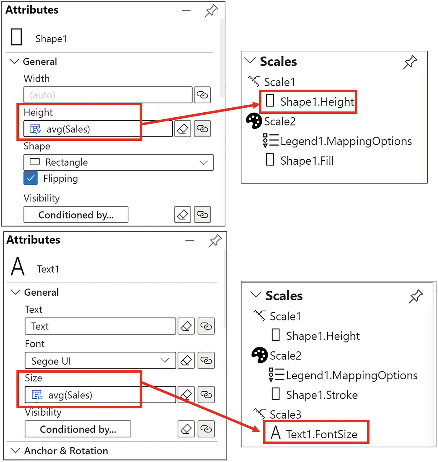
Binding a numerical field to attributes generates a numerical scale in the Scales pane

A numerical field bound to the Size attribute of the text mark
If you want to insert a numerical legend on the left of the chart, ensure that this is done after binding the numerical value to the Size attribute of the text mark. This will force “Scale3” to be generated and prevent the “Text1.FontSize” property joining “Scale1” which can result in unexpected behavior.

The average function is used by default in numerical attributes
However, this shouldn’t seem strange because remember that the glyph represents a single row in the underlying data, and therefore there is only a single value. The average of a single value is that value. In other words, this is simply the value itself. We will be learning more about Charticulator’s expressions in a later chapter.
Binding Numerical Fields to Nonnumerical Attributes
We’ve already seen that we can bind a numerical field such as “Sales” to the Text attribute of a text mark to show the sales value for each column, effectively adding numerical data labels to the chart.

Binding a numerical field to a nonnumerical attribute generates a gradient gray color scale
It’s unfortunate that the default gradient color scale is so dreary! Let’s now brighten up the chart by editing the color scale.
Editing a Gradient Color Scale

You can edit the gradient color scale and add a legend
Notice that you have the ability to customize the gradient colors by clicking Custom at the top of the color palette.
Adding a Legend for a Gradient Color Scale

You can add a color scale legend by using the Scales pane
You can use the attributes of the color scale legend to increase the font size and change the font color of the legend.

Binding the “Salespeople” field to the Text attribute of a text mark will label the columns accordingly
In the Glyph pane, the text mark was anchored to the bottom of the rectangle, rotated, and then placed in position inside the rectangle using the Anchor attributes of the text mark.
Binding Data to Axes

Binding a categorical field to the y-axis
The height and color of the glyph still represent the numerical value, and we still have the text mark bound to the bottom of the rectangle. However, now each year’s data is represented horizontally across the chart.
For clarity, in Figure 3-15, the text mark that showed the sales value has been removed using the eraser.

Binding a numerical field to an axis has unexpected results
Clearly, with Charticulator, generating numerical or value axes will have unexpected results if you don’t fully understand how Charticulator plots your data, and looking at the fine mess we’ve got into, I think it’s evident that we still have a lot to learn. Why does the numerical y-axis behave so strangely? To find out, you will need to read the next chapter.
However, there is one more example of binding data that we need to explore before we move on. We have left this to the last section in this chapter because we will need to start over with a new chart and different data. We are going to discover how we can bind images to categories that in turn are bound to an icon mark.
Binding Data to Icons
In the previous chapter, you learned how to add an icon to the Glyph pane and that it can be used for the same purposes for which you might use a symbol, for example, to design point style charts such as line or scatter charts (we look at building these in the next chapter). We saw that we could bind an image to the Image attribute of the icon to generate a single image that showed in the glyph. We could also bind a numerical field to the Size attribute to resize the image according to the numerical value in a similar way we can with a symbol.

The icon mark becomes effective if you bind an image to each category
Data used for building the flag chart

Binding an image to each category rather than to the Image attribute
In building this chart, just remind yourself that you have only reached Chapter 3, and you’re already designing visuals that are not possible to re-create in Power BI. I’m hoping this will encourage and inspire you to read on.
In this chapter, you have learned that it’s the binding of data to attributes of the glyph and the plot segment that enables you to plot data successfully using Charticulator and also provides you with a multitude of choices as to how you want to reflect your data. You have seen that with Charticulator the normal process of creating visualizations is reversed whereby you select the data to visualize first and then design a chart around that data. In a typical Power BI visual, you select the chart first and so are immediately restricted by your choice of visual.
But we still have that pesky visual in Figure 3-16 to sort out where we have bound a numerical field to the y-axis and ended up with a chaotic chart. Let’s now see how we can resolve this problem by moving on to the next chapter.