
In the last chapter, you learned how to use horizontal and vertical line scaffolds to lay out the glyphs in your chart as an alternative to sub-layouts. We also concluded that their use was limited to a few specific chart designs. However, there is another type of scaffold that does provide us with a wealth of design options. If you want to design circular types of chart such as pies, donuts, or radar charts, you will need to apply the polar scaffold, and, unlike horizontal and vertical line scaffolds, with this scaffold you’re supplied with a comprehensive choice of sub-layouts to work with. In this chapter, you will learn how to use the polar scaffold to generate not only conventional circular charts, such as the pie chart, but also more unusual and interesting ones too. We will also take a look at the custom curve scaffold which includes a tool for generating spiral and wavy style charts.
It might also be worth iterating at this point that the general consensus among data analysts is that pie charts and the like are not always the best choice of visualization. This is primarily because they can be difficult to decode when cluttered with many categorical fields. However, the purpose of this book is not to tackle the issue of which visuals are better than others but to teach you to use the tools and let you decide. We also know that by using charts generated by Charticulator, we can move away from the standard Power BI pie or donut charts with their cumbersome data labels and limited formatting options and instead design visuals that are able to engage with the consumers of our reports.

Charts created with the polar or the custom curve scaffold
If you think that these types of visualization have a place in the design of your reports, then read on and you’ll learn how to build them.
Applying a Polar Scaffold
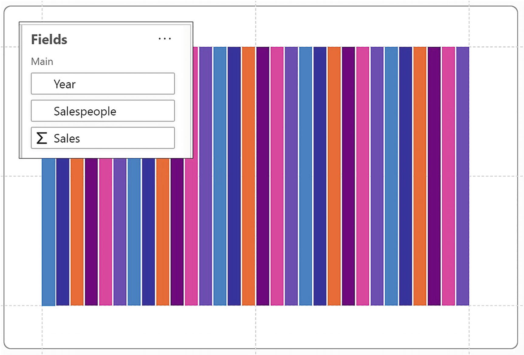
To apply a polar scaffold, start with a chart similar to this
This chart uses two categorical fields, one numerical field, and a rectangle mark in the Glyph pane. We’ve then bound the categorical “Salespeople” field to the Fill attribute.

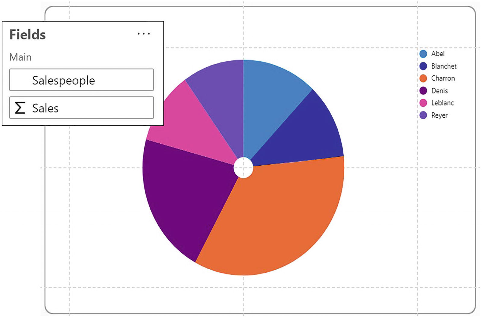
Apply a polar scaffold to the chart
The chart has now changed from a cartesian chart that uses x- and y-axes to a circular “donut” style of chart. Note in Figure 13-3 that there is a sector for both the category and subcategory, in other words a sector for every year for every salesperson, 30 sectors in all.
To convert the polar plot segment back to a 2D region plot segment, apply a horizontal line scaffold.
Already this donut chart is significantly different from a Power BI donut or pie chart where colored sectors can only define a single category. Also notice that applying a polar scaffold creates a polar plot segment. This can be identified in the Layers pane because of its different icon.
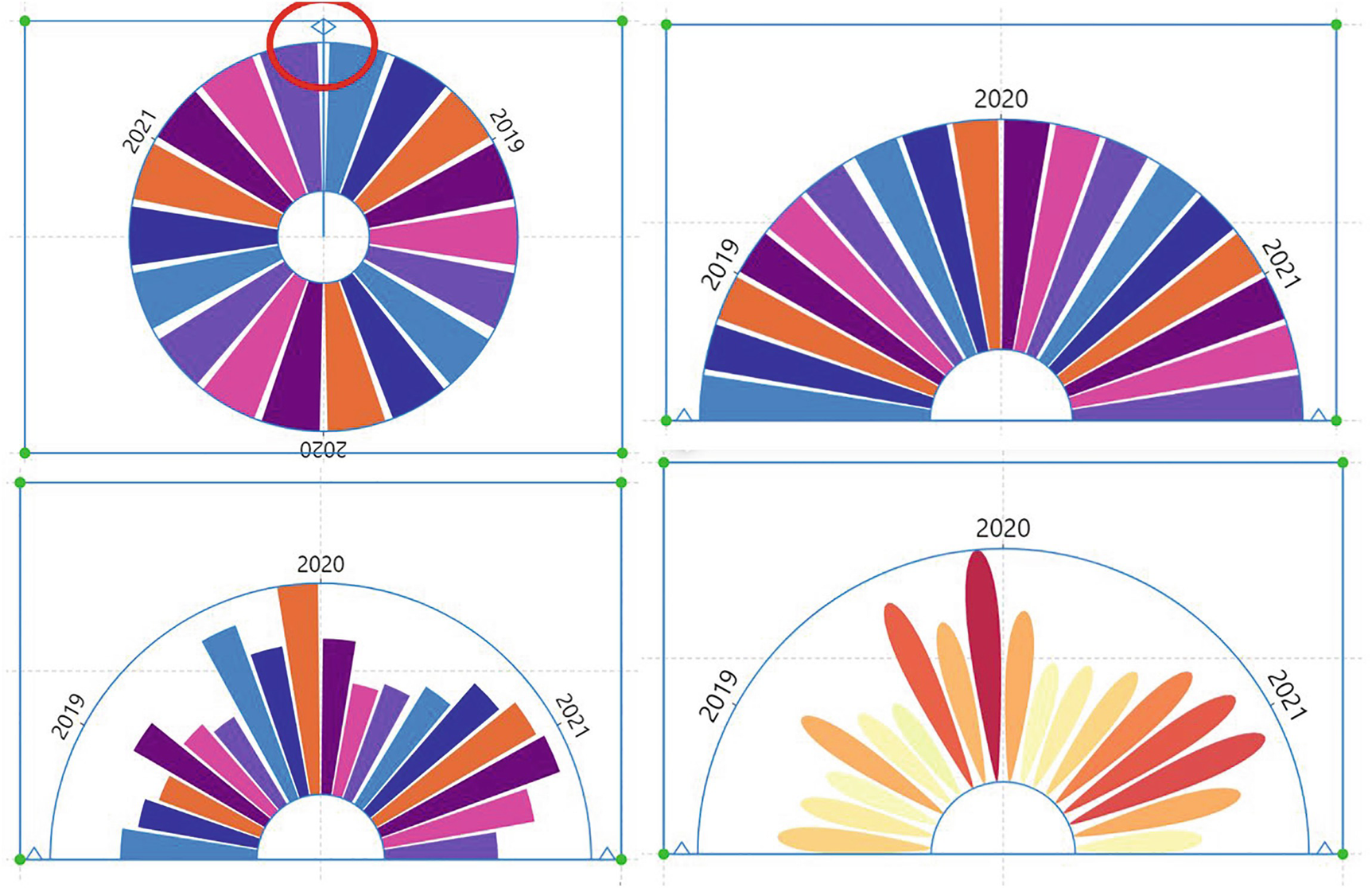
Reshaping the Polar Chart

Reshaping the polar chart
If you want to fine-tune these adjustments, you can also use the attributes of the polar plot segment where you can resize the plot segment and change the gap between categories and the spacing between glyphs.

Creating an arc layout
To move the arc shape to the bottom of the canvas, turn on the Automatic Alignment attribute under “Origin” in the plot segment Attributes pane. You can then move the bottom guide of the canvas upward to reposition the chart in the middle of the canvas. Another approach to moving the arc into the middle of the canvas is to drag the bottom guide of the canvas below the canvas.
Creating a Pie Chart
A Charticulator pie chart
The downside of using Charticulator to build standard pie charts is that displaying “detail labels” (e.g., the values or percentages as a callout) is problematic on two accounts.

Binding the category to the angular axis spaces the glyphs equally according to their value
Secondly, if you were to use a text mark anchored to the rectangle glyph to show the labels, the text mark will retain its alignment irrespective of the angle at which the glyph sits within the chart. The upshot of this is that the text marks may sometimes sit upside down. This wouldn’t happen to the detail labels on a Power BI pie chart. However, to remedy this problem, you could use a polar guide.
Using a Polar Guide

Using the polar guide to anchor labels around the outside of the chart
Unfortunately, these text marks won’t respond to the data changing. We might conclude therefore that if we want to use a simple pie chart, we’d probably be better off building it in Power BI.
What we must do now, therefore, is to see how we can generate circular style charts that are not so easily constructed in Power BI, if at all. If we start to explore the attributes of the polar plot segment and bind fields to these attributes, we will learn how easy it is to morph the pie chart into a host of other designs. The starting point for this is to understand how the axes of the polar plot segment are used to change the design of the chart and control the layout.
Binding Fields to Polar Axes
A polar plot segment has two axes: angular and radial. You can bind categorical or numerical fields to either the angular or radial axis by dragging directly onto the plot segment or by using the Attributes pane.
Binding numerical fields to either axis doesn’t typically generate meaningful charts, so in this chapter we concentrate on using just categorical data on the angular and radial axes. If you want to plot numerical data onto the axes of a polar plot segment, it’s easier to use a data axis (see Chapter 14) as you have more control over how the data will be represented. However, there is an exception to this and one compelling reason to use a numerical radial axis, and that is in the construction of the radar chart, and we look at this specific example later in this chapter.
Working with the polar plot segment’s angular axis will be more intuitive for you as it’s the only axis that is used in Power BI pie or donut charts. The field you use for Charticulator’s angular axis is synonymous with the field you would put in the Legend bucket when constructing the Power BI pie chart. Binding a categorical field to the angular axis will group the glyphs in sectors around the center point, with the labels sitting around the outside of the chart.

The angular and radial axes of the polar plot segment
Once you have plotted the axis you require, you can then further change the layout of the polar plot segment by using one of the sub-layouts. Let’s see how these sub-layouts can enable you to design the charts of your choice.
Using Polar Plot Segment Sub-layouts

The sub-layouts of a polar plot segment

The fields used for all the examples in the section on sub-layouts
- 1.
Stack angular with angular axis
- 2.
Stack radial with angular axis
- 3.
Stack angular with radial axis
- 4.
Stack radial with radial axis

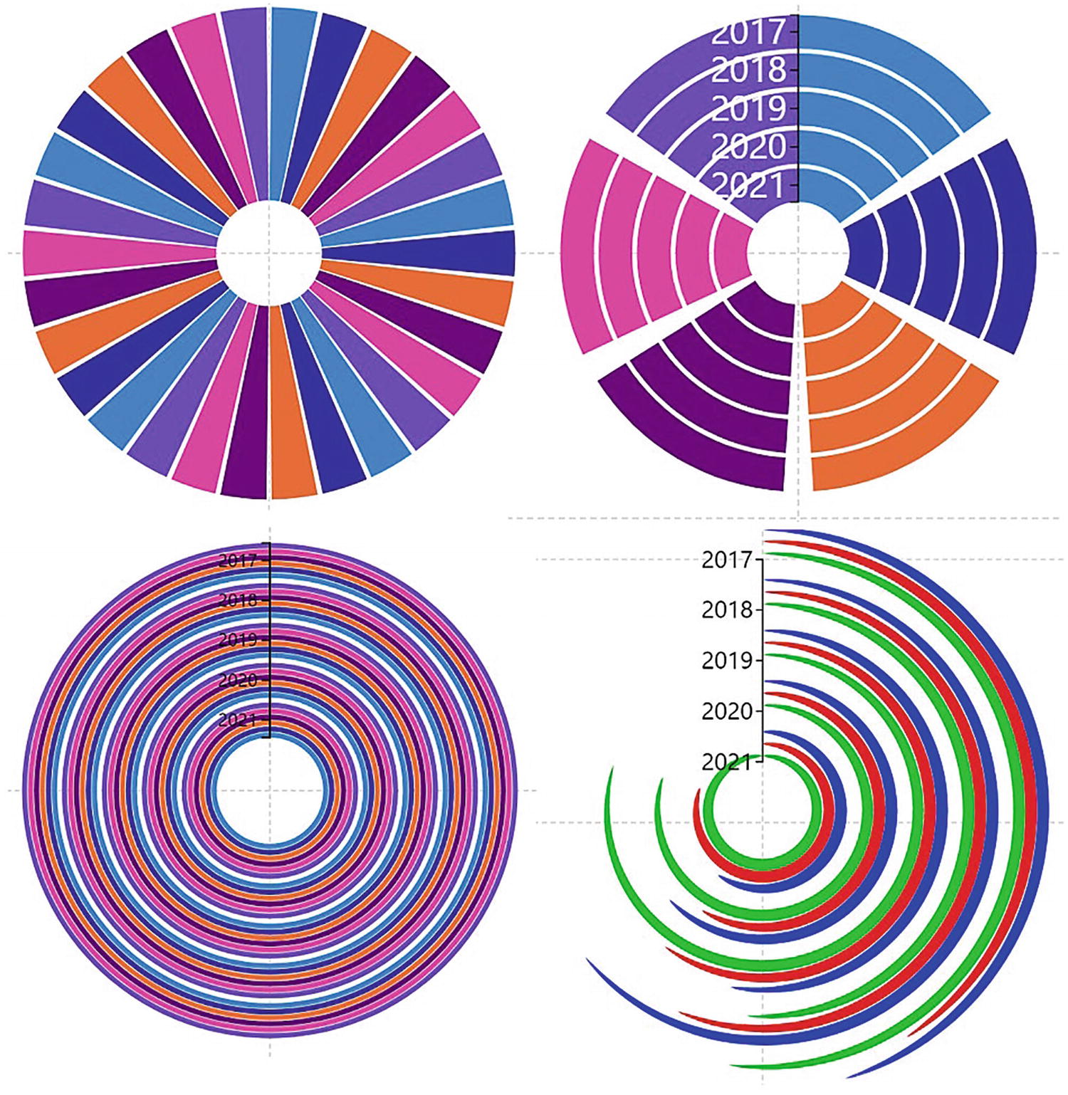
Combinations of sub-layouts with angular and radial axes
As with cartesian charts, the fields you bind to the axes take precedence. With an angular axis, the years are represented by sectors, but with the radial axis, the years are represented in concentric circles. The sub-layouts then stack the glyphs representing the subcategory (in our examples, the salespeople) side by side (stack angular) or one on top of the other (stack radial).
Rose (angular axis and stack angular sub-layout)
Peacock (angular axis and stack angular sub-layout)
Nightingale (angular axis and stack radial sub-layout)
Radial chart #1 (radial axis and stack angular sub-layout)
Radial chart #2 (radial axis and stack radial sub-layout)
Once you have learned how you can build these charts, we will then leave it to you to self-explore the myriad of other options and permutations when working with a polar scaffold.
Rose Chart (Angular Axis and Stack Angular)

Using an angular axis and stack angular sub-layout with a numerical field bound to the Height attribute of the rectangle
The angular axis arranges glyphs around the axis in the same way as an x- or y-axis and that is to arrange them equally around the axis according to the value bound to the Width attribute. The result of this is that a gap will be produced for smaller values (see Figure 13-7).
Peacock Chart (Angular Axis and Stack Angular)
A peacock chart uses an angular axis and a stack angular sub-layout
You will notice that we have also filtered the “Year” field to show only three years. This type of visual, like pie charts, generally works better when you have fewer categories.
Remember to turn on the Automatic Alignment attribute to move the peacock chart to the bottom of the canvas. You can then adjust the bottom guide of the plot segment to move the chart into the middle.
Nightingale Chart (Angular Axis and Stack Radial)

Transforming the default chart into a nightingale chart using an angular axis with a stack radial sub-layout
Using the stack radial sub-layout, the glyphs are grouped by year and stacked in concentric layers to show values for the salespeople. The real benefit of this chart is that not only can we analyze our salespeople’s performance and see that “Charron” is doing nicely, but we can also easily see that the years 2020 and 2021 were the better years. It’s the binding of a numerical value to the Height attribute of the rectangle that gives this visual its strength.
Radial Chart #1 (Radial Axis and Stack Angular)

Binding a categorical field to the radial axis and using the stack angular sub-layout
In this chart, we bound a numerical field to the Width attribute of the rectangle to plot the data. However, the radial axis for the years by default sits vertically at the top of the chart. If you change the angle of the plot segment (i.e., an angle of 270o to 450o), this would move the axis so it sits horizontally.
You will get some more interesting layouts if you experiment with the plot segment’s horizontal and vertical alignment options or the gap and sorting options.
Radial Chart #2 (Radial Axis and Stack Radial)
Redesigning the default chart to use a radial axis with a stack radial sub-layout
Attributes you can modify to generate interesting polar charts
Attribute to Modify | Example |
|---|---|
• Alignment | We’ve only used the “Bottom” and “Left” alignments, but you could try to edit these and see what impact it has on your chart. |
• Shape | Explore using triangles or ellipses. You could even experiment with symbols in the Glyph pane. |
• Angle | As we have seen, creating arc-shaped charts by changing the angle can produce an interesting variation on a circular chart. |
• Gridlines | You can show radial or angular gridlines using attributes of the relevant axis. |
• Binding data | We’ve always bound numerical fields to the Height attribute for the angular axis and to the Width attribute for the radial axis, but there is no rule regarding this. |
Height to Area
The Height to Area attribute is an attribute of the plot segment, and we need to take a more detailed look at it. Toggling the attribute on or off will affect the way the numerical data is plotted in the chart.
When you bind a numerical field to the Height attribute of a rectangle glyph, when plotted on a polar plot segment, the heights of the glyphs will be proportional, but the areas will be skewed for smaller values as the radius decreases. The outcome is that smaller values look disproportionally smaller relative to the area. The reason for this is that the “Height to Area” attribute of the polar plot segment is checked off by default.

The Height to Area attribute
Use the Height to Area attribute by checking it on to ensure that the numerical value bound to the Height attribute drives the area of each sector, as opposed to the height.
Numerical Radial Axis – The Radar Chart

The radar chart uses a numerical radial axis

The data plotted onto the radar chart
Let’s now explore how this chart was built. We started with a new chart and then applied the polar scaffold to the plot segment. We know that when we use a numerical axis on a cartesian chart, the default sub-layout is Overlap, and the norm is to use a symbol in the Glyph pane. This is no less true for numerical axes in polar charts. With a symbol in the Glyph pane, the “Student” field was then bound to the Fill attribute of the symbol and the “Subject” field was bound to the angular axis. The “Mark” numerical field was bound to the radial axis, generating a numerical radial axis that has all the same attributes as a numerical x- or y-axis. The Range attribute of the plot segment was set from 0 to 100.

Close the link line to create the radar chart
You may also find that you need to change the link line type to “line” rather than “Bezier.”
The Custom Curve Scaffold

A visual created with the custom curve scaffold
To use the custom curve scaffold, begin afresh with a new chart that uses two fields, one categorical and one numerical, and then put a rectangle mark into the Glyph pane. You can then bind your numerical field to the “Width” attribute of the rectangle and categorical field to the “Fill” attribute. In the visual shown in Figure 13-22, we used the “Regions” categorical field and the “Sales” numerical field and also sorted the glyphs ascending by numerical value, but the sorting isn’t essential.
Applying the Custom Curve

Applying a custom curve scaffold

Drawing your own custom curve
The custom curve scaffold creates a custom curve plot segment that you will see in the Layers pane. You can bind data to the tangent and normal axis by using the Attributes pane.
Creating a Spiral
As part of the custom curve scaffold, you can also produce spiral type charts. To do this, start with a very simple chart that comprises a rectangle mark that has a numerical field such as “Sales” bound to the Width attribute and a categorical field such as “Regions” bound to the Fill. Then close the gap to zero in the plot segment attributes to pull the shapes together. It works best if you restrain the Height of the rectangle to a measurement, such as 30, but experiment here to see what works for you.

Creating a spiral chart

Specifying the start angle of the spiral

Specifying the Windings of the spiral
I think you’ll agree that by using Charticulator’s polar and custom curve scaffolds and by combining angular and radial axes with the sub-layout options, you’ve been able to design some engaging, interesting, and unusual visuals. You now also know how to design a radar chart. It’s true that we need to be cautious in our choice of visual, and you may feel that some polar and custom curve charts are not always the best choice to do the job of reporting on your data. However, now that you know how to create pie, nightingale, and radial charts using Charticulator, at least you can make that choice for yourself.
In the next chapter, we turn our attention away from scaffolds and instead focus on the numerical data that we want to analyze in our visuals. It may not have escaped your notice that up to now, our data has mostly comprised a single numerical value, that is, the “Sales” value. This has been because designing charts that use multiple metrics often requires a completely different approach from plotting just a single numerical value against multiple categories. So let’s move forward and learn how to design visuals that can compare and contrast the metrics that matter to us.