
Chapter 1
What’s New in Excel 2019
Forward-Looking Features in Excel 2019
Power Query Is Still the Best New Feature in Excel 2019
Co-Authoring Allows Multiple People to Edit the Same Workbook at the Same Time
New Calculation Functions in Excel 2019
Using the Inking Tools in Excel 2019
Suggesting Ideas to the Excel Team
Accessibility Improvements Across Office
Changes to the Ribbon and Home Screen
Collecting Survey Data in Excel Using Office 365
This chapter explains the new features in Excel 2019 and a few important features that you might have missed if you upgraded directly from Excel 2013 to Excel 2019.
Office 365 Is the Future
Although this book is titled Excel 2019 Inside Out, it is far more likely that you are using Office 365 instead. During the Excel 2016 product cycle, subscriptions to Office 365 far outpaced people who purchased the traditional Office 2016.
Those people who mistakenly paid $400 for a perpetual license to Office 2016 sat on the sidelines as the people paying $10 a month for five licenses of Office 365 received new features month after month.
For Office 2019, it is even worse: Microsoft has said that Office 2019 is for the last holdouts—the people who refuse to switch to a subscription. As I write this in the summer of 2018, there are already new features coming out in the Office 365 version of Excel that will not be in Excel 2019.
If you are one of those holdouts, here is the guide to Office 365. First, Office 365 has nothing to do with using Excel in the cloud. You will still be running Excel from your computer just like the perpetual version of Excel. You can choose how often you want to get updates. I, as the author of this book, have one beta computer signed up for the Office Insider program, and it gives me new updates every Tuesday. These bits frequently break something. When the Insider Fast subscribers find a problem, we report it to Microsoft, so the bugs can be fixed when it rolls out to the Monthly channel in four weeks. Most people are on the Semi-Annual plan. You get updates twice times a year, and those updates have been thoroughly vetted by millions of others.
I’ve encouraged the Microsoft marketing department to offer an amnesty program. There should be a way for someone to say, “Gee, I made a mistake by giving you $400 for a perpetual license to Excel. Could I please convert this to an Office 365 subscription, so I start getting the exciting new updates like everyone else?”
Every feature mentioned in this chapter as being new in Excel 2019 has reached the Office 365 subscriber months or years ago.
Office 2019 Requires Windows 10
Microsoft used to support any version of Office for ten years. This is broken down into five years of mainstream support and five years of extended support. During extended support, you would get bug fixes, but no problem fixes unless your company pays for Premier support. Starting with Office 2019, the extended support period is being reduced to two years, which means that Office 2016 and Office 2019 will both lose extended support in October 2025.
In 2020, Windows 7 and Windows 8.1 will no longer be supported. Microsoft has decided Office 2019 will not run on Windows 7 or Windows 8.1. You will have to use a supported release of Windows 10. All Windows 10 releases are supported for 24 months, which means the original unpatched version of Windows 10 is no longer supported and would not be able to run Office 2019.
The reason for the change is to reduce the testing matrix that Microsoft must perform for each release of Office.
Forward-Looking Features in Excel 2019
The computing world is becoming increasingly a mobile workforce. You spend a lot of time doing tasks on your phone that you used to do on a desktop computer. Checking email can easily be done on a mobile phone. Spreadsheets can easily be viewed in mobile, but it is still difficult to author a spreadsheet on a phone. However, Microsoft is counting on spreadsheet use on mobile devices to increase.
A certain subset of people using Excel will extend the functionality of Excel by using macros and user-defined functions written in Visual Basic for Applications (VBA). This language is 30 years old and will never run in Excel Online, Excel for Android, or Excel for iOS. With Excel 2019, Microsoft announced support for user-defined functions written in JavaScript, which opens the possibility for a custom function to work both on your PC and in Excel online. There is still no support for Android or iOS, and the JavaScript functions are super-slow compared to their VBA counterparts. However, this is a step in the right direction.
Artificial Intelligence in Office 365
In early 2018, Microsoft began rolling out the Artificial Intelligence feature to Office 365 subscribers. If you enable Artificial Intelligence, you will be able to select up to 250,000 cells of data and ask Excel to analyze the data, looking for interesting patterns. Your data is sent to a Microsoft server where some routines written by Microsoft Research look for trends and patterns.
Troubleshooting
The Artificial Intelligence feature has appeared with two different names and in different locations.
In early 2018, “Insights” debuted on the Insert tab, just to the left of the Charts group. By September 2018, Microsoft was running a test in which the feature is called “Ideas” and appears on the far-right side of the Home tab.
The final name and location will depend on metrics during the test, but Ideas on the Home tab seems to be the eventual winner.
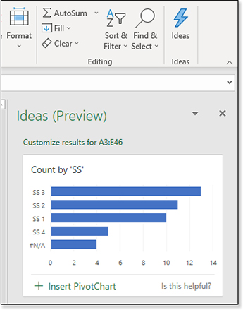
The Ideas icon is a lightning bolt and appears to the right of Find & Select in the Home tab of the ribbon.
Artificial Intelligence for Office uses the same engine used to power Insights in Power BI, but the Excel team did extra work to fine-tune the results. You will often get back 24 to 36 results—each one would insert a chart, pivot table, or pivot chart in your workbook (see Figure 1.1).
Microsoft’s initial decision is that Ideas will not be supported in Excel 2019. They’ve drawn a line that Ideas is a service that happens online, and if you are not paying the monthly fee for Office 365, you don’t qualify for the service. This seems like yet another policy designed to prevent people from buying the perpetual licenses of Office.
Read more about Ideas in Chapter 15, “Using Pivot Tables to Analyze Data.”
Support for Stocks and Geography Data Types in Office 365
During the summer of 2018, Microsoft began slowly rolling out support for data types in Excel. Type some ticker symbols in a range. Select the range and choose Stocks as the Data type on the Data tab of the ribbon.
The stock symbols will be replaced with an icon and the name of the company.
Click on any icon (or select the cell and Ctrl+Shift+F2) to see a data card with information about the company.
Far more interesting, though, are the new formulas that you can create. In Figure 1.2, the formula =B2.Exchange, =B2.Employees, =B2.[Ticker Symbol] will retrieve data from the Internet and return it to your worksheet. You can also use =FIELDVALUE(B2,"Volume") instead of the dot notation.
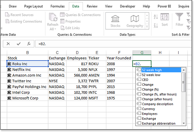
Once you have formulas in C2:G2 for Roku, you can copy those formulas down, and the results change to return values from Netflix, Amazon, Twitter, and so on.
If the data item is a single word, you can write a formula without the square brackets: =B2.CEO. However, if the data item contains a space or other special characters, use square brackets: =B2.[Price (after hours)].
All data such as Price and Price After Hours is delayed by 15 minutes.
These new Linked Data Types do not automatically refresh with every workbook refresh. You can either right-click B2 and choose Data Type, Refresh to refresh the entire block of B2:G8 or use Data, Refresh All (Ctrl+Alt+F5).
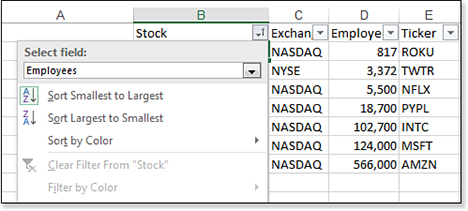
If you apply Filters to the data, a new drop-down menu appears at the top of the Filter menu. You can choose to sort the data by any field in the data card. In Figure 1.3, the data is sorted ascending by employee. You can even sort by a field that is not returned to the spreadsheet.
Power Query Is Still the Best New Feature in Excel 2019
That heading you just read seems like an anomaly. Power Query is not new. It was introduced as an add-in for Excel 2013, and it was made a full part of Excel in Excel 2016. How can a feature that is five years old be the best new feature?
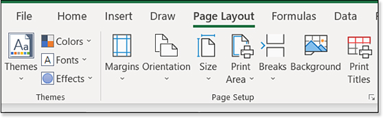
I still consider it a “new” feature because most people have not discovered it. Because of a series of branding missteps by the Microsoft Marketing team, the name “Power Query” was removed from the feature when it was quietly added as the third group on the Data tab of the Excel 2016 ribbon. Later, in Office 365, the Power Query icons were moved to the first group on the Data tab, replacing nearly similar icons from Excel 2013.
Consider the two versions of the ribbon shown in Figure 1.4. It is very easy to assume that the icons in the Excel 2019 ribbon are just a rearrangement of the icons from Excel 2013.
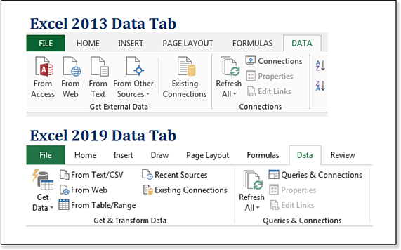
Although the icons look similar, the logic behind the icons is completely new and far more powerful than the legacy versions of the same icons.
Here are the improvements:
The data cleansing tools are new and offer all types of transformations that were difficult in previous versions of Excel. You can unpivot, and you can group and summarize. You can do the equivalent of a VLOOKUP, returning an item description when the CSV file only has an item number. You can split by delimiter to new rows. You can convert a date field to months or quarters or years during an import. New transformations are added frequently. While the Power Query ribbon offers 50+ transformations, there are hundreds of transformations available with a couple of lines of code in the M programming language. I estimate that you can save 20 percent of your time spent cleaning data on the first day of your Power Query usage. If you have something that used to take 20 minutes, you can do it in 16 minutes on the first day.
Power Query is self-documenting. As you do steps in Power Query, those steps are remembered and documented. When the internal auditor shows up and wants to know how you produced this data that made its way into the packet you handed out, you will have the steps documented.
Although Power Query is 20 percent faster right away, it is 99 percent faster going forward. Once you have cleaned a data set using Power Query, you simply re-open the workbook containing the query results and click Refresh to have Power Query re-apply all of the transformations to the new data.
Power Query can work on an entire folder of files. If you must combine all the CSV or Excel files from a folder, Power Query makes it easy.
Read more about Power Query in Chapter 13, “Transforming Data.”
Co-Authoring Allows Multiple People to Edit the Same Workbook at the Same Time
In the past, shared workbooks were a hassle. As soon as you shared a workbook to allow multiple people to edit the workbook, many basic features in Excel were deactivated. The ability to have everyone in a department edit the same file has been rewritten and works very well.
Google Sheets is an online spreadsheet competitor to Excel. Because everyone using Google Sheets is online, they were the first spreadsheet app to market with a usable interface where multiple people could edit a workbook.
Microsoft’s implementation requires your workbook to be saved online. You can save it in OneDrive, OneDrive for Business, or SharePoint Online. Once the workbook is saved in those locations, you can have multiple people on multiple endpoints editing the workbook.
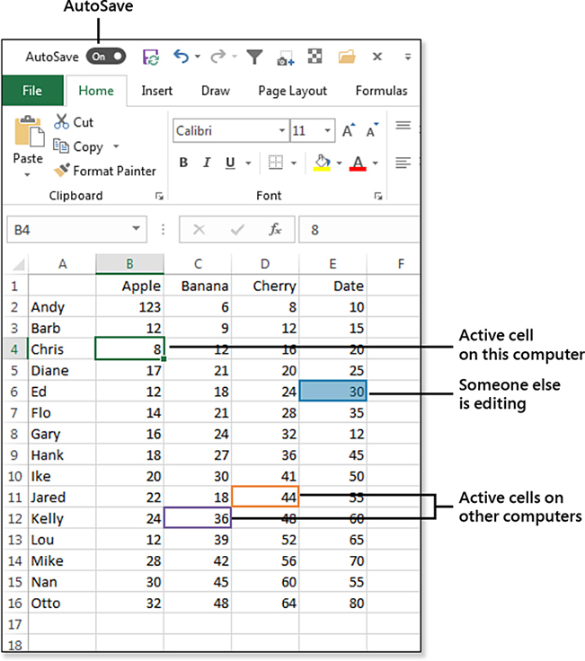
For example, right now, I am editing the same workbook in Excel 2019, Excel 2016, Excel for the iPad, and Excel Online for an old machine that only offers Excel 2013.
When I look at the workbook, I see four cell pointers. The cell pointer with the fill handle is the active cell on my computer. The other cell pointers indicate the active cell on every other computer. When one of the other people are editing a cell, that cell temporarily becomes shaded. See Figure 1.5.
Setting Up Co-Authoring
To set up a workbook for co-authoring, you need to use File, Save As and choose a OneDrive location or a SharePoint Online location.
After saving the workbook, you will see the AutoSave icon at the top left of the screen light up. A Sharing icon appears at the top right of the screen.
When you click Sharing, you can enter email addresses of specific people, or you can use the Get A Sharing Link tool to generate a link where others can edit. The Sharing Link tool is at the bottom of the Share panel.
When other people open the workbook, their initials should appear in a colored circle at the top right of the worksheet. Hover over the initials to see the name of the person. The color of the circle will match the color of the extra cell pointers.
You can hover over one of the extra cell pointers to see the name of the person who is editing that cell.
The delay for updating the cell pointer from all computers is very short. The delay for updating values can be longer. For example, imagine that you are looking at Computer A and someone is changing a cell on Computer B. The person using Computer B selects A1, types 123, and presses Enter. That person’s cell pointer will generally move to A2. On the other computer, you will see A1 be selected, then you will see A2 be selected. One to two seconds later, you will see the 123 appear in A1. For some reason, the synchronization of the cell pointers happens faster than the value updates.
Etiquette for Co-Authoring
You won’t have any trouble if you do not select any cells that other people are editing. Wait until they finish editing the cell and for the cell to update. You are then free to edit the cell.
If two people edit the same cell at the same time, Excel will choose one who wins. In general, the last person to change the cell “wins,” but not in all cases. Different endpoints support co-authoring in different ways. Sometimes, a person with an older version of Excel won’t have full support for co-authoring, and that person will always win.
There are some features that are not supported in co-authoring. If someone tries to use one of those features, the others might get “Refresh Recommended” or “Upload Failed” errors. In my opinion, once you get one of these messages, you start over. Microsoft says it is not that bad. Their advice:
If you don’t have any unsaved changes, simply click Refresh.
If you have unsaved changes that you were not particularly fond of, click Discard.
If you have unsaved changes that you need to keep, click Save A Copy and save the file with a different name. Select and copy the changes you need to keep. Reopen the original file and paste the changes back in.
The Bad Side of AutoSave
In my workday, I very rarely need to share workbooks. I will say that only one out of 200 workbooks requires co-authoring. Most of the time, I am not co-authoring.
AutoSave is great when everyone needs to see every change that you make, but AutoSave is horrible if you are the only person using the workbook.
How often do you do steps like this?
You need to create a February report.
Rather than start from nothing, you open the January report.
Then, you change the title.
You change the headings.
You clear out the January data.
Finally, you click File, Save As to save the workbook with “February” in the name.
With AutoSave, you destroy the January workbook after every step of the process.
Here’s another scenario: You have a great forecast model. Your manager has a crazy idea and wants to see the impact on profit if you do X. You know this idea will never work, but you need to give the manager the results. So, you open the forecast file, make the crazy changes, print, and then close the workbook without saving. This ability to close the workbook without saving is gone with AutoSave. Every change gets saved automatically.
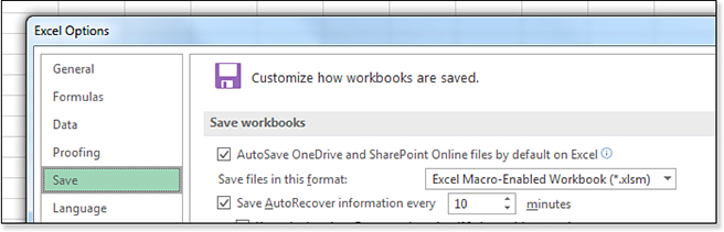
In 99.5 percent of the cases, AutoSave is really bad. If you regularly save your workbooks to OneDrive, AutoSave will be enabled by default. The Excel MVPs complained loudly to the Excel team on your behalf, and we were able to get a setting added to Excel Options. Choose File, Options, Save, and unselect AutoSave OneDrive and SharePoint Online Files By Default On Excel, as shown in Figure 1.6.
Improvements to PivotTables
Way back in Excel 2007, a new Compact Layout was introduced, and it was the default for all future pivot tables. There are a lot of people who preferred the old Tabular layout. For six years, I lobbied the Excel team to give us a check box to make all future pivot tables start in Tabular layout instead of Compact layout. In Excel 2019, that function is finally available, but it is much better than I requested.
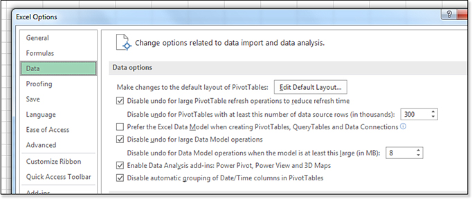
I am pretty excited that the release of this new feature led to the creation of an entirely new category in Excel Options. Because this feature has been slowly rolling out to Office 365 subscribers, there is a simple test to see if you have it. Open Excel Options, and if you have the brand-new “Data” category on the left, then you have the feature.
The first choice in the new Data category is Make Changes To The Default Layout Of PivotTables (the button reads, Edit Default Layout). Microsoft brought all the other pivot table options from the Advanced category to this new Data category.
Click the Edit Default Layout button (see Figure 1.7) to open the Edit Default Layout dialog box shown in Figure 1.8.
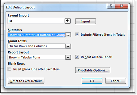
Once in the Edit Default Layout dialog box, you can control six settings right in the dialog box. You could also import settings from an existing pivot table using the Import button. Or, you can click the PivotTable Options button to change any settings.
More PivotTable Improvements
Pivot tables will no longer count if your data contains a mix of numbers and empty cells. You will still get a Count of Revenue if someone types some spaces where the revenue should be. However, if the cells are simply empty, Excel will treat them as numeric, and you will get a sum instead of a count.
In Excel 2016, adding a Date field to a pivot table would cause the pivot table to AutoGroup the dates. There was no way to turn this off except for editing the Windows Registry. You now have a way to turn it off. Use the Disable Automatic Grouping Of Date/Time Columns In PivotTables setting found in the Data category of Excel Options. Read more about PivotTables in Chapter 15, “Using Pivot Tables to Analyze Data.”
You can format individual cells in a pivot table, and that formatting will persist after a Refresh. Say that you need the East region Gadget revenue to be red. Right-click the revenue cell for East Gadget and choose Format Cells. Apply any formatting from the Format Cells dialog box. You can rearrange the pivot table, and provided you do not remove Product, Region, or Revenue from the pivot table, the formatting will persist.
The Power Pivot tab is now available in all SKUs of Excel 2019 for Windows. Back in Excel 2016, people with the Home, University, or Small Business versions did not have the full Power Pivot tab.
The Data Model version of PivotTables has new DAX calculations, such as Median or even ConcatenateX to allow you to report text in the values section of a pivot table. Read more about the Data Model in Chapter 17, “Mashing Up Data with Power Pivot.”
Power BI Desktop is a new way to share your pivot table and pivot charts. Read about Power BI in Chapter 28, “Sharing Dashboards with Power BI.”
New Calculation Functions in Excel 2019
Excel 2019 includes six new calculation functions.
In the Text category, CONCAT and TEXTJOIN are new. While CONCAT lets you specify a range of cells, TEXTJOIN is better because you can specify a delimiter between each cell and indicate if empty cells should be ignored. Read more in Chapter 8, “Using Everyday Functions: Math, Date and Time, and Text Functions.”
In the Statistics category, MAXIFS and MINIFS join the existing AVERAGEIF, SUMIFS, and COUNTIFS. Read more in Chapter 8, “Using Everyday Functions: Math, Date and Time, and Text Functions.”
Two new functions in the Logical category will simplify complex nested IF statements. The SWITCH function will let you test a single value for many possible values. The IFS function will let you specify many possible conditions without introducing new IF functions in the Value_If-False argument. Read more in Chapter 9, “Using Powerful Functions: Logical, Lookup, and Database Functions.”
Faster VLOOKUP When Multiple Columns
Say that you must do twelve columns of VLOOKUPs, one for each month. Every VLOOKUP starts out with =VLOOKUP($A2 and uses the same lookup table.
Formula gurus would tell you it would be faster to do one column with MATCH and twelve columns of INDEX.
New since Excel 2016, Excel will detect this situation and automatically speed up the VLOOKUP recalculation time. When Excel starts to look up the value for February, it will remember the location of the matching row for January.
Two New Charts in 2019
Excel 2019 adds two new chart types—a funnel chart as shown in Figure 1.9 and a filled map chart as shown in Figure 1.10.

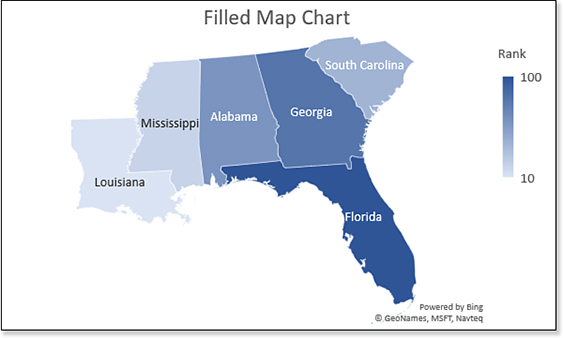
The important word in filled map charts is the word “Filled.” You can color code countries, states, provinces, counties, and zip code boundaries. However, you cannot plot individual points for each city. I never quite understood why Excel downloads the shape of a county but not the shape of a city.
Read more about both chart types in Chapter 23, “Graphing Data Using Excel Charts.”
One of the biggest improvements in charting is not out yet, but it has been promised soon for Office 365 customers. For the Power BI product, Microsoft allowed anyone to create an open-source visualization type. At the Build Conference in May 2018, Microsoft announced that you would soon be able to import custom visuals to Excel. Because this feature did not make it to Excel 2019, it is another example of exclusive content for Office 365 subscribers. Take a look at the custom visuals in Chapter 28.
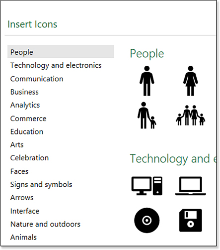
Inserting Icons and 3D Models
A new Icons feature appears next to Shapes on the Insert tab of the ribbon. The Shapes feature debuted in Excel 97. The 175 available shapes included a few interesting pictures, such as a heart or a lightning bolt. The new Icons feature offers 185 graphics divided into logical categories such as People, Communication, Arts, Apparel, and so on (see Figure 1.11).
Once you insert an icon into your worksheet, a new Graphics Tools tab appears in the ribbon. You can re-color, re-size, rotate, or add effects. The only apparent difference between an icon and a shape is that a shape can contain a text box. If you need to add text to your icon, you can use the Convert To Shape icon on the left side of the Graphics Tools tab in the ribbon.
Inserting and Exploring 3D Models
Almost half of all manufacturing companies are using 3D printing as a tool for rapid prototyping. Forbes estimates that 3D printing is a 12 billion dollar industry, and it is growing. Excel now allows you to import and rotate 3D printing files.
Specifically, Excel supports these file types: Filmbox (*.fbx), Object (*.obj), 3D Manufacturing Format (*.3mf), Polygon (*.ply), StereoLithography (*.stl), and Binary GL Transmission (*.glb).
On the Insert tab, choose 3D Models. There are a few sample files provided by Microsoft, or you can import any file you have. One great resource for free 3D models is NASA; browse for royalty-free models at https://nasa3d.arc.nasa.gov/models/printable.
Figure 1.12 shows a 3D model of the Hubble Space Telescope.

Click the center rotation icon and drag your mouse in any direction to rotate the model. Figure 1.13 reveals that the side view of Figure 1.12 is actually several pieces that you could print on a 3D printer and assemble.

Using the Inking Tools in Excel 2019
With the proliferation of touch screens, the Draw tab of the ribbon is now a permanent part of Excel 2019. Microsoft made a big deal about the ability to customize the pens used while drawing. As shown in Figure 1.14, the built-in pen types are either fine-point markers for drawing lines or wide-tipped highlighters. The highlighters are semi-transparent so that you can see the underlying text.
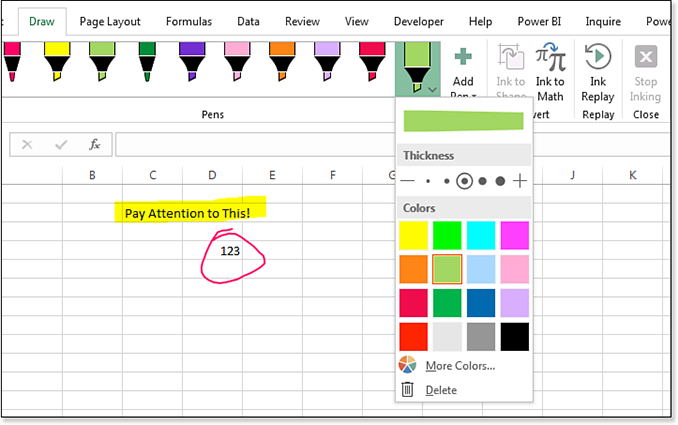
To add a new pen, use the New Pen icon. Choose Pen or Highlighter, then choose a thickness and a color.
To draw on the worksheet, click on a pen and then either drag with the mouse or draw with the touchscreen. To stop inking, use the Stop Inking icon on the right side.
I never like the results of me trying to draw a circle. If I wanted to circle something, I would use the built-in Shape tools to draw a perfect oval. However, if you need something quick, the tools on the Draw tab could work.
By the way, for those of you who use Microsoft Word, the similar feature in Word offers a pencil in addition to pens and highlighters. Also, there are a variety of gel-pen effects, such as Sparkles.
One oddity is the ability to play back your drawing. If you’ve highlighted five cells, clicking Ink Replay will highlight those cells in an animated fashion. I have no idea when you would use this; if you could add each highlight one at a time like a PowerPoint slide, I would get it. However, this feature is like blowing through the entire PowerPoint deck in one second.
Suggesting Ideas to the Excel Team
A new website has gained popularity since Excel 2016. Microsoft is billing Excel.UserVoice.com as “Excel’s Suggestion Box.” They encourage you to visit the site and tell them what changes you would like to see in Excel. The ideas are posted publicly, and other customers can vote for your idea. Each idea shows the title, description, and current vote count.
You can find a link to this website by using the new Help tab in the ribbon. Choose Suggest A Feature, and Excel will launch a browser for Excel.UserVoice.com.
The Excel team says they will personally respond to any idea with more than 20 votes. Just submitting an idea doesn’t mean they will implement it. In many cases, they will tell you the idea has already been implemented, or that they can’t implement your idea for one reason or another. However, if they encourage you to keep collecting votes, then your idea is actually under consideration.
I will attest that this works. Since Excel 2007, I’ve been lobbying for the Excel team not to have pivot tables default to Compact layout. I posted an idea and started encouraging viewers of my podcast to vote for my idea. After I collected 200–300 votes, I received a call from someone on the Excel team saying they were going to add the Defaults feature to Excel. They actually implemented something far more encompassing.
Each of the following features are new since Excel 2016 and were the result of the ideas getting a lot of votes on Excel.UserVoice.com.
Keeping the Copied Cells on the Clipboard
This new feature is a great example of what happens when you listen to people posting ideas on Excel.UserVoice.com. The original idea was posted and then received 224 votes. The Excel team implemented the idea, but then a lot of people did not like the side-effect of the idea.
The person who suggested the idea noted that they would frequently select some cells and choose Copy, click New Sheet, type a heading, and finally, choose Paste. However, the act of typing something in a cell would clear the Clipboard. This would cause some extra steps, such as screaming in your head, going back to the original sheet, pressing Ctrl+C to Copy again, moving to the new worksheet, and pressing Ctrl+V to Paste.
In my experience, the problem was slightly different. I would insert seven blank rows, then copy eight rows of data. I would want to insert one extra row, so I had room for the paste. Inserting rows caused the Clipboard to clear.
Excel 2019 will now keep the dotted marquee active even if you type something in a cell or if you insert some rows. (By the way, the “marquee” is the official Microsoft name for what a lot of people call the “marching ants” or “dancing ants”—the flashing animation around a selection that looks like a line of ants marching or the chaser lights on a movie marquee.)
Troubleshooting
Keeping the copied cells on the clipboard can trip up people using legacy hotkeys to Insert Cells.
In Excel 2019, Insert Copied Cells and Insert Cells are two different commands with two different hotkey sequences.
Excel speedsters have often memorized hotkeys for common tasks. In Excel 2019, you can choose Alt, H, I, E versus Alt, H, I, I to differentiate whether you want to insert empty cells or insert the clipboard contents.
The trouble is for people using the legacy Office 2003 hotkeys. Back in Office 2003, the same hotkeys would intelligently invoke one command or the other. If you press Alt+I, E when the clipboard is empty, Excel invokes Insert Cells to insert empty cells. If you press Alt+I, E with something on the clipboard, Excel invokes Insert Copied Cells, which inserts the contents of the clipboard in the newly inserted cells.
If you pressed Alt+I, E when the clipboard was empty, the Insert Cells dialog would open. If you press D and Enter, you would shift the data down, inserting new blank cells.
If you pressed Alt+I, E when there was something on the clipboard, the Insert Copied Cells would open. Pressing D (for Down) and Enter would complete the command.
People who frequently use these hotkeys do not slow down to notice which dialog box opens. Press Alt+I, E, D, Enter will complete the command and close the dialog box.
Because the Clipboard now does not get cleared, you might frequently be pasting the cells from the Clipboard instead of inserting empty cells. If you are experiencing this problem, there are four possible solutions:
Stop using hotkeys and use the commands on the ribbon.
Start using the new Alt, H, I, I, D, Enter sequence when you want to insert blank cells.
Start pressing the Esc key to clear the Clipboard before you begin the Alt+I, E, D, Enter sequence. With an empty Clipboard, pressing Alt+I, E, D, Enter will always insert empty cells.
Stop using Ctrl+V to paste. If you press Enter to paste, the clipboard will automatically get cleared.
I experience this problem frequently, and I have settled on the third option—pressing the Esc key to clear the Clipboard—as the easiest.
Speaking from experience, I like the new Keep The Copy feature. It saves me time a couple of times a week. I also hate the new feature because it causes me to choose Undo about ten times a week. It sounded really good on paper, but I never realized how frequently I would Insert Cells using the legacy hotkeys. And now that my Insert Cells process is sometimes broken, this one change is my leading cause of spreadsheet errors.
Here are the common options after you copy cells:
Press Ctrl+V to paste. This keeps the items on the Clipboard so that you can select another range and Ctrl+V again.
Press Enter to paste. This pastes the content from the Clipboard and clears the Clipboard.
Use Home, Insert, Insert Copied Cells to open the Insert Paste dialog box. Figure 1.15 shows an example just before this command. One cell with the text, “NEW” has been copied to the clipboard. Six cells have been selected in the midst of some data. Selecting Insert Copied Cells will paste the word “NEW” six times and shift the remaining data down. You will get the result shown in Figure 1.16.
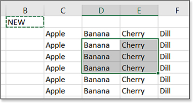
Figure 1.15 Copying one cell and preparing to paste it to six cells while shifting the data. 
Figure 1.16 After selecting Insert Copied Cells from the ribbon, the Insert Paste dialog appears. You can choose Shift Cells Down or Shift Cells Right.
Select some cells, such as B2:E10, as shown in the following figure.
In Excel 2013, it was impossible to deselect one of those cells. However, let’s say you tried the logical step of holding Ctrl while clicking the cell that you wanted to remove from the selection. When you Ctrl+click the cell, nothing happens.
If you thought you had mis-clicked, and you try to Ctrl+click again, rather than unselecting the cell, a bug causes the additional gray color to get applied to the selected cell a second time! The gray becomes darker gray. Likely, this is both annoying because Excel does not offer a way to unselect and amusing because you found a weird bug in Excel. If you continue Ctrl+clicking the cell, it gets progressively darker and darker. After Ctrl+clicking eight times, the cell will be almost completely black.
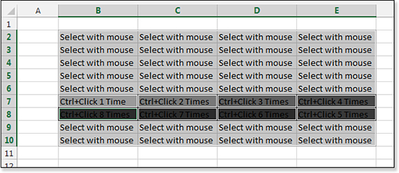
Unselecting a Cell with Ctrl+Click
You can select multiple ranges in Excel by using the Ctrl key. In Figure 1.17, click and drag the mouse to select the first six cells. Hold the Ctrl key while dragging the mouse to select the eight Yes cells in columns C and D. In real life, you might have many more regions to select, and if you accidentally selected an extra cell, such as the “No” cell, there was no way to remove one cell from the selection in Excel 2016.
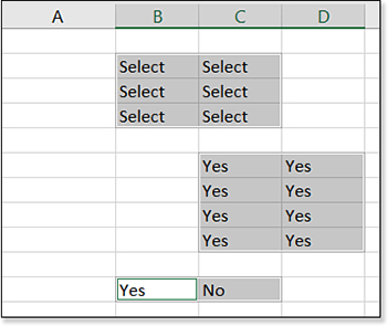
To remove the cell from the selection, you had to start all over again, carefully selecting one region at a time.
An improvement in Excel 2019 allows you to Ctrl+click a cell to remove it from the selection. This feature is new since Excel 2016, thanks to 327 votes at Excel.UserVoice.com.
Formatting Superscripts and Subscripts
It was previously possible to format characters in a cell as superscript or subscript, but it required a trip to the Format Cells dialog box while you were in Edit mode. After 372 Excel.UserVoice.com votes for Superscript and Subscript icons on the Quick Access Toolbar, they have been added to Excel.
They aren’t on the Quick Access Toolbar by default, but you can add them:
Right-click the Quick Access Toolbar and choose Customize Quick Access Toolbar.
Scroll to the bottom of the popular commands.
Click Subscript, then click the Add>> button in the center of the dialog box.
Click Superscript, then click the Add>> button.
Click OK.
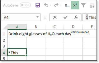
To actually format a character in a cell, you can do it while you are typing in the cell. In Figure 1.18, type You should drink H. Click the Subscript icon to toggle to Subscript mode. Type a 2. Click the Subscript icon again to leave Subscript mode. Type O per day. Click the Superscript icon. Type citation needed. When you press Enter to accept the cell, you automatically exit Superscript mode.
What if you need to format part of an existing cell? Select those characters in the formula bar, and then click either the Subscript or Superscript icon. You will not see the results in the formula bar, but they will appear in the cell.
Less Nagging About CSV Files
Using Comma Separated Values (CSV) is a very common way to move data between systems. Excel natively opens CSV files. CSV files are great for storing values and text, but they don’t handle storing formulas or formatting or charts or pivot tables.
If you open a CSV file, the Excel team is afraid you might add some formulas and formatting and then forget to save as an Excel file. When you save as CSV, Excel would routinely nag you that you were about to lose formulas and formatting. Even if you acknowledged that warning and that you want to save as CSV, Excel would nag you again when you closed the file.
One passionate request at Excel.UserVoice.Com was from someone who had to deal with CSV files all day. This person pointed out that she understood CSV files don’t support formulas, but her job was to produce CSV files all day, every day, and she did not appreciate the constant nagging. There were 1,196 votes for this idea. Excel 2019 now makes nagging optional.
The first time you try to save as a CSV file, this message appears in the information bar above the formula bar:
POSSIBLE DATA LOSS: Some features might be lost if you save this workbook in the comma-delimited (*.csv) format. To preserve these features, save it in an Excel file format.
Because the message appears in the information bar instead of a dialog box, you can simply ignore it. The information bar still offers the Save As button, but it also offers the Don’t Show Again button, which when clicked, means you will never be nagged about CSV files again.
If you choose Don’t Show Again and decide that you would like to be reminded about CSV files, choose File, Options, Save, and select Show Data Loss Warning When Editing Comma Delimited Files (*.csv).
Accessibility Improvements Across Office
Microsoft is committed to improving the Office experience for people with disabilities. There is a dedicated project manager for each product who makes sure that new features are possible to use if you are using a screen reader or other adaptive technologies.
Microsoft wants everyone to consider that some people might be reading their Excel worksheets with a screen reader. Your hilarious cartoon pasted in the worksheet might not make any sense to someone who is using a screen reader. You will see many instances in which you can add alternate text to any object in Excel. Alt Text is a short description of the art, which is helpful to those with visual difficulties and/or are using a screen reader program.
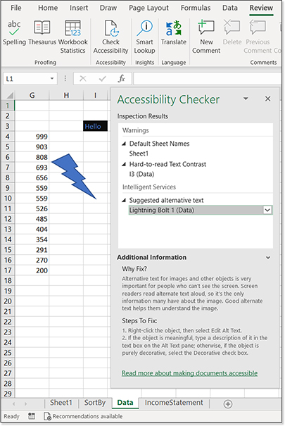
A new Check Accessibility icon is available in the Review tab that is useful with a couple of simple rules. First, give worksheets meaningful names instead of “Sheet1,” “Sheet2,” and so on. Provide Alt Text for charts and images/graphics.
Note
Although there are 28 chapters in this book, I always write Chapter 1 last because it encompasses the new features that are discussed in the other chapters. So, even though you might be reading this chapter first, I wrote it last. All Microsoft Press books contain Alt Text for every figure, which allows someone with a screen reader to follow along. With my recent experience of having written 800 Alt Text entries, I can tell you that adding Alt Text is easy. Adding the Alt Text forces me to think about the key elements of the image that need to be explained to someone who cannot see the image. Each Alt Text entry just takes a minute or two, and it will help you focus the message in the surrounding text while helping the reader understand the point of the image, chart, or graphic.
The dark blue font on a black background in cell I3 is hard to read, but it is the result of the default table style. Thankfully, it is easy to fix.
Sheet1 is not a helpful sheet name, unlike the other sheets with descriptive names. Someone using Narrator will not have any idea what is on the first worksheet without a more descriptive name.
The shape in column H has no alternative text. The checker suggests adding “Lightning Bolt” as alternative text for the shape.
Other accessibility improvements include the following:
The “Tell Me” feature introduced in Excel 2013 now actually works and works well. Press Alt+Q in any Office application to jump to the Tell Me box. If you know that you want to use the Sort Smallest To Largest command on the Data tab of the ribbon, you can press Alt+Q, type Sort Smallest, and press Enter to run the Sort Ascending command.
A new Modern sound scheme is available by selecting Options, Ease Of Access. Choose Provide Feedback With Sound and choose either Modern or Classic. Microsoft doesn’t explicitly explain this, but I think “Classic” apparently stands for “Super Annoying,” and “Modern” stands for “Soothing.” I can see just fine, but I have this feature turned on to provide a gentle audio response to certain tasks.
Provide Feedback With Animation is now an option in the Ease Of Access group. If the animations annoy you, you can easily turn them off.
It used to be impossible to rename a worksheet tab without using the mouse. The sheet tabs have been added to the F6 loop. Press F6 until a sheet tab is selected. Press Shift+F10 to display the context menu, and use the arrow to Rename.
The Windows Narrator has been improved with Excel. For example, say that you selected a pivot table slicer in Excel 2016. As you use the arrow keys to move up and down through the slicer, Narrator would endlessly call out “Slicer Item,” “Slicer Item,” “Slicer Item.” In the improved version, Narrator will announce, “Slicer Items List with Eight Items.” Use the down arrow to move from Apple to Banana and Narrator will announce, “Down Arrow. Banana.” Press the up arrow. Narrator will announce, “Up Arrow. Apple.” It is still not perfect because it will not announce whether a tile is selected.
Changes to the Ribbon and Home Screen
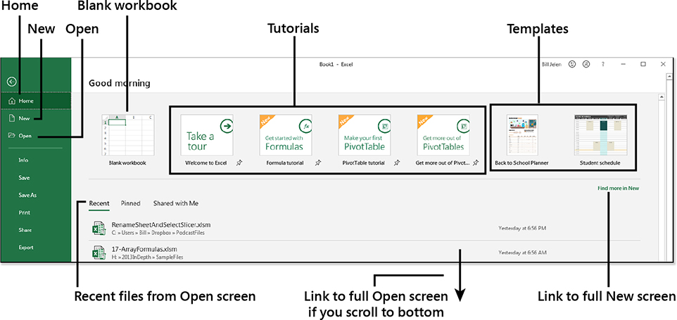
A new Home screen appears when you start Excel or open the File menu. The first three commands in the left navigation bar are Home, New, and Open. Without clicking anything, you will be on the Home screen of the File menu. The Home screen has been added for Excel 2019, and you will find it combines a few elements from both the New screen and the Open screen.
At the top of the Home screen, you will notice a message that reads, “Good Morning,” “Good Afternoon,” or “Good Evening.”
Below that message are tiles normally shown when you select New. The first tile is Blank Workbook. Next are a few tiles offering Excel tutorials and then some tiles of popular templates. A hyperlink at the far right offers more templates in the New screen.
Below the row of tiles, three tabs offer Recent Files, Pinned, and Shared With Me. This is a subset of the options on the Open screen. Note that if you recently opened a pinned file, it will be in both the Recent and Pinned tabs. If you scroll all the way to the bottom of this section, a hyperlink for “Find More in Open” appears (although it would be easier to click Open in the left navigation bar).
Figure 1.19 shows the new Home screen. When you open Excel, the new Home screen replaces the 2016 Excel Start screen. If you prefer Excel open to a blank workbook, you can turn off the Home screen. Go to File, Options, General. Scroll to the bottom and clear the check box for Show The Start Screen When This Application Starts.
New Look for the Office 365 Ribbon
In Excel 2016, the selected tab on the ribbon had a thin line on the left, top, and bottom of the tab. This selection indicator made the selected tab appear as a tab on a file folder.
In the summer of 2018, Microsoft began rolling out a new feature to Office 365 subscribers, which placed a thick border along the bottom of the selected tab name. In Figure 1.20, the Page Layout tab has a thick green underline. I neither hate nor love this; it is consistent with other items throughout Excel. For example, the Active and All tabs in the PivotTable Fields list have used this indicator for some time.
You will also notice that the icons in Figure 1.20 appear a little less crisp. The Office User Interface team says this is an improvement. The current direction from Microsoft is that Excel 2019 will not have these new icons.
Collecting Survey Data in Excel Using Office 365
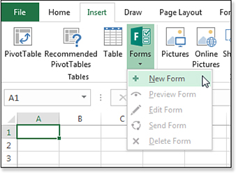
Microsoft introduced an online survey tool at Forms.Office.com that has been integrated with the Office 365 versions of Excel. To create a survey, start with a blank Excel workbook, and choose Insert, Forms, New Form, as shown in Figure 1.21.
Excel will prompt you to save your workbook to a OneDrive for Business account. As you type a name in the Workbook Name dialog box, remember that this name is the default title of the form. For this survey, you could use Excel 2019 Reader Survey.
A new form opens in your default web browser at Forms.Office.com. The name of the workbook appears as the default title. Customize the survey using these optional steps (see Figure 1.22):
Click the Title field to reveal new elements such as a subtitle and a form picture.
Click the Subtitle field and describe the form.
Click the picture icon at the right side of the title and choose Upload. Upload a small image or company logo, which will appear near the form title.
In the top-right corner of the screen, click Themes and choose a built-in theme or upload your own image. The theme provides a whimsical background and will only appear when the survey is viewed on a computer. When the survey is viewed on a phone, no space is available for the theme.
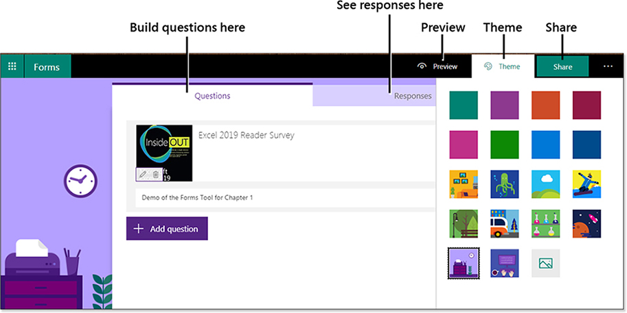
Figure 1.22 Add a subtitle, image, and theme to customize your form.
Click the Add Question button. Four question types are shown: Choice, Text, Rating, and Date. If you choose the ellipsis icon (…) after Date, you can choose Ranking or Likert. You will see an example of a Likert scale as question 2.
Select “Choice” as the type of question. The form will change to give you a space to type the question text and two choices. A button lets you add more choices. Another button lets you add “Other” as a choice. When you choose Other, the people taking the survey will be allowed to type a different value in the form.
Several options at the bottom of the question allow customization of the question:
Choose Multiple Answers to allow people to choose more than one answer.
Choose Required to add an asterisk to the question. The person taking the survey will have to answer the question before submitting the form.
Use the ellipsis (…) icon to optionally add a subtitle to the question.
If you choose Shuffle Options, the choices will be offered in a different order each time. Shuffling options is meant to prevent bias from someone who is bored and chooses the first answer for each question.
If you choose Drop-down, the person taking the survey will have to open a drop-down menu.
When you are done with the first question, click Add Question to move on to the next question. Figure 1.23 shows the first question.
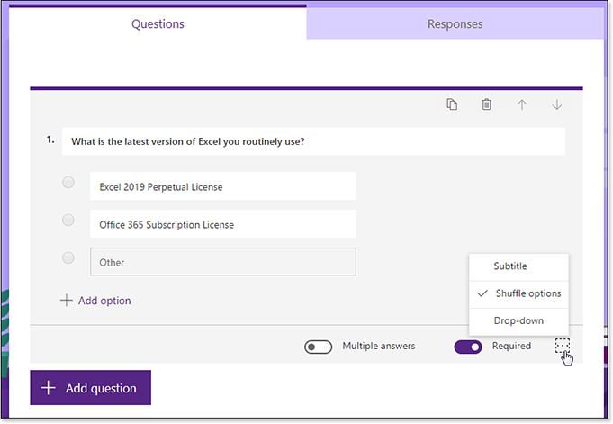
Figure 1.24 shows a Likert scale. Named after psychologist Rensis Likert, this question type allows different ratings across the top and questions down the side.
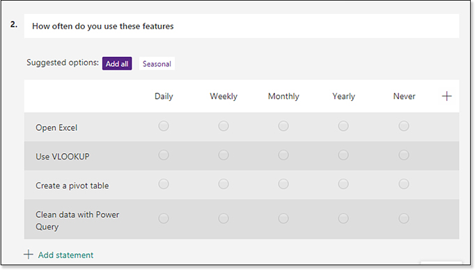
Although Likert is not shown as one of the four main question types, you can choose Likert by using the ellipsis (…) icon in the Question Type menu.
When you type a question such as, “How often….,” the form suggests choices for Daily, Weekly, Monthly, Seasonally, and Never. You can click Add All, or you can add just the ones that you want. Or, you can ignore those suggestions and type new option names.
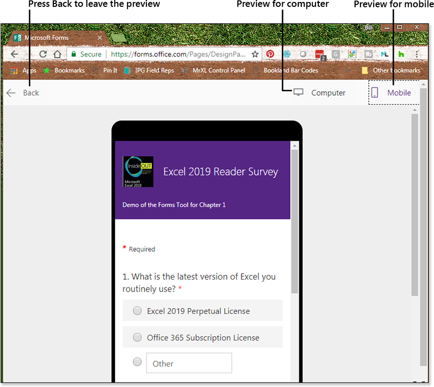
When you are done building your questions, click the Preview button shown at the top right of Figure 1.22. You can see how the form will look on a computer or on a mobile device (see Figure 1.25). When you are done with the Preview, click the <- Back icon above the Preview (not the Back button in your browser).
When you are ready to publish the survey, click the Share button (see top right of Figure 1.22).
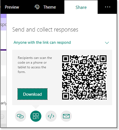
The form defaults to only allowing people from your organization to participate. Open the top drop-down menu to choose to allow anyone with the link to use the survey.
There are four ways to share the survey. You can create a link, get the code to embed the survey in a web page, or generate an email. However, my favorite way is to use a QR code.
QR stands for Quick Response and is a two-dimensional barcode. Try this experiment right now with this book or e-book. Open the Camera application on your smartphone. Focus the camera on the barcode shown in Figure 1.26. You do not have to take a picture. Simply hover on the barcode for a few seconds, and a box should pop up asking if you want to open a web page. Click that box, and you will be taken to the survey.
Note
Every year, I fly to 35 seminars around the country. Whether there are 40 people or 400 people, I start out with a PowerPoint slide that has the QR code filling the entire slide. I ask people in the room to take out their phones and point the cameras at the screen. Except for a few people using flip phones or people in the extreme corners of the room, this is a very easy way to get people to participate in the survey.
As people finish your survey, the Responses tab updates to show a summary of the results. If you are conducting a live survey, like I do in my seminars, it is fun to watch the answers from the audience appear on the screen (see Figure 1.27).
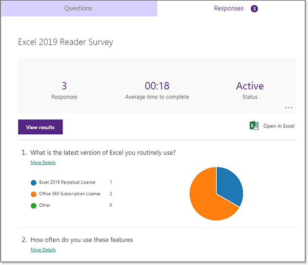
While all this is great, here is the payoff: After your staff meeting or after tweeting your survey, the answers automatically appear in your Excel workbook, as you can see in Figure 1.28. Additional system fields tell you the date and time that each item was submitted. If the workbook is sent to your organization, the respondents’ names appear (this does not happen with public surveys). Then, the answers to all the questions appear. You can now do any analysis you desire, such as sorting, filtering, charting, or creating a pivot table.
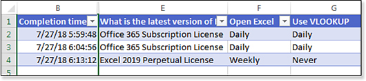
Note that the Forms.Office.Com website also offers the ability to create a quiz in Excel. The functionality is similar, although you can assign a certain number of points to each question. When you share a quiz, you will want to choose Only People In My Organization Can Respond. That way, each quiz answer will have the name and e-mail of the student in columns C & D. In a public survey, those columns are blank (so I hid them in Figure 1.28).
Future Features Coming to Office 365
If the Office team repeats the same pattern from three years ago, I predict that about a month after Excel 2019 ships to customers, the Office team will release a bunch of new features.
This happened with Excel 2016; the new features made my books seem out of date a month after it came out. However, this time, I have one computer on the Office Insider track that is getting the early test of upcoming features. The remainder of this chapter discusses features that are likely to appear in Office 365 by the end of 2018. There is a chance some of the interface will change slightly by the time the feature is released.
New Threaded Comments and Chat
It used to be that a single cell could have a single comment. With collaboration today, you might have multiple people from a company editing the same workbook at the same time. It would make sense that those people might want to have a conversation about one cell.
Office 365 will offer threaded comments. Instead of a single comment, the comments appear in a panel. You can see each person’s comment in sequence (see Figure 1.29).
Caution
Excel tricksters have long used various cool tricks to alter the formatting of comments. For example, the late David Hawley showed how you could change the shape of a comment to a star in his 2007 book, Excel Hacks: Tips & Tools for Streamlining Your Spreadsheets. I remember doing a segment for Leo Laporte on TechTV where I used comments to hold a photo that would pop-up when you hovered over the comment indicator. Others will color-code comments so that pink comments are warnings and yellow icons are cautions.
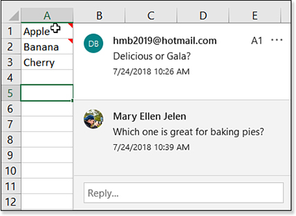
If you want to continue to use any of the legacy commenting tricks to format or display comments, you need to switch to using Notes instead of Comments. The Excel team added a Notes drop-down menu next to Comments, and the new menu includes all the old legacy comment functionality. The legacy comments are now called Notes. Actually, if you go back 20 years, the first version of comments were originally called Notes, so they are simply going back to the old name.
New threaded comments and old Notes can coexist in the same worksheet. Notes will have a red triangle indicator. Comments will have a purple thought-bubble-shaped indicator.
The threaded comments become a permanent part of the workbook. There have been requests to have a less-permanent form of comments, such as a Chat panel. This would allow people to collaborate on a workbook to discuss the workbook without the chat becoming a permanent part of the workbook.
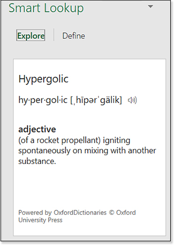
Workbooks Statistics and Smart Lookup
Two new icons will appear on the Review tab of Office 365. The Workbook Statistics opens a panel showing the number of cells and formulas in the workbook (see Figure 1.30).

The Smart Lookup feature is branded as an “Insights” feature and using it requires you to opt in to the artificial intelligence features. Click on any cell and ask for a Smart Lookup by clicking the large Smart Lookup icon in the Review tab (see Figure 1.30). In Figure 1.31, if you click Smart Lookup for the word “Hypergolic,” it returns a definition and some links to pages about rockets. This does not seem like “artificial intelligence,” but I guess it is just as easy as opening a browser.
Dynamic Array Functions in Office 365
Excel Project Manager Joe McDaid has been working on a bevy of new dynamic array functions for Excel. People using Office 365 will see these by the end of 2018 or early 2019. The functions are entered in a single cell but return a large range of answers. This is much easier than the old array formulas. You won’t have to remember Ctrl+Shift+Enter anymore to use an Array formula.
The dynamic array functions are FILTER, RANDARRAY, SEQUENCE, SORT, SORTBY, and UNIQUE.
Entering One Formula and Returning Many Results
This is amazing. Take a look at Figure 1.32. A formula of =A2:A9 is typed in cell C5. Excel spills the answers into C5:C12. If you select any cell in C5:C12, the formula appears in the formula bar, and a blue outline appears around the results range. Think of the blue outline as indicating that this one formula is returning all of the answers inside the outline.
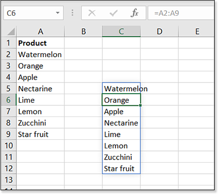
Here is an important distinction: The formula only exists in one cell: C5. When you select C6 or C7 or C12, the formula appears in the formula bar in a light gray font. But you can only edit the formula if you select C5. A formula of =FORMULATEXT(C5) will work. A formula of =FORMULATEXT(C6) will fail.
If A1:A9 happens to be a table and you add new rows to the table, the results from this one formula will automatically expand. Or if you delete row 4, the results will contract.
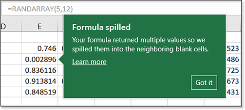
The first time that this happens to you in Excel, you will see a message shown in Figure 1.33. Once you click Got It, they won’t bother you again.
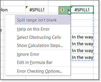
If you use Excel a lot, you realize two problems with this new functionality. The first problem: What happens if C6 through C12 are not blank? If Excel cannot return all the answers, then you get none of the answers. A brand new #SPILL function will appear, and the on-grid drop-down menu explains “Spill Range Isn’t Blank” (see Figure 1.34).
The second problem will only be apparent to hard-core Excellers. There is a concept called implicit intersection. If you enter =A2:A9 anywhere in rows 2 through 9, Excel will only return the value from A2:A9 that intersects the formula. In other words, =A2:A9 in C5 will return Nectarine from A5. Enter that same formula in C7, and you will get Lemon.
This is a bizarre trick that I’ve never used in real life. The only time that I’ve ever used implicit intersection is when trying to win a bar bet. However, someone out there is using it. Some modeler is taking advantage of this trick. Microsoft can’t take this feature away, so if you want to do what implicit intersection used to do, use the SINGLE function. If you enter =SINGLE(A2:A9) when in rows 2 through 9, the value from that row will be returned (see Figure 1.35).
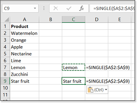
SINGLE function must be used when someone needs to do implicit intersection.Text appears in A2:A9, and cell A7 contains Lemon. A formula of =SINGLE($A$2:$A$9) entered anywhere in row 7 will return Lemon. Copy that formula to row 9, and it will return Star fruit because A9 contains Star fruit.
Note that implicit intersection and SINGLE also work for columns. If you had values in B1:J1 and enter =SINGLE(B1:J1) anywhere in column C, the formula will return just the value from C1.
The Excel team did a great job with backward compatibility on this feature: If you have an old workbook that is already doing implicit intersection, Excel will wrap that formula in the SINGLE function for you. If you create a SINGLE function and send it to someone who does not have SINGLE, Excel will rewrite the formula as implicit intersection.
Sorting with a Formula
Sorting with a formula is easier thanks to the new SORT and SORTBY array functions.
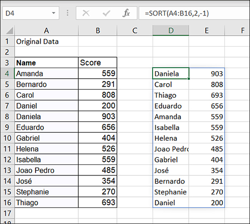
In Figure 1.36, you have a two-column range of results in A2:B16. Those results are constantly changing because of formulas that sum daily sales. You would like a formula to sort the results.
Sorting might be easy for you, but you can’t trust your manager’s manager to click the AZ button. That is why you used to go to crazy lengths with RANK, SMALL, MATCH, and INDEX to sort with a formula. All that goes away with the introduction of SORT.
The SORT function is a dynamic array function that returns a sorted list. The syntax is:
SORT( Array, [Sort_Index], [Sort_Order], [By_Column])
In Figure 1.36, the data in A2:B16 is sorted by name. You would like the results to be sorted by score, with the highest scores at the top. To sort that data with a formula, you would follow these steps:
Start by selecting where you want the results to appear. In Figure 1.36, this is cell D4.
Begin typing a formula: =SORT(A2:B16,
If you want to sort based on the score in column B, use 2 as the Sort_index because column B is the second column of the A2:B9 range. Type 2 and a comma.
For the Sort_Order, use 1 for ascending or -1 for descending. Choose -1.
The fourth argument is rarely used. There is an obscure version of sorting where you don’t sort the rows, but you sort the columns. Use True for the fourth argument if you want to sort by column. In most cases, you will leave this blank.
Type the closing parenthesis.
Press Enter. The results will spill into D4:E16.
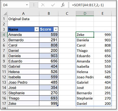
Convert the original range to a table using Ctrl+T. Type a new row at the bottom of the table with a high score. The SORT function automatically expands, and the new high score appears at the top of the results (see Figure 1.37).
SORT results expand.The SORT function is fine for simple situations. But sometimes you need to do more complex sorting. In Figure 1.38, the original data in A2:C16 contains Name, Team, and Score. You want to present the results sorted by Team ascending and Score descending. You only want to show the names, not the teams or the scores. The SORTBY function offers this flexibility.
You want to sort the names from A4:A16. The formula in E4 starts out
=SORTBY(A4:A16,You want to first sort by team name. Type B4:B16,.
You want the teams to sort ascending, so type 1, as the third argument.
SORTBYallows a multi-level sort. The second key is C4:C16. Type C4:C16, as the fourth argument.The scores from C4:C16 should be sorted descending. Type -1 as the last argument. Close the formula with a right parenthesis and press Enter.
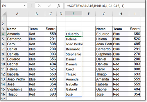
Figure 1.38 A formula performs a multi-level sort.
The results shown in E4:E16 has Eduardo at the top. Just to make sure it is working, I copied the data to G4:I16 and performed the sort using the Sort dialog. The results match.
Troubleshooting
There might be times when you need a multi-level SORT, but you cannot use SORTBY to refer to ranges.
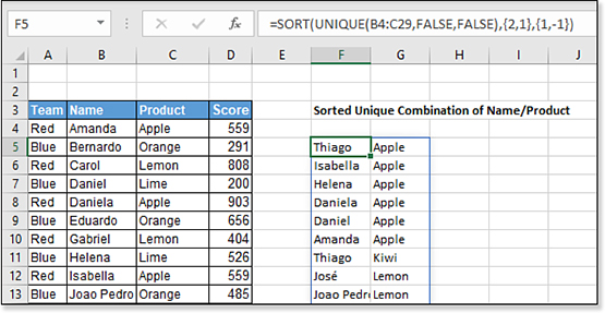
In the example below, you want to sort the results of a UNIQUE function. Those results live only in memory and do not have a cell address.
In this case, you can force a multi-level sort with the SORT function by passing an array constant as the Sort_index and another array constant as the Sort_order.
If you want to sort by the second column ascending and the first column descending, use:
=SORT(UNIQUE(B4:C29,FALSE,FALSE),{2,1},{1,-1})
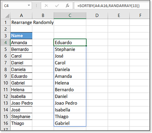
=SORT(A4:A16,RANDARRAY(13)).
=SORTBY(A4:A16,RANDARRAY(13)).
Filtering with a Formula
In Figure 1.39, you have a database in A3:C16. You want to use a formula to extract all records where the person is on the Red team. Use the new FILTER function.
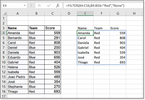
The syntax is =FILTER(array,include,[if_empty]).
In this case, the array to filter is A4:C16. The include argument is B4:B16="Red". The optional third argument will prevent an error in the case where no one is assigned to the Red team. You could specify None, None Found, or 0 here.
Figure 1.39 shows the results of a FILTER function. The beauty of this single formula solution is that you don’t need to know how many Red team records there will be. The old array formula solution required you to pre-plan the largest possible number of matches. This formula is so much easier.
The example in Figure 1.39 has the Red team hard-coded in the formula. It is simple to change this to have the team name in another cell. In Figure 1.40, the team name is stored in cell F1. Change the formula to:
=FILTER(A4:C16,B4:B16-F1,"None")
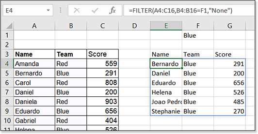
When you change from Red to Blue, the output range returns the records for the Blue team. This may be the same number of rows, it might be more, or it might be less.
If you type Yellow in F1, because there are no people assigned to the Yellow team, the result will be the word None in E4. This is because the last argument in the formula is None. If you leave this optional argument off, you will get an #N/A error instead.
Troubleshooting
How can you use FILTER to get all of the cells with a red font? Can you SORT by color or cell icon?
No. The FILTER, SORT, and SORTBY are operating on values in the cell. You cannot sort by font color, cell color, or icon.
Extracting Unique Values with a Formula
Getting a unique list of values has always been difficult in Excel. Excel MVP Mike "Excelisfun" Girvin spends two entire chapters of his Ctrl+Shift+Enter: Mastering Excel Array Formulas: Do the Impossible with Excel Formulas Thanks to Array Formula Magic book explaining how you can write a formula to return a unique list of values. This becomes dramatically simpler using the UNIQUE array function. The syntax is:
=UNIQUE(Array, [by_col], [occurs_once])
The By_Col argument will usually be False. The Filter command in Excel operates on a row-by-row basis. I’ve occasionally heard of people who want to filter by columns and setting this argument to True would allow you to filter sideways from normal.
The Occurs_Once choice in this argument makes me smile because to me it proves that the Excel team’s definition of “unique” is out of step with the rest of the world. Say that you have a list in A2:A5. The list is Apple, Butter, Cherry, Apple, Butter. If you used the Excel Conditional Formatting command to mark the “unique” values, Excel would only mark Cherry. Their twisted rationale is that Cherry is the only item in the list to appear exactly once. This is never what I need when I want a list of unique values. I expect to get a list of Apple, Butter, Cherry.
The default value for Occurs_Once is True to return the nearly useless list of items that occur only once in the list. I think most people will be choosing False for this argument for “occurs one or more times.”
Consider Figure 1.41. A list of products and customers appears in A2:B116. The silly formula in D3 shows that Lemon is the only product to be ordered exactly once:
=UNIQUE(A2:A116,FALSE,TRUE)
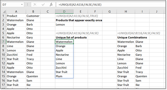
UNIQUE function dramatically simplifies returning a unique list of products.Who would ever need to know this? The person charged with figuring out the list of One-Hit Wonders might be the only case.
The far more common formula shown in D7 returns a list of every product that has been ordered one or more times. Change the third argument from TRUE to FALSE to switch to the common-sense situation of any product that has been ordered one or more times. The formula is:
=UNIQUE(A2:A116,FALSE,FALSE)
Going beyond the simple example, you could ask for all unique combinations of product and customer by entering the formula in two columns and specifying an array of A2:B116. A partial list of the results appear in H7:I17 of Figure 1.41.
The UNIQUE function does not sort the results. They appear in the same sequence they are found in the original data, just as the Advanced Filter command would do.
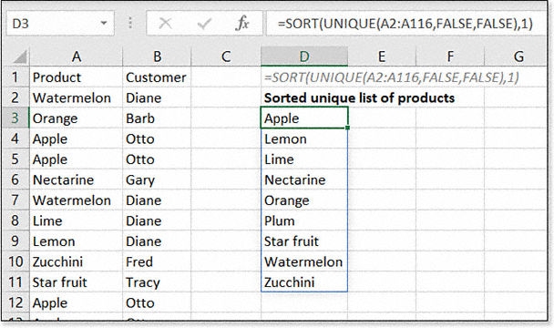
What if you need the results sorted? Simply wrap the FILTER or UNIQUE function inside of SORT. Figure 1.42 shows an example.
SORT and UNIQUE to get a sorted unique list.Troubleshooting
The previous example used two array functions nested inside each other. The limit is 32 functions nested.
Although the array functions are more powerful than regular functions, they support the same limit of up to 32 levels of nesting.
In the following figure, FILTER is wrapped in UNIQUE and then wrapped in SORT. Excel has no problem dealing with these complex combinations.
Note, however, that you cannot use 3-D references in the new array functions. There will also never be support for sorting by color or icon.

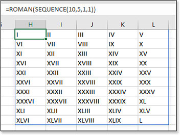
Generating a Sequence of Numbers
The new SEQUENCE function will generate a sequence of numbers. This function can be very simple: =SEQUENCE(10) entered in A1 will generate the numbers 1 through 10 in A1:A10. However, the syntax allows for a lot of flexibility:
=SEQUENCE([Rows],[Columns],[Start],[Stop])
In Figure 1.43, the formula =SEQUENCE(10,3) returns a 10-row by 3-column array with the numbers 1 to 30. A formula of =SEQUENCE(10,1,7,3) in G1 returns a 10-row by 1-column range with numbers starting with the number 7 and incrementing by 3.
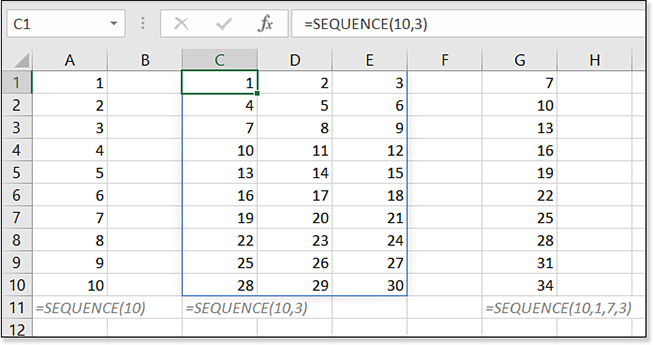
You might be thinking that SEQUENCE is the most boring new function. I don’t think Microsoft intended SEQUENCE to be used as shown in Figure 1.43. They did not give us SEQUENCE just to save us the hassle of Ctrl+dragging the fill handle or using =A1+1.
The power of SEQUENCE is when you need to return a sequence of numbers to another formula.
My favorite example in this realm is the IPMT and PPMT functions that are often used to calculate amortization tables for a loan. These functions are discussed in Chapter 10. But you can see the power of SEQUENCE in the examples in Figure 1.44.
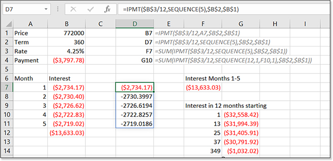
SEQUENCE inside of other functions to generate new array formulas.In Figure 1.44, you are planning on borrowing $772,000 for 30 years. A PMT function in B4 calculates the monthly payment.
But to create an amortization table, you need the IPMT and PPMT functions. A sequence of 5 numbers in A7:A11 is used to calculate the interest portion of the payment in B7:B11. As you would expect, the interest portion of the payment goes down a little bit in each month. Say that you need to know the total interest paid in months 1 through 5. A SUM function in B12 calculates the total as $13,633.03. It took 11 cells to calculate that value.
Can we shorten this by using SEQUENCE as the Period Number inside of IPMT? The formula in D7 is =IPMT($B$3/12,SEQUENCE(5),$B$2,$B$1). Press Enter and Excel returns the five monthly answers. That is fine, but you want the answer in one formula.
The formula in F7 wraps the IPMT inside a SUM function. Amazingly, there is no need to press Ctrl+Shift+Enter to make this work: =SUM(IPMT($B$3/12,SEQUENCE(5),$B$2,B$B1)) returns the same answer that required 11 cells over in B12.
What if you want to know the total interest paid in each year of the loan for tax planning purposes? The formula in G10 uses a SEQUENCE function to return 12 consecutive numbers starting from the month number in F10. Copy this down for each row of the loan.
Couldn’t you do this with CUMIPMT? Sure, but it requires an extra argument. The point of the example is that you will be able to insert the SEQUENCE function inside of other functions to generate array functions.
Troubleshooting
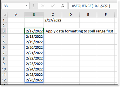
The format of the spill range will not be updated by the formula. The answers can spill, but the spill cells will remain unformatted.
If you know that your formula is going to return currency or dates, you should pre-format the range. In the following image, you would format B3:B12 as a date before entering =SEQUENCE(10,1,$C$1) in B3.
Generating an Array of Random Numbers with a Formula
The new RANDARRAY function will return a range of any number of rows and columns of random numbers.
The syntax is
=RANDARRAY([Rows],[Columns])
A trivial example shown in Figure 1.45 generates five rows and three columns of random numbers. Just like the RAND function, the results will be a decimal between 0 and 1.
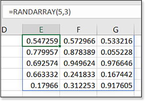
RANDARRAY to generate an array of random numbers.The power of RANDARRAY will be in building simulations and Monte-Carlo models where you need to multiply a range of numbers by a series of random numbers.
Refer to the Entire Array
To refer to the entire spilled dynamic array in another formula, use the new Spilled Range Operator. =AVERAGE(E1#) would average all the numbers returned by the formula in E1 in Figure 1.45.
Learning About New Functions and Features
The funny thing about Office 365 is that any book will become just a little more obsolete on any given Tuesday as the Excel team pushes new features out to the Office 365 subscribers. Once a year, Microsoft invites me to a non-disclosure session and shows me what they are working on. Some of those new features are in the product now. But there are other notes in my notebook about features that will be coming sometime in the future.
There are more functions and features that may have been released by the time you are reading this book. As new features are released, I will update this web page: http://mrx.cl/newafterexcel2019.