
Chapter 17
Mashing Up Data with Power Pivot
The Power Pivot add-in debuted in Excel 2010. The add-in allowed you to:
Load 100 million records in an Excel workbook
Join data from Sheet1 and Sheet2 in a single workbook
Create new calculated fields using a formula language called DAX
Use time intelligence functions to handle fiscal years not ending in December
Power Pivot was not developed by the Excel team. It was developed by the SQL Server Analysis Services team. In Excel 2010, the add-in was free and mostly separate from Excel. It proved so popular that the Excel team slowly began incorporating Power Pivot into the core Excel product.
In Excel 2013, Add This Data To The Data Model button was added to the Create PivotTable dialog box. This allowed you to create pivot tables from multiple sheets.
In Excel 2016, the Add Measure choice was added to a right-click menu in the PivotTable Fields list. This allowed you to use DAX formulas.
In Office 365, a new Relationships icon was added to the Data tab of the ribbon. This made it easier to define relationships between tables.
In Excel 2016, the Power Query tools were added to the Data tab of the ribbon. This allows you to get more than 1,048,576 records into Excel.
In Excel 2019, a Manage Data Model icon is added to the Data tab of the ribbon. This allows you to open the Power Pivot grid, define sort order, hide fields, define relationships using a diagram view, and more.
With Excel 2019, the full benefits of Power Pivot are freely available to anyone using Windows versions of Excel. This is a great improvement over Excel 2013 and 2016 when only the Pro Plus and E3 versions of Office had full access to the Power Pivot grid.
Joining Multiple Tables Using the Data Model
When you see the term Data Model in Excel 2019, it’s Microsoft’s way of saying you are using Power Pivot without calling it Power Pivot.
Preparing Data for Use in the Data Model
When you are planning to use the Data Model to join multiple tables, you should always convert your Excel ranges to tables before you begin. You theoretically do not have to convert the ranges to tables, but it is far easier if you convert the ranges to tables and give the tables a name. If you don’t convert the ranges to tables first, Excel secretly does it in the background and gives your tables meaningless names such as “Range.”
Choose one cell in a data set and use Ctrl+T or Home, Format as Table. In the Create Table dialog box, make sure My Table Has Headers is selected. After you create a table, Excel gives your table a basic name, such as Table1, Table2, and so on. Go to the Table Tools Design tab of the ribbon and type a meaningful name, such as Sales or Sectors.
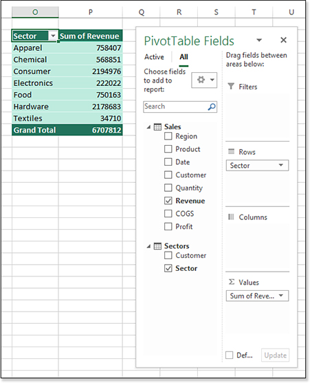
Figure 17.1 shows two ranges in Excel. Columns A:H contain a transactional data set named Sales. Columns J:K contain a customer lookup table called Sector. You would like to create a pivot table showing revenue by sector.
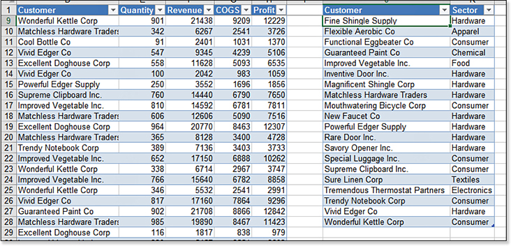
Excel gurus are thinking, “Why don’t you do a VLOOKUP to join the tables?” PowerPivot lets you avoid the VLOOKUP. In this case, the tables are small and a VLOOKUP would calculate quickly. However, imagine that you have a million records in the transactional table and 10 columns in the lookup table. The VLOOKUP solution quickly becomes unwieldy. The PowerPivot engine available in the Data Model can join the tables without the overhead of VLOOKUP.
Creating a Relationship Between Two Tables in Excel
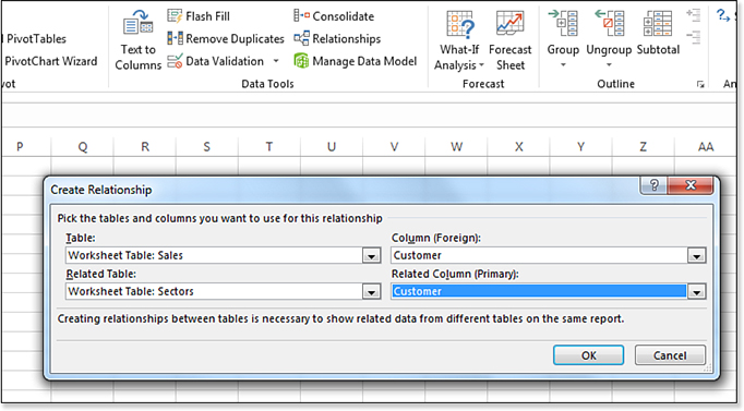
Look in the Data Tools group of the Data tab of the ribbon for the new Relationships icon. Click the icon to open the Manage Relationships dialog box. Click on New… to open the Create Relationship dialog box.
Your relationship should start from the transactional data set. Open the Table drop-down menu and choose the Sales table. Open the Column (Foreign) drop-down menu and choose the Customer column. The Related Table is the Sectors table. The Related Column is also Customer. Figure 17.2 shows the completed dialog box. Click OK to create the relationship. Click Close to close the Manage Relationships dialog box.
Creating a relationship automatically loads both tables to the Data Model. This is a great way to accomplish two tasks with one action.
In the past, it was common to add the first table to the model by using Add This Data To The Data Model in the Create PivotTable dialog box. This method works fine, all except for the point where the pivot table shows the wrong numbers as it displays the A Relationship May Be Needed. I always cringed at that step. By building the relationship in advance, you avoid having wrong numbers in the pivot table.
Creating a Relationship Using Diagram View
If you see a Power Pivot tab in your ribbon, there is a quicker way to get the data in to the Data Model and create a relationship:
Select one cell in the first table. Use Power Pivot, Create Linked Table to add the data to the Data Model.
Repeat step 1 for the second table.
Click on the Manage icon in the Power Pivot tab or the Manage Data Model icon in the Data tab. The Power Pivot grid opens.
On the right side of the ribbon, choose Diagram View.
In Diagram View, click on the the Customer field in the Sales table and draw a line to the Customer field in the Sector table (see Figure 17.3).
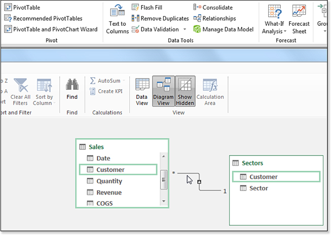
Figure 17.3 Create a relationship quickly with Diagram view. Use the Switch To Workbook icon in the Power Pivot Quick Access Toolbar to return to Excel.
Building a Pivot Table from the Data Model
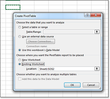
Choose a blank cell where you want your pivot table to appear. Select Insert, PivotTable. Because you have already defined a relationship, the Create PivotTable dialog box will default to Use This Workbook’s Data Model (see Figure 17.4).
Look at the PivotTable Fields task pane. In the second line of the pane, you have a choice for Active or All and All is selected. You now see a list of each defined table in the Excel workbook. There is a triangle icon next to each table.
Click the triangle next to Sectors to see a list of the available fields in the Sectors table. Drag the Sector field to the Rows area. Click the triangle next to Sales to expand that table. Drag Revenue to the Values area.
As shown in Figure 17.5, you have successfully created a pivot table from two different data sets.
VLOOKUP, you’ve successfully joined data from two tables in this report.Unlocking Hidden Features with the Data Model
I do thirty-five live Excel seminars every year. I hear a variety of Excel questions in those seminars. Some questions are common enough that they pop up a couple times a year. When my answer starts with, “Have you ever noticed the box called ‘Add This Data To The Data Model?’”, people can’t believe that the answer has been right there, hiding in Excel. A typical reaction from the audience member: “How was anyone supposed to know that ‘Add This Data To The Data Model’ means that I can create a Median in a pivot table?”
Counting Distinct in a Pivot Table
Consider the three pivot tables shown in Figure 17.6. The question is “How many unique customers are in each sector?”. The pivot table in columns A and B allow you to figure out the answer. You can mentally count that there are two customers (B4 & B5) in the Associations sector. There are six customers listed in the Consultants sector.
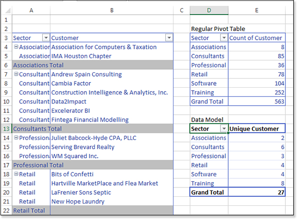
But how would you present the top-left pivot table to your manager? You would have to grab some paper and jot down Associations: 2, Consultants: 6, Professional: 3, and so on.
When you try to build a pivot table to answer the question, you might get the wrong results shown in D3:D10. This pivot table says it is calculating a “Count of Customer,” but this is actually counting the number of invoices in each sector.
The trick to solving the problem is to add your data to the Data Model.
The pivot table in D13:E20 in Figure 17.6 is somehow reporting the correct number of unique customers in each sector.
A regular pivot table offers 11 calculations: Sum, Count, Average, Max, Min, Product, Count Numbers, StdDev, StdDevP, Var, and VarP. These calculations have not changed in 33 years.
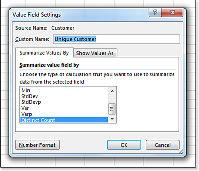
But if you create your pivot table and choose the box for Add This Data To The Data Model, a twelfth calculation option appears at the end of the Value Field Settings dialog box: Distinct Count.
Drag customer to the Values area. Double-click the Count Of Customer heading. Choose Distinct Count. Change the title, and you have the solution shown above. Figure 17.7 shows the Value Field Settings dialog box.
One oddity: the Product calculation is missing from the Value Field Settings for the Data Model. I’ve never met anyone who actually used the Product calculation. But if you were a person who loved Product, then having Excel swap out Product to make room for Distinct Count will not be popular. You can add a new Measure with =PRODUCT([Revenue]) to replicate the product calculation. See the example about creating Median later in this chapter.
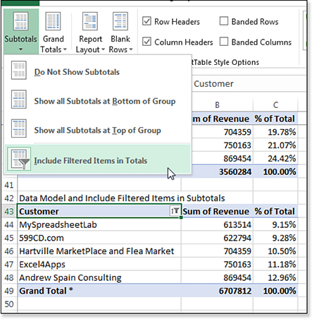
Including Filtered Items in Totals
Excel pivot tables offer an excellent filtering feature called Top 10. This feature is very flexible: It can be Top 10 Items, Bottom 5 Items, Top 80%, or Top Records To Get To $4 Million In Revenue.
Shortening a long report to show only the top five items is great for a dashboard or a summary report.
But there is an annoyance when you use any of the filters.
In Figure 17.8, the top pivot table occupies rows 3 through row 31. Revenue is shown both as Revenue and as a % of Total. The largest customer is Andrew Spain Consulting with 869,000. In the top pivot table, the Grand Total is $6.7 Million and Andrew Spain is 12.96% of that total.

In the same figure, rows 34:40 show the same pivot table with the Top 5 selected in the Top 10 filter. The Grand Total now shows only $3.56 Million. Andrew Spain is 24% of the smaller total number.
This is wrong. Andrew should be 13% of the total, not 24%.
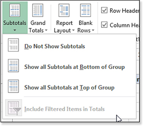
On January 30, 2007, Microsoft released Excel 2007. A new feature was added to Excel called Include Filtered Items In Subtotals. This feature would solve the problem in Figure 17.8. However, as you can see, the feature is not available, as shown in Figure 17.9. It has been unavailable every day since January 30, 2007. I can attest to that because I check every day to see if it is enabled.
To solve the problem? Choose Add This Data To The Data Model as you create the pivot table. Include Filtered Items In Subtotals is now enabled. The asterisk on the Grand Total in cell A49 means that there are rows hidden from the pivot table that are included in the totals.
More importantly, the % of Column calculation is still reporting the correct 12.96% for Andrew Spain Consulting in cell C48 of Figure 17.10.
Creating Median in a Pivot Table Using DAX Measures
Pivot tables still do not support the median calculation. But when you add the data to the Data Model, you can build any calculation supported by the DAX formula language. Between Excel 2016 and Excel 2019, the DAX formula language was expanded to include a Median calculation.
Calculations made with DAX are called Measures. Figure 17.11 shows different ways to start a DAX calculation. You can right-click the table name in the PivotTable Fields list and choose Add Measure. Or, you can use the Measures drop-down menu on the PowerPivot tab in Excel. Using the Measures drop-down menu is slightly better because any new measures are automatically added to the Values area of a pivot table.
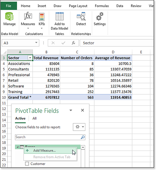
Figure 17.12 shows the Measure dialog box. There are several fields:
The Table Name will be filled in automatically for you.
Type a meaningful name for the new calculation in the Measure Name Box.
You can leave the Description box empty.
The fx button lets you choose a function from a list.
The Check Formula button will look for syntax errors.
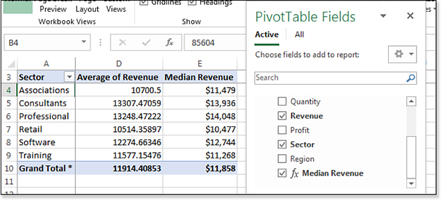
Type
=Median(Range[Revenue])as the formula.In the lower-left, choose a number format.
![Use the Measure dialog box to build a formula of =Median(Range[Revenue]).](http://images-20200215.ebookreading.net/7/3/3/9781509306015/9781509306015__microsoft-excel-2019__9781509306015__graphics__17fig12.jpg)
Figure 17.12 Build a measure to calculate Median.
As you type the formula, something that feels like AutoComplete will offer tool tips on how to build the formulas. When you finish typing the formula, click the Check Formula button. You want to see the result No Errors In Formula, as shown in Figure 17.12.
Click OK. The Median Revenue will appear in the Fields list. Choose the field in the Fields list and it will be added to your pivot table.
Column E in Figure 17.13 shows the Median for each sector.
Troubleshooting
The Check Formula button in the Measure dialog box does ensure the formula will calculate correctly.
Shown previously in Figure 17.12, the Check Formula button will often return a message: No Errors in Formula. You add the measure to your pivot table and get a #VALUE! error.
The No Errors In Formula error message means that you spelled all of the functions and field names correctly and that you are not missing any parentheses. It does not mean that the calculation will do what you want.
There have been many times when I have struggled to finally get the No Errors In Formula message and then been crushed to find that the formula still does not work. This is when I head to the forums to see if someone can spot the logic error in my formula.
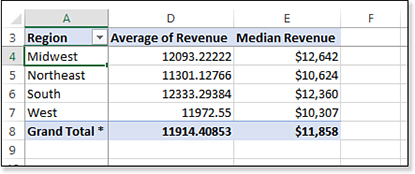
Calculations created by Measures are each to re-use. Change the pivot table from Figure 17.13 to show Regions in A instead of Sector. The measure is re-used and starts calculating statistics by Region (see Figure 17.14).
Time Intelligence Using DAX
The DAX formula language supports new functions for month-to-date, year-to-date, prior period, and so on.
Create a new MTDSales measure with the formula:
=CALCULATE([Sum of Revenue],DatesMTD(Sales[Date]))
The function CALCULATE is similar to SUMIFS, with one cool exception. Normally, a cell in a pivot table is filtered by the slicers, the row fields, and the column fields. In cell D21 of Figure 17.15, the row field is imposing a filter of 1/30/2018. The DAX measure is redefining the filter. By asking for all dates in DATESMTD(Sales[Date]), the MTDSales field returns all January 2018 dates up to and including the 30th of January.
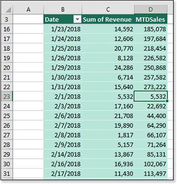
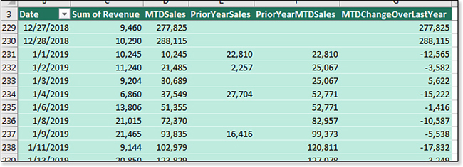
MTD calculation accumulates until a new month starts.To calculate sales for the same day last year, use DATEADD to move back one year:
Prior Year Sales
=CALCULATE(Sales[Sum of Revenue],
ALL(Sales[Date (Year)]),
DATEADD(Sales[Date],-1,YEAR))
After you define a calculated field, you can use that field in future calculations:
Prior Year MTD Sales
=CALCULATE([PriorYearSales],
DATESMTD(Sales[Date]))
And then:
MTDChangeOverLastYear
=[MTDSales]-[PriorYearMTDSales]
Figure 17.16 shows the results of those calculations.
Here is the beautiful thing: If your goal is to show MTD sales growth, you can remove all the intermediate calculations from the pivot table and show only the final calculated field.
Overcoming Limitations of the Data Model
When you use the Data Model, you transform your regular Excel data into an OLAP model. There are annoying limitations and some benefits available to pivot tables built on OLAP models. The Excel team tried to mitigate some of the limitations for Excel 2019, but some are still present. Here are some of the limitations and the workarounds:
Less grouping—You cannot use the Group feature of pivot tables to create territories or to group numeric values into bins. You will have to add calculated fields to your data with the grouping information.
Product is not a built-in calculation—I’ve never created a pivot table where I had to multiply all the rows. That is the calculation that happens when you change Sum to Product. If you need to do this calculation, you can add a new Measure using the PRODUCT function in DAX.
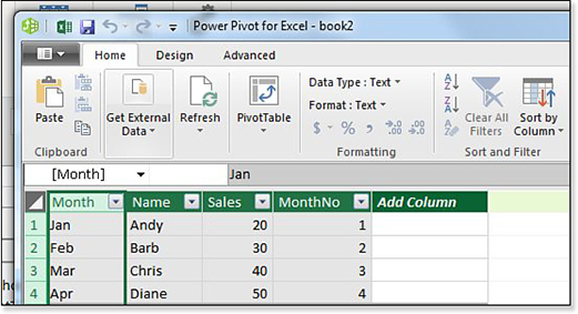
Pivot tables won’t automatically sort by custom lists—It is eight annoying clicks to force a field to sort by a custom list: Open the field drop-down menu and choose More Sort Options. In the Sort Options dialog box, click More Options. In the More Sort Options dialog box, unselect Sort Automatically. Open the First Key Sort Order and choose your Custom List. Click OK to close More Sort Options dialog box. Click OK to close the Sort dialog box.
Select the Manage icon in the Power Pivot tab of the Excel ribbon to open the Power Pivot grid.
Use the tab icons in the bottom of the Power Pivot grid to find the correct sheet that contains your month names.
In the Power Pivot grid, select the column that contains the month names or month abbreviations.
In the Power Pivot ribbon, select Home, Sort By Column, as shown in the figure below.
In the resulting Sort By Column dialog box, specify that you want to sort Month By MonthNo. Click OK. From this point forward, the month name will appear correctly in both the pivot table and any slicers.
Strange drill-down—Usually, you can double-click a cell in a pivot table and see the rows that make up that cell. This does work with the Data Model, but only for the first 1,000 rows.
No calculated fields or calculated items—This is not a big deal, because DAX Measures run circles around calculated items.
Odd re-ordering items—There is a trick in regular Excel pivot tables that you can do instead of dragging field names where you want them. Say that you go to a cell that contains the word Friday and type Monday there. When you press Enter, the Monday data moves to that new column. This does not work in Power Pivot pivot tables! You can still select Monday, hover over the edge, and drag the item to a new location.
No support for arrow keys in formula creation—In the Excel interface, you might build a formula with
=<LeftArrow>*<LeftArrow><LeftArrow><Enter>. This is not supported in Power Pivot. You will have to reach for the mouse to click on the columns that you want to reference.Refresh will be slow—The Refresh button on the Analyze tab forces Excel to update the data in the pivot table. Think before you do this in Excel 2019. In the current example, this forces Excel to go out and import the 1.7 million–row data set again.
February 29, 1900 does not exist in power pivot—There was no February 29 in 1900. Lotus 1-2-3 had a bug: the date algorithms assumed that 1900 was a leap year. As Excel was battling for market share, they had to produce the same results as Lotus, so Excel repeated the February 29, 1900 bug. The SQL Server Analysis Team refused to perpetuate this bug and does not recognize February 29, 1900. In Excel, day 1 is January 1, 1900. In Power Pivot, day 1 is December 31, 1899. None of this matters unless you have sales that happened during January 1, 1900 through February 28, 1900. In that case, the two pivot tables will be off by a day. No one has data going back that far, right? It will never be an issue, right? Well, in 2018, I met a guy who had a column of quantities. He had values like 30 and 42 and 56. But that column was accidentally imported as a date. All the quantities were off by one.
32-Bit Excel is not enough—I meet people who complain Excel is slow, even though they added more memory to their machine. Unfortunately, the 32-bit version of Excel can only access 3GB of the memory on your machine. To really use Power Pivot and the Data Model with millions of rows of data, you will need to install 64-Bit Excel. This does not cost anything extra. It does likely involve some pleading with the IT department. Also, there are some old add-ins that do not run in 64-bit Excel. If you happen to be using that add-in, then you must choose whether you want faster performance or the old add-in.
Enjoying Other Benefits of Power Pivot
Nothing in the previous list is a deal-breaker. In the interest of fairness, here are several more benefits that come from using Power Pivot and the Data Model:
You can hide or rename columns. If your Database Administrator thinks
TextSlsRepNbris a friendly name, you can change it toSales Rep Number. Or, if your data tables are littered with useless fields, you can hide them from the PivotTable Fields list. In the Power Pivot window, right-click any column heading and choose Hide From Client Tools.You can assign categories to fields, such as Geography, Image URL, and Web URL. Select the column in the Power Pivot window and choose a column. On the Advanced tab, choose a Data Category.
You can define key performance indicators or hierarchies.
Learning More
Power Pivot and Power Query are powerful tools that are completely new for most Excellers. These are my favorite books to learn more:
Mike Alexander and I cover more about Power Pivot in Pivot Table Data Crunching Excel 2019 (ISBN 978-1-5093-0724-1).
For Power Query, read M Is for Data Monkey by Ken Puls and Miguel Escobar (ISBN 978-1-61547-034-1).
For DAX formulas in Power Pivot, read Supercharge Excel by Matt Allington (ISBN 978-1-61547-053-2).
For Advanced Power Pivot, read Power Pivot and Power BI by Rob Collie and Avi Singh (ISBN 978-1-61547-039-6).