
When we get fields such as sales, profit, discount, and many more in either the Rows or Columns shelf, it creates an axis. However, at times, it is important to organize these continuous measures into discrete groups rather than just showing the individual values for each and every data point. For example, let's say we have a field that holds the age of people ranging from 10 to 90. Rather than showing each and every age in the view, we can bin the individual ages into age groups such as 10 to 25, 26 to 40 and so on. This helps us get an idea of the distribution of the population. The range of this distribution is called a Class Interval. Further, in order to visualize this distribution of data, we use a graphical representation called Histogram which was first introduced by Karl Pearson.
Thus, in other words, binning is a process of dividing the entire range of quantitative values into a series of small intervals and then counting how many values fall into each interval.
Another example for creating bins could be for analyzing the sales performance where we would like to find out how many customers have purchased less than $500, between $500 and $1,000, between $1,000 and $1,500 and so on.
In the following recipe, we will see the steps to create a Histogram. We will continue working in the same Tableau workbook; however, we will use the Box and Whisker Plot data sheet from the Data for Box plot & Gantt chart.xlsx Excel data that we downloaded for recipes in Chapter 3, Hungry for More Charts? Dig In! from https://1drv.ms/f/s!Av5QCoyLTBpnhkGyrRrZQWPHWpcY.
Since we have already used this data in the current workbook, we should have the data source already available in our Data window. Refer to the following image:

- Let us create a new worksheet and rename it Bins/Histogram.
- Select Box & Whisker Plot data (Data for Box plot & Gantt chart) data source in the Data window and we should see the relevant Dimensions and Measures.
- Next, we will right-click on the Weight field in the Measures pane and select the Create | Bins… option. Refer to the following image:

- Once we do that, we will see a new dialog box as shown in the following image:

- The size of the bins is basically the class interval and currently is set to
5.52. We will change that to 10 and click on OK. This will create a new dimension called Weight (bin). - Next we will drag the newly created Weight (bin) field from the Dimensions pane and drop it into the Columns shelf.
- Let us then drag Customer from the Dimensions pane and drop it into the Rows shelf. This will give us the list of customers. Refer to the following image:

- Instead of all the individual customers, we need to show the Count of Customers in each weight bucket/bin and to do so, click on the dropdown of the Blue pill called Customer in the Rows shelf and select the option Measure and select the Count (Distinct) option. Refer to the following image:

- Once we do that, we will get a view as shown in the following image:

- This chart, which looks like a bar chart, is actually called a histogram. We can enable the labels on the top of the bars/rectangles by clicking on the Labels shelf and enabling the Show mark labels option. Refer to the following image:
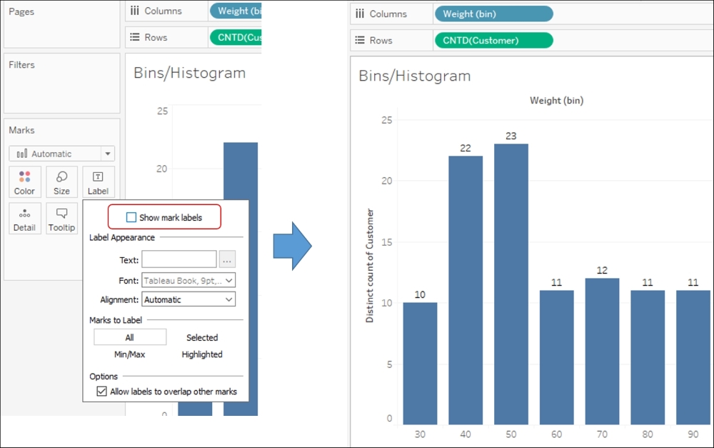
In the preceding chart, the X-axis is made up of headers for each bin; each bin is a weight range; and the length of bar gives the count of customers in that weight range.
So, in the preceding chart, we can see that there are about ten customers in the weight bucket ranging from 30 to 39.
People often confuse histograms with bar charts. The difference is that a histogram is created on continuous data (Measures), whereas a bar chart is created for categorical/discrete data (Dimensions).
Another way to creating a histogram in Tableau is to simply select the relevant measure in the Measures pane and select the histogram from the Show Me! button. Refer to the following image:

Tip
When we bin a Measure we create a new Dimension. That's because we are creating discrete categories out of a continuous range of values. The bins that we create using the above methods, will result in creating equal size bins. If we want to create variable sized bins, then we can do so by creating calculations using either the CASE function or the IF – ELSE function, which we'll be looking at in the following chapters.