
Being able to compare data across geographies is critical for any business. Imagine if an organization is doing business in multiple locations; the analysis of interest would be to find out which region is giving high sales, which region is profitable, which region has the maximum customer base, and so on.
Our data may consist of geographic fields such as countries, states, cities, and so on, and when we are analyzing these fields, it makes sense to plot them on a map, primarily because it is easier to compare information across regions to find various geographic trends.
Tableau has many data-map providers and it comes with a set of Online and Offline maps that one can access to create the maps views. Further more, Tableau understands various geographic roles as well, and once it does that, it will create a small globe icon as a prefix for that field. Refer to the following image:

Tableau will also auto generate two measures: Latitude (generated) and Longitude (generated). We will use these fields to plot the geographical data on the map in Tableau. In the following recipe, we will learn the steps required to create a map.
We will use the State field from our Orders dataset, Sample - Superstore.xlsx. Assuming that Tableau has identified our field as a geographical field and has generated the Latitude (generated) and Longitude (generated) fields, we will now proceed to create a map in Tableau.
- Let us create a new sheet by pressing Ctrl + M and call it
Symbol map. - Since we have some new datasets added to our workbook, let us make sure we select the Orders (Sample - Superstore) data in the data window. Once we do that, we will get to see the Dimensions and Measures of that dataset. Refer to the following image:

- Then, we willdrag the State field from the Dimensions pane and drop it into the Rows shelf.
- Next, let us drag the Profit field from the Measures pane and drop it into the Text shelf. Refer to the following image:

- Now, click on the Show Me! button, and we'll see that the map option has been enabled and highlighted. Refer to the following image:

- Select the chart which is highlighted in Show Me!. Once we do that, we will either get a United States map or a blank world map with no data plotted. In the latter case, there will be an indicator at the bottom of the view saying 49 unknown. Refer to the following image:

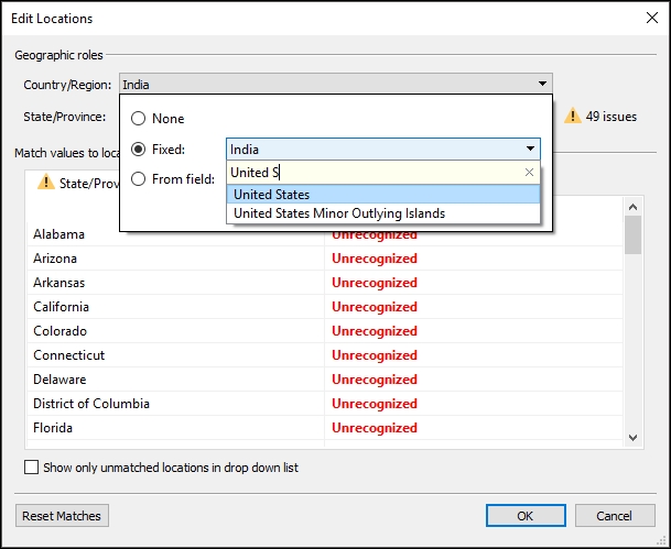
- If we get the preceding view, click on the indicator and select the option Edit Locations. The Edit Locations option can also be enabled from the toolbar Map | Edit Locations…. Once we do that, we will get a new pop-up window, as shown in the following image:

- Once we do that, we'll get a new window, as shown in the following image:

- Notice the Country/Region dropdown. For me, it says India. This is because my system locale is set to India. However, our data field contains state-level information for the United States. So, let's change the country from India to United States. Refer to the following image:
- Once we select the country as United States, we'll get the following view:

- This is called the Symbol map in Tableau. Notice that the size of the bubbles/circles is different and we will see a size legend on the right-hand side of the chart that we can refer to. The inference is that the bigger the bubble size, the greater the Profit, and the smaller the size, the less the Profit. We will also see that the Latitude (generated) and Longitude (generated) fields have been automatically placed in the Rows and Columns shelf, respectively.
- Now, as a next step, let's convert this Symbol map into a Filled map, where instead of having a bubble represent the Profit of the state, we'll color the entire state to represent the Profit value. The point to remember here is that, in a symbol map, we determine the Profit of the State based on the size of the bubble, whereas in a filled map, the color of that State will determine the amount of Profit. To create a Filled map, let us start by first duplicating the sheet by right-clicking on the sheet name and then selecting the Duplicate sheet option.
- Next time we will rename this new sheet as Filled map.
- We will then click on the Show Me! button and select the Filled map option. Refer to the following image:

- Once we select the filled map, we'll get the following view:

- This is called the Filled map in Tableau. Notice the entire state is color-coded and the color legend on the right-hand side of the chart helps us understand the significance of the color range. In the preceding image, the Orange color indicates Losses, whereas the Blue color indicates Profits. Further more, the various shades of Blue and Orange indicate the intensity of Gains and Losses, respectively. Finally, to complete the visualization, let us get the State field in the label shelf. Refer to the following image:

As mentioned previously, Tableau understands certain geographical roles.
The default logic in Tableau is that if the field name consists of common location names, such as country, state, city, zip code, post code, and so on, Tableau automatically identifies these fields as geographical fields. It will give these fields the previously discussed globe icon as a prefix and also automatically generate the Latitude (generated) and Longitude (generated) fields. The common location names identified by Tableau are typically the same as the geographical roles mentioned in the preceding link.
By default, Tableau will use the data from the online map provider. If we want to switch to the Offline mode, we can do so by selecting the Offline option from the Map | Background Maps menu.
In the case of the Offline maps, the image tiles that make up the map are stored in a cache along with our temporary Internet files. These temporary Internet files can be cleared manually at any time by simply deleting the temporary files from our browser. However, if we don't delete these manually, Tableau will clear them after about thirty days, after which it will then require us to reconnect and fetch an updated map. By doing this, Tableau makes sure that the map images that are being used don't become obsolete.
Apart from the default online and offline map options, Tableau also gives us the flexibility to use customized maps, by providing connectivity to either the Web Map Servers (WMS) or Mapbox Maps. This way, we can use custom maps, which can be specific to our industries. If we have access to a WMS provider or Mapbox maps, we can use these services by selecting either the WMS Servers… or the Mapbox Map… option by clicking on the Add button from Map | Background Maps | Map Services… in our toolbar.
To learn more about the usage of WMS Servers in Tableau, refer to http://onlinehelp.tableau.com/current/pro/desktop/en-us/maps_mapsources_wms.html.
To learn more about the usage of Mapbox Maps in Tableau, refer to http://onlinehelp.tableau.com/current/pro/desktop/en-us/maps_mapsources_mapbox.html.
As mentioned previously, Tableau reads the field name, and if it contains certain keywords such as state, city, country, zip code, and many more, and it will assume that the field is a geographical field. However, it may so happen that the field contains names of various cities, but the field name does not contain the word city in it. Instead it may be called, say, Location. In this case, Tableau will not consider this as a geographical field, and there won't be any Latitude (generated) and Longitude (generated) fields in the Measures pane. To convert this to a geographical field in order to create a map, we will have to assign a geographical role to the field. We can click on the dropdown or right-click on the field in the Dimensions pane and select the Geographic Role option, and then assign the relevant role. Refer to the following image:

Now, if we notice the Region field in our data, we will see the prefix Abc instead of the previously mentioned globe icon. This is because Tableau doesn't understand Region as a geographical role. However, if we wish to create a map from the Region field, we will have to right-click on the Region field in the Dimensions pane and select the Create from… | State option under Geographic Role. Refer to the following image:

Once we do that, the prefix of the Region field will change from Abc to the globe icon similar to that of the State field or City field in the Dimensions pane. We can then use the Region field to create a map by simply getting the Latitude (generated) and Longitude (generated) fields in the Rows and Columns shelf, respectively. We can then drop the Region field from the Dimensions pane into the Color shelf, followed by dropping the Sales field from the Measures pane into the Text shelf. We can then convert the Symbol map to a Filled map by selecting the Filled Map option from the Marks dropdown. Refer to the following image:

The preceding functionality was introduced in Tableau 10 and is referred to as Custom Territories. The other way to create the Custom Territories is by creating Groups, a functionality that we will learn about in the next chapter.
Further, there may be times, when the default mapping functionality in Tableau won't suffice and we may want to go beyond the roles that are predefined in Tableau. For example, let's say we have data for a retail chain. This retail chain may have various outlets that are spread across multiple locations within cities across various countries. The default mapping of Tableau may not be able to plot these outlets on the map since it doesn't have the necessary geographical role predefined. In this case, we may have to refer to an external source for these geocodes.
To do so, we'll need to Import Custom Geocodes in Tableau by creating a .csv file that contains the geocodes in the form of Latitude and Longitude. These Latitude and Longitude values will have to be stored as real numbers. This .csv should ideally be stored in a separate dedicated folder.
To import the Custom Geocodes, we will have to click on Map | Geocoding | Import Custom Geocoding. Refer to the following image:

In this case, we will need to give the path of the folder which contains the .csv file. However, there are a couple of points to remember when using this approach:
- The
.csvfile must contain the Latitude and Longitude data. - The Latitude and Longitude values must be stored as real numbers. We need to make sure to include at least one decimal place when specifying these values.
- Further more, we need to make sure that each geographical point has a unique geocode and that no two geographic points have the exact same geocodes.
- In most situations, the default map in Tableau will suffice, and the Import Custom Geocodes option may be very rarely used.