
A very important yet often neglected aspect of dashboard design is its ability to communicate information in a seamless and coherent manner; without this, a dashboard becomes nothing more than a series of unrelated views and scattered information.
In order to make the dashboard more holistic and useful, it needs to be designed with a specific purpose in mind. Different people in an organization will need different slices of information and each resulting dashboard should be aligned to this specific purpose. For example, a CXO will typically want to look at a higher or macro level of information that gives him a pulse of the overall health of the business, whereas a marketing head would want to look at a more granular perspective, of say his customer segmentation and transactional behavior, in order to plan a more effective marketing strategy.
To create and use dashboards in Tableau, let us follow the recipe given here.
In order to create a dashboard, first create a few worksheets. We will continue using data from the Orders sheet from the Sample - Superstore Subset .xlsx file and we will continue working in the same workbook, My first Tableau Workbook. Let's get started with the creation of dashboard by first building some worksheets.
- Let us create a new worksheet and name it as
Sales distribution by Region. We will create a pie chart here by selecting the Region field from the Dimensions pane and then selecting the Sales field from the Measures pane using Ctrl + Select. - Once we are done with the selection, select the Pie charts option from Show me!. Refer to the following screenshot:

- After creating the pie chart, we will create another worksheet and name it Sales distribution by State. Here, we will create a map by selecting the Sales field from the Measures pane and the State field from the Dimensions pane. Then select the Symbol Maps option from the Show Me.
- Next, let us drag the Region field from the Dimensions pane and drop it into the Color shelf. Then increase the size of the bubbles by moving the slider which appears when we click on the Size shelf. Refer to the following screenshot:

- Next, create one more worksheet and name it Sales distribution by Region and Category. For this sheet, we will drag the Region field and put it into the Columns shelf, followed by dragging and dropping the Category field into the Rows shelf and Sales into the Columns shelf.
- We will then right-click on the Order Date field in the Dimensions shelf and select the option of Show Filter. Our view should be as shown in the following screenshot:

- Now that we have three worksheets, let us put them together on a dashboard. In order to create a dashboard, we need to select the Dashboard | New Dashboard option from the toolbar or click on the tab which is right next to the sheet tab. Refer to the following screenshot:

- Once we do that we will get a blank canvas as shown in the following screenshot:

- This blank canvas is where we will create our dashboard. What we see on the left-hand side, are all the worksheets that we have created so far in this workbook. Refer to the following screenshot:

- To begin with the dashboard, we will first rename the dashboard from
Dashboard 1toMy first Tableau Dashboard. If we see any scroll bars, we can then simply adjust the dashboard size from Desktop to Automatic. Refer to the following screenshot:
- Next, we will get the three new sheets that we have created earlier in this recipe. In order to get these sheets on the dashboard, we can either drag the sheet names from the left-hand side or we can double-click on them. When we double-click, Tableau will automatically place the sheets. However, when we drag and drop the sheets manually, we can place them as desired by dropping them wherever we see the grey tile. Refer to the following screenshot:

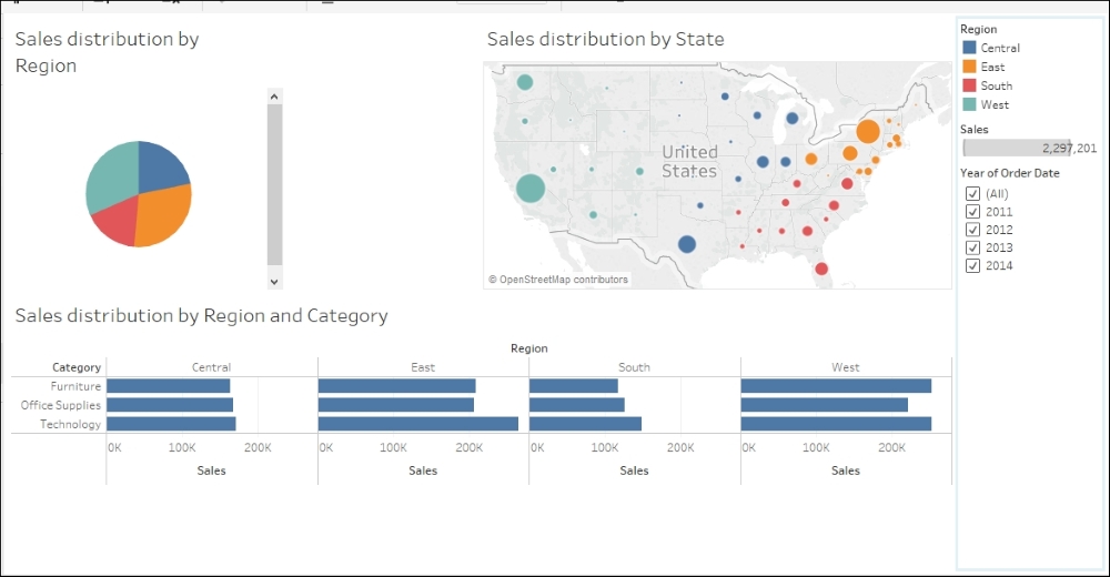
- Once we get all three sheets that we created earlier, our dashboard will look as shown in the following screenshot:

- Once we are done placing the sheets, we can again re-arrange them. In the preceding image, we see that the bar chart needs more horizontal space and hence we will move the map and try to align it in the top section of the dashboard where we have the pie chart. This way we will get more horizontal space for the bar chart. Refer to the following screenshot:
- This is how we can combine multiple visualizations into a dashboard. However, let us give it some finishing touches. Notice how the pie chart has a scroll bar. This leaves a lot of blank space on the dashboard. The same goes for the bar chart. There is plenty of blank space below the bar chart. This makes the dashboard look a little messy. In order to remove these blank spaces, we will have to make the chart fit in the space that has been allocated to it. To do this, select the pie chart sheet on the dashboard and select the option of Entire View from the dropdown which is available in the toolbar. Refer to the following screenshot:

- Let's do the same for our bar chart and the dashboard will now look like the image in the following screenshot:

- Also, if you notice, the Dashboard tab is called My first Tableau Dashboard. However, there is no title to our dashboard. In order to get a title for our dashboard, we will have to enable the Show dashboard title checkbox at the bottom left corner of the screen from the left-hand side menu. Refer to the following screenshot:

- When we do that, we will get the title for the dashboard. By default, the dashboard title is the same as the Dashboard tab name. Refer to the following screenshot:

- We can change the title of our dashboard by double-clicking on the title text or selecting the Edit Title…. option which is available when we select the title and click on the dropdown of the gray border. Refer to the following screenshot:

- When we edit the title, we get the option as shown in the following screenshot:

- Let's change the title and call it Sales distribution dashboard. We will also keep the title centre aligned. Once we do that, our dashboard will be as shown in the following screenshot:

- Just like the dashboard title, we can similarly edit our sheet title. In the current view, the font of sheet titles is a little big, so let's reduce the size of these sheet titles by keeping the font type the same and reducing the font size to 10. Once we do that, our dashboard will look like the following screenshot:

- There are a lot of cosmetic changes that can be done in order to make the preceding dashboard aesthetically more appealing. We will consider these formatting options later. Moving ahead, now that we have the desired visualizations in place, let's add some images. Typically, logos in the form of images are used to brand the dashboard. We will select the Image option from the left-hand side section of our Tableau screen by either double-clicking on it or by dragging and dropping it to a desired location on the dashboard. Refer to the following screenshot:

- Once we do that, we will be asked to browse the desired image file from our desktops/laptops. In this recipe, we will be using the image called
Image for Tableau dashboard.pngthat has been uploaded on the following link: https://1drv.ms/i/s!Av5QCoyLTBpnhkmdeOQ54NAUkB97. - We can download this image and save it in a new folder called
Tableau Data Visualization Cookbook Extrasthat we'll create inDocumentsMy Tableau Repository. We can use this image in the dashboard so that it now looks like the following screenshot: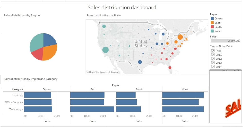
- You may notice that the image is not completely visible. In order to rectify that, we'll click on the drop-down menu of the gray border surrounding the image and select the Fit image and Center image options. Refer to the following screenshot:

- Once we do that, the view will look like the following:

- In the preceding dashboard, the image appears to be floating. In order to align it properly and place it at the right-hand side bottom section, simply get a Blank and place it between the image and the filter. Refer to the following screenshot:

- Once we drop the Blank in the highlighted grey area/tile, our dashboard will update as shown in the following screenshot:

- Next, if we click on the Year of Order Date filter, we will see that it only affects the bar chart. This is because the filter was created locally for that sheet. To make this filter applicable to all the worksheets on the dashboard, click on the dropdown from the gray border that appears when we select the filter and select the option of Apply to Worksheets. Refer to the following screenshot:

- Select the Selected Worksheets… option and, after we have done that, we will be given an option to select the worksheets that we wish to apply the filter to. Select all the sheets. Refer to the following screenshot:

- Click OK and then use the filter and you'll see that all the sheets on the dashboard are now filtered.
In the preceding recipe, we saw how to combine multiple visualizations into a dashboard, align them and format them to a certain extent.
When we get any particular worksheet on the dashboard, all the filters, Color legends, Size legends, Shape legends, and so on that are part of that worksheet, are by default fetched onto the dashboard and these can be removed from the dashboard if required.
Another important thing that we saw in the preceding recipe, was how to add images and blanks to our dashboard. The section which has the option of Images, also has various other options like Blank, Text, Web Page, and so on. These are referred to as dashboard objects in Tableau. These dashboard objects are explained here:
- Horizontal: The Horizontal object adds a horizontal layout container. This container will accommodate all the views or objects horizontally. Further, the widths of these views or objects will be automatically adjusted to equally fill the width of the container.
- Vertical: The Vertical object adds a vertical layout container. This container will accommodate all the views or objects vertically. Further, the heights of these views or objects will be automatically adjusted to equally fill the height of the container.
- Text: The Text object allows us to add a text box to our dashboard. This text box can contain instructions, descriptions, important notes and so on.
- Image: As seen in the previous recipe, the Image object allows us to add static image files to our dashboard. These could be logos, descriptive images and so on.
- Web Page: The Web Page object allows us to embed a web page into our dashboard. We will take a closer look at this object later in the chapter.
- Blank: As seen in the preceding recipe, the Blank object allows us to add blank areas to our dashboard. This is helpful for creating a perfect layout and for aligning our views and dashboard objects.
Just below the section of dashboard objects, there are two options called Tiled and Floating. These are the layout options for our views or objects.
When we get our views or objects on the dashboard, these will by default be arranged into a single layered grid which is the tiled layout.
However, when we want these views or objects to overlap, then we can change the layout to Floating. A tiled object can later be changed to Floating by clicking on the drop-down menu in the grey border surrounding the object and selecting the Floating option. Refer to the following screenshot:

One more important point to remember about dashboards is the dashboard size. In the preceding recipe, we saw how to change the dashboard size. Depending on our screen resolutions, many of us may get vertical or horizontal scroll bars when creating a dashboard, or many of us may even get a lot of grey space. This is because, the dashboard is by default set to fit a desktop which is 1,000 pixels by 800 pixels. We can change the size by using the drop-down menu as seen earlier in the recipe.
Lastly, we also saw how to apply a filter to more than one sheet on the dashboard. When we click on the drop-down menu of the Filter, we get an option of Apply to Worksheets as seen in steps number 30 and 31 of the preceding recipe. When we select this option, we further get four options to choose from. These are as follows:
- All Using Related Data Sources: Using this option allows us to apply the filter to all the worksheets that use the related data sources as their primary data source. This filter will automatically be applied to the relevant existing worksheets that are part of the workbook. Further, when we create any new worksheets that use the related data source going forward after using this option, then the filter will automatically be applied to those new worksheet as well.
- All Using This Data Source: Using this option, we can make the filter affect all the worksheets in the workbook that connect to the same data source. In other words, this is a Global filter that affects all the worksheets that are using the same data source as that of the filter.
- Selected Worksheets…: This option allows us to select the sheets that should be affected by the filter. Using this option, we can extend the filter's functionality to more than one worksheet. These worksheets can be either part of the same dashboard, across other dashboards, or just plain individual worksheets that may or may not be part of any dashboard.
- Only This Worksheet: This option allows the filter to only make changes to the sheet in which it was created. In other words, this is a Local filter that affects only the sheet where it was created.
In the previous recipe, we saw how to combine multiple visualizations on a dashboard. There are altogether three charts which convey the following:
- What is the Sales distribution across Regions?
- What is the Sales distribution across States?
- What is the Sales distribution for Product Categories across Regions?
What we currently have on the dashboard are visualizations that answer these business questions. However, what if we have to find out the Sales distribution of the Product Categories in a particular State. We already have the visualization which gives us Sales distribution by Region and Category. If we were able to click on a desired State from the Map which is Sales distribution by State and drill down to the bar chart which is Sales distribution by Region and Category, then that would help us answer our question. This can be achieved in Tableau with the help of actions.
Actions are another very important and powerful functionality of Tableau which allows us to add context and interactivity to our data and helps us create reactive components. We can use these actions to filter one view based on the selection from another view or to highlight certain results in our view to get our end user's attention. We can also link to web pages, files, and other Tableau worksheets.
An action can be applied at a worksheet level or at a dashboard level. When working on worksheets, we can create actions by navigating to Worksheet | Actions… from the toolbar. Refer to the following screenshot:

Further, when working on a dashboard, we can create actions by navigating to Dashboard | Actions… from the toolbar. Refer to the following screenshot:

There are three types of actions in Tableau and they are as follows.
- Filter action
- Highlight action
- URL action
Let us look how to enable interactivity by creating and using these actions in detail in the following sections.