
3
Visualizing Data Effectively
Presenting data in the right form allows for effective interpretation. There are many types of charts that can be used to visualize data. However, certain types of charts are better suited than others to depict particular types of data or answer certain types of questions. This chapter examines some basic chart types, which are available in Looker Studio, and their appropriate use. We will also look into some data visualization pitfalls that are commonly observed and understand how to avoid or mitigate them.
In this chapter, we are going to cover the following main topics:
- Choosing the right visuals
- Avoiding common pitfalls
Choosing the right visuals
Using the right chart types to represent data is perhaps the most important design decision you need to make as a dashboard developer. In this section, we will review the most common types of charts and discuss how to use them appropriately.
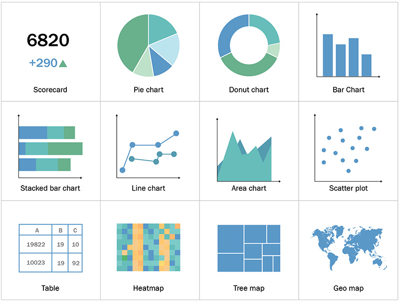
Figure 3.1 – Common chart types
Note
There are additional visualization types available to the ones discussed in this chapter that are used less widely. The objective here is to introduce only the most basic chart types rather than offering a comprehensive list. You can refer to the resources listed in the Further reading section of the chapter for broader and more in-depth coverage.
Different chart types are suitable for representing different types of data. Broadly, data can be either categorical type or numerical type. Examples of categorical data include countries, gender, education levels, and risk groups. Categorical data can be measured either on a nominal scale or an ordinal scale. Nominal values are just labels that don’t have any quantitative value associated with them and thus cannot be inherently compared among themselves – for example, specific product(s) you want to purchase from a store. Ordinal values, on the other hand, have an inherent order to them. A good example is measuring risk group as low, medium, or high, where each value exists in relation to others on an ordinal scale.
Numerical data can be either discrete or continuous and is measured against a quantitative scale. A discrete value is something that cannot be further broken down, such as the number of employees. Continuous data, on the other hand, can take on any value within a range, such as employee salary.
Another aspect that dictates the right chart type to use is the objective at hand – what you want to convey through the chart. Common objectives include showing the following:
- Distributions – How data is distributed across a spectrum. Line charts, scatter charts, and histograms are the most common forms of distribution charts.
- Compositions – How different parts make up a whole. Pie, tree map, and stacked bar charts are some chart type examples to use for this purpose.
- Relationships – Show the correlation or pattern of some type among two or more attributes. Scatter charts and bubble charts help with depicting relationships.
- Comparisons – Compare different attribute values and find the higher/highest or lower/lowest data points and trends. Line charts, bar charts, geographical maps, and choropleth charts are good chart type examples to show comparisons.
Scorecards
Scorecards are a simple and very useful way to represent Key Performance Indicator (KPI) values, usually a single metric, as text. This allows users to monitor and keep track of the most important metric values. The card visual displays the metric value and its name, as follows.

Figure 3.2 – A scorecard with a single KPI value
However, the value alone without any context is rarely useful. In general, KPIs are measured in the context of time – daily, weekly, monthly, yearly, and so on, and users are usually most interested in is knowing how these metrics change over time. With scorecards, users would like to understand at a glance whether the KPIs are tracking well compared to the previous period – for example, percentage change in the current month’s KPI compared to the previous month’s KPI value, as shown in the following figure.

Figure 3.3 – A scorecard with a single KPI and rate of change compared to the previous period
Using color and icons such as green upward or red downward arrows to indicate the increasing or decreasing behavior of the concerned metric adds some much-needed context. Using a green color for desired behavior and a red color for undesired behavior is a widely applicable norm, but it poses difficulties for color-blind people when these two colors are displayed together. Using any other colors to represent the good and the bad is counterintuitive and imposes an additional cognitive load on users. One way to address this is to use different intensities – a very light green color and a very dark red color. Almost everyone can differentiate between light and dark colors. Another option is to leverage icons such as emojis to indicate whether the metric is tracking well or not.
Pie and donut charts
When you want to display a proportion of different dimension values compared to a whole, a pie or donut chart fits the bill. Pie charts are easy to understand and are appealing to look at compared to other alternatives such as bar charts. For these reasons, both designers and users prefer these charts to be part of their dashboards. However, these charts are notorious for being very ineffective in representing data.
Humans cannot interpret and compare areas and angles as well as they can do with lengths and widths. So, when values close to each other are depicted in a pie or donut chart, the human eye cannot easily distinguish different magnitudes. Also, when there are a large number of categories, the pie chart becomes really cumbersome, making it harder to understand the data. The following figure showcases both flaws.
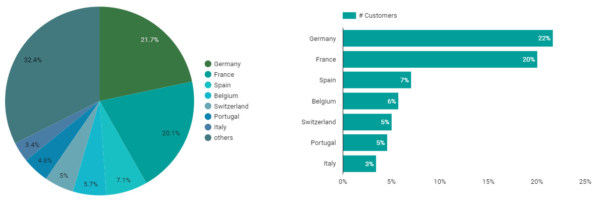
Figure 3.4 – A pie or donut chart is ineffective when used with too many categories. Use alternatives such as bar charts
Both pie and donut charts have the same characteristics and suffer from the same drawbacks. While there are some valid scenarios where these charts do not often make a good choice, by taking care of a few aspects, you can design them to be decent enough. Bar charts provide a good alternative when there are more than a few dimension values to represent.
You can design useful pie or donut charts by keeping in mind the following:
- Use a pie or donut chart only when the intention is to compare the proportion of a category to the whole. It should not be used to compare different categories among themselves.
- Use these charts only when there are fewer categories – ideally 2 to 5.
- Always make sure the sum of all proportions equals 100%. It is easy to get this wrong if pre-computed percentages that do not sum up to 100% are plotted and displayed.
Also, labeling the data in a pie or donut chart is very critical – the proportion, the category name, and optionally, the value. It is these labels that help in actually making these charts interpretable, without which they are effectively useless. So, do not forget to add labels to the chart.
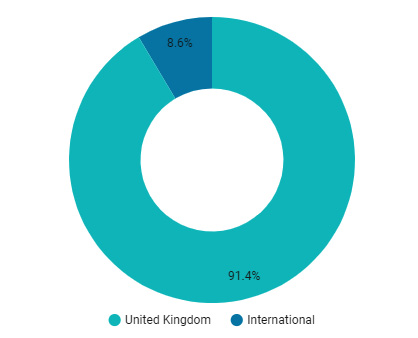
Figure 3.5 – A pie or donut chart works well with only a few categories
The preceding donut chart is a good example, which depicts just two categories. Pie/donut charts have a big advantage over bar charts in representing a few dimension values with widely varying proportions, as the former enable much easier interpretation of a composition.
Bar charts
A bar chart, whether horizontal or vertical, is one of the most fundamental and widely applicable chart types. When you want to compare different values of a dimension based on a metric, the bar chart is your friend. The dimension values can be nominal values without any inherent order, such as products, countries, and customers, or they can be discrete ordinal values, such as age groups and risk levels. The following chart compares different salespersons based on the total sales they have generated.
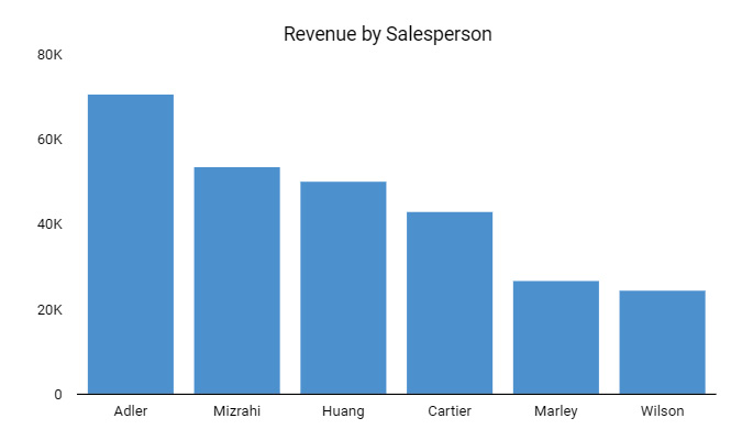
Figure 3.6 – A bar chart to compare revenue generated by salespersons
Horizontal bars are preferred in the following circumstances:
- When there are a large number of dimension values
- When the dimension values have longer names
For example, as shown in the following figure, long product names make a horizontal bar chart more suitable compared to using vertical bars.
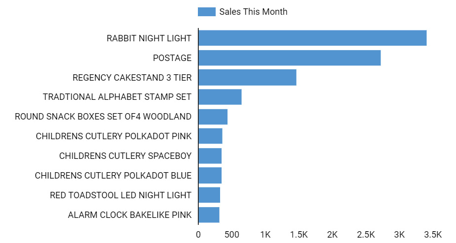
Figure 3.7 – A horizontal bar chart to accommodate long dimension names
Whether long or not, labels in horizontal bar charts are in general easier to read and process, as the layout follows our natural order of reading information. If the dimension values do not have an inherent order, the bar chart is usually sorted by the metric value. On the other hand, if the bar chart depicts a dimension with ordinal values, the bars should be sorted by the dimension values themselves. In the following chart, the bars are arranged in the increasing order of the age groups instead of the length of the bars. This allows for a more intuitive interpretation of the chart.
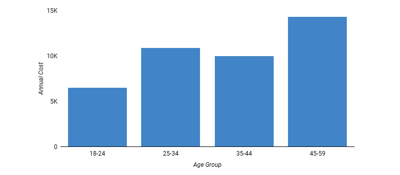
Figure 3.8 – A bar chart sorted by the ordinal values of the dimension
A key thing to note while building bar charts is that the y axis must start at 0 in order to provide an accurate representation of data. Starting the axis at a different positive value misleads the user because the length of the bar in this case doesn’t represent the actual metric value. In the following figure, the chart on the right side with the y axis starting at 40K indicates that Alder’s performance is about twice that of Mizrahi’s when, in fact, it’s only about 40% more, as shown by the chart on the left, in which the y axis starts at 0 and the length of the bar is a true representation of the sales value.
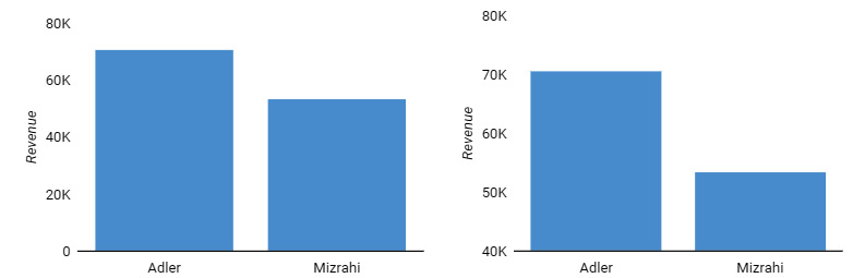
Figure 3.9 – The y axis of a bar chart should always start at 0 for accurate representation
A histogram is a special type of bar chart that depicts the frequency distribution of a numerical variable in a dataset. It groups the continuous numerical values into bins and displays them along the x axis. The frequency or the number of rows in the dataset that lies within each bin is represented on the y axis.
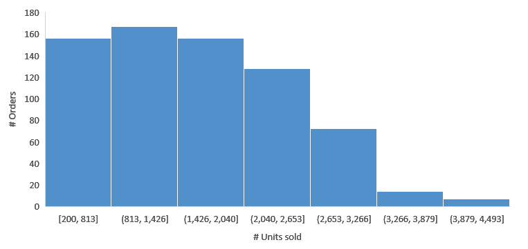
Figure 3.10 – A histogram showing the distribution of orders by units sold
A clustered bar chart, also referred to as a grouped bar chart, is a variation of the bar chart that either depicts more than one metric across a dimension or compares more than one dimension based on a single metric, as shown in the following figure.
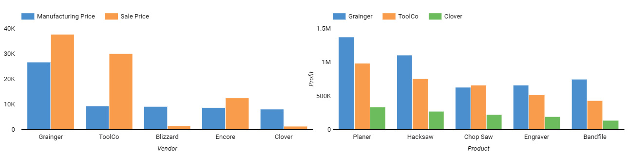
Figure 3.11 – Different ways of using a clustered bar chart
A bar chart allows you to compare the values of bars that are close to each other better than those that are far apart. Hence, following the gestalt principle of proximity, carefully choose which bars need to be clustered together versus which need to be along the axis. In the preceding example, the clustered bar chart on the right facilitates an easier comparison of profit across different vendors for each product than the other way round.
In the case of displaying multiple measures as a cluster of bars, make sure that the metrics are really comparable and can work with the same axis and scale. Use this variation when the intention is to compare the two metric values for each dimension value – for example, actual versus budget and current quarter sales versus previous quarter sales. To be most useful, make sure the clusters contain only a small number of bars, ideally no more than four.
Yet another style of bar chart is the stacked bar chart, in which each bar is broken down by a second dimension and the slices are shown as stacks within a single bar instead of as independent bars, as in the case of the clustered bar chart. The overall length of each bar indicates the total metric value of the dimension along the axis, which enables an accurate comparison of dimension values on it. When depicting a single measure by two dimensions, a clustered (grouped) bar chart and a stacked bar chart can display the same data, just in different ways. Like clustered charts, visualize only a few stacks per bar for them to be most effective.
The lengths of different stacks representing the second dimension in each bar, on the other hand, enable only an approximate interpretation of the values and comparison among themselves. Users may need to do some mental math to understand the magnitudes accurately. Also, comparing these stacks across different bars is really difficult with the exception of the bottom- or left-most stack in the case of the vertical bar chart and the horizontal bar chart respectively, owing to the fact that stacks, apart from the first one, do not offer a consistent starting point for easier comparison.
Stacked bar charts help you to compare totals and simultaneously see the composition of a metric by another dimension. They are useful when the value of the overall metric is more important than the breakdown by the second dimension. Stacked bar charts enable you to notice any marked changes at the breakdown or stack level that are likely to cause variation in the totals. The following figure shows the same data as the clustered (grouped) bar chart in the preceding figure as a stacked bar chart, showing the profit for various products broken down by vendors.
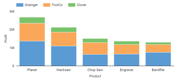
Figure 3.12 – A stacked bar chart
A 100% stacked bar chart is a closely related form of a stacked bar chart, with the length of the overall bar representing 100% of the dimension value on the axis. The stacks in the bar depict the percent contribution by each of the breakdown dimension values, as shown in the following figure.
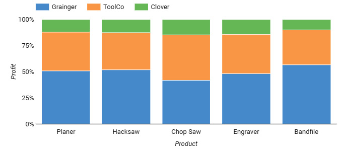
Figure 3.13 – A 100% stacked bar chart
Like the stacked bar chart, it enables only approximate comparison along the bar and is not amenable to comparing stacks across different bars. The main purpose of stacked charts is to provide a better understanding of the big picture, without much focus on little differences.
Line charts
Line charts are a natural choice to represent time-series data, where the x axis represents time and the y axis represents the metric. In general, a line chart can have any attribute that depicts continuous values with a uniform interval of measurement, not just time. Line charts provide an understanding of the overall trend and pattern of a variable depicted on the y axis along the continuous values of a variable represented on the x axis. The following figure shows a line chart that plots total monthly sales over time.
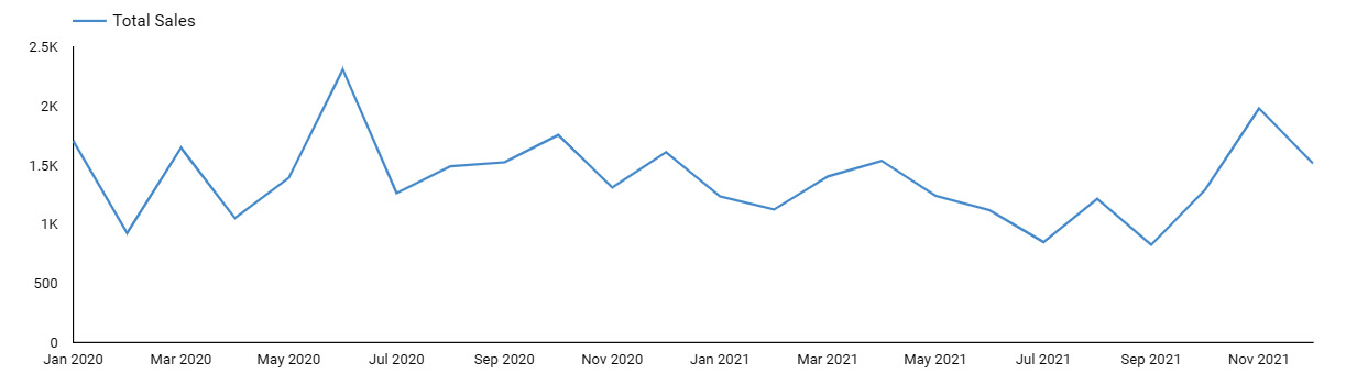
Figure 3.14 – A simple line chart
The metric can be broken down by a dimension with discrete values and represented by multiple lines. Displaying too many lines clutters the chart and makes it ineffective. General guidance says that you can show up to five lines to provide the most value.
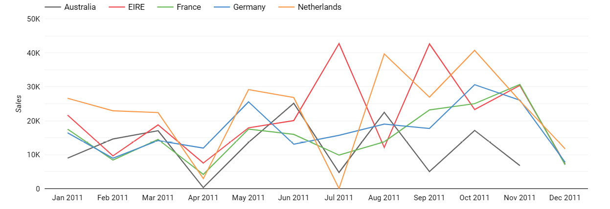
Figure 3.15 – A line chart with multiple lines depicting sales by different countries
While the data visualization community and experts generally agree that y axis for bar charts must start at 0, there is no consensus on whether it’s mandatory for other chart types to do so too. Starting the y axis for a line chart at a value that makes sense for the specific dataset enables you to view the changes along the axis more clearly. A classic example is the stock market price variation over time. Starting the y axis at 0 for this visualization has the line appear almost flat and makes it difficult to interpret the variations. Choosing the historically lowest value as the starting point will make the visual more useful in this case. The main focus of line charts is to depict relative changes along the line rather than the actual value at any point. Hence, the actual height at which the line appears doesn’t affect users’ ability to understand the variation correctly, even if it dramatizes the magnitude, as illustrated in the following figure. Be sure to notice the y-axis scale to interpret the magnitude though.
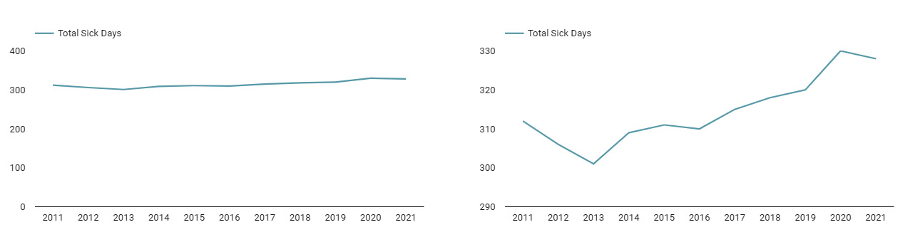
Figure 3.16 – A line chart with a y axis starting at a reasonable value for the dataset helps better read the variation in values
Area charts are just line charts filled with color and can be thought of as a combination of a line and a bar chart. This means that in addition to a change in values along the axis, area charts help users to understand the magnitude of a value by the overall area. Accordingly, like bar charts, area charts must start their y axes at 0.
Area charts are commonly used with multiple lines to compare different categories. They work best when data is divergent and overlap among the lines is minimal. In the following area chart, the daily number of tickets closed by two members of the technical support team is divergent enough to provide a useful visual.
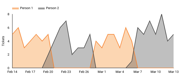
Figure 3.17 – An area chart with divergent data
When the lines overlap a lot, the overlay of colors causes confusion and makes it difficult for users to read the chart, as shown in the following figure. If the colors are not transparent, it further limits the utility of the chart as a result of occlusion or data being hidden.
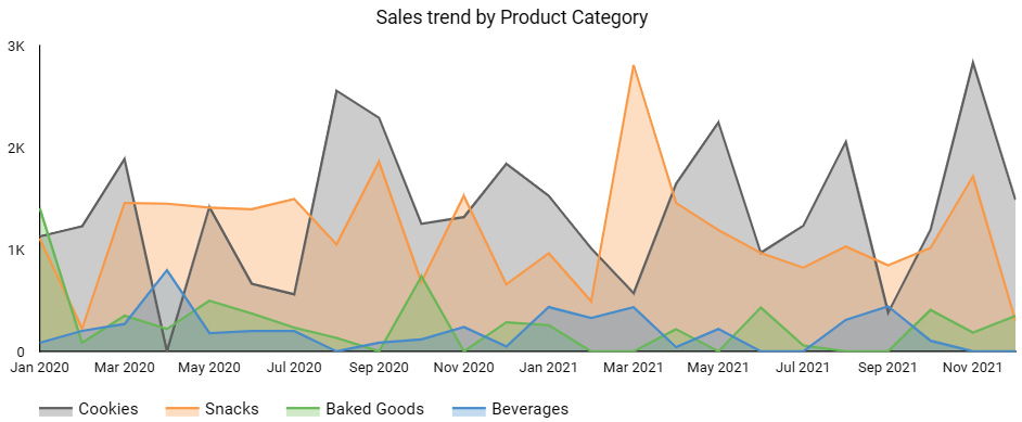
Figure 3.18 – An area chart with a highly overlapping series is confusing
Stacked area charts and 100% stacked area charts are more commonly used than regular area charts because they do not suffer from the problem of occlusion. Similar to stacked bar charts, stacked area charts are useful to depict both the overall total and composition by breakdown dimension at the same time. They allow users to understand any sharp changes at the individual series level along the horizontal axis that impact the overall total. Stacked area charts mislead users in discerning the true trends for the dimension values beyond the first one, just like the stacked bar charts.
Stacked area charts add additional complexity, as it is very difficult for users to accurately compare areas. Also, not everyone understands or interprets these charts properly. Hence, these should generally be used with caution.
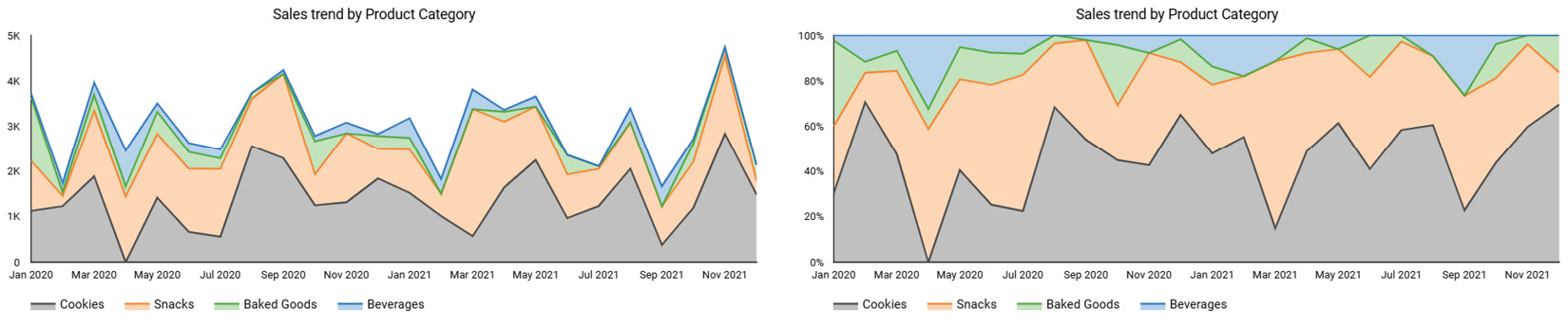
Figure 3.19 – Stacked area charts make it harder to discern the actual trends of different dimension values
Sparklines are a form of line charts that were introduced by the data visualization guru Edward Tufte. These are useful to provide the historical context for a metric. These lines neither show any axes nor any values, except the latest data point. Sparklines are space-efficient and well suited for a dashboard. But be sure to only use them when the actual values of the other points isn't relevant to your story.

Figure 3.20 – Sparklines add historical context
The preceding figure shows how a card visual can be augmented with the historical trend of the sales metric using a sparkline:
Combo charts
Combo charts allow you to represent different series with a different marker type – line, bar, area, and so on. The most common form of combo chart is the one which is composed of bars and lines, as follows.
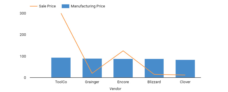
Figure 3.21 – A combination chart with a single y axis
A combination chart is helpful in augmenting a main chart with an overlay of a different set of data for comparison purposes. The secondary series can use the same axis as the main series or a different axis on the right.
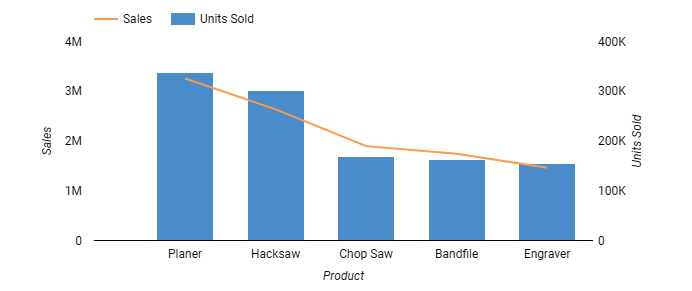
Figure 3.22 – A combination chart with dual Y axes
However, dual axes make the chart difficult to read and can lead users to interpret a series incorrectly. Hence, you should generally avoid them and consider alternative ways of presenting the data.
Scatterplot
When you are interested in understanding the correlation between two metrics, a scatterplot is the way to go. A scatterplot allows you to represent a large number of items and provides the general distribution of the items with respect to both metrics.
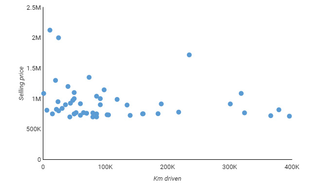
Figure 3.23 – A scatterplot depicting the distribution of car models based on distance traveled and sales price
In addition to the x and y axes, you can use color and size to represent two additional metrics. Color can also be used to represent distinct values of a breakdown dimension. A mark type or shape is another way to display additional grouping. However, incorporating all of these attributes at the same time may clutter the chart and make it difficult to read. Take care to use these dimensions judiciously to provide a simplistic yet useful display of information.
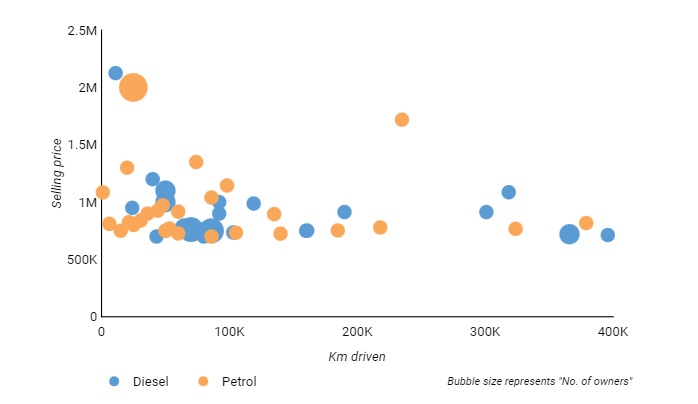
Figure 3.24 – A scatterplot using color and size to represent additional information
The scatterplot in the preceding figure depicts used cars, using color to represent a breakdown by fuel type, and size to indicate number of owners.
Tables
Tables are the best way to display detailed data. They also enable you to present several dimensions and metric values together easily. The following is an example of a table with multiple dimensions and multiple metrics. The profit values are shown as data bars instead of text.
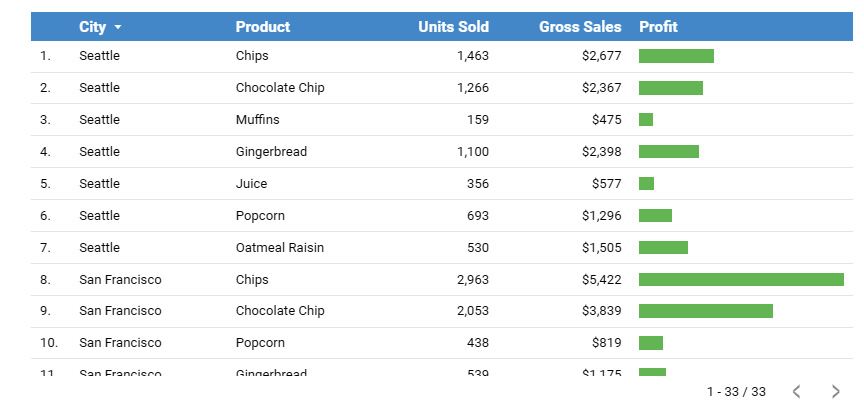
Figure 3.25 – A table with multiple dimensions and metrics
Tables can be part of detailed reports rather than compact dashboards. They tend to support the summary displays of metrics and allow users to investigate and understand details as needed. Tables are also commonly used in operational dashboards to help track day-to-day activities. When designing a dashboard, a user’s need to see detailed data in the form of tables can be addressed by providing a drill-through report or a link to a separate view with the table display, instead of directly incorporating the table in the dashboard.
Pivot tables, as shown in the following figure, allow users to view metric values summarized against two dimensions along rows and columns respectively, and they also allow you to include associated dimension hierarchies.
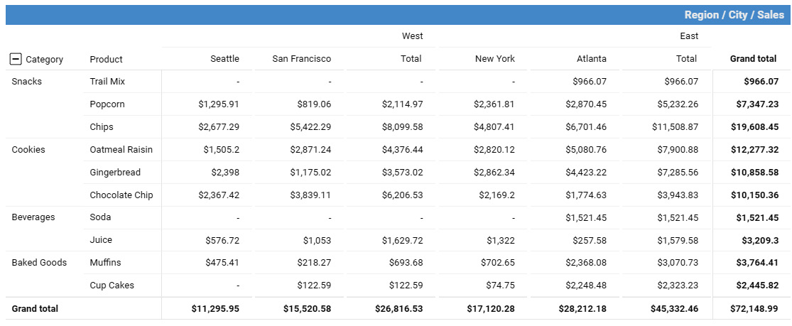
Figure 3.26 – A pivot table with row and column hierarchies
In short, a large amount of detailed data with suitable aggregations can be represented in pivot tables in a user-friendly way.
Heatmap (matrix)
Heatmaps use color intensity to represent metric values. Heatmaps when applied to tabular or matrix data help in comparing categories along rows and columns. You can use either a sequential color scheme or a diverging color scheme to make sense of the distribution of data along chosen dimension values. Using color to emphasize relationships among dimension values and the distribution of a depicted metric makes it easier to understand data patterns, compared to raw numbers.
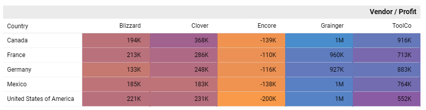
Figure 3.27 – A heatmap depicting the distribution of profit by country and segment
The heatmap in the preceding figure uses a warm color to represent the lowest profit and vice versa. This chart provides a quick way to gauge problem areas quickly and also how prevalent these concerned aspects are.
Treemap
A treemap is a good way to visually represent hierarchical data primarily using area and color attributes. For example, the following chart displays the sales for each category, depicted by the first level of boxes for each category. The sales by each product that belongs to a category are represented by the second level of rectangular boxes. The area of each box is proportional to the total sales for a particular category or product. Color can be used either to depict an additional metric value or a dimension. This is a form of heatmap.
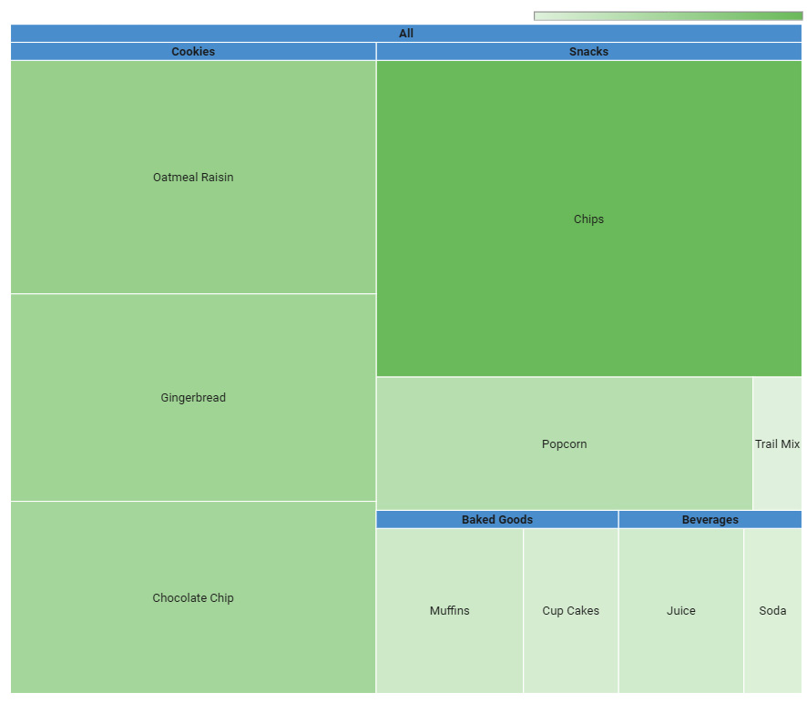
Figure 3.28 – A treemap displaying the proportion of sales across a product hierarchy
Treemaps are similar to pie charts in that they help represent the composition of data. In addition, treemaps allow you to drill down into one or more dimensions. Given that both area and color intensity provide only approximate comparisons, treemaps are useful only to present a high-level and approximate composition of dimensions and the extreme values of the metric, depicted by the color intensity.
Another limitation of the treemap is that dimension values on the lower end of the metric range would be too small and not easy to identify, especially if the range (the difference between the largest and smallest value) of the metric values is too large.
Geographical maps
Displaying location-based data on a geographical map makes the most intuitive sense. Almost all data visualization tools enable you to plot standard geographical areas, such as countries, states or provinces, cities, countries, and zip codes, out of the box. Some tools allow you to create custom areas such as regions and sales territories as well. Furthermore, some tools allow you to import or integrate advanced mapping data and capabilities directly into your dashboard.
Note
Advanced geospatial visualizations involve a fundamentally different type of data, called raster data, which is more closely related to images. This requires specialized tools such as Google Earth Engine or ArcGIS to visualize, and will not be covered in this book.
In more basic geographical charts, you present data on a map using either bubbles or a filled color. In the bubble geographical map, you can also use color in addition to the bubble size to represent an additional metric or a non-geographical dimension value for grouping, as shown in the following figure.

Figure 3.29 – A bubble geographical map chart, using bubble size to represent the metric and color to represent the metric breakdown by dimension
The filled map fills the entire geographical area with the corresponding color, based on a single chosen metric. It provides an overview of the distribution across geographical locations and displays spatial patterns and relationships effectively. These filled maps are also called choropleth maps.
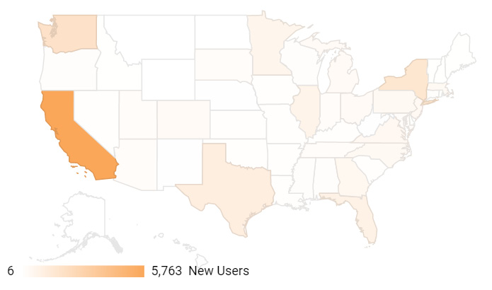
Figure 3.30 – A filled geographical map displaying sales across different countries
Both bubble and filled map charts are great at providing high-level regional patterns but are not suitable for identifying subtle differences.
Others
There is a plethora of other chart types out there that could be beneficial additions to your data visualization arsenal, but we cannot cover them all here. A good reference for additional chart types is https://flowingdata.com/chart-types/. However, the principles and guidelines we have discussed in this chapter should help you to evaluate those varied chart types and make the right decision for your data and your dashboard.
Avoiding common pitfalls
In this final section of the chapter, we will go through some of the common pitfalls and gotchas to watch out for while designing dashboards and visuals. You will see that these usually involve either inadequate application of the design principles we have discussed in this chapter or a complete lack of adherence to them.
Overloading a dashboard
A dashboard that tries to convey too much is an overloaded dashboard. It is tempting for dashboard developers to respond to users’ relentless demands for additional information by adding more and more visuals and information to an existing dashboard. This tendency will only result in a cluttered dashboard that will be cumbersome to use and understand.
Also, trying to address the needs of different groups of users with the same dashboard is a bad idea. Limit the scope of the dashboard and align it with a single major objective and persona. Provide additional details to the users through separate dashboards and enable seamless navigation to facilitate users’ analytical journeys. Create separate dashboards to serve different teams and objectives.
Understand the distinction between a dashboard and a report, and avoid or include details accordingly. Reports by definition tend to be elaborate, may contain multiple pages, and can cater to the needs of multiple personas. Also, do not clutter a dashboard or a report with too much non-data link.
Designing a poor or incohesive layout
By not thinking about the narrative and not having an understanding of the way humans consume visual data, you are likely to create a poor layout that isn't optimized for the quickest and easiest interpretation of information. Placing unrelated visuals together results in an incohesive layout that hurts the user experience and makes a dashboard really ineffective. You should spend time on the intended narrative you want to present to users and work deliberately to organize content on the dashboard to provide a cohesive picture.
Not emphasizing key information and a message
Use preattentive attributes such as color, intensity, size, length, and orientation to your advantage, and emphasize key information that needs attention. Also, a chart or a dashboard where everything is highlighted is one where nothing stands out. Use these attributes judiciously and sparingly to alert users to problematic or undesired behavior that needs attention.
Using color excessively or inappropriately
Do not use too many colors in a dashboard or a chart. Excessive color strains the human eye and makes it more difficult to process information. Also, do not use color to represent data when it doesn’t add any meaning to it.
Using dual axes in charts without caution
Using dual axes to present two different metrics in a single chart can lead to incorrect insights, especially about the relationship between the two data series. The dual axes can be implemented in different ways:
- Each axis represents a different metric in the same units but on a closely related scale (most confusing).
- Each axis represents completely different metrics and units of measure. This is a more appropriate use of dual axes with less confusion, but care should be taken when comparing the rate of change or absolute values of the two series.
- Both axes represent the same metric but at different occurrences. This is the most effective application of dual axes.
In the following figure, the chart on the right, which represents the total sales and percentage sales from new customers on either axis, may be acceptable. The one on the left though is misleading and confusing, giving the impression that both the product categories – Apparel and Shoes – are generating sales from new customers at a similar rate.
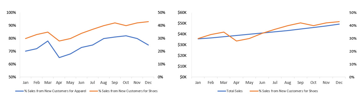
Figure 3.31 – Use dual axes with extreme caution
Using separate charts to present two metrics is the simplest alternative to using a complicated combo chart that is ineffective. Using a single axis, made possible either by plotting series with closely related scales and the same units of measurement or by plotting indexed values of both metrics, is another alternative.
Inappropriate manipulation of axes
Bar charts whose axis don’t start at 0 are plain wrong and present a very incorrect view of data. This pitfall must be avoided like the plague. The comparisons among the bars will be distorted when the bars do not start at 0. Always start the axis for the bar chart at 0. Figure 2.58 shows how such charts mislead users.
On the same note, for a line chart, you need to pick the scale that best brings out the trend that users are interested in. For example, the left chart in the following figure is not really useful, as the change in data over time is not depicted well, with the y axis ranging from 0% to 40%. The company sales have been growing a mere 2% to 4%, and defining the y-axis scale around these values represents the trend better, as shown in the chart on the right.
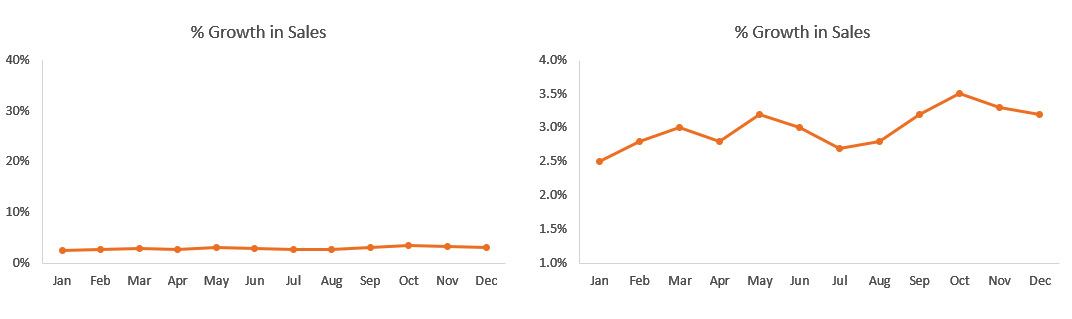
Figure 3.32 – An appropriate scale for the line chart to depict the trend well
Another aspect of axis design is “scale.” If you want to compare a metric across multiple charts, make sure the axis scales for those charts are the same. Using different scales for a metric in different charts leads to inaccurate comparisons and insights.
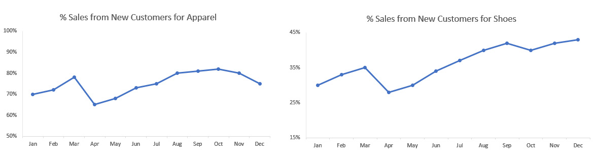
Figure 3.33 – Dissimilar axis scales lead to inaccurate comparisons
The preceding figure shows the percentage sales obtained from new customers for two product categories – Apparel and Shoes – in side-by-side line charts. At first glance, both categories seem to be acquiring customers at the same rate and the Shoes category is probably doing better, given the increasing trend. However, upon closer inspection, you can see that the two charts use different scales on their y axes. You realize that it is the Apparel category that is actually doing better.
Using inappropriate or complex chart types
Of course, using the most appropriate chart to represent the information is of paramount importance. In cases where multiple chart types are suitable, choose the simplest one. Do not use hard-to-read or complex chart types for the sake of novelty. In cases where the complexity of the data warrants a sophisticated chart, which requires greater efficacy from the users, include it in a dashboard only after making sure users are comfortable with it and can use it effectively. Provide helpful instructions and explanatory notes within the dashboard to aid users as needed. Alternatively, you can plan to convey the same information through a collection of simpler charts.
For example, consider the following radar chart. It shows the performance rating of different employees along six attributes.
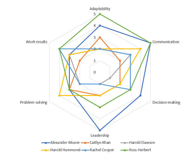
Figure 3.34 – A radar chart depicting employee performance scores along multiple attributes
Radar chart
A radar or spider chart can visualize one or more series of data over multiple quantitative variables. For example, you can easily compare the performance of different students across different courses. Given that it depicts variables in a circular fashion, it is especially suitable for comparing a series along different time periods, such as quarterly or monthly.
However, radar charts can be quite complex to read, especially when more than a few series are plotted. Also, filling the polygons with color results in occlusion – where the top polygon covers all the other polygons underneath it.
In this chart, the area of the polygon represents the overall performance of an employee. The intention is to be able to compare the performance of multiple employees among themselves. There are multiple things that make radar charts hard to read:
- The circular shape requires a conscious effort to compare values across the attributes and there is no implicit ordering.
- You cannot accurately compare the areas of different series visually. Also, the differences in the metric appear inflated as the resulting area of the polygon changes exponentially.
Alternatively, this data can be represented in a much simpler and more effective way using a bar chart. A clustered bar chart works best when there are only a few series, (i.e., employees, in this example) to compare.
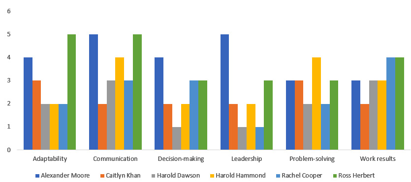
Figure 3.35 – A clustered bar chart is one alternative to a radar chart for easier comparison
You can use small multiples – a number of separate bar charts, one for each series (i.e., employee), each depicting the metric (i.e., performance rating) on the same scale – when there are more than a few series.
Summary
Using the right chart type to display information is of paramount importance. In this chapter, we reviewed a selection of common chart types to help you make the right choice for your needs. We discussed some of the common pitfalls and gotchas in visualizing data and how to avoid them.
This marks the end of part one of the book, which focused on the concepts of data storytelling and guiding principles. In part two of the book, we will explore Google’s data visualization tool Looker Studio and its features and capabilities. The next chapter introduces the tool and examines its major components.
Further reading
To learn more about visualizing data effectively, you can refer to the following resources:
- Knaflic, Cole Nussbaumer. Storytelling with data. John Wiley & Sons. 2015.
- Berinato, Scott. Good charts. Harvard Business Review Press. 2016.
- Jones, Ben. Avoiding data pitfalls. Wiley. 2019.
- Chart Types. FlowingData. https://flowingdata.com/chart-types/.
- The Data Visualization Catalogue. https://datavizcatalogue.com/.